fbpx

Monday Morning Art School: painting reflections

The ocean complicates matters by being bouncy, but it reflects light the same way as does glass or tinfoil.

Tin foil hat, by Carol L. Douglas. Oil on canvasboard.

Reflections are a distortion of the surrounding environment. That’s true whether you’re painting them in water or from glassware in a still life. Managing them is mainly a question of observation.

Imagine an ocean that is perfectly flat, and that you can walk on water. Looking at your feet, you can see straight down into the water. It’s not reflecting anything. Looking at a rubber ducky floating ten feet away, you’re looking at the surface at about a 26° angle. You’ll see a reflection of the ducky, the sky, and a glimpse of what’s under the surface. As you look farther away, the angle gets smaller and smaller, and all you see is the reflected sky.

Hard Drive, by Carol L. Douglas, oil on canvasboard.

Reflection involves two rays – an incoming (incident) ray and an outgoing (reflected) ray. Physics tells us that the angles are identical but on opposite sides of a tangent. This is why the reflection of a boat needs to be directly below the real object in your painting. You can add other colors into that area, but the reflection can’t be wider than the object it’s reflecting.

The reflection should be directly below the object. Don’t let it grow wider.

Water is transparent, but it has a shiny surface. Some rays of light make it through and bounce back at us from the sea floor. Reflections in glass work the same way. You can see through the glass in the surface that’s facing you, but the curving sides reflect light from around the room. Because glass is imperfect, these reflections will be distorted.

My quick watercolor of waves, done from the deck of American Eagle during our Age of Sail workshop.

The ocean complicates matters by being bouncy. Even on the calmest day, the surface of water is never perfectly flat; it’s wavy or worse, just like a fun-house mirror. Waves are a series of irregular curves. How they reflect light depends on what plane you’re seeing at that nano-second. It seems like the easiest thing to do is to capture it in a photo and paint from that, but what we see in photos is sometimes very different from what we perceive in life.

Instead, sit a moment with and watch how patterns seem to repeat. They’re never exactly the same, since waves are a stochastic process. But they’re close enough to discern general patterns.

Butter, by Carol L. Douglas, oil on canvasboard. Even something as transparent as Saran Wrap will have reflections.

Solid objects can also trip you up in their reflections. Consider the humble spoon. It’s concave. That distorts its reflections. There’s no point in trying to predict what you might see; it’s best to just look. Likewise, a mirror only reflects straight back at you if you’re in front of it.

It’s always best to paint the reflections at the same time you’re doing the rest of the painting, rather than adding them as an afterthought. They’re a fundamental part of the design.

Only smooth surfaces reflect light coherently enough to make reflections. That’s why burlap has no reflections. Sometimes, when water is being wind-whipped, it doesn’t have reflections either. To paint such a sea, keep the contrast low.

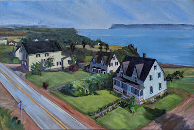
Ottawa House, by Carol L. Douglas, oil on canvasboard, available. The wind-whipped sea has very little contrast, but it does have texture.

Some people say that reflections should be lower in chroma than their objects, but I don’t think that’s true. Often, the ocean seems to concentrate color. Sometimes, the water will be lightest at the horizon; other days there will be a deep band there. However, the farther away, the more its colors shift toward blue-violet.

Your assignment is to make and paint a tinfoil hat (which is very useful in an election year). Your tinfoil will become a little battered and less reflective in places as you fold it. Work fast. Make your neutral greys using complements, not black.

Expect that your painting will look disjointed until you finish. Don’t overwork it. This is an exercise where rough brushwork is a virtue.
Monday Morning Art School: using angles for measurement

Measurement and angles are the basis of drawing. Learn how to use them, and you can draw anything.
Geraniums, by Carol L. Douglas, pastel. Available, but has to be collected in person as it’s glazed in non-reflective glass.

Last week’s lesson on the pencil and thumb method was easy to teach in person, but difficult to write out in steps. Today’s lesson, on using angles, is easier to write, but will be a little trickier to master.

This has to do with how our brains are wired, not how ‘talented’ you may or may not be—that’s mostly, as Mr. Edison pointed out, a matter of persistence anyway. But the human mind simply doesn’t ‘read’ angles and negative space when it’s not focusing on them. This is why we use our pencil as a visual aid. It forces our brains to pay attention.

The good news is that you can rapidly teach your brain to notice angles and negative space.

Two pieces of silverware and a coffee cup: a surprisingly tricky thing to draw. But when you’re done, you’ll have the basic tools to draw anything.

Once again, close one eye and focus on the pencil, not the object you’re measuring. Hold the pencil along an imaginary plate glass window in front of you, and tilt it to match the angle you’re measuring. Then reproduce the line on your paper.

If at first you screw up, it’s probably that you’ve canted one end of the pencil away from you. Straighten it up and try again.

Once you’ve mastered measuring with the pencil and thumb method and learned to see and copy angles on to your paper, you can draw anything from portraits to animals to landscapes to figure.

Start by measuring the basic shapes using the pencil and thumb method we learned last week. Mark off the  heights and widths of all the basic shapes.


Use your pencil to determine the angles at which the silverware, the sides of the cup, and the handle are traveling. Draw them in as straight lines. This takes a little practice, so be patient and take your time looking at each one.


Use your measuring and angle hash marks to block in the major shapes.


Often, you can see distortions, objects that are too close together, etc. more easily in the negative space than you can in your drawing of the positive objects. It’s best to check this before you go on to finish your drawing.

You can use angles to check your work. Here I checked the angle from the right tine of the fork to the handle of the cup, and the angle across the top of the two pieces of silverware.

Note: last week I wrote about the difficulty of decision-making in the age of coronavirus. My workshop in Pecos is now on, thanks to the Herculean efforts of Jane Chapin. The statewide 14-day-quarantine is expected to be lifted on September 1, but that doesn’t do travelers or hoteliers much good for trips immediately after that, which must be booked now. Jane figured out a great solution. We won’t be breaking quarantine, and we will be able to paint out in the field.

Jane cleaned her studio so we have a backup location in case of rain. Isn’t that gorgeous?
San Miguel County, where the workshop will be held, remains one of the safest places in America, with zero deaths from coronavirus. We’re going, using all the safety methods we can employ—masks and hand sanitizer in the airport, frequent handwashing, etc. And we expect to have a lovely, lovely time, paint in some gorgeous spots, and learn lots.

Ironically, airfares are so low right now that the total cost of the workshop has plummeted, at least for me, coming from the northeast.

At this point, the limiting factor isn’t the number of people I can teach, but the number of beds I can rustle up. Jane still has a few up her sleeve. So if you’re bold* and love the western landscape, you’re welcome to join us. Email me to initiate a conversation.

On the road again. I can barely contain my excitement!

*Jane and I have a history, and it always seems to include adventure… and lots of laughter.

Monday Morning Art School: anyone can draw

Drawing is a series of actions, rather like dance. It can be learned, just like any other process.

Teachers sometimes tell their students to hold the pencil fully outstretched. I disagree, because moving it up and down and sideways makes you move in an arc, as Sandy demonstrates, above. 

Drawing starts with measurement. Get that right, and everything else is just details.

1. Put yourself a few feet from the object you want to draw. Make sure you’re comfortable.

2. Hold your pencil between your thumb and fingers as shown. Most art teachers tell you to do your measurements with your arm completely outstretched; I prefer to have my arm loose and to visualize an imaginary plate glass window I’m running my pencil along.

Instead, hold your pencil loosely and comfortably, as if there were a plate glass window along which you were running the pencil. You will have to recheck your measurements frequently, but you should be doing that anyway.

3. Close one eye and focus on the pencil.

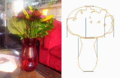
4. Holding your pencil upright and straight, align the point of your pencil with the top of the vase.

5. Slide your thumb down the pencil until it is at the bottom of the vase. This is now one unit of measurement in space.

Your pencil is your ruler. You are measuring ratios and then transferring them to the paper. (Note: my ratios look slightly different from what Sandy was seeing because I drew the picture later, from a slightly different angle.)

6. Put marks on your paper where you want the top and bottom of the vase to end up. This is now one unit of measurement on your paper. It doesn’t have to be the same size as your unit of measurement on your pencil.

7. Go back and line your pencil up again with the vase so that it fills the pencil from the point to your thumb. Now raise the pencil so you are measuring the flowers. Are they as tall as the vase?  Twice as tall? Half as tall? When you’ve determined this, add another mark to your paper to indicate where the top of the flowers should be. This should be the same ratio on paper as it was in space. But one unit on your pencil does not need to be one unit on your paper. What you draw can be much bigger than what you measure, as long as they are proportional.

Recheck the height with your pencil and then flip it to see how the width of the vase compares. It’s that simple. 

8. Go back and recheck the measurement on the vase height. Then just flip your pencil sideways and see how wide the vase looks in comparison to its height. Is the object as wide as it is tall? Twice as wide? Half as wide? Once you’ve determined this, go ahead and put horizontal marks on your paper to represent the width of the vase.

9. Turn your pencil to the side and observe that the flowers are about 2 or 2.5 times as wide as the vase (depending on where you’re standing).  Make those marks on your picture.

It really doesn’t matter where you start measuring or what order you measure in. You will figure out a system that works for you.

10. Once you have the proportions of the objects marked out, mark in the big shapes with a light pencil and then start breaking them down into smaller shapes. You are well on your way to drawing the object. 

Once you have the measurement hash marks in place, draw in the big shapes and start breaking them down into smaller shapes. The rest is just details.

Your assignment is to practice this. The more you practice accurate measurement, the better your painting will be. Next Monday I will talk about using angles and negative space to measure.

Monday Morning Art School: Tone your canvases

Toning makes a difference in how you see lights and darks.

Bracken fern, by Carol L. Douglas. Available through Maine Farmland Trust, Portland, ME.

Imprimatura is the initial stain of pigment painted on a gesso ground. In indirect painting, this color is left open where possible, reflecting back up through the paint layers and creating a cohesive tonal structure.

We don’t paint indirectly in the field, so why do we still tone canvases? Toning is invaluable in the initial stages of work. Not only will a white canvas blind you on a sunny day, it changes how you perceive darks and lights. The tendency when painting on a white board is to start your darks too dark. A toned canvas helps the painter establish a pleasing value structure. We touched on this in our Monday Morning Art School lesson based on Josef Albers.

I use a clapped-out oil-painting brush, but a 2″ wall brush works just fine and is cheaper.

Traditionally, artists chose a warm earth tone like a sienna or ochre, diluted it half-and-half with turpentine, applied it on the canvas with an old brush, and then wiped the residue off with a rag. This is still the best way to tone, since it leaves a layer porous enough to grab the gesso, but in a light, sparkling manner.

With oil-primed canvas and boards, you absolutely must tone that way. While oil paint can be applied over acrylic, acrylic must never be applied over oils. It delaminates. There are some fine painting boards with oil primer, and it’s easy to confuse them with the more common acrylic-primed boards. Read the labels. 

If you’re painting in acrylics, you must use acrylic primer and you cannot use an oil-primed board.

A more traditional toning color, and a frankly bad application. I can say that; I did it.

There is no reason that oil painters can’t also tone acrylic panels with oils, however. It will give you a slightly smoother painting surface, and it’s a good use for leftover paint. However, to save time, we often tone acrylic-gesso boards with acrylic, treating the tone as an extension of the ground rather than as the first layer of the painting.*

Alla prima painters often let the board show through in some passages. What color you want to show depends on your own taste, so I recommend experimenting. Traditionally, painters used earth tones—the ochres, umbers and siennas. I prefer 20th century pigments, so I’ve tried red, lavender, orange, yellow, and blue. I think our predecessors had it right: warmer tones work better.

Birch board is sealed, not toned, allowing the wood color to shine through.

I toned with naphthol red for several decades. I got that idea from Steven Assael, who probably got it from someone else. It’s a good counterpoint to green and blue, the dominant colors of our northeastern environment. It’s energetic, which I aspire to be, and it makes me immediately think in terms of all the accidental colors in the environment.

However, I’ve been experimenting with painting on plain birch panels for the past two seasons. These come naturally-toned, as long as one uses a clear sealant. That points out the basic character of imprimatura—the hue doesn’t matter nearly as much as the value does.

Safety check, by Carol L. Douglas. Available.

Toning makes a terrific mess. Cover your work surfaces. Smooth application isn’t a priority. If you’re toning with acrylics, you don’t want to wipe out the excess so much as mix it to the proper consistency at the beginning, paint it on, and let it dry. In either case, don’t over-coat your canvas; you still want the luminosity of the board to show through.

Acrylic paint manufacturers say you shouldn’t dilute acrylic paint more than 50-50. That’s true even at the toning level. If it’s breaking down into droplets, it’s got too much water in it.

*I recently had a student underpainting in acrylics. I investigated this myself a long time ago and abandoned it for two reasons. The first is that it requires two full paint kits in the field. More importantly, the underpainting becomes part of the ground, rather than the painting. If these are separated for some reason (like relining), there goes the bottom layers of the painting. Far better to just learn to apply the underpainting properly in oils.

How did you get that color?

While materials are important, how you lay paint down has a big effect on the purity of your color.

Summer Sky Summer Field, on a ponds walk behind my home on July 1, 2020, painted July 6, 2020 10″ x 8″ (w x h), Daniel Smith, Schmincke Horadam, and Winsor & Newton watercolors, and Uniball waterproof fade proof ink on 140 lb. Fabriano Artistico cold press rough 100% cotton extra white watercolor paper framed, available.

I’ve read somewhere that there are 18 million different palette permutations available to modern painters. I have a rationale for those I recommend. They are paired primaries based on color temperature. That doesn’t make them the only right option, just one that works for me (and my students).

Today I’d like you to look at a radically-different way of organizing color, that of children’s book writer and avid watercolorist Bruce McMillan. In watercolor, there’s a rationale for having more pigments at hand than one needs in oil painting. Different pigments have different particle sizes. That makes them behave differently in suspension in water, and they are absorbed differently into the paper. They also precipitate differently as they dry, leading to fantastic textural combinations.

Nubble’s Light Keeper’s House, at sunset as Georgia O’Keeffe would have seen it during her 1920s visits, as seen from Sohier Park on the Cape Neddick peninsula between Long Sands and Short Sands beaches in York, Maine. Commonly called Nubble Light or The Nubble, it’s officially named Cape Neddick Light, on Nubble Island, on October 25, 2014, painted April 19, 2020 7″ x 5″ (w x h), Daniel Smith, Schmincke Horadam, and Winsor & Newton watercolors, and Uniball waterproof fade proof ink on 140 lb. Fabriano Artistico cold press rough 100% cotton extra white watercolor paper framed, available.

Bruce has a fantastic ability to create deep, jewel tones in watercolor, and he always seems to hit a vibrant color in the first pass. That’s based partly on the pigments he chooses and partly on how he applies them.

You can watch Bruce painting and talking about color in this demo he recorded on Cape Porpoise.

Buoys from the Sea, at the Cape Porpoise Pier in Kennebunkport, Maine on March 1, 2019, painted March 18, 2019 12″ x 9″ (w x h), Daniel Smith, Schmincke Horadam, and Winsor & Newton watercolors, wax resist, and Uniball waterproof fade proof ink on 140 lb. Fabriano Artistico cold press rough 100% cotton extra white watercolor paper framed, available.

Using quality materials is important, and it’s doubly crucial for students. It’s tempting to buy dimestore paints until you know if you’re going to be serious about painting, but you start at a severe disadvantage. If your paints aren’t decent quality, there’s no way you can get good color in your paintings.

In watercolor, there’s another issue—pigments fade faster in watercolor than they do in oils. That’s why watercolorists are so fiendish about lightfastness tests.

Snow Stuck Opal Apple Study 1, on a sunny day behind my home in Shapleigh, Maine on December 4, 2019, painted December 12, 2019 7″ x 5″ (w x h), Daniel Smith, Schmincke Horadam, and Winsor & Newton watercolors, and Uniball waterproof fade proof ink on 140 lb. Fabriano Artistico cold press rough 100% cotton extra white watercolor paper framed, available.

Appended to the end of this post are Bruce’s pigments. Those he uses regularly are highlighted in red. Those he carries around but seldom uses are in grey.

“These were only selected after looking at all of the archival/permanence data available. I use colors from three brands, Daniel Smith, Schmincke Horadam, and Winsor & Newton,” he said. “I used to use Holbein, fun colors, but they don’t pass the archival test.”

Bruce noted the manufacturer of each paint on his list. “Colors are not the same going from brand to brand, and not only in color but also in permanence,” he said.

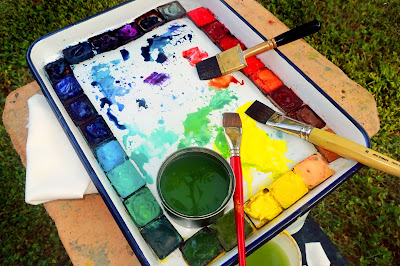
“I always have a half-sheet of Viva Signature Cloth paper towel in hand to adjust the water on my brush. And that brand is also perfect for lifting. And while I do mixing on my tray, I do a lot on paper, either wet-in-wet or wet-on-dry layering, many times painting after dipping my brush right from the color well.”

Bruce’s palette is large enough to allow him to mix enough paint for each full pass. He has bigger brushes at hand and bigger puddles of color available. Anemic color comes from not having enough of the color in question at hand, and then from applying it too sparingly. Bruce can hit strong colors because he makes enough of them to start with.

Paint glazed in numerous thin layers is not darker or more saturated than a single layer of the same paint applied right the first time. That’s a myth. In fact, multiple applications just muck up the surface of the paper, reducing its reflectance. Part of the reason Bruce’s colors sing is that he hasn’t ruined the paper with excessive layering.

Your assignment is to copy one of Bruce’s paintings—you can choose which one—trying to get the same intensity of color on the first pass, using the paints you have on your own palette. (If you use my palette, you should have no problem hitting all the points in his paintings.)

I’m hearing the oil-painters chuckling, thinking ‘this is so easy.’ Try it first.

—————————————————–
Cadmium Red   W&N
Permanent Alizarin Crimson   W&N
Quinacridone Coral   DS
Pyrrol Orange   DS
Permanent Orange   DS
Burnt Sienna   W&N
Raw Umber   W&N
Yellow Ochre   W&N
—————————————————–
Naples Yellow   DS
Hansa Yellow Medium   DS
Lemon Yellow   DS
Olive Green Yellowish   SH
Permanent Sap Green   W&N
—————————————————–
Hooker Green   W&N
Cobalt Green   W&N
Cobalt Turquoise   SH
Cerulean Blue   W&N
Phthalo Blue Green Shade   DS
Phthalo Blue Red Shade   DS
French Ultramarine   W&N
Prussian Blue   W&N
—————————————————–
Payne’s Gray Bluish   SH
Quinacridone Purple   DS
Cobalt Violet Deep   DS
Davys Grey   W&N
Ivory Black   Winsor & Newton

Monday Morning Art School: Perspective

Every landscape painter should understand two-point perspective, but don’t draw those rays in the field.

Midsummer, by Carol L. Douglas. It’s important to understand perspective, but don’t use those vanishing points when drawing in the field.

A door is commonplace, but it’s also a series of repeating shapes that can teach you a lot about perspective. If you have a choice, use a door with panels like this one. A flat slab door will be so much less fun to draw.

I left mine slightly ajar, but it doesn’t have to be. Seat yourself as far away as you can get from it. The closer you are, the more difficult it is to keep your measurements straight. Position yourself at an angle to it so you can think about perspective.

This is intended to be a fast drawing, taking you no more than 15 or 20 minutes. The same rules apply to a careful drawing, of course; you’d just be more meticulous in your measuring and marking. But you’ll learn just as much going fast.

My first task is to figure out the angles of the top and bottom of the door. (My camera distorts perspective so what’s in the photo won’t match what’s on my drawing.) I do that by holding my pencil along the bottom of the door and figuring out the angle.

I find that setting my pencil down on my paper at the appropriate angle helps me see it better.

Then I do the exact same thing on the top.

Note that the shelf at my eye level is completely horizontal. Any level surface at eye level has to be horizontal; that’s a hard-and-fast rule. 

Two-point perspective, courtesy Luciano Testoni. All those lines traveling off to the vanishing points on the left and right? Let’s call them rays.

The picture above is classical two-point perspective with a lot of extra bells and whistles. I don’t want you to get bogged down in it; I included it so you can compare the rays in that drawing to what you see in your room. Notice that when you look at lines high in your room, the ‘rays’ travel downward to the sides, where the so-called ‘vanishing points’ are. When you look at objects near the floor, the rays travel upward to the vanishing points. That’s because the vanishing points are always at the viewer’s eye level. 

Every landscape painter should understand two-point perspective, but should never draw those rays in the field. Like every other kind of 3D projection, it’s useful in drafting, but it is a falsehood when it comes to what you’re actually seeing. That’s because the vanishing points would be so far away in the real world as to be rendered useless.

But you can take away some useful information from two-point perspective. The farther away an object is, the less perspective distortion there is. And perspective works the same way above the horizon line as below it, so clouds are arrayed the same way trash cans are.

Next, I do that nifty measuring thing that involves holding my pencil in front of my eye and using it as a ruler. Since the height is already determined by my angled lines, I just need to figure out how wide the door is relative to the height. I figured the door is a little less than half as wide as it was tall. Later, I’ll find out just how off I was.

This shape is called a trapezoid, and there’s an easy way to find its center. Just draw an X from corner to corner as shown. That’s very useful information in perspective drawing, because it helps you place windows, doors, roof peaks, etc. correctly. Make a habit of finding it.

And here’s a quick-and-dirty way to get the perspective right. Divide the two side lines into equal units—thirds, quarters, eighths, or whatever other units you can mark off by eye. Then just draw lines connecting the corresponding sides. The 1/3 point on the left gets attached to the 1/3 point on the right, etc. You’ll have the perspective rays right in one try.

I never get my measurements right on the first try, so I’ve learned to not fuss too much on my initial measurements. The great thing about repeating shapes is that your mistakes are easy to see. I realized the door was slightly too short and wide, so I adjusted them slightly.

I can’t draw a straight line without a ruler, and my initial drawing had a free-hand curl on the right-bottom corner. I took a moment to correct that. Note how useful the center point is in placing the central spine of the door. I know that the moulding around the glass is the same width all around, so this is one of those repeating shapes I can use to check my work. (Of course, it’s going to be ever so slightly wider on the side closer to me, because of perspective.)

My final drawing. You can finish yours to your heart’s content, but the important part is learning how to use your pencil as a marker to see angles and distances.

This post originally appeared on November 17, 2017.

Monday Morning Art School: fast, efficient color mixing

To paint with assurance, you need to be able to mix colors effortlessly. These tips will help you get there.

Peppers, by me. Cool light, warm shadows.

Start with an organized palette. I paint with my pigments moving from blues on the left through reds and yellows, followed by the three earth pigments to the far right. White is at the bottom. My particular system isn’t what’s important. But always put paints in some kind of logical order and in the same spot.

These basic rules make mixing easier:

  • Never try to paint with hardened paints;
  • Squeeze out enough paint;
  • Put out every color, regardless of what you think you’ll need. Every painting should have a broad range of colors in it, regardless of the subject;
  • Put out more of each color when you use it up, not when you think you’ll need it again;
  • Start mixing each color with the closest match on your palette, and adjust from there;
  • Add smallamounts of paint as you adjust the mixture.
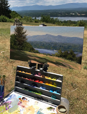
Jamie Williams Grossman‘s lovely painting and palette in the Hudson Valley style, showing color strings. Photo courtesy of the artist.
A color string is a set of premixed paints, usually modulated with white or another light color. Artists sometimes mix a series of these starting from each base color. In the Hudson Valley, you’ll sometimes see artists working from vertical palette boxes containing a slew of these premixed colors.

I use a simpler variation of that idea. I make mid-tone tints of each pigment. Different pigments may look the same when squeezed out of the tube, but there the similarity ends. Knowing how a pigment works when tinted with white is critical. Moreover, these tints become the backbone of a bright finished painting. 

A matrix is a color string in 3-D.

In watercolor, the equivalent is tonal steps, or how the pigment acts in different dilutions. You can’t premix them, but you should understand them.

Before you lift a brush, premix three colors for each major object:

  • A light tone, the color of the lightest side of the object;
  • A mid-tone, which is the local color of the object;
  • A dark tone, which is the deepest color.

These should be fairly close in value. For the extremes, you’ll use your global shadow and highlight colors.

In the example at top of the page, the light is cool—you can tell by looking at the tray. There is a warm dark shadow, a ‘true’ mid-tone, and a cool light color for each pepper. The tray is black. Since the shadows are warm, they’re a reddish black. They were made by tempering burnt sienna with ultramarine blue. The highlights are pale blue.

Start by getting the value right first. That’s usually the most difficult part. You can’t raise the chroma of a paint, so if you get it too neutral, set it aside and start again. If it’s too intense, mix in a bit of its complement.

My palette, diagrammed by Victoria Brzustowicz. I generally don’t use red in landscape painting.

Black has a role in painting, but it’s not in making grey. If you need grey, make one by mixing two complements. Greys are never totally neutral in real life; they always have overtones of color. Start by figuring out what that is. Then start from that color, and add its complement until you hit the perfect neutral note.

Once you’ve mixed your color ‘puddles’, look at them as a whole. How do they go together? Which do you want to emphasize?

Keuka Lake, by Carol L. Douglas. Available.

I use a green matrix for painting foliage. Otherwise, greens can be oppressively monochromatic in high summer. Remember those tints I had you mix? You can use them to modulate these greens into hundreds of different shades. Just use blues and violet tints to drive the greens back in space, and yellows and oranges to bring them forward.

By thinking through color relationships before you start painting, you can keep them consistent and unified. As time goes by, you’ll learn to do this intuitively. However, when I muck up a painting, it’s almost always because I haven’t really thought the light and color structure through.

Ten tonal steps of ultramarine blue

Your assignment is to make some color swatches:

  • A chart of ten tonal steps, starting with ultramarine blue. In watercolor, you will make the ten steps by increasing dilution. In oils or acrylics, you’ll add white.
Blue to sienna color variation
  • A color variation from burnt sienna to ultramarine. In watercolor, you’ll just go from straight-up burnt sienna to ultramarine in ten steps, at a moderate dilution. In oils or acrylics, mix each of those pigments with a small amount of white, so that you can more easily see the color shift.
  • A color variation from lemon or Hansa yellow to black. Do a straight-up scale in ten steps. There is no need to add white to your oils. Note: if you have a cadmium lemon “hue”, this is where you’ll find out just what a false economy buying hues is.

Monday Morning Art School: how to create a compelling still life

If you want to be a good painter, it’s critical that you learn to paint from life rather than from photos.

Baby Monkey, oil on canvas, by Carol L. Douglas

The liturgical year has two periods called Ordinary Time. In fact, we’re entering summer Ordinary Time today, since Pentecost was yesterday.

I have taken to thinking of the-time-before-coronavirus as Ordinary Time. My classes would be moving out of the studio now into field painting. That option is now closed, so I’m asking students to create still lives in their own studios.

If you want to be a good painter, it’s critical that you learn to paint from life rather than from photos. Still lives are an essential tool for that. “Still life is the touchstone of painting,” said Édouard Manet, who believed that you could say everything that needed to be said in a painting of fruit or flowers. He spent his last years paralyzed, so he painted brilliant still lives from his couch.

Butter, oil on canvas, by Carol L. Douglas

Composition

A compelling still life set-up has all the same elements as a compelling finished painting: unity, rhythm, movement and a focal point. Colin Page’s still lives combine modern color and paint handling with the exuberant excess of Dutch Golden Age paintings. As chaotic as they appear at first glance, he’s consciously directing your eye through his paintings. Your first assignment for today is to look at his still lives and ask:

1.      Where are the diagonals?

2.      Where are the dark punctuation points?

3.      Where are the reds and oranges?

There are lines that are spelled out and lines that are implied. Note how many triangles Colin makes with object placement.

New hard drive, oil on canvas, by Carol L. Douglas

Content

A still life is an opportunity to be witty, incisive, or topical. If you’re having trouble thinking of ideas, browse through this list. Or meditate on what most interests you today. For example, I might enjoy a still life based on my new grandson’s baby gear, which is all around my house right now.

Color

“Remember that a painting—before being a battle horse, a nude woman or an anecdote of some sort—is essentially a flat surface covered with colors, put together in a certain order,” said painter Maurice Denis. While gathering the objects for your still life, be thoughtful in developing a sense of color—not just hue (which is easy) but in value and chroma. That doesn’t mean “matching” different items, but playing them against each other.

Light and shadow

Even more important than the colors of the objects is the color of light and shadow that will unify your painting. Natural light will give you the broadest spectrum, but it’s not always possible. Look carefully at the light you’re using—if it’s an LED it will be a lot cooler than an incandescent bulb, which sheds an almost-orange light. If you can’t figure out what color the light is, check the color of the shadows.

Think carefully about shadow placement. It’s what will unify your composition.

Happy New Year, oil on canvas, by Carol L. Douglas

Viewpoint

You can set your composition up on the floor and look down on it, or you can put it at eye level. Looking down gives you the best opportunity for diagonals and converging lines. A composition at your eye level starts with a grid of stately horizontal and vertical lines, which makes it feel lofty and separate.  Most still lives are painted at the same angle as we see things on tables in the real world. That gives the opportunity for both diagonals and verticals.

How will you frame the subject?

The ‘negative space’ around the objects is as important as the objects themselves. Consider these shapes before you start painting. Outlining them with a pencil on your thumbnail is a useful way of analyzing them.

Your homework

Choose five ‘carefully curated’ objects (or more, if you’re ambitious) and create a series of still lives from them in different arrangements. Record them in thumbnail sketches as you go. If you’re lucky enough to have a Lazy Susan, you can set your still life up on it and rotate it to get a sense of how objects can look different from different angles.

Monday Morning Art School: color temperature and palette

Mixing paints is simple if you understand how pigments work.

Tilt-a-Whirl, by Carol L. Douglas, plein air.

In theory, you can paint with just four pigments: red, blue, yellow and white. For beginning painters this is sometimes a good idea, because it’s the fastest way to learn color management. It simplifies the thought process so you have only one decision to make at a time, and it is easier to get a more unified color scheme.

But there is a big limiting factor, and that’s the impurity of pigments. They all have overtones that muddy them up in certain mixes. That’s why your local paint dealer uses many, many more pigments than just red, blue, and yellow.

Split the color wheel in half like this and you have your cool tones on one side, warm ones on the left.

Claude Monet’s palette shifted over time, but included these paints:

  • Chrome yellow
  • Cadmium yellow
  • Viridian green
  • Emerald green
  • French ultramarine
  • Cobalt blue
  • Madder red
  • Vermilion (red)
  • Flake white
  • Ivory black (before 1886)

These are sets of paired pigments. That means he has a warm and a cool of each color, plus black and white. 

I use paired primaries as well, omitting the green but adding in some other earths. (Here are my supply lists for oils,  acrylics, and watercolors.)

The distinction between warm and cool colors has been important in painting since the Impressionists. Warm colors are said to be hues from red through yellow and cool colors are said to be the hues from green through violet. Each hue around the color wheel also has a warm and a cool version.

Paired primaries from my palette.

There’s no factual hot or cold point because this is just a poetic description that works. Much of what we believe about the psychology of color is hocus-pocus, but it’s true that if the light is what we call “warm,” the shadows are what we call “cool,” and vice versa.

Winter sun along my hedgerow, by Carol L. Douglas, plein air. If the light is warm, the shadows are cool, and vice versa.

When we say that lemon yellow is cooler than cadmium yellow deep, we mean that if you are trying to mix a greenish yellow, you’ll get a clearer shade with the lemon than you will with the cadmium yellow deep. The warm-cool language is just a convenient way of saying that.

Different pigments may look the same when squeezed out of the tube, but there the similarity ends. Pigments are impure, and you have to learn and work around those impurities.

Three blues that look similar out of the tube, but behave very differently. The ‘glaze’ on the left is the undertone. Courtesy Gamblin paints.

Mass tone is the color a pigment is straight out of the tube, dense and unmixed with another color. No real-world pigment, however, is as pure as a color on a video screen. While two pigments may look the same to the naked eye, their behavior when mixed can be radically different.

Undertone is the color revealed when a paint is spread thin enough that light bounces back up from the substrate. Some pigments are fairly consistent when moving from mass tone to undertone. Others have significant color shifts. Not understanding those undertones tones can lead to muddy mixes.

Cadmium Red Hue is usually made with napthol red and a little white. They mix very differently, which is why the hue is a bad substitute for the real pigment. (In its own right, napthol is a fine red, however.) Courtesy Gamblin paints.

Ultramarine, Prussian and phthalo blue are colors that shift radically from mass tone to undertone. They’re all so dark out of the tube that their differences aren’t apparent to the naked eye. But dilute them, and you’ll find a wide range of blues.

Undertones are why buying “hues” instead of pure pigments can be such bad value. Take, for example, cadmium red hue, which is usually a napthol red with a small amount of white added. Out of the tube, the two paints are indistinguishable, but they mix very differently.

To see a pigment’s mass tone, put a small dab of paint on a smooth white board or glass palette and draw it down with a knife, creating a uniform, solid stripe that completely obscures the painting surface.

To see the undertone, draw the sample down again so it is translucent. You should be able to see minute variations in the color, and in the covering power.

Click to get a printable PDF

Another way to test colors is to mix through what you have on your palette. Make the above color chart, using three sets of paired primaries:

  • Prussian blue—Ultramarine blue
  • Quinacridone violet—Cadmium orange
  • Indian yellow—Lemon yellow

The purpose of this exercise is to understand how paired primary pigments work together, so that you can make neutrals when you want them, and avoid mud when you don’t.

Draw the chart onto a canvas, and then mix across and down for each square. When I say “mix”, I mean mix them before applying, rather than in the squares themselves.

The left column and the top row should be pure pigments. Fill it in, then, just like the multiplication tables of your youth. For example, the intersection of cadmium orange and ultramarine blue should be a 50-50 mix of those two colors.

If you’re painting in watercolor, use enough water to make a jewel-tone transparency. In oils, the results should be opaque.

Monday Morning Art School: the tree outside your window

There is always something to see, even when we’re stuck at home.

The tree outside my front door is a maple, and it’s bereft of leaves right now.

Sue Colgan-Borror has been encouraging her fellow Knox County Art Society painters to take up a new art challenge each week. Last week’s subject was, “Where would you rather be,” to which Mary Ann Heinzen-Hackett responded, “Right here!” and went out and painted in the bitter cold.  I’m with Mary Ann. Although I enjoy jetting off to exotic places to paint, I love my own home the best.

One of the issues we face in lockdown is that many of us are being deprived of meaningful contact with nature. This is not a mere luxury. Research has shown that people who regularly spend time in green spaces are physically and mentally healthier than their peers. This finding cuts across lines of race, economics and gender.

A few weeks ago, I had my weekly painting classpaint the view from their windows. This was a limited exercise, in that each of them was working from their studio space. That meant they had one, or possibly two, windows to work from. But what about the views from all the other windows, the ones we barely notice?

The tree on the dooryard is an Eastern White Pine.

There are windows in my house that I seldom look out. I simply pass by them. I’m not alone in that. “When I encouraged people on social media to take a photo of a tree outside their window, one man replied that he’d thought it sad that he had no tree to photograph, before peering out into the street and realising that there was one right outside,” wrote Isabel Hardman.

Some of these tiny views that I ignore are arresting vignettes. Take the view from my front door. This door is never used; everyone uses the kitchen door, which opens off an area still called the dooryard in Maine. That neglected front door has a lace curtain over it, allowing only filtered light to come through. Outside is a beautiful old maple, the last survivor of a long line that once ran along Route 1. But since I never look at it, it’s seldom in my consciousness.

Tiny watercolor thumbnails done outside my window in Waldoboro, ME in the dead of winter.

There’s looking, and then there’s looking. There’s a difference between glancing at a tree and spending time drawing or painting it. The latter will give you most of the health benefits of a trek through Acadia National Park, and you won’t have to break quarantine to do it.

The tree outside your window is just one example of the beauty to be found in the everyday. There is always something to see, even as our viewpoint narrows with circumstances. Édouard Manet died tragically young of syphilis; he suffered from pain and paralysis during the last three years of his life. Yet during this time he completed many small still lives of flowers, fruit and vegetables that are today among the most admired and beloved of his work. I’ll bet they brought him joy, too.

Most of these thumbnails were done from my window in Rochester, NY.

A big part of learning to paint is learning to see.  Your assignment this week is to travel around your house and make small thumbnail sketches from various windows. If you’re lucky enough to get outside, sketch what you see out there as well. All the examples I’ve included in this blog were done in my daily travels around town or from my own home. They’re in watercolor, but you can work in pencil or marker. 

A marker sketch of my current house. Your window sketches don’t need to be any more complicated than this.

The goal here is two-fold:

  • To see beauty in the everyday;
  • To learn how to draw or paint better thumbnail sketches.