fbpx

Monday Morning Art School: painting drapery

Fabric is an opportunity to support the composition with line and shape, and insert abstract design into even the most hyper-realistic paintings.

Underwear and glass head, by Carol L. Douglas.

Every artist needs to be able to paint fabric, either to clothe his subjects or to support a still life. Drapery used to be an important element of art instruction; now, in the age of denim and t-shirts, it’s often an afterthought in figure classes.

It deserves more attention. It can be the most flexible element in a painting. The flow and rhythm of drapery are an opportunity to support the composition with line and shape. Fabric is a place to insert abstraction in even the most hyper-realistic paintings.

If you’ve never painted fabric before, keep it simple at first. Stay away from black in your first exercise; Bronzino and his pals might have made it look easy, but they had a lot of practice. Your composition can include an object as a focal point, or you can just concentrate on the fabric itself.

I find it easier to paint drapery with my glasses off, because it’s really a question of getting the values and shapes right. Details (if there are any) are almost irrelevant.

Start with shapes

Drapery for a Seated Figure, c. 1472, Leonardo da Vinci, courtesy the Louvre

Leonardo da Vinci did the above study of drapery as preparation for a painting he completed around the age of twenty; he continued to draw drapery throughout his life. That was the norm for the Renaissance artist, and it’s something we can learn from.

The good news is that you can practice drawing drapery almost anywhere. People are always dropping jackets over chairs. I did years of these sketches in church.

I drew my mittens in church about ten years ago. Boy, have they stretched out since then.

The individual shapes within folds and shadows are irregular and arresting, but they must be accurate and properly measured or the whole picture will be off. This is much easier to realize with charcoal or graphite then in paint. Drapery is one area where a quick value study is not sufficient—if you draw the shapes properly, then the painting will flow almost as an afterthought.

Don’t overstate the value shifts

The Laborer Resting, by Carol L. Douglas, has matte, shiny and lacy fabrics.

Fabric can be highly reflective, as in a silk taffeta, or very matte. The difference is in the contrast range. Taffeta has deeper shadows and lighter highlights than linen. You must get these right for the fabric to be plausible. You can achieve this by premixing paints (in oils) or with a good monochrome study (in watercolors).

The darkest folds may not be much darker than the mid-tones, but they can have significantly different color. Fabric reflects on itself; the highest chroma is often within folds and shadows.

In oils, start by blocking in the large shapes in the proper values. This will be easy if your drawing is good and a nightmare if you skimped on that phase. In oils you can lay down the shapes without regard to edges; in watercolor you’re going to have to paint the edges accurately from the beginning.

Teenage boy sleeping in church, by Carol L. Douglas. You can almost always find a drapery study to sketch wherever you are.

Most of the edges in draperies are soft

Blending is oil paint’s greatest strength, and you can block in your whole drapery study before going back with a dry brush and softening the edges. If you overblend, just repaint that passage.

In watercolor, the soft edges must be painted properly from the beginning. If both sides of a shape are soft, use a wet-in-wet technique. If one side of the shape needs a hard edge and the other a soft one, you can soften the edge right after you’ve applied the paint. The amount of water needed is critical, and the technique requires practice.
Monday Morning Art School: good reference photos

A good reference picture is not necessarily a good photo. A great photo is almost never a good reference picture.

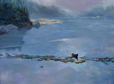
Headwaters of the Hudson, by Carol L. Douglas, private collection. This is one of several paintings I’ve done based on the following photograph.

Sometimes I’ll post a photo to Facebook, only to have someone suggest, “You should paint that!” Of course, I won’t. A photo good enough to elicit that response is a complete artistic statement in itself. Painting it won’t improve on it.

A good reference picture is not necessarily a good photo. A great photo is almost never a good reference picture. The purpose of a reference photo is not to make your composition, lighting, and color decisions for you, but to provide you the information you need to make those decisions in paint.

The photo was taken on the causeway to Moose Island, ME, many years ago.

When I do paint from photos, I always start (surprise, surprise) with a drawing. Why sketch first? I don’t want my photos to drive my paintings. It’s best for me to seek out the composition on my own, and then find the details and plug them in. The last thing I want is to be a slave to a photo.

I have tens of thousands of snapshots on my server, archived by where and when they were taken. But imagine, for a second, that I want to paint rolling surf. I‘ve taken many such photos, but was the right one on the Great Coast Road in Victoria, Australia, at Sandy Hook in New Jersey, or at Port Clyde in Maine? Nothing for it but to search every folder for the image I want. (My phone is, in this case, ahead of my laptop. It can search by image, and it does it very well.)

Deadwood, 36X48, available from the artist.

What will make one photo better than the next for my purposes? Not the setting, but the lighting, the color and the angle.

When I take reference pictures, I make a point of shooting far more peripheral material than I would for an artistic shot. This is because I’ve outsmarted myself too many times by cropping out essential information in the viewfinder. Detail is generally unimportant in a reference photo, and most modern cameras (including the one in your cell phone) have far greater resolution than the artist ever needs. Go ahead and crop when you’re ready to paint, but more overall information, not more detail, is generally what you’re looking for.

This was the reference photo for the painting above. It was taken by my friend Joe Wagner and I snagged it from Facebook. Yes, a certain amount of artistic license was taken in the final rendering.

Flat, indirect light can be really boring in a landscape painting, but it’s sometimes helpful in a reference photo. It allows you to create your own atmospherics. You’re never stuck fighting a lighting source that doesn’t work.

Yes, I sometimes Google images. There are things I have seen in life but have never photographed—the Northern Lights, a star-spangled sky over Nebraska, or a Friendship sloop, to name just three. I use these pictures as background information. The last thing I want to do is copy someone else’s artistic ideas.

Monday Morning Art School: make that negative space work for you

The background of your painting is a key element of its composition.

Prom shoes, oil on canvasboard, Carol L. Douglas

Last week I wrote about the lost-and-found edge, and techniques to make edges and lines sink. That allows the viewer to focus on other passages that are more important.

The painter has three tools to drive the viewer’s eyes: hue, chroma (saturation) and value. These are the three aspects of color. The human eye is designed to respond to value shifts first, so that’s where we usually start. However, hue and chroma are also important.

Amp up the contrast in any combination of these three elements and you emphasize a focal point. Soften the contrast and the viewer’s eyes can glide past.

Peppers, oil on canvas, Carol L. Douglas

Negative space is the area around and between the subjects in a painting—it’s what we generally call the background. It should not be an afterthought. Negative space should be carefully designed to be as interesting as the subjects themselves. One of the many ways in which still life is a great training tool is in teaching painters to control this supposedly ‘empty’ space.

Still Life with Partridge and Pear, 1748, Jean-Baptiste-Siméon Chardin, courtesy StÀdelscher Museums-Verein e.V.

Jean-Baptiste-SimĂ©on Chardin was a master of still life. His Still Life with Partridge and Pearshows just how dynamic supposedly-empty negative space can be in a painting. The brushwork is lively, and the light is concentrated on the shadow side of the pear to drive our eye to that edge. Contrast then drives us to look at the snare and then the bird’s tailfeathers and foot. The background seems quick and loose, but it’s very elegant in its design.

Self-portrait, 1771, pastel, Jean-Baptiste-SimĂ©on Chardin, courtesy MusĂ©e du Louvre, Paris, 

Twenty years later, Chardin carried that technique forward in his own self-portrait. The shifting light across the background throws the figure into stark relief. While the focal point is the light side of the face, he makes the shadows earn their keep by creating a vigorous edge down the shadow side of the figure. That line is at least as interesting as the line on the light side of the face, and it’s made visible by the light thrown onto the background.

Tin foil hat, oil on canvas, Carol L. Douglas

That, of course, was the 18th century, and we don’t tend to paint in such high contrast today. That doesn’t mean we aren’t using the same basic techniques. The modern painter can use any of the following in his work:

  • Heighten the contrast between positive and negative shapes with lighting;
  • Use lively brushwork in the background;
  • Carefully plan interesting negative shapes;
  • Bring background color into the foreground objects and vice-versa;
  • Imply background with brushwork, color and shadow;
  • Eliminate background detail, and just imply a shadow;
  • Break or minimize the edges of tables or drapes. 

Monday Morning Art School: the lost-and-found edge

Sometimes it’s what you don’t say that matters most.

Girl with the Red Hat, c. 1665-66, Johannes Vermeer, courtesy National Gallery of Art, Washington, DC.

I once had a painting teacher who told me that heavy edges were “my style.” Like many younger artists, I just hadn’t learned how to marry edges in my painting. Beginning painters tend to give all edges equal weight—they are borders to be colored in. Part of the learning process is learning when to keep the edge and when to lose it.

Vermeer’s Girl with the Red Hat, above, perfectly illustrates the lost-and-found edge. The smooth transitions between the hair and the hat on the left, within her gown, and the lack of contrast in the shadow side of the model’s face drive our eye to the highlighted passages. Squint and concentrate on just the shape of the highlighted passage for a moment. It’s just one long, beautiful abstract shape in a sea of darkness.

Losing the edges helps link visual masses into a coherent whole. It deemphasizes things that aren’t important. It’s a way to create rhythm in a painting.

In Church at Old Lyme, 1905, Childe Hassam softened the edges between leaves and sky by making them the same value. Courtesy Albright-Knox Art Gallery.

The human mind is adept at filling in blank spots in visual scenes (and seeing things that aren’t there). If you doubt this, squint while looking around your room. In any collection of similar-value objects, you don’t see edges, but you understand what you’re looking at. Your mind sorts it out just fine.

A careful drawing is different from a value study. Both are important, and the wise artist does them both. But a drawing explores the shapes and contours of an object. It’s a fact-finding mission. A value study concentrates on the links between objects and the final composition.

The Daughters of Edward Darley Boit, 1882, John Singer Sargent, courtesy of the Museum of Fine Arts, Boston. 

In the oil painting The Daughters of Edward Darley BoitJohn Singer Sargent uses the great dark entryway as a framing device, a compositional accent, and a poignant social statement. Only a hint of light in the shape of a window implies what is behind. The girls recede into space in order of age, with the eldest (Florence, age 14) almost enveloped in the darkness of the drawing room. Florence and Jane have no accents in their hair; their dresses and stockings disappear into the murk.

The Bridge of Sighs, c. 1903-04, John Singer Sargent.

Sargent painted at least two versions of this study of the Bridge of Sighs; a mirror-image is in the Brooklyn Museum. In this version, Sargent placed a hard edge at the top of the arch where sky meets stone. The shadows on the left bleed without any attempt at architectural precision. This creates the same kind of murky dark passage as in The Daughters of Boit. (A note for watercolor purists—the whites of the gondoliers’ clothes were done with white paint.)

In Two Women on a Hillside, 1906, Franz Marc tied the women to the background by repeating greens in their skin and garb. Courtesy Franz Marc Museum.

To lose an edge in painting, start by making both sides of the line the same value, even when they’re different hues. Conversely, the highest contrast will give you the sharpest edge. You can add to either effect by softening or sharpening the paintwork with your brush. Introducing the color of the adjacent object will also soften the contrast between an object and its background, as in the Franz Marc painting above.

Detail from John Singer Sargent’s Lady Eden, 1906, courtesy Philadelphia Museum of Art.

Remember that the sharpest, most contrasting edges draw our eye. The trick is to find a balance that supports the composition. Sometimes only a small flick of paint is necessary, as with Sargent’s sequins in the detail from Lady Eden, above. These support the dynamics and direction of the composition. If they didn’t, they’d undermine all his careful compositional work.

If you think I’m starting to repeat myself, you’re a sharp observer. This essay was originally posted in July, 2018. I’m focusing on it in my painting classes this week.

Your brush is not a pencil

Mark-making can be loose and gestural or very controlled. It’s personal, but it’s also something you can learn.

Dining Room in the Country, 1913, Pierre Bonnard, courtesy Minneapolis Institute of Art. Bonnard used small brush strokes, intense colors, and close values.

In this week’s painting classes we worked on mark-making and brushwork. This is, on one hand, the most personal of painting issues. It’s also (especially in watercolor) highly technical. Much of what is called ‘style’ comes down to what brushes we choose and what marks we make with them.

Modern viewers are immediately captivated by bravura brushwork; it’s a sign of self-confidence and competence. It comes from lots of practice.

Wheatfield with Crows, 1890, Vincent van Gogh, courtesy Van Gogh Museum, Amsterdam. The motion in the painting is created by his brush strokes.

First, let’s talk about how not to do it:

  • Unless you’re doing close detail, don’t hold your brush like a pencil. It’s a baton, and holding it to the back of the center-point (away from the ferrule) gives you more lyrical motion. Your grip can still be controlled by your thumb, you can hold it loosely, or even clutch it in your fist. The important thing is to let your arm and shoulder drive the movement of the brush, rather than just your wrist and hand. The farther back you hold the brush, the more scope of movement. To loosen up, blast some music and pretend you’re the conductor and that brush is your baton.
  • Don’t dab. By this I mean a pouncing/stabbing motion with the tip of your brush. It’s amateurish in oils, anemic in acrylics, and hell on your brushes.
  • Don’t use brush strokes that go in all one direction. Learn to apply paint in the round. This is a rule that can be broken, but make sure you’re doing so intentionally, not just because you don’t know how to paint in every direction.

Self Portrait with Beret and Turned Up Collar, 1659, Rembrandt van Rijn, courtesy National Gallery of Art, Washington, DC. Pay close attention to the economy of the brushwork in the hair, and the expressive, unfinished brushwork in the face. In this way, Rembrandt was able to create a powerful focus.

There are many painters whose brushwork I admire, but there’s little point in trying to copy them in my own work. Brushwork is as personal as handwriting. It’s where the artist expresses—or suppresses—his feelings. There’s value in attempting to copy passages by great painters, and I suggest you do so with the samples I’ve attached to this blog. But don’t try to paint like Sargent or Van Gogh or Rembrandt; use what you learn to create your own mature style.

Waterlilies, c. 1915, Claude Monet, courtesy Neue Pinakothek, Munich. Monet makes no attempt to hide his drawing in this painting. The brushstrokes are wet-over-dry.

The best, most immediate, brushwork lies on a foundation of careful planning. Continuous modification, glazing, changing color, etc., makes for diffident marks. For the same reason, if you’re happy with the color and form of what you’ve laid down, refrain from ‘touching it up.”

Use your brushwork to highlight the focal points in your painting. Sharp, clean, contrasting marks draw the eye, where soft, flowing, lyrical passages encourage us to move through. Let there be dry-brush texture and unfinished passages in your painting.

Lady Agnew of Lochnaw, 1892, John Singer Sargent, courtesy Scottish National Gallery, Edinburgh. Note that the transparent sleeves are not produced by glazing, but with direct, long brushstrokes.

Above all, don’t bury your line. Much of the power of Edgar Degas’ mature work comes from his powerful drawing; he was the most accurate draftsman of his age, and he let that stand prominently in his work.

Monday Morning Art School: different strokes

The best way to learn about your brushes is to experiment.Your brushwork contributes immeasurably to the quality of your painting. Don’t dab or be diffident; plan your strategy and then execute it with boldness.

A spalter or mottler is a most useful watercolor brush.

On Friday, I gave you a guide to buying brushes. What are you going to do with these brushes now?

OIL and ACRYLIC

In the following illustrations, I’ve tried to keep the amount of solvent the same (except with the fan brush).

Above is a sable flat brush by Rosemary & Company. It can put down a very smooth surface and offers a lot of control, but it doesn’t carry the quantity of paint that an equivalent bristle brush will. I save sable for glazing or blending.

This is a hog bristle flat brush. The paint it lays down is both rougher and more impasto than the sable.

Flat brushes make an immediate, energetic mark. They’re excellent for fast, powerful surface work, long sweeping strokes, and blocking in shapes.

Used on their sides, they also make great lines, far more evenly than a small round can do.

Two rounds of very different sizes. A round is a more lyrical brush than a flat, and is a classic tool for painterly surface marks. It can be used to make lines that vary from thin to thick. A pointed round is used for fine detail. Bristle rounds tend to lose their points very quickly, however.

The great advantage of a filbert is the variety of brushstrokes you can get from one brush. This is great for single strokes that taper, such as in water reflections. Its rounded edges are good for blending. Set on its side, it makes nearly as good a line as a flat.

A bright is a less-flexible version of a flat. It’s great for short, powerful strokes or situations where you want a lot of control.

A fan brush probably has no place in a plein air kit, but I carry one anyway. I use it for blending, as on the left, although some people like using it to make whacked out marks as on the right. The problem is, it can carry very little paint, so its marks tend to be either gooey, as above, or very abrupt.

In my studio, I just use a clapped out soft-haired brush to blend.

Many plein air painters also carry liners and riggers, which are useful in paintings that are built up smoothly. I don’t paint that way, so I seldom use them. Another brush that is good for detailed work is an angled brush. I don’t have one of them, either. You can do almost any work you can envision with just the brushes I’ve shown you above.

WATERCOLOR

Watercolor brushes are softer than oil-painting brushes. The most expensive are natural bristles, and the difference is usually worth paying for. Natural bristles combine strength with suppleness and hold more paint than synthetics. Unlike oil-painting brushes, your watercolor brushes should last a lifetime, so buy the best you can afford.

In general, watercolor brushes drop more pigment the more vertically they’re held. You can use this to move from a filled area to a broken one in one brush stroke. In all the following examples except for the mop, I’ve held the brush both ways. A good general rule is to carry the vertical brush slowly and in a controlled manner; pull a horizontal brush more rapidly to get the least amount of paint contact with the paper.

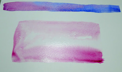
Made with the spalter brush at the very top of the page.

The brush I used for the photo montage at the top of the page is a 2″ flat synthetic mottler or spalter brush. I like this shape for both oils and watercolor. It’s a relatively inexpensive brush that gives a beautiful wash. It’s useful for covering large areas quickly, but with precise edges.

A flat gives you good even washes. Used on its side, it can give you a controlled line.
A bright is a shorter version of a flat. More punch with less pigment.

Flats and brights give you nice flat washes, but can be used to make expressive lines as well. Brights have more control and carry less paint, just as they do in oil painting. Turn them on their sides to make a controlled line. Twisting the brush while painting gives an infinite variety of shapes. So too does varying the ratio of paint and water.

You can’t do either of these things in any other medium.

Because of the way watercolor bleeds, its brushes can be used in ways not possible in any other medium–a long blend of different pigments, or by painting a shape in clear water and then dropping pigment into it.

Round brushes give more lyrical lines than flats do.

I don’t normally carry riggers with me in either watercolor or oils. (They’re meant to paint perfect lines, and my world-view apparently doesn’t have many perfect lines in it.) Most of my line work is done with rounds. They do not give as much control on long lines, but they are very expressive.

A mop brush gives a perfect wash, but it does so much more as well.

Squirrel mops are the most uniform wash brush you can use. It’s virtually impossible to make them skip, so use them where a lovely flat wash is a goal. But a good mop can also point, hold vast amounts of paint and sweep across the paper in style.

I think Guillo the dog ate my sea sponge.

Natural sea sponges are multi-purpose painting brushes. Use them to apply or remove paint. They can be as subtle or bold as you wish.

Monday Morning Art School: scaling up a painting

It may seem time-consuming, but with big paintings it saves a lot of work in the long run.

My watercolor sketch. It’s gridded on a piece of plexiglass laid over the drawing.

On Friday I wrote about losing my painting reference and going to great lengths to find substitutes. The human mind being so fickle, writing that post made me suddenly realize what and where my original reference was. I came downstairs to my studio convinced that I would wipe out the interloping boats and go back to my original drawing.
I drew the mast positions in with charcoal and a straight-edge before starting to paint. That way their angle will match my sketch.

However, when I looked at the canvas again, I realized it wasn’t that bad. Different from my original intent, certainly, but not bad. I walked the dog and pondered. By the time I was home again, I’d determined that I should just paint both iterations. It was possible to differentiate them enough to make two different works out of them, both speaking to the flying sensation of sailing.

That meant gridding up a second version. This time I decided to go with the original aspect ratio of the sketch, rather than cropping it. I liked the yawl I’d truncated the first time around.

Straight lines, curves–it doesn’t matter. Just find the point at which they intersect the grid, mark those points, and work from there. I usually do this in monochrome but since I was working from a watercolor sketch, I just massed color.

I have a projector, but I find that gridding is more accurate and takes less time. Knowing how to do it is imperative for large projects, but it can be surprisingly useful in small paintings, too. Whenever you have trouble going from your thumbnail to the canvas, gridding is your go-to answer.

Boats v.2, laid out 24X36 in just a few hours. Later today I can actually paint them.

I realize many artists are math-phobic, but there are times when a bit of arithmetic can save you a world of pain.

First, work out whether the aspect ratio of your sketch is the same as the canvas. This is the proportional relationship between height and width. Sometimes this is very obvious, such as a 9X12 sketch being the same aspect ratio as an 18X24 canvas. But sometimes, you’re starting with a peculiar little sketch drawn on the back of an envelope. You can use a trick you learned back in elementary school.

Remember learning that 1/2 was the same as 2/4? We want to force our sketch into a similar equivalent ratio with our canvas.

Let’s assume that you’ve cropped your sketch to be 8” across. You want to know how tall your crop should be to match your canvas.

Write out the ratios of height to width as above.

To make them equivalent, you cross-multiply the two fixed numbers, and divide by the other fixed number, as below:

Use your common sense here. If it doesn’t look like they should be equal, you probably made a mistake. And you can work from a known height as easily as from a known width; it doesn’t matter if the variable is on the top or the bottom, the principle is the same.

The next step is to grid both the canvas and sketch equally. In my painting above, my grid was an inch square on the sketch and 4″ square on the canvas, but as long as you end up with the same number of squares on both, the actual measurements don’t matter. You can just keep dividing the squares until you get a grid that’s small enough to be useful. For a small painting, that could be as simple as quartering the sketch and the canvas. I use a T-square and charcoal, and I’m not crazy about the lines being perfect; I adjust constantly as I go.

The last step is to transfer the little drawing, square by square to the larger canvas. I generally do this in a dark neutral of burnt sienna and ultramarine. On Friday, however, since I’d already done a grisaille and a watercolor sketch of the subject, I just transferred large blocks of color. It may seem time-consuming, but with big paintings it saves a lot of work in the long run.

Monday Morning Art School: how to draw a tree

Trees have limbs, so it’s no surprise that you draw them much like you do the human figure.

Old barnyard tree, by Carol L. Douglas. 6X8, oil on canvas.

All drawing starts with careful observation. Start by observing the branching structure and overall shape of your tree. Opposite branching means that side branches, twigs and leaf stems grow directly across from each other from a main trunk. These include maple, ash, dogwood and buckeye. Alternate branching is much more common. It’s where side branches, leaves and twigs do not grow opposite each other, but grow in either a spiral pattern or an alternating one. The oak family are alternate branchers; stems grow out in a spiral pattern with no two branches coming from the same node. This creates the oak tree’s distinctive silhouette.

Every variety of tree has a distinctive shape.

It’s very easy to fall into the trap of making trees two-dimensional cutouts, with branches extending to the left and right. In fact, branches extend in all directions, including straight at you. How do you render this with authority?

Wire-frame drawing of the basic shape of my White Oak.

Don’t try to sort all that complexity out in one shot. Rather, start with the major structure. Just as with the human figure, I start with a wire-frame drawing. In the case of trees, I start by reducing the trunk and branches into a series of tubes in space.

Check those negative spaces!

As you finish each major branch, check to be sure the negative space between the branches is accurate.

If you’ve done this phase correctly, you might notice that these simplified branches are almost human in movement and shape. This should be no surprise; we’re all part of the same creation.

That’s the basis of your line drawing.

Connect the tubes with flowing lines to create your tree’s wooden structure. Don’t obliterate the circles too fast; they will be your guides to setting shadows.

Time to set the shadows.

Identify the light source—is it coming from the left or the right? Once you’ve identified the light source, set the shadows.

The foliage doesn’t need to be fully articulated, just suggested.

Add foliage as masses of dark. If you want to articulate the individual leaves more carefully, you can do so, but be selective. Too much detail will obliterate the charm of your tree.

Presto, it’s a White Oak!

Refine the shadows and you’re done.

Monday Morning Art School: stop comparing yourself to others

Art is not like the Super Bowl, where there are clear winners and losers. It’s not necessary to be the most adept, brilliant, or incisive painter for your work to profoundly influence others.

Deer in snow, by Carol L. Douglas

“You can’t be somebody else,” I heard my husband tell a young person. “You can just be the best you can be, and not worry about everyone else.” He was talking about music, but his advice is just as applicable to painting.

I will sometimes ask students whom they most admire among artists, but the answers—while fascinating—seem to have little to do with where they end up as painters. I’ve fed myself on a solid diet of masters from the northern European Renaissance to the 21st century, and I don’t see much continuity between these influences and my own painting. I love them, but I can’t paint like them.

Downdraft snow, by Carol L. Douglas

That doesn’t mean I don’t sometimes fall into the pernicious trap of comparing myself to others. As much as I’d like it to be otherwise, I’ll occasionally succumb to the green-eyed monster of jealousy. It’s very difficult to watch someone else do something easily that you’re struggling with, or sail into honors and accolades that elude you.

That can be especially difficult for women artists, who labor under a system that is, in fact, more sexist (in terms of dollars) than society as a whole. So, sisters, cut yourselves some slack.

After teaching for so many years, I know that early success doesn’t always equate to winning the race. Students start at different levels of competence. Some take to painting faster than others. Sometimes these good students are trapped by their facility, because they cannot let go of their cheap tricks to plow through the hard work of learning good technique. At that point, ‘talent’ becomes a trap.

Snowsquall, by Carol L. Douglas

Conversely, there will be students who, for some reason, don’t get it right away, but who, with diligence and effort, will end up painting very well indeed.

At the Art Students League of New York, students are crowded into fairly small rooms. It is impossible to avoid seeing others’ canvases as you work on your own. A fellow student had a sign in his paintbox that read, “Don’t copy.” It was very good advice, but equally helpful would have been one that read, “Don’t compare.”

So how does the artist develop self-confidence based in their own abilities? “Passion plus competence equals self-confidence,” I readthis week. It’s a neat, economical explanation.

Toys in snow, by Carol L. Douglas

It doesn’t mean you have to wait until you’re completely competent to be happy. Instead, it gives you a roadmap to get to a point of self-confidence. Yes, painting is sometimes very frustrating, but that’s just a sign that you need to work on your skills in that area.

Art is not like the Super Bowl, where there are clear winners and losers. It’s not necessary to be the most adept, brilliant, or incisive painter for your work to profoundly influence others. But you can’t use the crowd’s applause to tell you if you’re on the right path. You simply have to work from your own gut. And that’s perhaps the hardest lesson in painting.

Monday Morning Art School: Baby, it’s Cold Outside!

Winter’s lack of light might deter the painter, but normal winter temperatures ought not.

Snowstorm at 12 Corners, by Carol L. Douglas. Long since gone to its permanent home.

My nurse-practitioner mother always insisted that one couldn’t get a cold from being cold—after all, it’s a virus. How, then, can I account for my dripping nose and general malaise, when I haven’t been in contact with strangers of my own species in weeks? I have been outdoors for extended periods, and it’s been nippy.

Occasionally, people will tell me, “there’s no bad weather, just bad clothing.” I’m from Buffalo, so I know that’s malarkey. But proper gear does help. Winter’s lack of light might deter the painter, but normal winter weather ought not.

Winter storm, 6X8, by Carol L. Douglas. That’s generally as big as I work in bad weather.

The most important part of your body to insulate is your feet. Painting is the only outdoor activity I know where you stand in one place in the snow for long periods. That’s far chillier than walking or skiing. A piece of old carpeting or cardboard on the ground will help. Always wear insulated boots and wool socks. Yes, you’ll waddle, but agility isn’t the issue here; insulation is.

I wear nitrile-palm fishing gloves to paint. They’re warm enough for all but the worst days, when I add a chemical hand warmer on the backs of my hands. Dress in layers, as you would for any winter activity. Ladies, that should include long johns (call them Cuddl Duds if it makes you feel better). This year, you can also wear a balaclava (a ski mask to the uninitiated) without shame, even to the bank.

Haybales in winter, by Carol L. Douglas. See those chunks? That’s what happens when you paint below 0° F in oils.

You might think the sun is a summer problem, but it can be blinding in the dead of winter. It never bothers to get over the yardarm in December in Maine, which means it’s often thwacking me right in the eyes. A painting umbrella helps now, more than it ever does in summer. If you have any skin showing, use sunscreen.

I regularly store my palettes outdoors in wintertime. Assuming I can find them, I can pull them out of the snowdrift and start painting immediately. In the summer, I move my palettes to a freezer. Most home freezers are set at about 0° F, so the paint is very chilled but not actually frozen. The cold temperatures slow down oxidation, which makes the paint stay open longer.

Winter, pastel, Carol L. Douglas. If you stick with pastel, you won’t have material-handling issues in winter, except that chalks are tough to handle with bulky gloves.

Oil paints in linseed oil binder won’t freeze until they reach -4° F (or -20° C). They will thicken slightly as you approach their freezing point; just increase the amount of solvent and they’ll move again. If it gets much colder than that, however, you’ll end up with chunky paint.

At that point, only an insane person or someone trying to prove a point would stay outside and squidge paint around. You’re more likely to snap your easel in extreme cold than you are to come up with anything good. I’m speaking from experience here.

If you use watercolor, you can add grain-alcohol, vodka or gin as antifreeze. A good rule of thumb is that you can add up to 20% booze to your paints before they get tipsy. But not all pigments can handle their liquor. Be prepared for excess paper staining, or different precipitation rates than you’re used to with plain water.

With any medium, you’re unlikely to have precise control of your brushes when you’re bundled up and your hands are in gloves. Work loose and don’t sweat the details.