fbpx

Monday Morning Art School: How to make time to make art

Having trouble finding time to get anything done? We all are.

Commit to working with others, either in a class, a group, or a workshop. It will jumpstart your process.

These days, I’m turning over my guest room as fast as the Starlight Motel down the street is turning over theirs. Not well, I might add; my brother tells me I’m in danger of losing my five-star rating. Even though I strongly discourage guests in the high season, there are still people whom I want to see.


Not having enough time to make art isn’t a unique problem. It’s something I hear from other artists in every station of life. Jobs, children, parents, spouses or homes aren’t time-killers; they’re the very fabric of our lives. Still, too often we go to bed realizing we’ve done no actual artwork that day.
Schedule studio time. If you work at the same time every day, you spend less mental energy waiting for inspiration to kick in—you just dive in and do it. That’s more than a mental trick. Your body and mind crave routine. Working on art at the same time every day makes it easier to transition into the flow zone.
Take a class. They’re fun, social, advance your skills, and—just like joining the gym—you have money riding on your involvement.
Keep the set-up to a minimum. I keep my palettes in the freezer so I can paint in small increments. I sometimes work in watercolor when I don’t have time to set up in oils. I draw when I can’t do either.
I’ve been recording the passing scene in sketchbooks forever. I wasn’t always kind.
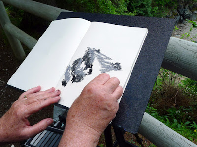
Put down your cell phone and pick up your sketchbook. Draw in meetings, classes and church—it won’t lower your comprehension much. I’ve written about the importance of sketching many times; it separates good artists from mediocre ones.
Make work a habit. Set aside a half hour a day and use it to make some kind of art. You really can cement a habit by doing it for a month.
A small amount of time with a sketchbook can yield wonderful results.

Cut out the screen time. Even with the decline in TV watching, Americans average about eleven hours a day in front of some kind of screen. You might find that all the time you need to make art can be found just by deleting the Facebook app. (Just be sure to subscribe to this blog before you do it! The sign up box is at the top right.)
Make a studio. If you don’t have a room to dedicate to art, make a studio in a corner of your bedroom or some other underutilized space. Having a dedicated, organized work space cuts down on the set-up time each time you want to work.
Find a corner somewhere where you can leave your project up.
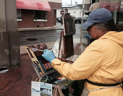
Make art a social activity. Join a figure-drawing or plein air group. There’s accountability in committing to work with someone else.
Run away from home.Apply for a residency somewhere. Even a week of focused work, sans family, can be great for your development. I’ll be doing one at the Joseph Fiore Art Center this September.
The dreaded deadline. I hesitate to recommend this, even though the best way I know to chain myself to my easel is to commit work for a show. Yes, deadlines make you finish things. However, they’re corrosive to body and soul. Better to just develop good work practices.
Be patient with yourself
I had cancer at age 40. Since then health issues have played a much larger role in my life. I’m always infuriated by being sick, because I like to keep busy. But if you’ve just had a baby or are recovering from pneumonia, you’re not going be efficient. Be patient. Just as you have to walk a little farther every day to regain fitness, you need to slowly reform your work schedule.
I’ve got one more workshop available this summer. Join me for Sea and Sky at Schoodic, August 5-10. We’re strictly limited to twelve, but there are still seats open.

Monday Morning Art School: painting when the sun don’t shine

Changing light, comfort and safety, and keeping your materials workable are big challenges for bad weather
Rocky, by Carol L. Douglas, Cape Elizabeth Paint for Preservation

I’ve had great luck with weather this year, but that isn’t always the case. Last year I did an event in a cold rain that lasted from the opening bell until the jurying was complete, at which time the sun came back out. Mother Nature may forego the rain and sulk instead. Fog is beautiful but the flat dull light of an overcast sky is a challenge to love. Organizers may sympathize, but they can’t magically change the parameters of a plein air event. The show must go on.

Outside of events, painters have the luxury of staying home when they aren’t inspired. I don’t recommend it. There are exciting atmospheric effects that take place in bad weather, and if you aren’t there, you won’t see them. Nor will you know how to cope if you suddenly find yourself in a downpour when it really matters.
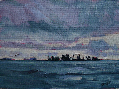
Storm Clouds (pastel), by Carol L. Douglas
There are three issues involved in painting in lousy weather.
  • Changing lighting conditions.
  • Your material’s stability;
  • Your personal comfort and safety;

Changing and imperfect light is one of the principle arguments for doing preparatory sketches. This weekend, I painted a dramatically back-lit rock for Cape Elizabeth Land Trust’s Paint for Preservation. I only had about four hours a day when these lighting conditions were true, and they weren’t true on the second day at all, because it was overcast. At the same time, I needed to include the tide, which advances almost an hour a day.
I’d done a fairly careful sketch in advance and was able to refer to it when in doubt. I repeated that process on the canvas when I started painting. Some people think underpainting is a substitute for an initial value sketch on paper. The problem, however, is that you cover up the evidence when you paint. Without my sketch as my guide, I doubt I would have retained the rigor of my initial idea.
Painting in the residue of a hurricane with Brad Marshall. (Courtesy Rye Art Center)
Watercolors and pastel are very difficult to manage in a downpour, even when they’re out of the direct rain. Paper and chalk both become saturated with moisture, making control impossible. The only solution I know is to work from inside your car. Acrylics actually benefit from higher humidity, but sideways mist and rain will make them run off the canvas too.
Remember learning that oil and water don’t mix? Instead, they form a sludgy emulsion that’s impossible to paint with. Oil paint won’t stick on a damp surface. Since the pigment is in suspension in the linseed oil, it can bleed off with water droplets. Shake loose water off and pour off any that ends up on your palette. Don’t blot.
Oil paint doesn’t freeze, however, making it great for winter painting.
Storm Clouds over Lake Huron was painted in the direct rain in a terrific downpour. The paint emulsified, but sometimes you just have to capture the scene.
With any media, you should avoid letting your canvas get wet from the back. Gesso expands and contracts with moisture changes. Copious rain will destabilize canvas and warp boards.
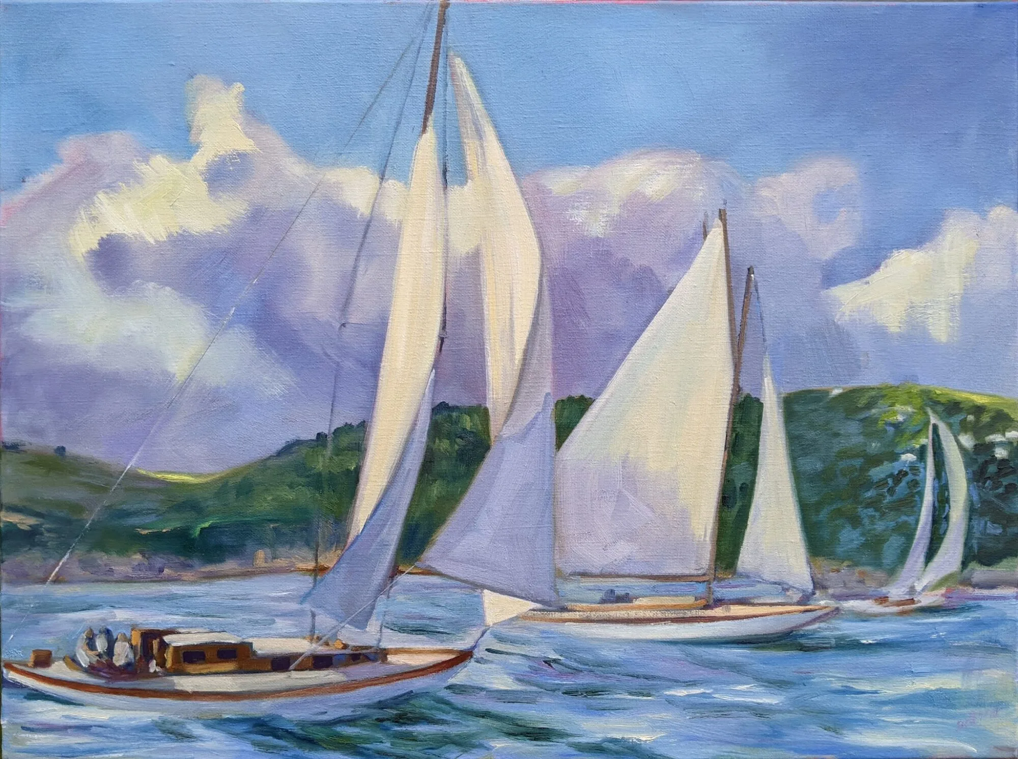
This spring, Ellen Joyce Trayer brought a bag full of knitted cowls along to my Age of Sailworkshop. She handed them out to anyone on the boat who wanted one. I was an immediate convert. They warm your neck without adding bulk. A general rule of dress: you are coldest when standing or sitting still, so bring more clothes.
Massed thunderheads are beautiful and transient but put away your lightning rod (easel) and get off your mountain long before the storm hits. Lightning strikes on both the leading and trailing edges of thunderstorms. Even if the sky directly over your head is clear, you’re at risk of a strike when you can hear thunder. Far better to get inside your car and record the pyrotechnics with gouache.
I’ve got one more workshop available this summer. Join me for Sea and Sky at Schoodic, August 5-10. We’re strictly limited to twelve, but there are still seats open.

Monday Morning Art School: Gel Pen and a Water Brush

Everything you need for pen-and-wash will balance comfortably on your lap, thanks to modern technology.
A fifteen-minute pen-and-wash sketch.

I slipped my sketchbook in my purse before church, only to find when I got there that my pencil had apparently been eaten by a bear. It was useless. That left me scraping around the bottom of my backpack, where I found a Uni-Ball gel pen and a tiny sample card from Turner Watercolours.

Recently, pen manufacturers have started offering fraud protection technology. This is because of a new form of crime called ‘check washing.’ That’s a kind of identity theft where ink is removed from a check and the check is reused. In response, pen makers have created waterproof and acetone-proof pens. Good luck getting the ink out of your clothes, but it’s a boon for artists looking for inexpensive, waterproof pens for pen-and-wash drawings.
Initial drawing.
There’s a tiny, unremarkable, ranch-style house across the road from our church. It’s best to practice drawing everyday objects. If you can get the composition and pattern of lights and darks right on a prosaic little house, you stand a much better chance of getting them right at Niagara Falls or some other equally-grand place. In painting, the composition should always come first.
Without a pencil, I couldn’t even put hashmarks on my paper. Sometimes flying without a net is a good thing, though. You’re stuck with your decisions. I laid out a simple line drawing, and then massed my dark shapes in with the pen.
More darks.
Pen drawing is supposed to be fast, and eyeing up proportions is a learned skill, just like reading. If you’re an absolute beginner, you might want to do a measured drawing of the building on another page first, in pencil. Then close that page and work fast on another page. Your mind’s eye will remember the proportions. If you have no idea where to start with that, do this exercise first.
My pal Mary Byromteaches a wildly successful weekly class in southern Maine called The Traveling Sketchbook.  We occasionally compare materials for our classes. It was Mary who reminded me of the versatility of the lowly waterbrush pen. The genius of these brushes is that they eliminate the need to carry water separately. 
I watched Richard Sneary, who is one of America’s top watercolorists, using the same waterbrush pen with watercolor pencils to do a value sketch at Parrsboro. That’s a technique I use and teach. If that kind of value study is important for him, it’s doubly important for the rest of us.
As far as I want to go with the pen. Now to find some color.
There are many makers of waterbrush pens. They’re cheap and I have a few tucked here and there, including at the bottom of my backpack.
My ‘watercolor kit’ for this project. You can do better.
I didn’t have a watercolor kit handy, but I could still mix paint on the sample card and fill in the big shapes with color. I really recommend that you carry a small watercolor kit instead, but it doesn’t have to be complicated. Everything you need for this exercise will balance comfortably on your lap. That’s a big improvement over pen-and-wash of the past. We used to need a pen holder, nibs, a bottle of ink, watercolors, a brush, a water bottle and a cup.
Voila! You’ve just done your first pen-and-wash drawing. This is another simple way to make a sketch without dragging around a ton of supplies, and it’s a good way to work in advance of a bigger painting.

Of course, the other—probably more common—way to do pen-and-wash is to start with the watercolor painting and enhance it at the end with the pen. That’s a technique for creating more finished work, often used in illustration. It’s usually done on a hard paper like Bristol board or hot-press watercolor paper.
I’ve got one more workshop available this summer. Join me for Sea and Sky at Schoodic, August 5-10. We’re strictly limited to twelve, but there are still seats open.

Toning canvases

I tone my canvases bright red because it works for me, but you can choose any warm color. The important thing is that you always do it.

I use a clapped-out oil-painting brush, but a 2″ wall brush works just fine and is cheaper.

Imprimatura is the initial stain of pigment painted on a gesso ground. In traditional indirect painting, this ground color is left open where possible, reflecting back up through the paint layers and creating a cohesive tonal structure. Imprimatura was used the Middle Ages but became standard practice during the Renaissance.

We don’t paint indirectly in the field, so why do we still tone canvases? Toning is useful in the initial stages of work, since it helps the painter establish a value structure. Not only will a white canvas practically blind you on a sunny day, it changes how you perceive darks and lights, which in turn mucks up your composition. We touched on this in our Monday Morning Art School lesson based on Josef Albers.
A more traditional toning color, and a frankly bad application. I can say that; I did it.
Traditionally, a painter would choose a warm earth tone like a sienna or ochre, dilute it half and half with turpentine, paint it on the canvas with an old 2” wall brush, and then wipe the residue clear with a rag. This would leave a layer still porous enough to grab the gesso, but in a light, sparkling tone.
If you’re using oil-primed canvases or boards, you’d better tone exactly like that, or you’re creating an archival nightmare. Everything I’m about to say applies only to acrylic-primed boards, which are the ones most commonly used in the field.
I use diluted naphthol red for a ground. This isn’t something I made up myself; I got it from Steven Assael, who probably got it from someone else. (In fact, I keep meaning to ask a conservator whether it’s the right red, or if there’s an analog that’s more migration-fast.)
I want enough pigment to be solid, but not enough to interfere with the tooth overmuch.
I like naphthol because the color is warm yet hot, unlike cadmium red, which tends to be dull. (That’s a great attribute for a painting red, just not for a ground.) Naphthol red is a good counterpoint to green and blue, the dominant colors of our northeastern environment. It’s energetic, which I aspire to be, and it makes me immediately think in terms of all the accidental colors in the environment.
Beginning painters often make the mistake of being skimpy with the paint, especially if their earliest training was with watercolor. There is nothing more amateurish than watery paint on a white board. A toned ground encourages the use of proper amounts of paint, and it makes those first efforts look more cohesive.
So what color should you use? What are you going for in terms of mood and feel? The typical answer to this is the earth tones—the ochres, umbers and siennas, either solo or in combination. I tend to like 20th century ‘hot’ pigments. I’ve used lavender, orange and pink with success. Straight-up lemon yellow, however, was a dismal failure.
Spring Pruning, by Carol L. Douglas. Sometimes I let the ground show, as here.
Manufacturers say you shouldn’t dilute acrylic paint more than 50-50, and I think that’s true even at the toning level. If it’s breaking down into droplets, it’s got too much water in it.
Toning makes a terrific mess. Work on the floor, the lawn, or cover your work surfaces. You can kill yourself to apply the paint smoothly, but I never bother. It doesn’t seem to make much difference in the finished product.
This afternoon I leave for Rochester, NY for my Color, Composition and Technique workshop. After that, there’s a watercolor workshop aboard American Eagle, June 10-14, and my annual Sea & Sky workshop at Acadia National Park, August 5-10. Email me if you have any questions.

Monday Morning Art School: the architecture of trees

To paint trees, you have to know trees. That doesn’t mean you need to memorize species, but you do need to be able to see the differences.
Along the Ottawa River, by Carol L. Douglas. You don’t need to be able to identify species at 200 paces, but you do need to be able to recognize how trees differ.
Trees, clouds and rocks are all frequently abused in the same way: the oblivious painter never thinks about their individual characteristics but paints them interchangeably. That’s a mistake.
Old Bones, by Carol L. Douglas
There is a major division in the forest world between conifers (the trees with needles) and broadleaf trees. Most, but not all, conifers are evergreens; the biggest exception being the larches (tamaracks), which turn a delicious yellow-gold in autumn. Which are dominant in your landscape? Even in the Pine Tree State, the distribution of conifers to deciduous trees is about 50-50.
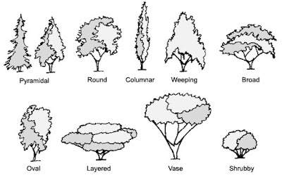
Most scenes will include a variety of canopy shapes.
For broadleaf trees, the most important distinguishing characteristic is the branching pattern of the tree, which defines the shape of its canopy. Silver maples are large trees with open, vase-like canopies. Oaks have large spreading crowns; beeches have similar crowns that appear to have melted. Most broadleaf trees branch alternately but maple, ash, dogwood and horse chestnut branch in opposite pairs.
Pines have fewer branches than spruces or firs, and their branches grow in circular whorls on the trunk. As they age, they develop an open, jagged canopy. Spruce branches grow in an upturned direction; as youngsters, they look the most like ‘Christmas trees’. In their dotage, they turn a fine, weathered figure to the wind. Firs have wide lower branches and a downcast mien. Notably, their cones point upward.
Along Kiwassa Lake, by Carol L. Douglas
Conifers are most easily identified by their needles. Pine needles grow in clusters of two, (red pines), three (yellow pines), or five (white pines), held onto the stem with a tiny papery wrapper. Spruce needles are short, stiff and grow individually from twigs. Fir needles are soft and flat. Cedars have flat, scale-like leaves and stringy bark. Junipers (including, confusingly, the Eastern Red Cedar) have berrylike, bluish cones on the tips of their shoots.
Basic broadleaf leaves.
Many people can identify the common broadleaf trees by their leaves, and I’ve included a chart to help you. The important part for the painter, however, is to see the differences in color. Silver maples have a lovely grey-silver color. Sycamores are garbed in military-fatigue green. Black spruces are dark while Eastern White Pines are fair and soft in their coloring.
This is why I discourage my students from using tube greens and encourage them, instead, to mix a matrix of green colors.
Baby black spruce and pines, by Carol L. Douglas
Too often, we painters ignore young trees, something I tried to rectify (with varying success) last season. Young trees often look radically different from their aged ancestors, but they have a beauty of their own.
To be a convincing painter, you don’t need to memorize the species of trees, but you do have to learn to distinguish between them. Any plausible landscape will contain a variety of them, with different bark, branch structures, and leaf colors.
It’s about time for you to consider your summer workshop plans. Join me on the American Eagle, at Acadia National Park, or at Genesee Valley this summer.

Monday Morning Art School: How to throw a party for 200

The artist’s job is to give linear thinkers a respite from their own minds. That starts with your opening.

The artist dancing with her eldest child.

Great gallerists also know how to throw great parties. Regular openings and developing a circle of fans is part of their job. There’s no value in having all that work assembled in one place if nobody ever stops by to see it. Selling—whether it’s art or cars—requires a person to be likeable.

That’s true for the artist too. Art-making may be a solitary job, but the artist needs to be convivial to sell his or her own work. I’ve thrown more brawls for a hundred or more people than I can count. Actually, I’d far prefer to do that than to have you over for dinner, which terrifies me.

An opening done by gallerist Sue Leo at Davison Gallery, for my show God + Man. Photo courtesy 
Iván Ramos .

The invitation is the key

Whether you call it an ‘invitation’ or an ‘advertisement’, the way you announce your event is key. It tells your intended guests the tone of the event, and hints at what kind of good time they’ll have. Graphic design is ruthlessly trend-driven. Spend time on Pinterest and Etsy and pay particular attention to fonts. They’re as fashion-sensitive as shoes.
Hound your guests
You’ll find yourself repeating, “Are you coming to my party?” over and over for weeks. This is a good thing. They won’t be excited if you’re not excited. Scarcity marketing—as perfected by the old Studio 54 in New York—is a great way to pack the house, but it only works if you’ve already demonstrated that your parties are worth attending.

Sue Baines’ hors d’œuvres are not like those in any other gallery.

Play to your strengths

Sue Lewis Baines of the Kelpie Gallery is a wonderful cook, and the hors d’œuvre at her openings could make me rise from my deathbed. Howard Gallagher of Camden Falls Gallery knows how to assemble great bands for a dance party. I can bake. Know your strengths and capitalize on them.
Make a budget and stick to it
I saw the most wonderful fairyland floral arrangements at the Renaissance Minneapolis Hotel three weeks ago. I whipped out my phone and snapped several shots, and then set them aside. To change my decorating scheme at this late date would cost a small fortune. A budget set in stone is the only way to survive to throw another party.

A beer-themed opening of my students’ work at VB Brewery in Fairport, NY.

Work way in advance

Procrastination is the worst possible habit for the host or hostess of a party. I have been working on this upcoming one for months.
Be surprising
Good taste is so highly overrated. What’s important is that people laugh and have a good time. If they can’t figure out how ceramic dogs, moose, and woodland animals go together, they might be overthinking this. The artist’s job, after all, is to give linear thinkers a respite from their own minds.
Ask for help
Nobody can throw a party for 200 without help, so when someone offers to help, smile and accept gracefully. Hire out what you can.
And on that note, I’m shuffling off to Buffalo for my third daughter’s wedding. It’s about time for you to consider your summer workshop plans. Join me on the American Eagle, at Acadia National Park, or at Genesee Valley this summer.

Monday Morning Art School: how to paint a quickie

Only got an hour? If you’re set up right, you can still do a credible field painting.
The bones of a painting.
I mentioned last week that I didn’t have time to get back to paint the apple tree at the abuelitos’ house in the tiny pueblo above Pecos, NM. That tree is what initially drew me to the place, and I didn’t want to leave without painting it. On Friday morning I went back to the little village to make a quick sketch. I was carrying only 12X16 canvases, so I had to work very fast.
I had two hours before I needed to get back to the ranch and pack for my flight. It turns out I had less time than that, because it spattered rain. But I was still able to get a field sketch done.
You’d hardly want to paint from this photograph, unless you knew what a magical place it was in real life.
I seldom paint from photos without a good field sketch alongside. One glance at my photograph will tell you why. Camera lenses distort shapes and flatten color and light. I know how to use my camera to make more interesting photos, but I eschew that artistry in reference pictures. Photographic artistry comes at the expense of details and architecture I want to preserve for the expression of the painting.
A good photograph is not necessarily a good reference photograph for painting. For example, too tight a crop often leaves out details you need later. Artists constantly move things around when painting, and you can’t do that if you’ve cut those items out.
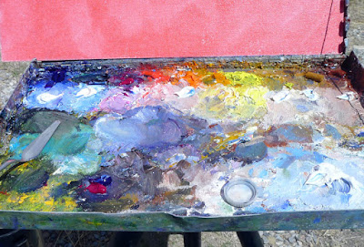
The paint array never changes, no matter how fast I’m painting. (The bottle cap is there for medium.)
Start by putting out your typical array of colors, including a dark mix with which you will draw. In the northeast, I typically use a dark mix of ultramarine and burnt sienna. In New Mexico, I made a mix of ultramarine and quinacridone red. I thought I was pushing the purples excessively, but in comparison with other paintings at the opening, my work felt low-key. That’s less a question of the light than of regional tastes.
Note the line of white just below my pure pigments. I always make tints of my colors when I start. That too speeds up my painting.
I do not clean my palette except for before a flight or at the end of the season. It goes in the freezer in a waterproof stuff-sack. That means I don’t have to mess around putting out paints at the start of each painting session. That’s important, since setting them out and cleaning them up can use up a half hour of precious time.
A very sophisticated drawing, the work of about two minutes.
Fast painting is where the habit of always setting out your paint in the same order helps. It would be disconcerting for a musician to find the keys of the piano in different places each time he played, or for a surgeon to have to hunt for the proper scalpel. The same is true in paints. You can read about my color organization here, but the important thing is consistency. 
I did not do a value study for this super-fast painting. I simply outlined my drawing with large strokes. Then I filled in the drawing with blotches of color. Mix and splat, with a fairly heavy dilution with mineral spirits.
From there, it was just a question of revising and dividing shapes. I was starting to break the apple tree into a pattern when the rain kicked up.
Right before scraping back and packing up.
My last step, which I forgot to photograph, was to scrape back slightly—not to bare canvas, but so I have a level surface on which to proceed. It’s important to not leave impasto in a half-finished alla prima painting, especially when you don’t know when you’ll get back to it. Scraping back often reveals the true lines, since it creates a shadow average of all your guesses in different layers.
And then I ran for the car. No, I didn’t win any prizes, but I don’t think my choices of paintings had anything to do with that. There was some terrifically strong work in this show. Onwards and upwards!

Monday Morning Art School: your first big event

You’re nervous, wondering how on earth you got into this show in the first place. What now?
Brush Creek, by Jeanne Echternach, courtesy of the artist.
I’m holed up on a ranch east of the Pecos with six superlative painters here for Santa Fe Plein Air Fiesta. “What advice would you give the emerging plein air artist before his or her first big event?” I asked them.
“Find something that grabs you and not the thing you think is the most important thing to paint. If I don’t have that connection, then I don’t have that edge,” said William Rogersof Antigonish, Nova Scotia.
Sonoran Preserve, by Richard Abraham, courtesy of the artist.
In other words, don’t focus on the picture postcard view. Sponsors often arrange paint outs for participating artists, and they’re very helpful to those who don’t know the area. But if it doesn’t move you, move on.
“When I was starting out, the worst thing was wasting time driving around looking for the best subject. Once you see something that would make a good painting, stop driving and start painting it,” said Deborah McAllister of Lakewood, CO. “Don’t worry about the other painters in the event or whether you’re going to win an award or not.”
First Snows, First Light, by Karen Ann Hitt, courtesy of the artist.
It’s easy to be unnerved in what is, essentially, a competition. “Find the joy and don’t let the event get in your head,” cautioned Jane Chapin of Santa Fe.
Remember that you were invited to this event because the jurors liked how you paint, so stop comparing yourself to others. That’s an insidious way to mess up your own excellent style. That doesn’t mean you can’t learn from others, but It’s best to put that in a tiny corner and ignore it for the duration of the event.
Ricardo and his horses, by William Rogers, courtesy of the artist.

I put the question to Karen Ann Hitt, of Venice, FL, as she drove away merrily in her big truck. “Less talk and more wine,” I thought she said. Later, she told me she’d actually said, “Red wine and dark chocolate, main food groups!” I’ll take that to mean: remember to bring snacks and plenty of water.
Later, she talked about the first painting of the event. “Start small, keep it simple, and get your first one under your belt. Don’t sweat the details,” she said. It’s a trap to try to do your masterwork on the first run.
Vendor, by Jane Chapin, courtesy of the artist.
“Paint something you’re familiar with. Play to your strengths,” added Jeanne Echternach, of Colorado.
Richard Abraham of Minneapolis knocked it out of the park with his first painting of this event. “Make sure you do your best painting the first day. Then you can relax,” he joked. But there’s some truth there. If your first painting is good, it builds confidence.
Still, you must leave room to be experimental. “Don’t chase your successes,” said Karen Hitt. By that, she meant, don’t fall into a formula. Take time to experiment, enjoy the place and the event, and challenge yourself.
Cottonwoods on the LaPoudre River, Deborah McAllister, courtesy of the artist.

“You can’t learn any younger,” said Jane Chapin.
Your painting will be better if you’re having fun. Take time to socialize. “Make friends with some new artists,” said Deborah McAllister.

Monday Morning Art School: How to develop an oil field sketch

A fast, simple way to do a quick, finished field study.

Megunticook River, Camden, by Carol L. Douglas

 A few weeks ago I mentioned that I use Inktense pencils to mark out my paintings on canvas. This is a technique borrowed from my pal Kristin Zimmermann.

Value study in charcoal.

My first step is always a value study. Whether I do this with charcoal, greyscale markers, or pencil is immaterial—if the value structure doesn’t work, the painting won’t work. After writing my post about value studies with Inktense pencils, I realized I could just as easily use the Inktense pencils and water to do my value study on paper as well as the transfer. That removes one more extraneous item from my backpack.

Inktense pencil transfer.

Next, I draw the picture on my canvas with the watercolor pencil. This is never simply a question of transferring my rough value sketch, nor is it a finished drawing into which I paint. What I do is a carefully-measured map of the future painting. I find this particularly useful when painting architecture, where measurement matters a great deal.

Using a watercolor pencil allows me to erase to my heart’s content with water, but when I finally start painting in oil the drawing is locked into the bottom layer.
Big shapes, blocked in.
From this point, I block in the big shapes, paying attention to preserving the values of my sketch, and working (generally) from dark to light. This is especially important if you plan to take more than a few hours to do a painting, because it allows you to paint through significant changes in lighting.
I say “big shapes,” but while I focus on these, I do not obliterate all the drawing I did earlier.
I’d originally set this painting up without the framing walls on either side of the river. It was on reaching this degree of blocking that I realized that I wanted the wall on the left back in. Putting it in over wet paint (without a drawing) resulted in it being somewhat vague compared to the rest of the painting, but I don’t think that’s necessarily a bad thing.
Ironically, looking back at it five years later, I think the composition was better without the tight framing. That just points to how subjective these decisions are.
It’s about time for you to consider your summer workshop plans. Join me on the American Eagle, at Acadia National Park, at Rye Art Center, or at Genesee Valley this summer.

Monday Morning Art School: Basic principles of painting

Some painting rules are meant to be broken. But they all exist to make painting faster and easier.

Cadet, by Carol L. Douglas. That’s American Eagle in the background. That’s the boat my June workshop will be on.

 It’s closing in on plein air season again. Here are some basic rules to speed up your field painting.

Buy the best materials and equipment you can afford: I was reminded of that this weekend as I struggled to get my low-end sewing machine to handle layers of tulle. If you invest in decent paints and decent brushes at the onset, you’ll make better progress in the long run. You’re better off with a decent limited palette and two decent brushes than more stuff of lower quality. Then you can add to, instead of replace, over time.
Skinny layers in the beginning, please!
Fat over lean (oil painting only): This means applying paint with more oil-to-pigment over paint with less oil-to-pigment; in other words, use turpentine or odorless mineral spirits (OMS) judiciously in the bottom layers and painting medium in the top layer.
The more oil, the longer the binder takes to oxidize. This keeps paints brighter and more flexible. However, oil also retards drying. Using too much in underpainting, will result in a cracked and crazed surface over time.
The makers of Galkyd and Liquin say their products are designed to circumvent this rule. However, we have no track record for these alkyd-based synthetic mediums, whereas we have centuries of experience layering the traditional way.
Even if we could change it, why would we want to? Underpainting with soft, sloppy medium gives soft, sloppy results. The coverage is spotty and thin. The traditional method is tremendously variable and gives great control. It just takes a little while to learn it properly.
Can’t tell what that’s going to be? No matter; it’s the shapes that drive a painting, not the other way around.
Big shapes to little shapes: Work on the abstract pattern before you start focusing on the details.
The untrained eye looks at a scene and thinks about it piecemeal and in terms of objects: there’s a flower, there’s a path, there’s a tree. The trained eye sees patterns and considers the objects afterward.
Is there an interesting, coherent pattern of darks and lights? Are there color temperature shifts you can use? In the early phases of a painting, you must relentlessly sacrifice detail to the good of the whole.  This is true whether the results you want are hyper-realistic or impressionistic. Composition is the key to good painting, and the pattern of lights and darks is the primary issue in composition.
Following the fat-over-lean rule, above, allows you to think about broad shapes first. In the field an underpainting done with turpentine or OMS will be mostly dry when you start the next layer. Stop frequently to make sure you haven’t lost your darks. If you have, restate them.
Follow the natural working characteristics of your medium: For oil painters, that’s dark to light. For watercolorists, that’s light to dark, because dark is impossible to eradicate. Acrylic painters can proceed any way they want, as long as they’re using opaque paint.
Doing the drawing in a dark neutral follows the natural working characteristics of oil paints. By Carol L. Douglas.
In oils, it’s easy to paint into dark passages with a lighter color; the reverse isn’t true. This doesn’t mean oil painters don’t jump around after we set the darks; we can and do. In watercolor, it’s almost impossible to erase a dark passage, so it’s best to know where it belongs before you commit to it.
Don’t choose slow-drying or high-stain pigment to make your darks. The umbers are great because the manganese in them speeds drying. However, I don’t want to carry an extra tube just for this. I use a combination of burnt sienna and ultramarine.
By the way, this is a common rule of painting to break. Just be sure you have the process down before you start experimenting.
Drawn slow and painted fast by Carol L. Douglas.
Draw slow, paint fast: This isn’t a classic tenet; it’s something my student Rhea Zweifler coined in my class years ago. Nevertheless, it’s a great rule.  
Taking time over your drawing allows you to be looser and more assured in your painting. Do value studies and sketches before you commit to color. Your mind needs time to think about the shapes it sees. Spend that time in the drawing phase, when ideas are easy to assess. Otherwise, you will be doing it on canvas, where your mistakes are more difficult to clean up.
Value study at Point Prim, Nova Scotia, by Carol L. Douglas.
Value studies and sketches allow you to be inventive. When you’ve only spent three minutes on a sketch, you don’t lose much by throwing it out. Drawing and value studies at the beginning actually speed you up, rather than slow you down.
It’s about time for you to consider your summer workshop plans. Join me on the American Eagle, at Acadia National Park, at Rye Art Center, or at Genesee Valley this summer.
This post was originally published in May, 2017 and has been edited and updated.