fbpx

Monday Morning Art School: cleaning your brushes

Don’t expect brushes to last forever. But cleaning them regularly means they will last a good long time.
A constant, revolving mess.
A few weeks ago I wrote about what different shaped oil painting and watercolorbrushes were used for. A reader asked me to follow up on the care of brushes.
That’s rich, I thought, because I’m the worst abuser of my own brushes, especially when I’m on the road. There’s never a utility sink available, and it’s not nice to repay your hosts by washing brushes in their kitchen sink. I have been known to shower with them and clean them with shampoo, since they’re usually no dirtier than I am. Mostly I wrap them in plastic and hope for the best. And the best, after a week in a hot car, often isn’t very good.
Wrapped in plastic, hoping for the best.
The cardinal rule of brush care is to not let them stand in any kind of solvent—mineral spirits or water. That includes during painting, which is why a small, swinging solvent holder is such a great idea—it’s impossible to leave a brush in it.
Image result for "Carol L. Douglas" watercolor
If you paint out of a moving car, as I did here, you have to wait to clean your brushes.
Let’s start with watercolor brushes. In general, they need to be rinsed when you’re done, shaped back into their proper form, then allowed to dry flat. This is where a brush roll comes in handy. Pay particular attention to rinsing them if you paint with saltwater or use alcohol to prevent freezing.
Fine hair brushes can be washed with mild soap. However, the only situation where that would be necessary is if you’re committing the faux pas of using your watercolor brushes to paint in acrylics. If that’s the case, on your own head be it, as the Psalmist wrote.
Soap is not detergent.
Both are emulsifiers known as surfactants. These allow oil to be lifted out with water. That’s why they are both capable of cleaning your hair, although we generally use a different kind of surfactant—shampoo—for that.
Soaps are made from natural ingredients like plant oils or animal fats. Detergents use synthetic bases, and they have additional surfactants added to increase the oil-stripping. This is why we don’t generally use detergent to wash our hair—it’s too good at removing oils. The same is true for our brushes.
Soap, by the way, dates back to 2800 BC, whereas detergent was formulated during a World War I soap shortage.
Soaking them in coconut oil can sometimes loosen up dried paint.
If you left your brushes standing and they’ve started to harden up, detergent won’t work any better than soap at softening the mess. I sometimes pre-treat them with coconut oil when I can’t get the paint out. Masters Brush Cleaner also manages to soften up dried paint without using dangerous chemicals.
A few years ago, a friend sent me a sample of a product she likes for brush cleaning: War Horse Saddle Soap. This is a glycerin-based soap and is now my preferred brush soap, not least because they’re a family-based business using safe and sustainable materials.
However, I think any saddle-soap or brown soap like Fels-Naptha works. For that matter, I’ve washed a lot of brushes with the sample soaps available in hotel rooms. One product that doesn’t clean brushes well is Dr. Bronners Organic Pure Castile Soap. It’s a pity, because it smells good.
The only secret of brush-cleaning is to get to them fast. Get as many solids as you can out with mineral spirits; that will prevent clogging your sink. Thoroughly coat them with soap, inside and out, and wash them with a rag, not your bare hand. (Even the least-toxic of pigments shouldn’t be ground into your skin.) The brush is clean when the water runs clear, and not before.
Don’t expect heavily-used brushes to last forever. They’re made of hair and they wear out. In fact, most of my filberts started life as flats. But by cleaning your brushes regularly, you’ll ensure that they will last as long as is possible.

Monday Morning Art School: accurate lines in oils

It may seem like a fine brush is better, but that’s not always true in wet-on-wet painting.
Sea Fog on Main Street, by Carol L. Douglas. When painting plein air, you don’t have time to wait for the painting to dry to draw lines.

I’m working on a commission that has a lot of architectural detail. I don’t want the end result to be fussy. I’m not a clean renderer like Frank Costantino. He can drop a fine line with a rigger and it falls into the painting, cool and elegant.

Watercolor loves fine lines. Alla prima oil painting doesn’t. It tends to be looser and rougher. A fine line added with a rigger can lie on the surface looking silly, or it can melt into the bottom layers and look like mush.
Working backwards allows you to make clean edges without being overly fussy.
My solution is to paint edges and lines in reverse. I lay down the line and then back the color up to meet it.
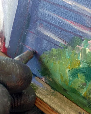
Lines should be happening on an already-wet surface, because they aren’t important in the big-shape phase. That means you need a technique for removing excess paint before you draw. For large erasures, I take off excess paint with a palette knife. For lines, I use a wipe-out tool. I had a very old one made by Loew-Cornell that I lost this summer. I replaced it with a terrible one I picked up on the road. But Bobbi Heath assures me this is the best one currently available.
Start by getting rid of excess paint.
Getting rid of that schmearof excess paint is an important first step. You can’t draw into soup.
Lay the line in before the surrounding background. With architecture, this often means a line of light-colored paint before its dark surround. Don’t worry that you’ve broken the dark-to-light rule. Lines are usually added toward the middle or end of a painting, so you should be past that point anyway.
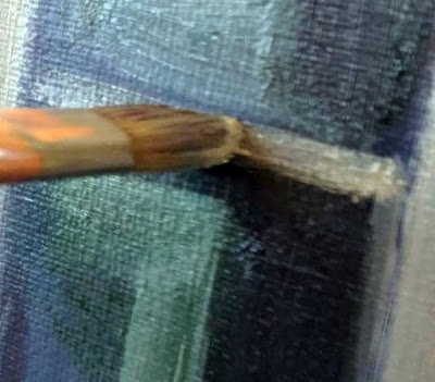
In oils, the side of a flat brush always works better than a tiny round for straight lines. Flats are more stable and tends to track in the right direction. Go ahead and use a ruler if you want.
The line going on with a bright.
This line should be made of fairly thin paint, with just enough medium to carry it smoothly. Too much oil and it will blend into its surround.
It’s easier to paint a line with a flat on its side than with a small round.
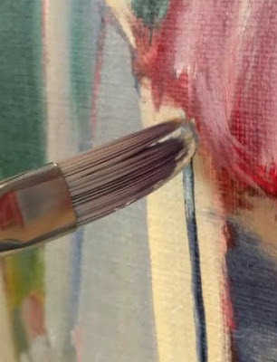
Next paint the surrounding area, pushing up against the line with the background color. Use enough paint and be bold. It’s best to do this edging in a single stroke, but that takes practice. However, as a general rule, the more you touch the surface, the muddier the edges will get.
Then push the background color right up against the line.
In my examples, I use two different brushes. The fine flat, made by Rosemary & Co., was a gift this summer. It is very precise, but as with all synthetic fibers, it doesn’t carry much paint. The bright is old and clunkier, but it carries enough paint for a good, finished line. It may seem like finer is better, but that’s actually not true. What’s most important is getting enough paint on the canvas, evenly, so that your line doesn’t look anemic. I find that with alla prima painting, hog bristles are almost always better.
After two flags, a chair, and a lot of white trim, I was so cramped up by precision that I had to do this fast surf exercise to wash out my mind (and loosen up my hand).
I enjoyed painting with the Rosemary & Co. flat, but it was no good for surface work. Eventually, I realized I didn’t like my painting at all. I set it aside and did a fast exercise with big brushes that got rid of the stiffness that had crept into my painting from using the wrong brush.

Monday Morning Art School: Stayin’ Alive

It’s the most dangerous time of the year.

Take a boat. They’re objectively safer. Tricky Mary in a pea-soup fog, by Carol L. Douglas, courtesy Camden Falls Gallery.

According to the people who measure these things, the most dangerous form of transportation is your family car. There are two seasons when highway accidents jump—summertime and the holidays. Surprisingly, Massholes and New Yorkers are better drivers than Mainers.

Why am I harping on this? I opened the holiday season with a car accident. This weekend I came too close to being sideswiped by an aggressive driver. You can’t take my workshops if I’m dead, so listen up.
The empty road, in Yukon Territory or eastern Alaska. The risk changes from distracted drivers to enormous animals.
Pay attention
You will be more distracted during the holidays. That seems obvious, but is it objectively true? Yes, and there’s an app for that. It’s from a company called TrueMotion.
They say we’re 33% more likely to drive distracted in the period between Thanksgiving and Christmas. And that means we’re:
  • 12.2 times more likely to crash from dialing a phone.
  • 6.1 times more likely to crash from texting.
  • 2.2 times more likely to crash while talking on the phone.

The adjustor who looked at my car added another distraction: fiddling with the radio or heat. The controls in new cars are too big and complicated to adjust at a glance.
Set it and forget it
Like most of you, I used my phone to navigate, so it’s not practical to throw it in the backseat. But I’ve trained myself to ignore it. If I’m alone, I location-shareto the person waiting for me. That way I don’t need to tell them how late I’m running. (They can buy that golden pineapple at TJ Maxx without my opinion.)
Driving while drowsy
I think it’s absurd to tell American adults to get more sleep. Most can’t. But the devilish thing about micro-sleeps—which is what happens when you’re wrung out—is that we don’t even know they’re happening until we’ve lost control and crashed. I have many years of experience managing long drives. I drink coffee in moderation, drink as much water as I can stand, and I sing. Listening to music is soporific, but singing wakes up your whole body. And I’m not averse to stopping and napping or even sleeping in my car rather than pushing through.
Life in the breakdown lane.
Don’t drive drunk or high
Seems obvious, doesn’t it? But people still do it; in fact, drunk driving is what caused Maine drivers to fail so dismally in the rankings above.
I drink and drive, but never at the same time.
A University of California at San Diego study found a driver with a blood-alcohol level of only 0.01 is 46% more likely to be found at fault for a car accident than a sober driver involved in a crash. There’s no such thing as a safe level of alcohol consumption before driving a car. Although we haven’t devised ways of measuring, I’m pretty sure that’s true for pot, too.
Stop being so self-centered
You’ve got no business climbing up my tailpipe. Frankly, I resent it. Yes, you might be able to intimidate timid drivers into speeding up, but not me, Bucko.
Meanwhile, there’s some damn fool potting along in the left lane at exactly 66 mph. He steadfastly ignores the line of traffic behind and the angry drivers swerving around him. He owns that left lane and has no plans to vacate.
Wait! Are we really using two-ton battering rams to vent our personal problems? Can’t we all save that for Christmas dinner?

Monday Morning Art School: what do different brushes do? (Part 2, watercolor)

Brushes are much more important in watercolor than in oil painting. Here’s what each brush is for.
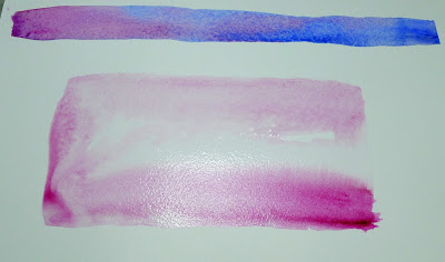
The more vertical the brush, the more flow.
Recently a student asked me why he was carrying so many different brushes. What were their uses? This is the second part of the answer; I addressed oil painting brushes last week.

Watercolor brushes are softer than oil-painting brushes. The most expensive are sable brushes, and unlike oil-painting brushes, the difference is worth paying for. Natural bristles combine strength with suppleness and hold more paint than synthetics. However, there are some fine synthetic brushes out there. Several of my go-to brushes are Princeton Neptunes. 
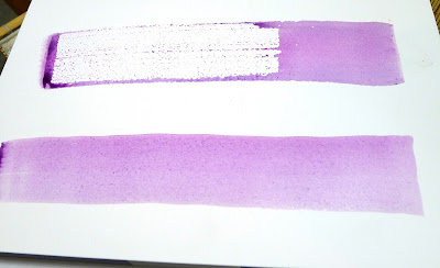
Unlike oil-painting brushes, your watercolor brushes should last a lifetime, so buy the best you can afford. The only absolute rule is to never leave them standing in water. Set them down flat between brushstrokes and rinse them thoroughly when you’re done.
Made with the synthetic spalter brush, above.

Except for squirrel mops, watercolor brushes drop more pigment the more vertically they’re held. You can use this to move from a filled area to a broken one in one brush stroke. In all the following examples except for the mop, I’ve held the brush both ways. A good general rule is to carry the vertical brush slowly and in a controlled manner; pull a horizontal brush more rapidly to get the least amount of paint contact with the paper.

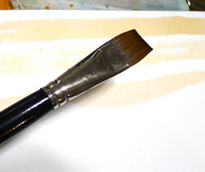
The brush I used for the photo montage above is a 2″ flat synthetic mottler or spalter brush. I like this shape for both oils and watercolor. It’s a relatively inexpensive brush that gives a beautiful wash. It’s useful for covering large areas quickly, but with precise edges.

A flat gives you a good even wash. Used on its side, it can give you a controlled line.
And that would be the bright. More punch, less pigment.
Flats and brights give you nice flat washes, but can be used to make expressive lines as well. Brights have more control and carry less paint, just as they do in oil painting. Turn them on their sides to make a controlled line. Twisting the brush while painting gives an infinite variety of shapes. So too does varying the ratio of paint and water.
You can’t do either of these things in any other medium.

Because of the way watercolor bleeds, its brushes can be used in ways not possible in any other medium–a long blend of different pigments, or by painting a shape in clear water and then dropping pigment into it.

Round brushes are just more lyrical than flats.
I don’t normally carry riggers with me in either watercolor or oils. (They’re meant to paint perfect lines, and my world-view apparently doesn’t have many perfect lines in it.) Most of my line work is done with rounds. They do not give as much control on long lines, but they are very expressive.
A mop brush makes a perfect wash, but it does so much more as well.

Squirrel mops are the most uniform wash brush you can use. It’s virtually impossible to make them skip, so use them where a lovely flat wash is a goal.

Mop brush on very textured paper.
But a good mop can also point, hold vast amounts of paint and sweep across the paper in style.
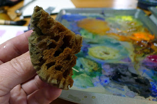
One of my favorite tools, a natural sponge.

Natural sea sponges are multi-purpose painting brushes. Use them to apply or remove paint. They can be as subtle or bold as you wish.
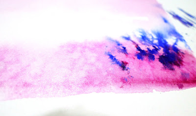
Paint lifted (left) and applied (right) with a sponge.

Your brushwork contributes immeasurably to the quality of your painting. Don’t dab or be diffident; plan your strategy and then execute it with boldness. To do this, of course, you have to practice.


Monday Morning Art School: what do different brushes do? (Part 1)

The best way to learn about your brushes is to experiment, but meanwhile, here’s a handy guide to oil painting brushes.

Plein air painters usually favor hog’s bristle brushes. These are far less expensive than softer hairs like sable. They are the only brushes that spread thick paint smoothly and evenly, making for the freshest technique.
Bristle brushes tend to form a flag (a v-shaped split) at the end over time. However, if the brush is made properly, with good interlocking bristles, it will have a natural resistance to fraying. Because field painters often go long periods without being able to clean their brushes, this durability is important.
There are some good synthetic brushes on the market, but none of them are quite as stiff as a good natural bristle brush. 
In the following exercises, I’ve tried to keep the amount of solvent the same (except with the fan brush).

Above is a sable flat brush by Rosemary & Company. It can put down a very smooth surface and offers a lot of control, but it doesn’t carry the quantity of paint that an equivalent bristle brush will. I do have many sable brushes, but I save them for thin work in the studio.

This is a Robert Simmons Signet flat brush. The paint it lays down is both rougher and more impasto than the sable.

Flat brushes make an immediate, energetic mark. They’re excellent for fast, powerful surface work, long sweeping strokes, and blocking in shapes.

Used on their sides, they also make great lines, far more evenly than a small round can do.

Two rounds of very different sizes. A round is a more lyrical brush than a flat, and is a classic tool for painterly surface marks. It can be used to make lines that vary from thin to thick. A pointed round is used for fine detail. Bristle rounds tend to lose their points very quickly, however.

The great advantage of a filbert is the variety of brushstrokes you can get from one brush. This is great for single strokes that taper, such as in water reflections. Its rounded edges are good for blending. Set on its side, it makes nearly as good a line as a flat does.

A bright is a less-flexible version of a flat. It’s great for short, powerful strokes or situations where you want a lot of control.

A fan brush probably has no place in a plein air kit, but I carry one anyway. I use it for blending, as on the left, although some people like using it to make whacked out marks as on the right. The problem is, it can carry very little paint, so its marks tend to be either gooey, as above, or very abrupt.

In my studio, I just use a clapped out soft-haired brush to blend.

The only ‘novelty’ brush I carry is a double filbert, or Egbert, above. It’s a lyrical brush that has a lot of expressive quality.
Many plein air painters also carry liners and riggers, which are useful in paintings that are built up smoothly. I don’t paint that way, so I seldom use them. Another brush that is good for detailed work is an angled brush. However, you can do almost any work you can envision with just the brushes I’ve shown you above.
Next week, I’ll talk about watercolor brushes.

Black and white all over

A class exercise on design, and a chemistry question I can’t answer.
Christ and the Woman Taken in Adultery, 1565, Pieter Bruegel the Elder, image courtesy of the Courtauld Institute of Art but the painting has been stolen.

Yesterday was the kind of day that drives poets mad. Just below freezing, it rained heavily, with gusts of wind. Our plein air painting class was forced into the studio.

grisaille (pronounced griz-eye) is a painting done entirely in shades of grey or another neutral color. Historically, it was used as decorative painting in imitation of sculpture. Some are what we moderns call duotones. They have subtle colors added to extend the value range. But for our class, they would be strictly in black and white.
Abstract design by Christine Covert

Painting runs along two parallel tracks. The first is design. This is why painting teachers relentlessly push students to do thumbnails and other value sketches. Value is our most important tool. Get it right, and you can be wrong about a lot of other things.

(I came to this realization late, by the way. I studied with Cornelia Foss, who tinkers endlessly with the ‘rules’ of painting. From her I got the hairbrained idea of minimizing value as a structural concept. However, this was a misinterpretation on my part. That’s a good lesson in not asking the right questions at the opportune moment.)
Grisaille by Jennifer Johnson.
The second track is color. It’s so much more interesting in some ways that it can be a distraction to the beginning painter. Mixing paints is both difficult and exciting.
Of course, value is part of color. In color space, value is the range from black to white. All successful paintings have some kind of pre-meditated value range in them. A high-key painting is one in which the contrasts are extreme. A low-key painting is one in which the range is narrower. In either case, there must be midtones too. They are also part of the design process.
Grisaille by David Blanchard.
It’s a lot easier to experiment with value when you’re not fussing about color management at the same time. One way to familiarize yourself with this idea is to paint a ten-step scale ranging from black to white. That’s not a bad exercise, but it’s boring. Instead I asked my students to do the monochromatic still life that I assigned in Monday Morning Art School last month.
Grisaille by Chris Covert.
Before that, however, they did an abstraction in charcoal, based loosely on the drawing I included in yesterday’s blog. Charcoal is the most painterly of drawing tools, but this is something you can do in a sketchbook while watching TV. It is a bit intimidating for someone to ask you to do an abstract drawing, but if I call it “doodling,” you can relax and get on with it.
There are only two rules:
  • Have a full range of tones, not just a line drawing.
  • And no realistic objects belong in your drawing at all.

A question: One of my students has had a problem with red pigment from her toned boards bleeding into her final paintings. She prepared a sample board for me to test her M. Graham acrylics vs. a similar red from a very inexpensive craft paint. I tried the squares at 15 minute- and 30 minute-intervals. The M. Graham pigment bled into the white paint, but the craft paint did not. I then tried the same intervals using my own Golden-toned board. Again, there was no bleeding.
Acrylic is pigment suspended in acrylic polymer emulsion. It is supposed to be water-resistant when dried. That doesn’t mean it’s oil-resistant. I’m beyond my chemistry knowledge here, but if any readers can suggest what’s happening, I’d be very grateful.

Monday Morning Art School: How to use medium

The actual process is simple, but it has to be done right to prevent chalkiness or cracking.
The Farm at Olana, by Carol L. Douglas
“How should I treat older, unvarnished paintings that have become chalky?” a reader asked me. “And for that matter, what kind of varnish do you recommend?”
Chalky paintings are best revived with varnish. My personal preference is Winsor and Newton Artist’s Matt Varnish. It’s easily removable by a conservator, provides UV protection, and it doesn’t shine. (If you want more reflection, they make both gloss and satin finishes.) As with all varnishes, it shouldn’t be applied for a year after the painting has been finished, and it should never be used as a painting medium.
But learning to use medium properly is a better protection against chalkiness. (If you’re new to oil painting, consult my basic rules of oil painting.)
Mamaroneck River, by Carol L. Douglas, in its finished form right before it went on the auction block.
There are several families of oil painting mediums out there:
  • Traditional mediumsare made from a slow-drying oil (poppy, linseed, etc.) a resin, and a solvent, sometimes with a siccative like Cobalt Drier added to improve the drying time.
  • Alkyd mediums are made with a slow-drying oil reacted with an alcohol and an acid. They dry faster, making them suitable for multiple glaze layers, but they carry less pigment. They should never be used on top of traditional oil mediums.
  • Solvent-free mediumsdo not include any petroleum distillates. All unmixed slow-drying painting oils are inherently solvent-free, being plant-based.
  • Wax based mediums include cold wax and encaustic.

Mamaroneck River, when the second layer was done but the top layer hadn’t been started.
For field painting, I prefer a traditional medium: Grumbacher’s Oil Painting Medium II. It retards the drying time and allows me to work wet-on-wet longer. In particularly dreary conditions, I’ll use their Medium III, which has a drier. For studio work, I sometimes use their Medium II, because it dries to a matte finish. I buy this brand because I prefer a very thin medium. There are many good brands out there, and I would trust any medium made by a reputable paint house.
Grain elevators, Buffalo, by Carol L. Douglas is an example of a cold-wax medium painting. It gives tremendous latitude in effects.
Back in the last millennium, there was a popular recipe of linseed oil, turpentine, Damar varnish and a few drops of Cobalt drier. I stopped making it when I realized that so many 20th century masterpieces were degrading terribly. Chemists understand chemistry better than painters do.
The drawing layer is always done with solvent, whether in the studio or in the field. That’s Sandy Quang, back when she was my studio assistant.
Neither medium nor solvent is a substitute for good, open paint. If you’re poking a skin off your paint and extending it with solvent, it’s time to clean your palette and get new paints out.
The actual process for using medium in alla prima painting is simple: fat over lean. Your first layer—where you’re drawing the picture on the canvas, called the underpainting—is cut with a small amount of solvent only. Use too much and you’ll have muck above. Your middle layer should be as close to pure paint as you can get, applied thinly. Your top layer should be paint with a small amount of medium, and here’s where you can get as impasto as you want.
Clip this and paste it in your pochade box until it’s a habit.
Medium doesn’t belong in the bottom layers of a painting. The more oil in a layer, the longer the binder takes to oxidize. This keeps paints brighter and more flexible. However, oil also retards drying. Using too much in underpainting will result in a cracked and crazed surface over time.
Use too much medium and you’ll have a soup that dries to a plasticky finish. Use too little, and the paint will drag as you paint and cloud as it dries. I generally just touch the tip of my brush to the medium before mixing it into a brushstroke’s worth of paint.
This traditional method is tremendously variable and gives great control. Practice it.

Monday Morning Art School: a simple exercise in composition

Diagonals keep us interested because they’re harder for us to “solve”.
The Artist’s Studio in an Afternoon Fog, 1894, Winslow Homer. Courtesy of Memorial Art Gallery.
Winslow Homer’s most successful compositional motif was the long diagonal. He used it with great success from the beginning of his career right through to his mature Maine seascapes. Diagonals are particularly important in the latter, since they tie rock and sea together in a monolithic whole.
But diagonals are tricky, as I found last week. The Brandywine hillsides are lovely, but they’re not what I’m used to. They kept turning out stumpier than I wanted. Today’s exercise is designed to help us see the subtlety of the diagonal line.
The basic structure of The Artist’s Studio in an Afternoon Fog, above. Use tracing paper to do this step.
Diagonals are more dramatic than vertical or horizontal lines. They draw us through the picture, tie disparate elements together, and create depth and perspective. They don’t need to be articulated; this is a good place for the lost and found edge. A diagonal can be implied by a value shift within a larger object.
Our minds like diagonals for the same reason we like space divisions like the Golden Ratio: they keep our interest because they’re harder for us to “solve”.
Experiment with different values within the painting’s structure.

Today’s exercise is one you can do with a printer and tracing paper. Unfortunately, I have neither, being still on the road, so I’ve approximated it in Photoshop. First, find a suitable Homer painting, one where the diagonal drives the composition. I’ve used an old friend: The Artist’s Studio in an Afternoon Fog, 1894. This painting is at home at the Memorial Art Gallery in Rochester, where I’ve studied it many times.
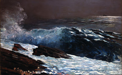
Sunlight on the Coast, 1890, Winslow Homer. Courtesy Toledo Museum of Art.
You can use this painting or another. All I require is that the broad sweep of motion be on the diagonal. I’ve included a few other possibilities as well.
Next, I want you to print a copy of the painting and trace its major shapes. When you’re done, you should have something that looks approximately like the outline above.
The Fox Hunt, 1893, Winslow Homer. Courtesy Pennsylvania Academy of the Fine Arts.
The last step is to experiment with different value systems inside Homer’s basic structure. He was working from reality, but you have no such limit. When you’re finished with this, what do you observe about the values he used versus the ones you’ve tried?
  
If you sketched in the smaller dashes with high contrast, those passages should drive your eye as much as the big shapes do.

Monday Morning Art School: ditching the color

A painted value study is a great tool for understanding your subject.
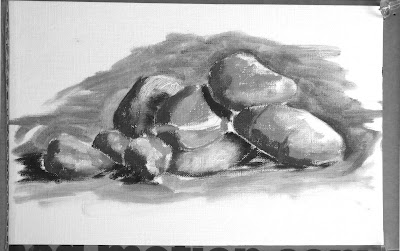
Pile of rocks value study, by Jennifer Johnson

Last week, I had you find and identify the simple shapes within a drawing. The prior week, we learned how to do abstracted value studies of our own homes.  This week I want you to do a monochrome (black and white) painting based on a value drawing.

Jennifer Johnson is usually two steps ahead of me. At the end of Tuesday’s class she told me she’d done this assignment before I assigned it. She graciously offered her paintings to illustrate this post.
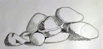
Jennifer started by doing this meticulous, detailed drawing of her pile of stones.
Before you can work successfully in color, you need to be able to work successfully in black and white. This is possibly the most valuable training an artist can give him or herself. I often do watercolor value studies before I paint in oils, but any painted medium will do for a monochrome study—gouache, watercolor, acrylic or oils.  It is not necessary to use a pricey substrate for this exercise: gessoed paper is sufficient for acrylics and oils; use any paper you have for gouache or watercolor.
Jennifer was trying to teach herself about rock structure, so she set up a pile of stones. First, she drew a meticulous, careful drawing of her subject. This step is akin to research; you are learning the details of your subject.
She traced the basic shapes for each iteration. It saved her tons of time and made it easier to do multiple iterations of the same idea.
Next, she simplified and redrew her picture in graphite, focusing on the values, not the fine details. She then painted the rocks in monochrome acrylic. She added a final step, using five different colors to represent five different value levels. If you want to add this step, the exact colors you use are immaterial, but they should go from warm to cool or cool to warm as they get darker.
Jennifer used tracing paper to redraw her outlines. That’s perfectly fine, since she didn’t get hung up on the drawing. You may find yourself doing a half-dozen drawings before you get the levels and composition just right. Your goal isn’t to simply copy reality, but to design a construction that pleases your eye. It may be almost exactly what you see, or it may be very different.
Next came a simple value sketch of the rocks.
Value is the first and most important visual element available to the painter. Get it right, and you can be wrong about a lot of other things and still produce a stellar painting. It’s a lot easier to experiment with value when you’re not fussing about color management at the same time.
Why use paint instead of a pencil for your value study? In practice, many students have trouble applying different pencil tones to paper. They leave most of the paper white. Moreover, it’s hard to differentiate four or five value steps with a #2 pencil.
In addition to her monochrome painting, Jennifer did a version where she assigned different colors to different values. If you do this, make sure the colors move warm-to-cool or cool-to-warm as they get darker or lighter.
Work from light to dark. When you’re done, check where the area of highest contrast is. If that’s not where you wanted the focal point to be, you may have a design problem. If so, just do it again until your work can be read like a story: first focal point, next focal point, next focal point, etc.
Don’t be timid about laying in darks and don’t worry about neatness. This is rough work, and it should be done fast.
Why not do your value studies on the canvas you intend to work on? Once you cover it up, you no longer have it for reference. That becomes very important as the light shifts. Having a value study on hand can make the difference between being able to finish a painting or not.

Monday Morning Art School: finding the super simple shapes

If you think it’s too complicated to draw, you’re looking at it all wrong.

Winch (American Eagle), by Carol L. Douglas, courtesy of Camden Falls Gallery.
This exercise builds on last week’s Monday Morning Art School, where we did simple drawings of our homes and then experimented with cropping them. The idea was to see beauty in the everyday, and to see how even big architectural drawings are just a combination of smaller shapes.
This week I want you to go back to your homes, find something prosaic, familiar and commonplace as a subject, and then analyze your drawings in terms of these simple shapes.
That painting is just a series of simple shapes.
I’m near-sighted. I just need to remove my glasses and I’m working in simple shapes. That’s more difficult for someone with perfect vision; you poor schmoes are going to have to squint. Either way, by blurring your vision, you can reduce the scene before you to a few basic elements.
When you blur your vision, smaller shapes fall away and form a few, larger shapes. It’s much easier to break down a scene if you can’t see it in sharp detail. You don’t have to do this for every drawing—just enough to grasp the concept of simplification.
Old Greek Revival farmhouse in Western New York.
Consider this elderly farmhouse I photographed in western New York. With my glasses on, it might seem daunting—a collection of windows, doors, pillars, peeling paint and overgrown shrubberies. But it’s easily broken down into a series of rectangles, triangles and circles. Anyone can draw those, even the people who tell me they can’t draw a straight line. “I’m going to draw an abandoned Greek Revival house” is a lot more daunting than “I’m going to nail down these few shapes.”
This is a computer estimation of what it looks like to me without my glasses.
Concentrating on the big shapes not only makes starting easier, it leads to more accurate measurement. It’s much easier to draw the big rectangle of the portico and fit the pieces into it than to start with one window and grow the shape outwards.
Either way, it breaks down to these approximate shapes. Anyone can draw them!
Once you’ve drawn the basic shapes, you can work inward to add detail. When you have a decent basic sketch, you can start thinking about the composition you might want to paint. A good composition has a variety of shapes and angles.
The painting at top is of the American Eagle in drydock. A boat is a long, lean thing, in or out of the water. A side view isn’t its most flattering angle. (Come to think of it, that’s true for me, too.) For this reason, it poses a compositional problem in drydock or at its berth. Here, I’ve reverse-engineered the drawing into a series of simple shapes, so you can see my solution to the problem. 
My house drawing from last week.
Let’s go back to my shape drawing of my house from last week. In the end, that can be reduced to a black-and-white cut-out (below). Simplified, is there a coherent black-and-white pattern? Is it pleasing enough to bother with? If the answer is no, then back to the drawing board. That is the point of a thumbnail. If it doesn’t work in a tiny sketch, it isn’t going to work in a painting.
Does it reduce to a few simple shapes that make a pleasing pattern? I think so.
Your assignment—like my class here in Rockport—is to choose a simple scene in or near your house and break it down to extremely simple shapes. How do they intersect? Is any one intersection more compelling than the rest? If so, that’s probably your focal point.