fbpx

Monday Morning Art School: the warm and cool of it all

Mixing paints is simple if you understand how pigments work.
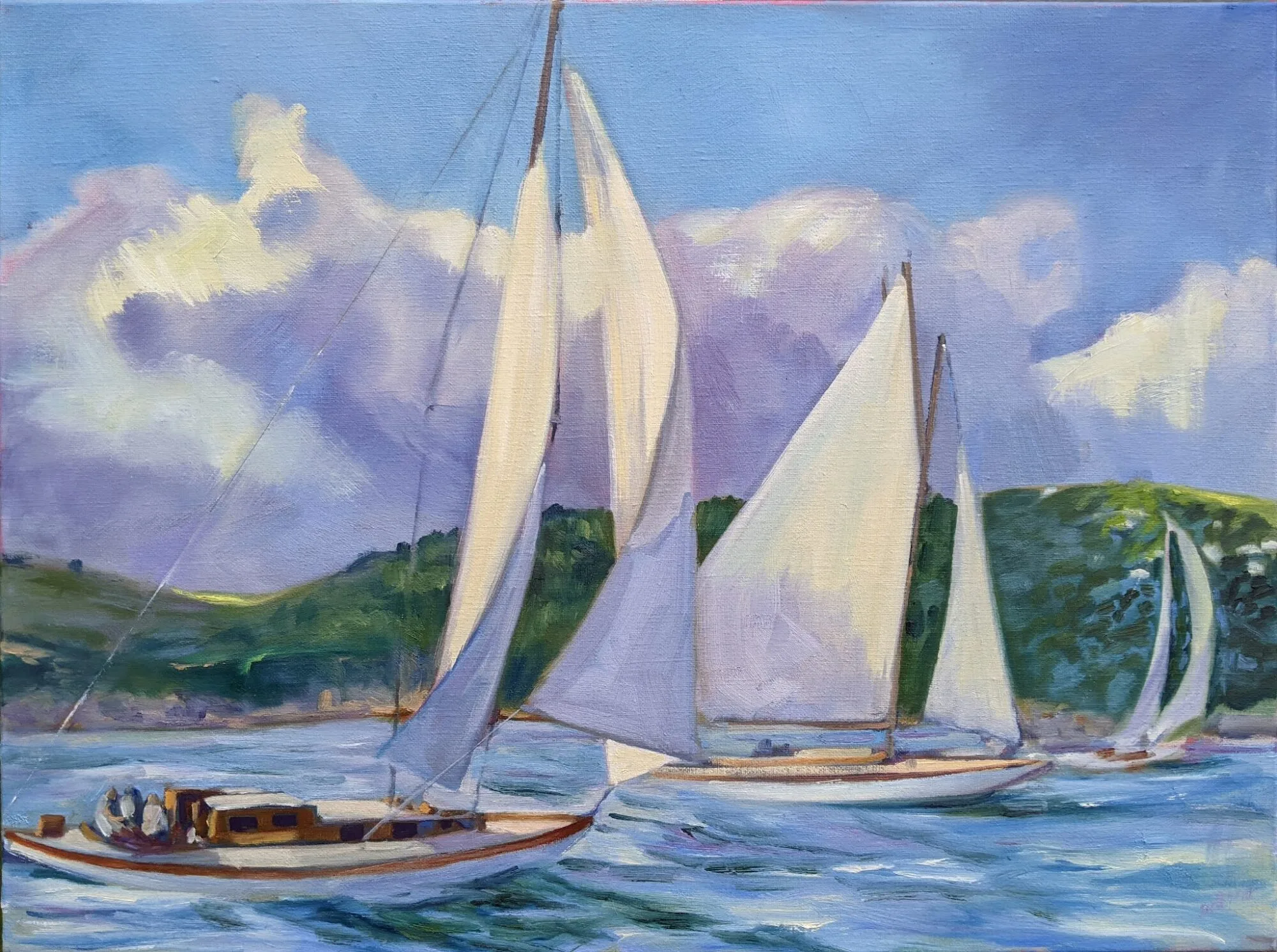
Tilt-a-Whirl, by Carol L. Douglas. Painted plein air.
Let’s start with some simple review of the color wheel. Red, blue and yellow are the primary colors. Across the wheel from a color is its complement—the color that completes the circle. The complement of a primary color is always a secondary color. A secondary color is one made by mixing two primary colors.
The color wheel.
In theory, you can paint with just four pigments: red, blue, yellow and white. For beginning painters this is sometimes a good idea, because it’s the fastest way to learn color management in a hurry. It simplifies the thought process so you have only one decision to make at a time, and it is easier to get a more unified color scheme.
But there is a big limiting factor, and that’s the impurity of pigments. They all have overtones that muddy them up in certain mixes. That’s why your local paint dealer uses many, many more pigments than just red, blue, and yellow.
The takeaway lesson here is that different pigments may look similar out of the tube, but they reflect light (and thus mix) very differently. From Scientific Examination of Art: Modern Techniques in Conservation and Analysis, 2003, National Academy of Sciences.
Claude Monet’s palette shifted over time, but included these paints:
  • Chrome yellow
  • Cadmium yellow
  • Viridian green
  • Emerald green
  • French ultramarine
  • Cobalt blue
  • Madder red
  • Vermilion
  • Flake white
  • Ivory black (before 1886)

These are sets of paired pigments. That means he has a warm and a cool of each color. Gamblinmakes a modern version of this impressionist palette. It includes:
  • Cadmium yellow light
  • Cadmium yellow medium
  • Cadmium red light
  • Alizarin permanent (actually anthraquinone red)
  • Ultramarine blue
  • Cerulean blue hue (actually phthalo blue plus white)
  • Viridian
  • Ivory black
  • Flake white replacement (or titanium white)
Paired primaries.
Both Monet’s and Gamblin’s palettes are paired primaries plus green, white and black. I use paired primaries as well, omitting the green but adding in some other earths. (Here are my supply lists for oils,  acrylics, and watercolors.)
The distinction between warm and cool colors has been important in painting since the Impressionists. Warm colors are said to be hues from red through yellow and cool colors are said to be the hues from green through violet. Each hue around the color wheel also has a warm and a cool version.
  
There’s no factual hot or cold point because this is a poetical description that works, rather than a scientific fact. Much of what we believe about the psychology of color is hocus-pocus, but it’s true that if the light is what we call “warm,” the shadows are what we call “cool,” and vice versa.
When we say that lemon yellow is cooler than cadmium yellow deep, we mean that if you are trying to mix a greenish yellow, you’ll get a clearer shade with the lemon than you will with the cadmium. The warm-cool language is just a convenient way of saying that.
Different pigments may look the same when squeezed out of the tube, but there the similarity ends. Pigments are impure, and you have to learn and work around those impurities.
Today’s lesson is an experiment in working through those color shifts. I want you to make the above color chart, using three sets of paired primaries:
  • Prussian blue—Ultramarine blue
  • Quinacridone violet—Cadmium orange
  • Indian yellow—Lemon yellow

The purpose of this exercise is to understand how paired primary pigments work together, so that you can make neutrals when you want them, and avoid mud when you don’t.

Draw the chart onto a canvas, and then mix across and down for each square. The left column and the top row should be pure pigments. Fill it in, then, just like the multiplication tables of your youth. For example, the intersection of cadmium orange and ultramarine blue should be a 50-50 mix of those two colors.
Unless you’re painting in watercolor, the result should be opaque.
Let me know if you have any questions. And have fun!

Monday Morning Art School: landscape from abstraction

Create a drop-dead painting from a so-so scene.
Wreck of the SS Ethie, by Carol L. Douglas
Certain places are fascinating for something other than their pictorial value. The angle, the light, and the setting aren’t conducive to a great composition. An example of this was the wreckage of the SS Ethie in Gros Morne National Park in Newfoundland. This is a lovely shipwreck story featuring a dog and a baby, but I’ve told it before.
I’d driven up the Great Northern Peninsula specifically to paint this wreck (and to visit the Viking site L’Anse aux Meadows.) When I arrived, I realized it was nothing more than a beautiful cove with a debris field spreading for thousands of feet along a rocky shore. There was no hulking wreck to paint, merely broken things lying around—much like my parents’ barnyard, in fact.
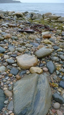
The actual debris field looks like this.
Hurricane Matthew was bearing down on us in the form of a blizzard, so I took photos and completed the painting elsewhere. However, I’ve used this technique successfully in plein air painting as well.
The cove itself is beautiful, and I could have painted a nice anodyne scene of it—lovely, but saying nothing about the wreck. I could have done a close up of one bit of machinery. Instead, I created an abstraction and fitted the details in to it. I do this whenever I’m feeling blocked, either because the subject matter isn’t fitting naturally, or because I’m too anxious.
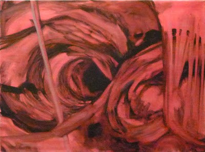
Initial abstraction for Ethie, based on the word Maelstrom.
To do this, I improvise a series of shapes on a large canvas, much as if I were going to paint a non-representational painting. The only guidance I give myself is a word. In the case of the wreck, the word was maelstrom. When I demonstrated this technique last week for the Bangor Art Society, the word was mourning. Another painting I did recently started with a phrase, Dwight’s school bus. It was nonsensical; my son walked to school. That word is generally inspired by place or events, and it’s surprising how often the painting ends up reflecting the word I started with.
After the Bangor Art Society decided this was a tree, I turned it that way and started making it into one. Photo courtesy of Teddi-Jann Covell.
I start this process with a line. In the Bangor painting, it was a flat, thick line that crossed the canvas. In the Ethie painting it was rounded and rollicking. I never start this with a sense of up or down, and I often rotate the canvas while I work. This process can be the longest part of a painting. I’m searching for the composition from my subconscious, rather than from reality. Sometimes it’s based on my initial line and sometimes the line gets subsumed into something else entirely.
When the abstraction is done, I rotate the canvas to see how it might represent something real. At the demo, I asked participants to identify things they saw in my abstraction. Suggestions came fast and furious. I’d had them draw alongside me, so I then asked them to identify things they saw in their abstractions. Total silence. I asked them to trade with their neighbors and again the room was full of suggestions.
There’s a lesson here. We’re born with the capacity to recognize objects in abstract shapes; it’s part of what makes us intelligent and aware, and keeps us safe. A half-seen shape tells us, almost instinctively, when we belong on high alert. But we moderns tamp that down. We allow subliminal shapes to appear in our drawing, but then resolutely refuse to recognize them. That’s where turning the canvas is so helpful. The mind no longer sees it as ours, but as something new.
My demo painting for the Bangor Art Society. It’s not finished to a level I aspire to, but I was getting tired.
Once I find the objects in my abstraction, I hew to them fairly tightly, converting them into figurative art. But I don’t always solve all the corners of my paintings at the first run. After I’ve drawn in one thing, another suggests itself. And sometimes I change up passages on the fly.
“I feel like I had to understand a lot about light/shadow, perspective, and value before I could do an invented landscape with any authenticity,” a painter commented. This is true, but we all know more than we think we know. And painting from memory is a great way to expand one’s visual memory.
Furthermore, it’s not necessary to do this totally from memory. Try it outdoors, subbing in that rock over there or that tidal pool over there. You’ll end up with a sense of the place, rather than a literal transcription of the place. If you use photo reference, don’t start adding details until you’re well along in the design process. Remember that reality should always be subservient to design.
This reaching down inside yourself is difficult business. But it’s worth experimenting with. I hope you’ll try it and let me see your results.

Monday Morning Art School: practice seeing values

Value is the most important dimension of color. Here’s an exercise to help you see it better.
On the left, color strips. On the right, monochrome approximations of those colors. Photo courtesy of Kyle Buckland.

This week’s exercise is brought to you by outstanding painter and teacher Kyle Buckland. He graciously allowed me to share it with my class and you.

A simple value scale.

Value in color theory is how light or dark something is on a scale of white to black (with white being the highest value and black being the lowest value). It’s the hardest dimension of color to match, but it’s also the most important. It’s what we register first when we look at a painting.

“You can never do enough of this type of training the eyes,” wrote Kyle. He’s right.
I made you this approximation of Kyle’s stripes, or you can paint your own.
Kyle ran a series of colors across a sheet of paper, as above. You can either copy his technique and make your own stripes, or you can print the image I made, above. A PDF is here.
I printed this on a color laser printer on card stock. If you have an inkjet printer, you may need to spray it with fixative to prevent the ink from bleeding into your greys.
You’re going to make a series of stripes on the right, matching the value of the color on the left as closely as you can get with grey paint. Use acrylic if you have it; gouache or oils otherwise. If all you have is watercolor, you’re going to have to make a separate card and set it next to this one. 
Kyle converted his photo to black and white to demonstrate his close matches. Photo courtesy of Kyle Buckland.
When you’re done with this exercise, I’d like you to photograph it with your cell phone and camera and delete the color information; i.e. turn it into black-and-white. (On my cell phone, I go to picture editing and a b/w filter pops up automatically.)
Cameras can be wrong in value assignments. Both the yellow and green are way off.
Compare your stripes. If you’re way off, repeat this exercise until you’re more accurate. However, this comes with a caveat. The human eye is subjective and not everyone sees value the same way. Software is also in some ways subjective, since it was programmed by humans. In the sample above, yellow is obviously the highest-value color on the wheel. But Photoshop perceives it as darker than orange. Your camera and your eye may disagree.
Why is value so important? It creates a structure for the painting to flow through. If there are dark values in an organized pattern, synchronized with mid-range and light passages, your finished piece will draw the viewer in.

Monday Morning Art School: an exercise in color

This exercise teaches you to think of the three aspects of color as separate properties.
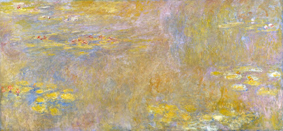
Water lilies (Yellow Nirwana), 1920, Claude Monet, courtesy the National Gallery, London. Much of Monet’s work was experimenting about the nature of color.

When we ask people, “what’s your favorite color,” we’re using the word color in a simple way, and we expect a simple answer. In fact, color has three basic characteristics:

Value – How light or dark is the color? Blue-indigo is the darkest color, yellow is the lightest. Red and green fall somewhere in the middle.
Hue – Where does it sit on the color wheel? All colors fall into one of the following hue families: red, orange, yellow, green, blue and violet. Within those families, however, are many subdivisions.
Chroma – How much intensity, or “punch” does the color have? Grey is low-chroma; fuchsia is high-chroma.
For more detail, see here.
Complementary colors are opposite positions on the color wheel.
Analogous colorsare a set of colors that sit next to each other on the color wheel.
This exercise teaches you to hold value and chroma steady and manipulate only hue. It’s hard to make these judgments subjectively, so your samples may not look exactly like someone else’s.
Go to the paint store and select paint chips in two different color schemes—complementary and analogous. I want you to choose paints with the same value and chroma but the hue will be different.
Complements where the value and chroma are the same.
They don’t necessarily have to be high-chroma combinations. Here’s a pair of complementary hues which have less saturation (lower chroma):
An example of an analogous color scheme where the value and chroma are the same for all three hues:
Once you’ve selected the three paint samples, chop them up and arrange them on a little card as a design. Glue them down in a pattern that pleases you. Try to leave no space between the different colored tiles so your finished work looks something like this:
Above: my chops. Below: Photoshop’s evaluation of how close I came with the values. (Remember, Photoshop is interpreting as much as I am.)

I don’t care what kind of shapes you make or how complicated your design is. I just don’t want white showing between the sections.

If it proves difficult to get out, and you want to get started, you can always make your own paint swatches. But it’s fun to get them from the hardware store, cut them up and make patterns.

Monday Morning Art School: saving a so-so painting

You like it, but there’s something just not exactly right. Or you’re not sure you like it at all.

Miss La La at the Cirque Fernando, 1879, Edgar Degas National Gallery, London. How does pattern and repetition hold this painting together?
Last week I went through a collection of paintings belonging to another artist. “Pull out the ones that I should burn,” she said. There were almost none in that category. In fact, most of them were quite lovely.
Of the ones that weren’t, most were promising starts that either fizzled or were never finished. “You can fix this very easily,” I kept saying. Of about 75 small paintings she brought, only a very few were consigned to the burn pile. Most of them needed a simple fix: a passage lightened, an edge softened, or a focal point developed. All she needed was to have those pointed out.
The next day, my student Dave went through my slush pile during a break. It’s huge; it has hundreds of paintings in it. “I love this,” he kept saying. “Why don’t you like this?”
Crucifixion of St. Peter, 1600, Caravaggio, Cerasi Chapel, Church of Santa Maria del Popolo, Rome. In chiaroscuro, value creates volume. How did Caravaggio drive us back through space in this painting?
I don’t not like them, I told him; I just don’t feel like selling them. I almost never wipe out work that’s not finished or not what I’d envisioned. They go on shelves in my studio. Occasionally, I will sell these paintings for rock-bottom prices, but mostly they’re there for my edification. Occasionally, I’ll notice something I really like and pull it out and study it, both for what’s working and what isn’t working.
Everyone has problem paintings. Often, I discover a year or two later that what I thought was a problem was actually a roadmap. It was a precursor to where I was headed as a painter. In some cases, all these paintings need is varnish to bring up the color and they sing. Or, they may need revision.
Michael tramples Satan, 1636, Guido Reni, Santa Maria della Concezione church, Rome. How does line drive you through this painting?
Last week, I wrote about the five basic elements of painting design. The best way to rescue a so-so painting is to subject it to formal analysis. That doesn’t mean you have to write a dissertation about it. It means you consider your painting in terms of each of these design elements. Are you using line, shape, space, color and texture to guide the viewer through the space you’ve created? Have you emphasized important passages and subordinated others? Is there repetition, pattern and rhythm in the piece?
A painting that doesn’t work almost always fails in several of these areas. You are as qualified as anyone to analyze your paintings based on these objective standards. There’s a great advantage in learning to do this: you will never be led astray be a stupid critique again. (I once ruined a wonderful painting by following bad advice, made worse because I’d paid for it.)
Le Wagon de troisième classe (The third-class carriage), 1864, Honoré Daumier, Metropolitan Museum of Art. This has nothing to do with the subject of this post; it’s just how I feel when flying.
We recently did this exercise in my Rockport painting class. In my experience, amateurs fixate on mark-making to the exclusion of far more important qualities in painting. They’re so worried about their handwriting that they fail to see the bigger picture. My students walked away from this exercise with the objective knowledge that they were doing better than they thought. I think you will, too.
I would have illustrated this with some of my flubs, but I’m traveling today without access to my server. I’m off to Pecos, NM, to paint snow.

Monday Morning Art School: the basic elements of design

Design elements are there whether you’re conscious of them or not. Learn to use them.

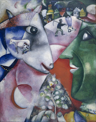
I and the Village, 1911, Marc Chagall, courtesy MOMA. In this painting, line is a dominant design element, articulating the relationship between man, beast and place.

Line

In math, a line is straight, has no thickness and extends in both directions through space. Sometimes that’s what we mean by a line in art—for example, a horizon line.
More typically in art, a line is just a path through space. Wherever you have an edge, you also have a line. However, lines also refer to mark-making, so in that sense they can be fat, thin, punctuated, tapering, diffident, bold or whispering.
Diagonals and curves tend to keep us more engaged than unbroken verticals, as they’re more difficult for the eye to ‘solve.’
Interior of the Laurenskerk in Rotterdam, 1664-66, Cornelis de Man, courtesy Mauritshuis. The illusion of three-dimensional form is created with drawing and value.
Shape and form
Shape and form define objects in space. Shapes have two dimensions–height and width–and are usually bounded by lines. Forms are three-dimensional. The artist’s dilemma is to give the illusion of three-dimensional form in a two-dimensional painting.
Ploughing in the Nivernais, 1849, Rosa Bonheur, courtesy Musée d’Orsay. The vast sky and field create as much narrative as do the team of oxen.
Space
Space is, in the real world, three-dimensional. In art, the term refers to a sense of depth, or the artist’s use of the area within the picture plane. The illusion of three-dimensional space is created with perspective drawing, atmospherics, positioning, size, and defining volume through modeling.
Sometimes we refer to negative and positive space, which means the division between the primary object(s) and what we perceive as the background. Positive and negative space were a very big deal in much twentieth-century design, which often used the vast emptiness of the page as a counterweight to the primary object.
The Crucifixion of Saint Peter, 1601, Caravaggio, courtesy Cerasi Chapel. Chiaroscuro relies primarily on value to drive the eye.
Color has three essential characteristics:
  • Hue—where it falls on the color wheel (red, blue, etc.),
  • Chroma—how brilliant or dull it is,
  • Value—how light or dark it is.
Color is also described as ‘warm’ or ‘cool,’ but these are useful artistic conventions and not measurable as fact.
Historically, value did much of the heavy lifting in painting. The Impressionists began using hue and chroma to define volume, and that is essentially how most alla primapainters work today.
Portrait of the Baronness James de Rothschild, 1848, by Jean-Auguste-Dominique Ingres, private collection. We see satin, lace, tulle, feathers and jewels primarily due to Ingres’ exquisite control of reflected light.
Texture refers to the surface quality of an object. Paintings have implied texture, conveyed by color, line and brushwork. They also have real texture in the form of smooth or impasto surfaces.
Your assignment is to take one of your own paintings and subject it to formal analysis. Consider each of these elements of design in turn. How are you using them? How could you use them better?

Monday Morning Art School: repetition, pattern and rhythm

Variation is your friend when you’re striving for movement in your painting.

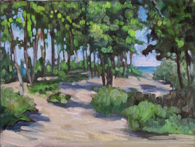
Beach Saplings, Carol L. Douglas
“You have a great sense of visual rhythm,” I told the young artist.
“I’m not sure I even know what that means,” he answered.
“Well, I’m not sure I do either, but I’m sure that between the two of us, we can figure it out,” I replied.
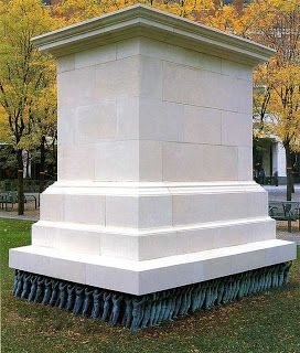
Public Figures, Do-Ho Suh 2001 Art Experience:NYC. The artist understood how to create movement enough that he intentionally suppresses it for a powerful political statement.
Rhythm creates visual tempo that provides a path for the viewer’s eye to follow. It’s closely aligned to movement and action, and it’s usually achieved through the repetition of lines, shapes and colors.
Rhythm builds on two other artistic concepts: Repetition, which is one object or shape repeated, and pattern, which is a combination of elements or shapes repeated in a recurring and regular arrangement. Rhythm is the song produced from these elements. It can be random, as in a pottery glaze, or obviously patterned.
The basic building block of rhythm is a motif. It need not be a real object. It can just as easily be an abstract shape.
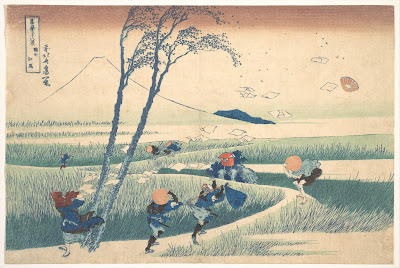
Ejiri in Suruga Province, c. 1830, Katsushika Hokusai, courtesy Metropolitan Museum of Art
Ejiri in Suruga Province demonstrates the importance of motifs, rhythm and repetition in creating a sense of movement. Katsushika Hokusai wanted us to understand that it was a very windy day. The blowing papers, the pattern of the grasses, the figures themselves and the doubled tree trunks are different motifs. They’re running across each other in different rhythms, giving an intense sense of motion to the foreground. This contrasts with the utter stillness of Mount Fuji in the background.
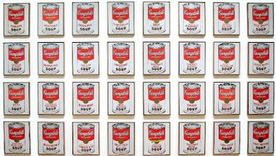
Campbell’s Soup Cans, 1962, Andy Warhol, courtesy MoMA

Repetition can lift the prosaic into a new level, as Andy Warhol’s Campbell Soup Cans illustrate. Warhol went to his local grocery store and bought every flavor of soup Campbell was then making, 32 in all. Alone, one can of soup was meaningless; blocked together on shelves as at a grocery store, they created an immediately-recognizable symbol of the plentitude of American culture. (When asked why he painted soup cans, Warhol said, “I used to drink it, I used to have the same lunch every day, for twenty years.”)

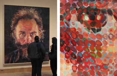
Lucas, 1986-87, by Chuck Close, fair use. His changing mark-making provides the only relief in these remarkably static portraits.
The work of American painter Chuck Close demonstrates the ability of rhythm to gin up an otherwise static painting. His first  paintings were monumental monochrome hyperrealistic portraits. By the 1980s, he was superimposing a grid over them, breaking down the image into a series of dashes, dots, thumbprints, paper, or shapes. The pixelization gives them a degree of dynamism the earlier paintings don’t have.
How can you apply those principles of rhythm to your work?
Under the Marshall Point Light, Carol L. Douglas
Don’t be so quick to eliminate all evidence of the built world from your landscape paintings. Cars, telephone poles, houses and roads all create interesting visual patterns.
Be conscious of the rhythmic motifs in your subject before you start painting. Overlapping hills, granite outcroppings, tree patterns, and water ripples are all complex rhythmic patterns. Rhythm is a fundamental attribute of nature. Focus on it.
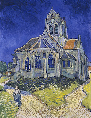
The Church in Auvers-sur-Oise, View from the Chevet, 1890, Vincent Van Gogh, Musée d’Orsay
Mark-making is an excellent way to insinuate rhythm into a painting. You can drive the viewer’s eye around your canvas by changing the thickness, length and direction of your strokes. The greatest practitioner of this was Vincent van Gogh; study his work to see how you can apply this technique.
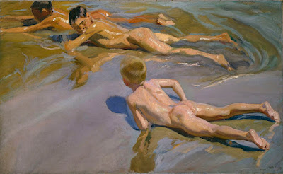
Children on the beach, 1910, Joaquín Sorolla, Museo del Prado, Madrid

Color is a powerful tool for repeating motifs. See how Joaquín Sorolla uses color temperature alone to make a pattern of ripples around his bathing children, above. Understand and use color temperature.
Your assignment—should you choose to accept it—is to find and draw a naturally recurring motif in your immediate environment.

Monday Morning Art School: think in contours

The closer the object, the more foreshortening and distortion there is. Objects at a distance appear to have almost no perspective at all.
Shoes, by Carol L. Douglas
Every object, we have been famously taught, is comprised of simple shapes—globes, cylinders, cubes—stacked together. That’s absolutely true… until it stops being true. There are some shapes that are organic and asymmetrical. A shoe is a great example. It has evolved to accommodate the human foot, not to obey the laws of symmetry.
When we draw these shapes, we must draw their contours. This is different from a contour drawing, which is just an outline. I’m talking about contours in the sense of a topographic map, which shows us the bumps on the earth’s surface.
I drew my examples during church on Sunday. It was so crowded I sat behind the sound booth. There was a molded plastic wastebasket which is neither rectangular nor round; instead it’s a splashy combination of the two.
I started by drawing the cross at the top to give me the orientation of the bin. From there I drew the best approximation of the shape that I could come up with, but it wasn’t until I segmented it into planes that I could correct my drawing errors.
This looks like a very simple drawing, and it’s quite small (about 1.5 inches tall). However, it took a long time to get the contour lines right. I measured, erased, and measured again. Shading and detail is almost irrelevant; In the end, it’s getting the contour right that makes a drawing successful.
I repeated the process with a Dunkin Donuts cup. It was on a ledge above my head, so its perspective is reversed from what we usually expect. Its symmetry made the drawing easier, since it is really just a series of cylinders of differing widths. But again, it’s getting the contour lines right that make the drawing work.
This was so much fun that I decided to apply the same system to a gentleman sitting nearby. It’s always the same system, whether it’s a glass, a person, or a building—find the shapes and mark out their planes.
Rockport Harbor, by Dwight A. Perot (courtesy of the artist)
I was sitting close to the cup and the wastebasket, so their perspective is quite pronounced. The closer the object, the more foreshortening and distortion there is. In the photo above, you can see the reverse effect, as happens with a telephoto lens. Objects far away from us appear to have almost no perspective at all. The telephoto lens faithfully records that, and it looks ‘wrong’. From a long distance the difference in scale and, thus the foreshortening, is almost meaningless.
Your assignment—should you choose to accept it—is to find an object in your house that’s rounded; in other words, one that’s not a box. Break it down into contour lines indicating the shifting planes and curves.

Monday Morning Art School: Pricing your work

For some artists, the hardest thing in painting isn’t drawing or color-mixing but how to price their work. Charge by the square inch, of course.
Keuka Lake Vineyard, 30X40 by Carol L. Douglas, is available through Kelpie Gallery

A proper price is the meeting point between how much you can produce of the product and how much demand there is for it. If you can’t keep your paintings stocked, you’re charging too little. If your studio is full of unsold work, you’re either charging too much or not putting enough effort into marketing. Your job is to find that sweet spot.

Art sales are regional. If you live in a community with an aging population and a prestigious art school, you’re going to have low demand and high supply. If you live in a booming new city, you will have more demand and prices will be higher.
Art is not strictly a commodity, however. A painting’s value depends on the artist’s prominence. Most artists are terrible judges of their own work, seesawing between believing they’re geniuses and thinking they’re hopeless. Such subjective judgments hinder their ability to price their work.
Art festivals are a good way to establish a price history. I don’t miss them, however.
Don’t assume that because you labored for a long time over a piece, it is more valuable. Your challenges are not the buyers’ problem.
You can simplify the problem by setting aside your emotions and basing your selling price on the size of the piece and your selling history. How do you do that if you’ve never sold anything before? Survey other artists with the same level of experience and set your first prices in line with theirs. Visit galleries, plein air events and art fairs. If you see a person whose work seems similar to yours, find his resume online and check his experience. Know enough to be able to rank events. Painting in Plein Air Easton is not the same as painting your local Paint the Town.
Charitable auctions are a good way to leverage your talent to help others. They provide a sales history to new artists. (But they aren’t tax deductible contributions.)
Striping (Heritage) 6X8, by Carol L. Douglas, is available through Camden Falls Gallery.
Let’s say you gave an 8X10 watercolor of the Old Red Mill to your local historical society, which turned around and sold it for $100. Great! You have a sales history (albeit a limited and imperfect one) from which to calculate prices. Just figure out the value per square inch and calculate from there.
Square inch is the height times the width. That means your 8X10 painting is 80 square inches. Dividing the $100 selling price by 80 gives you a value of $1.25/square inch.
To use this to calculate other sizes, you would end up with:
6X8 is 48 square inches. 48 X $1.25 = $60
9X12: $135
11X14: $240
12X16: $315
In practice, my price/sq. inch gets lower the larger I go. This reflects my working and marketing costs, some of which are fixed. If you started with my example, above, a 3X4” painting would more reasonably sell for $3 a square inch or $36, and a 48X48” painting for $.75 a square inch, or $1700. But that sweet spot between 6X8 and 16X20 are a fixed cost/inch, rounded off for convenience.
My price list is on Google Drive and I can access it wherever there’s phone service.
Charity sales are known for seriously underpricing work, but it’s better to start low and work your way higher. Periodically review your prices, and make sure you have a copy with you at all times, because people will ask you about paintings at the strangest times. I keep mine on a Google sheet I can refer to from computer or phone.
Once you have a price guide, it should be absolute. I adjust it slightly for family members (or more likely just give them the painting), but I use the same price structure in events and galleries.
You should continuously update your prices based on your average sale prices for the prior year or two. The goal of every artist ought to be to sell at constantly rising prices. When you find yourself “painting on a treadmill” to have enough work for your next show, it’s definitely time to charge more. Each time you show, your work will be better known, and over time your prices will rise.
The marketplace favors fair, consistent pricing. I charge the same amount everywhere I sell. I don’t want to undercut my galleries.
And I don’t explain my prices, for the most part. Does anyone ever tell Christian Louboutin that $995 is a bit much for a pair of platform suede pumps? No; they either understand Louboutin’s market or they don’t buy designer shoes.

This post originally appeared on December 18, 2017. How quickly a vacation rolls past! Have a happy New Year, and I’ll see you again on Wednesday.

Monday Morning Art School: how to draw an angel

Angels are devilishly difficult to draw, even though we all ‘know’ what they look like.
Choir of Angels from the Ghent Altarpiece, early 15th century, by Jan van Eyck, courtesy Sint-Baafskathedraal. Ghent

The Bible is notorious for its lack of description when it comes to celestial beings. The Archangel Michael appears to Daniel and all the prophet can say is that Michael looked like a man. The angelic form also differs depending on context. Mostly, though, angels are spirit beings. You, the artist, have a lot of latitude in drawing them.

Still, we all ‘know’ what angels look like: they are infinitely sweet, sing in choirs, have wings and ringlets and wear white robes.
The gap between the Biblical text and tradition has bedeviled artists through history. For example, who says that angels have to have bird wings? I’m not the first person to note this. Jan van Eyck gave the Archangel Gabriel fabulously iridescent wings in the Ghent Altarpiece, just like a bug. William Blake, that old curmudgeon, gave the angel of Revelation no wings at all.
Wing of a European Roller, watercolor on vellum, 1510-12, Albrecht Dürer, courtesy of the AlbertinaVienna
Albrecht Dürer painted a dead European (blue) roller twice, meticulously observing its plumage and structure. His research paid off: his angels never suffer from static, limp wings.
Dead bluebird, watercolor on vellum, 1510-12, Albrecht /Dürer, courtesy of the Albertina, Vienna
If you try this at home, a Christmas turkey won’t do. They’ve had the flight bred out of them. A bird’s shoulders—or scapula—are actually part of its wings. In the wild, they’re strong and muscular. After all, most birdlife revolves around flight. If angels are to fly, their wings must be part of their structure, not just pinned on as in a Christmas play.
The Expulsion From Paradise, 1510, woodcut, Albrecht Dürer. He’d studied wings enough to know how the different coverts, or sets of feathers, move.
Human shoulders are adapted for operating our arms and hands. Winged angels must have two sets of scapula and the muscles to operate both. That’s hard to imply in a painting, but the best ones have the wings operating in parallel with the shoulders.
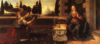
The Annunciation, 1474, Leonardo da Vinci, courtesy the Uffizi Gallery
For most of art history, angels were depicted wearing the luxurious robes of the high princes of their day. The Renaissance artist often didn’t give a lot of consideration to tailoring wing-sleeves into these gowns. Sometimes they look as if the wings are sprouting from the drapery.  Leonardo da Vinci (as usual) had an ingenious solution in his Annunciation. The archangel Gabriel wears feathers around the base of his wing that echo the poufs of his sleeve. Tres chic!
Angels in togas from the Basilica di Santa Maria Maggiore, Rome.
Angels were depicted in togas—the garb of ancient, pagan Rome—in the fifth century mosaic cycle of the Basilica di Santa Maria Maggiorein Rome. I particularly like the contrast with the hipsters in their modern dress at the bottom.
If you extend that to modern life, you’ll dress your angels in jeans and a t-shirt. These, however, can be unsatisfying to draw. Here is a quick lesson on drapery if you want to be traditional.
Halos were used in the iconography of many ancient people, including the Romans. Halos were adopted by early Christian artists to indicate that here was something worthy of veneration. The new naturalism of the Renaissance pretty much did away with them. If you want to add one to your angel, make sure you get your ellipse right by following the instructions here.
Song of the Angels, 1881, by William-Adolphe Bouguereau, courtesy of the Getty Center.
By the time William-Adolphe Bouguereau painted Song of the Angelsin 1881, angels had been sanitized and softened, undergoing a gender transition in the process.
Historically, angels were depicted as male and terrifying. However, the paucity of description in Scripture allowed artists wide latitude. With the Enlightenment, angels became less frightening. This is when they began to transition into females in popular culture. (A classic case of a profession letting women in after its power has diminished.)
Eastern Orthodox icon of a tetramorph cherub, depicting four essences in one being. Is there anything cute about this? 
Worse, they started showing up as infants, in the form of putti.
Putti were originally meant to symbolize the profane passions of the pagan Romans. That’s why Cupid is frequently depicted as a winged boy. In the Baroque period, however, putti came to represent the omnipresence of God. Weirder, they became conflated with the Biblical cherubim. How cherubim—the fierce, serious beings that guarded the Garden of Eden—became fat little boys is one of the enduring mysteries of art.
May you have a blessed Christmas and great peace today, tomorrow and in the year to come.