fbpx

Monday Morning Art School: the lost-and-found edge

Sometimes it’s what you don’t say that matters most.

Girl with the Red Hat, c. 1665-66, Johannes Vermeer, courtesy National Gallery of Art, Washington, DC.

I once had a painting teacher who told me that heavy edges were “my style.” Like many younger artists, I just hadn’t learned how to marry edges in my painting. Beginning painters tend to give all edges equal weight—they are borders to be colored in. Part of the learning process is learning when to keep the edge and when to lose it.

Vermeer’s Girl with the Red Hat, above, perfectly illustrates the lost-and-found edge. The smooth transitions between the hair and the hat on the left, within her gown, and the lack of contrast in the shadow side of the model’s face drive our eye to the highlighted passages. Squint and concentrate on just the shape of the highlighted passage for a moment. It’s just one long, beautiful abstract shape in a sea of darkness.
In Church at Old Lyme, 1905, Childe Hassam softened the edges between leaves and sky by making them the same value. Courtesy Albright-Knox Art Gallery.
Losing the edges helps link visual masses into a coherent whole. It deemphasizes things that aren’t important. It’s a way to create rhythm in a painting.
The human mind is adept at filling in blank spots in visual scenes (and seeing things that aren’t there). If you doubt this, squint while looking around your room. In any collection of similar-value objects, you don’t see edges, but you understand what you’re looking at. Your mind sorts it out just fine.
A careful drawing is different from a value study. Both are important, and the wise artist does them both. But a drawing explores the shapes and contours of an object. It’s a fact-finding mission. A value study concentrates on the links between objects and the final composition.
The Daughters of Edward Darley Boit, 1882, John Singer Sargent, courtesy of the Museum of Fine Arts, Boston. 
In the oil painting The Daughters of Edward Darley BoitJohn Singer Sargent uses the great dark entryway as a framing device, a compositional accent, and a poignant social statement. Only a hint of light in the shape of a window implies what is behind. The girls recede into space in order of age, with the eldest (Florence, age 14) almost enveloped in the darkness of the drawing room. Florence and Jane have no accents in their hair; their dresses and stockings disappear into the murk.
The Bridge of Sighs, c. 1903-04, John Singer Sargent.
Sargent painted at least two versions of this study of the Bridge of Sighs; a mirror-image is in the Brooklyn Museum. In this version, Sargent placed a hard edge at the top of the arch where sky meets stone. The shadows on the left bleed without any attempt at architectural precision. This creates the same kind of murky dark passage as in The Daughters of Boit. (A note for watercolor purists—the whites of the gondoliers’ clothes were done with white paint.)
In Two Women on a Hillside, 1906, Franz Marc tied the women to the background by repeating greens in their skin and garb. Courtesy Franz Marc Museum.
To lose an edge in painting, start by making both sides of the line the same value, even when they’re different hues. Conversely, the highest contrast will give you the sharpest edge. You can add to either effect by softening or sharpening the paintwork with your brush. Introducing the color of the adjacent object will also soften the contrast between an object and its background, as in the Franz Marc painting above.
Detail from John Singer Sargent’s Lady Eden, 1906, courtesy Philadelphia Museum of Art.

Remember that the sharpest, most contrasting edges draw our eye. The trick is to find a balance that supports the composition. Sometimes only a small flick of paint is necessary, as with Sargent’s sequins in the detail from Lady Eden, above. These support the dynamics and direction of the composition. If they didn’t, they’d undermine all his careful compositional work.

This essay was originally posted in July, 2018. I’m repeating it because I’ve been focusing on it in painting class and want my students to concentrate on it.

Monday Morning Art School—adding figure to your landscapes

Animals, people, automobiles and other evidence of life add humanity to an otherwise static scene.

Erie Canal, by Carol L. Douglas. The figure is my daughter Julia.

Figures are best incorporated as part of the design, rather than added as an afterthought. Groups of people are such strong design elements that they can overwhelm a composition if they’re not planned in advance. In a different way, that’s equally true of a single animal in a landscape.

An individual figure can dominate a composition as well. We humans are innately curious as to what other people are doing, and a figure in a painting is an invitation for us to indulge in that curiosity.
Therefore, they’d better have a good reason to be where they are. Tossing in a figure or a gull or two to balance a composition is a Hail Mary pass that seldom works. Odds are, these last minute additions will overset your painting. It will look like it’s wearing one too many pieces of jewelry.
Tilt-a-Whirl, by Carol L. Douglas. Someday I’ll write about how to paint a spinning subject en plein air.
Is the figure important to the scene? I think beaches and street scenes benefit from having people in them, because they are how we experience those places. Streets generally have cars; in fact, they’re so ubiquitous that we barely notice them. I generally limit my own animal drawings to dogs or horses, but there are western landscape paintings that would be far less compelling if they didn’t have animals in them.
Decide in advance whether you’re painting a landscape, or a figure in a landscape. If it’s the former, keep detail to a minimum. If it’s the latter, then perhaps you should redesign your painting to be a figural or animal painting. If it’s primarily a landscape, added figures, cars, or animals should be there to complement, not dominate.
59th Street Bridge approach, by Carol L. Douglas. It’s impossible to paint in Manhattan without including cars.
That doesn’t mean you get away without drawing. In fact, drawing is paramount in these added elements. I’ve learned to stop painting and pick up my sketchbook when a figure nearby interests me. I draw it carefully and then insert it into the painting only when I’m sure it’s right, rather than trying to capture the person in two or three brushstrokes as they’re moving.
New Puppy, by Carol L. Douglas. This started as a sketch of the group; the beach is subservient. Available through Camden Falls Gallery.
The good news is that some of the details of drawing that bedevil the beginning artist—like fingernails, eye sockets or nostrils—must to be omitted. But proportion and placement are paramount, so it’s helpful to practice drawing people whenever you have the opportunity.
Castine lunch break, by Carol L. Douglas. Bicycles, cars, and boats are symbols of human activity that can stand in for the figure.
Even when the figure is the focal point, it must be integrated into the greater color scheme of the landscape. A fawn under the cool green canopy of the forest is not going to be as warm in tone as she would be nestled in a dry grass nest. The same is true for humans, and for their cars.
A critical aspect of figure is a sense of scale. That’s the most likely place to make a mistake. Often my figures are a pastiche of different people who’ve passed the site as I’ve been working. I start by drawing a dummy placeholder and checking its size in its position. (A few feet along a sidewalk can change the size dramatically.) Only when I have the scale right do I try to personify the character.

Monday Morning Art School: The color of light

The season of mist and mellow fruitfulness is upon us. Let’s talk about the color of light.
Boys on the Beach, Joaquín Sorolla, 1908. There is warm light with cool shadows, but there’s also a strong warm reflection from the sand on which the figures are resting. 
What we call “light” is really the narrow band of electromagnetic waves that our retinas can perceive. This narrow band is comprised of the colors of the rainbow, or what we sometimes call ROY G BIV. (There really isn’t an indigo; it’s there so that Roy has a pronounceable surname.) Each of Roy’s color names corresponds to a specific wavelength. For example, blue is about 475 nm; red is about 650 nm.
Valencian Fishwives, Joaquín Sorolla, 1903. Here the light is cool and the shadows are warmer.
When the whole visible light spectrum strikes your eye at the same time, you perceive white. This is not a color in itself, but the admixture of a bunch of colors. In the real world, this is never a pure mix. The atmosphere bends light just like a prism does, so what you see is always tinted. The light might be gold and peach at sunset and blue at midday. Impurities in the atmosphere also give us the energetic indigo-violet of the far distant hills—the farther away something is, the more likely dust has filtered out the higher wavelengths (the warm colors).
Return from Fishing, Joaquín Sorolla, 1894. The light is warm, the shadows are cool, and the places where the light is going through the sails are warmer still, since they’re filtered by the off-white fabric.
Just as all the colors together form white light, the absence of light is total blackness. But unless you’re in a cave or darkroom, that’s a theoretical construct. There’s always reflected light bouncing around in the shadows, and that light gives the shadows its color. It’s never black and it’s unlikely to be grey, either.
Looking for Shellfish, Joaquín Sorolla, 1905. A warm light comes from our side of the figure, but there are warm shadows—the result of local color reflection from the rock. Likewise the bottom half of the torso reflects strong cool tones from the water and anchors the boy into the sea.
If the color of the light is essentially warm, the color of the shadows is almost always going to be cool, and vice-versa. Knowing this and identifying the color of the light and shadow is the first step to a good landscape painting.
Catalonia: the Tuna Catch, from Visions of Spain, Joaquín Sorolla, 1919. In this case, most of the painting is in shadow, and what light there is, is filtered through the yellow awning. It is the distortion of the light-dark color scheme that tells us viewers that we are in an enclosed space.
The exception to this is an object in filtered light. Its shadows and lighter passages will be variations of the same color temperature. This is how we instinctively know that something we’re seeing is under an awning, for example.
Study the Spanish painter Joaquín Sorollato understand the color of light. He was a master at painting white fabric in a variety of circumstances, and comparing the light passages to the shadow passages will tell you much about managing the color of light in your painting.
This post was originally published in 2015. Let me know if you’re interested in painting with me aboard the schooner American Eagle in late September.

Monday Morning Art School: painting on demand

Sometimes it’s not fun. Sometimes it’s almost painfully stressful. What do you do then?
Sunrise, oil on canvasboard, is available through my studio at 394 Commercial Street, Rockport.
At my first plein air competition, I was a nervous wreck. “Come on, Carol,” my exasperated friend said. “Get a grip! You know how to do this.” At that moment, it wasn’t exactly true; I’d forgotten everything I ever knew about paint.
For some of us, commissions result in painter’s block. For others, plein air competitions are painfully stressful. Occasionally, I’ll have a student who freezes in my workshops. I used to suffer terrible performance anxiety, which is why I’m a painter and not a musician. As I’ve gotten older, I’ve found ways to cope. These strategies have in turn lessened my overall anxiety.
Glade, watercolor on Yupo, will be at the Jackson Memorial Library, Tenants Harbor, ME, in September.
The first of these is to have a plan. It may seem counterintuitive to go into a painting with a process mapped out, but in fact that’s what you have to do to complete any project within an allotted time. When I painted a portrait in Edinburgh in April, I had a tight deadline. I planned how long I had for the charcoal drawings, how long for the underpainting, and how long to finish the top coat. When I do a quick-draw, I know I must finish the drawing and underpainting in the first hour in order to finish the top layers in the allotted time.
You might think that a flow plan is inhibiting, but it’s exactly the opposite. I learned this many years ago while painting a portrait commission for my late friend Dean Fero. It was a surprise birthday gift for his wife. That meant a precise deadline, which he didn’t let me forget. As I worked, I found the tight schedule liberating. I couldn’t perseverate and noodle endlessly on passages. That, in turn, meant freer, better brushwork.
Bracken Fern, oil on canvasboard, is available through Trove on Main, Thomaston, ME.
Playwright Robert More was finishing a comedy when I last saw him. “I can rewrite this ending eight times, and the last one won’t necessarily be better,” he told me. “I’ll just end up with eight different versions.”
Having a set protocol is invaluable for quelling nerves. In addition to providing consistent results, it focuses your mental energy on the doing, rather than on worry. (I’ve given you protocols for oilsand watercolor; you can follow them or write your own.)
Once you’ve established a painting process, practice it repeatedly—not concentrating on the results, but on mastering the process. Being absolutely prepared is the best cure for performance anxiety. This is the great benefit of painting-a-day schemes; they’re not about producing great artwork, but about getting a hammerlock on your process.
Castine Sea Fog, oil on canvasboard, Carol L. Douglas, available.
As you go on, stop thinking about all the ways you can screw up the painting. Instead, think only about the phase you’re in. If something goes wrong, don’t berate yourself, and above all, ignore the voices in your head that tell you you’re no good. They’re wrong. Instead, ask yourself where in your process you made a wrong turn.
In other words, develop enough self-awareness that you can monitor your own progress. When I’m agitated, I develop a nervous tic of constantly rinsing my brush. That’s a mud-making mistake in any medium. Because I know I do it, I can stop doing it before it’s out of hand—and ask myself what’s gotten me upset.
The Golden Hour, oil on canvas, Carol L. Douglas (private collection)
Even in pressurized painting situations, take time to eat decently and get some exercise. While in Edinburgh, I enjoyed taking my model’s dog, Poppy, out in the magnificent local parks. Exercise lifts the mood and reduces anxiety.
Above all, don’t waste time worrying about whether the client will like the work, or whether you’ll make a sale or win a prize. Focusing on the results, rather than the process, can effectively kill a painting.

Monday Morning Art School: aspect ratio

When working big, start with a smaller sketch and grid it up. It’s easy.
A large canvas transferred from a 9X12 sketch.
When you’re on the road, no two billets are the same. I was confident that I could use a tethered hotspot to write this morning’s blog, but then realized I’m in a cell-signal hole. So I’m reworking an earlier blog on aspect ratio. It’s especially important when transferring a field value sketch to your finished paper or canvas.
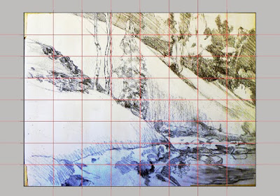
The largest I generally work is 60X60. This is too large to draw directly, as I can’t get far enough away to see the whole thing as I’m drawing. When I’m working this big, I always do a smaller sketch in oil or cartoon in graphite first. Then I scale it up. This prevents proportion distortion.
I have a projector, but I find that gridding is more accurate and takes less time.
I realize many artists are math-phobic, but there are times when an small bit of arithmetic can save  you a lot of work. I’ll try to make this painless.
The first step is to work out whether the aspect ratio of your sketch is the same as the canvas. This is the proportional relationship between height and width. If you’re cropping a value sketch, you want to be sure that the aspect ratio of your crop is the same as will be in the finished canvas.
Usually I grid in Photoshop because it’s faster and I can just delete the lines with a keystroke. But you can grid just as well with a pencil on your sketch.
Sometimes this is very obvious, such as a 9X12 sketch being the same aspect ratio as an 18X24 canvas. But sometimes, you’re starting with a peculiar little sketch drawn on the back of an envelope. You can use a trick you learned back in elementary school.
Remember learning that 1/2 was the same as 2/4? We want to force our sketch into a similar equivalent ratio with our canvas.
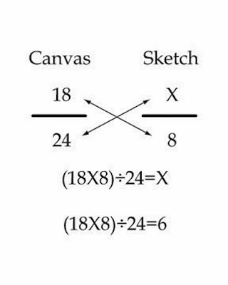
Let’s assume that you’ve cropped your sketch to be 8” across. You want to know how tall your crop should be to match your canvas.
Write out the ratios of height to width as above.
To make them equivalent, you cross-multiply the two fixed numbers, and divide by the other fixed number, as below:
Use your common sense here. If it doesn’t look like they should be equal, you probably made a mistake. And you can work from a known height as easily as from a known width; it doesn’t matter if the variable is on the top or the bottom, the principle is the same.
The next step is to grid both the canvas and sketch. You could spend a lot of time calculating the distances, but I prefer to just divide it in even amounts in each direction. I use a T-square and charcoal, and I’m not crazy about the lines being perfect; I adjust constantly as I go.
The last step is to transfer the little drawing, square by square to the larger canvas. I generally do this in a dark neutral of burnt sienna and ultramarine. It’s time-consuming, but with big paintings it saves a lot of work in the long run.

Monday Morning Art School: basic protocol for painting in watercolor

An efficient plan for fast plein air painting in watercolors.

Surf at Marshall Point, by Carol L. Douglas

Last week I gave you a basic primer for oil painting in the field. This week, I’ve done the same for watercolor.

1. Set up your paint box/palette with pigments arranged in a rainbow pattern.
You don’t need as many colors as you think you do. But be sure to replace a color when you run out, not when you think you’ll next need it.
2. Do a value drawing of the scene in question, in your sketchbook.
Identifying a value structure at the beginning is the single most important thing a watercolor artist can do to make a strong painting.

Blueberry Barrens, by Carol L. Douglas
3. Crop your drawing, and identify and strengthen big shapes and movements.
If you start by filling in a little box, you only allow yourself one way to look at the composition. Instead, draw what interests you first, and then contemplate how it might best be boxed into a painting.
A watercolor value study. I sometimes do this in oils as well, when I’m a little concerned about my composition.
4. Do a monochrome value study, using a combination of burnt sienna and ultramarine to make a dark neutral.
This is where you solidify your choices of lights and darks. It’s a ‘practice swing’ for the final painting. I took a watercolor workshop from the incomparable Poppy Balser a few years ago and was chuffed to see that she teaches the same thing.
5. Transfer contour drawing to watercolor paper.
The more thinking you’ve done about placement and composition before you start, the less likely you are to obliterate your light passages.
Glade, by Carol L. Douglas
6. Apply Initial Washes
Using a large brush, start with the sky and work down. Allow lighter washes to bleed across spaces for darker objects and let the sky bleed into the sea, if applicable.
7. Add darks and definition
Work down from medium to smaller brushes, remembering to leave some white space showing.
8. Paint the Cast Shadows
The cast shadows should be transparent and colorful, not gray. 

Monday Morning Art School—basic protocol for oil painting

An efficient plan for fast outdoor painting in oils.
Perkins Point, by Carol L. Douglas. All the paintings in this post were done for Castine Plein Air last week.

Often people ask me how we manage to get so many paintings done during an event. We avoid what my friend Brad Marshall called “flailing around.” That means those times when you seem to lose your way. We’ve all done it, when apparently everything we know falls out of our memory. I’ve written a simple protocol to avoid this. If you always work in this order, you’re less likely to flail around. Feel free to print this and tape it inside your paint box.

Glacial erratic, by Carol L. Douglas

1. Set up your palette with all colors out, organized in a rainbow pattern; may be done before going out.

Putting your pigments in the same spots each time speeds up your process. And putting out all of them when you start ensures that you develop the painting based on what you see, rather than on what’s at hand. Be sure to replace a color when you run out, not when you think you’ll next need it.

Lil’ Toot, by Carol L. Douglas
2. Value drawing of the scene in question, in your sketchbook.
If you do this on your canvas and then paint over it, you won’t have it to refer to when the light changes or you need to restate your darks. Keeping it in your notebook means it’s always accessible.
3. Crop your drawing, and identify and strengthen big shapes and movements.
If you start by filling in a little box, you only allow yourself one way to look at the composition. Instead, draw what interests you first, and then contemplate how it might best be boxed into a painting.
Tenney cottage, by Carol L. Douglas
4. Transfer drawing to canvas with paint as a monochromatic grisaille.
This allows you to draw with a brush and check your composition’s values.
5. Underpaint big shapes making sure value, chroma and hue are correct. Thin with odorless mineral spirits (OMS), turpentine, or whatever solvent you generally use.
This underlayer should be thin, but not soupy, so it can accept top layers without making mud. You don’t want added oil or medium in this layer as it can lead to cracking in the future. How much OMS? That varies by the day, but just enough that you can drag your brush without scumbling.

Sunrise, by Carol L. Douglas
6. Second layer: divide big shapes and develop details. A slightly thicker layer.
This is the body of your painting, without a lot of detail. Use almost no OMS, and no painting medium or linseed oil. It’s still too early for impasto. For some painters, this is combined with the last layer.
Water Street, by Carol L. Douglas
7. Third and last layer: use medium and more paint, adding highlights, detail and impasto.
This is the final layer, the one with painterly flourishes. Controlled use of medium here results in an even, bright, tough final surface.

Next week: a basic protocol for watercolor painting.

Monday Morning Art School: mixing greens

The rookie error for summer is to paint all foliage using the same basic color. You lose more points if it’s sap green.
Hazy mountain afternoon: Keuka Lake, by Carol L. Douglas. Available.
I have a student who reacts to my pulling out black paint by making the sounds of a rattlesnake at me. She’s been fully inculcated into the idea that black should be banned.
Michael Wilcox published a famous watercolor pigment guide called Blue and Yellow Don’t Make Green. Most of what it tells you can now be found on the internet, but it’s where I first got the idea to add back the banned black.
His point was that there are many routes to the same destination, and that to really mix colors, you need to understand what pigments you’re using, not work from trade names for colors. Consider sap green, for example—a staple of many plein air painters’ toolkit. It’s really a convenience mix made of a phthalo blue and some kind of yellow. The same is true of Hooker’s Green.
Chart courtesy of Victoria Brzustowicz
The single-pigment (‘true’) greens available are chromium oxide green, viridian, and cobalt green. Chromium oxide green is a lovely, heavy, natural green. Unfortunately, it outweighs everything it’s mixed with. Viridian and cobalt green are lovely, but expensive. Beware viridian hue—it’s just another phthalo in disguise.
By now, foliage has settled into a deeper, more uniform tone. The rookie error of August is to paint all your greens using the same basic color, modulating lighter or darker for highlights and shadows. You’ll have much more life in your trees if you know all the different ways you can get to leafy green. One of the most useful greens is black plus cadmium yellow lemon (or Hansa yellow).
Mixed greens, in oils.
The best way to navigate the colors of foliage is to avoid greens out of a tube altogether. A system of paired primaries gives you more options, avoiding the acidity of phthalo, the weight of chromium oxide green, or the soul-sucking darkness of sap green.
In my experience, bad paint mixing causes paintings to go wrong faster than anything else. Constantly over-daubing to modulate the paint color distorts the original drawing and makes a grey mush. If you’re confident of the color, you can apply it fast and accurately.
I make my greens on a matrix, which I’ve shown you both mixed (at top) and on a chart (below). I’m leaving for Castine Plein Air, but if I were teaching, I’d be drilling my students on green this week.
Swatches by Jennifer Johnson
First mix greens according to the chart, and then modulate your resulting greens with tints (meaning a mix of white and a color). The specific tints are unimportant, but the most useful one for landscape is a mix of white, ultramarine and quinacridone violet, making a pale lavender. It is great for atmospheric perspective.
Note that blue/black pigments are much stronger than the yellows. You need about half the amount of blue or black as you do yellow.
Your assignment is to hit paint swatches as closely as you can. 
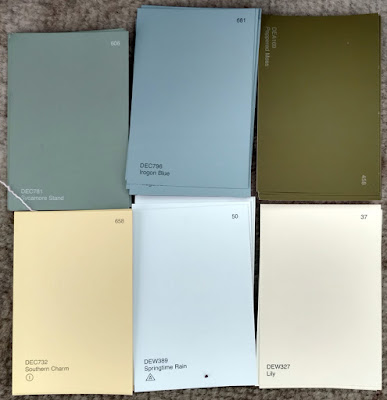
The second exercise involves stopping at your local hardware store for a few paint swatches. These are Benjamin Moore brand, but you should be able to find similar ones elsewhere. There are two off-whites: one cool and one warm. There’s yellow, green, and two soft blues. Your assignment is to mix until you think you’ve hit the exact color. Then put a dot of it on the card to see how close you got. (If you’re working in watercolor, the dot goes on paper instead.)
Jennifer’s neutral swatches, up close.
I also have my students make neutrals using combinations of ultramarine blue with burnt sienna and raw sienna. I use ultramarine blue and burnt sienna as my standard dark-neutral, because it can go to the warm or cool side depending on how it is mixed. Raw sienna plus ultramarine is my go-to starting point for granite and the sands of our northern beaches.

Monday Morning Art School: continuing education

We learn from studying our peers and the painters who’ve gone before us.
Victoria Street, oil on linen, 16×20, by Carol L. Douglas
Bruce McMillan emailed me last week. “Just in case you feel you’re painting a lot, in 1911, from early August to late September on Monhegan, Robert Henri painted 300 paintings, most of them on 12×15 wooden boards, his last major foray into marine art.”
I churned out fifteen largish canvases in thirteen days during my Parrsboro residency and wondered if I was sacrificing quality for quantity. But I’m familiar with Henri’s marine paintings; they’re simple, monumental and brilliant. Bruce’s reassurance came at exactly the right time.
Once we’re done with art classes, we learn mostly from observing other artists. When we see something that we admire, we want to incorporate the essence of that idea into our work. It’s not stealing; it’s how all art develops.
Miss Margaret, oil on canvasboard, 8×10, by Carol L. Douglas. Maggie was my roommate for two weeks.
Alison Hill is a painter I’ve known since before I moved to Maine. We were set up next to each other at Cape Elizabeth Paint for Preservation last month, so I had time to study her brushwork. She lays it down once and leaves it.
A writer told me recently, “you can rewrite that ending eight times and it won’t necessarily be better; you’ll just have eight different endings.” At least with the written word, they’re separate. In alla prima painting, those previous iterations lie there in the murk and muddy up the top layers.
I’d never heard of Tom Forrestall before this current trip. He’s sometimes called the Canadian Andrew Wyeth because of the precision of his egg tempera technique. But beneath that is a light, quirky vision. It’s magical realism unencumbered with social commentary. Can this kind of ruthless observation be learned? I won’t know until I try.
Clearing to the west, oil on canvas, 12×16, by Carol L. Douglas
Tara Will is a pastel painter from Maryland. She has never met a compositional rule she’s not willing to bend, break or pummel into submission. I look at everything she posts because her paintings are always colorful, light, and energetic. She keeps pastel lean and fresh.  
Marc Granboisis a plein air painter from Quebec. His snow and ice are tremendous, but his skies are what I’m interested in these days. He can pull moody, brooding, and dramatic out of a leaden northern sky. There’s tremendous energy in his linework and patterning.
Every artist needs to know art history to understand where he or she fits into the great saga of art. A number of Nova Scotians commented that my painting style looked very Tom Thomson or Group of Seven. That’s partially because they’re familiar to Canadians, but it’s also because I have studied them for many years.
Recent landslide (Cape Sharp), oil on linen, 18×24, by Carol L. Douglas. This painting is the only one that’s going to get a studio revision–in this case, a crop, I think. I removed something at the last minute and it unbalanced the composition. 
More recently, I’ve been thinking about the Scottish Colourists, particularly Francis Cadell. Both the Canadians and Scottish groups are post-impressionist, but they’re as interested in a sense of place as they are in formal order and structure.
Most of the painters I’ve mentioned are not superstars; they’re my fellows in the trenches. Who do you admire right now? What can you learn from their painting?

Your list will be different from mine, but thinking about what you like in your peers’ work gives you an idea of what you might want to change in your own. It’s a moving target. In a year, we’ll be talking about entirely different artists.

Monday Morning Art School: step out of your comfort zone

Risk-taking is not only good for art, it’s good practice for life.
Midsummer, by Carol L. Douglas. Oil on canvas, 24×36.

“I can’t remember what you told me you plan to concentrate on during this residency,” Bobbi Heath said.

That was because I had deftly avoided answering her question. A residency is a great time to set up a challenge and then answer it. The people vetting your application want to know how the opportunity is going to expand your vision or change your practice. We try to do something inventive yet considered. Of course, that sometimes means you’ve painted yourself into a corner before you’ve even started.
I’ve been thinking recently about architecture, and what gives us a sense of place, and, of course, boats. I’m sure I could have whipped up a grandiose statement with those ingredients, but my heart wasn’t in it.
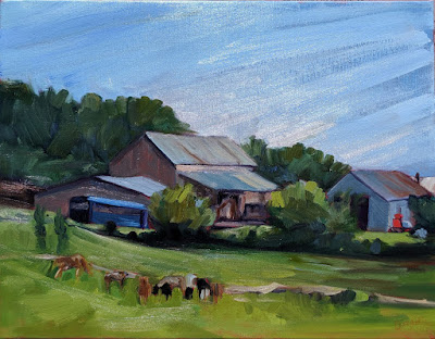
Farm, by Carol L. Douglas
Nova Scotia has a vernacular building style that’s peculiar to Canada and Britain. These are steep-roofed houses with twin gables. Sometimes they have matching window bays. They may be tarted up with gingerbread, or they may be very simple. They’re always proper, like a nice old lady in her best pantsuit. It’s not a common building style in most of the United States, but there are many examples in my part of Maine.
It was thinking about them that made me spend my first several days painting buildings from above. There is, in fact, something audacious about this kind of painting: it’s based on drawing.
“You must have taken mechanical drawing or drafting in school,” an artist said after she saw my sketch for Midsummer. Rather, I learned to draw when perspective and measurement were routine. If I could get students to do one thing, it would be to spend twice as much time drawing as they ever spend painting. But I digress.
As fun as painting houses has been, they’re still well within my skill set. It was time to radically mix it up.
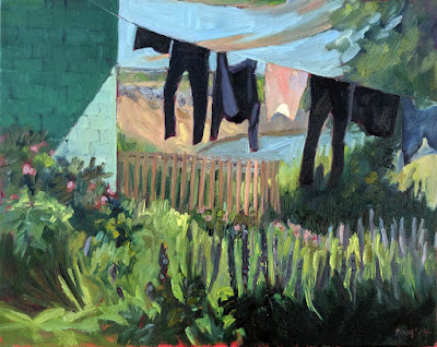
Her laundry and lupines, by Carol L. Douglas
I offered to demo in downtown Parrsboro. I painted the estuary two weeks ago and wasn’t keen on doing it again so soon. My other options were commercial buildings. Behind one was a laundry line. It was unfortunately surrounded by a scramble of wild roses and lupines. My least-favorite things to paint are flowers.
I drew the scene three times and realized I was getting nowhere with the scientific method. I started lashing paint on without a good underpainting, moving objects in mid-process, and doing all the things I tell students to never do. It took much longer than a well-drafted painting ever does.
Is it successful? It doesn’t really matter. It was a good way to force myself past my resistance to flowers, and to hang my painting on a tale. The laundry told a powerful story to me. It was a single woman’s working wardrobe, hanging outside a simple, concrete-block apartment. Everyone paints white sheets. I painted black leggings.
When I was done, I wanted to paint the exact same subject again, but this time I would approach it very differently. The beauty of a residency is that I can do that.
Why push yourself out of your comfort zone? It develops your tolerance for change. Human beings are wired to experience negative results more keenly than positive ones. It’s called our negativity bias, and it’s there to stop us from doing stupid things that will kill us.
This bias carries over to predicting outcomes. We tend to think things will go wrong more than they’ll go right. The fewer risks we take, the stronger that belief is. We can become immobilized by the fear of change.
There are a few ways around this, of course. Personally, I believe that an interactive God has my back. You can call that a positivity bias, if you want.
Repeatedly taking controlled risks is in itself therapeutic. It reduces our negativity bias. Our brains learn that risky ventures can succeed, and that failing is not necessarily awful.
That is not only good for art, it’s good practice for life. This week, challenge yourself.