fbpx

Monday Morning Art School: drawing the human hand

Hands are worth mastering because they speak about our experiences and character.

Study of a Woman’s Hands, 1490, charcoal and silverpoint, Leonardo da Vinci, courtesy Royal Collection, London

I wish I’d had the opportunity to study with one of the comic book greats like Jack Kirby or Steve Ditko. They had a gift for compressing human expression into explosive images. That’s especially true of their hands.

I look at my own hands every day. When I’m writing this blog and when I’m painting, they’re always in the periphery of my vision. The trained observer could read some of my history from my nails and calluses. Beyond that, our hands move expressively. The carpenter has power in his grip; the musician has grace.

Hands can be difficult to draw due to their complexity. However, it’s easy enough to get reference for your drawings. You’ve always got a spare hand hanging around. When I’m drawing in church, my right hand is often my model. Or, if you want to draw a two-handed or more complex pose, hire a model or take a reference photo. Hands shift shape as they move through their range. It’s difficult to get that right without photo reference.

Praying Hands, detail study for the Heller Altarpiece, 1508, India ink and wash, Albrecht Dürer, courtesy Albertina.

Start by understanding the bone structure. There are 27 fixed bones in the hands (plus an indeterminate number of sesamoid bones). A rookie error in drawing is to treat the thumb as if it sticks sideways out of the hand; instead, it sprouts from that nest of bones at the wrist called the carpals. The fingers don’t stick straight forward, either; instead, they’re arrayed like a bouquet of flowers. All movement in the hands starts at the wrist, not the fingers.

Our thumb is our most mobile digit, because its metacarpophalangeal joint isn’t locked down. Pay attention to that joint; it’s important in drawing. In our fingers, that joint is tied to its mates. Our little fingers and index fingers have some sideways mobility, but the poor suckers in the middle are pretty well stuck. However, our hands are designed to move in coordinated arches, which is why we can grip so strongly and accurately.

Metacarpophalangial joints, courtesy Wikipedia.

There are age- and sex-specific differences in hands. Older people develop arthritic bone spurs and knobbiness and lose the fatty deposits on the back of the hands. That means we can see their bones and blood vessels more clearly. The length ratio between the index and ring fingers are often different between men and women. Men tend to have less body fat, so their blood vessels in the hands are visible from a younger age.

Mark out the positions of each knuckle. The metacarpophalangeal joints (our first knuckles) form the major hinge of our hands. While they move in concert, they’re not always on the same plane, so mark their positions as circles. Do the same for the second and third knuckles. At this point, your drawing should look like a loose mishmash of circles. From there, limn out the shapes of the fingers in terms of simple geometry. The palm is a trapezoid, and the fingers are flattened rectangular or rounded shapes. The heel of your hand has volume, especially the plump part at the base of your thumb.

Study of hands, 1955, pencil, Andrew Wyeth, courtesy Swann Auction Galleries

Fingers aren’t flat. They’re more box-like than round, and they can be quite individual in their shape. But you must think of them as having volume and size, or you can’t visualize how they’re changing in perspective.

The last tricky thing you have to deal with are the fingernails. They’re curved, and mostly visible by the deep shadow they cast on their edges. Don’t make too big a deal of them or they’ll overwhelm your drawing.

Once you have the fundamental shapes and landmarks in place, drawing the lights and shadows is easy. The blocking on the knuckles makes the delicate shadows around them visible.

Monday Morning Art School: The Canon of Human Proportions

Vitruvian Man, c. 1492, by Leonardo da Vinci.

Throughout history, artists have subjected the human figure to canons of proportion. That means they’ve overridden what they see, in favor of what they think is beautiful or graceful. In fact, in some cultures (classical India, for example), drawing from life was not considered an advantage. And until the age of photography, subjects like squirming infants were difficult to draw.

Every flourishing culture has developed its own canon of proportion. The best known examples are the art of ancient Egyptand classical Greece, both of which had rigid standards of what was true and beautiful.

Vitruvian Man, illustration in the edition of De Architectura by Vitruvius; illustrated edition by Cesare Cesariano, Como, Gottardus da Ponte, 1521

Marcus Vitruvius Pollio was a Roman architect and civil engineer whose ten-volume de Architectura profoundly influenced Roman building. He believed that beauty derived from nature, with universal laws of proportion and symmetry. He carefully measured the human (male) body, thinking it a model of natural proportional perfection. He demonstrated that the ‘ideal’ human body fitted into both a circle and a square, which illustrated the link between perfect geometry and the perfect body.

Leonardo da Vinci drew Vitruvian Man as a sort of rebuttal to this, since he knew there was no way the circle and square could have the same midpoint on the human form. He used his own measurements and idealized them into a system that’s written across his drawing.

His is, at least to modern eyes, a more beautiful scheme; compare it to an illustration from the 1521 version of de Architectura, which bears an uncomfortable resemblance to a crucified man.

The human measurements I learned as a child in mid-century America.

Fast forward to our own times and our own canon. We’re taught that the human form is between 7.5 and 8.5 heads tall. As a child, I learned that the midpoint of the body is the hipbone, that the line from top of head to chin equals the line from chin to nipple line, from nipple line to natural waist, from natural waist to hips, and then an equal distance from there to the feet.

This of course is the measurement of a long-limbed person. A stockier person will have a bigger head, and the measurement will be more like 7 figures tall.

Tableau Vivant by German actress Olga Desmond, c. 1908. I’ve taken the liberty of adding the hashmarks to demonstrate how variable those proportions are.

Of course, what is considered beautiful changes with the generations. Consider the figure of Olga Desmond, a German dancer who performed nude at the turn of the last century. Even making allowances for her head being tipped down, she is significantly large-headed and short-waisted compared to the ideal of the 20th century. Her legs are three head-units long, rather than four.

Idealized proportions are a useful guide, especially when you’re drawing people from imagination. I probably sketched them a few hundred times as a kid, before I had access to models. They’re also useful for checking your work. If your drawing seems way out of proportion, check it against this standard.

But relying on memorized proportions will lead to lazy, generalized, generic drawings. It’s far better to measure carefully.

This is especially true in our polyglot American culture. A society that idolizes both Emily Ratajkowski and Lil’ Kim has no rigid standards of beauty, and that’s a great thing. The only generalization you can make about Americans is that we’re, by and large, well-fed.

Reserve your spot now for a workshop in 2025:

Monday Morning Art School: how to draw an angel

Angels are devilishly difficult to draw, even though we all ‘know’ what they look like.
Choir of angels from the Ghent Altarpiece, early 15th century, by Jan van Eyck, courtesy Sint-Baafskathedraal, Ghent
The Bible is notorious for its lack of description when it comes to celestial beings. The Archangel Michael appears to Daniel and all the prophet can say is that Michael looked like a man. The angelic form also differs depending on context. Mostly, though, angels are spirit beings. You, the artist, have a lot of latitude in drawing them.
Still, we all ‘know’ what angels look like: they are infinitely sweet, sing in choirs, have wings and ringlets and wear white robes.
Wing of a European Roller, watercolor on vellum, 1510-12, Albrecht Dürer, courtesy of the AlbertinaVienna
The gap between the Biblical text and tradition has bedeviled artists through history. For example, who says that angels have to have bird wings? I’m not the first person to note this. Jan van Eyck gave the Archangel Gabriel fabulously iridescent wings in the Ghent Altarpiece, just like a bug. William Blake, that old curmudgeon, gave the angel of Revelation no wings at all.
Albrecht Dürer painted a dead European (blue) roller twice, meticulously observing its plumage and structure. His research paid off: his angels never suffer from static, limp wings.
Dead bluebird, watercolor on vellum, 1510-12, Albrecht /Dürer, courtesy of the Albertina, Vienna
If you try this at home, a turkey or chicken won’t do. The modern grocery store versions have had the flight bred out of them. A bird’s shoulders—or scapula—are actually part of its wings. In the wild, they’re strong and muscular. After all, most birdlife revolves around flight. If angels are to fly, their wings must be part of their structure, not just pinned on as in a Christmas play.
The Expulsion from Paradise, 1510, woodcut, Albrecht Dürer. He’d studied wings enough to know how the different coverts, or sets of feathers, move.
Human shoulders are adapted for operating our arms and hands. Winged angels must have two sets of scapula and the muscles to operate both. That’s hard to imply in a painting, but the best ones have the wings operating in parallel with the shoulders.
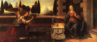
For most of art history, angels were depicted wearing the luxurious robes of the high princes of their day. The Renaissance artist often didn’t give a lot of consideration to tailoring wing-sleeves into these gowns. Sometimes they look as if the wings are sprouting from the drapery.  Leonardo da Vinci (as usual) had an ingenious solution in his Annunciation. The archangel Gabriel wears feathers around the base of his wing that echo the poufs of his sleeve. Tres chic!
The Annunciation, 1474, Leonardo da Vinci, courtesy the Uffizi Gallery
Angels were depicted in togas—the garb of ancient, pagan Rome—in the fifth century mosaic cycle of the Basilica di Santa Maria Maggiore in Rome. I particularly like the contrast with the hipsters in their modern dress at the bottom.
Angels in togas from the Basilica di Santa Maria Maggiore, Rome.
If you extend that to modern life, you’ll dress your angels in jeans and a t-shirt. These, however, can be unsatisfying to draw. Here is a quick lesson on drapery if you want to be traditional.
Halos were used in the iconography of many ancient people, including the Romans. Halos were adopted by early Christian artists to indicate that here was something worthy of veneration. The new naturalism of the Renaissance pretty much did away with them. If you want to add one to your angel, make sure you get your ellipse right by following the instructions here.
Song of the Angels, 1881, by William-Adolphe Bouguereau, courtesy of the Getty Center.
By the time William-Adolphe Bouguereau painted Song of the Angels in 1881, angels had been sanitized and softened, undergoing a gender transition in the process.
Historically, angels were depicted as male and terrifying. However, the paucity of description in Scripture allowed artists wide latitude. With the Enlightenment, angels became less frightening. This is when they began to transition into females in popular culture. (A classic case of a profession letting women in after its power has diminished.)
Worse, they started showing up as infants, in the form of putti.
Eastern Orthodox icon of a tetramorph cherub, depicting four essences in one being. Is there anything cute about this? 
Putti were originally meant to symbolize the profane passions of the pagan Romans. That’s why Cupid is frequently depicted as a winged boy. In the Baroque period, however, putti came to represent the omnipresence of God. Weirder, they became conflated with the Biblical cherubim. How cherubim—the fierce, serious beings that guarded the Garden of Eden—became fat little boys is one of the enduring mysteries of art.
This post first appeared last Christmas. I solemnly promise that my vacation ends after the new year, and I’ll be back with more art instruction, art history, and art criticism. Happy New Year, one and all!

Symbol and subconscious

Leonardo da Vinci painted two Madonnas set in caves. Why?

Madonna of the Rocks, Leonardo da Vinci, c. 1483-86, courtesy of the Louvre.

We moderns are very good at seeing subconscious imagery in everything. In contrast, our ancestors communicated with universally-understood symbols. These represented an idea, a person, or even a relationship. Earlier this week, I came across a quotation from Leonardo da Vinci’snotebook, in which the distinction between symbol and subconscious gets a little fuzzy:

 “Having wandered some distance among gloomy rocks, I came to the mouth of a great cavern, in front of which I stood some time, astonished,” he recalled. “Bending back and forth, I tried to see whether I could discover anything inside, but the darkness within prevented that. Suddenly there arose in me two contrary emotions, fear and desire—fear of the threatening dark cave, desire to see whether there were any marvelous thing within.”
Madonna of the Rocks, c. 1503-06, Leonardo da Vinci, courtesy National Gallery
Leonardo painted two versions of The Madonna of the Rocks, twenty years apart. These are based on a legend of the time. The Holy Family, on the flight to Egypt, encounters a toddler John the Baptist, who then worships (adores) his savior cousin.
Artists before and after Leonardo regularly placed nativities in caves. This made historical sense, as Jesus’ birthplace was assumed to be the grotto under the Church of the Nativity in Bethlehem. (Natural caves were used as homes and barns in Bible-era Israel.)

Leonardo also painted St. Jerome in a cave, but everyone did that. Jerome translated his Bible into Latin in the cave where Jesus was born.

St Jerome, c. 1480, unfinished, Leonardo da Vinci, courtesy the Vatican
But Leonardo stepped out into new territory when he painted his adoration scene. What did he mean by painting what is essentially an idyll framed by something he found terrifying?
Back to his own narrative. Desire won out over fear, and Leonardo entered the cave. He found a great, fossilized whale. “O mighty and once living instrument of formative nature. Incapable of availing thyself of thy vast strength thou hast to abandon a life of stillness and to obey the law which God and time gave to procreative nature…
“You lashed with swift, branching fins and forked tail, creating in the sea sudden tempests that buffeted and submerged ships. Now destroyed by time thou liest patiently in this confined space with bones stripped and bare; serving as a support and prop for the superimposed mountain.”
Madonna of the Carnation, 1478, Leonardo da Vinci, courtesy Alte Pinakothek. Isn’t this just a more stylized version of the same traps and dark passages as in the cave paintings?
There are those who assume his maudlin meanderings are metaphorical, a sort of picture of what lies before us all. But Leonardo was more an earnest student of nature than a poet, and whale fossils are indeed found in Tuscany. Real or imagined, he read a lot into the experience.
Apocalyptic scenes from da Vinci’s notebooks, c. 1517-18, Royal Collection Trust
Leonardo went on to describe the end of existence as we know it. “The rivers will be deprived of their waters, the earth will no longer put forth her greenery; the fields will no more be decked with waving corn; all the animals, finding no fresh grass for pasture, will die. In this way the fertile and fruitful earth will be forced to end with the element of fire; and then its surface will be left burnt up to cinder and this will be the end of all earthly nature.” He went on to illustrate these dark, apocalyptic scenes.
Biographer Walter Isaacson described these pages as a sort of existential crisis. That’s a very modern mindset. I’d first be inclined to look for religious imagery—leviathan, Jonah and the whale, Resurrection, Revelation. Was he was setting the Adoration of the Christ Child against his own deepest fears, or those of the culture in which he lived?

Monday Morning Art School: how to draw an angel

Angels are devilishly difficult to draw, even though we all ‘know’ what they look like.
Choir of Angels from the Ghent Altarpiece, early 15th century, by Jan van Eyck, courtesy Sint-Baafskathedraal. Ghent

The Bible is notorious for its lack of description when it comes to celestial beings. The Archangel Michael appears to Daniel and all the prophet can say is that Michael looked like a man. The angelic form also differs depending on context. Mostly, though, angels are spirit beings. You, the artist, have a lot of latitude in drawing them.

Still, we all ‘know’ what angels look like: they are infinitely sweet, sing in choirs, have wings and ringlets and wear white robes.
The gap between the Biblical text and tradition has bedeviled artists through history. For example, who says that angels have to have bird wings? I’m not the first person to note this. Jan van Eyck gave the Archangel Gabriel fabulously iridescent wings in the Ghent Altarpiece, just like a bug. William Blake, that old curmudgeon, gave the angel of Revelation no wings at all.
Wing of a European Roller, watercolor on vellum, 1510-12, Albrecht Dürer, courtesy of the AlbertinaVienna
Albrecht Dürer painted a dead European (blue) roller twice, meticulously observing its plumage and structure. His research paid off: his angels never suffer from static, limp wings.
Dead bluebird, watercolor on vellum, 1510-12, Albrecht /Dürer, courtesy of the Albertina, Vienna
If you try this at home, a Christmas turkey won’t do. They’ve had the flight bred out of them. A bird’s shoulders—or scapula—are actually part of its wings. In the wild, they’re strong and muscular. After all, most birdlife revolves around flight. If angels are to fly, their wings must be part of their structure, not just pinned on as in a Christmas play.
The Expulsion From Paradise, 1510, woodcut, Albrecht Dürer. He’d studied wings enough to know how the different coverts, or sets of feathers, move.
Human shoulders are adapted for operating our arms and hands. Winged angels must have two sets of scapula and the muscles to operate both. That’s hard to imply in a painting, but the best ones have the wings operating in parallel with the shoulders.
The Annunciation, 1474, Leonardo da Vinci, courtesy the Uffizi Gallery
For most of art history, angels were depicted wearing the luxurious robes of the high princes of their day. The Renaissance artist often didn’t give a lot of consideration to tailoring wing-sleeves into these gowns. Sometimes they look as if the wings are sprouting from the drapery.  Leonardo da Vinci (as usual) had an ingenious solution in his Annunciation. The archangel Gabriel wears feathers around the base of his wing that echo the poufs of his sleeve. Tres chic!
Angels in togas from the Basilica di Santa Maria Maggiore, Rome.
Angels were depicted in togas—the garb of ancient, pagan Rome—in the fifth century mosaic cycle of the Basilica di Santa Maria Maggiorein Rome. I particularly like the contrast with the hipsters in their modern dress at the bottom.
If you extend that to modern life, you’ll dress your angels in jeans and a t-shirt. These, however, can be unsatisfying to draw. Here is a quick lesson on drapery if you want to be traditional.
Halos were used in the iconography of many ancient people, including the Romans. Halos were adopted by early Christian artists to indicate that here was something worthy of veneration. The new naturalism of the Renaissance pretty much did away with them. If you want to add one to your angel, make sure you get your ellipse right by following the instructions here.
Song of the Angels, 1881, by William-Adolphe Bouguereau, courtesy of the Getty Center.
By the time William-Adolphe Bouguereau painted Song of the Angelsin 1881, angels had been sanitized and softened, undergoing a gender transition in the process.
Historically, angels were depicted as male and terrifying. However, the paucity of description in Scripture allowed artists wide latitude. With the Enlightenment, angels became less frightening. This is when they began to transition into females in popular culture. (A classic case of a profession letting women in after its power has diminished.)
Eastern Orthodox icon of a tetramorph cherub, depicting four essences in one being. Is there anything cute about this? 
Worse, they started showing up as infants, in the form of putti.
Putti were originally meant to symbolize the profane passions of the pagan Romans. That’s why Cupid is frequently depicted as a winged boy. In the Baroque period, however, putti came to represent the omnipresence of God. Weirder, they became conflated with the Biblical cherubim. How cherubim—the fierce, serious beings that guarded the Garden of Eden—became fat little boys is one of the enduring mysteries of art.
May you have a blessed Christmas and great peace today, tomorrow and in the year to come.

Jesus travels to the heart of Islam (by way of Christie’s)

Can a painting preach peace? I certainly hope so.

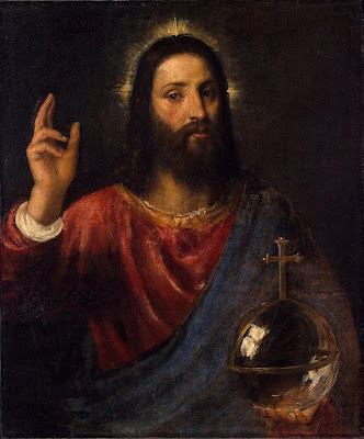
Salvator Mundi, Leonardo da Vinci, c. 1500, Louvre Abu Dhabi

“Who do people say that I am?” Jesus asked his disciples. Ask a Muslim that, and you’ll get a markedly different answer than from a Christian. Muslims believe that Jesus was a prophet who was given injil (the gospel) to convey to all people. This gospel confirms what was taught in the Torah and foretells the coming of Prophet Muhammad. Jesus will come back on the Day of Judgment, when he will destroy the ad-dajjal (Antichrist). However important Christ is as a prophet, teacher, servant and follower of the Word, Muslims do not believe that he was either divine or the son of God.

While we ‘know’ that Islam prohibits painting human figures, that is not strictly true. The painting of miniatures was raised to a high art during the SafavidMughal and Ottoman empires. The miniature was private, kept in a book or album and never displayed. That made it acceptable.
Paintings of Muhammed are contentious, rare and generally old. By the 16th century, the prophet was being represented as an abstraction or a calligraphic image to avoid idolatry. In Islam, the most absolute proscription is of graven images of God, followed by Muhammed, the Islamic prophets (of which Jesus is one) and the relatives of Muhammed. However, all painting of animals and humans is discouraged.
Muhammad leads Abraham, Moses, Jesus and others in prayer, Persian miniature, artist unknown, from The Middle Ages. An Illustrated History by Barbara Hanawalt (Oxford University Press, 1998). The aureoles of flame are loan-symbols from Buddhism and equivalent to western halos.
As with so many other issues, the modern Muslim world is split on the subject. Most Sunni Muslims believe that all visual depictions of all the prophets of Islam should be prohibited. Shia Islam, however, has loosened up their stance on graven images.
The House of Saud (the Royal Family) of Saudi Arabia are not just Sunni, but have long been associated with the Salafi movement, or Wahhabism, which we in the west would describe as ‘ultraconservative’ or ‘puritanical.’
In November, Salvator Mundi by Leonardo da Vinci sold at auction at Christie’s New York for $450 million. The purchaser was identified as Saudi Arabian prince Bader bin Abdullah. In December 2017, the Wall Street Journal reported that Prince Bader was in fact an intermediary for Crown Prince Mohammed bin Salman, the true buyer. Christie’s subsequently stated that Prince Bader acted on behalf of Abu Dhabi’s Department of Culture and Tourism, which will display the work at the Louvre Abu Dhabi. The United Arab Emirates (UAE) is also a Sunni Muslim country, and a key Saudi ally.
Salvator Mundi, Titian, 1570, Hermitage Museum. This shows the orb as a globus cruciger, surmounted by a cross and thus more explicitly stating Christ’s dominion over the orb of the world.
The Saudi purchase came on the heels of an extensive purge of influential national figures at the bequest of the crown prince. Bader bin Abdullah is reportedly his close friend and confidant.
The Saudi crown prince is—at least at this phase—a reformer. He has been given credit for the end of the ban on women drivers. In October, he said a return of “moderate Islam” was key to his plans to modernize the kingdom. Those plans include diversifying the Saudi economy so it’s not completely oil-driven.
The neighboring UAE have been Muslim for a long, long time. Their conversion is traced to a letter sent by Muhammad to the rulers of Oman in 630 AD, nine years after the Hegira. This led to a group of coastal princes travelling to Medina, converting to Islam and subsequently throwing off Sassanid rule.
Roman coin, c. 270-275 A.D. showing the Emperor Aurelian receiving the globe from Jupiter.
So where does a 500-year-old oil painting fit into this? Its provenance is far from settled, and it was a mess, with lots of overpainting, before its final restoration. Still, as with all artwork, it has the power to speak.
Salvator Mundimeans “Savior of the World.” Jesus’ right hand is raised in blessing and his left hand holds a crystal globe, meant to represent the earth. That’s a symbol that’s been used since antiquity, for both spiritual and temporal rulers. The Roman Empire knew it as the plain round globe held by Jupiter, representing the dominion held by the emperor. It was borrowed in later art as a symbol of Jesus’ dominion over the earth.
Not only is Salvator Mundi an icon, it’s an icon that flatly contradicts Muslim theology.
What was the prince’s motivation in buying the painting? What does it mean that such an image has been acquired on behalf of the people of the United Arab Emirates? I can’t say, but I can read something hopeful and instructive in the journey. A child could.

Consider the source.

Canaletto did not use a camera obscura. People repeat that because they’re uncomfortable with the fact that they can’t draw.
Westminster Abbey with a procession of Knights of the Bath, 1749, Canaletto
It has long been held that Canaletto achieved the amazing accuracy in his vedute through the use of the camera obscura. This is not a modern thesis, although it is widely repeated as fact. It came down to us from Canaletto’s earliest biography, written in 1771, but it’s convenient for our modern sensibilities. After all, Canaletto’s landscapes are so perfect, they could not have been rendered from life—could they?
The Royal Collection Trust has released a report that seems to prove, conclusively, that this theory is wrong. While infrared technology is often used to examine what’s under the surface in oil paintings, it’s not commonly used on drawings. The Trust applied this technique to their collection of Canaletto’s works on paper. This is significant; they own a third of known Canaletto drawings.
They discovered the ruler edges, pencil markings and other traces of the drawing process under the finished surfaces. It was enough for the curators to state “categorically” that the stories of Canaletto’s use of the camera obscura were mythical.
Architectural Capriccio, drawing, Canaletto. “Capriccio” means it’s a fantasy landscape.
There is nothing inherently wrong with the camera obscura or any other mechanical aid to drawing. Nor was David Hockney revolutionizing the art world when he proposed that our ancestors used it. Leonardo da Vincidescribed its workings in 1502, and a similar pinhole drawing device was illustrated in Albrecht Dürer’s Four Books on Measurement. For Canaletto, born simultaneously with the Age of Reason, the temptation to try the camera obscura would have been overwhelming. But he would have quit for the same reason many mature artists stop working directly from photos:
The results are boring.
The Stonemason’s Yard, 1726–29, is considered Canaletto’s early masterpiece.
What is seen by the human eye, with its pronounced center pole, is so much more interesting than the flattened line of ‘real’ optics. That is why our photographs so often disappoint us, and why photography really is a lot more complicated that simply pointing a camera and firing away.
The popularity of the Hockney thesis lies in an uncomfortable fact: by and large, moderns don’t draw well. We haven’t put in the hours with ruler, pencil and paper. We rely on viewfinders, photographs, and other devices for our underpaintings. Rather than face up to that deficiency, it’s easier to imagine that drawing is impossible.
Of course, it’s not, and nobody can really paint until they master the elements of drawing. Too often, modern landscape painting is about fragment and impression. Is that because fragments are so interesting, or because we’ve given up on drawing?

The Greatest Painter Who Never Lived

The Facts of Life, Norman Rockwell

It’s a sad fact that in the United States one can defame the reputation of a dead person with impunity and his or her loved ones and heirs can do nothing to stop it. Such is the case with Deborah Solomon’s American Mirror: the Life and Art of Norman Rockwell, which characterizes Rockwell as a complex, depressed, repressed gay man whose repression led to pedophiliac urges expressed in his paintings.

A Scout is Helpful, 1941, Norman Rockwell
A nice person—one not looking for duplicity everywhere—would agree with Rockwell’s granddaughter’s assessment: “My grandfather was a charming, kind, generous man; his models, without exception, say that posing for him was one of the highlights of their lives. He had a marvelous sense of humor, was a remarkable observer of people and human behavior…” 
Rockwell was a fantastically successful illustrator because his ear was perfectly tuned to the 20th century zeitgeist, which celebrated work, home, family and children. Of course, Deborah Solomon is in perfect tune with the zeitgeist of our times, which holds that there is nothing good in this world. Nor is there any privacy, apparently. 
The Babysitter, 1927, Norman Rockwell
Abigail Rockwell has done an excellent job of debunking Solomon’s sources, but she gets little traction in modern media, because she—unfortunately—is working at cross-purposes to our modern world. We like knowing that others are ‘no better than they should be.’
Rosie the Riveter, 1943, by Norman Rockwell. Of this iconic painting, Solomon said, “You know who else is masturbating? Rosie the Riveter. Women to him [Rockwell] were sexual demons. Over here, the riveting-gun penis on her lap, and in the background these pulsating red waves. Even though she’s a worker she’s not working, she’s just eating and satisfying her desires.”
But why is it being gay is so frequently the ‘secret sin’ of which artists are accused? (For a start, see Caravaggio, Michelangelo, and Leonardo Da Vinci; never mind that their culture cannot be transcribed literally into our culture.) And why did a publisher like Farrar, Straus and Giroux publish an outrageous, unsubstantiated claim of a putative link between homosexuality and pedophilia? If that had come from the Right, the howling would have been deafening.

Let me know if you’re interested in painting with me on the Schoodic Peninsula in beautiful Acadia National Park in 2015 or Rochester at any time. Click here for more information on my Maine workshops! Download a brochure here. 
Nothing new under the sun

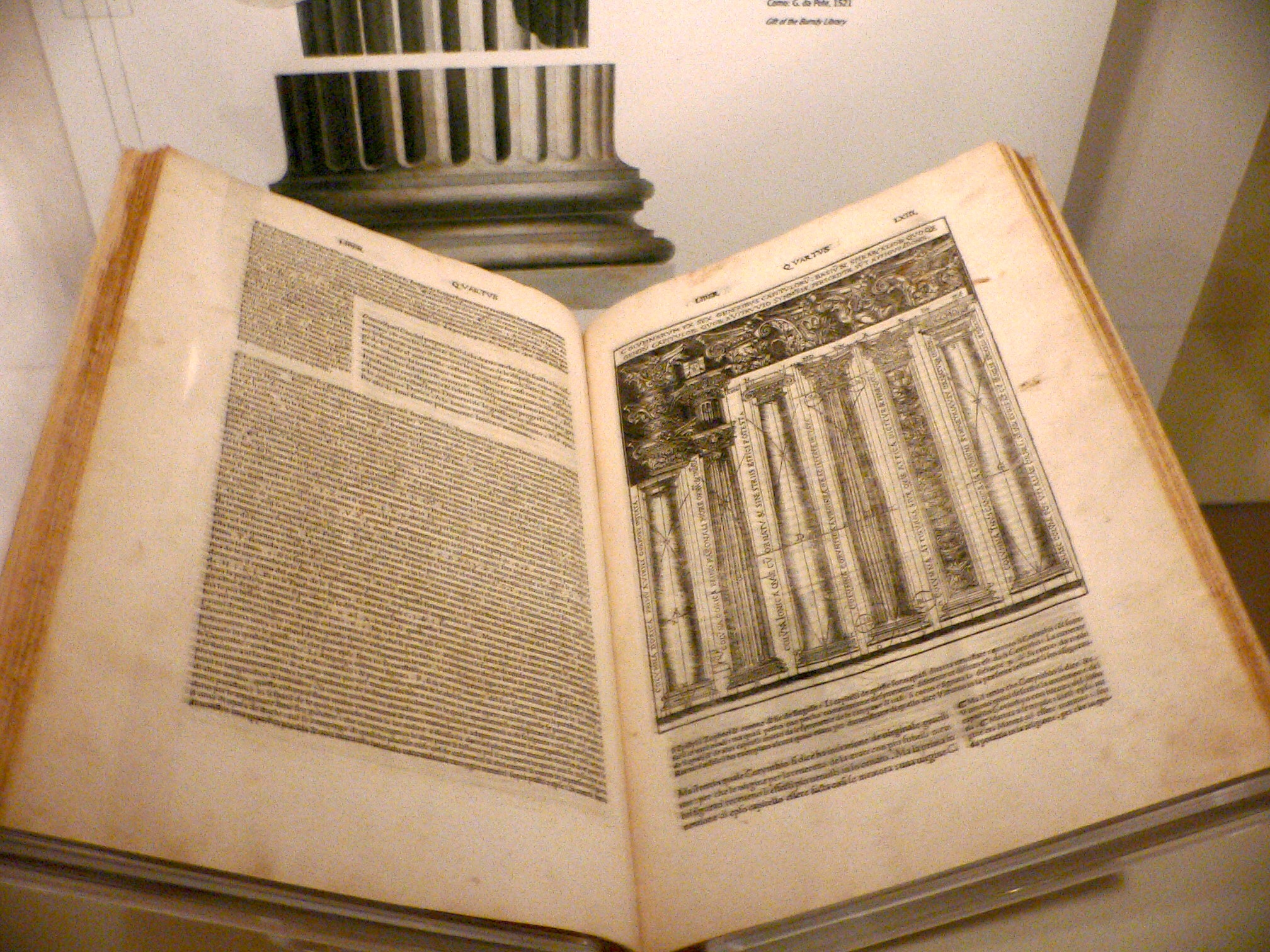
Leonardo da Vinci’s Vitruvian Man was based on book III of De Architectura. Vitruvius said the human figure was the principal source of proportion for the classical orders of architecture.
The art of hydraulic cement was lost after the fall of the Roman Empire and not rediscovered until 1756, but if people had just read their Vitruvius, the recipes were in there all along.

Sandy Quang (who is writing her Master’s thesis) prefers her Vitruvius aloud so I’ve listened to quite a bit of his De architectura in recent months. He’s such a lucid writer that I have no trouble following it while driving. What’s amazing is how much of what he describes hasn’t changed in almost 2100 years.

1521 edition of De architectura, translated and illustrated by Cesare Cesariano
Very little is known about Vitruvius’ life. He was born about 80–70 BC and died sometime after 15 BC. He was some kind of praefect, but whether that was in the army or civilian life is not clear. He was mentioned by Pliny the Elder and Frontinus, but even his cognomen (surname) and first names are uncertain.
What an amazing mind Vitruvius had! He not only wrote; he practiced his craft. As an army engineer he specialized in the construction of ballista and artillery. He described the building methods of foreign tribes throughout the Roman Empire, from which it can be inferred that his service was broad. And somehow, he had the time to write this ten-volume treatise on architecture, which is the only surviving classical text on the subject.

Triumph of Neptune standing on a chariot pulled by two ichthyocentaurs, Barthos and Aphrosthird century AD. It was built as per Vitruvius’ instructions, and if you were inclined to make one today, you’d use essentially the same technique. (The fundamental absurdity of ichthyocentaurs is not an architecture question, so Vitruvius would have had no advice about whether or not to include them.)
Ancient Roman architects had a broader remit than our modern equivalents, being responsible for engineering, urban planning, materials, HVAC, acoustics, plumbing, and a whole host of other sub-specialties. De Architectura attempts to break down this massive field and describe it in simple, comprehensible terms.
Sandy has read to me from the books on materials and pavements and decorative plasterwork (which relate to her particular interest in Roman mosaics). Having done my share of construction and plastering, I’m pretty familiar with how we use those materials today. Other than adjustments for climate, it’s shocking how little has changed.
An ancient Roman concrete vault in Rome, from the Basilica of Maxentius and Constantine, c. 312 AD. Can we possibly improve on concrete structures that lasted two millennia?
We don’t seem to produce such brilliant generalists in the modern era. I wonder why that is? You can read De architectura here.
Let me know if you’re interested in painting with me in Maine in 2014 or Rochester at any time. Click here for more information on my Maine workshops!

The genius isn’t inside the camera

An artist drawing a seated man onto a plane of glass through a sight-vane, from the fourth book of Albrecht Dürer’s Four Books on Measurement.
Last month, a number of people sent me Vanity Fair’s pieceon engineer Tim Jenison’s painstakingly-complex recreation of Johannes Vermeer’s The Music Lesson. Jenison faithfully built the room and objects depicted in the painting, and then repainted the scene using a version of a camera obscura. In the end, he discovered what any freshman art history student could have told him: yes, it’s possible that Vermeer used a camera obscura. He’d have hardly been alone.
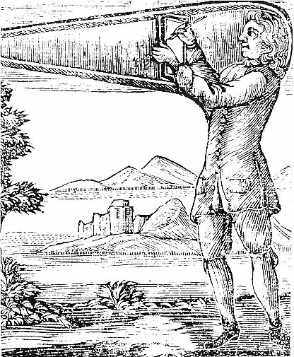
Sir Robert Hooke’s portable drawing machine should be familiar (in concept) to any of my plein air painting students. There is nothing new under the sun.
The peculiar properties of the pinhole camera were known and described in antiquity from Greece to China. In the west, the principles behind it were analyzed and described by the eleventh century Arab scientist, Ibn al-Haytham. In the 13th century, Roger Bacon described the use of a camera obscura to watch solar eclipses. Leonardo da Vinci puttered with one, and even came up with a proto-telescope based on it:
…in order to observe the nature of the planets, open the roof and bring the image of a single planet onto the base of a concave mirror. The image of the planet reflected by the base will show the surface of the planet much magnified.
Above, A man drawing a can, and below, A man drawing a recumbent woman, in foreshortening through a frame with a network of squares on to a paper also with squares, in order to be able to reduce or enlarge proportionally, both from the fourth book of Albrecht Dürer’s Four Books on Measurement.
Filippo Brunelleschi (1377-1446), sculptor, architect, artist and engineer, is generally (and perhaps falsely) credited with the invention of linear perspective in art. He also created a device to demonstrate that perspective, which we call Brunelleschi’s peepshow, but which is in fact a version of a camera obscura:
“[He] had made a hole in the panel on which there was this painting; … which hole was as small as a lentil on the painting side of the panel, and on the back it opened pyramidally, like a woman’s straw hat, to the size of a ducat or a little more. And he wished the eye to be placed at the back, where it was large, by whoever had it to see, with the one hand bringing it close to the eye, and with the other holding a mirror opposite, so that there the painting came to be reflected back; … which on being seen, … it seemed as if the real thing was seen: I have had the painting in my hand and have seen it many times in these days, so I can give testimony. (Antonio di Tuccio Manetti)
A Man Drawing a Lute, from the fourth book of Albrecht Dürer’s Four Books on Measurement. 
Albrecht Dürer was not a visionary in the manner of Leonardo, but he was peerless in investigating and recording his experiments. Several woodcuts of drawing aids come down to us from him, so we know he used them. Nevertheless, using a camera obscurawas not the only thing he could do; the man could draw brilliantly. Very few living artists today could duplicate his Young Hare or Large Piece of Turf, neither of which relied on optical tools.
Courtyard of the Former Castle in Innsbruck without Clouds, 1494, Albrecht Durer. Was it done with a drawing device? Perhaps. Does that make it less brilliant? I don’t think so.
Ultimately, it doesn’t matter whether Vermeer used an optical device. That’s the one thing Tim Jenison’s experiment proves. It’s ultimately nothing more than a fair copy of a masterpiece, such as art students churn out every day. Vermeer’s incalculable genius is safely his own.
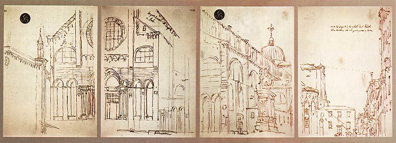
Artists used the camera obscura until the development of photography made it obsolete. Here are four camera obscura drawings by Canaletto from the early 18th century.


Let me know if you’re interested in painting with me in Maine in 2014 or Rochester at any time. Click here for more information on my Maine workshops!