fbpx

The perfect size painting class

Bigger art classes are easier for the instructor, but not necessarily good for the students. Neither are very small classes.

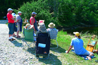
A delightful day at Owls Head.
“Do you ever offer private lessons and if so, what advice can you offer me on what I should charge?” a painting instructor asked.
There are very few things I won’t do for money, but private painting instruction heads that list. Learning to paint is all about repetition. I show you a technique, and you repeat it until you’ve got it. The best balance for plein air painting, I’ve found, is a class of 6-9 people. Fewer, and I am crowding my students with too much information. More, and I can’t pay enough attention to their needs.
The wilder the terrain, the fewer students I can teach. That’s why I often use a monitor at my Acadia National Parkworkshop. He or she handles problems of logistics, freeing me to concentrate on painting questions.
The rockier the terrain, the fewer students you can teach.
“How many people are in the class?” a person wrote me this summer. That was one smart cookie. We’ve all taken workshops where the instructor tries to manage a group that’s much too large. Teachers cope by doing long demos, but that’s unfair to the students. They might as well watch a video.
Rushing around on rocks can lead to injury, as we discovered a few years ago.
It’s easier indoors. Classes at the Art Students League were very large, but I wasn’t neglected. I benefitted from the instruction happening around me as much as from what my teachers told me.
A big group is easier to teach than one or two people. Teachers are only human, and humans are essentially proprietary. The longer we spend at a students’ easel, the more we want to take over.
Demos have their place, but they’re no substitute for one-on-one attention.

When I’m first looking at a student’s work, my mind is fresh. One or two things immediately jump out at me for correction or praise. I can articulate them and move on without meddling. That keeps the focus clear and directed.

Give me a enough time there, however, and I start deconstructing the painter’s vision. Students tell horror stories of teachers who have repainted whole sections of their work. That’s hard to avoid when you’re spending too much time with a single painting. You get proprietary.
The right size class makes for lots of attention but no hovering.
Handicapping conditions don’t necessarily require private lessons. They can often be accommodated surprisingly well in a class. Several years ago, I taught a mobility-impaired student in an outdoor workshop. We made sure there was a safe, flat, level site available at every painting location. She brought an assistant with her.
If you choose to teach private lessons, you should charge based on your hourly earnings for teaching a class. Tot up the number of students you usually teach, multiply by the class fee, and divide by the number of hours you spend on that session. Add travel time if you’re expected to go to the students. $50-75 an hour is not an unreasonable fee for your undivided attention.

How to choose a view

Writers are told to write about what they know. What should artists depict?
The Red Truck, by Carol L. Douglas
Yesterday I stopped to sit for a few minutes on a stone wall in Rockport. In my solitude, I noticed the beautiful asymmetry of the house across the street. Its white clapboard and modest door were framed by dark spruces and a dandelion-studded lawn.
Most people zip down this street with no more than a passing glance at the historic homes and the harbor below. Yet there are many quietly memorable moments: a brook burbling over granite, ancient gnarled beeches, sunlight glancing off cedar shakes. The only way to see them is to get out of the car and walk.

“Yes, well, views are very nice, Hastings. But they should be painted for us so that we can study them in the warmth and comfort of our own homes. That is why we pay the artist for exposing himself to these conditions on our behalf.” (Poirot: The Adventure Of The Clapham Cook)

Drying Sails, by Carol L. Douglas.

 â€œHow and why do you choose the views you paint?” a reader asked. The answer depends, in part, on why I’m painting. If I’m in a plein air event or on the road, the views I choose will tend to be more iconic. Here in mid-coast Maine, I have the luxury of intimacy.

Anything can be the subject of a painting. That doesn’t mean content is unimportant. I paint what matters to me: boats, rocks, water, skies, earth and trees. This was never a conscious choice, but the impulse is so strong that it drove me from Western New York to Maine.
Keuka Lake, by Carol L. Douglas
I don’t think you can force this choice. Most artists experiment with subject matter before finding their mĂ©tier. Piet Mondrian’s windmills and Vincent Van Gogh’s dark peasant studies are two examples.
Composition must drive any painting. In Rochester last week, a student showed me her first design, of a row of peonies marching at a diagonal across her page. I suggested she move 90° to catch the slight S-curve in the row. The difference was staggering.
Castine Lunch Break, by Carol L. Douglas
Closely tied to this is the question of light. Sunlight is the major organizing principle in landscape painting, but we can’t always order it up. In today’s drear, I’m going to suggest to my plein air class that we concentrate on close-ups rather than vistas. The architecture of objects can partly cover for the absence of light.
“There are no lines in nature, only areas of colour, one against another,” Edouard Manet said. The northeast is overwhelmingly cool in color: blue or grey skies against similar seas and green foliage. I look for color patterns within that, particularly those with a flash of warmth: the orange line in the seaweed, the pink of granite, a yellow glint in the sky. After light, color patterns are paramount.
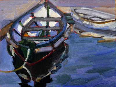
Dinghy, Camden Harbor, by Carol L. Douglas
I also think about meaning. This is old-fashioned, but I don’t see the point of painting if my work says nothing. I hope that my paintings speak about the relationship of man to his environment, about the enduring qualities of the earth, and about simple joy.
Rocks at the American Yacht Club,by Carol L. Douglas.
Addendum: if you’re a landscape photographer, you might be interested in this contest sponsored by Machias Savings Bank.

The many virtues of value studies

They can help you fix a bad painting or avoid painting one in the first place. They can be inventive, abstract, stress-free and fun.
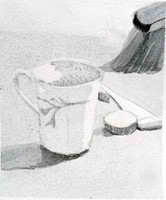
Value study of my pieris japonica.

I knew I would have a small class the day after the long weekend; I didn’t expect it would be just Roger. It would also have to be indoors because the weather forecast was for cool air and rain.

Private lessons don’t allow time for the student to practice what I’ve taught. Nobody can remember more than a few things at once without applying their new skills. Having an instructor hovering while you’re practicing can be overwhelming. But Roger is a good mid-level painter and this seemed like an opportunity to work one-on-one on value studies with him.
What I’d intended us to do was straight up value studies of an intentionally-boring scene, but we strayed.
I set up a monochromatic still life that I would never really paint: a wooden basket on a wooden tray, with wooden tools and blocks scattered around it. Any interest came from the pattern of shadows and light. We sat down with some umber paint and a handful of small cards and did a few studies of the scene.
Roger asked me what had gone wrong with a plein air painting he’d started in April. That was another day of changeable weather. The eastern sky had glowed pale yellow across Rockport harbor just before it dumped icy rain on us. The odd colors stuck with him.
My interpretation of the painting more or less as Roger painted it.
When a painting is failing, I ask myself some basic questions: Is my composition good? Are my paints fresh? Am I physically uncomfortable? Are my brushes hardened into sticks? Has the subject changed beyond recognition?
I thought Roger had abandoned his initial value drawing, weakening his composition. When that happens, we need to go back and restate the darks. In fact, this is a necessary step in almost every oil painting, but it’s particularly important when you can’t remember what attracted you to the scene in the first place. It helps to have your thumbnail study on hand.
How I thought he could improve the scene.
We didn’t, so I painted a quick copy of what he had on his canvas, and then a suggestion of how I might fix it. I’ve never done a value study after the fact, but it proved helpful. I need to remember that when I’m flailing around at a plein air event.
Meanwhile, the fickle sky had turned a deep cornflower blue. There was nary a hint of the promised rain. There are too many ticks right now to stand in tall grass and paint, so we moved our operation to my patio, and did studies of the light playing on the roof of my shed. That pointed out one of the great values of preliminary studies: they save you from wasting a lot of time on bad ideas. Bleech.
My shed. Boring.
My pieris japonica, on the other hand, is a leggy, ailing shrub that nonetheless looks good against the woods. Our studies of that turned out much better.
Lastly, I showed Roger my favorite game with value studies: making abstractions and then applying real objects to them. This is akin to finding faces in the steam on your shower walls. I create a loose monochrome abstraction that I like, and then mate reality to it. I’ve demonstrated the process here, with the final result here.
An abstraction that could become a figurative painting.
His assignment—and yours too, if you accept it—is to create a monochromatic abstraction and then use it as the basis for a representational painting.

Welcome back to the Flower City

I’ll be teaching at Highland Park this afternoon. A break in the rain is a fine welcome-home.

Spring at Highland Park, Carol L. Douglas
Even though I’ve taught at Highland Park in Rochester countless times, I still needed to pace through it to determine the best place for my class. It’s chock-full of specimen plants. When they bloom depends on many factors besides the calendar date, as the organizers of the Lilac Festival know. This year, they were dead to rights. The festival (which closed this weekend) and the lilacs lined up perfectly.
Lilacs, like all mauve or blue flowers, make a difficult focal point for a painting. They recede just when they’re asked to take center stage, so they need architecture to support them. This the park doesn’t offer. Its lilacs are planted en masse, in a sloping forest, designed to overwhelm the wanderer with sight and smell.
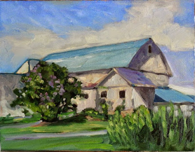
Lilacs are beautiful, but they need an architectural foil to compensate for their color. (Painting by Carol L. Douglas.)
I looped through all my favorite haunts: the pinetum, the rhododendrons and azaleas, around the reservoir. With each turn, I remembered prior classes—Gwendolyn arriving from hospital in her robe, Sam eating a huge fried turkey leg among the flowers, Teressa wailing in frustration and then nailing a perfect drawing. Highland Park was the center of my teaching practice for many years.
The park was started on a twenty-acre parcel given to the city by George Ellwanger and Patrick Barry of Mount Hope Nurseries. It came with restrictions, but also with the gift of plantings from what was then a world-class nursery. Landscape architect Frederick Law Olmsteddidn’t want the gig because the site didn’t include a natural water feature, but he relented when Seneca and Genesee Valley Parks were thrown in.
Highland Park Pinetum, Carol L. Douglas
What Highland Park does have is glacial topography. It sits atop Pinnacle Hill, a terminal moraine in an otherwise flat landscape. Olmsted used this to create the illusion of wilderness in this most urban of parks.
The Lake Plain on which Rochester is located is sopping wet during the best of years, and the city has been breaking rainfall records all spring. Plants are enormous and healthy. The result is a jungle-like shagginess. I was reminded that much of my gardening work in the so-called Flower City involved hacking back plants to keep them in some kind of control.
I stopped to see the gardens at St. Thomas’ Episcopal Church, which I designed and planted (with much help, of course) back in the day. The gardeners-in-chief, Michael and Kathy Walczak, were hard at work replanting canna lily tubers. I then drove by my old house, and was pleased to see my plantings looking well.
Redbud blossoms, Carol L. Douglas
Gardens are cooperative art. Once you hand them over, you’ve ceded control.
There’s a break in the rain forecast for today, and Rochester’s normally heavy skies are expected to clear. I’ll be teaching this afternoon at my favorite spring spot of all, the path along the Poet’s Garden where the peonies meet the magnolias. It’s a fine welcome-home from my former town.

Old subject, new technology

Yesterday I went all digital on a schooner. Allowing for the learning curve, this has potential.

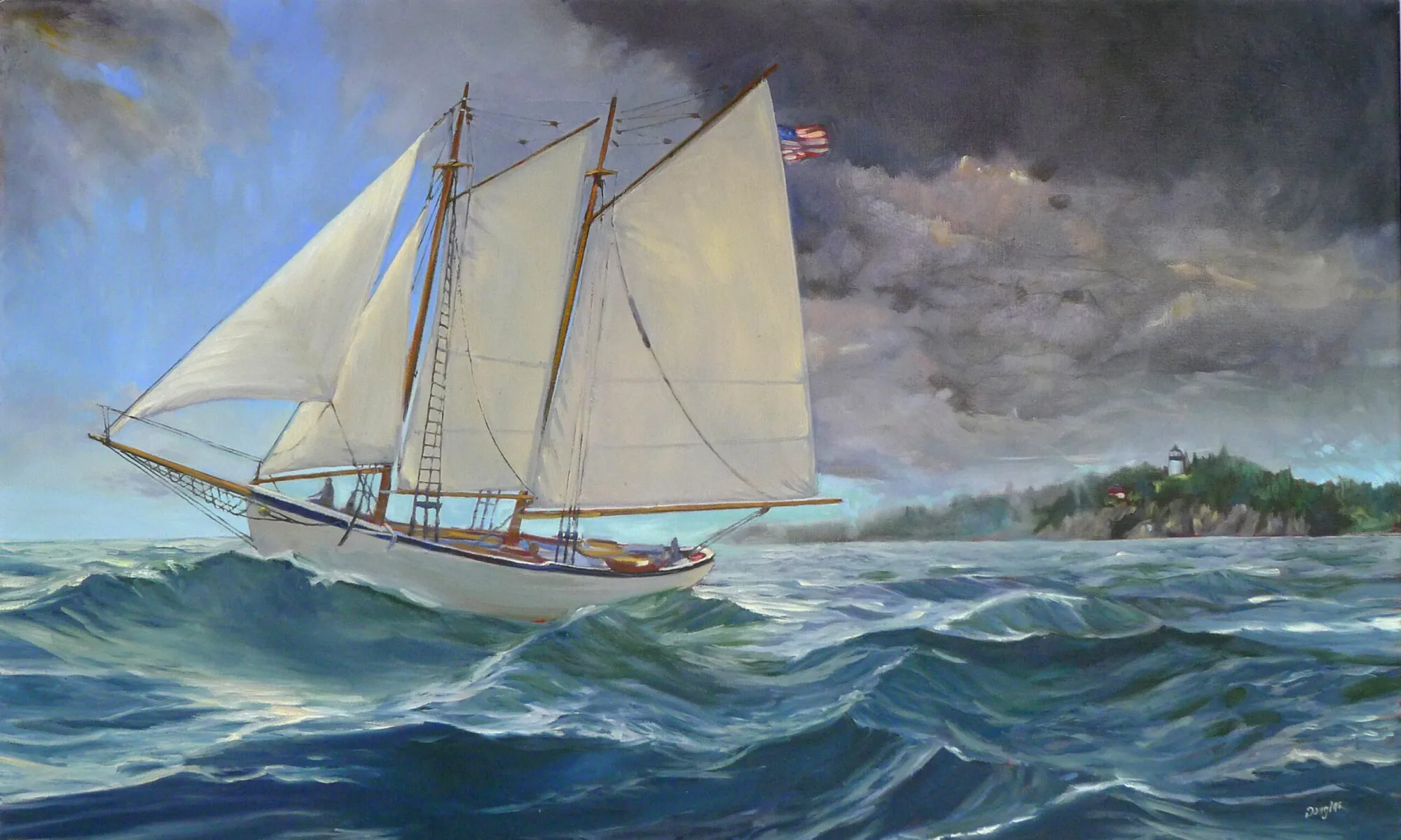
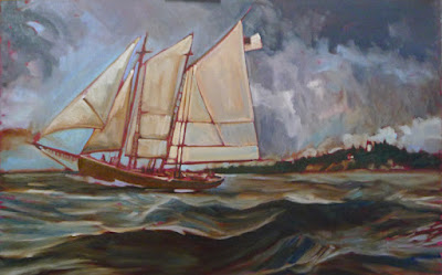
Underpainting of American Eagle passing Owl’s Head, by Carol L Douglas
I’ve toyed for a while with the idea of doing a large, Fitz Henry Lane-influenced scene of the American Eagle under sail. A large canvas of a boat in motion is not something you do en plein air, but the studies I’ve done in harbor certainly influence it.
A student recently asked me if I like painting ‘just water.’ I do, indeed, because to me there’s no such thing as ‘just water.’ There’s light, reflection, movement, the skipping of the wind, clouds, and promise. I showed him the wave study I did while cruising on the American Eagle last spring. That is the closest I get to a purely personal painting, one that has meaning for me and nobody else.
This field study of waves from last summer was the genesis of the painting above.
It was also the genesis of this larger idea. What better landform to use as a background than Owl’s Head, which sits just outside Rockland harbor, and where I paint many times every season?
When enlarging a sketch to a final composition, I generally use gridding, which I’ve explained here.  It’s laborious and time consuming. It’s also extremely accurate and allows you to execute a pretty decent grisaille on the fly, depending on how much time you want to spend.
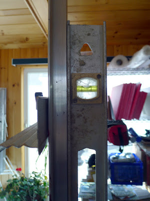
The horizon has to be straight on a nautical painting, or else the oceans will run dry.
My daughter gave us a cast-off video projector last year. Yesterday I decided to experiment with it. I haven’t used projection to enlarge a sketch since the demise of 35mm slides. 
These projectors are designed to shoot an image high on a wall, so they are set up to correct for the keystone effect, which is the distortion you get when you project an image at an angle. Once I managed to undo that correction, squaring the image was relatively easy. Making it exactly the size of my canvas was harder.
Level and square relentlessly.
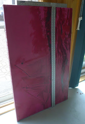
I started with relentless leveling and squaring. The easel was perpendicular to the floor, the canvas leveled, the two lower corners the exact same distance to the projector. Even with all those preparations, the image was slightly canted. Fixing that took a lot of fussing.
From there, it was just a question of tracing the lines in the original sketch. However, my ability to see differences in value was vastly reduced.
I couldn’t see values but it was a neat optical effect.
Lest you think tracing is the answer to all your drawing problems, it’s still possible to make drafting errors. Note the slight sag in the bowsprit. I’ll fix that in the next iteration.
With all my fussing, I was able to finish underpainting this 30X48 canvas in a single day. There’s promise there.
It’s anemic compared to my usual gridding, but I still think it has potential.
I tell my students to use a combination of ultramarine and burnt sienna for their initial drawing, but in practice I generally use leftover paint for this step. The exact color isn’t nearly as important as the value. Yesterday, I chose an old tube of Williamsburg Brown Pink. I don’t use this brand because I find the pigment load in the blues to be too low for my style. 
That wasn’t true with this color. This morning my whole studio is swimming in a butternut-colored haze. There is brown stain everywhere—creeping along the canvas, in my brushes, on my hands, possibly in my hair.

Oh the places you’ll go

Cheap, plentiful, environmentally-friendly, and you can create a masterpiece with it. We should all use more charcoal.
Portrait of my friend Jane in charcoal, by Carol L. Douglas.

 Art supplies tend to be expensive, especially at the rarified corners of the business. Mother Nature, however, has given us a drawing material that is plentiful, dirt cheap, and environmentally friendly. A package of 12 sticks of Winsor & Newton vine charcoal costs just ten bucks, and a tablet of newsprintis about the same. For the cost of a pizza, you can go to the far corners of self-expression.

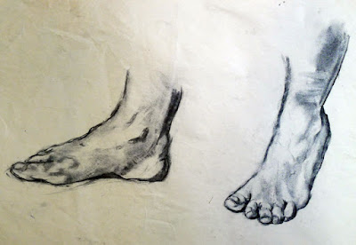
Charcoal is a great way to work out difficult drawing problems before you commit the problem to paint. Feet by Carol L. Douglas.

I use charcoal extensively in my studio: to work out new ideas, for gesture drawings, or to contemplate composition. It’s an excellent medium for experimentation. As a student yesterday remarked, “it’s not all about lines, like pencil work is.” When blended and lifted with an eraser, charcoal handles much like paint, making it the perfect preparatory medium for oil and acrylic painting. That’s why I start every new class with charcoal drawing exercises. It’s far better to learn the fundamentals of drawing and composition with something that’s not precious.

This was a preparatory sketch for a painting. By Carol L. Douglas.

I particularly like to have watercolor students do value exercises with charcoal. Value separation is a major challenge in watercolor. It helps to do it up front.

Charcoal is the cheapest medium in which one can create a masterpiece with staying power. For example, there are many works on paper by Edgar Degas done in charcoal and white pastel. He and other great masters used charcoal extensively.
Charcoal allows us to work out compositional questions. By Carol L. Douglas.
Choose a paper with a dull finish so that the charcoal can bite into the surface. Charcoal doesn’t stick well to hot-pressed, smooth papers like Bristol. It’s best on a fine-toothed, dull paper, but a rough tooth is also appropriate at times, although it raises more dust. My solution is to buy Canson’s Mi-Tientes, which has a different surface on either side, but there are many fine papers for charcoal work, including Canson Ingres, Strathmore 500 Series and Fabriano Tiziano. You shouldn’t need to use fixative to get the charcoal to adhere; if you do, try a different paper.
Compressed charcoal is powdered charcoal bound with gum or wax. It’s harder than vine or willow charcoal, meaning it can be sharpened to do very fine work. However, it’s not appropriate for using under paintings, because the binding can bleed. It doesn’t blend or erase as well. I never use it.
Seated figure, by Carol L. Douglas
Willow and vine charcoals are made of burnt grape vines or willow branches. They have no added binders, making them easier to erase. This charcoal can be used to sketch on canvas before painting in oils or acrylics; it will just vanish into the bottom layers of your work. It’s very light and makes soft, powdery lines.
“It takes a steady, careful, and patient hand to use charcoal,” an online student remarked yesterday. Only sometimes! Charcoal is an infinitely varied medium, in which one can make smooth graduations of value as well as slashing, dark strokes.

Weekly painting classes in Rockport, Maine

Painting by student Marilyn Feinberg
Color, light, and composition for outdoor painters
Carol L. Douglas
394 Commercial Street, Rockport
Starting April 4, 2017
10-1 AM Tuesdays, six week session
Fee: $200
Last month two friends took me to lunch at the Waterfront restaurant in Camden. As a bitter wind piled clouds high above the islands of Penobscot Bay, they put a question to me. “When will you stop slacking and start teaching weekly classes again?”
They’re right. My trip to Canada had stretched into the holidays, which had then become a trip to the Bahamas. I’ve been working hard, but not teaching.
 They nailed me down to a commitment. Our next cycle of classes starts on Tuesday, April 4. That will be from 10-1 AM, in my studio at 394 Commercial Street, Rockport. If you’re interested, there are more details available on my website, here.
The goal is intensive, one-on-one instruction that you can take back to your studio to apply during the rest of the week. We’ll cover issues like design, composition, and paint handling. We will learn how to mix and paint with clean color, and how to get paint on the canvas with a minimum of fuss.
And, yes, we’ll talk about drawing. If you ever want to paint anything more complicated than marshes, you must know how to draw. As I’ve demonstrated before, any person of normal intelligence can draw; it’s a technique, not a talent. And it’s easy to learn, no matter what you’ve been led to believe.
Painting by student Jennifer Jones
We’ll start in my studio, but on pleasant days, we’ll paint at outdoor locations. Painting outdoors, from life, is the most challenging and instructive exercise in all of art. It teaches you about light, color and composition.
That, of course, limits the media you work in to oils, watercolor, acrylics, or pastel, since they’re what is suitable to outdoor painting.
Years ago, a friend kept asking me to give painting lessons. “I don’t know how to do that,” I’d answer. We went round and round for several years. Eventually, I caved. Three people signed up. I figured I’d teach one session and they’d realize I was clueless. My studio was on the third floor. I was the model and the instructor and I kept hitting my head on the ceiling as I moved around the room.
Turns out, I wasn’t actually that bad. From there I moved into a nicer room above the garage and enlarged my teaching practice. I started teaching workshops and concentrating on plein air instruction, since that’s what I love best. When I left Rochester, I left a large circle of students behind. You can see a small sample of their work here. One of my great joys is that they formed a group, Greater Rochester Plein Air Painters, and continue to paint together.
“You used to teach on Saturdays,” a student recently pointed out. That’s true, I realize. If you want to study with me but work during the week, let me know. If I have three people interested, I’ll offer a weekend class.

Full moon over Frenchman Bay

Nocturne by Matthew Menzies, from Sea & Sky 2013.

There’s something magical about painting a nocturne over water. It’s even better when there’s a full moon. My calendar tells me we’ll have that opportunity during our third annual Sea & Sky Workshop. Think of magnificent granite slopes at Schoodic Point, silhouettes of Jack Pines against the midsummer night sky, and moonlight shimmering on the ocean.

Yes, there are still openings for the workshop, because (as usual) I got interested in other things and forgot to do any advertising after Christmas. That’s one of the curses of being a one-woman shop. However, Bobbi Heath just showed me a nice system for keeping all the balls in the air. It pointed out to me that I juggle a lot of things—possibly too many things.
This is the fifth year I will be teaching in midcoast Maine, and my third season at Schoodic Institute. It’s the best place for raw, natural beauty without crowds on the whole Maine coast, and the Institute itself is set up for learning. The campus was created when a former Navy base was returned to the National Park Service. It is one of 19 National Park Service Research Learning Centers in the United States. They do all our meals and snacks, so we can concentrate entirely on painting. And you can bring non-painting guests, who will enjoy fishing, hiking, birdwatching, and more. 
We’ll study composition, color, drawing, and paint mixing in morning and afternoon sessions. By now I have a pretty intimate knowledge of Schoodic and the surrounding area. That means you get access to the best painting locations.
Even though we’re on an uninhabited peninsula, it’s still easy to get to painting locations. There’s a ring road with frequent pull-offs. And Schoodic itself is only 90 minutes from Bangor International Airport, for those of you who fly to Maine.
I’ve worked with people from raw beginners to those who already hold MFAs. I have more than fifteen years of experience teaching in watercolor, oils, acrylics and pastels. I’m a former chairperson of New York Plein Air Painters and my work is in public and private collections worldwide. I studied at the Art Students League in New York with Cornelia Foss, Nicki Orbach, Joseph Peller and others.
Dinghy, Camden Harbor, by Carol L. Douglas
“This was the best painting instruction I have ever had. Carol’s advice in color mixing was particularly eye-opening. Her explanations are clear and easy to understand. She is very approachable and supportive. I would take this course again in a heartbeat,” student Carol Thiel once said about me. (By the way, some of my lessons can be read here.)
The one-week workshop is just $1600, including five days’ accommodation in a private room with shared bath, meals, snacks, and instruction. Accommodations for non-painting partners and guests are also available. Your deposit of $300 holds your space. Complete registration forms should be returned by mail to Carol L. Douglas, PO Box 414, Rockport, ME 04856-0414 with your $300 deposit.
Or email the form here and make a credit card payment by phone to 585-201-1558. Refunds are available up to 60 days prior to start, less a $50 administration fee. Final payment is due 60 days prior to the start of the workshop.
A discount of $50 is available to members of New York Plein Air Painters, Plein Air Painters of Maine or returning students.

And bring a night lamp! Even better, remind me to add night lamp to the supply list.

How to avoid the #1 obstacle to being a good artist

Yes, it’s a lighthouse. Wanna fight me?
Years ago, I was stymied by a large canvas of figures framed by a little house and an orchard. Following the conventional advice of the time, I took it to a well-known artist for critique. “It looks like an immature Chagall,” she said. In trying to fix that, I destroyed the work. 
My mature self knows exactly what was wrong with that painting: I was messing around way too much with glazing. A few decades of maturity have also taught me that orchards and fruit trees are important images to me. There was no cribbing from Chagall.
That critique set me back in my development because the artist looked at my work through the narrow lens of her own education and experience. She had no idea what I was striving for. Neither did I, of course, because I was a callow youth. These things require time and work to become clear.
I get lots of advice in my mailbox. I generally scan and ignore it. But this one irked me: “How to Avoid the #1 Obstacle to Becoming a Professional Artist,” it trumpeted. It went on to talk about how painters need to take classes and critiques and seek feedback from their peers to avoid what the writer calls “illusory superiority”—the idea that you think you’re better than, in fact, you are.
This painting of Beauchamp Point has few fans, but it still resonates with me. That’s because it was pointing in the direction in which I was moving at the time.
In fact, the fastest way to be a mediocre painter is to seek too much advice from others.
I’m all for learning one’s craft within structured instruction—it saves a lot of time and wasted material. Beyond that, however, group thinking should be approached with a certain wariness.
Once you get out of art school, most painting groups are comprised of supportive, kind, and helpful people. But even these tend to reward those whose work looks a certain way and ignore those whose inner vision is radically different from the group’s norm.
If you don’t believe this, just imagine taking your carefully-crafted landscape to this gallery and asking for representation. The art world is all about conformity, while at the same time it paradoxically hungers for individual expression.
A lot of research has been conducted on normative social influences and conformity. Human beings are social animals. To be liked and respected within their group, they tend to moderate their own opinions. Research tells us that group norming is consistent across cultures and gender. In short, it’s everywhere where two or more of you are gathered together. The ability to get a group of people to think and work alike is useful in corporate culture, but not so good for making innovative art.
I once heard an artist I admired sneer at “lighthouse paintings.” Ever since, I’ve approached painting them with some trepidation. Yes, I understand they are overdone for the tourist trade, but they are also powerful symbols and beautiful buildings. There is nothing inherently wrong with them. It irks me that he planted this idea in my mind with a casual comment he doubtlessly doesn’t even remember.
This painting of the Raising of Lazarus was savaged in a newspaper review. It’s not something I’m likely to forget in a hurry.
I can’t count how many times I’ve heard one painter say to another, “Stop! You’re done! Not one more brushstroke!” Of course one can diddle a painting to death, but that process is sometimes necessary for the next observational breakthrough. By saying that to another painter, you’re putting yourself in charge of his or her development.
When I was younger, the exposed background in my paintings often took the form of dark, heavy lines. “That’s your style!” one teacher told me. I’d had enough art-history classes to know that ‘style’ is a transitory thing, and I found those lines frustrating. Later, Joe Peller taught me how to marry edges. What a less-competent teacher took as style, Peller recognized as a technical deficiency.
This is why we should teach and critique with a light hand. Even more importantly, we should accept criticism and commentary with a healthy dose of skepticism. They are no substitute for doing our own hard thinking about our own work.

Exercises are so much more fun in the abstract

Goes right into the slush pile…

 Last week, I wrote about my troubles painting lobster traps. Bob Baines, a lobsterman from S. Thomaston, ME, kindly lent me a trap to study. As a teacher, I know the only answer to confusion is close examination of the troubling object. As a student, I don’t like hard work any more than anyone else. Exercises are good for us, but so much more exciting when they’re still in the planning stages.

Bob’s trap weighs as much as a fresh bale of hay or a kindergartener. Now imagine shifting 800 of the things. My respect for lobstermen—already high—rose another notch.
The trap is four feet long, a generous foot deep, and almost two feet wide. It has two “parlors”—the space where lobsters wait for their fishermen visitors—and one “kitchen”—the space where the bait is hung.
The real deal weighs as much as your kid.
Speaking of language, you may have heard that the expression “the bitter end” is a nautical term, referring to the inboard end of a chain, rope or cable—in other words, the part that gets wound around a bitt or bollard. There’s also a part of a lobster trap called the “ghost panel.” It allows lobsters to escape if a trap is lost. According to Maine’s state regulations regarding lobstering, buoys should be attached to their lines with so-called “weak links” to protect whales from entanglements.
Who knew lobstering was such a poetic exercise? Mankind has been getting its food from the sea almost as long as we’ve been talking, so I suppose language is deeply entwined with fishing.
Axonometric projection grids were a cheat for draftsmen back in the days when they drew by hand. You laid them on a light table and drew above them. I still have a set. I could have made this easier on myself by using them to draw the wire mesh, but I chose to do it freehand instead. Estimating perspective is always good for the mind.
My real goal was to try to figure out a way to represent the color interference of different layers of mesh without drawing every gridline separately. I drew the trap freehand—by which I mean I used a straight edge and no measurements—on a very cheap bit of canvas from Ocean State Job Lots.
My erasures with water pulled the gesso right off this very cheap canvas.
I keep those canvases for students who forget their own, but now I’m not sure they’re good even for that. Erasing, I rapidly peeled the gesso off the boards. They handled paint just as badly.
My trap was squatter and shorter than the real thing, but no matter. I wanted to paint it using the #6 or #8 filberts I was using on my actual work. Obviously, this is no way to get any detail, but I haven’t been after detail, just an impression.
And the brush I painted with…
Had I been working in either watercolor or acrylics, I’d have approached this by painting the background and contents of the trap and applying the grids on top of these. But oil paint doesn’t work that way. I settled for painting in a dark pattern for the grids, plugging the holes with color and then restating the darks by incising back to my initial darks.

It’s never going to win me a scholarship to art school, but I’ve learned what I needed to know. Thanks, Bob, for the loan of your trap.