fbpx

The Paper Garden

Winter Cherry or Chinese Lantern, by Mary Delany
Mary Granville Delany took up serious art in her seventies. From age 71 to 88, when her eyesight failed, she made nearly a thousand cut-paper botanical collages.
She was raised to enter the court as a sort of junior lady-in-waiting, with all the necessary language and decorative skills. These hopes were dashed with the death of Queen Anne in 1714, and Mary’s family repackaged her to make an advantageous marriage to an elderly man. Advantageous to the families, perhaps, but not to her; the gouty old fellow drank himself to death, leaving her a penniless 24-year-old widow.
Passiflora laurifolia, by Mary Delany
Passed among relatives and friends, Mary met an already-married Irish clergyman, Dr. Patrick Delany. It was not until she was in middle age that he was free to marry her. Both were interested in gardening and botany. Her happy second marriage allowed her to pursue the leisure arts of the time: paper-cutting, painting, shellwork and embroidery.
Asphodil Lilly, by Mary Delany
She might have been just another eighteenth-century Bluestocking had she not gone to live with her friend Margaret Bentinck, Duchess of Portland, after Dr. Delany’s death. The Duchess of Portland was a fabulously famous woman in her day: Bluestocking, the wealthiest woman in Britain, and an avid collector. Her natural history collection was the largest and most famous of its time. She was also a dedicated botanist in her own right.
Portrait of Mary Delany, John Opie, 1782.
Mary threw herself into decoupage in her widowhood. This was a fashionable craft at the time, but she elevated it into art, using it to make exceptionally detailed, accurate renderings of plants. Admirers of her work included Sir Joshua Reynolds and botanist Sir Joseph Banks.
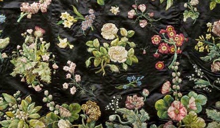
Floral embroidery by Mary Delany
After the Duchess of Portland’s death, Mary was given a pension by the Crown and lived the remainder of her life at Windsor Castle. In 1896, the British Museum was bequeathed her ten volumes of botanical paper-cuttings.


Message me if you want information about the coming year’s 
classes and workshops.

Thinking big

Canterbury Cathedral, view of the Western Towers, engraved by J.LeKeux after a picture by G.Cattermole, 1821, showing the entrance before it was rebuilt.
I work predominantly in two different art forms—the fast painting and the short essay. I like the immediacy of laying paint and words down quickly. In that, I am very much a child of my time. Ours is an age of fast assault.
Ten years ago, I planted a beech tree at a local church, knowing it would never reach maturity in my lifetime. That was frustrating enough. The centuries-long effort required to build the medieval cathedral is completely beyond my conception.
“I am particularly struck by the perseverance required to bring these incredible places to light and life,” Rev. John Nicholson messaged. “To think of my grandchildren attending a dedication service for something I began is mind-boggling. I am sure our paltry, microwavable theology would not sustain such an effort.”
Canterbury Cathedral: the Corona, shrine to Thomas Becket, David Iliff, License: CC-BY-SA 3.0
The visionary who conceived a cathedral had no guarantees that his work would endure. Consider Canterbury Cathedral. Founded in 597 by Augustine, it originally consisted of an Anglo-Saxon nave, narthex and side chapels. It was destroyed by fire in 1067 and completely rebuilt from 1070 to 1077 under the first Norman archbishop, Lanfranc. The east end was immediately demolished by his successor and the nave doubled in length.
The murder of Thomas Becket turned the cathedral into a place of pilgrimage, necessitating another enlargement of the east end to accommodate his shrine.  This and the choir were then rebuilt in the Gothic style following a fire in 1174. The Norman nave and transepts survived until the late fourteenth century, which is also when the massive crossing tower was added. During the Dissolution of the Monasteries, Becket’s shrine was pillaged and most objects of value carried off by the Crown.
Canterbury Cathedral: West Front, Nave and Central Tower, Hans Musil, 2005
We modern evangelicals live in mini-mansions and go to church in graceless buildings that look like barns. The medieval mind thought it appropriate to live in barns and worship in celestial mansions.  “They had a much clearer vision of the difference between themselves and God,” messaged Laura Turner.
“Our God is too small,” added John Nicholson.

Message me if you want information about the coming year’s 
classes and workshops.

Building great things

Choir at Canterbury Cathedral, photo by David Iliff. License: CC-BY-SA 3.0.
The prevailing WASP culture of mid-century America reflexively recoiled against the pomp of the European church. The argument was that the resources of the church would be better spent on the poor than on accumulating treasures in a church building. It’s an old argument, echoing from Matthew 26:9 (where it’s in fact hypocritical).
This viewpoint undermined my attitude toward my work for a long time. In a world where service is the highest expression of humanity, art and music are a frivolous waste of time.
Cloisters at Canterbury Cathedral, photo by David Iliff. License: CC-BY-SA 3.0.
The 26 medieval cathedrals of England date from about 1040 to 1540. In the great era of cathedral-building, a sizable portion of the British population was living in wattle-and-daub hovels. The twentieth-century impulse would have been to use that money to build them warmer houses. That would have been a great loss for western culture.
The Anglo-Saxon conversion is traditionally dated from 597 AD, when Augustine arrived in Canterbury, but no systematic program of religious building started until the Normans showed up. There is not a single example of Saxon secular architecture left in Britain. They simply didn’t have the technical skill or social organization for large-scale building projects until they were colonized.
Parliament Hill in Ottawa is an example of how English Gothic influenced world architecture.
English cathedral builders borrowed extensively from the Norman culture from which their masters came. Since they were built over centuries, most cathedrals incorporated several styles and made no effort to integrate them. This storm of creativity fused together a uniquely English architecture.
American Gothic, Grant Wood, 1930, features an example of American Carpenter Gothic architecture. He liked the house and wanted to paint it along with “the kind of people I fancied should live in that house.”
Could that have happened had the impulse to build been directed into housing the poor? There are echoes of English Gothic and Tudor architecture all over the world, including in the neighborhood in which I live. Has anyone ever consciously tried to copy a public housing project?


Message me if you want information about the coming year’s 
classes and workshops.

Heading off to art school

A typical day in the studio means a mix of youngsters and not-so-youngsters.
Tomorrow, two of my students are skipping class to attend National Portfolio Day at Syracuse University. I wouldn’t be encouraging students to pursue a career in the arts if I didn’t believe it was a viable career path.
Ever since President Obama said that “folks can make a lot more, potentially, with skilled manufacturing or the trades than they with an art history degree,” educators have been falling all over themselves to point out the value of a humanities education.
If you’re not willing to work hard, it’s best to major in something less demanding.
Anyone who has ever paid a plumber knows that, strictly speaking, the president was right. Very few kids are encouraged to go into the trades in modern America, and these jobs pay very well. Nor should they have any stigma attached to them; a craftsman is a craftsman, no matter what material he’s working with.
There is nothing more fun than working with youngsters.
But money is only part of the job-satisfaction equation, and art majors are among the happiest of all professionals, scoring higher than lawyers, financial managers, and high school teachers.
Sadly, a recent comprehensive surveyadministered online to arts alumni seems to indicate less satisfaction among recent graduates than among old-timers.  This is no surprise, since they’re graduating into the worst job market since the Great Depression, and I’d wager that lower job satisfaction is true of recent graduates across all disciplines.
There is nothing more fun than working with youngsters, even when they are eating a deep-fried turkey leg in class.
Student debt is a specter haunting all new college graduates, but can be particularly crushing for those with arts degrees. Less than a third of recent art alumni graduated with no debt, whereas half the older students reported doing so. About 14% of recent graduates finished school with more than $60,000 in student debt.
So I want to see those high school seniors on the hunt not only for admission, but for scholarship money. The best way to do that is to produce outstanding portfolios. That is tremendously hard work. If they’re not willing to do it, it’s better for them to major in something less demanding. The art world is a ruthless culler of the unmotivated.

Message me if you want information about the coming year’s classes and workshops.

Use your power for good

The Canadian National War Memorial (also known as The Response), was originally built as a WWI memorial. It was designed by British sculptor Vernon March but modified in 1982 and 2000. It is a stunning evocation of wars throughout time.

Because the National Gallery of Canada has one of the world’s largest collections of Group of Seven paintings, I’ve made pilgrimage to Ottawa. It’s a lovely city—beautiful architecture, relaxed pace, and in a gem of a landscape. I was so impressed with it, in fact, that I asked my husband why we didn’t move there. Alas, Canada is not a belligerent nation, so it wasn’t likely he was going to get a job there in the military-industrial complex.
From a lifetime of living on the border, I believe a Canadian is far more likely to talk you to death than shoot you. Canada is safe, kind, dull, and neighborly. That—and hockey—is its brand.
Peace and Liberty stand at the top of the Memorial
When I was writing my essayabout Death of Klinghoffer yesterday, it occurred to me that what the Metropolitan Opera of New York was doing was rebranding itself as edgy and relevant, and in a morally dubious way.  And now that I’m seeing everything through the lens of branding, I wonder about the two homegrown terrorists who attacked Canadian soldiers this week.

The WWI figures on the National War Memorial.
I’ve been thinking in these terms because one of my painting students (and pals) is branding guru Brad VanAuken. We often talk about branding in painting class, and I find it fascinating.
Memorials to all wars were added in 1982.
Yesterday’s Ottawa jihadist has been identified as 32-year-old Michael Zehaf-Bibeau, French Canadian by birth and a recent convert to Islam. He was apparently a “high risk traveller” and had his passport seized to prevent his joining Islamic terrorists overseas. What’s shocking is that Martin Couture Rouleau, who earlier this week mowed down and killed two Canadian soldiers in Saint-Jean-sur-Richelieu, Quebec, was also a disaffected French-Canadian who rebranded himself as an Islamic terrorist.
Memorials to all wars were added in 1982.
 Their personal rebranding efforts are a form of performance art—a fatal form, since you die before you get applause. It only works because Islam itself has succeeded in rebranding itself as a romantic, meaningful alternative for the young male loner. All it takes is a keffiyeh and a gun.
Meanwhile, what does this do to Brand Canada? Canada comes late to most social ills, but it generally gets there, as the stories of Paul Bernardo and Karla Homolka and the École Polytechnique massacre remind us. And then it returns to its innocence, being our good neighbor to the north.
The Tomb of the Unknown Soldier, where Cpl. Nathan Cirillo was gunned down, was added to the National War Memorial in 2000.

Message me if you want information about the coming year’s classes and workshops.

Rising from the ashes

End Times Deliverance Church, Rochester, NY, by little ol’ me.
A few years ago, I wrote about painting the old Corn Hill Methodist Episcopal Church. I’d learned a little of its history by talking to passers-by and looked up a little more online, and I thought I’d go back and do a more complete painting another day. Like most of my ideas, it faded into the woodwork.
Corn Hill Methodist Episcopal Church in its glory days.
This week, historian Emily Morry wrote about the building in the Rochester Democrat & Chronicle’s Retrofitting Rochester column. The graphic is one of those fascinating “then and now” sliders. It is the first time I’ve seen what the church looked like in its glory days. It was built of red Medina sandstone in the Romanesque Revival style. It was massive, squat and imposing; in fact it looked a lot like my own childhood church in Buffalo, Delaware Baptist Church.
As a long-time churchgoer, I know how precious and rare the truly desegregated church is. We cling to the “faith of our fathers,” but one unanticipated legacy is that we worship with people who look and sound the same as us. Several years ago, that started to be a problem for my family, which is how we ended up at Joy Community Church on North Goodman.
And as it stands today.
So I was amazed to read that Corn Hill Methodist was an early mover in trying to break the race boundaries in church:
Beginning in the 1950s, the ministry made a concerted effort to develop an interracial congregation to better serve its changing community. The campaign cost the institution some parishioners, but as Reverend G. Kenneth Tuttle remarked in 1959, those that chose to continue with the denomination “are spiritually stronger,” adding that, ““segregation is not a true expression of Christian fellowship.”
Seeking to meet both the spiritual and social needs of Corn Hill residents, the institution partnered with the Mount Olivet Baptist Church to run an annual interracial summer program for black and white youth. Further dedicating itself to the cause of civil rights, the church invited Malcolm X to speak in 1965. (Emily Morry)
That would be the last speech Malcolm X ever gave; he was assassinated five days later.

All of which makes the fate of the old church even more suspect. The original congregants, unable to make a go of it in the rapidly-changing neighborhood, gave the building to the Corn Hill A.M.E. Zion church in 1969. Shortly thereafter, the building suffered a series of fires, the last of which destroyed the main sanctuary.  The new congregation, restricted by finances, put up the modest frame sanctuary that is there today.

The empty bell-tower.
In the 1960s, the United States was galvanized by a series of race riots, set off by President Lyndon Baines Johnson signing the Civil Rights Act in July, 1964. Among the very earliest was one in Rochester, just a few weeks after the signing. Racial tension was very high. While the blame for those fires has never been established, in the context they seem very suspicious.
But fifty years later, there is still a church on that site. The mainline congregations of my youth are in decline, replaced by evangelical churches. And these evangelical churches—unrestricted by tradition—are far more integrated than the historic church. God is never the author of evil, but he can work in the ashes.
Message me if you want information about next year’s classes and workshops.

Do as I say, not as I do

Winter coats thrown over chairs are the sketch artist’s dream.
I advocate drawing anywhere you’re required to sit quietly: the subway, doctors’ offices, and especially in church. (‘Idle hands are the devil’s workshop.’) I have stacks of sketchbooks filled with drawings of unsuspecting people, but I’ve noticed recently that my drawing is falling off both in quality and quantity.
Part of this, I’m afraid, is because I got a smart phone at the beginning of summer. It’s too easy to pick it up when I have a few idle moments. But as dissolute as I am, I would never hang out on Facebook in church.
I’ve been letting my kids choose where we sit. Their inner WASP leads them unerringly to the back row. When church is lightly attended that’s not a problem; I can still see well enough to draw. But when it’s crowded (as it usually is) all I see is the hair in front of me. Unless the wearer has spectacular cornrows, that’s of limited appeal.
Even I get tired of always drawing people from the back.

But this week I was saved by the season. It was 40° F. when we left for church and our fellow worshippers were bundled up in coats. Our church being humble, there is no narthex, so winter clothing ends up thrown over chairs. And fabric tossed willy-nilly is the sketch artist’s dream.
Message me if you want information about next year’s classes and workshops.

Why do we draw? (Part 3)

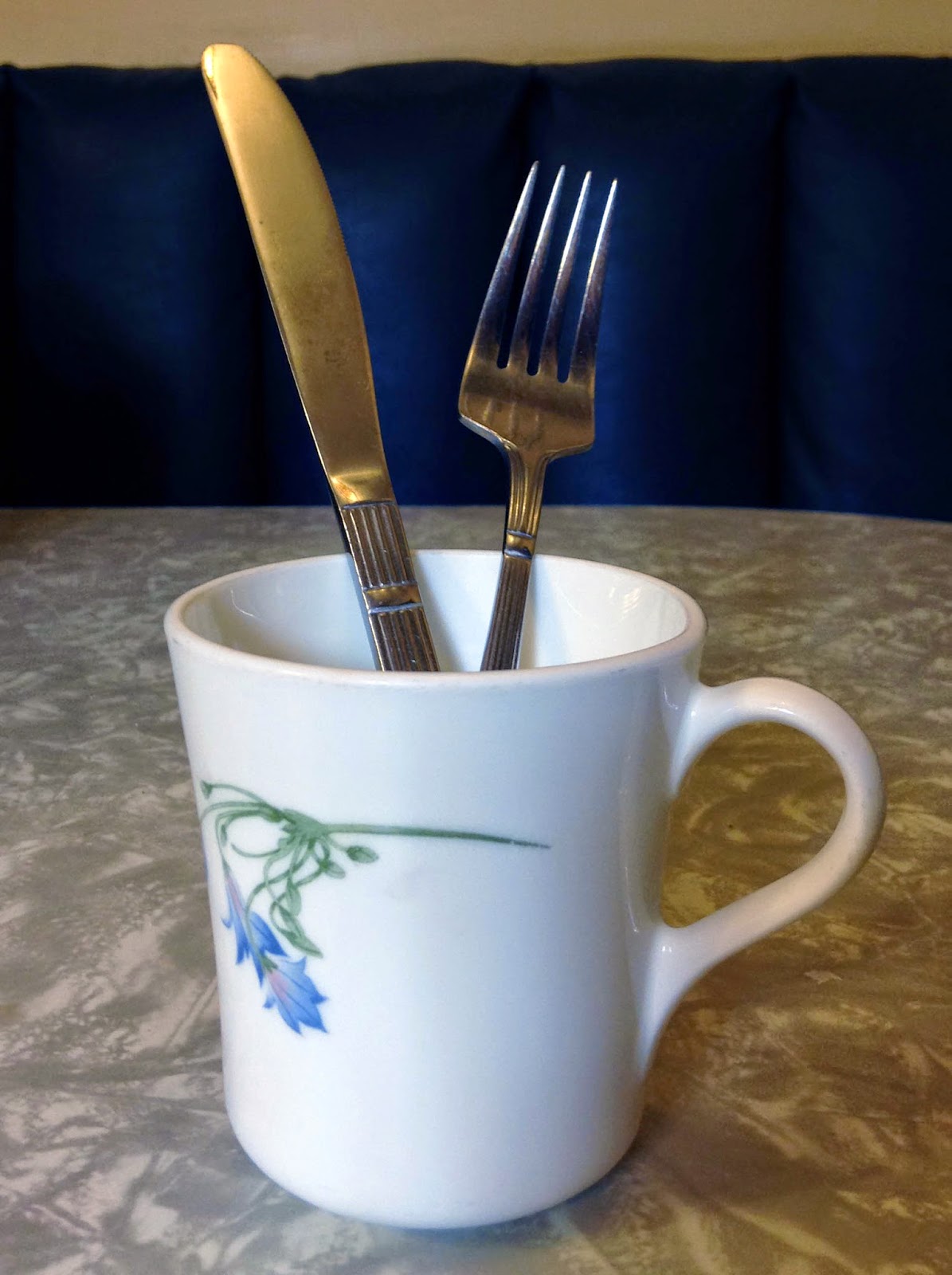
Two pieces of silverware and a coffee cup: a tricky thing to draw. But when you’re done, you’ll have the basic tools to draw anything.
Yesterday’s lesson on the pencil and thumb method was easy to teach in person, but difficult to write out in steps. Today’s lesson, on using angles, is easier to write, but will be a little trickier to master.
This has to do with how our brains are wired, not how “talented” you may or may not be. We simply don’t ‘read’ angles and negative space when we’re not focusing on them. This is why we use our pencil as a visual aide. It forces our brains to pay attention.
The good news is that you can rapidly teach your brain to notice angles and negative space.
Once again, close one eye and focus on the pencil, not the object you’re measuring. Hold the pencil along an imaginary plate glass window in front of you, and tilt it to match the angle you’re measuring. Then reproduce the line on your paper.
If at first you screw up, it’s probably that you’ve canted one end of the pencil away from you. Straighten it up and try again.
Once you’ve mastered measuring with the pencil and thumb method and learned to see and copy angles on to your paper, you can draw anything from portraits to animals to landscapes to figure. I promise.
Start by measuring the basic shapes using the pencil and thumb method we learned yesterday. Mark off the  heights and widths of all the basic shapes.
Use your pencil to determine the angles at which the silverware, the sides of the cup, and the handle are traveling. Draw them in as straight lines. This takes a little practice, so be patient and take your time looking at each one.
Use your measuring and angle hash marks to block in the major shapes.
Often, you can see distortions, objects that are too close together, etc. more easily in the negative space than you can in your drawing of the positive objects. It’s best to check this before you go on to finish your drawing.
You can use angles to check your work. Here I checked the angle from the right tine of the fork to the handle of the cup, and the angle across the top of the two pieces of silverware.

 Message me if you want information about next year’s classes and workshops.

Why do we draw? (Part 2)

Teachers often tell their students to hold the pencil fully outstretched. I disagree, because moving it up and down and sideways makes you move in an arc, as Sandy demonstrates, above. 

Many people tell me they would like to learn to draw, but they live too far away to take my class. Often they are going through some kind of crisis. From long experience, I know that drawing is cheaper than therapy, it always calms anxiety, and a tablet of paper and pencil are so small and benign that they can be carried anywhere.

I can teach most people the rudiments of life drawing in a single class session. Drawing is a series of actions, rather like dance. The best way to teach it is to sit next to the student and demonstrate the steps. Still, a half loaf is better than none.

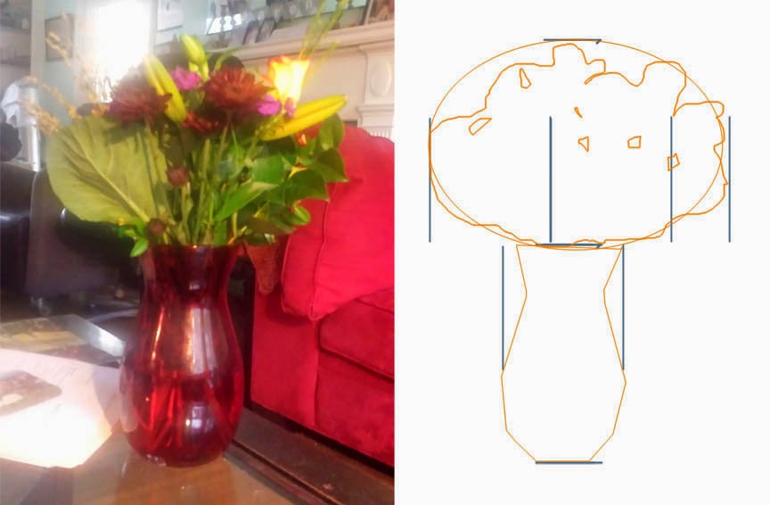
Drawing starts with measurement. Get that right, and everything else is just details.

Instead, hold your pencil loosely and comfortably, as if there were a plate glass window along which you were running it. You will have to recheck your measurements frequently, but you should be doing that anyway.
1. Put yourself a few feet from the object you want to draw. Make sure you’re comfortable.
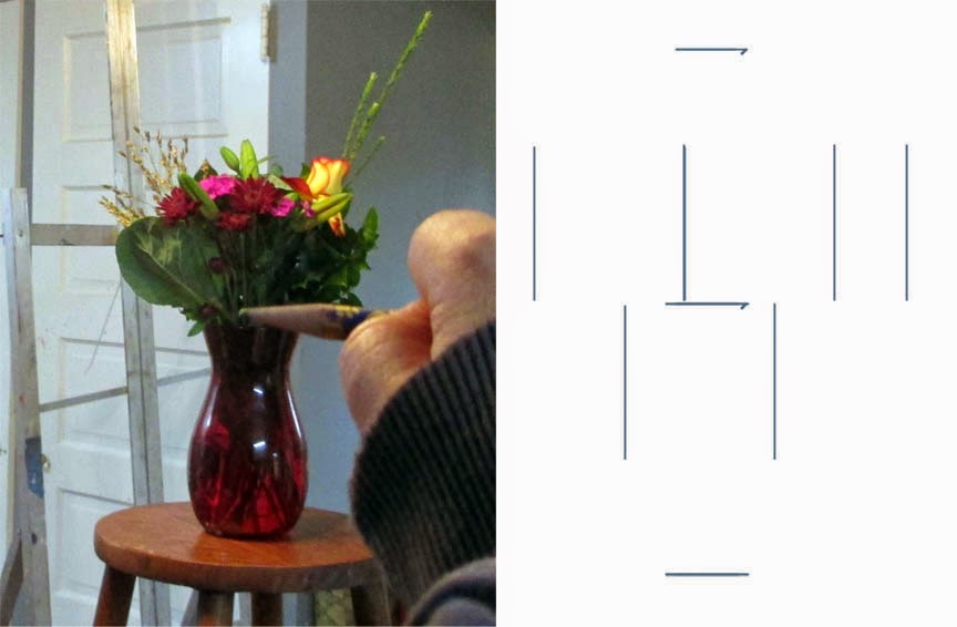
2. Hold your pencil between your thumb and fingers as shown. Most art teachers tell you to do your measurements with your arm completely outstretched; I prefer to have my arm loose and to visualize an imaginary plate glass window I’m running my pencil along.
3. Close one eye and focus on the pencil.
4. Holding your pencil upright and straight, align the point of your pencil with the top of the vase.
5. Slide your thumb down the pencil until it is at the bottom of the vase. This is now one unit of measurement in space.
6. Put marks on your paper where you want the top and bottom of the vase to end up. This is now one unit of measurement on your paper. It doesn’t have to be the same size as your unit of measurement on your pencil.
7. Go back and line your pencil up again with the vase so that it fills the pencil from the point to your thumb. Now raise the pencil so you are measuring the flowers. Are they as tall as the vase?  Twice as tall? Half as tall? When you’ve determined this, add another mark to your paper to indicate where the top of the flowers should be. This should be the same ratio on paper as it was in space.
8. Go back and recheck the measurement on the vase height. Then just flip your pencil sideways and see how wide the vase looks in comparison to its height. Is the object as wide as it is tall? Twice as wide? Half as wide? Once you’ve determined this, go ahead and put horizontal marks on your paper to represent the width of the vase.

9. Turn your pencil to the side and observe that the flowers are about 2 or 2.5 times as wide as the vase (depending on where you’re standing).  Make those marks on your picture.

10. Once you have the proportions of the objects marked out, mark in the big shapes with a light pencil and then start breaking them down into smaller shapes. You are well on your way to drawing the object. 
Tomorrow I will talk about using angles and negative space to measure.
Your pencil is your ruler. You are measuring ratios and then transferring them to the paper. (Note: my ratios look slightly different from what Sandy was seeing because I drew the picture later, from a slightly different angle.)

Recheck the height with your pencil and then flip it to see how the width of the vase compares. It’s that simple. 
It really doesn’t matter where you start measuring or what order you measure in. You will figure out a system that works for you.
Once you have the measurement hash marks in place, draw in the big shapes and start breaking them down into smaller shapes. The rest is just details.

Message me if you want information about next year’s classes and workshops.

Why do we draw? (Part 1)

Corroboree, 1880s, William Barak, Natural pigments over charcoal on paper
It’s only been in the last few years that drawing has been studied as a cognitive process along the lines of language and mathematics. I have written about the psychological resilience that making art helps to produce and its ability to aid concentration and memory, and I will return to that tomorrow.
In The Visual Language of Comics, Neil Cohn argues that drawing is related to language, and that comics are drawn using a visual language that uses patterns and repetition to support the story being played out in its word balloons. Although we artists think of drawing as primarily spatial, Cohn has demonstrated that reading comics causes the same neural regions to kick in as reading a written sentence.
Yinma – A gathering of people for ceremonial purposes, 1973, Yumpululu Tjungarrayi, Australia
Sand stories among the Warlpiri and the Arandic people of Australia are mostly told by women, and they seamlessly combine words and changing pictures. They use repetitive symbols (which also appear in Aboriginal paintings). Their intended audience understands them as easily as we understand the words on this page.
All toddlers go through a phase where they scribble. When they do this on walls, they’re mostly just irritating, but it does seem that their scribbles are similar from child to child. Are they a precursor to a drawing language, just as babbling is a precursor to a spoken language? And have we cut off the development of that language with our disdain for the visual arts?
 (See Are We Hard-Wired to Doodle, here.)

 Message me if you want information about next year’s classes and workshops.