fbpx

Holiday gift guide #1—brushes for oils, acrylics, and watercolor

That Holiday is coming up. I am often asked for gift ideas. Brushes are expensive, and most students limp by with rotten ones rather than spend the money on good brushes. A gift certificate to an art supply store would give the most flexibility, but some people don’t want that.

The brush department is where most painters stand and drool in an art store

Oil and acrylic plein air painters should limit themselves—in general—to long-handled hog bristle brushes. These carry paint most effectively. Shape is a personal preference, but a decent mixture of sizes and shapes gives the greatest flexibility.
Oils and Acrylics
In general, painters are better off with fewer good brushes than a lot of mediocre ones. Sizing is not standard across manufacturers, but a variety between #2 and #12 should suffice for most field work.
Here are the fundamentals:
Brights are stubby flat brushes, useful for short, aggressive strokes and heavy paint application.
Filberts are oval brushes. They carry more paint than a round but the pointed end allows for greater paint-carrying capacity. People who like to blend their edges often like filberts best.
Flats have been my go-to brush for many years. They can be used on edge for fine work, but used on the flat they carry lots of paint and create a bold style.
Rounds are good for details, lines, and fills. I generally carry a few smaller rounds in my kit, but many painters swear by them in all sizes. 
Here are specialty brushes, for the painter who already has a basic kit:
Riggers: These are short-handled, pointed, long round brushes made of sable, and their main mission in life is painting boat rigging and other fine lines.
Fans: While you could use these to daub happy trees, they are really intended for blending. I have a couple in my studio kit, but I don’t carry them in the field.
The basic shapes
Egbert or Double filberts are long, squishy brushes. I have three of these. They are easily damaged and shouldn’t be left to stand in a can of turpentine. They are especially good for figure work, and give a dancing, prancing line.
Spalters are big flat brushes with either long or short handles. I use them to underpaint my studio canvases and as dry blending brushes.
Watercolors
Watercolor painters have the choice between Taklon, squirrel and sable. The latter costs the earth but has the finest paint-carrying capacity.
The three basic shapes are:
Round: this is more pointed than an oil-color round and is suitable for most detail work. Sable takes a point better than synthetics, and this is a place where spending the money would be appropriate. A #10 for regular painters, and a #16 for big painters is a good place to start.
Flat wash: Most painters carry a few of these. I have a .5” and 1”, both of Taklon. These often have an angled end for scraping and burnishing.
Mop/oval wash:This is a big floppy brush useful for laying in large areas. It is usually made of squirrel hair, and is very absorbent.
Hake: Also a wash brush, but of Asian extraction. I find a mop more versatile, but it wouldn’t hurt to have one to play with.
Riggers: These are short-handled, pointed, long round brushes made of sable, and their main mission in life is painting boat rigging and other fine lines.
Script/Liner: A detail brush for outlining and long continuous strokes.


I will be teaching in Acadia National Park next August. Message me if you want information about the coming year’s 
classes or this workshop.
Timing is everything

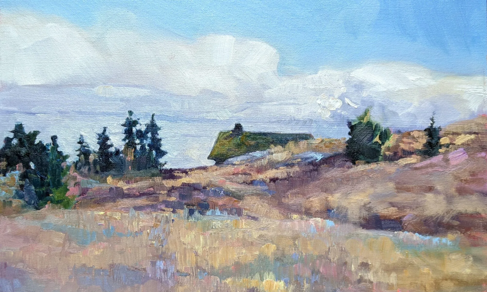
Yesterday would have been a perfect painting day, but I’m a native of these here parts. I knew it was probably the last day we had to winterize before Mother Nature dumps snow on us. So my laddie and lassies and I moved and stacked the seven face cords of wood we’ll need this winter, raked the turf and swept the driveway, rolled up the hoses, trimmed the roses, and put things away for the season. We get lots of snow here in Rochester, and not being prepared gums up the works.
Conversely (and perversely) the day we met to shoot my how-to-paint video was miserably cold and windy. Why can’t Mother Nature cooperate?
Serina Mo filming.
But Serina Mo did a GREAT job with it, and I’ve learned just how much of a Buffalo accent I really have. Enjoy!

I will be teaching in Acadia National Park next August. Message me if you want information about the coming year’s classes or this workshop.

If you don’t have something good to say


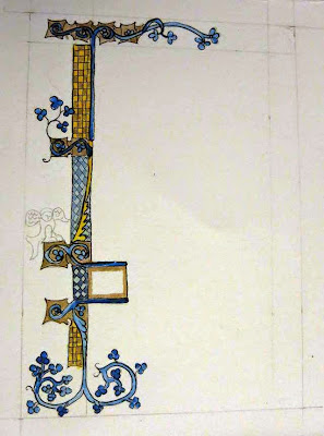
Doodled illumination, by Gail Kellogg Hope

 My pal Gail Kellogg Hope is home chasing a toddler around. Gail’s a trained artist, with an MA in art education from RIT. Occasionally she gets bored and does something ‘arty’ although she doesn’t have the mental space or energy to paint seriously right now.

This is why she ended up making the illuminated borders here. They’re pen-and-wash doodles, and she thought she’d make a set of them as cards as a gift for someone.  I thought they were sweet and told her so. Then she showed them to a group on Facebook, where she received a scathing rip by a fellow artist about her lack of detail.
Doodled illumination, by Gail Kellogg Hope
There is a place for constructive criticism, and Facebook—in general—isn’t it. This is not to say that I never critique work on Facebook, since I have hundreds of artist friends and we’re always bouncing images back and forth. But critique is best done one-on-one and among people you trust.
Doodled illumination, by Gail Kellogg Hope
The artist has just presented you with the best work he is capable of at this time. He is profoundly attached to it. Like a parent, he is blind to its weaknesses. Yes, you can gently point out ways to make the work stronger—and that is, after all, the primary job of a teacher—but you had better start from the position that the work is fundamentally good.
This is why nice people sandwich the negative between two positives: “I love your use of color/the horizon is crooked/your composition is strong.” Practice that technique. It will come in handy all through life, not just in art.
Doodled illumination, by Gail Kellogg Hope
I have a painting in my studio that I wrecked after a bad critique session. Fifteen years later, I know that the comment that crushed me—“It’s like a bad Chagall”—was neither true nor helpful. I would hate to think I ever did that to another student.
Be honest, but if you don’t have anything good to say, then you probably shouldn’t be critiquing work at all.
Doodled illumination, by Gail Kellogg Hope
I will be teaching in Acadia National Park next August. Message me if you want information about the coming year’s classes or this workshop.

Facing up to it

Cece (who’s really being a good sport about these photos) starts by measuring her features and their positions.
Almost every high school student who expresses an interest in going to art school is proficient at one thing: drawing from photographs. When I introduce them to the idea that they have to learn to draw from life, their reaction is always the same: they don’t want to do it because it’s hard.
Drawing is such a fundamental tool that every high school student should know how to do it, but they don’t. And this is true of kids from every high school, so I know it’s a general trend, not a problem specific to one place. (And, by the way, this is nothing new. In my public high school in the 1970s there were three art teachers, only one of whom taught traditional methods.)
It’s a good likeness but any competent reviewer is going to know she did it from a photo.
The difference between a life drawing and a photographic drawing is something a trained artist can pick off at twenty paces. Life drawing is going to give kids an edge when it comes to portfolio review, and it’s going to make the transition to college easier. By the time I get them, most of these kids are already advanced enough to get into the college of their choice. My goal, therefore, has to be to help them get as much scholarship money as they can muster, because art school is expensive.
Finally, the measurements are done and she can start working on the modeling.
I have three high school seniors in my Saturday class, and they are currently doing an assignment they all loathe: a self-portrait done from a mirror. This requires that they suspend their idea of what they look like, which for all of us (but adolescents in particular) is a litany of things we don’t like about ourselves. It also forces them to use the first technique of drawing: measurement and angles.
We started this with practice drawings in charcoal. From here they go to carefully-rendered pencil drawings. I had hoped to work alongside them, since my ravaged old face hasn’t been immortalized in a while, but alas, I’ve been too busy.

I will be teaching in Acadia National Park next August. Message me if you want information about the coming year’s classes or this workshop.

When life hands you lemons, draw them

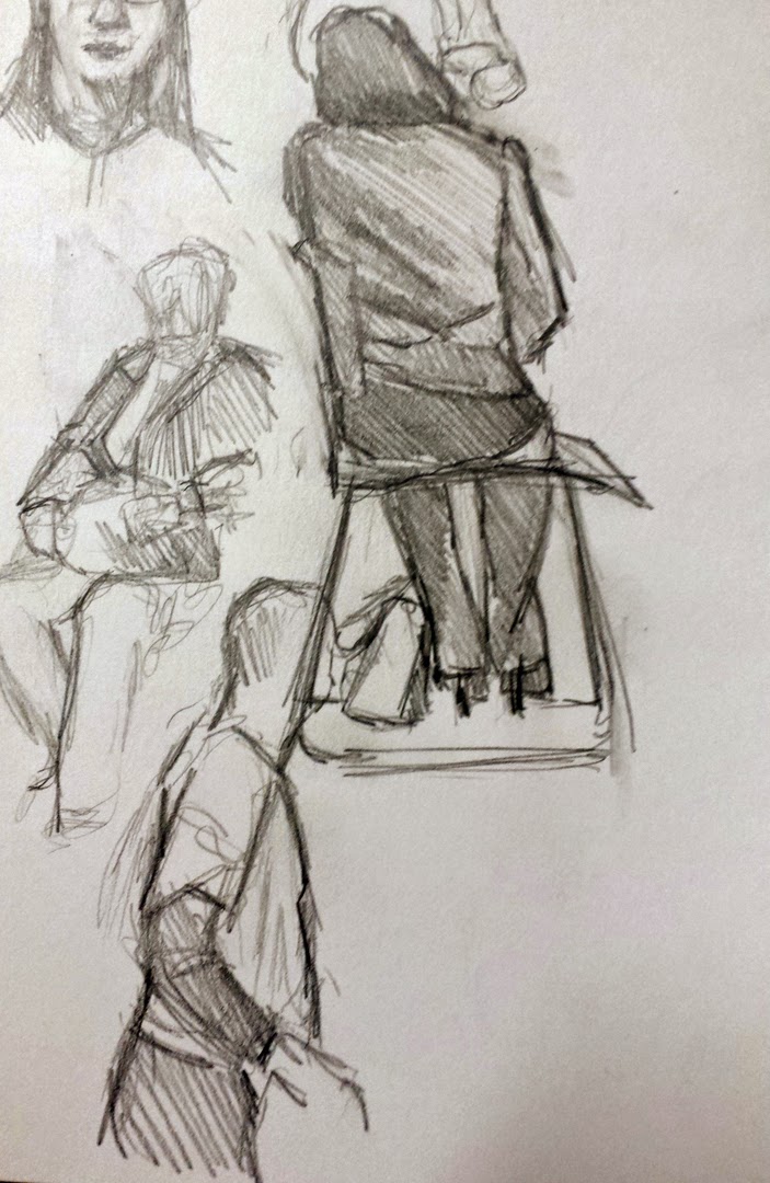
Passing a kidney stone. Did I mention there’s very little privacy in a hospital ward?

Yesterday I found myself bunged into the hospital. (This is about the miasma that passes for a climate here in November, and it’s nothing to worry about.) Luckily I nabbed my toothbrush and sketchpad on the way.

It ran into the drawing above, but I loved the caring gesture by the doctor.
I may be the only patient in history that asks to be left on a gurney in the hall. There’s much more interesting stuff to draw.
Two guys who were passing through.
Don’t believe what you hear about people lying on gurneys waiting for hours; in general they’re treated in a minute or two. In most cases, I have very little time to work. (It’s always about me, isn’t it?) I start these drawings as fast gestures. And no, nobody objects to my drawing them—they’re too sick to care.
Charting.
The easiest people to draw are staffers working on computers. Engrossed in patients’ records, they’ve been known to sit still for minutes at a time. Conversely, sick people move around all over the place. They’re uncomfortable.
Charting.
Inevitably, someone said, “I’m so jealous of your talent! I can’t draw a thing.” I answered as I always do: I can teach anyone to draw. Her disbelief was writ large in her face, but it’s true. The point isn’t whether these are good, bad or indifferent drawings. The point is that you learn to draw mainly by using your time to draw.
Waiting.
Having said that, I’m down to my last three pages of clean paper. Either they spring me loose this morning or my daughter is going to have to bring me a new sketchbook.

I will be teaching in Acadia National Park next August.  Message me if you want information about the coming year’s classes or this workshop.
Victorian Death Portraits

The art of living is more like wrestling than dancing. (Marcus Aurelius)
I’ve been reminded of that a lot this week as I watch a friend struggle with her husband’s end-stage cancer. It makes one keenly aware that life isn’t exactly a picnic.
There is a misunderstanding that Victorian parents were somehow distanced from their children because they lost so darn many of them. 19thcentury literature, with its recurrent cry of loss, tells us otherwise. It was a period of great innovation but death rates did not drop; in fact it was the Dark Ages of child mortality in the western world. Urbanization, industrialization, poverty, war and unsanitary obstetrical practices were ruthless killers of people of all ages, but especially children.
If you were wealthy, you could hire a sculptor to immortalize your late son in marble, as here, in the Blocher Memorial in Forest Lawn Cemetery in Buffalo.
Consumption, or tuberculosis, was the “family attendant” in all too many Victorian households:
I paid a sad call at the Worths where 2 children seem to be at the point of dying, the poor terrible little baby has constant fits & little Madge two years old, who has been ill 12 days with congestion of the lungs. This is the second time I’ve seen them in this illness
we went into next door where we saw poor little Miss Lee evidently very near the end, but sweet and affectionate as ever. (Louisa Baldwin’s diary, 26 April 1870)
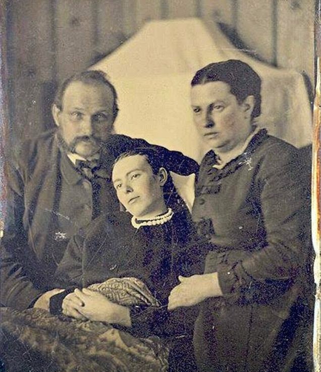
If you were middle-class, your posthumous family portrait was done in daguerreotype.
The spread of the daguerreotype photographic process made portraiture more commonplace, but until late in the century most people had never been photographed. This was especially true of children. To the parent who had unsuccessfully nursed a beloved child through a cruel illness, the steady slow erasure of memory was the final blow.
These portraits were not ghoulish memento mori; they were keepsakes to remember specific people. The practice remained in vogue until Rochester’s own George Eastman standardized photography equipment and film, making picture-taking an everyday art form.
Early examples took advantage of the slow exposure of daguerreotypes (and the required stiffness of their posing) to make the subject look lifelike. The deceased was photographed in poses with living family members, braced on furniture, or with a favorite toy.

The family grouping with dead child would probably be the only photo of the kids together.
There was very little palliative care for the dying Victorian. Most people died in their homes. Yet the idea of assisted suicide or “death with dignity” would have been inconceivable to them. It is a thoroughly modern concept.
I have done one death portrait, of a newborn baby. I don’t have a photo of it since I delivered it hurriedly to the family, but it was (I think) one of the most important things I’ve ever painted. It is rare that artists have the chance to help with healing.

Message me if you want information about the coming year’s classes and workshops.

Message from Mt. Hope

Both Anthony’s and Douglass’ graves typically have offerings left on them.
If you ever come to Rochester, I’ll take you to Mount Hope Cemetery to introduce you to two of Rochester’s most illustrious citizens, Frederick Douglass and Susan B. Anthony.
I did that with Serina Mo, Chad Dusenbery and Kari Ganoung Ruiz after we were done filming on Sunday. It was especially important this week. Pundits are predicting very low turnout this Election Day. Both Douglass and Anthony devoted their lives to expanding the voting franchise; it seems sinful to fritter that away.
Memorial service at Anthony’s grave on July 22, 1923.
The 19th century American religious revival called the Second Great Awakening spawned an equally great reform movement. Temperance, abolition, and women’s suffrage were its three major strands.
Susan B. Anthony (1820–1906) was raised in a reformist Quaker family. She was deeply involved in all three of these movements, although she is most remembered as a suffragette. With her friend Elizabeth Cady Stanton she worked tirelessly to organize women into a coherent political force.
Frederick Douglass’ grave has a concrete cover. Perhaps this is because in 2000, vandals broke into the nearby tomb of Civil War General Elisha G. Marshall and stole his skull. 
In 1872, she was arrested and convicted for voting in here in Rochester (her hometown). In the face of constant opposition, ridicule, and abuse, she traveled, lectured, and wrote constantly.  She and Stanton first presented an amendment giving women the right to vote in 1878; neither of them lived to see it passed as the 19th Amendment.
Frederick Douglas in his late twenties. He never knew his real birth date.
Born into slavery in Talbot County, Maryland, Frederick Douglass (c. 1818 â€“1895) was separated from his mother as an infant and raised by his grandmother until age 7, after which he was moved around in the slave labor pool. He taught himself to read and write. After several failed attempts, he escaped to Philadelphia. Fearing recapture by his owners, he decamped to Ireland. His English supporters purchased his freedom.
Returning to the US, he settled here in Rochester, where he started publishing the abolitionist paper, The North Star. He embraced the suffrage cause, just as Susan B. Anthony had embraced abolition. He became the first African-American appointed to a high Federal office, and was one of the most famous intellectuals of his day.
Susan B. Anthony
“The great constitutional corrective in the hands of the people against usurpation of power, or corruption by their agents is the right of suffrage and this when used with calmness and deliberation will prove strong enough,” said Andrew Jackson. The power of democracy may be wrested from us, but never let it be said that we willingly gave it away.

Message me if you want information about the coming year’s classes and workshops.

Suffering to be beautiful

Serina Mo and yours truly, filming in Mt. Hope Cemetery. (Photo by Chad Dusenbery.)
Yesterday I made a painting tutorial with Serina Mo. This project has been delayed because of equipment problems, so we were running later in the season than we’d intended. Sunday dawned clear, windy and very cold.
I’m accustomed to painting in cold weather, and I have the clothes for it. But they are ratty and I felt I needed to look more respectable for video. However, it was colder than I’d imagined was possible. Even with thermals under my clothes, three hours in the wind was too long. I finished before the picture was done, because my hands were too cold to control the paintbrush. “The rest is just details,” I’m fond of telling my students, and this is certainly true when the light is right. (I was so cold when I got home that I didn’t even take a photo of the finished painting, which is still in my car.)
My sketch for the painting.
RIT seems to be on a roll developing Bright Young Things for the animation industry, and Serina is one of them. I met her through one of her co-workers at Workinman. These kids blow me away with their abilities in 2D and 3D animation. Their fundamental training is very good, and it comes through when they take up traditional painting, where the only question they have is how paint itself works. In terms of color theory, composition and drawing, they’re as well trained as any art school graduates I know.
The scene in question. I love the diagonals of the oaks.
So I’m confident knowing that this video is in Serina’s competent hands, and I can’t wait to see how it turns out.
Filming my lovely little easel. (Photo by Chad Dusenbery.)
Message me if you want information about the coming year’s classes and workshops.

Is there racist architecture?

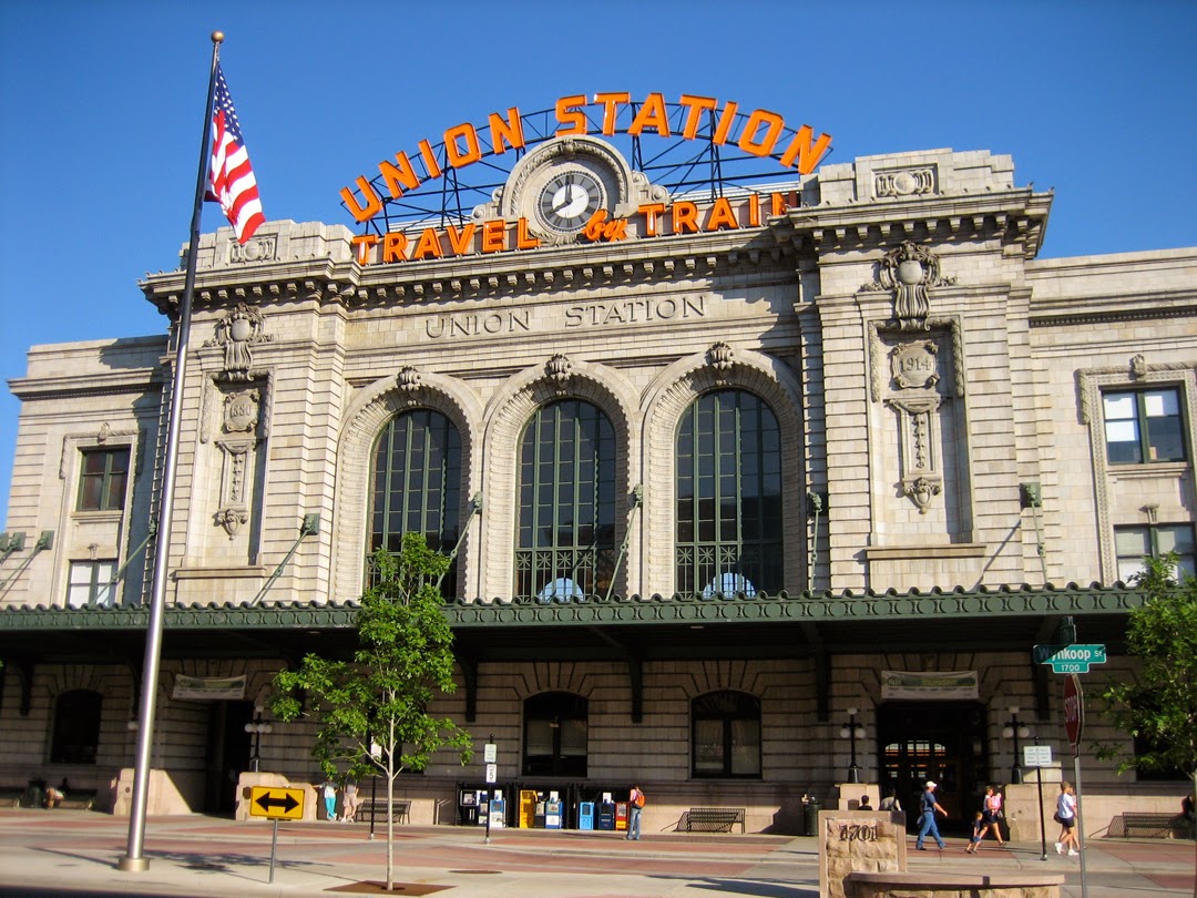
Denver’s Union Station with light rail development.
If you’ve taken the California Zephyr across the country, you’ve stopped at Denver’s Union Station. There’s been a station on this site since before the first Transcontinental Railroad was completed. The current one, designed by Denver architects Gove & Walsh, was built in the Beaux-Arts style and opened in 1914.
The station was built of marble quarried at Yule Creek Valley in Colorado. This marble is so white, uniform, and workable that it was also used for the Tomb of the Unknown Soldier and the Lincoln Memorial in Washington, D.C.
And how it looked to prior generations of rail travelers.
Perhaps it was the whiteness of the marble that caused the Denver Post’s Fine Arts Critic, Ray Mark Rinaldi, to accuse the building itself of being racist.
“The symmetry, arched windows, ornate cornice and stacked, stone walls have their roots in the glory days of France, England, Greece and Rome, in empires that were nearly absent of ethnic minorities and who felt fully at ease invading, exploiting and actually enslaving the people of Africa, subcontinent Asia and South America,” he wrote.

It’s ironic that he omitted the legitimate acts of racial oppression related to the Transcontinental Railroad: the abysmal treatment of Chinese workers both on the railroad and in the mines, and the displacement of indigenous Americans.
Denver in 1859, Collier and Cleveland Litho Co. If ‘exploitation’ means indoor plumbing, I’m all for it..
I went to kindergarten in a building that had separate boys’ and girls’ entrances. I wouldn’t even go so far as to accuse that building of being sexist.
“There’s no traditional Mexican restaurant
” Rinaldi laments. Of course, had there been, it would have been built in another exploitative style, since Mexican architecture borrows heavily from Spain.
Al Khazneh in Petra.
People borrow from other cultures even when they haven’t been colonized or exploited by them. Consider all the paeans to “Asian simplicity” in modern architecture. Al Khazneh in Petra looks like a Greek building, but it was built by the Nabataeans while they were still independent of Rome. The Nabataeans just dug that Greek look.
Crofutt’s Trans-Continental Tourist’s Guide Frontispiece 1870
When Denver plopped its first rail station on that site, it was a “city” of fewer than 5000 people. When it started building the station that is there now, it was a boom-town of double-digit population growth. Its lovely train station was aspirational, not racist or exploitative.


Message me if you want information about the coming year’s 
classes and workshops.

Women’s work

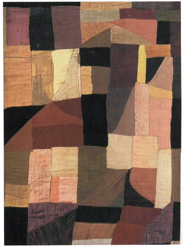
Baby quilt, Sonia Delaunay, 1912 
In 1980 I saw a show of Sonia Delaunay’s embroidered textiles at the Albright-Knox Art Gallery in Buffalo. If I hadn’t been with a very rational friend, I’d think I imagined it, because I’ve seen nary a trace of that work since, online or elsewhere.
I was reminded of it yesterday when writing about Mary Delany, because both were attempting to bridge the gap between high art and women’s traditional crafts.
From La prose du TranssibĂ©rien et de la Petite Jehanne de France, a collaborative artist’s book by Sonia Delaunay and Blaise Cendrars, featuring the Eiffel Tower.
Sonia Stern (Terk) was born in Ukraine in 1885. At a young age she was sent to live with relatives in St. Petersburg, where she had the benefits of affluence, ultimately culminating with an art education in Karlsruhe and Paris. There she entered a marriage of convenience until she eventually met and married the painter Robert Delaunay.
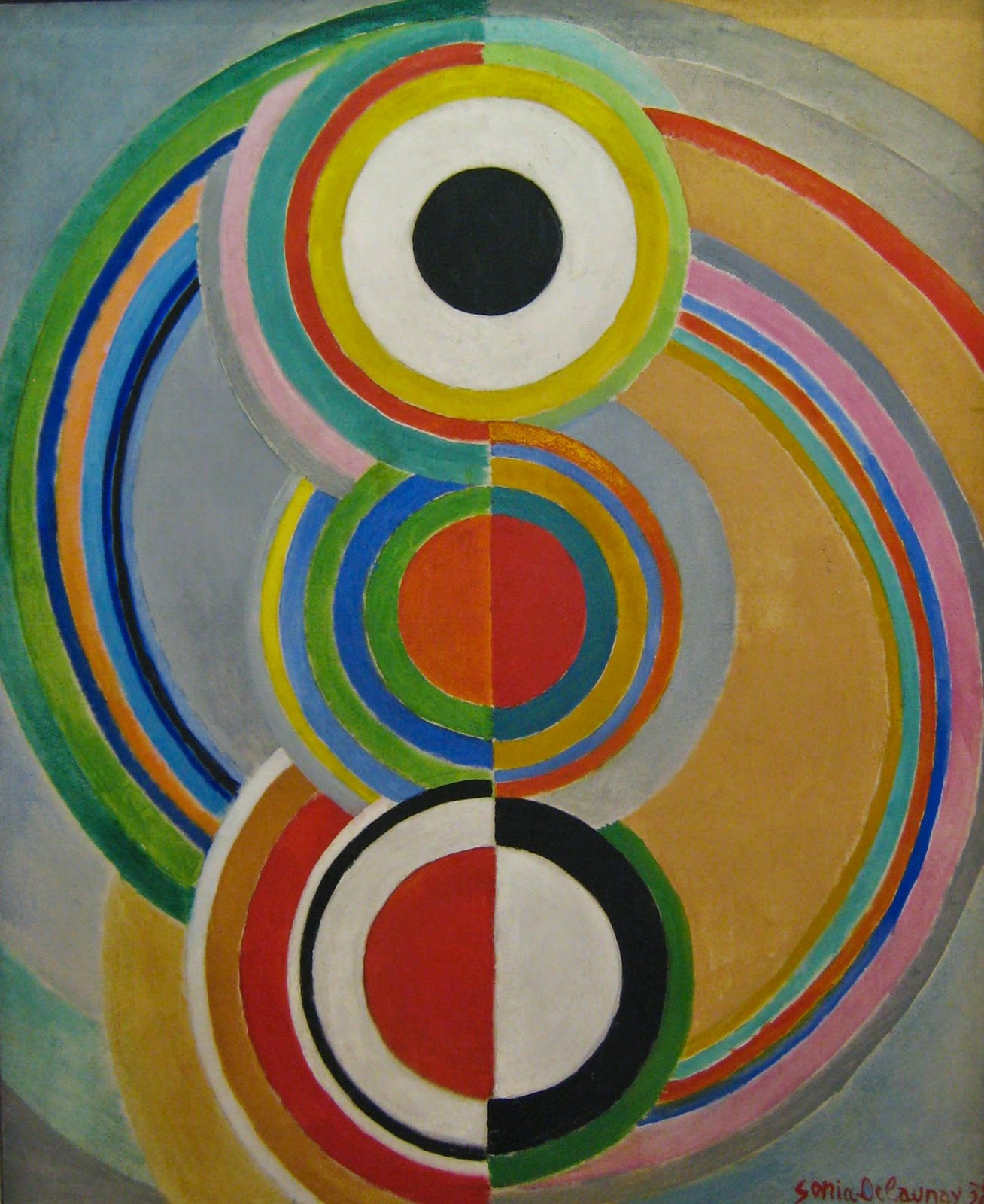
Rythme, 1938, Sonia Delaunay
The couple pioneered a form of painting called Orphism, which was the intermediary step between Cubism and Abstract Expressionism. While art critics ponder its roots in Fauvism and the writings of Paul Signac and others, I see it as based in quilting.

Bathing suit, 1928, Sonia Delaunay
There are historical grounds for that, as well.  “About 1911 I had the idea of making for my son, who had just been born, a blanket composed of bits of fabric like those I had seen in the houses of Russian peasants. When it was finished, the arrangement of the pieces of material seemed to me to evoke cubist conceptions and we then tried to apply the same process to other objects and paintings,” Sonia Delaunay wrote.
Simultanéisme dress, 1913, Sonia Delaunay
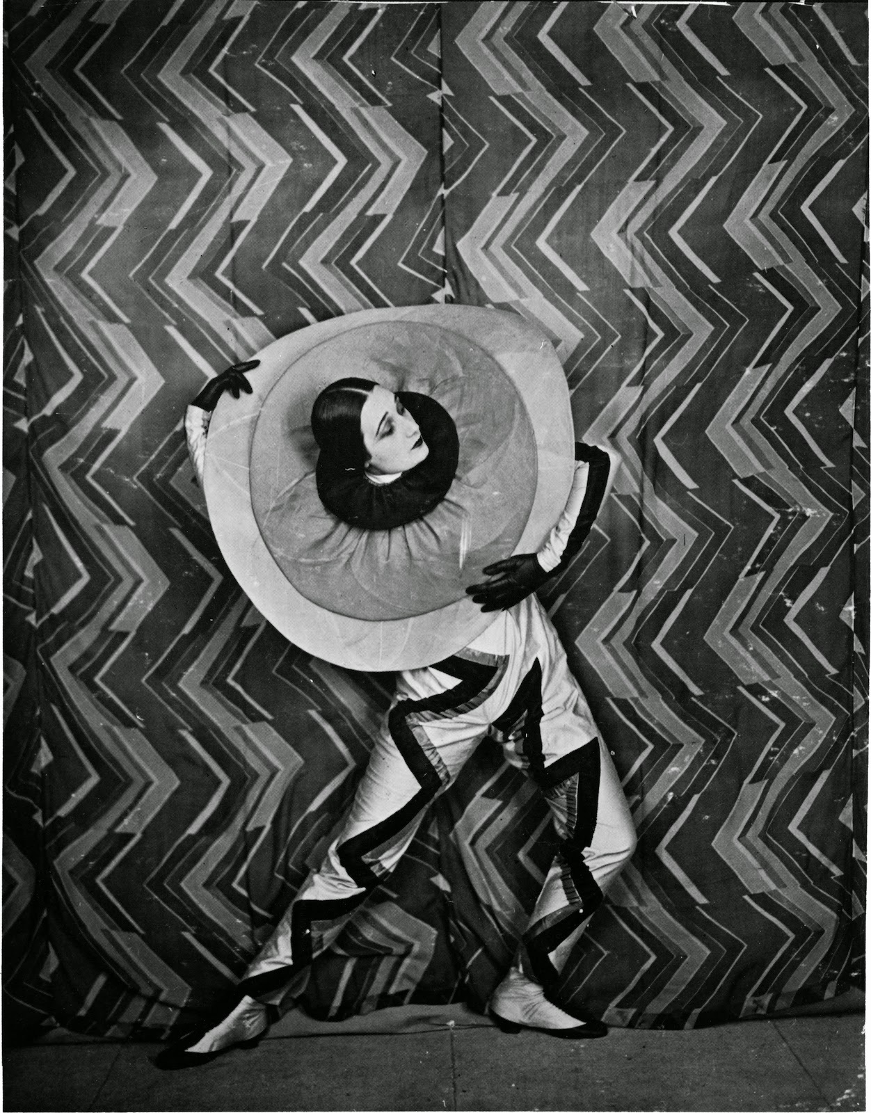
The period between the World Wars was one of great invention for her. She designed fabrics, theater and movie sets and costumes, and opened a fashion studio. She lectured at the Sorbonne and had a pavilion at the 1925 Exposition Internationale des Arts DĂ©coratifs et Industriels Modernes in Paris (which gave us the term Art Deco).
Printed silk satin with metallic embroidery dress, c. 1925-28, Sonia Delaunay.
Sonia Delaunay outlived her husband by decades. After his death from cancer in 1941, she continued to paint and design, eventually being decorated with the Ordre national de la LĂ©gion d’honneur.
Still photo from Le P’tit Parigot, 1926, costume and set by Sonia Delaunay.
The textile embroideries I saw in 1980 combined two great interests of hers—words and needlework. It’s a pity they’ve vanished from modern consciousness. But that’s often the lot of women’s design—influential, intellectual—and ultimately forgotten.


Message me if you want information about the coming year’s 
classes and workshops.