fbpx

Mind control; thought control

A very typical boy illustration of a “smoking gun,” albeit better executed than most.
From the sketchbook of one of my former students.

I’m particularly fond of teenagers and especially that creature-in-crisis, the teenage boy. I’m currently the proud owner of a 16-year-old model, and I’ve taught others in my studio. And of course you know that I’ve been assiduous in telling my students to draw, draw, draw—to draw in class, to draw on the bus, to draw on dates. I don’t care what they draw; I don’t care where they draw; I just want them to draw.

So imagine my shock and dismay when I read in Salonthat a 16-year-old high school student in Egg Harbor City, NJ, was arrested after doodling in his notebook. The boy drew what has been variously described as either weapons or a flamethrower hand (which is the second most-common trope among teen boy artists, after guns).
Another drawing, same kid.
Having clearly never before seen a teenage boy, a staffer called the local cops, who—instead of rolling their eyes—searched both the school and the kid’s home with sniffer dogs. There they found chemicals which when combined could create an explosion, and pieces of electronics which when rebuilt could have been used to make detonators.
Boys of that age live in a
comic-book universe.
(I am glad they didn’t stop by my house, since they would have found electronic parts and chemicals strewn all over the kitchen, this being our week to refinish the kitchen cabinets and repair the light fixtures.)
This would all be the makings of a ridiculous story, except that the boy was sent to juvenile detention while the so-called crime was investigated.
(Read more here, here, here, and here.)

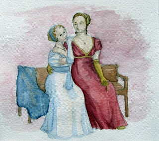
I’m not much of a believer in gender differences, but having taught a lot of teenagers to draw and paint, I know there are distinct differences in what they draw when they’re not being ordered around by the likes of me. Teen girls draw archetypal faces and bodies (often in Regency clothes). Teen boys draw weapons and fight scenes. This is universal, and I’m shocked that anyone working with kids doesn’t know this.
Last year I had a sweet kid in my studio, SH, who has graciously allowed me to share some of the gun doodles from his sketchbook. SH is every mother’s dream kid—handsome, kind to others, involved in extracurricular activities, a competitive swimmer, camp counselor, and having excellent manners. But when he was bored, he drew guns—just like every other boy I’ve ever known.
This is a typical girl drawing of the same age, again better executed than most.
By my daughter.
Drawing is a form of thinking as well as communicating, and in the hands of most people is primarily therapeutic and cathartic, rather than descriptive. A kid who draws a flamethrower is dealing with the stress of sexuality in a time-honored manner. A kid who draws a monster clawing off Mrs. Addlepate’s face has in fact found an excellent way of dealing with the stress of Mrs. Addlepate’s inanities. On the other hand, the kid who is prohibited from expressing his frustration, his zeal, his intelligence, his adolescent hormones and his pain is a kid who’s more likely to quite literally “go ballistic.”

Of sidekicks and teenagers who sleep in class

He’s fifteen… I asked him.

I had the good fortune to have lunch yesterday with two of my former sidekicks, Marilyn Feinberg and Matthew Menzies. A good sidekick is a beautiful thing, and these two are among the best. In some ways, they’re polar opposites: she is a middle-aged intellectual; he is a rather rowdy teenage boy. 
I love teen boys’ oversized puppy paws.
Matt went straight from our lunch to speak—as a grown-up, second-year RISD student—to Brighton High School’s AP art class. I was pleased but not surprised to hear that he emphasized drawing, for Matt drew in all his classes. In a nutshell, this is why he’s such a fine draftsman today, and it’s a pity that his school now discourages students from doing so.

This one I know is fifteen. He’s mine.

I frequently draw in church, because it helps me to concentrate on the sermon. In recent weeks a group of teenagers has caught my eye—the teenagers who “concentrate with their eyes closed.”

Along with drawing in class, looking as if you’re sleeping is absolutely verboten in high school (evidently, the students are all expected to look as if they’re on a Synchronized Learning Team). In church, however, the congregation isn’t a captive audience, and our preachers work to retain interest, so lounging, drawing, and other out-of-the-ordinary behavior is tolerated.
Really too far away for me to see their faces in detail. 
Having taught Sunday school as well as watched teenagers in church over the course of many years, I’m convinced the kids are actually hearing more than most adults credit them with, since they always seem to perk up when it gets interesting. Anyway, the proof is when teenagers continue to come to church as young adults. That indicates that their teacher was someone who worked to earn their attention and respect. 

Not a child at all, and a totally different setting:
a bailiff at Monroe County Hall of Justice.
But there was something boyish in his oversized solidity.

You might think drawing a sleeping kid would be easier than most surreptitious figure drawing, but these kids actually wiggle as much as their attentive neighbors (another clue that they aren’t really sound asleep). I usually have about five minutes, tops, before my subject moves, and I plan accordingly. No great detail—if I get the gesture and measurement right, I’m happy.

The Quality of Light

“Michelle in incandescent light,” 36X24, oil on canvas.
(Photo credit, Brad Van Auken)

Last week I went to a figure group which used incandescent spots and Odalisque poses. Here I never set up with either, and haven’t since I studied with Cornelia Foss. When I returned to my studio after my trip, I was wondering whether I was missing anything, so yesterday I decided to set up with a spotlight.

Students like spotlights because at the beginning painting with them seems easier. Most of the major color and value decisions are made before one ever picks up a brush. There are only two fundamental colors to worry about—the color of the light and the color of the shadow, since all of the natural, accidental, reflected tones are blown away by the color of the spot.
The problem is that one can go a certain distance quickly, but then can go no farther. I painted the above in three hours. It was impossible to find any real color range. Gone were the delicate blues and greys and olives of Michelle’s skin; she was rather like one of those Thomas Kinkade lighthousesthat are apparently on fire from within. To be honest, I cheated with the warm midtones—they didn’t even exist. As I said to Michelle, “I am painting what I want to be true, not what is actually here.”
With incandescent spots, the pattern of darks and lights is spelled out by the lighting itself, and one need not work for it. That seems easier at the beginning, but it makes new discovery next to impossible. This is especially true in all the variations of the Odalisque pose.
Make no mistake: the history of the Odalisque is erotic. The word comes from the Turkish ‘odaliq’, or chambermaid, which in the west was understood to mean a harem concubine, and to refer to the whole sensualized artistic genre in which the model lies on her side on display. (If you doubt this, just do a Google search of Odalisque and imagine the models writhing.)
The art world has historically been deeply misogynistic. Art has been made by some very competent women— Artemisia Gentileschi, Berthe Morisot, Mary Cassatt, Judith Leijster, Käthe Kollwitz, Gabriele Münter, and so many others—but art is generally made by men and purchased by men. The Odalisque is sexual objectification, but a higher-rent version of it than the porn available on the internet. Sometimes it is done brilliantly, but it’s certainly nothing I’m interested in perpetrating (and I wonder sometimes why so many women are acolytes at the feet of its proponents).
For the next three weeks we will be working on one long pose, and I have set high-school student MB the task of creating the pose, having assigned her five artists to study: Goya, Manet, Degas, Modigliani, and Freud. That will give us nine hours to paint in this pose, and that’s an opportunity not to be missed. I should note that the times are slightly changed to accommodate MB’s schedule.
Friday, December 7, 2012: 3-6 PM
Thursday, December 13, 2012: 3-6 PM
Friday, December 21, 2012: 3-6 PM

One Morning in Maine

With apologies to Robert McCloskey

“Sunset at Marshall Point,” 8X6, oil on canvasboard, private collection
People say, “Paint what you know,” but I’m more for knowing what I paint. That said, my knowledge of Maine has until now been surface deep. I’ve painted in Eastport and Lubec and the mid-coast region, but not in the last few years, and never with the kind of intense concentration that you get from being in the same place day after day.  I freely admit that I don’t understand the Maine landscape with the same intensity that I understand Keuka, but that doesn’t mean I can’t learn.
Sunset over Penobscot Bay.
I’ve been invited to teach plein air in mid-coast Maine next summer. The only way from here to there is to pull out my brushes and paint there, intensively, day after day. Most sane people do NOT do that in November, but I believe in striking while the iron is, er, stone cold.
Cold it is during the two weeks leading up to Thanksgiving, no matter where in the Northeast you’re painting. One morning I was painting on a commercial wharf and thought it was warming up enough to doff the gloves, until I reached for a baby wipe and found it frozen solid to the ground. (An aside: the good news about painting all day in that kind of cold is that you sleep like a baby.)
“Pine trees at sunset near Owl’s Head, ME,” 8X6, oil on canvasboard, private collection.

Maine is iconic, and there are subjects which are almost verboten because they are clichés—lighthouses, lobster boats, surf, lobster traps, and buoys. Yet those things are also integral to what Maine is, and in the hands of good painters, are both transformed and transformative. Maine resonates with many of us precisely because it is a place whose hard work is on display. We Americans revere and respect work. To ignore that would be almost as clichéd as the worst lighthouse painting.
“Surf,” 8X6, oil on canvasboard, available.
I frequently fall into two compositional traps when painting the ocean, something I never worked out satisfactorily before this trip. The first is getting caught in the perfect ellipse of the shore, and the second is the triangle formed by ocean silhouetted by land. After ten days or so of fighting this, I drove two hours to see a wonderful show, “Weatherbeaten: Winslow Homer and Maine,” at the Portland Museum of Art. As one entered, one first saw “The Artist’s Studio in an Afternoon Fog,” which is owned by Rochester’s own Memorial Art Gallery. This painting is an old friend, and one I frequently use to teach composition.

Homer used two devices to organize his Maine paintings: a strong dark diagonal, and vast simplification. I use that diagonal in figure-painting all the time; why did it never occur to me as a solution here?

Maine in November bears little resemblance to the traffic jam that is US 1 in July. The plein air painter has to know two things—how to get off the beaten path, and where to find toilets and coffee. I spent much of my two weeks figuring out these details. Much of my painting was, therefore, less about painting than about planning to paint. But then I would see seals gamboling in the ocean, and it was about the joy of God’s creation and my grateful heart.
My wee little paint kit on a cold day in Belfast, ME.
The Farnsworth in Rockland has to be flat-out the best museum in a city of its size (7,297 people, I kid you not), anywhere. When I visited, they were simultaneously featuring Louise Nevelson and Frank Benson, which was a stretch for my limited brain. I was most moved and surprised by the Jamie Wyeth-Rockwell Kent show. I am a big fan of surrealism in literature, but in painting it generally leaves me cold. Wyeth has an iteration of this painting (in oil) which is simply the best surrealist painting I have ever seen. I was also quite taken by his The Seven Deadly Sins as expressed through seagulls.
Near Port Clyde, ME.
I am about the same age as Jamie Wyeth and like him was taught to paint by my father. (There, obviously, the similarity ends.) I was rather surprised to find in his mature work such a strong resonance with his grandfather, the great narrative painter NC Wyeth. All those Wyeths are story-tellers, but there’s a romanticism that skips from grandfather to grandson.
In my wanderings, I met Robin Seymour, gallery manager for Eric Hopkins, who is a joyful, lyrical and yet very intellectual painter. Robin is a true art historian, worlds away from the typical gallerista, and I got a tremendous kick out of talking to her. I also met Hopkins himself, who demonstrated looking at things upside down by lying on his back on his credenza; it’s a sign of the Mainer’s resilience that he was able to get back up. Robin introduced me to her neighbor, Yvette Torres, who in turn introduced me to the fantastic work of Winslow Myers. Later that week, painter Alison Hillof Monhegan took me along to her weekly figure session, which was in Yvette Torres’ gallery. When life moves in circles like this, it’s simply wonderful.
“Marshall’s Point,” 12X16, oil on canvasboard, available.
To say I’m looking forward to teaching there next year is to vastly understate the case. Watch this spot.

Ten days on the road

Painting John Porter on the porch of the Irondequoit Inn. Normally, you develop a painting all over, in layers, but not if your model has temporarily disconnected his oxygen to pose. (Photo by Carol Thiel)

September and October are New York’s grandest months, when our state throws off its sartorial rectitude and arrays itself in scarlet, purple, and cloth-of-gold. And the last week in September was the best possible time to be at the Irondequoit Inn with 14 of my fellow New York Plein Air Painters (NYPAP). This organization is being wonderfully revived by painter Marilyn Fairman, who organized the event.

A tiny study of trees and reeds, by me.
However, there’s a reason Native Americans considered the Adirondacks their summer home. Its cold is brooding, often accompanied by rain and mist, and the weather is fickle.  Last autumn, the mercury was hitting 80° F, but this year it was pouting in the 40s and 50s, with rain and wind. That often corresponds to the best fall color, but it’s chilling to work in. However, we are all dedicated outdoor painters, so of course we soldiered through.

Painting at Oxbow Inlet
(Photo by Mary Beth Vought)
At one point, I trekked through a drenching downpour to find Janet Yeates turned out like the Gloucester fisherman and Ruth Crotty in knee-high Wellingtons, the hood of her rain slicker pulled tight around her face. Both, of course, were too stubborn to quit. Ruth was tarping down her easel under a pine tree, muttering, “What else could possibly happen?”

“Lightning?” I asked.

Mercifully, I was wrong.

The start of our retreat coincided with the end of a workshop given by National Geographic photographer Ralph Lee Hopkins. The end of it coincided with the start of my painting workshop. The Irondequoit Inn was a whirling parade of the visual arts, running for two weeks straight, and it would be difficult to express just how energizing it was.

Snag at Piseco Outlet, by me.
My trip started with Bruce Bundock’s opening at Locust Grove in Poughkeepsie. The show should have been called Friends in Low Places, because Bruce’s gift is finding the sublime in the pedestrian. This review features one of his finest paintings, but this painting currently is my favorite: a classic composition that might typically be used for a villa on the French Riviera, but which he translated to a raised ranch along the Hudson, with a tanker in the background. Since it’s Bruce’s day in the sun, I might as well add that he was recently profiled for his day job as a preparator at Vassar, here.

Value study by workshop participant Carol Thiel.
For several years, my goal in landscape painting has been to capture the sense of tapestry rather than the sense of distance.  I find that much more difficult than building a global scene comprised of discrete objects like buildings, islands, lakes and hills. I’ve gone past the point of liking or disliking the results; I am simply compelled to paint this way. Nothing was different this week: as my friends and then my students turned out fantastic paintings of the woods, fields and lakes, I continued to slash and burn amongst the trees.

One afternoon we finished up early and took a canoe trip in Piseco Lake and up the mouth of Fall Stream. We each brought small watercolor kits, but no painting was done (although the paper was certainly damp by the time we finished). But we did look at the mists, the black water, and the gold-drenched grasses on their earthen hummocks.

Watercolor of Piseco Outlet by workshop participant Shirley Ernst.

At 94, John Porter is the Piseco Company’s oldest living shareholder. I’ve had the good fortune to spend time with him during the last three autumns. He’s a retired woodsman, and wonderfully knowledgeable about both natural and human history. He’s getting a bit frail these days, and mostly looks at the woods from the front parlor. On the last afternoon of my workshop, we were working on architecture. I had set up a painting of the lovely old green chairs and dinner bell on the Inn’s commodious porch. The rain vanished, the sun came out, and it was suddenly warm. John joined us for a few minutes, so I put him in my painting. I’ll share it with you when it’s done, because to me it’s a wonderful memory of a precious day.

Blessings of a non-pictorial nature

Let’s get the sketch out of the way, first. No, it’s not very good, but that
is small potatoes compared to the experience of painting it.
It’s embarrassing to admit, but prior to this weekend I’d never spent any time in Corn Hill, which contains Rochester’s best-preserved collection of 19th century houses. I’ve driven through it, but to look at it, photograph it, or paint it—no, I’d never done that. So on Friday and Saturday, I spent a little time in lovely Lunsford Park.

Lunsford Park was laid out in 1837. It is surrounded by architectural gems, including a block of brick row houses, the Greek Revival home of canal engineer Col. Henry Cody, and a magnificent Second Empire rectory. There are two churches on the Circle as well: Immaculate Conception Catholic Church (1864) and the ruins of a lovely Medina sandstone gothic facade.

The sandstone stripe marks the
end of the old, start of the new.
This ruin is what everyone assumes they know about the history of the American church. A proud Richardsonian Romanesque-style Methodist Church, its membership had declined to unsustainable lows by 1969. The departing Methodists gave the building to an AME (African Methodist Episcopal) congregation. It then suffered several suspicious fires, the last (in August, 1971) being the disaster that did it in. The AME congregation followed the example of its Methodist predecessors and  withered away. They built a plain and functional sanctuary behind the surviving sandstone walls. Then they left too. Now it houses something called the End Time Deliverance Miracle Ministry, which has no internet presence and as far as I can see isn’t part of any denomination.

It seemed like there was nobody there: it appeared to be a squat barn of building (albeit very neat) with a hopeful name on a sheet of plywood above the door. A bit out of place in the lovely stillness of Lunsford Park, but it’s only a few blocks from Plymouth Avenue, and next door to it is an empty lot where a former city school stood.

I like churches and I like their buildings. I wandered around the circle for a while, looking for a subject to paint, but I kept coming back to this pile of stone. I looked at the memorial plaque to Dr. Charles Lunsford (1891-1985, Rochester’s first black physician), scuffed my feet through the falling chestnuts, took a few arty shots of the gazebo, and talked about our kids with a man sitting on a park bench, who—it turns out—is a member of End Time Deliverance.

He told me he was taking a cigarette break from handing out free clothes.  For the first time, I noticed the steady stream of people coming and going from a back door, toting full black plastic garbage bags over their shoulders. He told me he remembered the fires, and that he’d played in the old church as a kid (a rather poignant story I heard several times that afternoon).

In my more sophisticated moments, I understand that painting ruins is (in our day and age) a trope to be avoided at all costs. But there’s something about the wrecked face of this church that I love. It reminds me of my childhood church, Delaware Avenue Baptist Church. The ivy glowed green, orange and red against the violet sandstone walls, and pigeons called across the autumn afternoon. I know better, but I was seduced.

I set up on the hatchback of my Prius so I could look straight up at the tower. This is a foreshortened view and, frankly, I did a pretty poor job of drafting. But perhaps that’s because I spent almost the whole afternoon talking. As I mentioned, men were handing out clothing and coffee to the neighbors. A little boy was there with his Daddy, working on repairs. The praise band finished practicing. The sound guy finished adjusting the sound. Teen girls finished their dance practice. The ladies of the church were off somewhere else witnessing, but when they finished, several of them stopped by. (“I still gotta check on them,” one of them told me, and as a blue-haired church lady myself, I totally understand that.)

One man spent quite a long time telling me about the church’s outreach, which includes summer picnics for the neighbors. At one point the conversation moved to race and faith. “I don’t see why it matters,” a man told me. “Black, white—we’re all one church.” And then he invited me to join them on Sunday (which I would have done, except that my husband was playing in a praise band elsewhere). 

How many times have I driven around Buffalo’s East Side and lamented the death of the old churches that once proudly hosted German or Polish Catholic congregations? Under that surface decay, are they doing more of God’s work than ever? Conversely, how many of the beautifully-maintained faux-Tudor churches in the suburbs and countryside are dying from inside?

I would love to return and paint this church’s portrait, because it’s a portrait of an elemental truth: it’s not just that appearances can be deceiving—they almost certainly are deceiving. But to be honest, I don’t have a clue how I’d start to depict the beating heart inside this old ruin. Any suggestions?

Immaculate Conception isn’t unscathed either;
its steeple was hit by lightning and ruined.

Last chance! A week of instructed wilderness painting, only $775 inclusive!

September 30-October 5 2012


Paint in the unfettered splendor of nature with celebrated artist Carol L. Douglas, in the bewitching, boundless and historic Adirondack Park—a week of unparalleled instruction at some of the wildest, most scenic painting locations the nation has to offer. Your outdoor adventure will be balanced by the comfort of an all-inclusive accommodation package at the historic Irondequoit Inn.
Eric and Liz Davis
$775.00 inclusive!
·         Basic package: includes 5 nights lodging and meals.
·         Private non-smoking room with shared bath in either lodge or cabin accommodations
·         15 meals served communally
·         Breakfast: Monday-Friday
·         Box Lunch for off-site painting sessions,
M-F
·         Dinner: Sunday-Thursday
·         Coffee and Tea Bar
·         Sunday afternoon welcome reception
·         Morning and afternoon instruction sessions,
·         Monday-Thursday
·         Group critique session, Thursday evening
·         Available on request:
·         Non-painting partner accommodations
·         Private portfolio critique
·         Private Room and Private Bath: add $125
·         Suite with Private Bath and Kitchen: add $250
To register:
Call the Irondequoit Inn at 518-548-5500
For more information:
Eric and Liz Davis

Fall classes starting now!

The model’s eye point of view…

Studio in Art

Saturday, 10-1
Tuesday, 2:30-5:30

(Oil, pastel, acrylic, watercolor)This class focuses on still life as a fundamental tool for developing drawing and painting technique. It is appropriate for both beginning and advanced students. Instruction emphasizes direct painting, where paint is applied solidly rather than through glazing. For watercolor and acrylic, the emphasis is on alla prima techniques.

High school juniors and seniors interested in pursuing a BFA are especially encouraged to sign up for this class. I have an excellent track record in helping students develop outstanding college portfolios.

$100/month


Open Model Sessions, by invitation only

Our open model sessions are moved to Friday afternoons. Please contact me if you want more information.


Autumn is always a difficult time to schedule, since I have obligations elsewhere and there is a surfeit of holidays. If your class is cancelled, you have the option of taking the other class that week, receiving a refund, or taking a private lesson. Just ask me.


The schedule, as it currently appears

Note: we will still be painting outside, as long as the weather permits.

September, 2012  
Tuesday 9/11/2012 Open studio class 2:30-5:30 PM
Saturday 9/15/2012 Open studio class 10 AM-1 PM
Tuesday 9/18/2012 Open studio class 2:30-5:30 PM
Saturday 9/22/2012 Open studio class 10 AM-1 PM
Tuesday 9/25/2012 Open studio class 2:30-5:30 PM
Saturday 9/29/2012 NO CLASS: workshop 10 AM-1 PM

October, 2012  
Tuesday 10/2/2012 NO CLASS: workshop 2:30-5:30 PM
Saturday 10/6/2012 Open studio class 10 AM-1 PM
Tuesday 10/9/2012 Open studio class 2:30-5:30 PM
Friday 10/12/2012 Model  2 to 5 PM
Saturday 10/13/2012 Open studio class 10 AM-1 PM
Tuesday 10/16/2012 Open studio class 2:30-5:30 PM
Saturday 10/20/2012 Open studio class 10 AM-1 PM
Tuesday 10/23/2012 Open studio class 2:30-5:30 PM
Friday 10/26/2012 Model  2 to 5 PM
Saturday 10/27/2012 No CLASS 10 AM-1 PM
Tuesday 10/30/2012 Open studio class 2:30-5:30 PM

November, 2012  
Saturday 11/3/2012 Open studio class 10 AM-1 PM
Tuesday 11/6/2012 Open studio class 2:30-5:30 PM
Friday 11/9/2012 Model  2 to 5 PM
Saturday 11/10/2012 Open studio class 10 AM-1 PM
Tuesday 11/13/2012 Open studio class 2:30-5:30 PM
Saturday 11/17/2012 Open studio class 10 AM-1 PM
Tuesday 11/20/2012 Open studio class 2:30-5:30 PM
Saturday 11/24/2012 NO CLASS: Thanksgiving 10 AM-1 PM
Tuesday 11/27/2012 Open studio class 2:30-5:30 PM
Friday 11/30/2012 Model  2 to 5 PM

December, 2012  
Saturday 12/1/2012 Open studio class 10 AM-1 PM
Tuesday 12/4/2012 Open studio class 2:30-5:30 PM
Friday 12/7/2012 Model  2 to 5 PM
Saturday 12/8/2012 Open studio class 10 AM-1 PM
Tuesday 12/11/2012 Open studio class 2:30-5:30 PM
Friday 12/14/2012 Model  2 to 5 PM
Saturday 12/15/2012 Open studio class 10 AM-1 PM
Tuesday 12/18/2012 Open studio class 2:30-5:30 PM
Friday 12/21/2012 Model  2 to 5 PM
Saturday 12/22/2012 Open studio class 10 AM-1 PM
Tuesday 12/25/2012 NO CLASS: Christmas 2:30-5:30 PM
Saturday 12/29/2012 NO CLASS: Holiday 10 AM-1 PM
Tuesday 1/1/2013 NO CLASS: Holiday 2:30-5:30 PM

It’s not easy being green

“Jamie’s waterfall,” 12X16, oil on canvasboard. Painted in two hours flat, and after
packing my car and driving six hours. Only possible because I was working with a color matrix.
We are at that moment when the greens of the northeast suddenly become massive, heavy, and sometimes overbearing to new painters. We love summer, we want to share how delicious it is… and then we hit the wall of green.
Sue Bailey Leo’s version
of my green matrix.
I paint with color matrices wherever possible because they speed the process up, and the more one can get out of one’s own way, the better things go. In the case of foliage, a matrix allows one to separate the different green tones in a painting.
I don’t generally paint with a green pigment on my palette (with the occasional exception of chromium oxide green because it’s the exact shade and weight of summer foliage in the northeast). Instead, I mix them:

This matrix is, top to bottom: black, ultramarine blue.
Left to right: Cad. lemon yellow (or Hansa yellow, depending on my mood), Indian yellow hue (or gamboge hue), yellow ochre.
That gives you nine yellows ranging from high-chroma to subdued, blue to almost orange. In addition, you can tweak each color to either side by adding more of one or the other component, and you can also tint each tone by adding white.
The same matrix, mixed and with the addition of a row of cad. orange in the “yellows”.
Sometimes I shake it up by adding a row of cadmium orange tints, as above.

I’ve taught with this matrix for years and can attest that it helps beginning painters escape the deadly weight of greens, fast. 
Sue Bailey Leo’s first trip out this season. Note
 how effectively she was able to separate the greens.
And here is me, painting in a creek this week. Never happier than when wet, cold, and totally into the process.
Painting in the creek in front of Jamie’s waterfall, at dusk. I loves my Keens!

There just might be something to this.

Early spring morning, Piseco Lake, oil on canvasboard, 12X16

Yesterday, I wrote about a Stillman & Birn Alpha Series sketchbook that Jamie Grossman gave me, and my first attempt to pre-sketch my paintings in it in watercolor.
This morning as I walked my appointed rounds, I carried the sketchbook and watercolors instead of my camera. The first thing I noticed—of course—is that it took rather longer to make my circuit than it usually does.
I’ve had my eye on this lovely house set on a hill for a few years, and there being a convenient bench, I sat down to sketch it. (I decided that it will be a better painting when the leaves are leafed out.) From there, I moved to a tree in the deep woods with a triple trunk, which proved to be very difficult, but which was good observationally. In both cases, I was approaching the project too much like real painting, which just irritates when all one has is one small brush.
My sketch, a bench.
This last sketch I did much more quickly, just ripping off a pencil drawing and then flooding the sheet with a color map. And it is frankly more satisfying than either of my earlier sketches (which you can’t see because I finished my day after dark and forgot to photograph them).
Transcribed directly
to canvas
Because I didn’t have a toned canvas, I decided to underpaint my finished study in alkyds. (By this point, time had ceased to be a meaningful constraint.) And it was a good day for them, too—the wind whipping off the lake dried them in no time. My alkyd painting is a simplified but direct rendition of the watercolor sketch.
In the end, this painting took me about four hours, and that is about what I’d expect for a field sketch of this size (12X16). So whatever time I spent on the watercolor sketch was saved on the final project.

Alkyd underpainting, transcribed from
watercolor sketch.

 Marilyn Fairman has joined me in the hermitage, and we spent the afternoon painting intensively. Tomorrow, we have all day to paint. What a joy that will be.