fbpx

Oh the places you’ll go

Cheap, plentiful, environmentally-friendly, and you can create a masterpiece with it. We should all use more charcoal.
Portrait of my friend Jane in charcoal, by Carol L. Douglas.

 Art supplies tend to be expensive, especially at the rarified corners of the business. Mother Nature, however, has given us a drawing material that is plentiful, dirt cheap, and environmentally friendly. A package of 12 sticks of Winsor & Newton vine charcoal costs just ten bucks, and a tablet of newsprintis about the same. For the cost of a pizza, you can go to the far corners of self-expression.

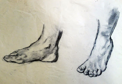
Charcoal is a great way to work out difficult drawing problems before you commit the problem to paint. Feet by Carol L. Douglas.

I use charcoal extensively in my studio: to work out new ideas, for gesture drawings, or to contemplate composition. It’s an excellent medium for experimentation. As a student yesterday remarked, “it’s not all about lines, like pencil work is.” When blended and lifted with an eraser, charcoal handles much like paint, making it the perfect preparatory medium for oil and acrylic painting. That’s why I start every new class with charcoal drawing exercises. It’s far better to learn the fundamentals of drawing and composition with something that’s not precious.

This was a preparatory sketch for a painting. By Carol L. Douglas.

I particularly like to have watercolor students do value exercises with charcoal. Value separation is a major challenge in watercolor. It helps to do it up front.

Charcoal is the cheapest medium in which one can create a masterpiece with staying power. For example, there are many works on paper by Edgar Degas done in charcoal and white pastel. He and other great masters used charcoal extensively.
Charcoal allows us to work out compositional questions. By Carol L. Douglas.
Choose a paper with a dull finish so that the charcoal can bite into the surface. Charcoal doesn’t stick well to hot-pressed, smooth papers like Bristol. It’s best on a fine-toothed, dull paper, but a rough tooth is also appropriate at times, although it raises more dust. My solution is to buy Canson’s Mi-Tientes, which has a different surface on either side, but there are many fine papers for charcoal work, including Canson Ingres, Strathmore 500 Series and Fabriano Tiziano. You shouldn’t need to use fixative to get the charcoal to adhere; if you do, try a different paper.
Compressed charcoal is powdered charcoal bound with gum or wax. It’s harder than vine or willow charcoal, meaning it can be sharpened to do very fine work. However, it’s not appropriate for using under paintings, because the binding can bleed. It doesn’t blend or erase as well. I never use it.
Seated figure, by Carol L. Douglas
Willow and vine charcoals are made of burnt grape vines or willow branches. They have no added binders, making them easier to erase. This charcoal can be used to sketch on canvas before painting in oils or acrylics; it will just vanish into the bottom layers of your work. It’s very light and makes soft, powdery lines.
“It takes a steady, careful, and patient hand to use charcoal,” an online student remarked yesterday. Only sometimes! Charcoal is an infinitely varied medium, in which one can make smooth graduations of value as well as slashing, dark strokes.

Weekly painting classes in Rockport, Maine

Painting by student Marilyn Feinberg
Color, light, and composition for outdoor painters
Carol L. Douglas
394 Commercial Street, Rockport
Starting April 4, 2017
10-1 AM Tuesdays, six week session
Fee: $200
Last month two friends took me to lunch at the Waterfront restaurant in Camden. As a bitter wind piled clouds high above the islands of Penobscot Bay, they put a question to me. “When will you stop slacking and start teaching weekly classes again?”
They’re right. My trip to Canada had stretched into the holidays, which had then become a trip to the Bahamas. I’ve been working hard, but not teaching.
 They nailed me down to a commitment. Our next cycle of classes starts on Tuesday, April 4. That will be from 10-1 AM, in my studio at 394 Commercial Street, Rockport. If you’re interested, there are more details available on my website, here.
The goal is intensive, one-on-one instruction that you can take back to your studio to apply during the rest of the week. We’ll cover issues like design, composition, and paint handling. We will learn how to mix and paint with clean color, and how to get paint on the canvas with a minimum of fuss.
And, yes, we’ll talk about drawing. If you ever want to paint anything more complicated than marshes, you must know how to draw. As I’ve demonstrated before, any person of normal intelligence can draw; it’s a technique, not a talent. And it’s easy to learn, no matter what you’ve been led to believe.
Painting by student Jennifer Jones
We’ll start in my studio, but on pleasant days, we’ll paint at outdoor locations. Painting outdoors, from life, is the most challenging and instructive exercise in all of art. It teaches you about light, color and composition.
That, of course, limits the media you work in to oils, watercolor, acrylics, or pastel, since they’re what is suitable to outdoor painting.
Years ago, a friend kept asking me to give painting lessons. “I don’t know how to do that,” I’d answer. We went round and round for several years. Eventually, I caved. Three people signed up. I figured I’d teach one session and they’d realize I was clueless. My studio was on the third floor. I was the model and the instructor and I kept hitting my head on the ceiling as I moved around the room.
Turns out, I wasn’t actually that bad. From there I moved into a nicer room above the garage and enlarged my teaching practice. I started teaching workshops and concentrating on plein air instruction, since that’s what I love best. When I left Rochester, I left a large circle of students behind. You can see a small sample of their work here. One of my great joys is that they formed a group, Greater Rochester Plein Air Painters, and continue to paint together.
“You used to teach on Saturdays,” a student recently pointed out. That’s true, I realize. If you want to study with me but work during the week, let me know. If I have three people interested, I’ll offer a weekend class.

Full moon over Frenchman Bay

Nocturne by Matthew Menzies, from Sea & Sky 2013.

There’s something magical about painting a nocturne over water. It’s even better when there’s a full moon. My calendar tells me we’ll have that opportunity during our third annual Sea & Sky Workshop. Think of magnificent granite slopes at Schoodic Point, silhouettes of Jack Pines against the midsummer night sky, and moonlight shimmering on the ocean.

Yes, there are still openings for the workshop, because (as usual) I got interested in other things and forgot to do any advertising after Christmas. That’s one of the curses of being a one-woman shop. However, Bobbi Heath just showed me a nice system for keeping all the balls in the air. It pointed out to me that I juggle a lot of things—possibly too many things.
This is the fifth year I will be teaching in midcoast Maine, and my third season at Schoodic Institute. It’s the best place for raw, natural beauty without crowds on the whole Maine coast, and the Institute itself is set up for learning. The campus was created when a former Navy base was returned to the National Park Service. It is one of 19 National Park Service Research Learning Centers in the United States. They do all our meals and snacks, so we can concentrate entirely on painting. And you can bring non-painting guests, who will enjoy fishing, hiking, birdwatching, and more. 
We’ll study composition, color, drawing, and paint mixing in morning and afternoon sessions. By now I have a pretty intimate knowledge of Schoodic and the surrounding area. That means you get access to the best painting locations.
Even though we’re on an uninhabited peninsula, it’s still easy to get to painting locations. There’s a ring road with frequent pull-offs. And Schoodic itself is only 90 minutes from Bangor International Airport, for those of you who fly to Maine.
I’ve worked with people from raw beginners to those who already hold MFAs. I have more than fifteen years of experience teaching in watercolor, oils, acrylics and pastels. I’m a former chairperson of New York Plein Air Painters and my work is in public and private collections worldwide. I studied at the Art Students League in New York with Cornelia Foss, Nicki Orbach, Joseph Peller and others.
Dinghy, Camden Harbor, by Carol L. Douglas
“This was the best painting instruction I have ever had. Carol’s advice in color mixing was particularly eye-opening. Her explanations are clear and easy to understand. She is very approachable and supportive. I would take this course again in a heartbeat,” student Carol Thiel once said about me. (By the way, some of my lessons can be read here.)
The one-week workshop is just $1600, including five days’ accommodation in a private room with shared bath, meals, snacks, and instruction. Accommodations for non-painting partners and guests are also available. Your deposit of $300 holds your space. Complete registration forms should be returned by mail to Carol L. Douglas, PO Box 414, Rockport, ME 04856-0414 with your $300 deposit.
Or email the form here and make a credit card payment by phone to 585-201-1558. Refunds are available up to 60 days prior to start, less a $50 administration fee. Final payment is due 60 days prior to the start of the workshop.
A discount of $50 is available to members of New York Plein Air Painters, Plein Air Painters of Maine or returning students.

And bring a night lamp! Even better, remind me to add night lamp to the supply list.

How to avoid the #1 obstacle to being a good artist

Yes, it’s a lighthouse. Wanna fight me?
Years ago, I was stymied by a large canvas of figures framed by a little house and an orchard. Following the conventional advice of the time, I took it to a well-known artist for critique. “It looks like an immature Chagall,” she said. In trying to fix that, I destroyed the work. 
My mature self knows exactly what was wrong with that painting: I was messing around way too much with glazing. A few decades of maturity have also taught me that orchards and fruit trees are important images to me. There was no cribbing from Chagall.
That critique set me back in my development because the artist looked at my work through the narrow lens of her own education and experience. She had no idea what I was striving for. Neither did I, of course, because I was a callow youth. These things require time and work to become clear.
I get lots of advice in my mailbox. I generally scan and ignore it. But this one irked me: “How to Avoid the #1 Obstacle to Becoming a Professional Artist,” it trumpeted. It went on to talk about how painters need to take classes and critiques and seek feedback from their peers to avoid what the writer calls “illusory superiority”—the idea that you think you’re better than, in fact, you are.
This painting of Beauchamp Point has few fans, but it still resonates with me. That’s because it was pointing in the direction in which I was moving at the time.
In fact, the fastest way to be a mediocre painter is to seek too much advice from others.
I’m all for learning one’s craft within structured instruction—it saves a lot of time and wasted material. Beyond that, however, group thinking should be approached with a certain wariness.
Once you get out of art school, most painting groups are comprised of supportive, kind, and helpful people. But even these tend to reward those whose work looks a certain way and ignore those whose inner vision is radically different from the group’s norm.
If you don’t believe this, just imagine taking your carefully-crafted landscape to this gallery and asking for representation. The art world is all about conformity, while at the same time it paradoxically hungers for individual expression.
A lot of research has been conducted on normative social influences and conformity. Human beings are social animals. To be liked and respected within their group, they tend to moderate their own opinions. Research tells us that group norming is consistent across cultures and gender. In short, it’s everywhere where two or more of you are gathered together. The ability to get a group of people to think and work alike is useful in corporate culture, but not so good for making innovative art.
I once heard an artist I admired sneer at “lighthouse paintings.” Ever since, I’ve approached painting them with some trepidation. Yes, I understand they are overdone for the tourist trade, but they are also powerful symbols and beautiful buildings. There is nothing inherently wrong with them. It irks me that he planted this idea in my mind with a casual comment he doubtlessly doesn’t even remember.
This painting of the Raising of Lazarus was savaged in a newspaper review. It’s not something I’m likely to forget in a hurry.
I can’t count how many times I’ve heard one painter say to another, “Stop! You’re done! Not one more brushstroke!” Of course one can diddle a painting to death, but that process is sometimes necessary for the next observational breakthrough. By saying that to another painter, you’re putting yourself in charge of his or her development.
When I was younger, the exposed background in my paintings often took the form of dark, heavy lines. “That’s your style!” one teacher told me. I’d had enough art-history classes to know that ‘style’ is a transitory thing, and I found those lines frustrating. Later, Joe Peller taught me how to marry edges. What a less-competent teacher took as style, Peller recognized as a technical deficiency.
This is why we should teach and critique with a light hand. Even more importantly, we should accept criticism and commentary with a healthy dose of skepticism. They are no substitute for doing our own hard thinking about our own work.

Exercises are so much more fun in the abstract

Goes right into the slush pile…

 Last week, I wrote about my troubles painting lobster traps. Bob Baines, a lobsterman from S. Thomaston, ME, kindly lent me a trap to study. As a teacher, I know the only answer to confusion is close examination of the troubling object. As a student, I don’t like hard work any more than anyone else. Exercises are good for us, but so much more exciting when they’re still in the planning stages.

Bob’s trap weighs as much as a fresh bale of hay or a kindergartener. Now imagine shifting 800 of the things. My respect for lobstermen—already high—rose another notch.
The trap is four feet long, a generous foot deep, and almost two feet wide. It has two “parlors”—the space where lobsters wait for their fishermen visitors—and one “kitchen”—the space where the bait is hung.
The real deal weighs as much as your kid.
Speaking of language, you may have heard that the expression “the bitter end” is a nautical term, referring to the inboard end of a chain, rope or cable—in other words, the part that gets wound around a bitt or bollard. There’s also a part of a lobster trap called the “ghost panel.” It allows lobsters to escape if a trap is lost. According to Maine’s state regulations regarding lobstering, buoys should be attached to their lines with so-called “weak links” to protect whales from entanglements.
Who knew lobstering was such a poetic exercise? Mankind has been getting its food from the sea almost as long as we’ve been talking, so I suppose language is deeply entwined with fishing.
Axonometric projection grids were a cheat for draftsmen back in the days when they drew by hand. You laid them on a light table and drew above them. I still have a set. I could have made this easier on myself by using them to draw the wire mesh, but I chose to do it freehand instead. Estimating perspective is always good for the mind.
My real goal was to try to figure out a way to represent the color interference of different layers of mesh without drawing every gridline separately. I drew the trap freehand—by which I mean I used a straight edge and no measurements—on a very cheap bit of canvas from Ocean State Job Lots.
My erasures with water pulled the gesso right off this very cheap canvas.
I keep those canvases for students who forget their own, but now I’m not sure they’re good even for that. Erasing, I rapidly peeled the gesso off the boards. They handled paint just as badly.
My trap was squatter and shorter than the real thing, but no matter. I wanted to paint it using the #6 or #8 filberts I was using on my actual work. Obviously, this is no way to get any detail, but I haven’t been after detail, just an impression.
And the brush I painted with…
Had I been working in either watercolor or acrylics, I’d have approached this by painting the background and contents of the trap and applying the grids on top of these. But oil paint doesn’t work that way. I settled for painting in a dark pattern for the grids, plugging the holes with color and then restating the darks by incising back to my initial darks.

It’s never going to win me a scholarship to art school, but I’ve learned what I needed to know. Thanks, Bob, for the loan of your trap.

Who taught JRR Tolkien to draw and paint?

Rivendell, by JRR Tolkien  (Tolkien estate)
The other day, I found the above picture of Rivendell for a friend, and it struck me anew that J.R.R Tolkien was an accomplished illustrator. He could have worked as an artist had he not had an even greater facility with the written word. “Who taught him to paint?” I mused.
Turns out, it was his mother. After their father’s death in 1896, she moved young Ronald and Hillary to Sarehole, a hamlet that has now been absorbed into greater Birmingham. Mabel Suffield Tolkien was a capable artist and passionately interested in botany. “Ronald can match silk lining or any art shade like a true ‘Parisian Modiste,’” she wrote to her mother-in-law in 1903.
Those lessons ended tragically young, since Mabel died of diabetes when her young sons were 10 and 12. She entrusted his care to Fr. Francis Xavier Morgan of the Birmingham Oratory. This put him within visiting distance of one of the most important collections of Pre-Raphaelite Brotherhood painters, that in the Birmingham Museum.
Fangorn Forest by JRR Tolkien was originally done as a Silmarillion painting in the late 1920s, and reflects the current aesthetic. (Tolkien estate)
That the medieval fantasies of the Pre-Raphaelites would appeal to an adolescent of Tolkien’s temperament seems obvious, but we have a scholar’s word for it. Humphrey Carpenter, author of Tolkien’s authorized biography, wrote that Tolkien associated his childhood gang, the TCBS (Tea Club, Barrovian Society) with the Pre-Raphaelites, indicating that he and his pals were certainly aware of them.
Tolkien began to make visionary pictures after he went up to Oxford in 1911. These included scenes that would later be expressed in words. For his story Roverandom, conceived in 1925, Tolkien made at least five illustrations. In the late 1920s or early 1930s he produced a picture book, Mr. Bliss, in colored pencil and ink. These pictures and others, however, were for his own and his family’s amusement, not for print.
His illustrations for The Hobbit, however, were intended for publication. The first printing of this book, in 1937, contained eleven black-and-white illustrations and maps. Full-color plates were added to later editions.
Tolkien used drawing as a means of understanding the complex topography of his imaginary world. He made many sketches and drawings during the writing of The Lord of the Rings. These have subsequently been published, but his intention was not to illustrate the novel, but to aid in his writing.
Lamb’s Farm, Gedling, (c. 1914) represents a real farm, owned by Tolkien’s aunt. (Tolkien estate)
“In human art Fantasy is a thing best left to words, to true literature,” wrote Tolkien. “In painting, for instance, the visible presentation of the fantastic image is technically too easy; the hand tends to outrun the mind, even to overthrow it. Silliness or morbidity are frequent results.”
Tolkien continued to paint and draw all his life. His home was supplied with “paper and pencil and a wonderful range of coloured chalks, paintboxes and coloured inks. We knew as we got older that these things gave him particular pleasure, and they continued to do so right through his life,” his daughter Priscilla recollected.
His work was in the style of his times—realism with lashings of the Art Nouveau of his childhood and the Art Deco of his young manhood. 
To answer my initial question, Tolkien learned to paint from everybody and nobody. His initial instruction was that of a good, bright, home-schooled lad of his time. He then built on that as an autodidact, absorbing the architecture and art of the world around him. How he applied that to his own inner vision was, of course,  his own unique gift.

Learn to paint in beautiful Acadia

Christmas
Now is the time to buy an artist you love—possibly even yourself—a special gift for Christmas. Spend a week painting with Carol L. Douglas in one of the most beautiful venues in America—inspirational, mystical Schoodic in Maine’s Acadia National Park. And if you reserve before January 1, you can save $100!
Far from the hustle and bustle of Bar Harbor, Schoodic has dramatic rock formations, pounding surf, and stunning mountain views that draw visitors from around the world.

Instruction10
At 440 feet above sea level, Schoodic Head offers a panoramic view of crashing surf, windblown pines and enormous granite outcroppings laced with black basalt. Across Frenchman’s Bay, Cadillac Mountain towers over the headlands of Mt. Desert Island.
You might look up from your easel to see dolphins, humpback whales or seals cavorting in the waves. Herring gulls will visit while eiders and cormorants splash about.
A day trip to the harbor at Corea, ME is included. Far off the beaten path, Corea, ME is a village of small frame houses, fishing piers and lobster traps. Its working fleet bustles in and out of the harbor.
Your instructor, nationally known painter and teacher Carol L. Douglas, has taught in Maine, New York, New Mexico and elsewhere, and regularly returns to Acadia.
Boo
Concentrate on painting 
Meals and accommodations at the beautiful Schoodic Institute are included in your fee. This former navy base is located right at Schoodic Head. It gives workshop students unrivalled access to the park.

All skill levels and media are welcome
Carol Douglas has more than fifteen years’ experience teaching students of all levels in watercolor, oils, acrylics and pastels. Her Acadia workshops are very popular. “This was the best painting instruction I have ever had. Carol’s advice in color mixing was particularly eye-opening. Her explanations are clear and easy to understand. She is very approachable and supportive. I would take this course again in a heartbeat.” (Carol T.)
Lynne hard at work
Easily accessible
It’s easy to get to painting locations on the Schoodic Peninsula. A ring road with frequent pull-offs means you never walk more than a few hundred feet to your painting destination. And Schoodic itself is only 90 minutes from Bangor International Airport.
To register
The one-week workshop is just $1600, including five days’ accommodation in a private room with shared bath, meals, snacks, and instruction. Accommodations for non-painting partners and guests are also available. Your deposit of $300 holds your space, and if you reserve before January 1, you can save $100 off the price.
At Owl's Head
You can download a registration form here or a brochure here. Complete registration forms should be returned by mail to Carol L. Douglas, PO Box 414, Rockport, ME 04856-0414 with your $300 deposit. Or email the form here and make a credit card payment by phone to 585-201-1558.
Refunds are available up to 60 days prior to start, less a $50 administration fee. Final payment is due 60 days prior to the start of the workshop.

It’s a fake, darn it!

“Women working in wheat field, Auvers-sur-oise,” 1890, Vincent van Gogh

“Women working in wheat field, Auvers-sur-oise,” 1890, Vincent van Gogh.
I often say I’m not a big believer in an art genius, any more than I’m a believer in a math genius or a language genius. Almost everyone can learn to draw, just as almost everyone can learn to do sums, write or sing. To make this point, I frequently point people to Van Gogh’s drawing. By dint of hard work, his drawing went from pedestrian to splendid in just a few short years.
Vincent van Gogh: the Lost Arles Sketchbook was published simultaneously this week in France, the United States, Japan, Britain, Germany and the Netherlands. Its author, Bogomila Welsh-Ovcharov, is a respected Van Gogh scholar from the University of Toronto. “When I opened it up, the first thing I said was, ‘No, unbelievable!’ The first drawing that I took out and held in my hands, it was a moment of total mystical experience: ‘Oh my goodness, this is impossible!’” said Welsh-Ovcharov.
The book is based on a folio purported to contain 65 recently-discovered Van Gogh drawings from his mature period. Van Gogh’s drawings are very instructive. He used a pencil or pen with the same flourish as a brush, creating works with energetic and detailed mark-making using an enormous range of technique. Even at the nosebleed list price of $85, the book was making my credit card hand start to itch.
“Small house on road with pollarded willows,” 1881, Vincent van Gogh.

“Small house on road with pollarded willows,” 1881, Vincent van Gogh.
But wait, there’s more! On Tuesday the Van Gogh Museum in Amsterdam—the accepted top dogs on the subject—released a statement saying that the drawings are fakes. Among other things, they say that the drawings do not show the rapid development in skill that was the hallmark of this period in his work.
I wouldn’t need anything more to convince me, because that’s the defining characteristic of his drawing career. However, the Museum also notes that the drawings include topographical errors. Van Gogh was a meticulous recorder of reality. It is inconceivable that any painter would forget the details of a place in which he lived and worked. Drawing has a way of deeply imprinting them on your being.
“Vincent's boarding house In Hackford Road, Brixton, London,” 1873, Vincent van Gogh

“Vincent’s boarding house In Hackford Road, Brixton, London,” 1873, Vincent van Gogh.
I feel like a kid who just got socks for Christmas instead of the toy I really wanted. This doesn’t, however, negate what Van Gogh’s drawings say to me as an artist and teacher: to paint, you need to be able to draw, and you need to do it as regularly and naturally as you brush your teeth.

On a clear day, you can see Denali

Small study from Potter Marsh, looking at the Chugach National Forest across Turnagain Arm.

“The road to Seward,” 8X6, by Carol L. Douglas.
On Friday morning, I wondered whether I was stranded in Anchorage with a dead SUV. Since I wasn’t expecting this, I had no Plan B. It turns out that the engine misfire isn’t a fatal problem. The bad news is that we still don’t have a running car.
After the track bar was re-welded on Friday, our mechanic suggested we make ourselves scarce until he had time to work on the engine. My daughter Mary recommended Potter Marsh in the Anchorage Coastal Wildlife Refuge. Here, the Seward Highway runs along Turnagain Arm. Across the water are the blue peaks of the Chugach National Forest, shrouded in clouds. Any of these land features would send me hurrying for my paints; together they were overwhelming.
Painting with Plein Air Painters of Alaska members.

Gil, at right, gave me enough OMS to start painting. These are members of Plein Air Painters of Alaska.
At the first overlook, I met another plein air painter. He turned out to be Gil fromPlein Air Painters of Alaska. They were holding their weekly paint-out at the marsh. Chattering happily, I set up next to Gil, only to realize that I’d forgotten to buy odorless mineral spirits (OMS) and medium after my flight. Mary ran off to the art supply store, and Gil kindly poured enough OMS into my tank to get me started.
I painted until about 1 PM and returned to the garage. Eventually, the mechanic realized that he couldn’t diagnose the problem in the time left. Disheartened, Mary called her friends Debbie and Jason to ask if we could stay another night with them. Jason drove the car and listened to the misfire. He called a mechanic friend of his for help, who offered to look at the car on Saturday afternoon.
My impromptu drawing class on Saturday morning. From left, Kendra, Mitchell and Jason.

My impromptu drawing class. From left, Kendra, Mitchell and Jason. That’s Brodie supervising.
Meanwhile, Debbie cooked up a drawing class for me on Saturday morning. We spent a few hours at Westchester Lagoon learning how to measure, about perspective, and how to draw a tree and a house. It was a beautiful distraction from car trouble.
Jason’s mechanic friend turned out to be a born teacher himself. He reasoned through every step with us. By the time he’d spent a few hours puttering, he’d convinced me that the problem is a blocked catalytic converter. Trouble is, the work can’t be done until this morning, and there’s always the question of parts.
Very incomplete painting of the Chugach range from Anchorage. Struggling with the colors, my drawing is suffering.

Very incomplete painting of the Chugach range from Anchorage. I may work on it today while the SUV is being fixed.
Jerry and Heidie Godfrey met us in Anchorage for lunch. They were on their way to Costco; we convinced them that they really wanted to go up Mt. Baldy to enjoy the perfect autumn weather. They hiked; I painted Denali.
Another unfinished painting, of Denali and Foraker from Mt. Baldy in Eagle River, AK. The midrange mudflats need to be lightened and the flank of Baldy finished.

Another unfinished painting, of Denali and Foraker from Mt. Baldy in Eagle River, AK.
Denali is 250 miles north of Anchorage as the crow flies. The mountain is less a presence than a shimmering mirage floating above the horizon. How does one paint what doesn’t even seem possible? The picture isn’t finished, but I did work out some of the light and color questions that are so different than my native northeast vistas.
On Sunday I finally admitted I was tired. After services at Eagle River Church of the Nazarene, we had a midday dinner of Alaskan salmon and halibut, caught and cooked by the Godfreys themselves. The wind blew and rain spattered. Mary did laundry and prepped road food. I did absolutely nothing.
Anchorage is a beautiful and kind city. I’ve had the opportunity to meet people, eat fantastic food and work out the kinks in my painting kit. However, I’m keenly aware that we’re imposing on others. Each day is a day closer to winter. Saturday, we scraped frost off our windshield and Eagle River saw termination dust, heralding the end of summer. Summer—especially this far north—is fleeting. The open road is calling me.

Painting clouds

"Whiteface makes its own weather," by Carol L. Douglas. High contrast clouds and a flat brush imply rain.

“Whiteface makes its own weather,” by Carol L. Douglas. High contrast clouds and a flat brush imply rain.
Clouds are a terrific, rampaging part of the landscape, and often the best part of a composition. I love painting them. They seem so easy that I never figured there was much secret gnosis to painting them, any more than there is some magic trick to painting water. However, last week a reader wrote asking for tips about painting clouds, and she got me thinking about how I manage them.
Clouds have perspective, but it is upside-down from earth-bound objects. That’s because the vanishing point is the horizon, putting the farthest clouds at the bottom of the sky. While we mostly look at the tops of earthbound objects, we mostly look at the bottoms of clouds. That makes the shadow color predominant.
Altocumulus clouds over the Hudson River, by Carol L. Douglas

Altocumulus clouds over the Hudson River, by Carol L. Douglas
As with earthbound objects, there is also atmospheric perspective: clouds are generally lighter and duller at the horizon. This, however, is subject to circumstances. At dawn and dusk the horizon may be the most colorful part of the sky. A good storm turns everything on its head.

Figuring out the color of clouds is easy: there’s a color for the highlights, and a color for the shadows, and these are more or less opposite each other in color temperature. On a peaceful day, the values of shadow and highlight are almost the same. When there’s a real range in value in the clouds, you have an ominous sky.
Surf study by Carol L. Douglas

Surf study by Carol L. Douglas
Note and use the patterns of clouds, rather than randomly placing one or two clouds in the canvas. The pattern should be part of your design. White, puffy cumulus clouds often appear in repetitive patterns across the sky. Cumulonimbus clouds are towering portents of rain or worse. These are the clouds that often have dark shadows and odd coloring, for they are livid.

A mackerel sky, high in the atmosphere, is a sky knitting itself together in advance of a change in the weather. “Mares’ tails and mackerel scales make lofty ships to carry low sails,” is an acknowledgement of this phenomenon. High-atmosphere clouds have no volume. They are merely regular patterns of white against a blue sky.

Higher cirrus clouds at Olana, by Carol L. Douglas

Higher cirrus clouds (above) and cumulus clouds (horizon) at Olana, by Carol L. Douglas
I used to live in the Great Lakes region. If I looked north, I would almost always see a band of cumulus clouds low on the horizon, racing down the center of Lake Ontario. Such local weather patterns exist all over the country. They are part of the ‘sense of place’ where you live. You can’t paint them until you observe them.
How do I translate those observations onto my canvas? In practice, I mix a puddle of the shadow color of the cloud and a puddle of the light color. I race around, first with the shadow color and then with the highlight color, to create a pattern. When that is established, I used particular clouds as reference to finish the details. Since clouds constantly morph, there is no danger of repetitiveness. This is the only time I ever use straight white from the tube, for it sometimes acts as my mid-tone in clouds.
"Clouds over Hudson, NY," by Carol L. Douglas

“Clouds over Hudson, NY,” by Carol L. Douglas
What brush? As with everything else, it depends on what you are trying to say with your mark-making. A flat will convey energy. A filbert or round will allow you to be more lyrical. It’s up to you.
Dr. Albert C. Barnes, founder of the Barnes Collection, was very particular in how his paintings were hung. He believed that he could improve individual paintings’ compositions by juxtaposing paintings and furnishings in the greater space of a room. That’s pretty cheeky considering the Impressionist masterpieces he collected, but in his defense, nobody knew they were masterpieces yet.
You can use clouds in your painting to redirect the viewer in the same way. Although—like water—clouds’ patterns are usually wavelike and horizontal, there is no reason to be hidebound about that. Within the reality of their structure, you can find ways to lift and lead the viewers’ eyes.
The greatest painter of clouds alive today is the Glasgow-trained landscape artist,James Morrison. I strongly encourage you to study his paintings, to see how his clouds have volume, character and energy. They are never an afterthought in the landscape; they are a potent force within it.