fbpx

Art history can make you a better painter

We are affected by what has happened before us, and we have the power to influence those who follow. 
Blueberry Barrens, Clary Hill, will be at Camden Falls Gallery’s Autumn Hues show, opening this Thursday.

I know a painter whose flawless technique is hitched to 19thcentury luminism. Another excellent painter watched him one day and sighed, “if he knew any art history, he’d be brilliant.” It was a sage comment. With a little understanding of modern art movements, my friend’s ability could be updated into something powerful, something that resonated with today’s viewers.

I’m not talking about putting on a new style like a shirt you bought at FatFace. That never works. Style is something that integrates one’s training, technique, emotional state, and personality. It’s what’s left when you’ve eliminated everything but inner truth. Done right, the artist has no more control over his or her style than he does over his autonomic nervous system. Try to put on an acquired style, and you’ll immediately be recognized as a poseur.
Downdraft snow in the Pecos, by Carol L. Douglas, oil on canvas
But note that I included training in that equation. To paint like a 19th century luminist today means ignoring the impact of a century and a half of war, the horrors of government-sponsored genocide, and the relentless push-pull of modern urban living. It means ignoring abstract-expressionism, magical realism, the invention of movies, color photography, and the entire digital age. There’s a reason modern painting has an edge that 19thcentury painting didn’t.
Beach Erosion, by Carol L. Douglas, oil on canvasboard.
With rare exceptions, my art-history posts are the least-read of anything on this blog. (I moved to this platform in 2007 and have my stats since then, with the exception of the period I was writing for the Bangor Daily News.) It’s always disappointing to write about a great artist of the past and realize nobody cares to read about him or her. But, like cod liver oil, I know art history is good for you, so I’m going to continue to offer it regularly.
None of us stand alone in the great continuum of history. We are affected by what has happened before us, and we have the power to influence those who follow. But to do that, to take our rightful places as painters or teachers, we need to be part of our epoch. To do that, we must understand where we are and where we came from.
Tricky Mary in a Pea-Soup Fog, by Carol L. Douglas, oil on canvasboard
That’s not limiting; it’s liberating. For example, observing how Bronzino painted energy into apparently-static portraits can make us better landscape or still-life painters. Our predecessors have experimented in color and composition in ways that can give us a firm foundation for our own exploration.
Understanding the goals of Rogier van der Weyden or Kazimir Malevich doesn’t make us paint like them. But understanding their place in the great sweep of time helps us to position ourselves in our place. Ultimately, that is the most important thing we learn through art history. It is the difference between a pretty painting and one that will have meaning to future generations.

Color and meaning (color temperature, part 2)

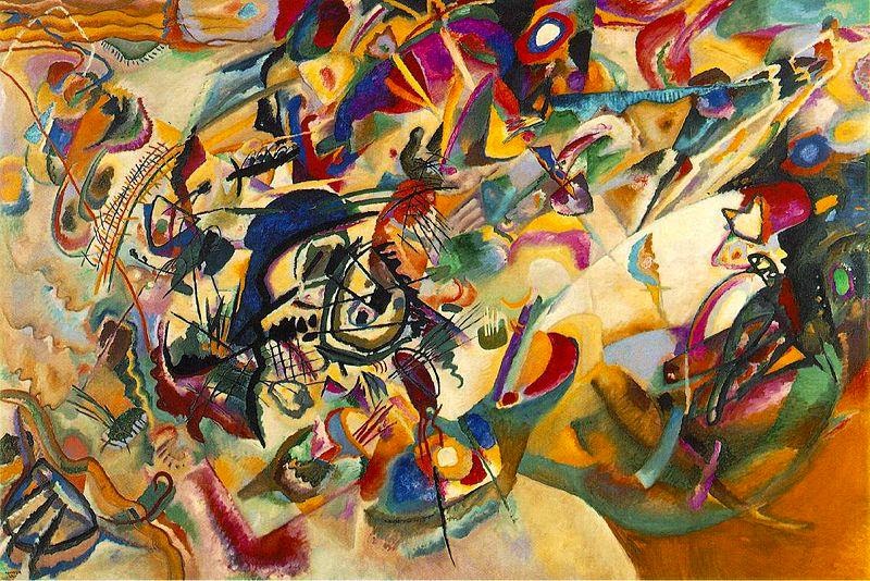
Composition VII, 1913, by Wassily Kandinsky.

Three artists arrived at the idea of pure abstraction at roughly the same time: Wassily Kandinsky, Piet Mondrian, and Kazimir Malevich. This was not coincidence; all three believed in the spiritual properties of abstraction, an idea they got from the rich stew of spiritualism swirling around turn-of-the-century Europe.

One of the chief promoters of the Fourth Dimension was Pyotr Demianovich Ouspenskii, a follower of G. I. Gurdjieff. Ouspenskii believed our consciousness was evolving, which would ultimately lead us to perceive the fourth dimension, and that art and music were the path to this evolution.  In the fourth dimension, reality and unreality were reversed, and time and motion were revealed as illusions.
Theosophy was Madame Blavatsky’s occult movement. She described it as “the archaic Wisdom-Religion, the esoteric doctrine once known in every ancient country having claims to civilization.” Madame Blavatsky taught that color had spiritual vibrations which would awaken the dormant spirituality within a person, and that art should begin in nature, a nature that would be found in a world-birthing apocalypse.

A fully realized theory must include the proper colors for shapes. The passive and dull circle deserves a correspondingly dull blue. The energetic triangle ought to be rendered in a dangeresqueyellow.
Rudolph Steiner’s spin on theosophy was called Anthroposophy.  This postulated the existence of an objective spiritual world accessible through inner development of the clairvoyance and intuition that modern man had lost as he developed rational thought. Steiner focused on the symbolic and synesthetic properties of color.

And then there are angles, which should be matched in aggression with their colors.
Kandinsky’s Concerning the Spiritual in Art (1912) is both turgid and broad-ranging. Let me just hit his major points about color:
  • Colors evoke both a purely physical effect on the eye and a vibration of the soul or an “inner resonance.”
  • The elements of color are warmth or coolness, and clarity or obscurity. 
  • Warmth means yellow, and coolness means blue, so yellow and blue form the first great contrast. Yellow has an eccentric movement and blue a concentric movement; a yellow surface seems to move closer to us, while a blue surface seems to move away. Yellow is a terrestrial color: mad, disturbed and violent. Blue is a celestial color, deeply calm but sinking toward the mourning of black. The combination of blue and yellow (green) yields total immobility.
  • Clarity is a tendency towards white, and obscurity is a tendency towards black. White and black form the second great contrast, which is static. White is a deep, absolute silence, full of possibility. Black is nothingness, an eternal silence without hope (death). 
  • The mixing of white with black gives gray, which possesses no active force and is similar in tonality to green. Gray is frozen immobility; dark grays tend toward despair, but even lightening gray yields very little hope.
  • Red is a warm color, forceful, lively and agitated. Mixed with black it becomes brown, which is a dull, hard, inhibited color. Mixed with yellow, red gains in warmth and becomes orange, which irradiates and energizes its surroundings. When red is mixed with blue it moves away from man to become morbid and mourning purple. Red and green form the third great contrast, and orange and purple the fourth.
In short, Kandinsky’s color theory is a magnificent exercise in hooey. Still, it has had a long-reaching influence, with overtones in fashion, industrial design, and every other area that touches our lives.

Message me if you want information about next year’s classes and workshops.