fbpx

Monday Morning Art School: Narrative painting

The publicā€™s embrace of plein air painting tells us that our audience, too, is hungry for a good story.

The Veteran in a New Field, 1865, by Winslow Homer, courtesy Metropolitan Museum of Art. Painted at the end of the Civil War, itā€™s a poignant metaphor for the coming demilitarization.  

The human mind is hardwired for narrative. Long before the written word was developed, our paleolithic ancestors were telling stories on cave walls. Imagination is fundamental to human life.

ā€œNarrative paintingā€ simply means that the painting tells a story. During most of art history, that was the norm. A narrative painting can illustrate a cycle of ideas, as did Egyptian tomb frescoes or Michelangeloā€™s ceilings in the Sistine Chapel. Or, a narrative painting can illustrate a single moment, as does Sandro Botticelliā€™s The Birth of Venus.

While narrative painting is well suited for mythology and religion, it was also used to transmit historical ideas. The Death of General Wolfe, for example, is a 1770 painting by Benjamin West that commemorates the deciding affray in the struggle between Britain and France for control of the New World. It could also be propaganda, as with Ingresā€™ Napoleon I on his Imperial Throne. And it was used to convey moral truths ranging from early Renaissance genre paintings to the great French Social Realist art.

Haymaking (Les Foins), 1877, Jules Bastien-Lepage, courtesy MusĆ©e d’Orsay

And then came the Cult of Genius, when artists shifted from being craftsmen to being intellectuals. That was a product of the Age of Enlightenment, and among other ideas, it gave us the concept of the enfant terrible, offensive, rebellious artist. In fact, this individualism was so popular that it earned a label: Bohemianism.

The phrase ā€œArt for artā€™s sake!ā€ meant that all ā€˜trueā€™ art should be divorced from moralizing, instructive, political, or utilitarian functions. In short, it was art only when it was useless, practically speaking.

ā€œArt should be independent of all claptrap ā€” should stand aloneā€¦ and appeal to the artistic sense of eye or ear, without confounding this with emotions entirely foreign to it, as devotion, pity, love, patriotism and the like,ā€ wrote James Abbott McNeill Whistler.

Cromwell and the corpse of Charles I, 1831, Paul Delaroche courtesy MusĆ©e des Beaux-Arts de NĆ®mes

Pure art would be art that resonated with all people, regardless of their language, histories, or creeds. That idea marks the beginning of modern art. Since it allowed for the development of Impressionism and other forms of modern painting, it was extremely useful. But like all good ideas elevated to the point of religion, it eventually became an impediment to creativity. Much of human understanding lies in culturally-derived images. The cognoscenti may understand the meaning of a pile of bricks on the floor, but the average viewer doesnā€™t, and doesnā€™t want to.

(And of course, the cognoscenti was just replacing one set of images with another, with the added insult of being exclusionary. Either you pretended to understand, or you marked yourself out as uncouth.)

Paintings which told a story were either from the dustbin of history, or the province of those odd American realists, the Wyeths. This was the world in which I came of age as a painter. Iā€™m a natural-born storyteller, so itā€™s no surprise that I didnā€™t know what the heck I was doing, or where I belonged.

Then came the post-modern era, which we could call ā€œmeaning without art.ā€ Extracting a scroll from oneā€™s vagina, vomiting paint, or defacing a First Folio of Goyaā€™s Disasters of War may have seemed witty, but hardly required skill or craftsmanship.

In the post-post-modern era, plein air paintingā€”an exercise in realismā€”is one of the most significant art movements, despite being largely ignored by art institutions. Most plein air painters are didactic by nature. We are speaking about our love of nature, the fragility of our world, and more. The publicā€™s embrace of plein air painting tells us that our audience, too, is hungry for a good story.
Monday Morning Art School: working from your imagination

Lockdown is a good time to work from your inner landscape.
Heart of Darkness #1, monotype and pastel, by Carol L. Douglas
Todayā€™s exercise is in converting words to images, and the text Iā€™m giving you is the opening paragraphs of Joseph Conradā€™s Heart of Darkness.
For your convenience, Iā€™ve made a text file of these opening paragraphs, or you can read the whole novel on Project Gutenberg. This is a complex novel; itā€™s about madness and sanity, at once a condemnation of colonialism and yet conventional for its time in its racial views.
Conrad was a sailor in the French and British merchant navies, starting at the bottom and working his way up to Captain. He spent three years with a Belgian trading company running the steamer Le Roi des Belges on the Congo River, experiences which formed the basis of Heart of Darkness. Le Roi des Belges was, of course, King Leopold II of Belgium, then operating his infamous Congo Free State. Conrad met and befriended the humanitarian Roger Casement in the Congo. Both men initially thought that colonialism would be good for the Congo; both soon realized their error.
Heart of Darkness #2, monotype and pastel, by Carol L. Douglas
The opening scene of Heart of Darkness is serene, contrasting with the choking, awful mystery of the main story. ā€œAnd this also,ā€ says the narrator, ā€œhas been one of the dark places of the earth.ā€
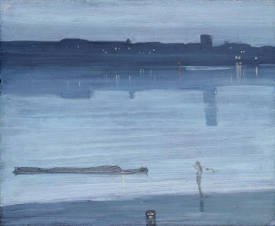
A few years ago, I was experimenting with monotyping. I did three iterations of the opening passages of Heart of Darkness. In the end, none of them fully reflected what I thought I felt about sitting in the cockpit of a boat as darkness falls. I was imagining I’d make something more along the lines of James Abbott McNeill Whistlerā€™s Nocturne: Blue and Silver – Cremorne Lights (1872). Yet I trust my subconscious, and Whistler’s nocturne doesnā€™t have the undercurrent of destruction that rides at anchor even at the beginning of the book.
How do you paint from a text without training as an illustrator? Read it and follow your feelings, not your rational mind. What about the text fascinates you? Twenty years ago, I was interested in the water and the blue light of dusk; today, Iā€™d probably be more interested in the cast of characters assembled on deck.
Heart of Darkness #3, monotype and pastel, by Carol L. Douglas
Once youā€™ve read the text, without looking at anything else, start to sketch. Make a drawing from your own internal source material: your mind. Donā€™t worry whether youā€™re doing a good likeness or not; that can come later. Worry more that you have caught the sensation that the words invoke. Think about the interplay of imagery on the page, and the abstract arrangement of lights and darks. Facts are the least-important part of the process at this point.
When you have a sketch that feels right, you can then assemble some reference material online. Go lightly here. I could not, for example, draw the cockpit of a cruising yawl without looking at pictures of a cruising yawl. But donā€™t get too dependent on that reference material. Look at it, perhaps sketch it out to memorize it, and then put it away. Be subservient to your original idea, not to photos.
I chose this bit of literature because I like its watery imagery, but you can do this with any written text that strikes your fancy. I did a similar thing with Jerusalemwhile in quarantine in Argentina. The important thing is to find something that resonates with you now, and see where it leads you. Iā€™m interested in seeing the results.

Figurative does not mean figure

Where do you fall on the continuum from representation to abstraction?

I Saw the Figure 5 in Gold, 1928, Charles Demuth, courtesy the Metropolitan Museum of Art

English (my daughter never tires of telling me) is a descriptive, rather than proscriptive, language. Words mean whatever most people agree that they mean. Thatā€™s why English is so endlessly adaptableā€”why, for example, we can suddenly accept the ungrammatical ā€˜theirā€™ as a replacement for ā€˜hisā€™ or ā€˜herā€™ without making a Federal case of it. English sees a need and answers it, and its users follow along.

There is one neologism I resist, however, and thatā€™s the substitution of the word figurative for figure. As descriptions of art, they are not equivalent. Figure painting means painting the human form. Figurative paintingmeans realism.

Rider, Attic red-figured cup, middle of 5th century BC, courtesy of Luynes Collection

Figurative is an old word in English, and comes to us from French. It has always had overtones of metaphor and meaning. Itā€™s slightly different from figure, which has multiple meanings in English. Figurecan mean a shape, the human body; a number, or a symbol. Think of the term figure eight and you begin to understand the complexity of the word.

Figurative art, or figurativism, however, is simple: it means representational art. The term was coined when abstraction came along, to describe abstractionā€™s opposite number. A painting of your car is as figurative as a painting of your spouse.

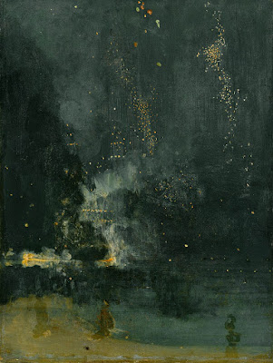
Nocturne in Black and Gold: The Falling Rocket, 1874, James Abbott McNeill Whistler, courtesy Detroit Institute of Arts 

What is the difference between figurative and abstract art? Itā€™s not easy to draw a line. There have always been elements of abstraction in figurative art. This is why ancient art often surprises us with its modernity.

Even hyperrealism is a form of abstraction. Itā€™s seemingly impossible for humans to represent nature exactly as it appears. Imperfect beings, we insist on putting our own spin on everything.
Likewise, there are often figures in abstract art, and much abstraction derives from observed figures in nature. The abstract geometry of Piet Mondrian, for example, resonates with us because weā€™ve observed such geometry in nature.

Premier Disque, c. 1912-13, Robert Delaunay, private collection

The ā€˜figureā€™ in Charles Demuthā€™s I Saw the Figure 5 in Gold is both a number and a symbol. And itā€™s both abstract and realistic. It was painted in homage to his friend William Carlos Williamsā€™ poem, The Great Figure:

Among the rain
and lights
I saw the figure 5
in gold
on a red
firetruck
moving
tense
unheeded
to gong clangs
siren howls
and wheels rumbling
through the dark city.

Nocturnes, fear and longing

Now the outsider is us, alone in the dark, excluded from whatever is going on in that beautiful spot of light.

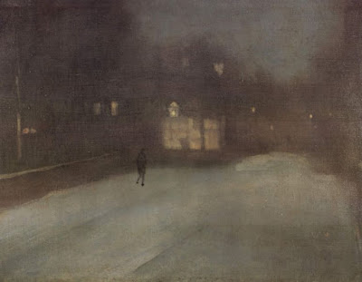
Nocturne in Grey and Gold: Chelsea Snow, 1896, James McNeill Whistler, courtesy Fogg Art Museum

Last week my husband was studying a beautiful nocturne by the Taos painter Oscar E. Berninghaus. The dim light is a soft greenish-blue, and he wondered why. Berninghaus didnā€™t have the advantage of ā€˜knowingā€™ what the night sky looks like through color photography. That gave him the liberty to paint what he felt and saw.

The human eye canā€™t make the adjustment between gloom and brilliance very fast. Because of this, modern photography and lighting have changed how we paint nocturnes, as I wrote here. The change is technological but it also reflects our changing worldview. Nocturnes are about fear and longing as much as they are about design.
Nocturne: Blue and Silver: Chelsea, 1871, James McNeill Whistler, courtesy Tate Museum
Night-painting evolved into its own discipline in the 19thcentury, about the same time as the first gas lights were invented. This corresponds to the Industrial Revolution and urbanization in Europe and America. Suddenly, people were out of their beds and working and playing until all hours.
James McNeill Whistler, more than anyone else, made the nocturne an important subject for painting. His nocturnes are reticent, diffuse and spare. They resolutely refuse to tell any stories. ā€œI care nothing for the past, present, or future of the black figure, placed there because the black was wanted at that spot,ā€ he said of Nocturne in Grey and Gold: Chelsea Snow.
Whistler is credited for ushering in modern art with these nocturnes. ā€œBy using the word ā€˜nocturneā€™ I wished to indicate an artistic interest alone, divesting the picture of any outside anecdotal interest which might have been otherwise attached to it. A nocturne is an arrangement of line, form and colour first,ā€ he wrote.
Apache Scouts Listening, 1908, Frederic Remington, courtesy National Gallery of Art
His peer in nocturne painting was Frederic Remington. He didnā€™t particularly like Whistlerā€™s arty-farty attitude to painting, or his nocturnes. ā€œWhistler’s talk was light as air and the bottom of a cook stove was like his painting,ā€ he wrote in his diary. Remington, trained as an illustrator, was primarily a storyteller.
He painted his nocturnes late in his short life, as he tried to find a transitional path between illustration and fine painting. The dark, wavering light of night provided a relief from excessive observation. ā€œCut down and outā€”do your hardest work outside the picture and let your audience take away something to think aboutā€”to imagine,ā€ he wrote in 1903.
The End of the Day, c.1904, Frederic Remington, courtesy Frederic Remington Art Museum
What was ā€˜outside the pictureā€™ was often the most important element. Consider Apache Scouts Listening (1908). Thereā€™s a fantastic diagonal composition that draws us to the wavering black tree line in the distance. Shadows are cast by unseen trees in the foreground. The crouching scouts listen to some sound we canā€™t hear, as does the trooper. Even the horses are on edge.
Whistler and Remington had even less photographic color reference than did Berninghaus. Thatā€™s why their night skies are so fascinatingā€”they could be any color or texture. The contrast is low, and the unlit night sky is brighter and more varied than we see today.
Rooms for Tourists, 1945, Edward Hopper, courtesy Yale University
Set their nocturnes against those of later artists like Edward Hopper or contemporary painter Linden Frederick. Their skies are inky blue or black, thrown into utter darkness by the ever-present electric lights.
Likewise, the narrative has been completely set on its head. Now, whatā€™s ā€˜outside the pictureā€™ is us. Weā€™re alone in the dark, excluded from whatever human activity is going on inside.

Keeping the beat

Whatā€™s important in painting? Master the basics and the mark-making will take care of itself.


Mother of Pearl and Silver: The Andalusian, 1888ā€“1900, James Abbott McNeill Whistler, National Gallery of Art, Washington, DC. This painting demonstrates the power of letting a single value dominate the composition. 

My husband has this thing he likes to tell young musicians: ā€œJust do what youā€™re doing but do it in time.ā€ Thatā€™s because they like to try things that are more complicated than their skill supports, and they end up losing the beat. He wants them to understand that the beat is whatā€™s essential, not slick fingering.

Of course, young musicians are fascinated with ornamentation. For one thing, itā€™s actually easier than keeping the beat.
On Monday, I wrote, ā€œI never bother much about my mark-making [in drawing]. It can take care of itself. Iā€™m mostly interested in applying accurate values.ā€ If it becomes your focus, mark-making can be the slick fingering that makes you lose the beat.
Thatā€™s not to say that mark-making isnā€™t important. But whatā€™s essential in painting is:
Values: A good painting rests primarily on the framework of a good value structure. This means massed darks in a coherent pattern, simplified shapes, and a limited number of value steps. In a strong composition, one value generally takes precedence over the others. It in effect ā€˜sets the mood.ā€™
Weymouth Bay, 1816, John Constable. This uses closely analogous colors to create cohesiveness in a painting of raw natural elements.
Color: Right now, we focus on color temperature, but that hasnā€™t always been the case. Every generation has had its own ideas about color unity, contrast, and cohesion. A good color structure has balance and a few points of brilliant contrast to drive the eye. It reuses colors in different passages to tie things together.
Movement: A good painter directs his audience to read his work in a specific order, by giving compositional priority to different elements. He uses contrast, line, shape and color to do this. If nothingā€™s moving, the painting will be boring.
Line: These are the edges between forms, rather than literal lines. These edges lead you through the painting. They might be broken (the ā€œlost and found lineā€) or clear and sharp. Their character controls how we perceive the forms they outline.
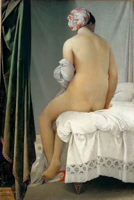
Even the most linear of painters uses movement to direct the viewer in reading his work. The Grand Baigneuse, also called The ValpinƧon Bather, 1808, Jean-Auguste-Dominique Ingres, the Louvre.
Form: Paintings are made of two-dimensional shapes, but they create the illusion of form. That is the sense that what weā€™re seeing exists in three dimension. While some abstract painting ignores form, a feeling of depth is critical in representational painting.
Texture: A work is called ā€˜painterlyā€™ when brushstrokes and drawing are not completely controlled, as with Vincent van Gogh. A work is ā€˜linearā€™ when it relies on skillful drawing, shading, and controlled color, as with Jean-Auguste-Dominique Ingres.
Unity: Do all the parts of the picture feel as if they belong together, or does something feel like it was stuck there as an afterthought? In realism, itā€™s important that objects are proportional to each other. Last-ditch additions to salvage a bad composition usually just destroy a paintingā€™s unity.
Loose brushwork does not mean lack of drawing or preparation. Vase of Sunflowers, 1898, Henri Matisse, Hermitage Museum, St. Petersburg, Russia.
Balance: While asymmetry is pleasing, any sense that a painting is heavily weighted to one side is disconcerting.
Focus: Most paintings have a main and then secondary focal points. A good artist directs you through them using movement, above.
Rhythm: An underlying rhythm of shapes and color supports that movement.
Content: I realize this is a dated concept, but itā€™s nice if a painting is more than just another pretty face, if it conveys some deeper truth to the viewer.
By the time you master these, scribing and mark-making will come naturally to you.

The trouble with nocturnes

Modern nocturnes document only the contrast between bright lights and the void. There are so many other cool things that go bump in the night.

Nocturne in Blue and Gold: Old Battersea Bridge, c. 1872-1875, James Abbott McNeill Whistler

Yesterday, a student was describing a late-evening sky she had seen, with the objects bathed in an unusual warm light. ā€œIā€™m sick of nocturnes always being done in Prussian blue fading to black,ā€ she complained. Since she has an MA in art history and works in a gallery, sheā€™s not talking through her hat.

ā€œWe always paint nocturnes wearing headlamps,ā€ said another student. ā€œThe human eye takes about 25 minutes to fully adapt from bright sunlight to complete darkness, and the headlamp continuously interrupts that. Cameras lie, too, about what darkness looks like.ā€
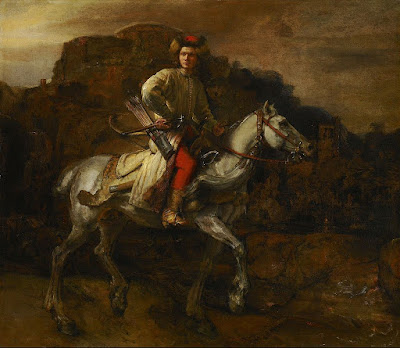
The Polish Rider, 1655, Rembrandt van Rijn 
She had just explained the technical problem with painting nocturnes in a nutshell. They are driven by our current technologyā€”headlamps and easel lightsā€”just as the high contrast of Frederic Remingtonā€™s nocturnes were driven by camera technology of his day. Headlamps and easel lights exaggerate the contrast between dark and light because theyā€™re constantly stimulating our eyes to stay in a photopic(daylight) state.
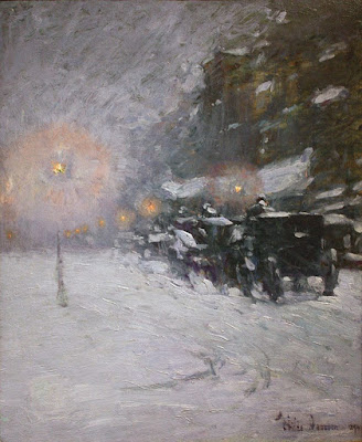
Winter, Midnight, 1894, Childe Hassam
Human night vision is limited to discriminating between different values of black and white, and the resolution and contrast are poorer. But there are many steps between light and true darkness, and most nocturnes are in fact painted using mesopicvision, which we use when weā€™re faced with a combination of lighting.
Moonlight, Ralph Albert Blakelock
When we transition from day to night, our eyes create photopigments in the cones and rods to increase sensitivity. The adaptation period is different for rod and cone cells. Cone cells can do this in about ten minutes of darkness, but rods require between 30-45 minutes. There are, of course, differences in how fast each of us can make the adaptation. Old age, as with so many other things, slows us down.
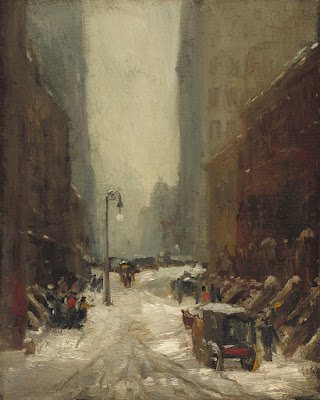
Snow in New York, 1902, Robert Henri
The transition from dark to light happens much more quickly. It takes about five minutes for the eyes to bleach out the photopigments they created to see in the dark.
The Call for Help, Frederic Remington
Humans are color-blind in true low-light situations. However, at twilight, when most nocturnes were painted, we suffer from something called the Purkinje shift. During the daytime, people are most sensitive to light that is greenish-yellow. At night, people are more sensitive to greenish-blue light.
The Tornado, 1835, Thomas Cole
The rods in our eyes (which are more light-sensitive and thus more important in low-light situations) respond best to green-blue light. The cones in the retina, which respond to colors, donā€™t work well in lower-light situations. As the light gets lower, our ability to see reds falls off.
Moonrise, 1894, David Davies
Scientists and tinkerers have long understood that red lights donā€™t trigger our eyes into photopic vision. Thatā€™s why theyā€™re used in control rooms or the nocturnal animal displays at the zoo.  
Starry Night Over the RhƓne, 1888, Vincent Van Gogh
Historically, nocturnes were about solitude, or sometimes, bad behavior. In our jazzed, electric world, they’re more likely to focus on lighting and energy. The modern nocturne is always a description of civilization overtaking nature. It is a brightly-lit subject set against an empty field of blackness. By definition, thatā€™s urban, and it contrasts our desires against our fears. The best modern nocturnes create a place to go to escape encroaching darkness. I’d say there’s more to that than just how our eyes work, but our vision certainly plays a part.
Nocturnes are very popular right now, both with painters and with buyers. I donā€™t paint them often, because Iā€™m not a night person, but several of my friends do, and do it well.
Hiawatha, 1870, Thomas Eakins
Today’s post is absurdly larded with illustrations, but I wanted to show you the many ways in which people painted nocturnes before we had headlamps.

How do people stay awake to paint nocturnes?

At their best, nocturnes strip away all extraneous detail, leaving us with powerful impressions and nothing more.
Nocturne in Gray and Gold, Westminster Bridge, c. 1871-1874, James Abbott McNeill Whistler. Courtesy Glasgow Museums.

Iā€™m preparing for my workshop at Schoodic Institute, which starts on August 6. There will be a full moon on August 7. According to the Farmerā€™s Almanac, this is known as the ā€œSturgeon Moonā€ because Native Americans fished for these big brutes at that time. Why they wanted sturgeon in the first place is not explained. Perhaps they fed it to their enemies.

If the weather cooperates, weā€™ll be painting a nocturne one night that week. We havenā€™t had that opportunity for several years. The jack pines and thundering surf should make excellent foils for the moon over the water.
The Artist’s Studio in an Afternoon Fog, 1894, Winslow Homer, courtesy Memorial Art Gallery of Rochester
As delicious as this soundsā€”and Iā€™m quite looking forward to itā€”itā€™s also the most worrisome part of the workshop for me. Iā€™m the antithesis of a night owl. By 8:30 PM Iā€™m yawning uncontrollably. Luckily for me the moonrise is going to be at 7:49 PM. I ought to manage a few brushstrokes before Iā€™m fast asleep.
Itā€™s a pity, because I love nocturnes. Theyā€™re mysterious, edgy, moody. In fact, Iā€™m working on one right nowā€”on the easel in my studio, where I can look at it in the full light of day.
The Polish Rider, c. 1655, Rembrandt van Rijn, courtesy Frick Collection.
ā€œNocturneā€ started out as a musical term; it was introduced to painting by James Abbott McNeill Whistler. His nocturnes are reductions to value studies and focus on composition.
Whistler did not invent night painting. Itā€™s integral to chiaroscuro, meaning that it was used by everyone from Caravaggioon. Rembrandt famously used it in The Night Watch, (1642).
Moonlight Wolf c. 1909, Frederic Remington, courtesy Addison Gallery of American Art.
Frederic Remington started his career as an illustrator, gradually moving to fine painting and sculpture. Around 1900 he started a series of paintings focusing on the color of the night. By his death in 1909, he had painted more than seventy nocturnes. They are filled with color, but they also shroud his illustrative temperament in mystery.
One of my favorite paintings of Maine, Rooms for Tourists by Edward Hopper, wasnā€™t painted in Maine at all. Itā€™s 142 Bradford Street, Provincetown, MA. While it exists today, itā€™s awfully swank compared to its 1945 incarnation.
Rooms for Tourists, 1945, Edward Hopper. Courtesy Yale University Art Gallery. 
At the time he painted it, it was a private residence. By cloaking it in darkness, Hopper could strip away all extraneous details, leaving only a coastal boarding house.
The Artist’s Studio in an Afternoon Fog (1894) features Winslow Homerā€™s trademark diagonal composition, but is pared down to its essential form. We must imagine the rocks, sea, and the color of fog.
Moonrise, 1894, David Davies, courtesy National Gallery of Victoria, Melbourne
Historically, nocturnes were about solitude. In our jazzed, electric world, they’re more likely to focus on lighting and energy. Contemporary painter Anthony Watkins is particularly good at nocturnes. He painted a brace of them at Ocean Park and sold them all in a whirl. I love them; I just canā€™t see how he can stay up all night painting.