fbpx

Monday Morning Art School: painting evergreens

Your assignment this week is to paint an evergreen, using one of the great masters as your muse.
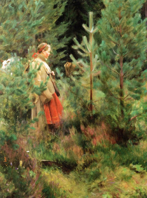
Herdsmaid, 1908, Anders Zorn. You could identify the species of trees in this painting, but it’s short on detail.

Last week, I wrotethat there are as many ways to paint water as there are moments in the day. The same is true of painting evergreens.

We can look to the painters of the great northern landscapes for guidance on evergreens. Swedes Bruno Liljefors and Anders Zorn, Tom Thomson and the Group of Seven, the Russian Peredvizhniki, and the northeastern painters from Winslow Homer to Andrew Wyeth are all worth studying.
Winter landscape at dawn, 1900, Bruno Liljefors. If the evergreens are in a supporting role, they’re often painted as a single mass.
Spend an hour searching their work on the internet along with the key words “spruce,” “pine”, or “evergreen.” You’ll notice that most of these artists handled the subject differently depending on whether they were in the studio or painting en plein air, or if the trees were the main subject or incidental.
After the bath, 1895, Anders Zorn, courtesy Nationalmuseum. The evergreens are nothing more than a few brushstrokes, but they’re perfectly realized.
Anders Zorn often used evergreens behind his pulchritudinous nudes. The contrast between his perfectly-observed trees and cookie-cutter models is striking. The Herdsmaid (1908) is probably the best evergreen painting ever executed. It’s all about the young trees, but Zorn never overstates the detail. Instead, he allows his brush to wash softly over the darker background, suggesting the softness of pine needles.
That apparent artlessness rests on a solid ground of observation. Zorn (and Wyeth) were able to be specific but loose because they drew and observed endlessly from nature. Each species of tree has a specific design. There are no shortcuts to knowing and understanding them. If you want to be able to paint trees, you must first draw them—a lot. Observe their branching structure, their needles or leaves, their bark, and where they like to grow.
Spruce Gun, watercolor, 1973, Andrew Wyeth, private collection
But trees are also forgiving; when you understand their structure, you can fearlessly mess with their form. While Wyeth’s tree in Spruce Gun looks perfectly natural to us, it’s also stylized to give a dynamic boost to the gun.
North Woods Club, Adirondacks (The Interrupted Tete-a-Tete), watercolor, 1892, Winslow Homer, courtesy Art Institute of Chicago. The trees are simple silhouettes, but they work because they’re accurate.
Either watercolor or oil are perfect for the organic character of trees; they can be schooled into great detail or allowed to wash with great softness across the canvas or paper.
It’s easy to become overwhelmed with detail in a tree, but it’s best, instead, to concentrate on overall values and colors instead. Start with the large shapes and concentrate on a few details at the end. After all, when we notice trees at all, we generally perceive them as masses, rather than as individual details. The exception is when someone is interacting with the tree, as in Mary Cassatt’s Child Picking a Fruit.
Isles of Spruce, silkscreen, c. 1943, Arthur Lismer. While the contrast between background and foreground is high, the values within individual trees are quite close.
How do we create form in trees? The same way we do with any other subject, by creating a pattern of light and dark. Our first question ought always be, “where is the light coming from?” The second question should be, “Is the light cool or warm?”
Start with a drawing. This is where you can get carried away with the gothic intricacies of the structure, and get them out of your system. Make sure that the height and width relationship is accurate. Also double-check that you have branches on all sides of the trunk, not just to the sides. Some will come directly towards you. While these are difficult to draw, they’re what anchor the tree in space.
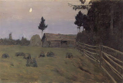
Dusk, 1900, Isaac Levitan, courtesy State Tretyakov Gallery. Depending on the light, evergreens may be represented with no green at all.
I’ve written before about working with a green matrix; you can use it as successfully with evergreens as with deciduous trees. Let’s assume you’re drawing in early morning and the light is golden. Make the shadows cooler and darker and the highlights warm and light. It’s possible that the only true greens in your tree will be in the midtones or highlights. But avoid excessive value jumps; making the highlights too light can end in visual chaos. It’s usually what’s happened when someone complains that they’ve gotten lost in the detail.
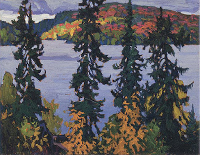
Montreal River, c. 1920, Lawren S. Harris, courtesy McMichael Canadian Art Collection. The Group of Seven painters were interested in trees as screens.
Unless you’re painting a deciduous tree in the dead of winter, the branches and trunk are secondary to the masses of foliage. 
Your assignment this week is to paint an evergreen, either from life or a photograph. Before you start, find a masterpiece from one of the artists I’ve mentioned above, and study his paint application carefully. Try to emulate that in your painting.
Slow looking

Don’t blame people’s short attention spans. Blame your overstuffed museums.
Above the Eternal Tranquility, 1894, Isaac Levitan, courtesy State Tretyakov Gallery
A landmark study conducted at the Metropolitan Museum of Art in 2001 found that the mean amount of time visitors spent looking at great works of art was 27.2 seconds. However, the mode—the number seen most often—was just 10 seconds. In 2017, the study was repeated at the Art Institute of Chicago, with almost exactly the same results.
There was one striking difference, however; the later study found those times included people taking selfies with the work. This was common across genders, race and age. It meant that the already scant time that museum-goers were spending looking at paintings was being deflected into the act of making self-referential photos.
Westminster Abbey with a procession of Knights of the Bath, 1749, Canaletto
Recently, Tate Modern cited a study saying their average viewer spends eight seconds looking at a piece of art. Another study declared that gallery goers spend two seconds looking at the painting and eight seconds reading the label, a trend that depresses me more than the selfies. The illustration for the latter story was of a couple reading the label for a large solid-grey canvas. Perhaps two seconds was actually too long.
Clearly, people don’t spend much time looking at paintings when they visit museums. But for some reason, museums are very popular with tourists. Among the world’s leaders are the Louvre, with 8.1 million visitors; the Met, 7 million; the Vatican Museum, 6.4 million; Tate Modern, 5.6 million; and the (US) National Gallery, with 5.2 million. That’s a lot of people milling through buildings stuffed with things nobody wants to look at.
To combat this, Tate Modern is pitching something called slow looking. They want you to look at paintings for ten minutes, but saythat five minutes or half an hour are okay, too. “To keep track of time, set a quiet timer on your phone or try simply counting a number of breaths.”
Portrait of a Lady, c. 1460. Rogier van der Weyden, courtesy National Gallery of Art, Washington DC
Please, no. Painting and sculpture are unique in that they don’t impose obligations on our time. Once we open a book or take a seat at a movie, we’ve obligated ourselves to sit through a narrative whose duration is laid out for us. With painting, we’re free to walk right past or to take a bench and sit for an hour.
Obviously, nobody metered the time spent looking at all the works in any of these major galleries. The Metropolitan owns 2 million pieces; the Art Institute of Chicago has about 300,000. (Of course, only a fraction of them are on display.)
What works were they measuring? There’s more content in a Roger van der Weydenaltarpiece than a stripe painting by Kenneth Noland. There’s the architecture, the starched linen coifs, a blood vessel throbbing below a monk’s tonsure, the oddly-plucked hairline of a lady, and angels with wings that match their gowns.
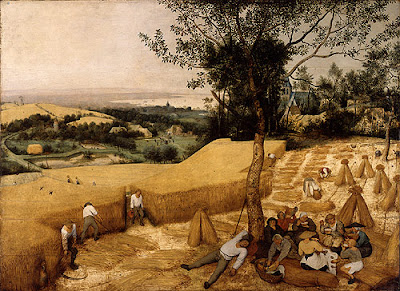
The Harvesters, c. 1565, Pieter Brueghel the Elder, courtesy the Metropolitan Museum
One of the powerful attributes of visual art is how it can disengage you from time and place. Stand in front of a Canaletto and you’re suddenly in Venice. But that isn’t going to happen with someone at your elbow, silently pushing you along.
Of course, paintings were never intended to be hung in a crowded museum. They were originally in churches, dining rooms, drawing rooms, and public halls, as part of the experience of that place. People looked at them over many years. Perhaps the problem is not our digital age, but the massive warehouses of art we’ve created and called museums.

Paintings from Mother Russia

Silence, 1890, Nikolay Nikanorovich Dubovskoy
If we think about Russian artists at all, we tend to remember 20th century expatriates like Wassily Kandinsky and Marc Chagall. But before the Russian Empire collapsed in civil war in 1917, it had a fine tradition of landscape painting. 
Trees in the Snow, 1908, Nikolay Nikanorovich Dubovskoy
My late student, Gwendolyn Linn, was a fan of these classical Russian landscape painters. From her I learned about Ilya Repin, Arkhip Kuindzhi, Isaac Levitan, Ivan Shishkin, Vasily Vereshchagin, and others. Many of these painters were members of the Peredvizhniki (or Wanderers or Itinerants in English). Formed in rebellion to the rigid Academic standards of the day, the group eventually became the status quo.
Yesterday I got a text from a student reminding me of one of the Peredvizhniki painters, Nikolay Nikanorovich Dubovskoy. Dubovskoy was born into a family of Don Cossacks in Novocherkassk in 1859. He studied from 1877 to 1881 at the Imperial Academy of Arts in St. Petersburg. In 1911, he was appointed a professor there.
The Waterfall Imatra, 1893, Nikolay Nikanorovich Dubovskoy
Dubovskoy died in 1918, a pivotal year in Russian history. It was the end of four years of World War and near the start of five years of civil war. The population of St. Petersburg was in free-fall: it dropped from 2.3 million in 1917 to 722,000 by the end of 1920. By the beginning of 1918 German troops were so close to the city that the Bolshevik government abandoned it. One shudders to imagine the life (and death) of a middle-aged artist when all the former luxuries had been condemned and reality was a struggle to find scarce food and fuel.
First Snow, 1910, Nikolay Nikanorovich Dubovskoy
But when the Peredvizhniki  painters were in their heyday, that was all still in the distant future. They mined the myths of Mother Russia, so their work is a blend of genre, history and nationalist painting. It can be mawkishly sentimental, but just as often is profound and arresting in its singular beauty.
Let me know if you’re interested in painting with me in Maine in 2014 or Rochester at any time. Click here for more information on my Maine workshops!