fbpx

Monday Morning Art School: Repoussoir

If your landscape is flat and delicate, you can introduce drama using this framing device.
 
Paris Street; Rainy Day, 1877, Gustave Caillebotte (courtesy Art Institute of Chicago).

Repoussoir is a compositional technique where an object along the left or right foreground directs the viewer’s eye into the composition. The bracket is often done with a tree, but sometimes it’s a person. In Paris Street; Rainy Day(above) the man with the umbrella on the far right of the canvas drives your eye up. Note that he’s a simplified and non-distracting figure compared to the complexity and detail of the rest of the canvas.

The Art of Painting, 1665-68, Johannes Vermeer (courtesy Kunsthistorisches Museum)

Repoussoir was an important special effect of the 17th century. Vermeer used it in The Art of Painting, above. The great dark shape of the drapery drives our eye to the traceries of the map on the far wall.

El Río de Luz (The River of Light), 1877, Frederic Edwin Church (Courtesy National Gallery of Art)

The Dutch Golden Age painters particularly loved repoussioras a way to pop drama into the flat, Dutch landscape. So did the Hudson River School painters. The example above, is by Frederick Edwin Church. Church was keenly interested in the flora and fauna of the tropics. There’s a canoe in the distance and waterfowl in the middle-foreground, but the tree on the left conveys most of our factual information about the scene. But it’s still a framing device, and what lies beyond is even more important. That’s our impression of the terrifying sublimity of the steaming riverbed beyond. (You can look at the painting in detail here.)

Nunda Farm, by Carol L. Douglas. This is not repoussoir, but rather a path drawing you into the composition.

Repoussoir is still extensively used in modern photography and landscape painting. It is a different effect from creating a path into the composition. I’ve given you an example of that in Nunda Farm, above, where the corn stalks draw your eye through the composition.

Repoussoir gone bad, by Carol L. Douglas. Why do you think the evergreen on the right fails to draw you into the composition?

I’ve also given you a failed sketch by me as an example of how repoussoir can go wrong. I was searching for a way to give perspective to a scene of unbroken snow and darkness. The small pine at the right doesn’t exist in the real scene. I abandoned this composition because the tree conflicted with, rather than enhanced, the main subject. Why do you think it didn’t work?

Hedgerow in Paradise, by Carol L. Douglas. I’m deliberately blocking the viewer out here. Why do you think that is?

Hedgerow in Paradise is a painting of a farm in Bloomfield, New York. This is an area of delicate beauty, where the flat lake plains are tentatively breaking out into gentle rolling hills. I intentionally chose to let the long view sit alone, giving the viewer no framing and no path into the subject. In other words, there’s no real foreground, just a scene set in the middle distance.

Hedgerow in Paradise, reimagined with repoussoir. How does it change the composition?

Above, I’ve imposed a tree in the foreground. Does it add to or distract from the subject? How does it change the meaning of the composition?
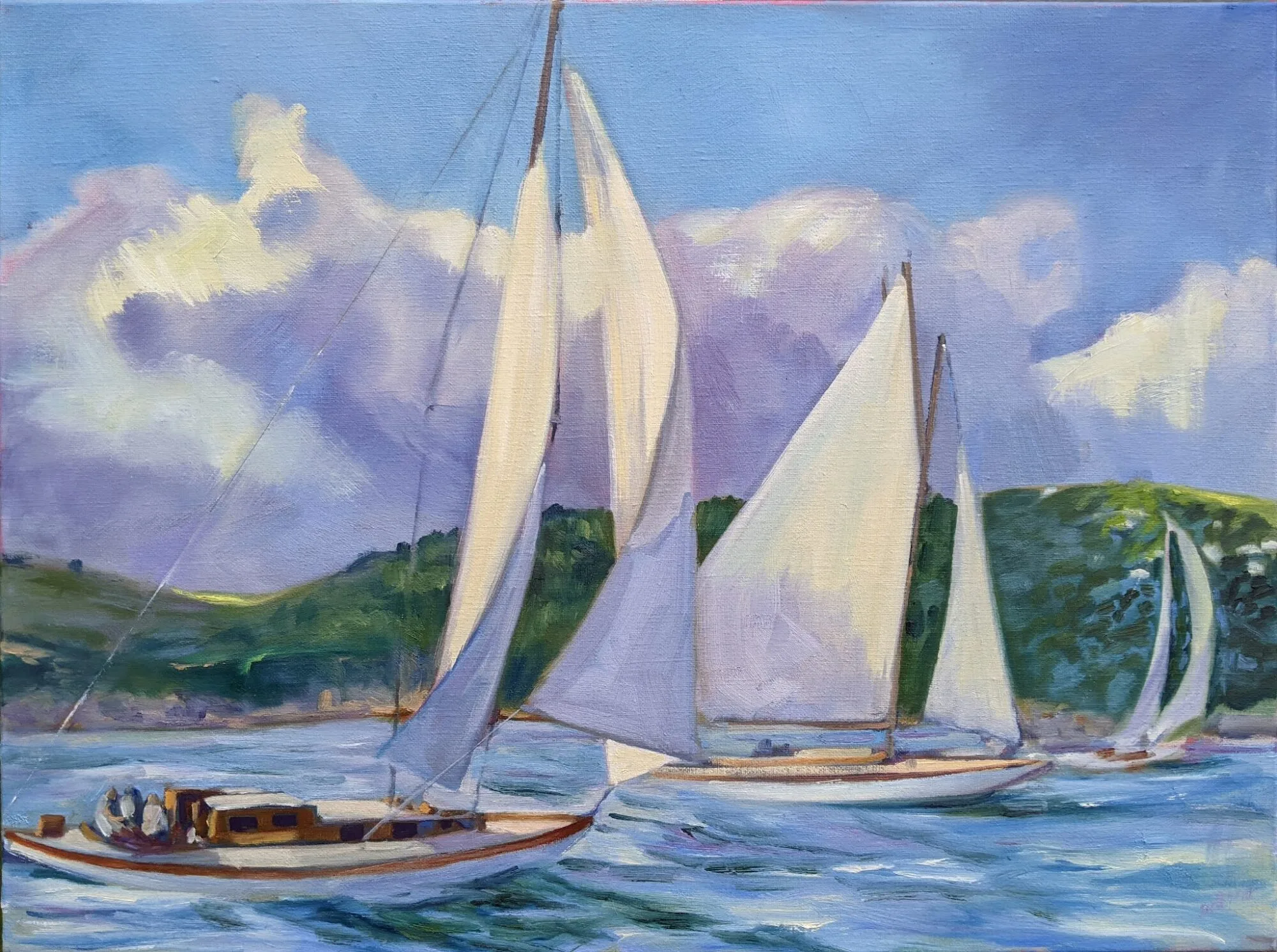
In your work, do you have something similar to Hedgerow in Paradise? Your assignment is to do a sketch based on that painting or drawing, reframing the composition using repoussoir. If you don’t have a painting like this, use a photograph from the internet. I’m interested in the before-and-after. I used Photoshop, but you can do a simple sketch. It doesn’t need to be complicated. How is the scene changed with repoussoir? Do you like it better or not?
Repoussoir is a technique that’s particularly applicable to the midwestern plains and to ocean views. I’ll be stressing it at my Rochester workshop* because of the delicacy of the glacial landscape at Mendon Ponds, but it works well with water, too.
*Since this post was written, I’ve replaced my Rochester workshop with several other exciting locations. Register ASAP!

Not your grandfather’s abattoir

Carcass of Beef by Chaim Soutine, c.1924. This is part of a series that was painted in his apartment in Montparnasse, sans refrigeration.
Every art student knows Chaim Soutine’s Carcass of Beef series. Soutine—who didn’t always act as if both his oars were in the water—kept a beef carcass hanging in his studio to paint, bathing it daily in blood to keep it fresh. The stench drove his neighbors to call the flics. Soutine promptly lectured them on the importance of aesthetics over mere hygiene. At one point, the painter Marc Chagall saw the blood from the carcass leaking into the hallway outside Soutine’s room. He rushed out screaming, “Someone has killed Soutine!”
Rembrandt van Rijn’s Slaughtered Ox, 1655, was in the Louvre at the time Soutine painted his Carcassseries. Another version, very similar, is in Kelvingrove Art Gallery.
Soutine painted 10 works in his Carcass of Beef series. They were inspired by Rembrandt’s 1665 still life, Flayed Ox. The Christ-like aspects of Rembrandt’s steer carcass are often remarked on, but that probably reflects our modern separation from the slaughterhouse. We simply don’t see beef on the hook much anymore.
The similarities to a crucifixion noted in Rembrandt’s paintings probably come from the reality of slaughtering beef. Modern beeves are split in half before hanging.
I periodically buy a side of beef from a farmer in Niagara County, NY. I knew his grandfather, who farmed the same patch of land. The farmer has switched abattoirs to the one where we used to send our own steers back in the 1970s. It’s gone through two owners since then, so in a way I guess I knew the abattoir’s grandfather too. It’s still a small operation, but now it’s immaculate and odor-free.
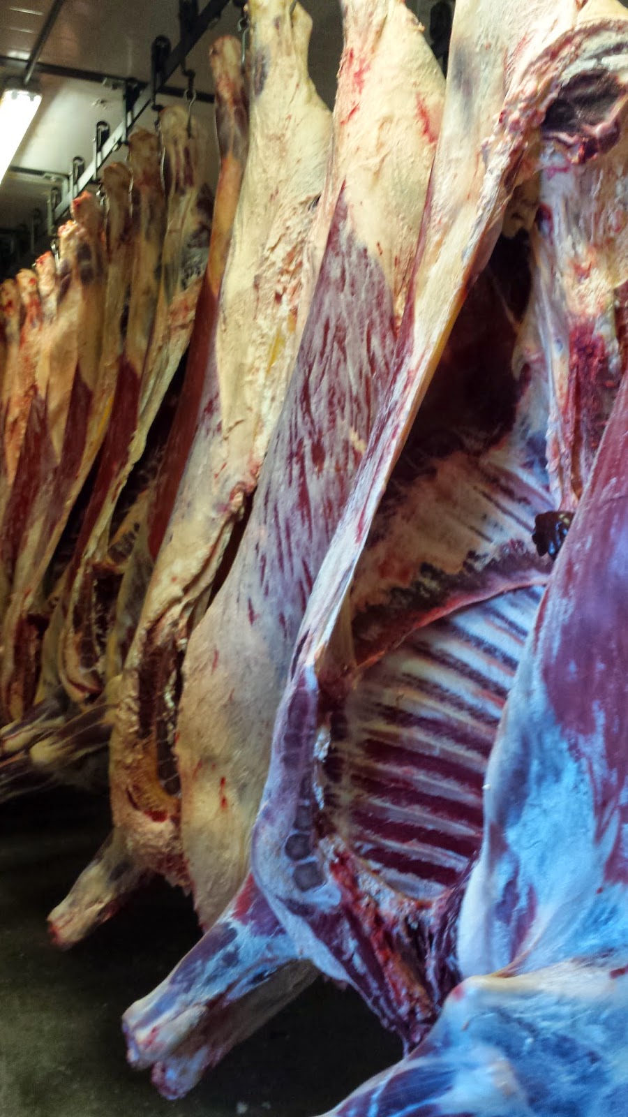
Beef aging in a modern abattoir.
Either mid-century French beeves were a fraction of the size of modern American steers, or that old story about Soutine is flawed. The hanging weight of the steer we collected yesterday was just under 700 lbs. Soutine could not have humped that from the slaughterhouse up the stairs to his apartment. I doubt he could have paid for it unless it was already rancid, since he was perennially broke. A month-old Angus calf can weigh between 80 and 200 lbs., so I’m guessing those paintings should probably be called the Carcass of Veal series.
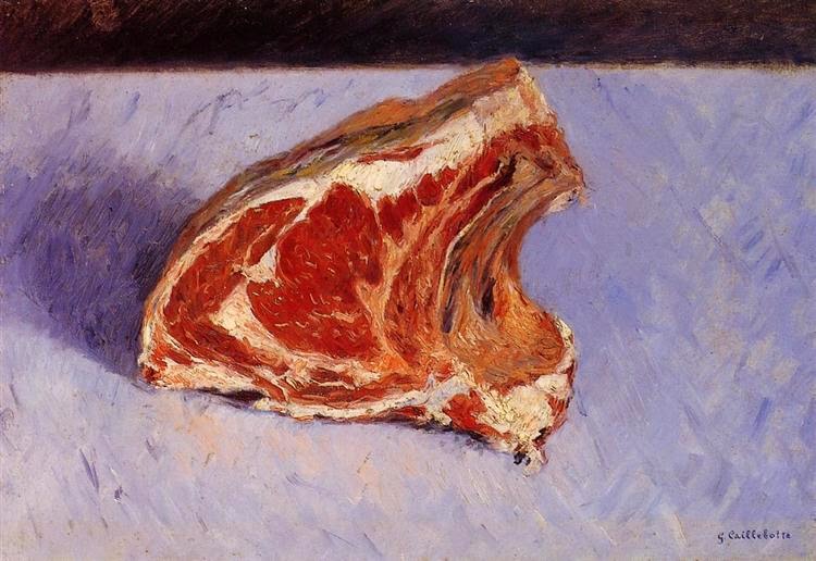
Gustave Caillebotte was an upper-class Parisian with an independent allowance. His Rib of Beef, 1882, is a much more sanitized affair.
I jumped at the opportunity to take a tour of the abattoir. We followed the workflow from the room where steers are stunned and killed, to the great coolers where they hang for a few weeks to age, to the newly installed smoker. The place was absolutely spotless. “When we kill a steer, we have both a veterinarian and a USDA meat inspector right here,” the butcher told me.
The stamps are from the USDA inspector.
Most of us eat meat but want to imagine that it originates in the plastic packaging in a grocery store. But there is nothing particularly revolting about a well-managed slaughterhouse. I am certainly more confident about a well-regulated abattoir in tiny Hartland, NY, than I am in the great slaughterhouses of the Midwest. And as a bonus, there are no plastic films, no Styrofoam trays, and no blister packs.
And, yes, I would jump at a chance to paint a hanging side of beef. They are beautiful, complex, corporeal, and colorful. Alas, the food inspectors would never allow it.
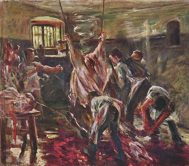
Lovis Corinth’s In the slaughterhouse, 1893, was painted during the first great reform movement of slaughterhouses.
Let me know if you’re interested in painting with me on the Schoodic Peninsula in beautiful Acadia National Park in 2015 or Rochester at any time. Click here for more information on my Maine workshops! Download a brochure here.