Not every color that’s on your painting must be there in real life.
 |
|
A Sunday on La Grande Jatte, 1884, Georges Seurat, courtesy Art Institute of Chicago |
Pointillismand its twin, Divisionism* developed as painters sought to advance and understand the optical revolution that was Impressionism. Their flagship painting—and the root of the concept—is Georges Seurat’smasterpiece, A Sunday Afternoon on the Island of La Grande Jatte. Seurat called his painting style ‘chromoluminarism,’ which hints at what he was striving for—a way to enhance the ability of canvas and paint to reflect light.
For the record, Seurat didn’t paint La Grande Jattein one sweep. It would have been close to impossible to hold that many ideas simultaneously. In the first pass, he used conventionally-mixed pigments including earths. In the second, he dispensed with the earths and limited the number of paints on his palette. It wasn’t until his last sweep that he introduced the dots of color that we see today. Remember that next time you want to toss a canvas that isn’t working.
 |
|
The Pine Tree at Saint Tropez, 1909, Paul Signac, courtesy Pushkin Museum |
Seurat believed that he could get more vibrant and pure colors by letting the viewer’s eye do the mixing, instead of mixing colors on the palette. In truth, what he was striving for—an additive color scheme—is impossible with paint; it remains subtractive because it’s reflecting light. What Seurat really wanted was digital painting, and it wouldn’t be invented for another 100 years.
Nevertheless, he did create an exciting new way of putting down paint. Placing contrasting colors next to each other causes an optical excitation that typical color mixing cannot achieve. In some way, every color in a Seurat painting manages to maintain its individuality while contributing to a larger whole.
 |
|
Le séchage des voiles (The Drying Sails), 1905, André Derain, courtesy Pushkin Museum |
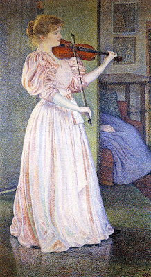
To create these effects, the divisionist painter first identified the local color of objects. Then, he interspersed dots of yellow-orange in the sunlit passages, and blues, reds and purples in the shadows. Pointillists worked a little differently, thinking through the entire painting in raw color, much like modern printing creates an image in CMYK.
The impact of adjacent colors on perception is a well-known and -researched phenomenon, one that touches on the area of optical illusion. These optical sleights-of-hand are known as contrast effects. By putting dots of contrasting colors next to each other, pointillists hoped to recreate these contrast effects in their paintings.
Were the pointillists and divisionists able to make colors seem brighter than their peers who were still mixing and painting the conventional way? Perhaps slightly, because they avoided the muddiness that can happen in paint-mixing. However, that was a battle that had largely already been won by their Impressionist peers.
 |
|
Portrait of Irma Sèthe, 1894, Théo van Rysselberghe, courtesy Musée du Petit Palais |
Nor were they able to entirely express shadow and light with hue; these still need some value shifts to make them intelligible.
Nevertheless, their optical experiments influenced a century of painting, ending in the experiments of op art in the 1960s. We don’t have to want to paint like them to learn from them.
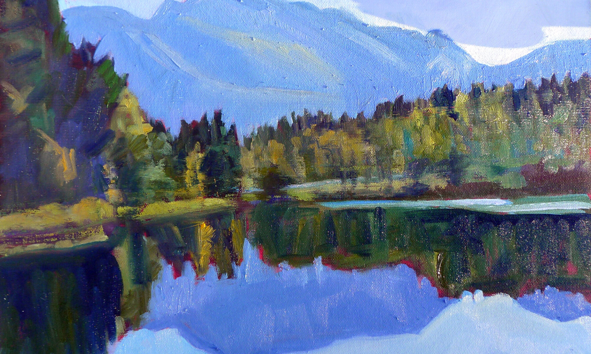
The takeaway lesson of the pointillists is that not every color that’s on your painting must be there in real life. Your job as an artist is to represent the inner reality of a situation, not its photographic shell. If the trees are moving, perhaps a flash of orange will add a sense of motion. The sky may be blue, or it may be yellow; it’s hard to say.
The human eye craves interest, and as long as you have the value right, you can play fast and loose with the actual hue.
*What most of us call Pointillism is actually Divisionism but there’s really little point (ahem) in dividing them, at least for our purposes.
