fbpx

Figurative does not mean figure

Where do you fall on the continuum from representation to abstraction?

I Saw the Figure 5 in Gold, 1928, Charles Demuth, courtesy the Metropolitan Museum of Art

English (my daughter never tires of telling me) is a descriptive, rather than proscriptive, language. Words mean whatever most people agree that they mean. That’s why English is so endlessly adaptable—why, for example, we can suddenly accept the ungrammatical ‘their’ as a replacement for ‘his’ or ‘her’ without making a Federal case of it. English sees a need and answers it, and its users follow along.

There is one neologism I resist, however, and that’s the substitution of the word figurative for figure. As descriptions of art, they are not equivalent. Figure painting means painting the human form. Figurative paintingmeans realism.

Rider, Attic red-figured cup, middle of 5th century BC, courtesy of Luynes Collection

Figurative is an old word in English, and comes to us from French. It has always had overtones of metaphor and meaning. It’s slightly different from figure, which has multiple meanings in English. Figurecan mean a shape, the human body; a number, or a symbol. Think of the term figure eight and you begin to understand the complexity of the word.
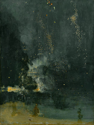
Figurative art, or figurativism, however, is simple: it means representational art. The term was coined when abstraction came along, to describe abstraction’s opposite number. A painting of your car is as figurative as a painting of your spouse.

Nocturne in Black and Gold: The Falling Rocket, 1874, James Abbott McNeill Whistler, courtesy Detroit Institute of Arts 

What is the difference between figurative and abstract art? It’s not easy to draw a line. There have always been elements of abstraction in figurative art. This is why ancient art often surprises us with its modernity.

Even hyperrealism is a form of abstraction. It’s seemingly impossible for humans to represent nature exactly as it appears. Imperfect beings, we insist on putting our own spin on everything.
Likewise, there are often figures in abstract art, and much abstraction derives from observed figures in nature. The abstract geometry of Piet Mondrian, for example, resonates with us because we’ve observed such geometry in nature.

Premier Disque, c. 1912-13, Robert Delaunay, private collection

The ‘figure’ in Charles Demuth’s I Saw the Figure 5 in Gold is both a number and a symbol. And it’s both abstract and realistic. It was painted in homage to his friend William Carlos Williams’ poem, The Great Figure:

Among the rain
and lights
I saw the figure 5
in gold
on a red
firetruck
moving
tense
unheeded
to gong clangs
siren howls
and wheels rumbling
through the dark city.
Monday Morning Art School—adding figure to your landscapes

Animals, people, automobiles and other evidence of life add humanity to an otherwise static scene.

Erie Canal, by Carol L. Douglas. The figure is my daughter Julia.

Figures are best incorporated as part of the design, rather than added as an afterthought. Groups of people are such strong design elements that they can overwhelm a composition if they’re not planned in advance. In a different way, that’s equally true of a single animal in a landscape.

An individual figure can dominate a composition as well. We humans are innately curious as to what other people are doing, and a figure in a painting is an invitation for us to indulge in that curiosity.
Therefore, they’d better have a good reason to be where they are. Tossing in a figure or a gull or two to balance a composition is a Hail Mary pass that seldom works. Odds are, these last minute additions will overset your painting. It will look like it’s wearing one too many pieces of jewelry.
Tilt-a-Whirl, by Carol L. Douglas. Someday I’ll write about how to paint a spinning subject en plein air.
Is the figure important to the scene? I think beaches and street scenes benefit from having people in them, because they are how we experience those places. Streets generally have cars; in fact, they’re so ubiquitous that we barely notice them. I generally limit my own animal drawings to dogs or horses, but there are western landscape paintings that would be far less compelling if they didn’t have animals in them.
Decide in advance whether you’re painting a landscape, or a figure in a landscape. If it’s the former, keep detail to a minimum. If it’s the latter, then perhaps you should redesign your painting to be a figural or animal painting. If it’s primarily a landscape, added figures, cars, or animals should be there to complement, not dominate.
59th Street Bridge approach, by Carol L. Douglas. It’s impossible to paint in Manhattan without including cars.
That doesn’t mean you get away without drawing. In fact, drawing is paramount in these added elements. I’ve learned to stop painting and pick up my sketchbook when a figure nearby interests me. I draw it carefully and then insert it into the painting only when I’m sure it’s right, rather than trying to capture the person in two or three brushstrokes as they’re moving.
New Puppy, by Carol L. Douglas. This started as a sketch of the group; the beach is subservient. Available through Camden Falls Gallery.
The good news is that some of the details of drawing that bedevil the beginning artist—like fingernails, eye sockets or nostrils—must to be omitted. But proportion and placement are paramount, so it’s helpful to practice drawing people whenever you have the opportunity.
Castine lunch break, by Carol L. Douglas. Bicycles, cars, and boats are symbols of human activity that can stand in for the figure.
Even when the figure is the focal point, it must be integrated into the greater color scheme of the landscape. A fawn under the cool green canopy of the forest is not going to be as warm in tone as she would be nestled in a dry grass nest. The same is true for humans, and for their cars.
A critical aspect of figure is a sense of scale. That’s the most likely place to make a mistake. Often my figures are a pastiche of different people who’ve passed the site as I’ve been working. I start by drawing a dummy placeholder and checking its size in its position. (A few feet along a sidewalk can change the size dramatically.) Only when I have the scale right do I try to personify the character.

Style versus substance

I wanna go north, east, south, west
Every which way, as long as I’m movin’…

My method of packing is to start with the important stuff, like vacuuming the floor joists in the basement. That’s excitement speaking. Like Ruth Brown, I’m happy as long as I’m moving. I’ve been home in Maine since February, when I went to Pecos, NM to paint with Jane Chapin. For my mid-Atlantic friends, the plein airseason has already started in earnest, whereas we in the north are just starting to believe the snow is finally behind us.
My current adventure started with a deceptively-simple question. Could I do a portrait “in the manner of Francis Cadell?” That the inquirer differentiated between “style” and “manner” meant that he wasn’t asking me for an imitation Cadell painting. I wouldn’t know how to do that.
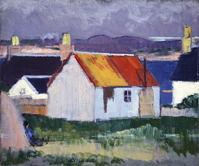
Iona Croft, 1920, by Francis Cadell, courtesy National Galleries of Scotland
“In the manner of” has a specific meaning in art history, which is that it was done by a follower of a particular artist, but after the artist’s death.
Style, on the other hand, is the mark-making, composition, color palette and other visible attributes (or method of working) that give the appearance of the finished work. Style ties a painting to other works by the same artist, or to a specific period, genre or movement. It’s the art historian’s principle tool in classifying artwork. I can never be a Scottish colourist, any more than I can be a Canadian Group of Sevenpainter. Each of us is tied too closely to our own time and place in history, and imitating the Dead Masters is a sure path to mediocrity. But we can think seriously about the values those painters brought to their work.
Cadell had a palpable affection for his subjects: human, still life or landscape. Even so, people and objects were always somewhat subservient to their settings, which were frequently the Georgian rooms he occupied in Ainslie Place in Edinburgh’s New Town. Ironically, I’ll be painting just down the street, in a similar Georgian townhouse.
Full stop, by Carol L. Douglas. Well, we both like purple.
Cadell chose beauty over stylishness. The difference is depth and staying power. It takes some scratching to get down to fundamental truth. It’s easier to go for pretty scenes, cheap symbols or trendy commentary. But those things are only transient.
My old friend and model Michele Long used to say that figure painting was a collaboration between the artist and the model. I think that was a profound insight, but I’d add a third player: the audience, present and future. Art is primarily communication, and that requires that the subject, artist and audience all bring something to the engagement.
Michelle reading, by Carol L. Douglas
People sometimes ask me if there are paintings I would never sell. There’s one: my grandson Jake as an infant. (It was the last time he was ever still.) Once I’ve laid down my brushes, I don’t think of a painting as mine any longer. From that, it’s easy for me to realize that it was never really mine in the first place.
Thus, it isn’t about me, my skills, my whims, or my inadequacies, but about the subject and the viewer. That takes a lot of the ego out of the process, and makes me able to relax and enjoy painting.

Stations of the Cross (1 of 5)

This week I am running a series of Stations of the Cross. They were completed during a deadly year, one in which I was being treated for an advanced cancer. For this reason—and because I was traversing new territory for myself—they’re uneven. But their power comes from the underlying story.

The language is simple, meant to be accessible to a child.

The originals are owned by St. Thomas’ Episcopal Church, 2000 Highland Avenue, Rochester NY 14618, and are traditionally displayed during Holy Week.

The night Jesus was arrested.
On the night Jesus was arrested, he was brought to the house of Caiaphas, the high priest. Caiaphas and his council were looking for a reason to put Jesus to death.
Caiaphas was afraid of Jesus. He did not want to give Jesus a fair trial. He told his council, “It is better for you to have one man die than to have the whole nation destroyed.”
“Are you the Messiah?” Caiaphas asked Jesus.
“You have said so,” Jesus answered.
“Why do we need witnesses?” Caiaphas asked the council. “You heard him! What is your verdict?”
“Death!” the council responded.
They spat in Jesus’ face, hit him and insulted him.
The priests brought Jesus to Pilate.
The members of the council took Jesus to the Roman governor, Pilate. They were careful to stop at the gates of Pilate’s palace. They did not want to go into a place where people were hurt. If they did, they would no longer be clean and they could not eat their Passover meal.
“Take him yourself and judge him by your laws,” said Pilate. But the council could not have Jesus crucified, which is what they wanted.
The high priests carefully followed the law that God gave them. But they used the law to get what they wanted, not what God wanted. We choose how we use our gifts from God—whether for good or evil, to help others or to help just ourselves.

Pilate enthroned.

Pilate asked Jesus, “Are you the King of the Jews?”

“My kingdom is not of this world,” said Jesus. “If it were, my followers would be fighting to save me.”
Jesus did not wear a golden crown or command armies. He wore a crown of thorns and knew his power was in God.
When we follow Christ, our power comes from God and no one can see our riches.


Let me know if you’re interested in painting with me on the Schoodic Peninsula in beautiful Acadia National Park in 2015 or Rochester at any time. Click 
here for more information on my Maine workshops! Download a brochure here.

Censored. Me. Really.

Shuttered. Closed down. Censored. Moi? Really?
My duo show with Stu Chait, Intersections of Form, Color, Time and Space was closed on July 18 by RIT-NTID’s Dyer Gallery because the nude figure paintings might be offensive to young campus visitors. It seems like just yesterday that I was saying issues of censorship didn’t raise their ugly heads here in Rochester.
At our first meeting with the gallery, I specifically asked whether nude figure paintings would be a problem. I pointed out that the primary work dealt with difficult themes of how women are marginalized in the 21st century. I am a feminist, and my figure work deals with things like religious submission, bondage, slavery, prostitution, obesity, exploitation, etc.
The Laborer Resting, 36X48, oil on canvas. Available.
These paintings were reviewed, accepted and hung by the gallery with no problems. The opening was well-attended, and there were children present. (For that matter, my son regularly schleps paintings for me, and his biggest complaint is that he’d rather be using his computer.) The show was featured in RIT’s University News  and mentionedin City newspaper. It was not until administrators saw the work that it was deemed unacceptable.
The cynic in me thinks that if I painted coy, sexy Odalisques there would have been no objection to the show. Young people are exposed to sexually-charged but non-intellectual images every day; in fact, this is part of the problem I am painting about.
Meanwhile, kids who go to malls are exposed to images like this on an everyday basis. And this really is obscene, because it uses sex to sell clothing.
If difficult issues of women’s rights can’t be examined in a college gallery, where can they be examined?
I have occasionally pulled individual pieces that were too challenging. Last month I had a show at AVIV CafĂŠ and Gallery at Bethel Church on East Avenue. The director pulled one work because its depiction of starving Africa frightened children. But since he left the bulk of the work intact, this was no problem.
Aviva Sleeping, 36X24, challenges the notion that an obese woman cannot be a beautiful one.
Of course, I’m in Maine, so Stu Chait and Sandy Quang had to deal with the work of pulling, wrapping and moving around 60 large paintings. And visitors to the show will find the gallery empty. What a pity.

Sorry, folks. My workshop in Belfast, ME is sold out. Message me if you want a spot on my waitlist, or information about next year’s programs. Information is available 
here.

Opening tonight: Intersections of Form, Color, Time and Space

The Laborer Resting, by Carol L. Douglas, oil on canvas, 36X48, $3,750.
Several friends have sent me storiesabout Leena McCall’s oil painting of her friend, Portrait of Ms Ruby May Standing, being removed from a Society for Women Artists show in London because it was deemed to be pornographic. McCall painted her work in the flat style of mid-century English painters, and that’s the best part of the painting. She’s baiting a censorship that vanished decades ago. It’s her great luck (or planning) that she found someone—anyone—to object to it in this day and age.
The painting—although obvious—hardly dings my porn meter. I’m a born-again Christian who sometimes paints on the subject of women’s bondage. The only person who complains is my husband, who blocks them on his newsfeed so they don’t violate his employer’s policy.
The Joker, by Carol L. Douglas, oil on canvas, 30X40, $2,500.
My nudes, by the way, are on view at RIT-NTID’s Dyer Art Centerthis month. The show, Intersections of Form, Color, Time and Space, opens tonight, from 4-7 PM. I hope you’ll come out and say hello. RIT’s campus is lovely, and this would be a fantastic evening to be out there.
Unlike McCall, I’m taking an anti-pornographic stance. I’m painting about the abuse and objectification of women. You would think that a culture that aspires to complete equality for women would see less of this, not more, but these two trends have increased, not decreased, in my lifetime.
Submission, by Carol L. Douglas, oil on canvas, 24X20, $1,500.
I nursed all four of my kids and nobody ever tried to shame me about it. So I’m amazed at the stories my young friends tell about women being harassed for nursing in public. My friend Tim Vail pointed out that there are centuries of images of nursing mothers. “It seems like the more sexualized our culture gets, the more repression there is over what used to be completely normal.”
I’m afraid we’re living at the high-water mark of women’s rights worldwide. And that’s what I’m painting about. The more I paint, the less able I am to explain the material in words, so I hope you come out tonight to see them.
The Dyer Arts Center is in Lyndon Baines Johnson Building at Rochester Institute of Technology, 52 Lomb Memorial Drive, Rochester, NY 14623Intersections of Form, Color, Time and Space, featuring abstract-expressionist Stu Chait and realist Carol Douglas, is in all three galleries during the month of July.

I’m leaving for Maine next week. Come join me! I have two openings left for my 2014 workshop in Belfast, ME. Information is available here.

It’s all about Michelle

Michelle will be happy that she finally has a face in this painting. (From my upcoming show with Stu Chait at RIT-Dyer.)

The other day I wroteabout photographer Terry Richardson and allegations that he abused his models. I said, “Artists and their models can be friends; sometimes they’re even lovers. But every artist-model relationship also involves an implied balance-of-power calculation.”
I’ve worked with a lot of models over the years, and I think my relationships with them have been professional and courteous. Over the years, several of them have become my friends, including Kate Comegys, Gail Kellogg Hope and Michelle Long.
Michelle as a sort of Madame X character. (From my upcoming show with Stu Chait at RIT-Dyer.)
Michelle is as close to an international model as Rochester has. She collaborated on a project with Keith Howard called “Eve’s Garden: The Lost Creation.” I wish I’d thought of this idea, because it revolved around the idea of printmaker Howard sending his painting work offshore to China. The result was visually pleasing and perfectly in tune with the zeitgeist.
Usually my skin-tones are modulated with grey, but I want the illusion of florescent light, so I’m using blue. Note there is no true red on my palette right now.
I’m finishing a painting of Michelle for my upcoming duo show with Stu Chait at RIT-Dyer. True to form, Michelle won’t be there; she is leaving to work in Uganda. If you want to support her at the Ugandan Water Project, go here.

This painting has been sitting unfinished for a long time, because I was mad at it. It taught me the limits of drafting huge paintings in my 18X18 studio. I ended up having to redraft her head and shoulders to correct the severe foreshortening.

Yep, those are my skintones. Along with my modulating colors, they gave me the faces above.
Occasionally someone asks me how to mix skin tones for different races. I think that’s a funny question, because I use exactly the same paints for everyone; only the proportions change. For that matter, I’m using the same paints I use to paint foliage.

I have three openings left for my 2014 workshop in Belfast, ME. Information is available 
here.

What you do when nobody’s looking

Ellwanger Berry Garden, 12X16, $650, by Carol L. Douglas.
Sure, I get to drive around and visit with fascinating people and go to interesting shows and occasionally pick up a brush and paint something, but I spend more time than I’d like on bookkeeping and that bugaboo of all sales: inventory control.
Stu Chait and I are putting the final details together for our upcoming show at RIT-NTID’s Dyer Arts Center, which opens July 11 from 4-7 PM. If you’re in town, you should really find a way to get there, since this is a sprawling show.
Manipulation in Red by Stu Chait.
Stu and I met at the Ellwanger Garden here in Rochester. We were the only painters there, so we stood at opposite ends of the garden and painted facing each other. I’ve long since sold that painting, but I painted another painting with him at the same place, which will be in this show.
It’s been years since I pulled out all my work to organize a show, but since the passage of time is part of our theme, I inventoried every piece of work I have in play right now. That is nearly a hundred pieces, which is less absurd when you consider that I have three separate bodies of work: landscape, figure, and faith-based. (Even with all those paintings, I am actually scant on work to meet specific summer commitments.)
The Servant, 36X40, $3000, oil on canvas, by Carol L. Douglas.
What surprised me even more is how many paintings are no longer in my inventory.  Next winter I’m going to go through my photo archives and sales records and try to piece together a comprehensive catalogue. I loathe that kind of task, but if I don’t do it soon, I’ll never get it done.


I have three openings left for my 2014 workshop in Belfast, ME. Information is available 
here.

Just a travelin’ man

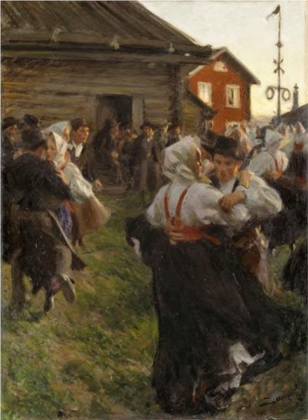
Midsummer dance, Anders Zorn, 1903

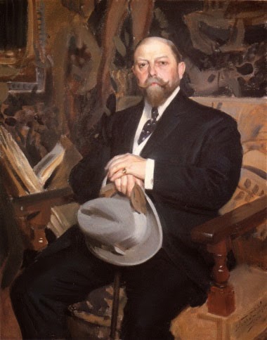
This morning I’m off with my pal Brad Marshall to see Anders Zorn: Sweden’s Master Painter at the National Academy. Before Brad suggested this, I knew absolutely nothing about Zorn. That’s ironic, because at the turn of the last century he was one of the world’s most renowned painters. In fact, he painted three American presidents: Grover Cleveland (and his wife), William Taft, and Theodore Roosevelt, along with many other of the social luminati of the time.

Portrait of Hugo Reisinger, Anders Zorn, 1907
Anders Zorn was raised on the family farm in rural Sweden. He studied at local grammar schools before enrolling in the Royal Swedish Academy of Arts.  His painting and social skills must have been prodigious, because he rapidly became a luminary in the Stockholm art world. His wife, Emma, was from a wealthy and cultured family; they met through his work.
Not content to be a big fish in a small pond, Zorn traveled to the world’s major cultural centers.  He was feted internationally while still in his twenties. (He in turn became a notable art patron upon his return to Sweden.)
Sensitive to cold, Anders Zorn, 1894.
Like John Singer Sargent, Zorn was a highly-skilled watercolorist; like Sargent and Joachim Sorolla, he was known for his loose, lyrical paint handling. Unlike them, his fame has flamed out, at least here in the United States.  What will I think of his work? Only one way to find out.
Anders Zorn: Sweden’s Master Painter runs until May 18, 2014 at the National Academy of Art, XX Park Avenue, New York, NY.

Let me know if you’re interested in painting with me in Belfast, Maine in August, 2014 or in Rochester at any time. Click 
here for more information on my Maine workshops!

That fine line between art and erotica

Hermaphrodite, Mateo Bonarelli, 1652, Prado

“Son of Hermes and Aphrodite, Hermaphrodite was a singularly handsome youth. According to Ovid (Metamorphoses 4, 285 ff.) Salmacis, the nymph from a lake in Caria, was enthralled by his beauty and passionately embraced him while he was bathing. Their two bodies merged as one, with double gender.

“This sculpture, commissioned by Velasquez in Italy for the decoration of Madrid’s AlcĂĄzar Palace, is a copy of the classic marble from the Borghese Collection in Rome, now in the Louvre Museum. The high technical quality of this piece makes it a masterwork that surpasses the original.” (From the Prado website)

 I watched thisnews story about a kerfuffle about nude photographs in a gallery window in Belfast, ME last week. The culture snob in me would have liked to believe that it was a small-town issue, except that a proposal for a show of my nudes was summarily rejected at the same time by a local college gallery because they have a no-nudity policy.
Despite what the photographer says on the video, there is no clear line between art and pornography, because there have always been painters whose primary goal was to titillate, and because sexuality is part of our humanity. It cannot be simply excised from the model or the process.
Consider the dancing girls in this fragment from ancient Thebes (c. 1350 BC). One presumes that the serving girls and dancers are naked for Nabamun’s amusement in the afterlife, but it is not overtly sexual.
A feast for Nebamun, the top half of a scene from the tomb-chapel of Nebamun, Thebes, Egypt, Late 18th Dynasty, around 1350 BC, The British Museum
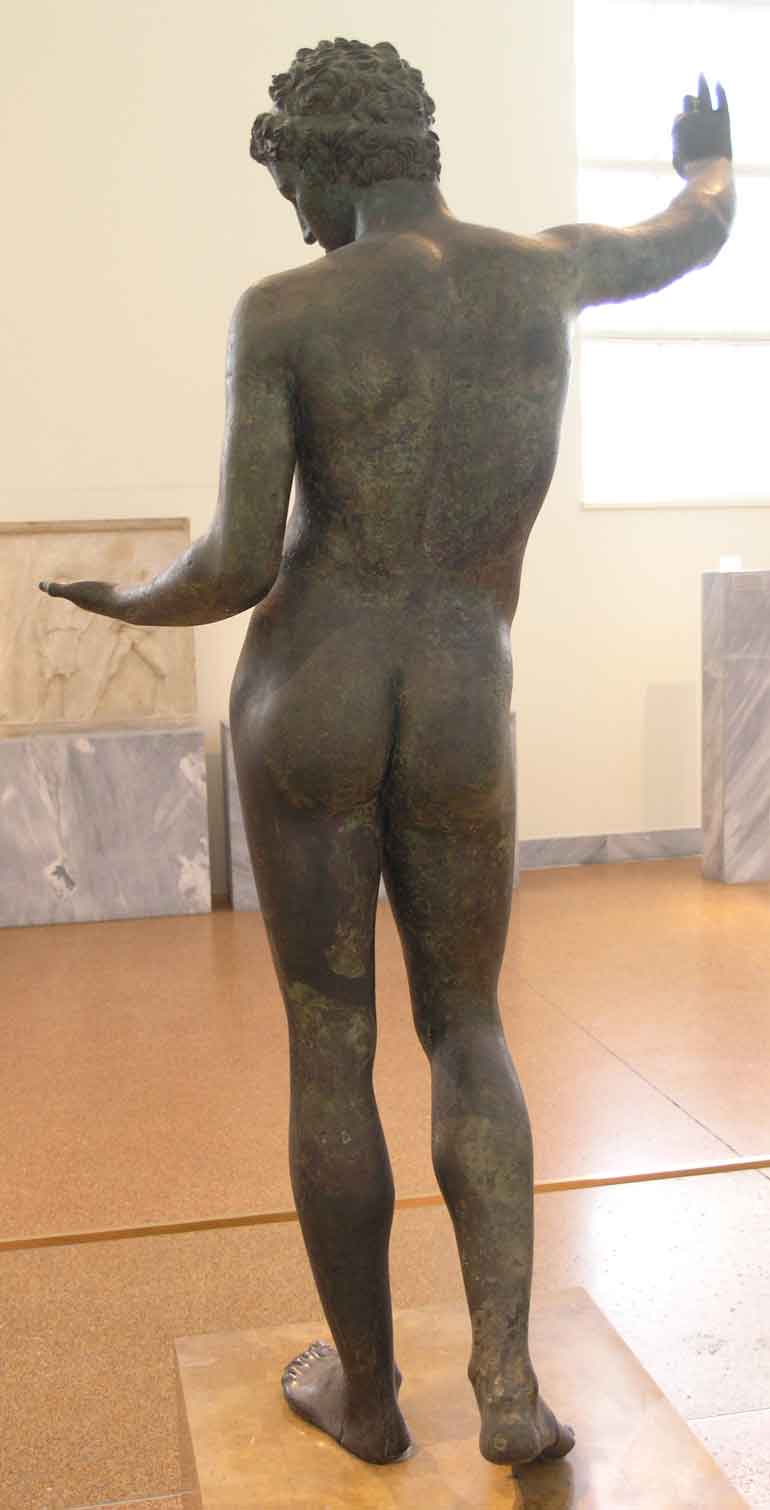
Compare that to the Ephebe of Marathon, which is a sculpture of a boy (perhaps the god Hermes). The school of Praxiteles was interested in presenting a new view of the gods: more accessible, naturalistic, humanistic. These sculptors were perhaps even more interested in the aesthetic issues of contrapposto, which basically means putting the model’s weight on one foot. (This is a convention we use to this day.) I can’t even figure out how to frame the question of whether the Ephebe was intended to be erotic; their social, religious, and cultural milieu didn’t make the same distinctions we do.
Ephebe of Marathon, School of Praxiteles, c. 325-300 BCE, National Archaeological Museum of Athens
Then there’s Da Vinci’s Vitruvian Man (which in addition to being an exquisite drawing, has to be one of the most enduring bits of graphic design in the history of art). Here, I think the intention is quite clear: Da Vinci is attempting to write a canon of measurement for the human body.
Vitruvian Man, Leonardo da Vinci, c. 1490, Gallerie dell’Accademia