fbpx

Ruthless pruning

If I had more time, I would have written a shorter essay.

Coast Guard Inspection, 6X8, oil on canvasboard.

The above witticism has been attributed to many people because it’s a universal truth. President Woodrow Wilson put it thus: “If it is a ten-minute speech it takes me all of two weeks to prepare it; if it is a half-hour speech it takes me a week; if I can talk as long as I want to it requires no preparation at all. I am ready now.”

On Wednesday, I wrote and designed an ad with exactly 24 words of new copy; it took five hours. Then I made a short promotional video. I spent 12 hours to make two minutes of finished video.

This won’t surprise anyone in the creative fields. Editing is an important skill in any creative endeavor.

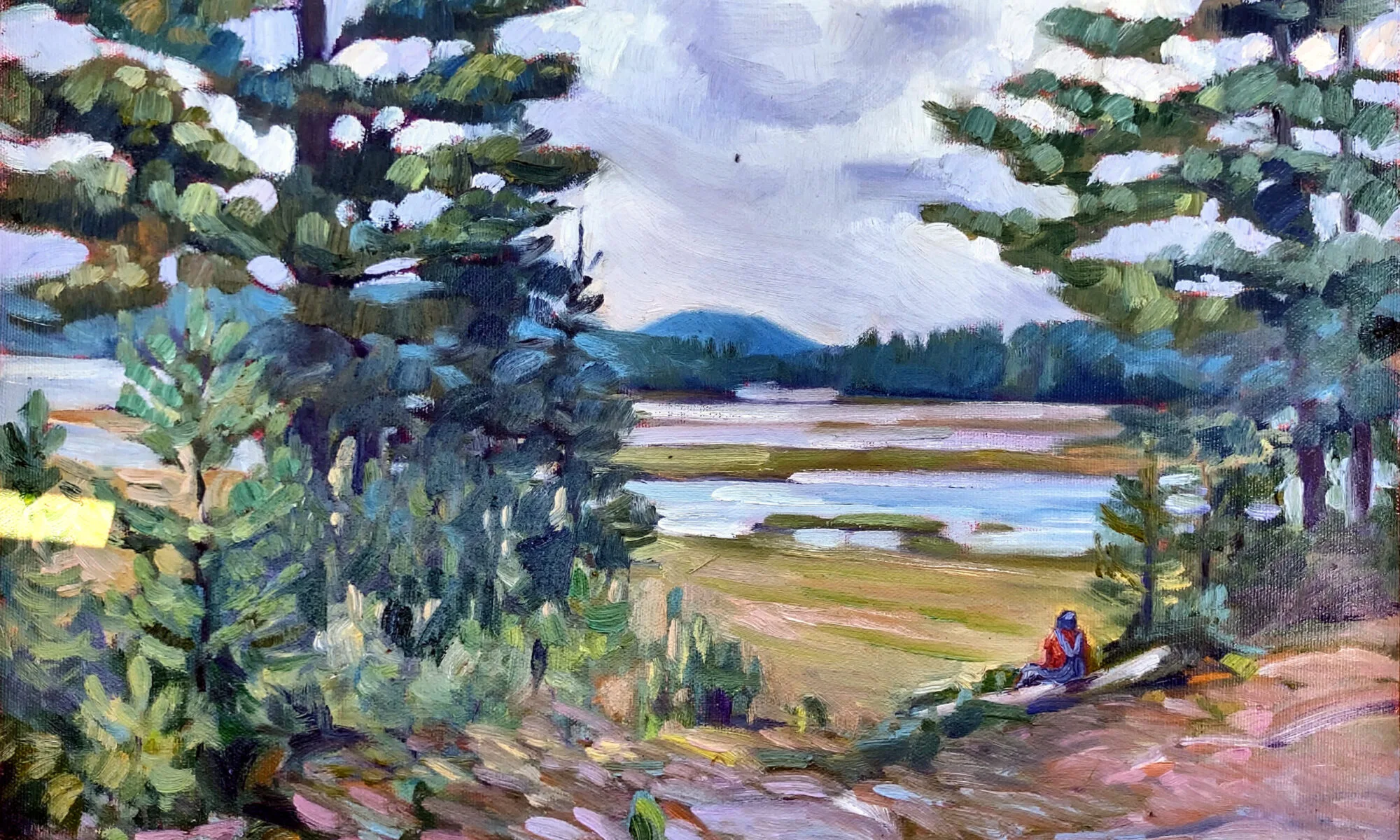
Blueberry Barrens, Clary Hill, 24X36, oil on canvas.

When I started blogging experts recommended that a blog post be kept to a thousand words. Today, I try to keep it around 500-600 words. There are many things that interest me, but if they don’t support the main trunk of the narrative, they’re ruthlessly scrubbed out.

This has changed my writing style, just as ruthless editing has changed my painting style. There are things I used to be able to do with pen or brush that I can no longer do. Losing some skills is the price we pay for pursuing mastery of others.

I’d like to blame simplification on our sleek modern sensibilities, but the quote at the head of this page dates from at least 1657. It was written (more wordily) by the French mathematician and philosopher Blaise Pascal. For centuries, writers have aimed for spare simplicity.

Main Street, Owl’s Head, 16X20, oil on gessoboard.

There are, of course, actions and reactions in public taste. Following hard on the heels of Pascal’s geometry came the French Rococo, with painters like Giovanni Battista Tiepolo, Antoine Watteau and François Boucher creating absurdly exuberant paintings. But rococo had a limited run; within a few decades, tastes swung back to the neoclassical.

There’s a limit, apparently, to the frenzy the human mind can tolerate. At the same time, there are paintings that seem empty to us. Dutch Golden Age church interiors come to mind, as do most of the experiments of 20th century op art. There isn’t enough there to hold our interest. Editing is a delicate balance.

I’ve written before on the question of simplification in painting, most recently here. It’s not a question of taking things out for the sake of simplicity, but of ruthlessly paring away what doesn’t matter. That makes room for what’s important. That’s not necessarily content; it could be rhythm, texture, color or line.

The Late Bus, 8X6, oil on archival canvasboard.

“When in doubt, take it out” is another pithy aphorism that can also apply to painting. I’ve spent vast amounts of time trying to squeeze an idea into a painting or essay only to realize it was superfluous from the get-go.

In painting, the best time to do these edits is before you pick up a brush. Paper and charcoal (or pencil) are cheap and forgiving. Andrew Wyeth was a careful planner; his preparatory sketches are worth studying. Just as an outline is invaluable for the writer, a sketch is invaluable to the painter.

Paintings almost never benefit from last-minute additions or changes to the composition. These decisions need to be taken early on. Jan van Eyck may have moved feet and hands and added the little dog to the Arnolfini portrait, but he did so in the underpainting. The essential composition was worked out long before he got to the end.
Why should my students have all the fun?

What to do when you don’t know what to do.
Underpainting. The schooner is just a placeholder. I vowed to not paint nonsense from my head anymore. That lasted about ten minutes.  
This week, my painting class worked on skies. Not the one outside, which was crabby, but the ones in their imaginations. It was a small class, which sometimes allows time for my mind to wander.
I idly swooped some bright orange lines across a large, dull canvas I’ve been noodling to death. “That helps!” Jennifer Johnson said. The lines were ridiculous, but they pointed to a solution to my problem: the night has no color.
If you look at Winslow Homer’s Sleigh Ride or Edward Hopper’s Room for Tourists, you’ll see that they get around that problem by simply lying about what can be seen in the dark. I admire that, but I haven’t figured out yet how to do it convincingly. This canvas is the battleground on which I fight with myself over it.
Dawn sail out of Camden, so unfinished and a terrible photograph.
When class ended, I left the orange lines, intending to come back later. Before I knew it, it was bedtime.
One of our kids is studying fundraising. “The antidote to fear is a plan,” she said. “One of the biggest challenges in life is deciding what to do when you don’t know what to do.” I decided to mix some colors I want to see in this painting and then figure out where to add them. I had the orange-to-red already on my palette, so I mixed some reds-to-purples and let it rip.
How can I toss these colors in a nocturne?
I spent much of the day painting dreck and then scraping it out. But I think, in the end, I figured something out. The orange is still there, in all its original places, but subdued and modulated. When I get home from Scotland, this phase will be thoroughly dry. I’ll finish the water, tighten up the edges of the sails, and add the rigging. Then it will be done, for good or ill.
Canvases that never resolve are torture, but fertile ground for self-discovery. It’s taken time to understand what isn’t working chromatically, but it’s a lesson I’ll carry with me forever.
“Spare me from painting with no reference,” I muttered. But what to do with all those garish sunrise colors on my palette? Why, underpaint something new, of course. That will be dry when I get home too, and I can start to build another fantastical schooner painting. My resolution to avoid painting from my head lasted about ten minutes.
Fuel dock, by Carol L. Douglas
I was on a roll of sorts, so I picked up the plein air piece I hated last week. A few brush strokes and I’d lightened the wall’s reflection in the water and added a fictitious highlight to the boat. Would it still qualify as plein airfor purposes of judging? I think so, but no matter; it’s not good enough. But it’s less horrible than I thought.
I’m not going to paint the island tanker Capt Ray O’Neillagain any time soon, I vowed. It’s the second time I’ve tried and come up short. That resolution is probably as good as the one about painting without reference.
Sleeping model, by Carol L. Douglas
All too soon, it was time for life drawing, where I focused on a portrait of our sleeping model. This is familiar territory for me, so it went just fine. Now I can head to Scotland feeling as if my finer drawing skills have been buffed up.

What is plein air painting?

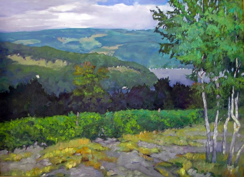
A painting of Keuka Vineyard, by Carol L. Douglas
Keuka Vineyard, by Carol L. Douglas. That’s the studio version. Courtesy the Kelpie Gallery.

John Morra recently wrote an excellent essay examining the nature of plein air painting. I’m assigning it to all my students; it’s that good.

Most of us have been in a competitive plein air event and seen something passed off as outdoor painting that was clearly not painted from life. How do we know this? Because we were there. The atmospherics were wrong, that person was never in that spot, or—mirabile dictu—the oil paint has already set up.

But mostly, we know because there’s a sort of static perfection to a studio painting that is never there in plein air. A painting done on site is never as balanced or stately as a studio landscape. The plein air painting expresses a longing for the natural world that just isn’t there in the studio.

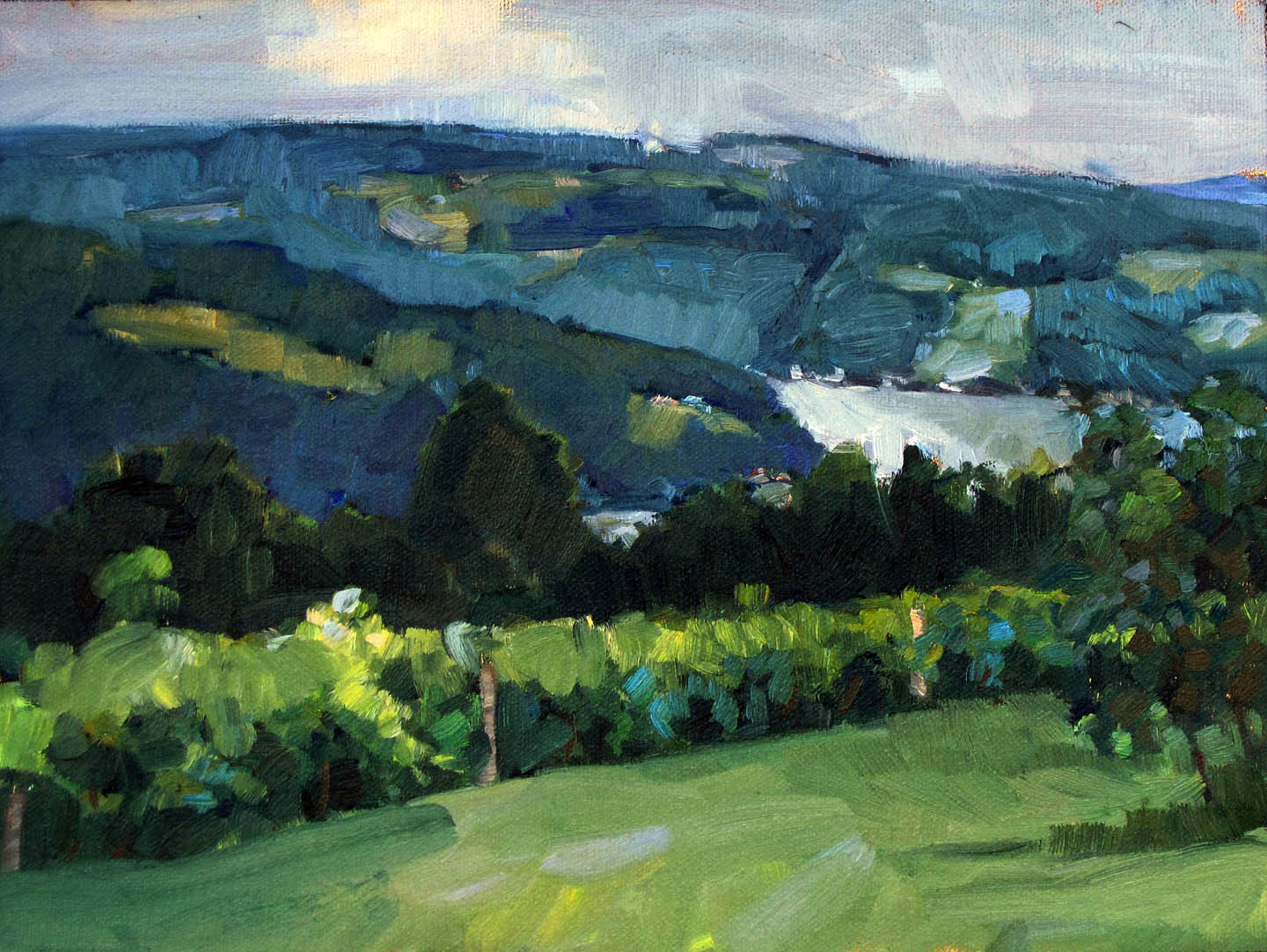
A painting of Keuka Vineyard by Carol L. Douglas
Keuka Vineyard, by Carol L. Douglas. That’s the plein air version. (Private collection.)

Morra makes the point that we tend to over-edit in plein air painting. We’ve had two hundred years of being told that objective observation is not painterly. Until I read this, I hadn’t considered how much I’ve been programmed to think non-objectively. I came of age during the heyday of abstract-expressionism. I’m still half-apologizing for liking realism. That colors every brushstroke I make.

Still, I constantly emphasize editing in my classes and workshops. Composition is one of the hardest skills in painting. The rules of reading a composition are the same whether the piece is done in studio or in the field. We edit because we’re working around environmental distractions.

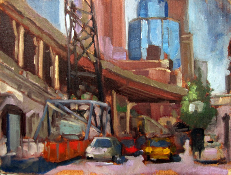
A painting called Queensboro Bridge Approach, by Carol L. Douglas (plein air)
Queensboro Bridge Approach, by Carol L. Douglas (plein air). The built environment is part of our landscape too.

But that kind of editing can easily go overboard. Consider the lowly car. Many of us delete them—frankly, because they’re hard to paint. But today’s Toyota Corolla is really no different from Childe Hassam’s hansom cabs were in 1890. His paintings would be far weaker without them.

In fact, a lot of modern plein air is excessively planed down to a conceptual idea. We can call that style or schtick, depending on how charitable we’re feeling. Either way, too much style gets in the way of the scene. The first time I see a painter employing crepuscular rays or the silhouettes of birches or a monochrome passage in a composition, I’m dazzled. The fifth time, I realize the artist is using them for a crutch. It’s no more impressive than Thomas Kinkade’s flaming cottages.

“A plein air painting should be painted quickly,” Morra stated. This is the only point on which I disagree. Fast, expressive brushwork is the trope of our age, but it’s by no means the only way to paint. Consider the great Rackstraw Downes, for example. He paints meticulous, beautifully-drafted scenes of industrial America, and he does it observationally, working outdoors. His work is no less plein air than a fast scribble is.

Another modern painter who works meticulously is Patrick McPhee. He paints in great detail without losing luminosity or freshness. He bases his style on the first American plein air painters, the Hudson River School painters. They didn’t slap it down either.

Float, by Carol L. Douglas. If you can’t draw, you’re going to have a hard time painting en plein air.

In fact, modern plein air painting is often so fast it sacrifices drawing. A badly drawn house or person is a rookie mistake. My own preference is for fast painting paired with meticulous drawing. Want a great contemporary example? Check out Marc Grand Bois.

Reserve your spot now for a workshop in 2025: