fbpx

Drawing as prayer, play and thought

“Drawing is prayer,” Delacroix famously said. He could have added that it’s play as well. And thinking.
The Giaour on Horseback, by Eugène Delacroix, c. 1824–26, by Eugène Delacroix, pen and iron gall ink with wash over graphite, courtesy Metropolitan Museum of Art
Shelving books this week, I came across a small volume of drawings by Eugène Delacroix. I flipped it open and the better part of an hour was lost.
Delacroix was a Romantic painter. He is considered the last of the Old Masters and the link between Romanticism and the Impressionists. He rejected the more-structured romanticism of Géricaultand the classical coolness of Ingresin favor of frenzied brushwork and explosions of color. But there is nothing modern in his painting; it is far too topical for us to dive right in. Delacroix was a man of his times—perhaps the illegitimate son of the great diplomat Tallyrand—and it’s hard for us to skim past the allusions to Shakespeare and Greek myth and find the passion within. But it’s there, a kind of fervor we usually associate with Spanish visionaries.
Louis of Orléans Unveiling his Mistress, by Eugène Delacroix, c. 1825–26, courtesy Thyssen-Bornemisza Collection
Still, he’s a cool observer of the human condition. Consider his portrait of the 14th century Duke of Orléans, above. The historic figure was a young, debauched, power-hungry prince. Delacroix portrays him considering a young woman as if she were a side of beef. It’s both a well-realized portrait of female powerlessness and a devastating attack on the French nobility. Delacroix was both politically incisive and technically proficient, a combination that is largely lost today.
Evolution of an idea: the following illustrations take us through Delacroix’ thinking process. Study for The Sultan of Morocco and His Entourage, by Eugène Delacroix, c. 1832–33, brush and brown ink, courtesy Metropolitan Museum of Art
But it was his drawings I was interested in. Immediately before his death in 1863, he wrote a will ordering the contents of his studio to be sold. At the sale the following year, an amazing 9140 works were attributed to him: 853 paintings, 1525 pastels and watercolors, 6629 drawings, 109 lithographs, and over 60 sketch books. “Color always occupies me, but drawing preoccupies me,” he frequently said.
Study for The Sultan of Morocco and His Entourage, by Eugène Delacroix, 1845, graphite, squared in white chalk, courtesy Metropolitan Museum of Art
Delacroix’s drawings and sketchbooks outline a classical artistic training and developing career. They include academic nude figure drawings, écorchés and compositional studies for his paintings and murals. They included drawings from life and nature, and the many, many drawings he created from his imagination.
The Sultan of Morocco and his Entourage, by Eugène Delacroix, 1845, courtesy
Musée des Augustins de Toulouse. By this time, the French and Moroccans had been at war.
They weren’t, by any means, all graphite pencil drawings. Many are in ink or wash and demonstrate a calligraphic assurance. Others are in watercolor. “Drawing is prayer,” Delacroix famously said. He could have added that it’s play as well. And thinking.
He couldn’t leave the idea alone. Study for The Sultan of Morocco and His Entourage, by Eugène Delacroix, c. 1855–56, graphite, courtesy Metropolitan Museum of Art.
If you’re serious about painting, you ought to take him as an example and draw every day. Yes, it’s important to learn to lay down paint, but drawing is the foundation from which painting rises.

The servant stairs

My diet is in tatters but I’m on schedule with the portrait.
I spent most of my time yesterday moving the coffee table from place to place trying to make an interesting geometry of that bottom left corner.

Mary Killen tells the story of Antony Armstrong-Jones (Lord Snowdon) and his lifelong enmity to Colin Tennant. It began when Armstrong-Jones was told to go to the tradesmen’s entrance while photographing Tennant’s wedding to Lady Anne Coke. The two men had been at Eton together.

I’d assumed it was a story of injured amour-propre. This week I’ve spent some time on the servants’ stairs of a Georgian townhouse, and my sympathy for Lord Snowdon has increased (albeit marginally). I would not have enjoyed hefting the absurdly-heavy photography equipment of 1956 up and down those narrow stairs, skirting past the maids and footmen I ignored in everyday life.
I’ve rearranged the furniture, set up my easel, and otherwise made a terrible mess of the drawing room. That’s a James Morrison landscape overlooking my shoulder there; a happy omen, if you ask me.
The house in which I’m working has had many iterations since its construction. The main staircase, very grand, rises in a beautiful spiral from a first-floor vestibule. There is a modern staircase, added after the building served a stint as offices after World War 1, when the house was converted to flats. This staircase connects the first floor with the basement floors into a three-story unit. But in its original form, the public rooms of this house—the first floor, the piano nobile above it, and the bedrooms above that—were effectively sealed off from the tradesmen’s entrance by this lack of public staircase.
The only staircase which ran the height of the house was a stone one, intended for servants. Despite my familiarity with historical English novels, I didn’t fully grasp what this meant until I’d trotted up and down them a dozen times.
It’s easy to feel how intimidated a homeowner would be at the idea of running down those service stairs to check on the operation of his own home (if such an outlandish idea had even occurred to him). The stone steps are set as far back as is possible without actually being in the garden, and they’re not easy on the feet. They are narrow and turn fast in their circular shaft. The humble historical housemaid must have had legs of steel.
I captured my subject briefly for a quick drawing and managed to make her look all of fifteen years old. The bones are right, however, and I’ll try again today.
The modern Scots who live in these terraced houses are more fit than their American cousins, with our easy, lazy two-story homes. The stone stairs are now the main stairs between the garden-level kitchen and the main rooms of the house. Our host, a man in his fifties, regularly trots up and down them. I’m working in a drawing room, and I’m not as strong as a Regency lady’s maid, so I recruited my husband to carry my easel and kit up for me.
This room is a symphony of indirect light and beautiful paneling. The setting is very lovely, but I don’t want to allow it to dwarf my subject. I spent the day carefully measuring and plotting my composition.
I’ve also managed, occasionally, to sit my subject down for some preliminary drawings. I’m afraid I’ll need a butterfly net and some duct tape to fully capture her. She’s a very energetic woman.
Then there is the city itself, which is hilly and congested. It was a foggy, rainy evening, and our hosts graciously took us to dinner. We took a cab there and walked home; the trips took the same length of time, and walking was frankly more pleasant.
I had Shetland scallops, served very differently from the bay scallops at home, with a dry white wine along the lines of a vinho verde. This was followed by a nightcap of a private cask single-malt whisky. My diet is in tatters but I’m feeling less guilty than you might think.

Monday Morning Art School: drawing a boat

This exercise is like learning perspective. You’ll never draw this way in the real world, but practicing it will improve your harborside skills.
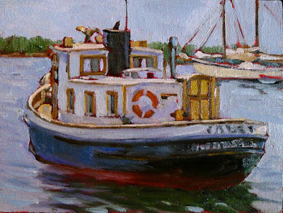
Cadet, by Carol L. Douglas

I tell my students that it’s best to paint a boat from the deck of another boat or a floating dock. If you can’t, then keep your distance. The tides in Rockport average about 12 feet. That means that if you stand on the public landing painting the lovely and graceful Heron, her angle is going to shift more than 20° over six hours. That’s an impossible perspective shift to manage.

There aren’t tides on lakes, obviously, but the waterline-view of a boat is still often the loveliest view.
Two figure eights. The top one is going to be stern-facing; the bottom one is going to be bow-facing. Thus the lines on the right are straight for the sides of the transom, curved for the bow. I made the bow loop slightly bigger because in practice the bow is likely to be higher.
I learned to draw boats based on figure eights. This is simple. You can master it in the studio before you go out to tackle the real thing. Since the bow of a boat is generally higher than the stern, I draw that end of the figure eight higher. The figure mustn’t be two circles, but you can make it as short or long as you wish. There’s no reason the two loops must be equal, although you should try it that way first. It’s easiest to do this when you’re not trying to be overly precise.
The fattest points of your figure eight are going to be the stern and bow of your boat. The keel curves in the front, so that line is drawn as a curve. The stern may curve in a fantail or be a flat transom. That varies by the boat.
The next step is to erase the extra lines and add a little shading. I took the liberty of adding a little extra height to the bow on the bottom.
In the top example, I put the transom forward; in the bottom drawing I put the bow forward. The important thing to realize is that the figure-eight is just like an optical illusion: it can go either way. Once I draw the curve or cut off the transom, I just erase the extra lines and gussy it up with some shadows. 
In the very old days, small boats were sometimes clinker-built, meaning they had overlapping planks that made for beautiful curving lines beloved of artists. If you see those planks on a modern boat, they’re molded. I halfheartedly faked them in on my drawing, because I no longer entirely believe in them.
The actual direction of the boat is like an optical illusion; it can flip either way. The Scrumpy’s notch is a little crooked; sorry.
Drawing boats like this is like drawing perspective. You need to know how to draw 2-point perspective but you’ll never really draw those rays on your canvas while you’re working. It’s an exercise that teaches you a principle that you then incorporate into your work.
Dinghy, by Carol L. Douglas, shows how fast that can be done in practice. This was a workshop demo.
The same with this kind of boat drawing. The take-away lesson is this: as long as you have the relative heights of the pieces of your boat right, it can swing on its anchor all afternoon without significantly messing up your painting. Block it in with initial measurements and let it go from there. The parts will stretch out or grow shorter, but their heights will always remain the same. 
Once you see it as a process of squeezing and lengthening the horizontal shapes while leaving the heights the same, drawing moving boats is easy.
That liberates you from worrying when your boat—as it will—wanders around its mooring. I did the little sketch above to demonstrate that.
This was first published on February 12, 2018, but some things bear repeating.

Monday Morning Art School: think in contours

The closer the object, the more foreshortening and distortion there is. Objects at a distance appear to have almost no perspective at all.
Shoes, by Carol L. Douglas
Every object, we have been famously taught, is comprised of simple shapes—globes, cylinders, cubes—stacked together. That’s absolutely true… until it stops being true. There are some shapes that are organic and asymmetrical. A shoe is a great example. It has evolved to accommodate the human foot, not to obey the laws of symmetry.
When we draw these shapes, we must draw their contours. This is different from a contour drawing, which is just an outline. I’m talking about contours in the sense of a topographic map, which shows us the bumps on the earth’s surface.
I drew my examples during church on Sunday. It was so crowded I sat behind the sound booth. There was a molded plastic wastebasket which is neither rectangular nor round; instead it’s a splashy combination of the two.
I started by drawing the cross at the top to give me the orientation of the bin. From there I drew the best approximation of the shape that I could come up with, but it wasn’t until I segmented it into planes that I could correct my drawing errors.
This looks like a very simple drawing, and it’s quite small (about 1.5 inches tall). However, it took a long time to get the contour lines right. I measured, erased, and measured again. Shading and detail is almost irrelevant; In the end, it’s getting the contour right that makes a drawing successful.
I repeated the process with a Dunkin Donuts cup. It was on a ledge above my head, so its perspective is reversed from what we usually expect. Its symmetry made the drawing easier, since it is really just a series of cylinders of differing widths. But again, it’s getting the contour lines right that make the drawing work.
This was so much fun that I decided to apply the same system to a gentleman sitting nearby. It’s always the same system, whether it’s a glass, a person, or a building—find the shapes and mark out their planes.
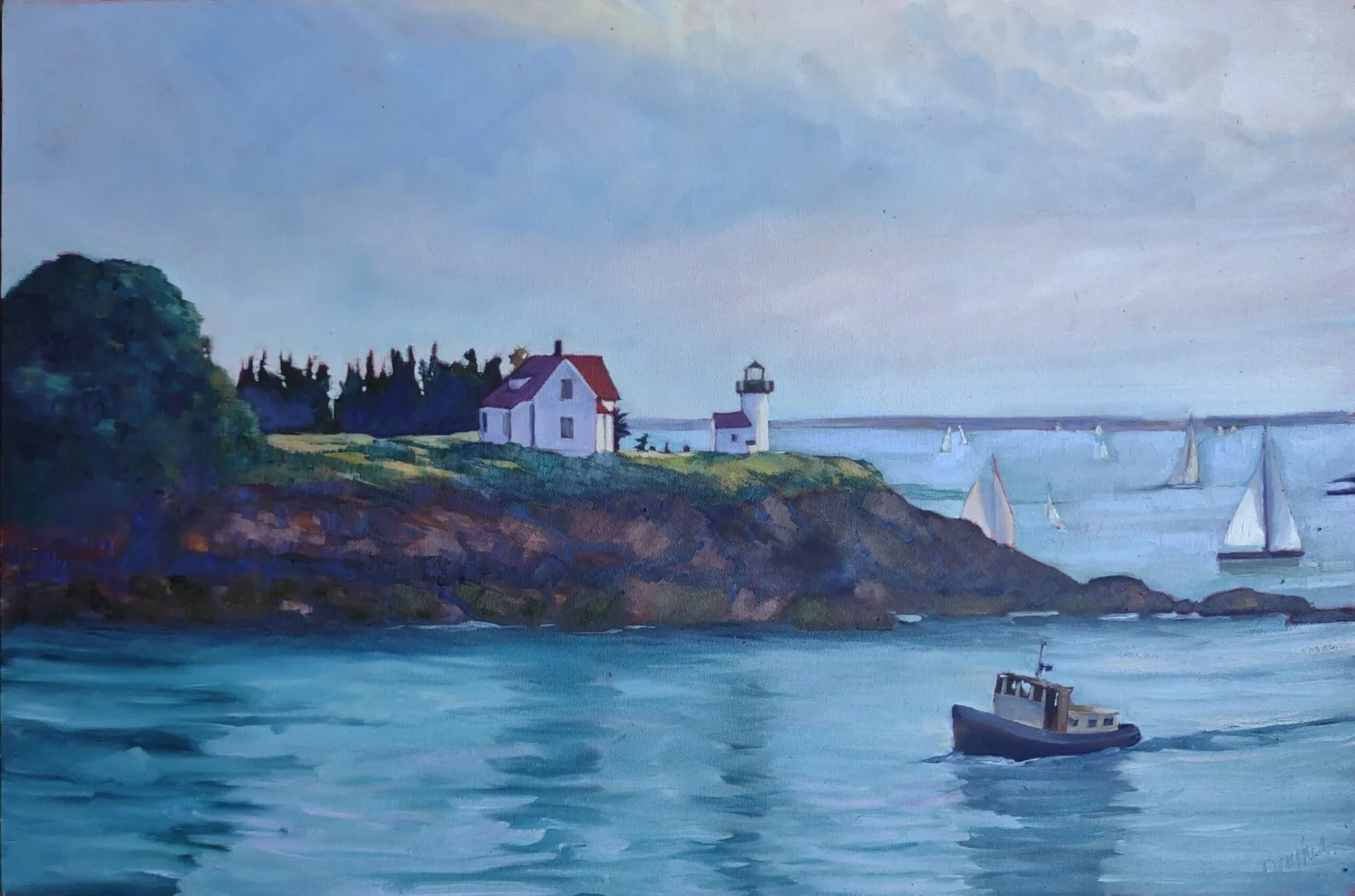
Rockport Harbor, by Dwight A. Perot (courtesy of the artist)
I was sitting close to the cup and the wastebasket, so their perspective is quite pronounced. The closer the object, the more foreshortening and distortion there is. In the photo above, you can see the reverse effect, as happens with a telephoto lens. Objects far away from us appear to have almost no perspective at all. The telephoto lens faithfully records that, and it looks ‘wrong’. From a long distance the difference in scale and, thus the foreshortening, is almost meaningless.
Your assignment—should you choose to accept it—is to find an object in your house that’s rounded; in other words, one that’s not a box. Break it down into contour lines indicating the shifting planes and curves.

You can’t draw a straight line, and other falsehoods

“I’m not talented” is the most pernicious lie in the world. Science is slowly disproving it.
Under a milky sky (Hare Bay, Newfoundland), Carol L. Douglas. It’s exactly what today’s sky looks like.

Like Thomas Edison, I firmly believe that “Genius is one percent inspiration, ninety-nine percent perspiration.” I have zero tolerance for the 18th century idea of the Cult of Genius or for Sigmund Freud‘s theories of poetic madness.

These ideas stripped rationality from the creation of art and the art market. They made it inevitable that art and music would be considered non-essential, meaning we could cut them from our schools. They removed the joy of making art from the everyday experiences of ordinary people. Early in our educations, some of us are labeled ‘talented’ and the rest are encouraged to do something else. That’s rigid and it limits everyone, artist and non-artist alike. 
Creativity is the one of the defining characteristics of mankind, after all, and it should flow through everything we do. That’s especially important in our post-industrial society, where making stuff—canning, farming, woodworking, sewing, etc.—is now unnecessary.
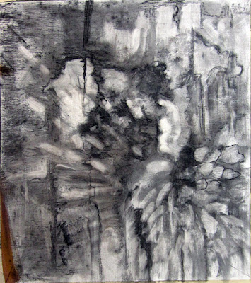
Abstraction, by Carol L. Douglas. Drawing takes many forms, and all of them are helpful to the human mind.
Science is slowly returning us to a pre-Enlightenment understanding of art as part of the toolkit of the rational man. Drawing is not just a tool to communicate; it’s a tool to classify and learn.
Sadly, educators seem to be the last ones on board with this idea. Here’s another study which says what I told my kids’ principals in vain: if you want my son to learn, let him doodle it. Don’t just try to cram it into his brain.
The researchers in this recent study figure that drawing gives your brain different ways to engage with new material—imagining it, rendering it, and looking at your visual record. All those steps encode it in your memory. I’d add one more thing—doodling is the spoonful of sugar that makes the medicine go down.
My late friend and student Gwendolyn Linn attracted a flock of kids eager to learn.
Adults can leave a work environment that discourages doodling. Kids aren’t so lucky.
Many of us were riveted by last week’s story of 40,000-year-old figurative cave drawings found in Borneo. “It now seems that two early cave art provinces arose at a similar time in remote corners of Paleolithic Eurasia: one in Europe, and one in Indonesia at the opposite end of this ice age world,” wrote co-researcher Adam Brumm.
It actually means that scientists have only found these drawings in Europe and Indonesia. Not every cave has conditions to preserve art, of course. But reason tells us that if there’s cave art in two such distant places, it was probably practiced worldwide by paleolithic man.
There’s a connection between these two stories, and it comes from my pal, artist Diane Leifheit.
Adult students getting fresh air and intellectual exercise last summer near Spruce Head. We won’t be so fortunate today; it’s raining.
“When someone says, ‘Oh I can’t draw,’ I say, ‘We have been making art for thousands of years. It is in our DNA. We just have to scratch the surface to find it,’” she said.
Next time you tell me you aren’t talented, remember that. As for drawing straight lines, I carry a straight-edge in my painting kit. Works every time.

Monday Morning Art School: perspective of boats

Don’t fall into the trap of drawing what you know instead of what you see.
The Bridge at Argenteuil, 1874, Claude Monet. All three waterlines are parallel to the horizon.
I prefer painting from a floating dock, where I’m at eye-level with the boats regardless of the tide. However, on Friday, I found myself up on the wall looking across Camden Harbor. That creates a different perspective.
The horizon line in a drawing is the viewer’s eye level, regardless of where the viewer is standing. At the top of Mount Rainier, your horizon line is around 14,410 feet above sea level, and everything is below you. If you’re swimming in the Caribbean, your horizon line is about three inches above sea level and everything but the sharks are above you.
I explained basic perspective in this post about drawing clouds; the exact same rules apply to boats, except that everything is flipped over. We can see down into objects that are at our feet, but not into objects at the same level that are far away. The farther away the object is, the more horizontal our gaze is as we look at it. Our measly 5 or 6 feet in height is nothing compared to the distance across. 
When a boat is a few hundred feet away in the water, it’s for all intents and purposes at eye level. Its waterline is almost absolutely flat, regardless of whether you’re looking at its side, transom, or bow.
The Seine at Argenteuil, 1872, Alfred Sisley. Although it’s also from towpath height, Sisley included more foreground, creating the sense that we are looking down into the Seine.
During the 1870s and 1880s Argenteuil, northwest of Paris on the Seine, became an important painting location for the Impressionists. They immortalized its bridges and boats from every conceivable angle.
We can infer Monet’s point of view in the top painting as being about equal to the house across the river. In other words, he was standing on a towpath. That allows us to see into the boat slightly, as we’re at mast height to it and it’s close to the near bank. We cannot see into the far boats at all. Note that the far bank and the waterlines of the far boats are parallel to the horizon. The bridge, which reaches across the river to us, is not.
Alfred Sisley’s painting is from the same height, but he’s given us more foreground, and therefore the sense of looking down into the water. But while the tree in the river is definitely below us, the boats are not. Again, their waterlines are parallel to the horizon. The river bends, and the land curves away, but the curve is very gradual.
Boating, 1874, Édouard Manet. Here we’re looking straight down into the boat from impossibly close quarters.
We are definitely looking down into Édouard Manet’s pleasure boat in his 1872 painting done on the same river. Manet has us practically standing on the rail looking down into the well of the boat. The horizon isn’t even visible. It would be yards above the boaters’ heads.
An example of incorrectly drawn boats.
Ignoring these rules results in the most common error I see in painting boats. This is from an example I picked up on the internet. The boats are close to the horizon but we still seem to be looking down into them. In fact, the closest boat is at about the angle of Manet’s Boating. This is an impossibility, as the three masterpieces from Argenteuil have demonstrated.
This happens frequently with painters unaccustomed to boats. I think it is a case of painting what we think we know vs. what we see. We know that boats have form, therefore they must have perspective, too. Well, they do, but it’s very subtle from the distance we usually see them.

Monday Morning Art School: drawing clouds

Clouds are objects with volume, obeying the rules of perspective.

Whiteface makes its own weather, by Carol L. Douglas
Clouds are not flat. The same perspective rules that apply to objects on the ground also apply to objects in the air. We are sometimes misled about that because clouds that appear to be almost overhead are, in fact, a long distance away.
I’ve alluded before to two-point perspective. I’ve never gotten too specific because it’s a great theoretical concept but a lousy way to draw. Today I’ll explain it.
A two-point perspective grid. You don’t need to draw all those rays, just the horizon line and the two vanishing points.

Draw a horizontal line somewhere near the middle of your paper. This horizon line represents the height of your eyeballs. Put dots on the far left and far right ends of this line. These are your vanishing points.

A cube drawn with perspective rays. It’s that simple.

All objects in your drawing must be fitted to rays coming from those points. A cube is the simplest form of this. Start with a vertical line; that’s the front corner of your block. It can be anywhere on your picture. Bound it by extending ray lines back to the vanishing points. Make your first block transparent, just so you can see how the rays cross in the back. This is the fundamental building block of perspective drawing, and everything else derives from it. You can add architectural flourishes using the rules I gave for drawing windows and doors that fit.

All objects can be rendered from that basic cube.

I’ve included a simple landscape perspective here, omitting some of the backside lines for the sake of clarity. (I apologize for the computer drawing; I’m recovering from surgery and it’s hard to draw with my foot up.)

As a practical tool, two-point perspective breaks down quickly. In reality, those vanishing points are infinitely distant from you. But it’s hard to align a ruler to an infinitely-distant point, so we draw finite points at the edges of our paper. They throw the whole drawing into a fake exaggeration of perspective. That’s why I started with a grid where the vanishing points were off the paper. It doesn’t fix the problem, but it makes it less obvious.
Staircase in two-point perspective, 1995, Luciano Testoni
The example above is from Wikipedia’s article on perspective. It’s a masterful drawing, but it isn’t true two-point perspective, because he tosses in several additional points. There is also three-point perspective, which gives us an ant’s view of things, and four-point perspective, which gives a fish-eye distortion reminiscent of mid-century comic book art. And there are even more complex perspective schemes. At that point, you’ve left fine art and entered technical drawing.
Still, two-point perspective is useful for understanding clouds. Clouds follow the rules of perspective, being smaller, flatter and less distinct the farther they are from the viewer. The difference is that the vanishing point is at the bottom of the object, rather than the top as it is with terrestrial objects.
Basic shapes of clouds using the same perspective grid.
Cumulus clouds have flat bases and fluffy tops, and they tend to run in patterns across the sky. I’ve rendered them as slabs, using the same basic perspective rules as I would for a house. If I wasn’t elevating my foot, I’d have finished this by twisting and changing their shapes in my imaginary bounding boxes.
Mackerel sky forming over the Hudson, by Carol L. Douglas
A flight of cumulus clouds or a mackerel sky will be at a consistent altitude. That means their bottoms are on the same plane. However, there can be more than one cloud formation mucking around up there. That’s particularly true where there’s a big, scenic object like the ocean or a mountain in your vista. These have a way of interfering with the orderly patterns of clouds.
I don’t expect you to go outside and draw clouds using a perspective grid. This is for experimenting at home before you go outside. Then you’ll be more likely to see clouds marching across the sky in volume, rather than as puffy white shapes pasted on the surface of your painting.
It’s about time for you to consider your summer workshop plans. Join me on the American Eagle, at Acadia National Park, at Rye Art Center, or at Genesee Valley this summer.

Monday Morning Art School: how to draw windows and doors that fit

 The South sure loves its Greek Revival pillars, doors and windows. Here’s a little trick to draw them evenly.

My painting of Siloam Baptist Church from last week.

The South also observes Blue Laws. That meant I wasn’t able to get a replacement sketchbook at Hobby Lobby yesterday. I drew these on tissue paper; the quality is terrible.

Earlier, I taught you how to draw a door in basic perspective. The door makes a shape called a trapezoid. (Don’t be frightened; that’s as mathematical as we’re going to get here.) When drawing buildings, most people get basic two-point perspective right but then mess up in spacing windows and doors. Here’s a technique you can use to divide the face of any building into regular units, no matter what angle you are looking at it from.
Dividing in half
Just draw an X from corner to corner. The vertical line that runs through the middle of this X is the center of your building. This is very useful for buildings, because if there’s a pitched roof, it almost always comes down from that center point.

Dividing into thirds

Draw a star shape, starting from the bottom outside corners and running to the top-middle and the top-outside corners.
Do the same thing, upside down, so that you have a six-pointed star.
The points where the lines intersect are the thirds.
Dividing into fourths
This requires that you figure out the middle of one side of your trapezoid. Then draw a line between it and the middle-point. Now you have the horizontal center-line. It will not be level; it should hit both sides at the mid-point.
Draw your star-shape again. The points where it intersects the center line are the quarters.
Dividing into fifths

This is the most complicated and fun of the divisions. Start with a horizontal center-line as you did above.
Now you’re going to draw some crazy diagonals:
  • From the bottom left corner to the top middle.
  • From the bottom middle to the top right.
  • From the top left to the right middle.
  • From the middle left to the right bottom.

The points where those diagonals meet are the 1/5 divisions.
In practice you can divide and subdivide these units to figure out the placement of windows and doors pretty quickly. Here is my division of Siloam Baptist Church, above (yes, the bottom line was wrong; I fixed it after I took this photo):
And here is a fast division of my first drawing. I just broke the units I had into smaller ones using the same principles:
Which I then extrapolated into this purely imaginary facade of a house:
I didn’t do any of this with a ruler, but with another piece of paper as a straight-edge. Once you learn these divisions of space, they take only seconds to do. They are much easier than guessing and erasing.

Monday Morning Art School: draw six different boats

Drawing six similar objects will teach you to observe details.
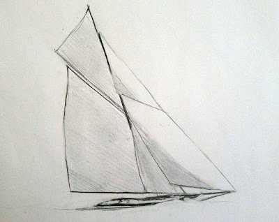
Reliant rigged as a sloop.

I once got a commission to paint Lazy Jack II in Camden Harbor. I was pretty happy with the results. As I finished, two deckhands from another boat stopped to look at it. Their eyes met. “You’ve got the…” one started. “It’s not important,” said the other, and they quickly walked away. I’ve never figured out what’s wrong in that painting, but I did realize that you can only fudge the details so far. The experts will find you out.

In the normal course of things, you’re not going to see many square-rigged vessels here in mid-coast Maine (although you could see USS Constitution if you drive down to Boston). You’ll see fore-and-aft rigs, where the sails run above the keel rather than perpendicular to it.
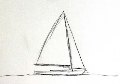
A Bermuda-rigged sloop. This is the most common silhouette you’ll see wherever pleasure boats congregate. 
A boat’s sails all suspend from a vertical spar called the mast. This transmits all the power of the wind pushing the boat through the water. It’s really a marvel of engineering, especially since the kinks were worked out before the age of composite materials. There are some other spars whose names will be useful to know: booms, which run along the bottom of the sails, and gaffs, which get raised up in the air. Not every sailboat has gaffs, but they all have at least one mast and boom to hold the sails taut.
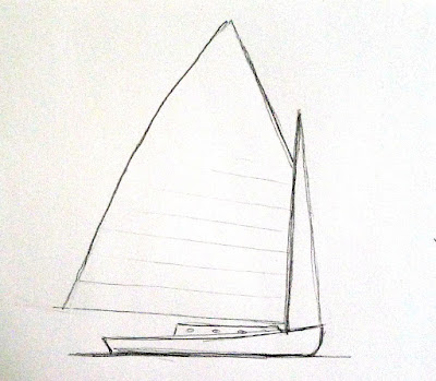
A gaff-rigged catboat.
A catboat is small and has a single sail on a single mast set well forward in the bow, or front of the boat. (I think this would be the perfect painter’s boat, especially if I could find one towable with my Prius.)
A sloop also has one mast, with only one sail in front of the mast. If that head-sail multiplies, your boat has morphed into a cutter. Reliance, the 1903 America’s Cup defender, could be rigged as either a sloop or cutter. I drew Reliance to illustrate that single-masted boats can be gaff-rigged as well as Bermuda-rigged. She was a peculiar thing, built only to win America’s Cup and then sold for scrap. Like all transitory things, she was, oh, so pretty.
A ketch. Angelique is far prettier.
Ketches and yawls have two masts, with the back (mizzen) sail smaller than the front sail. The difference is that in a ketch (like Angelique) the aft mast is meant to push. It’s pretty big. A yawl’s mizzen sail is very wee, almost vestigial, and is way to the back of the boat. It’s basically an air rudder, used to keep things in balance.
A yawl (or y’all, for those of you from the south).
Schooners started out having two masts, but three-masted schooners were introduced around 1800, and the spars proliferated from there. The only seven-masted schooner, the steel-hulled Thomas W. Lawson, was built in 1902. It was 395 ft. long.
While you might run across Victory Chimes, a three-masted schooner out of Rockland, the rest of the Maine windjammer fleet have two masts. A schooner’s forward mast is shorter than its mainmast, giving it an appearance of eagerness. Schooners come in all kinds of sail configurations.
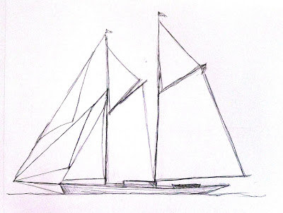
A schooner’s foremast is shorter than its mainmast.
Your assignment is to find a photo of each of these sailing vessels and sketch them out as I did, paying particular attention to where the sails attach to the masts, the angles at which the gaffs are running, and the height of the masts in relationship to the length of the hull. This is not about sailing, it’s about attention to the details that matter.
If you aren’t interested in boats, you can do the same exercise with cars, motorcycles, or varieties of apples; I don’t care what they are, just that you have six objects from the same class of objects. 
The point of this exercise is not to create six beautiful boat drawings. It is to show you how much you learn by sketching. At the end of it, you should have a clear sense of why sketching in the field is a far better preparation for painting than taking photos is.
Remember, those of you who love boats: we’ll be sailing with Captain John Foss on the most beautiful of all windjammers—American Eagle—in June, studying watercolor painting on the move. For more information, see here.
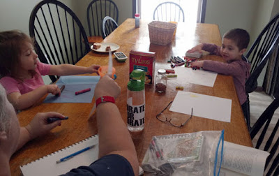
My little assistants. I drew the boats and they colored.

Monday Morning Art School: how to draw a boat

This exercise is like learning perspective. You’ll never draw this way in the real world, but practicing it will improve your harborside skills.
Cadet, by Carol L. Douglas
I tell my students that it’s best to paint a boat from the deck of another boat or a floating dock. If you can’t, then keep your distance. The tides in Rockport average about 12 feet. That means that if you stand on the public landing painting the lovely and graceful Heron, her angle is going to shift more than 20° over six hours. That’s an impossible perspective shift to manage.
There aren’t tides on lakes, obviously, but the waterline-view of a boat is still often the loveliest view.
Two figure eights. The top one is going to be stern-facing; the bottom one is going to be bow-facing. Thus the lines on the right are straight for the sides of the transom, curved for the bow. I made the bow loop slightly bigger because in practice the bow is likely to be higher.
I learned to draw boats based on figure eights. This is simple. You can master it in the studio before you go out to tackle the real thing. Since the bow of a boat is generally higher than the stern, I draw that end of the figure eight higher. The figure mustn’t be two circles, but you can make it as short or long as you wish. There’s no reason the two loops must be equal, although you should try it that way first. It’s easiest to do this when you’re not trying to be overly precise.
The fattest points of your figure eight are going to be the stern and bow of your boat. The keel curves in the front, so that line is drawn as a curve. The stern may curve in a fantail or be a flat transom. That varies by the boat.
The next step is to erase the extra lines and add a little shading. I took the liberty of adding a little extra height to the bow on the bottom.
In the top example, I put the transom forward; in the bottom drawing I put the bow forward. The important thing to realize is that the figure-eight is just like an optical illusion: it can go either way. Once I draw the curve or cut off the transom, I just erase the extra lines and gussy it up with some shadows. 
The actual direction of the boat is like an optical illusion; it can flip either way. The Scrumpy‘s notch is a little crooked; sorry.
In the very old days, small boats were sometimes clinker-built, meaning they had overlapping planks that made for beautiful curving lines beloved of artists. If you see those planks on a modern boat, they’re molded. I halfheartedly faked them in on my drawing, because I no longer entirely believe in them.
Dinghy, by Carol L. Douglas, shows how fast that can be done in practice. This was a workshop demo.
Drawing boats like this is like drawing perspective. You need to know how to draw 2-point perspective but you’ll never really draw those rays on your canvas while you’re working. It’s an exercise that teaches you a principle that you then incorporate into your work.
Once you see it as a process of squeezing and lengthening the horizontal shapes while leaving the heights the same, drawing boats is easy.
The same with this kind of boat drawing. The take-away lesson is this: as long as you have the relative heights of the pieces of your boat right, it can swing on its anchor all afternoon without significantly messing up your painting. Block it in with initial measurements and let it go from there. The parts will stretch out or grow shorter, but their heights will always remain the same. That liberates you from worrying when your boat—as it will—wanders around its mooring. I did the little sketch above to demonstrate that.