fbpx

Painterliness

Your brushwork is your handwriting, and that develops with practice.
Tom Sawyer’s Fence, by Carol L. Douglas.
The idea of painterliness was developed by Swiss art historian Heinrich Wölfflin in his Principles of Art History (1915). In it, he contrasts painterliness with linearity. Wölfflin was primarily concerned with defining classic and baroque art, but the terms can be applied to any period and any media.
To Wölfflin, linearity was a focus on draftsmanship, contour, and fixed boundaries. Painterliness included tactile brushwork, non-local color in shadow, and patterns of shadow and light. The painterly artist used these things, instead of edges, to define shapes.
Best Buds, by Carol L. Douglas. Courtesy Trove on Main.
Today we have reduced his thesis to one point: a painting is painterly when there are visible, uncontrolled brushstrokes. By our lights, Lois Dodd is painterly; Rackstraw Downes is linear. That’s a gross oversimplification.
What are brushstrokes? They are so well-understood by non-artists that they’re used as metaphor (“broad brushstrokes”). Yet brushwork is highly individual and difficult to teach. Still, there are rules that painting teachers lay down about them, such as “when you’re Pierre Bonnard, you can dab; until then, it looks amateurish.”
Bracken Fern, by Carol L. Douglas
I have never liked my own brushwork. I recently decided that I’ve intentionally smoothed it over because it’s embarrassingly self-revelatory. This summer I stopped overpainting, and suddenly people have been telling me I’ve made a breakthrough.
A bad solution to brushwork insecurity is to become extremely stylized, especially in the manner of someone you admire. This is instantly appealing to uneducated audiences, so it’s a popular idea. It’s also a stifling trap. Far better to take the time to let your own brushwork emerge naturally.
Dry Wash, by Carol L. Douglas
Deborah Lazarposed an interesting idea to me a while ago. She compared brushwork to the envelopein musical sound. This has three parts. Attack is the changes occurring before the sound reaches its steady state. Sustain is the sound at its maximum intensity, and decay is how it fades to silence. Together, they create the distinctive tone color of a sound.
As painters get more experienced, they’re able to control the attack and decay better and hold the sustain longer. That, by the way, is one powerful reason to use a bigger brush. It holds more paint.
Spring thaw on the Pecos River, by Carol L. Douglas
Unlike the violinist, the painter has many brushes. Each has a different envelope. That’s why painting teachers generally don’t dictate what brushes students should use, any more than we teach the Palmer Method of Penmanshipin school today. We teach you how to make the shapes, and it’s up to you to develop fluency.
It takes most kids the better part of a decade to learn to write beautifully. The more you practice, the more fluid your brushwork will be, but if you don’t cut corners, it will be unmistakably your own.
A sense of place

I can’t get a painting out of my mind. That means the artist did an unusually good job.
Lobster dock, by Carol L. Douglas, watercolor on Yupo paper.

In September, our days often start with fog, as the cooler, longer nights of autumn dance with the warm ocean. “Season of mists and mellow fruitfulness,” John Keats called it. It’s exquisitely cool on the skin and a delight to paint. But I was having none of that joy on Sunday. In fact, I was miserable.

As the sky cleared, the day emerged perfect. There is a limpid, golden light from now until March in this latitude. Still, it’s not cold; a warm, gentle breeze floated across Damariscotta Lake. September is the most glorious month in Maine, and the knowledgeable holiday-makers know it.
They were out in force, zipping along the water on their jet skies, in power and pontoon boats. I like boats, and don’t generally begrudge them their fun on the water, but the engine sounds were drilling neat holes in my temples. After six hours, I capitulated to my awful headache and packed up my brushes.
I’m not a crank, I have hay fever. Really.
Yesterday morning I noticed that my eyes were swollen. The penny dropped. I used to have fierce autumn allergies when I lived along the Lake Plains. Here, my bedroom overlooks a hundred-acre hayfield. I have hayfever again.
I’d planned on meeting Bobbi Heath to paint in the pickerelweed above Damariscotta Mills. When I showed her my eyes, she suggested that we go, instead, to the shore, where the ocean breezes could clear my sinuses. That is how we ended up at Round Pond, and it suited me to a T.
Private Island, definitely unfinished, by Carol L. Douglas
I’m having fun with Yupo, and doing some interesting work with it, but the medium is driving my painting, rather than being subservient to any sense of place. That’s shifting, but it’s a slow process.
“Sense of place” is difficult to define. Most geographic places have strong identities, although some (like shopping malls) are interchangeable. But sense of place isn’t merely geographical. It’s also perception, based on history and feelings.
A sense of place needn’t be positive. Charles Dickens opened Great Expectations in a miasma of graveyard, swamp, and convict hulks on the river. Charles Burchfieldhas a tremendous sense of his adopted hometown of Buffalo, and it’s threatening. But in painting, sense of place is generally a positive thing.
In the national imagination, Maine has a strong place identity. That is why gazillions of ceramic lighthouses are flogged here every year. But a sense of place is deeper than simple media coverage and souvenir shopping. Digging to its essence is one of the trickiest jobs in landscape painting.
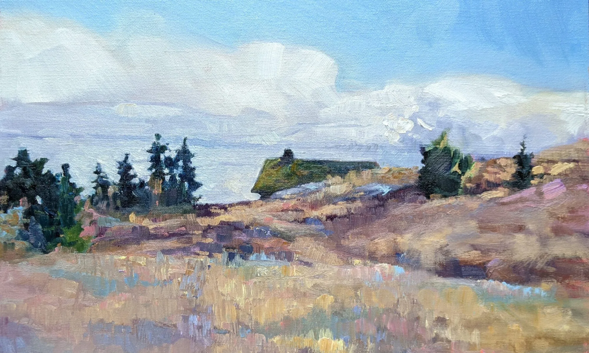
View from Mount Pisgah, by Deborah Lazar, has a tremendous sense of place. It comes from the brushwork as much as from the forms.
I’ve thought a lot about a painting I saw last month at Adirondack Plein Air that has a stellar sense of place. It was a tiny gem, almost unnoticed in the crush, but it’s resonated with me ever since. I asked its painter, Deborah Lazar, if I could share it with you.
Deborah has captured the Adirondacks’ essential color and form in simple terms. I can practically feel the wind in the looseness of her brushwork. She couldn’t have done that had she focused on style rather than content, because her mark-making would have overridden the movement of the wind. 
Style is often what’s rewarded by jurors. But this painting has stuck with me long after the prize-winners have faded from my memory.