Don’t skimp on paint quality, or you’ll defeat yourself from the outset.
 |
| Ogunquit, by Carol L. Douglas. If the pigment isn’t in the paint to start with, you can’t magically enhance it. |
When I send supply lists, I suggest brands. These are Golden for acrylics, QoR for watercolor, and RGH or Gamblin for oils. In pastels, there is too much variation in hardness for a blanket recommendation, but I like Unison myself. Of course, nobody’s paying me for these endorsements; they’re just my preferences.
That doesn’t mean these are the only good art supplies out there. They have a combination of pigment load and handling characteristics that I like. There are many excellent makers of paint out there. They come in a variety of price points, but price is not the sole indicator of quality.
| Late October, Beauchamp Point, by Carol L. Douglas |
There are an equal number of horrible paints on the market. You might think you’ve saved a few bucks, but they’re an expensive mistake, one that will cost you time in learning. Don’t skimp on paint quality, or you’ll defeat yourself from the outset. Instead, cut down on the number of colors you buy.
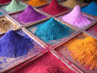
All paints (and pastels) consist of pigment and a binder. There are differences in the quality of binders, in the amount of pigment the manufacturer uses, and how the pigments are stabilized. There may be filler added, or drying agents.
Most major paint brands in the US subscribe to voluntary associations of quality control. (RGH is an exception; that’s too bad, because their paint is excellent.) The most well-known is Colour Index International (CII), a database dating back to 1925. It contains over 27,000 individual products sold under 13,000 different product names. This standard classification system gives you the facts about the pigments in your tube.
 |
| Autumn Farm, by Carol L. Douglas |
Just as Benjamin Moore uses names like Yukon Sky to peddle grey paint, art paints are often marketed with evocative names. These names appeal to our sense of tradition, even when the old paint has no relationship to its namesake. If you buy Naples Yellow thinking you’re buying an historic pigment, think again: the modern paint is a convenience mix replacing the historic (and toxic) lead antimonate.
Expect to find, at minimum, the following information on the label of your paint tube:
- Manufacturer’s name or common name for the color.
- The CII number and, sometimes, the name of the pigment(s).
- The manufacturer’s lightfastness or permanence rating.
The CII code consists of two letters and some numbers. Most paints start with a “P” which means it’s a pigment, not a dye. The next letter is the color family: PR is red, PY is yellow, etc. The number is the specific pigment included in the tube.
Save this link somewhere accessible from your phone: https://www.handprint.com/HP/WCL/waterfs.html
You’ll need it when you shop. This pigment guide was built for watercolors but is generally true across all media. (Watercolor is the canary in the coalmine of pigments). All painters should understand lightfastness, transparency, and color shift. Granulation, bloom and diffusion, however, are watercolor-specific issues.
| Winch, by Carol L. Douglas |
When you compare paints with the same names, check their CIIs. Are they the same or different pigments? A “hue,” is made of a blend of less-expensive pigments. There is nothing inherently wrong with hues, but they don’t behave the same as the pigments they’re named after. For example, “cadmium yellow hue” may look like cadmium yellow coming out of the tube, but it makes insipid greens.
There’s little to be gained by buying a hue mimicking a more expensive pigment. If you are comfortable painting with a hue, then learn what’s in it and mix it yourself. You always have the greatest flexibility by working with pure pigments (rather than mixes) out of the tube.
Most manufacturers include their own lightfastness ratings on the tube. This is a measure of how quickly the color fades. If it’s not listed, look it up.
The series number tells you the price. Are pricier pigments better? Not by a long shot. Twentieth-century manufacturing gave us a new world of inexpensive pigments, which tend to be less toxic, higher in chroma and lightfast.
I’m thinking about supply lists because it’s time to send them out for Find Your Authentic Voice in Plein Air in Tallahassee, Florida, in early November. There are enough students to go, but there are still openings, so I’d be excited if you signed up. s
From there on in, it’s all Zoom, Zoom, Zoom until the snow stops flying. The Tuesday morning class is sold out; there are still openings for Monday night Zoom classes.


