fbpx

Figurative does not mean figure

Where do you fall on the continuum from representation to abstraction?

I Saw the Figure 5 in Gold, 1928, Charles Demuth, courtesy the Metropolitan Museum of Art

English (my daughter never tires of telling me) is a descriptive, rather than proscriptive, language. Words mean whatever most people agree that they mean. That’s why English is so endlessly adaptable—why, for example, we can suddenly accept the ungrammatical ā€˜their’ as a replacement for ā€˜his’ or ā€˜her’ without making a Federal case of it. English sees a need and answers it, and its users follow along.

There is one neologism I resist, however, and that’s the substitution of the word figurative for figure. As descriptions of art, they are not equivalent. Figure painting means painting the human form. Figurative paintingmeans realism.

Rider, Attic red-figured cup, middle of 5th century BC, courtesy of Luynes Collection

Figurative is an old word in English, and comes to us from French. It has always had overtones of metaphor and meaning. It’s slightly different from figure, which has multiple meanings in English. Figurecan mean a shape, the human body; a number, or a symbol. Think of the term figure eight and you begin to understand the complexity of the word.

Figurative art, or figurativism, however, is simple: it means representational art. The term was coined when abstraction came along, to describe abstraction’s opposite number. A painting of your car is as figurative as a painting of your spouse.

Nocturne in Black and Gold: The Falling Rocket, 1874, James Abbott McNeill Whistler, courtesy Detroit Institute of Arts 

What is the difference between figurative and abstract art? It’s not easy to draw a line. There have always been elements of abstraction in figurative art. This is why ancient art often surprises us with its modernity.

Even hyperrealism is a form of abstraction. It’s seemingly impossible for humans to represent nature exactly as it appears. Imperfect beings, we insist on putting our own spin on everything.
Likewise, there are often figures in abstract art, and much abstraction derives from observed figures in nature. The abstract geometry of Piet Mondrian, for example, resonates with us because we’ve observed such geometry in nature.

Premier Disque, c. 1912-13, Robert Delaunay, private collection

The ā€˜figure’ in Charles Demuth’s I Saw the Figure 5 in Gold is both a number and a symbol. And it’s both abstract and realistic. It was painted in homage to his friend William Carlos Williams’ poem, The Great Figure:

Among the rain
and lights
I saw the figure 5
in gold
on a red
firetruck
moving
tense
unheeded
to gong clangs
siren howls
and wheels rumbling
through the dark city.

Art and advertising

An amendment to the Rockland building code brings us full circle back to Pop Art.

Robert Indiana’s art sign is on the left and the commercial Strand sign on the right. Which is art? Photo courtesy of Coastal Maine Realty.

 Heading into Rockland, ME from the south, you can’t help but notice Robert Indiana’smassive Electric Eat sign on the roof of the Farnsworth Art Museum. It’s been there since 2009 and has become a fixture of the local skyline.

The piece was initially commissioned for the New York State Pavilion at the 1964 World’s Fair. Fair attendees immediately queued for the non-existent restaurant. After a day of frustration for all concerned, the sign went dark. It wasn’t relit again until it moved to Maine.
In its original setting, the piece blurred the line between art and life a little too effectively.
While the piece is unequivocally good for Rockland’s cityscape, it was also the bellwether for an issue recently facing Rockland’s town board: when is a sign a sign, and when is it art?
The question facing code enforcement officer John Root was whether a sign proposed for the front of Ada’s Kitchen constitutes art or advertising. It will read, simply, ā€œEast.ā€
Ada’s Kitchen is owned by Jen and Rick Rockwell. ā€œThere’s no such business as EAST,ā€ Rick Rockwell told the Pen Bay Pilot. ā€œEAST is a concept. It’s a general direction. The object of this piece is to celebrate the past of Rockland. It speaks about our proximity as being in the eastern part of our country, in the most eastern parts of our state.ā€
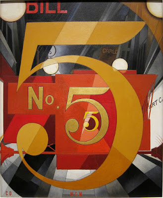
I Saw the Figure 5 in Gold, 1928, Charles Demuth, Metropolitan Museum of Art. This is proto-pop.
The paper reported that Jen Rockwell told the City Council, ā€œfurther north, toward her establishment, drivers start speeding up due to their perception that there’s nothing more to look at until the ferry terminal.ā€ Well, now she’s talking about advertising. I’d have to disagree with her anyway, because one of my favorite signs in town is for the Rockland CafĆ©. That’s very close to their location.
But Ms. Rockwell was right that the visual concentration is weighted to the south end of town. She was, in essence, critiquing Main Street as a work of art in itself, and saying its balance is off. 
Rockland has successfully recreated itself as the northeast’s art mecca. With art sales, I suppose, comes public art. Not all of it is going to be by artists of the stature of Robert Indiana, but a Code Enforcement Officer isn’t qualified to judge aesthetics. Nor, I suppose, does he want to.
Campbell’s Tomato Juice Box, 1964, Andy Warhol. Synthetic polymer paint and silkscreen ink on wood. Museum of Modern Art. This is full-blown Pop Art
He does need to assess whether the sign is properly sized, lighted and hung, and to be sure that it won’t swing loose in a Nor’easter or fall and crush visitors. To do that, he needs a specific code addressing art signs, and now he has one.
My own definition of art is that it’s something that’s useless for any practical purpose. The Rockland City Council came close to the same conclusion when it concluded that a sign is art if it doesn’t advertise the product being sold by the business. In other words, you can hang an art lobster up if your business is selling hand-knitted scarves, but you can’t hang a lobster up if you actually sell lobsters.
Then one looks at the sign for the Strand Theatre and realizes that it’s as much an art statement as anything on Main Street, even though it advertises their specific business. That brings us full circle to Robert Indiana’s work and the whole Pop Art movement of the 1960s. Their goal was to blur the line between mass culture and fine art. And now it is done.

American history through British eyes

Death on the Ridge Road, 1935 by Grant Wood. Williams College Museum of Art

Occasionally a painting gets stuck in my head. Such is the case with Death on the Ridge Road, by Grant Wood, above. Viewers in 1935 understood this painting as something painfully probable in rural driving: innocent passengers careening happily toward their imminent deaths. One could see it as a metaphor for life, since we’re all in that state of happy ignorance. We are, however, in a new era, and current conventional wisdom is that it is a metaphor for Woods’ own privately tortured sexuality.

That’s a contemporary American viewpoint, however, and it’s unlikely to hold up. Death on the Ridge Road is currently in London, in America after the Fall: Paintings in the 1930s, at the Royal Academy of Arts in London. If I find any spare change, I’m going to see it before it closes. It’s not that I can’t or haven’t seen these paintings here in their native home. I’d like to see them interpreted through British eyes.
Erosion No. 2 – Mother Earth Laid Bare, 1936, Alexandre Hogue, Philbrook Museum
The Telegraph called this show ā€œa pungent mix of American horror stories,ā€ but there’s more than a bit of Schadenfreude there. We Americans don’t necessarily think of urbanization, industrialization, or any of the other themes of the Great Depression as horror stories. They are the stories of our parents and grandparents, repeated down through the generations.
Nor were they the end of an idyllic past, as the title implies. We had been riven by Civil War two generations earlier; we had suffered through rocketing financial depressions before. Ours was a society that was constantly in flux.
It was, however, a ā€œdecade like no other,ā€ as the Royal Academy describes it. The impulses in art were varied and many. Painting wandered down many different by-ways, from the regionalism of Wood to the Symbolism of Philip Evergood, the Precisionism of Charles Demuth and Charles Sheeler, the folk expressionism of William H. Johnson and the modernism of Georgia O’Keeffe. It was a ferment that we can only begin to sort out in retrospect, and it happened in literature and music along with painting.
Gas, 1940, Edward Hopper, MoMa
ā€œHe’s putting the pump back, he’s staring into the dial, he’s falling apart: who knows? The garage stands empty, its light sinister as the dusk descending over the woods, presaging a thousand movies. The rural past meets the industrial future in this vision of a lone American lost out there in the spreading vastness,ā€ wrote the Guardian about Edward Hopper’s Gas.
I, through my American eyes, see the homely Northeast in that painting. It’s the Maine of my childhood, moving from Mom-and-Pop gas bars to whatever it is today. 
Meanwhile, in 1940, when Hopper painted it, Britain was enduring the Blitz. It seemed as if defeat at the hands of Luftwaffe was inevitable. A British public has to see the night sky in Gas as intensely personal. It’s more about them than us.