fbpx

A warp speed tour of Buffalo

Buffalo City Hall

Yesterday I took a Texan on a mad dash across Buffalo, swerving to get in as many landmarks as possible before the light faded. I remarked to her that Buffalo is a city of superb architecture. Serious students of the discipline travel from all over to see it.

Buffalo City Hall (65 Niagara Street) is a 32 story Art Deco building completed in 1931 by Dietel, Wade & Jones. It is one of the largest and tallest municipal buildings in America, and at the time of its construction was one of the priciest. It is decorated with elaborate ceramic tile frieze-work; its interior is lavishly decorated with murals, skylights, and sculpture.
The main facade of the Buffalo Psychiatric Center.
The Buffalo Psychiatric Center (400 Forest Ave) was Henry Hobson Richardson’s largest commission, and the first work ever done in the iconic American style that would be known as Richardson Romanesque. It’s built of dark red Medina sandstone.  Ground was broken in 1871 and the project was finished in 1895, nine years after Richardson’s death. The grounds were designed by landscape architect pioneer Frederick Law Olmsted, who also designed the nation’s first coordinated system of public parks and parkways in Buffalo.
Detail on the Guaranty building.
The Guaranty Building (26 Church Street) was designed by the “father of skyscrapers,” Louis Sullivan. Finished in 1896, it was one of the finest new office buildings in America, and is considered one of Sullivan’s best works.
The Guaranty incorporated the idea of steel-supported curtain walls, which allowed buildings to grow taller without additional weight. Sullivan let the support piers create the building’s design, and then ornamented the whole thing with intricate terra cotta tiles in natural and geometric motifs.
The Electric Tower
The Beaux Arts Electric Tower (535 Washington Street) was built on the model of John Galen Howard’s Electric Tower, which was the centerpiece of the 1901 Pan American Exposition in Buffalo. That event was famous for two things: the assassination of President McKinley, and for being lighted by power from Niagara Falls.
The tower is covered in shiny white glazed terra cotta tiles that sparkle under its colored floodlights (currently red, white and green for Christmas). It is ornamented with molded generators and electric motors, a forerunner of the terra cotta Art Deco ornamentation with which Buffalo is filled.
Buffalo Main Light.
The Buffalo lighthouse was made necessary by the Erie Canal, and was completed and lit in 1833. It sits on an older breakwater roughly at the confluence of the Buffalo River, Lake Erie, and the Niagara River. By the early 20th century, its position was wrong as a navigation aid, and it was decommissioned in favor of an outer-harbor light.  It is built of unpainted limestone, with a cast iron lantern on the top.
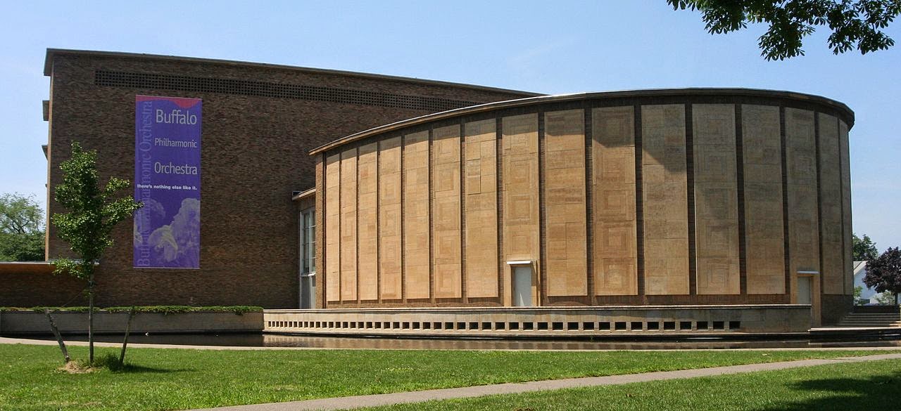
Kleinhans Music Hall
Kleinhans Music Hall (3 Symphony Circle) was designed by Eliel and Eero Saarinen. The acoustical and lighting research which went into the hall’s design made it one of the finest in the world. It sweeps in understated, smooth, curving lines with a minimum of ornamentation, and uses that newfangled material, plywood, to acoustical advantage. The main auditorium seats more than 2,800 people, the smaller one 900. It opened in 1940, and was the legacy of menswear magnate Edward Kleinhans.
Cargill Elevator on Lake Erie.
No tour of Buffalo is complete without at least a quick sweep past the grain elevators along the waterfront. The steam-powered grain elevator was invented in Buffalo in the 1840s as a way of cross-docking grain from lake freighters to canal boats. Buffalo has the world’s largest collection of extant examples, most of them clustered along the Buffalo River near Lake Erie.


This allowed the grain grown in Ohio, Indiana and points west to be moved to New York City and from there to the world.  
I will be teaching in Acadia National Park next August. Read all about it 
here, or download a brochure here

The other faces of Madame X

Madame Gautreau Drinking a Toast, John Singer Sargent, 1882-83. This small, intimate painting was done a year before the infamous Madame X, and was given by Sargent to Madame Gautreau’s mother.
Madame X—Madame Pierre Gautreau—is remembered because of John Singer Sargent’s famous portrait. Like him, she was an American expatriate and arriviste, which perhaps explains why she sat for him when so many artists were clamoring to paint her.
She was born Virginie Amélie Avegno in New Orleans in 1859. Her parents were Creoles: her father claimed he was Italian, and her mother was French. Her father—an officer—was killed in the Battle of Shiloh in 1862.
Figure study of Madame Pierre Gautreau by Sargent in watercolor and graphite, c. 1883. The difficulties of painting a socialite’s portrait included getting her to settle down to posing.
The South being suddenly inhospitable to planter society, Virginie’s mother moved the two of them to Paris, where the girl was educated for her role as a parisienne. This was the 19th century equivalent of a Sloane Ranger or BCBG—a young, polished woman whose primary raison d’être was to exist beautifully. These women were sometimes called “professional beauties.”
Just as Virginie herself was being reengineered for a European career, Paris in 1867 was in the midst of reinventing itself. The ancient city had been largely redesigned and rebuilt by Baron Haussmann. A brash new city required brash new people, people like Virginie Avegno, now married to Pierre Gautreau, banker. They might not have had pedigrees, but they had money and youth and beauty.
The painting now known as Portrait of Madame X, by John Singer Sargent, 1884. The only one that mattered, and the one that scandalized Paris society.
Virginie was a very pale brunette with an arresting face and an hourglass figure. She was a fardée, or an openly painted lady. Her hennaed hair and lavender powder (to enhance her pallor) enhanced, rather than detracted from, her reputation. She was very much a new woman in the Parisian style. And because she was a stunner, and an American, people gossiped. Did she use arsenic to achieve that pallor? With whom was she sleeping?
Madame Pierre Gautreau, Antonio de La Gandara,1898. Mme. Gautreau went on to be painted by many other society artists, but never as memorably as by Sargent.
Her reputation and exotic looks also made her a magnet for artists. Among them was Sargent. “I have a great desire to paint her portrait and have reason to think she would allow it and is waiting for someone to propose this homage to her beauty. If you are bien avec elle and will see her in Paris, you might tell her I am a man of prodigious talent,” he wrote a friend.
Madame X was shown in the Paris Salon of 1884 under the title Portrait de Mme –, as if that could protect the sitter’s anonymity. Although Mme. Gautreau and Sargent both thought it was a masterpiece, the public reception was one of shock.  Mme. Gautreau’s mother asked him to withdraw the painting, which the artist refused.
Portrait de Madame Gautreau,1891,Gustave-Claude-Étienne Courtois. This was painted seven years after Sargent’s portrait, and the falling strap and décolletage raised nary an eyebrow.
Mme. Gautreau quickly recovered from her humiliation, and was painted again by other artists. Sargent moved on to greener pastures in London. And the painting is remembered as an iconic masterpiece.


I will be teaching in Acadia National Park next August. Read all about it 
here, or download a brochure here

Inspired

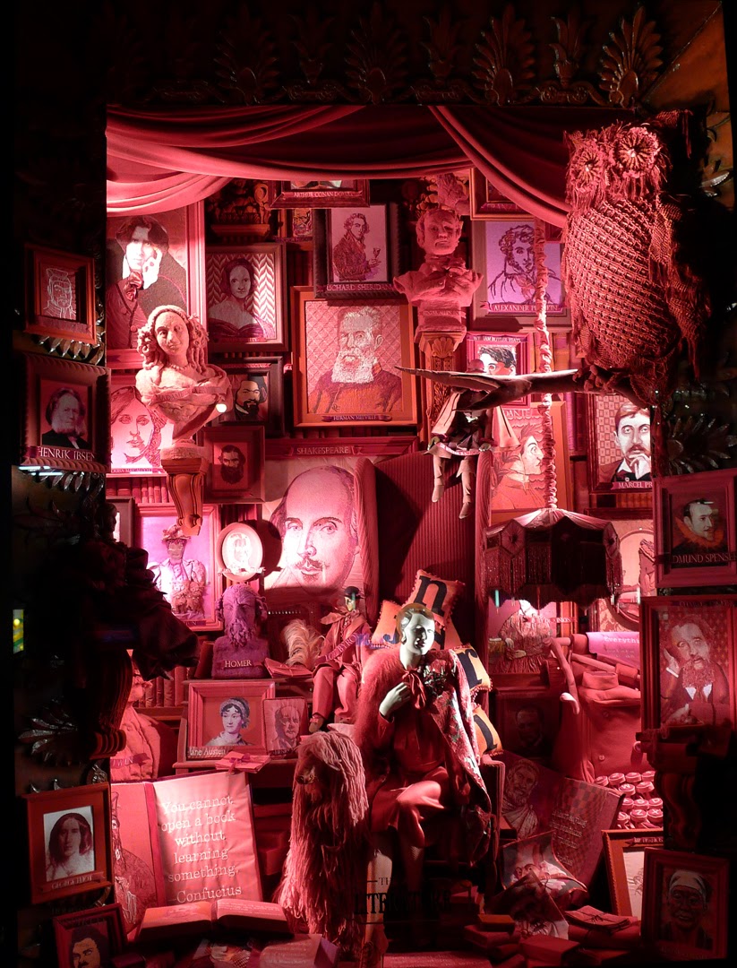
Literature. If you look closely, you’ll find Van Reid in there.
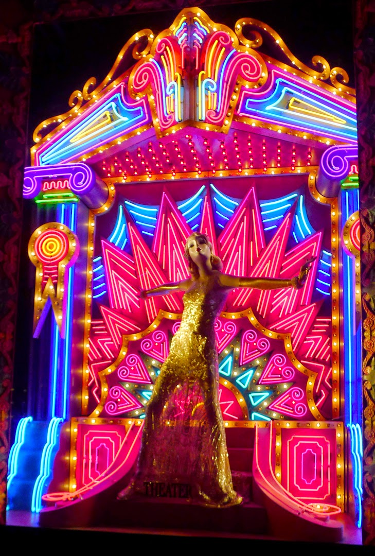
Why listen to me talk about art when you can look at windows from Bergdorf Goodman on 5th and 58th in New York City? Their theme this year is “Inspired” and their windows revolve around the arts.
The music window is everything you want from New York–brash, bubbly, shiny.
And it wouldn’t be New York without Broadway.
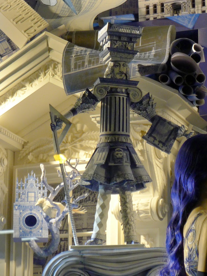
“We decided to base each window on a major art form, drawing equally from the fine arts, performing arts and applied arts. For our main windows, we settled on literature, architecture, theater, painting, music, dance, sculpture and film. Each window would be designed independently from the others. Each would be made from its own set of materials. But the entire set of windows would constitute a sort of eight-lesson course in art appreciation,” the store announced on its blog.
Sir Christopher Wren presides over the architecture window.
More than 100 artists and display artisans contributed to the windows, which take the store nearly a full year to finish.
The movies…
Happy holidays!
The Rochester window. Ice and monkey and ice tongs.

I will be teaching in Acadia National Park next August. Read all about it here, or download a brochure here

A painting to match the couch

Lancaster County, PA, 18X24, by Carol L. Douglas. It’s moving from my own bedroom to our guestroom, where it will better match the pale blue walls and furniture.
Artists kvetch about people who buy paintings to match their sofas, but it is a real consideration. A mismatch will never be to the painting’s or the room’s advantage.
I’ve been putting away work from my Black Friday sale. It’s been an opportunity to rearrange some of the artwork in my house (and, yes, to vacuum). It’s interesting how some paintings look grand against some walls and bland against others.
Autumn floral, 16X20, by Carol L. Douglas. I think I’m going to see what this looks like in my dining room.
I had a mid-century street scene done by a cousin in Tennessee hanging in my living room.  It’s a very accomplished painting, but it never looked good against the pale-turquoise-and-red décor. To keep it safe during the sale, I slid it on a hook in my bedroom, which has navy walls and warm accents. Here in a room with fruitwood furniture and a related color scheme, the painting glows.
Where then, to put the high-chroma but abstract landscape that previously was in that spot? With its pale frame and cool colors, it looks far better in our guest room, which has pale blue walls and pale furniture.
And this pastel of geraniums has already relocated to the living room.
Most artists I know own too many paintings, of our own and others. We usually just plop new work on hooks wherever we can. This exercise has been a good reminder that a painting’s inherent value can be obscured by bad interior design.

I will be teaching in Acadia National Park next August. Read all about it here, or download a brochure here


Starting and searching

Rock Study, 11X14, by Carol L. Douglas. I did this rock study with my pal Bruce Bundock and hated it at the time. I love it today.
I admire the well-planned, carefully-drafted, meticulously-executed painting, but something happens between the time I start and the time I finish. A furious spirit overtakes me that drives me irresistibly in the opposite direction.
This is why I’m very reluctant to wipe out all but the absolute worst starts. In so many cases, what I thought was bad five years ago has turned out to be pivotal in my evolution as a painter. I’ve come to listen to my ‘bad’ paintings; they’re usually trying to tell me something.
Rockport, 9X12, by Carol L. Douglas.
Textile artist Jane Bartlett sent me the list below, which was (according to the Internet) found among Diebenkorn’s papers after his death in 1993. I haven’t corrected the spelling or punctuation, even though they pain me.
Notes to myself on beginning a painting (by Richard Diebenkorn)
1. attempt what is not certain. Certainty may or may not come later. It may then be a valuable delusion.
2. The pretty, initial position which falls short of completeness is not to be valued — except as a stimulus for further moves.
3. Do search. But in order to find other than what is searched for.
4. Use and respond to the initial fresh qualities but consider them absolutely expendable.
5. Dont “discover” a subject — of any kind.
6. Somehow don’t be bored — but if you must, use it in action. Use its destructive potential.
7. Mistakes can’t be erased but they move you from your present position.
8. Keep thinking about Pollyanna.
9. Tolerate chaos.
10. Be careful only in a perverse way.

Rock Tumble, 16X20, unframed, by Carol L. Douglas
I will be teaching in Acadia National Park next August. Read all about it here, or download a brochure here

The Chautauqua Movement

We’ll be holding our own ‘improving’ workshop again next August. This is the Dyce Head Lighthouse in Castine, ME, painted by me.
“You wrote, ‘And as with so many things in 19th century America, the vacation was tied up with religious reform,’” an alert reader wrote me yesterday. “What does that mean?”
Ours is a country prone to religious revival. Historians call those periods our ‘Great Awakenings’. America experienced a Third Great Awakening from the middle of the 19th century until the early 20th century. This particular revival had a strong dose of social activism in its nature. The three greatest movements of the 19th century all sprang from this religious impulse: abolition, temperance, and women’s suffrage. So too did the early middle-class getaways, the Chautauqua movement.
1915 postcard
The first Chautauqua was organized as a training camp for Methodist Sunday school teachers. This outdoor summer school format grew so popular that it was copied all over the country in the form of ‘daughter’ Chautauquas.
These were far more than religious tent revivals. They offered lecturers, theatrical readings, music, art, and more. When Theodore Roosevelt called them “the most American thing in America,” he was correct, for they enshrined the American do-it-yourself spirit of bringing learning to places that were too small, too remote, too new for established culture.
The Lyceum Magazine advised members to continue to challenge popular amusements with improving ones, even in time of war.
Having taught painting for a long time, I know that this love of learning is engrained in us. Speaking of which, I have fixed the year on my workshop brochure.
Lunch break, Castine Maine, Carol L. Douglas
The real dates are August 9-14, 2015. Dramatic, inspirational Schoodic Point in Acadia National Park will be our base. This is the quiet side of Acadia, far from the hustle of Bar Harbor, but with the same dramatic rock formations, pounding surf, and stunning mountain views that make Acadia a worldwide tourist destination.
Of course, all skill levels and media are welcome. From beginner to advanced, in watercolor, oils, acrylics, pastels — bring any or all with you. Because bringing family along was so popular in 2014, we’ve arranged to make it possible this year, too.
Water Street View, Castine, ME, by Carol L. Douglas
Just make sure you get back to me by the end of the year to get that early-bird discount!

I will be teaching in Acadia National Park next August. Read all about it here, or download a brochure here

A change is as good as a rest

Kaaterskill Falls, 8X10, unframed, by Carol L. Douglas. Kaaterskill Falls is one of America’s oldest tourist attractions.
Yesterday I was moaning with a friend about how a busy holiday leaves us needing a vacation. She said, “I can’t remember the last vacation I took.”
That’s something I hear frequently. It got me wondering about the history of the vacation. Luckily, while we may not get much time off, we can find almost anything online, and I went to Cindy Aron’s Working At Play: A History of Vacations in the United States for a précis.
The first tabernacle at Ocean Grove, NJ, in 1876, from Harper’s Monthly.
Of course the idea of vacationing arose with the elite: those wealthy people who could afford to get out of the steaming city in the summer and head to their rural estates or the shore. That started as a way of avoiding disease, just as the Grand Tour was meant as an educational capstone.
It wasn’t until the Civil War that vacationing became more commonly available. And as with so many things in 19th century America, the vacation was tied up with religious reform.
Yellowstone was the world’s first national park. This poster is from 1938.
On the one hand there were secular resorts like Saratoga Springs, NY, Hot Springs, VA, and Newport, RI. These catered to money, with a whiff of dissolution and activities like billiards, bowling, gambling, dances, and concerts. On the other hand, there were the improving resorts, like Chautauqua, NY (and all the little chautauquas it spawned) or Ocean Grove, NJ.
Kaaterskill Creek, 8X10, unframed, by Carol L. Douglas. 
Even as transportation improved and religious revival died down, the middle class tended to prefer improvement to frivolity, favoring camping, touring, and the National Parks over fashionable resorts. While there have always been amusement parks like Coney Island to attract middle-class visitors, it wasn’t until the opening of Disneyland in 1955 that the modern theme park was born.

Want an improving vacation? I will be teaching in Acadia National Park next August. Read all about it here, or download a brochure here.

Signs and Portents

Foliage study, 9X12, unframed.
Dreamt of an angel of death appearing in winter white and gunmetal grey (my dreams are nothing if not chic), awakened by the soft chirp of text messages arriving in the middle of the night, and then this: I realized the entire print run of my workshop brochure have the wrong year on them, and I don’t have time to have them reprinted.
Oh, well. Other than that, they’re really pretty.
Azaleas, 6X8, Highland Park. Some days it doesn’t pay to be too realistic.
I’ve lost count, but I sold more than a dozen paintings on Black Friday, against a very relaxed background of music, company, wine and cheese. I haven’t done retail sales in a long, long time, and I’m not really set up for it. I’ve lost the key to my cash box (which contains my receipt book). It’s a good thing nobody needed to pay by credit card, because my card reader was in my grandson’s crib along with all my other bookkeeping tools.
Ellwanger-Berry Garden, 14X18, oil on canvasboard.
Today I get to clean it up and return house and studio to their normal luster.
There’s no Cyber Monday around here, but if you want to look at my inventory, you’re welcome, of course. No, it’s not set up for online commerce; you can call me or send me a text or email and we will finish the sale.
Foliage, 12X16, unframed.
Meanwhile, I’m going to be figuring out what to do about those brochures.

I will be teaching in Acadia National Park next August. Read all about it here, or download a defective brochure here. It’s really 2015, not 2014.

Black Friday!

Dame’s Rocket, 11X14, unframed, is a great reminder of Spring.
Today is my Black Friday un-sale.  This runs from 2-9, at 410 Oakdale Drive, Rochester, NY 14618. It includes plein air and studio work, framed and unframed, along with prints and notecards—everything 25-50% off.
That is—of course—so much better than being at Wal-Mart at 0:dark:30 this morning to buy some electronic toy you won’t even want by the time Christmas rolls around.
Spring Foliage, 11X14, unframed, features Rochester’s lilacs.
Among my less-than-brilliant ides was having this event the day after having 20 people here for dinner the night before. But an angel in the form of my daughter Mary tidied and mopped the house in the wee hours of the morning, so it doesn’t look much worse than it usually does.
Plus, my tecchie kids are all home today, so they can figure out how to set up this Square credit card reader and make it work.

Durand Lake, 16X20. All these unframed works are 50% off.
Several people have asked me whether there are images online of these paintings. I’ve been kind of busy making pies, so I just got it started this morning. Here’s the album; I’ll be adding details as I can. No, it’s not set up for online commerce; you can call me or send me a text or email and we will finish the sale.
Happy shopping!

I will be teaching in Acadia National Park next August. Read all about it here, or download a brochure here.

Queensboro Bridge

Queensboro Bridge approach, 9X12, oil on canvasboard.
Several years ago I got into painting under the Queensboro (59th Street) Bridge with my friend Kristin. This is a great painting location, because it has architecture, traffic, public seating, and a Starbucks with a restroom close by.
Under the Queensboro Bridge, 12X16, oil on canvasboard. 
I enjoy painting in Manhattan, and have sold a few paintings from my easel there, but I don’t paint there enough to have a body of work large enough for a dedicated show.  
Queensboro Bridge approach, 12X16, oil on canvasboard.
So it’s no surprise that these four paintings are going into my Black Friday un-sale this week. (In case you’ve missed it, this holiday un-sale is from 2-9 on Friday, November 29, 2014, at 410 Oakdale Drive, Rochester, NY 14618. It includes plein air and studio work, framed and unframed, along with prints and notecards—everything 25-50% off.)

Queensboro Bridge, oil on canvasboard.
Painting in New York City is different from painting in Rochester. There’s much more foot traffic and it’s far noisier. I am very extroverted, and I feed off its energy, but some painters would be annoyed at the constant interruptions.
I will be teaching in Acadia National Park next August. Read all about it here, or download a brochure here.