fbpx

The Fine Art of Packing

Texting and falling into a fountain, 6X8, Carol L. Douglas. Artists can justify keeping anything as still life props.
Sometimes God likes to remind me that I’m not superhuman. Like this week, when my work has been limited by asthma. The combination of pollen, dust and exertion has pretty much done me in by early afternoon, and I’m about 20 boxes behind in my packing.
Every American family should pack once a decade. That way we would relentlessly cull our stuff. It would be nicer for our children when we die, for one thing.
Yes, all the weird stuff has to come with me. And much of it requires special handling in packing.
Every studio is full of odd and useful things. In my case, several plaster heads, one blue glass head, a Vaseline glass figurine, several compotes, and a glass bowl full of rocks from Maine. That last one has me baffled; I use those rocks for still lives, but I can’t really see moving them back to Maine.
Paintings and frames are a hassle to pack.
The fine art of packing consists entirely in tossing stuff out until your current house is empty and you fall in love with it again. I’m not a hoarder. I can be relentless with books, with clothes and with furnishings. But there’s still an awful lot of stuff here to go through, and time is slipping through my fingers.
Where there was once order, there are now… boxes.
Meanwhile, I remember what it’s like to paint. Really, I do.

Let me know if you’re interested in painting with me on the Schoodic Peninsula in beautiful Acadia National Park in August 2015. Click here for more information on my Maine workshops! Download a brochure here.

Get your hands off our trashy landmark

You call that a highway? We call it a theme park. (Photo by Jim Henderson)
The Obama Administration has told the City of New York that Times Square is in violation of the 1965 Federal Highway Beautification Act. Its iconic signage has to come down or the city will forfeit some $90 million a year in Federal highway funds.

It is probably not a coincidence that this is happening during the funeral of 25-year-old NYPD officer Brian Moore. His death undermines the cop-brutality narrative, and the powers-that-be probably want us thinking about other things. Among the flash at Times Square is the iconic neon police station, beloved of tourists. I suppose that, too, is in violation of Lady Bird’s Bill.

The NYPD are having a rough week. Let’s not let the kerfuffle over Times Square distract us from that.
Reaction in New York has, predictably, ranged from mockery to ridicule.
“It’s about time!” my own husband exclaimed. “Every time I’m pulling the Airstream through Times Square behind my ’65 Buick Roadmaster, I complain that I can’t see the trees and cows because of those darn signs!”
Times Square in 1898. As tacky as non-electric signs could make it.
“I could plotz,” another friend texted, ramping up her New York accent for the occasion.

Someone else said (as someone always will) that she liked it better before it was cleaned up. Well, I hated it then and I hate it now. I’m an equal-opportunity hater.

I’m not unusual in that. It’s there for visitors. But like all theme parks, its economic impact is huge—greater than the $90 million penalty the Feds are threatening.
Times Square on V-J Day.
For a hundred years, Times Square has been one of America’s most-recognized landmarks. Oddly enough, in another way, it’s completely anodyne—all the same stores as, for example, Piccadilly Circus in London. But as trashy, tacky and predictable as it is, it’s our trashy, tacky landmark. The Feds can just go annoy some other highway.

Let me know if you’re interested in painting with me on the Schoodic Peninsula in beautiful Acadia National Park in August 2015. Click here for more information on my Maine workshops! Download a brochure here.

Some basic color theory

Tilt-a-Whirl, 12X9, Carol L. Douglas. This was a plein air painting. Really.

Yesterday I showed you a PDF of a palette chart I like my students to follow. Today I’m going to talk about the basic color theory underlying it.

The three primary colors we learned in primary school are red, yellow and blue. Forget about any other color space you’ve learned about; they’re not relevant to painting.

Above are the three primary colors in subtractive color. This is the color space in which painters work. These three colors are the foundational building blocks on which all other colors are made.

Mix the primary colors in the first illustration with their neighbors and you end up with the secondary colors. A secondary color is always across the color wheel from a primary color.
If you mix the primary colors with those adjacent to them, you get the secondary colors: green (blue and yellow), orange (yellow and red)and purple (red and blue). A secondary color is always across the color wheel from a primary color. If you want to neutralize a color in a hurry, a fast way to do it is to mix it with whatever’s across the color wheel.

This is the theory on which all limited palettes are based. Unfortunately, there are no pure paint pigments. They’re either too warm or too cool, or they have overtones that muddy them up in certain mixes. So all real-world limited palettes have holes in them, places you just can’t get to with the available pigments.
This is why I use paired primaries on my palette. I have a warm and cool blue, warm and cool red, and warm and cool yellow. This allows me to go almost anywhere on the color wheel without sacrificing chroma.

The colors on my palette are a riff on the primary colors. It’s the same principle, but there’s a warm and cool version of each of them.
Why, then, do I have four more tones: yellow ochre, raw sienna and burnt sienna, and black? These are all iron-oxide pigments. They’re cheap and they make great modulators in places where white is inappropriate.

This allows you to go anywhere you want on the color wheel without sacrificing chroma (intensity).
All the colors on my color wheel are modern synthetic pigments (with the exception of the cadmium orange, which is a 19th century organic pigment). The iron-oxide pigments are the most ancient known to man. For some reason, using the modern pigments to create hyper-saturated colors and using the ancient pigments to modulate them works.

Let me know if you’re interested in painting with me on the Schoodic Peninsula in beautiful Acadia National Park in August 2015. Click here for more information on my Maine workshops! Download a brochure here.

How to mix any color

Plastic wrap, by Carol L. Douglas. Red—although a primary color—is largely superfluous on the palette, unless you’re using it to modulate greens. You can get to almost every naturally-occurring red with quinacridone magenta and orange.
The last thing I want is to create a school of mini-me painters with a slavish fidelity to my style. But there are ways to make painting easier, and people wouldn’t take my classes and workshops if they didn’t want to learn that.
Victoria Brzustowicz made this color chart based on my workshop palette. Here is a printable PDF.I crossed out the red on the chart because in most cases, it’s unnecessary.

On the other hand, I’m emphatic about how the beginner’s palette is set up. One of my students made the nifty little paint chart above and gave me permission to share it.
Why do I ask my painters to set up like this?
  • It’s efficient;
  • It allows you to mix without thinking;
  • It prevents the beginner’s error of modulating with white or black;
  • It teaches how to mix greens.

The color tints are there as a substitute for straight-up white. If the light is cool use a cool tint; if the light is warm, use a warm tint. (I make an added puddle of lavender to modulate my greens; often that is the most appropriate cool modulator for our northern forest of mixed greens.)
I crossed out the red on the chart because in most cases, it’s unnecessary.
Admittedly, it’s a bit scruffy, but I’ve got all my landscape greens and all my figure skin hues built on the same system.
Is this the only palette organization that works? Of course not! I recently had a funny conversation with a fellow teacher who swears by phthalo green, a paint that I think should be banned by international convention. We each have our rationale, but the pigments we each use are part of our own coherent systems, not purchased higgledy–piggledy. In time, you will branch out in your paint buying, but it makes sense to start with a proven system.
Let me know if you’re interested in painting with me on the Schoodic Peninsula in beautiful Acadia National Park in August 2015. Click here for more information on my Maine workshops! Download a brochure here.

Utopia among the carnivorous plants

Floating sedges at the Irondequoit Inn, 20X16, oil on canvasboard.
I love boreal bogs. There’s a terrific one at Quoddy Head in Lubec and there’s Corea Heath which we’ll be visiting in August. New York’s Adirondacks are chock-full of them, including Barnum Bog at Paul Smith’s VIC.
A bog is a nutrient-poor acidic wetland dominated by sphagnum mosses, sedges, and shrubs and evergreen trees rooted in deep peat. This is in contrast to a marsh, which is dominated by grasses, rushes or reeds, and often sits at the edge of open water. Swamps are forested wetlands containing slow-moving to stagnant waters; they too are usually attached to open water.
Weather Moving In At Barnum Bog, 12X9, oil on canvasboard.
All of these have their attractions, but none is as lovely as a bog. It is a feast of color even when the rest of the landscape is uniformly green.
Bogs are built on a base of sphagnum, which is a genus of about 120 different plants commonly lumped together as peat moss. Sphagnum and sedges sometimes make floating  mats along the edges of open water; I’ve painted these mats in Piseco many times. It’s tricky to gauge their color, which runs from purple at the base to green and orange in the foliage.
The Dugs in Autumn, 11X14, oil on canvasboard.
Sundews and pitcher plants are hardy, long-lived perennial plants that have found a niche chowing down insects. They rise straight above the sphagnum with flower heads in snappy red, green and purple. Dwarf cranberry and Labrador tea shrubs form low mounds. Poking out through this mess are stunted evergreens attempting to get a foothold on the peat cushion. And usually there’s a vast semicircle of pines framing the scene, and perhaps a mountain rising in the distance. Bogs are a painter’s paradise, often ignored for flashier scenes.
Autumn Sedges, 6X8, oil on canvasboard.
Let me know if you’re interested in painting with me on the Schoodic Peninsula in beautiful Acadia National Park in 2015 or Rochester at any time. Click here for more information on my Maine workshops! Download a brochure here.

Utopia, derailed

Queensboro Bridge construction, 10X8, by Carol L. Douglas. Cities were once the highest expression of civilization. What happened?
I had intended to write about the beauty of boreal bogs this morning. But then I came across this, from the Economist:
The bigger problem for Baltimore is that lawlessness is not limited to nights like tonight. As one young woman standing taking photos said to me, West Baltimore is “always like this. Well not like this, but you know, shootings”. This is a city where a young black man is killed almost every day—not by police officers, but by other young black men. The failure of the police in this city is that they cannot enforce the law even at the best of times. At their worst, as the death of Mr Gray seems to suggest, Baltimore’s police are simply another source of the lawlessness.

Whenever I am totally disheartened, I wander over to Mt. Hope Cemetery to commune with my heroes.
On Monday I wroteabout returning from Maine to Rochester’s daily violence. As Baltimore descended into chaos, I was following a local story:  the (Rochester) Regional Transit Service’s decision to end a 37-year relationship with the Rochester City School District (RCSD). That means the district needs to figure out how to move 9,500 students around, and 144 jobs will be cut. The problem is a simple one: a small percentage of the kids in the district are abusing their bus privileges with fighting, and the usual correctives haven’t worked.
Beneath the Queensboro Bridge, 14X18, by Carol L. Douglas
“As being an older adult, it can be intimidating at times because you never know when you’re going to be caught up in a situation,” Elmyra Crawford-Brown toldTime-Warner News.
I have concluded that the Rochester story is really the same as the Baltimore story: a city skittering on the edge of chaos resorts to extreme measures to protect the law-abiding majority of its citizens.
Toya Graham, the mother who yanked her 16-year-old son out of the fray in Baltimore, said, “A lot of his friends have been killed. I just want to keep him in the house, but that’s not really going to work.” At the end of the day, the National Guard will leave Baltimore, the RCSD will find some other way to move its students, and the killing fields will get back to business as usual.
What would Susan B. Anthony and Frederick Douglass make of the mess we have today?
Tune in tomorrow for the boreal bogs.


Let me know if you’re interested in painting with me on the Schoodic Peninsula in beautiful Acadia National Park in 2015 or Rochester at any time. Click 
here for more information on my Maine workshops! Download a brochure here.

Hidden gems

A vintage photo of the Tidal Falls from August 1954, by Ellis Holt.
Yesterday I was packing art books when I came across a forgotten little volume, The Plein Air Artist Guide to Acadia National Park and Mount Desert Island, by Gail Ribas. Leafing through it, I realized that students driving to my workshop at Schoodic Point will drive right past the Tidal Falls at Hancock.
The Tidal Falls is about halfway between Ellsworth and the turnoff to Winter Harbor.
Reversing falls are caused when tides force water up against a prevailing current. They dot the coast: in Blue Hill and Lincoln, ME, at Cobscook Bay down east, and on the St. John River in New Brunswick. And there’s one right along our motor route to Schoodic.
Corea Heath is also managed by the Frenchman Bay Conservancy (photo by Bob DeForrest)
The farther north you wander in Maine, the bigger the tidal range gets. In fact, the highest tidal range in the world is not far away, at Burntcoat Head in Nova Scotia. Its mean spring range is 47.5 feet and its extreme range is 53.5 feet. The bigger the tide, the more noticeable the reversing falls phenomenon is. (I suppose that’s why nobody notices them in the Great Lakes.)
It’s amazing what you find when you start packing.
The Frenchman Bay Conservancy owns 4.2 acres overlooking the Tidal Falls at Hancock. There are a pavilion, picnic tables and grills—in short, the perfect set-up for a break from driving.
Beautiful Corea, ME.
I love a good boreal bog, so I’m excited about another property owned by the Conservancy: Corea Heath. This is on my workshop itinerary for the week, so you don’t need to hunt it out on your own. It’s a 600-acre habitat for inland and coastal waterfowl and wading birds, migrating land birds, and rare plants.
Rising from the edge of the wetland complex is a mixed forest of hardwoods, spruce, fir and pine, including a beautiful stand of the fire-dependent jack pine.

Let me know if you’re interested in painting with me on the Schoodic Peninsula in beautiful Acadia National Park in 2015 or Rochester at any time. Click here for more information on my Maine workshops! Download a brochure here.

Beautiful Winter Harbor

Part of Winter Harbor Yacht Club’s fleet.(Credit unknown.)
Yesterday I saw this photo essay of Winter Harbor, ME in Yankee Magazine. I hope you click through and enjoy the pictures.
This is the closest town to Schoodic Institute in Acadia National Park, where my workshop will be held August 9-14, 2015. (There are just a few openings in the workshop, so if you’re interested, I hope you let me know soon.)
Winter Harbor itself is a quaint little fishing community of 500 people with a general store, a gas station, and a great little Main Street.  It includes a summer colony called Grindstone Neck. This colony was formed in 1889, modeled along the lines of Bar Harbor. As usual, I stumbled across it in my perambulations while looking for a painting site.
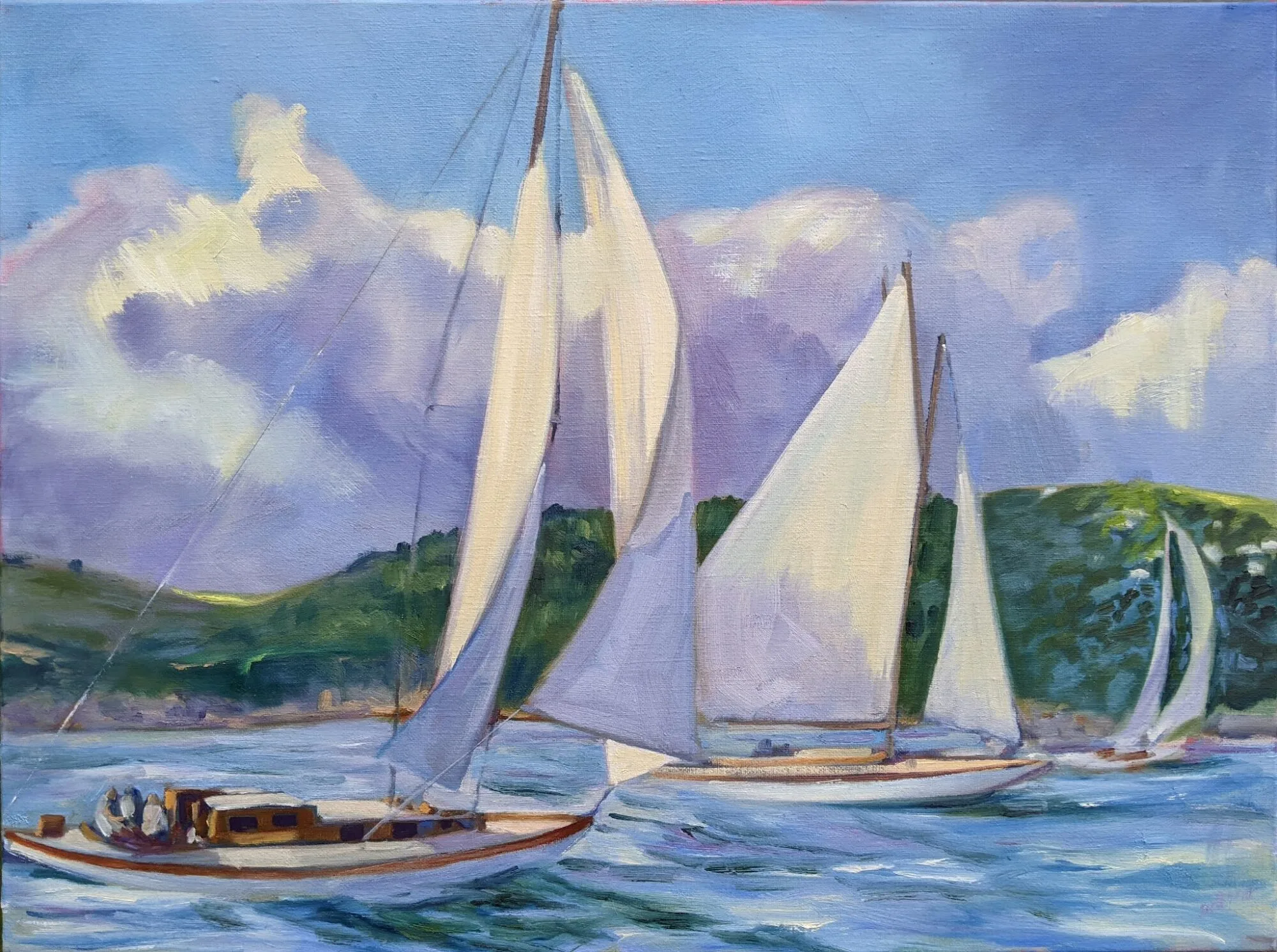
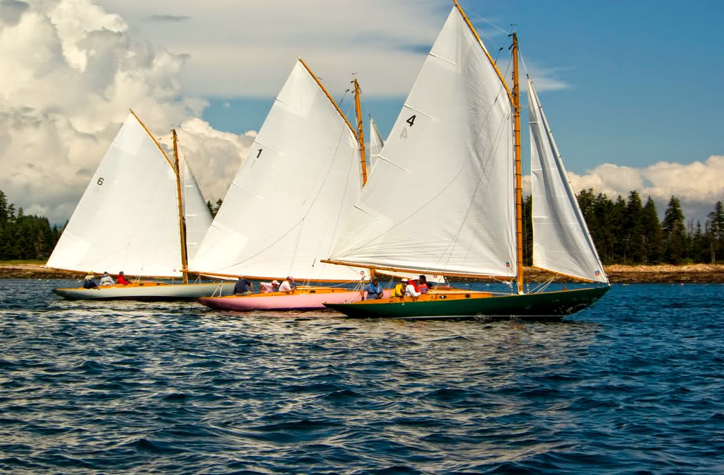
This group has its own yacht club, which in turn has its own yacht. The Winter Harbor 21 (or Winter Harbor Knockabout) is a 31′ racing sloop designed and built by Burgess & Packard, of Marblehead, Massachusetts, specifically for the club.
Cloverly, the first boat to be rescued and restored. (Credit unknown.)
In 1906, club members Fredrick O. Spedden and George Dallas Dixon Jr. commissioned  Burgess & Packard to build seven boats to a specific design. These were launched in 1907. Two more were added in the 1920s.
By mid-century the small fleet had been dispersed until only two remained active. In 1976, the club’s then-commodore, Alan Goldstein, decided that he wanted to find and buy one back. After two years, he found Cloverly rotting in a barn. His enthusiasm was catching and by the mid-80s, all nine boats were restored and  back in Winter Harbor.
Near Winter Harbor, ME. I promise you that Yankee Magazine‘s photos, here, are much better than mine.
The Winter Harbor 21s are the oldest intact one-design racing sailboat fleet in the United States.

Let me know if you’re interested in painting with me on the Schoodic Peninsula in beautiful Acadia National Park in 2015 or Rochester at any time. Click here for more information on my Maine workshops! Download a brochure here.

Back home in New York

Grain Elevators, oil on canvas, 16X20, Carol L. Douglas
I got home on Tuesday to read yet another news story about the dystopia that is America’s archetypal mid-sized city. The feral children who are the result of 50 years of public policy were rioting in the new transportation center, and this week’s police department reorganization coincided with a wave of shootings. Six shot in a pub in Gates, one dead. A man shot and killed on Hudson Avenue.
North Rochester, oil on canvas, Carol L. Douglas. This was the view from my studio window back in the day.
In short, business as usual, but it was like a dousing with cold water after a few days away from the news.
I’m a New Yorker, bred to the bone. But I’m also exhausted by the intractability of our problems, and I can’t think what good I do to fix them.
First Ward, Buffalo, field sketch, 4X5, Carol L. Douglas
I’ve lost count of how many people I’ve known who’ve had murder touch their lives. It’s an everyday occurrence around here and in most cities. The news media generally pays little attention unless it breaks the usual pattern of urban youths blowing each other to perdition. Not noticing it is in some ways the worst racism and classism of all.
First Ward, Buffalo, oil on canvas, 16X20, Carol L. Douglas
When we talk about the reasons for the 50-year exodus from upstate New York, we usually concentrate on economics: loss of jobs, high taxes, a government culture that stifles innovation. Seldom do we think about despair as a motivator, but it has to be part of the equation. If I can’t make it better, am I somehow helping to make it worse?
Let me know if you’re interested in painting with me on the Schoodic Peninsula in beautiful Acadia National Park in 2015 or Rochester at any time. Click here for more information on my Maine workshops! Download a brochure here.

Quantifying color

From A. Boogert’s treatise on watercolor pigments, TraitĂ© des couleurs servant Ă  la peinture Ă  l’eau, 1692.
Every artist I know loves color swatches—especially those done by other artists. Old ones are particularly interesting, since there wasn’t much unified color theory until the Impressionists came along. 
From A. Boogert’s treatise on watercolor pigments, TraitĂ© des couleurs servant Ă  la peinture Ă  l’eau, 1692.
A few years ago I wrote about Saussure’s Cyanometer, which attempted to measure how blue the sky was. Today I’d like to introduce you to A. Boogert’s treatise on watercolor pigments,  TraitĂ© des couleurs servant Ă  la peinture Ă  l’eau. This was published in 1692, putting it square in the Dutch Golden Age of Painting. It was intended as an educational tool for artists, but, alas, there was no color printing technology at the time, so its reach was limited.
Boogert describes how to make watercolor paints, mix colors, and dilute the pigment. To illustrate his methodology, he filled 700 pages with exacting shades of color.  Then he indexed all the colors he described.
From A. Boogert’s treatise on watercolor pigments, TraitĂ© des couleurs servant Ă  la peinture Ă  l’eau, 1692.
The book was shelved and forgotten at the Bibliothèque MĂ©janes in Aix-en-Provence, France until art historian Erik Kwakkel published selections from it last year.
Click here to see scans of Boogert’s paint samples.
From A. Boogert’s treatise on watercolor pigments, TraitĂ© des couleurs servant Ă  la peinture Ă  l’eau, 1692.
Let me know if you’re interested in painting with me on the Schoodic Peninsula in beautiful Acadia National Park in 2015 or Rochester at any time. Click here for more information on my Maine workshops! Download a brochure here.