My personal instinct is anti-social, to look at nature rather than the man-made environment. But that’s a mistake.
 |
| Pasturage, by Carol L. Douglas |
The Mohawk River forces a separation between the Catskill and Adirondack Mountains, making it one of the only natural passages across the Appalachians. This is the heartland of Linden Frederick’s Night Stories. The Mohawk Valley has fallen on hard times. It’s dotted with small, moldering cities of great charm.
Canajoharie is on the southern bank of the Mohawk River. In a sense it’s prehistoric, since it was one of the two main Mohawk settlements before white settlers arrived. The little town has a few 18thcentury remnants from the heyday of the Haudenosaunee, but most of it is 19thcentury.
 |
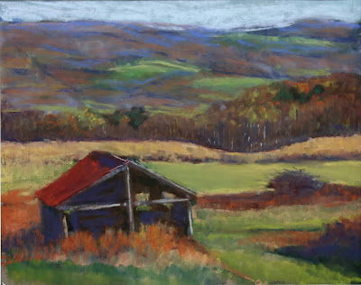
| Genesee Valley Farm, pastel, by Carol L. Douglas |
Driving past yesterday, I was struck by how high above the water these historic buildings are. They stretch along a ridge overlooking the town, which in turn overlooks the river. In fact, that’s true of much of the Mohawk Valley as it winds through the hills and mountains. Nothing old or historic is built on or near the alluvial plains. Only in the 20
thcentury has humankind been foolish enough to build on the river bottoms—most notably the
Governor Thomas Dewey Thruway. Our ancestors could just wait for the Mohawk to fall. Now we need extensive flood control systems. Even with them, the Mohawk is known to rise and inundate communities downstream.
 |
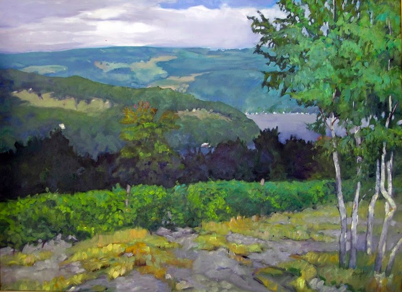
| Nunda farm in autumn, pastel, by Carol L. Douglas |
Today if you build your own home, your contractor will build from a set of architectural plans. In the 19th century, architects designed very grand buildings, but most homes were designed and constructed by local carpenters, and they did a fine job of it, too. There are certain universal designs, and there were trends in house styles, just as there are today. For example, you’ll find T-shaped farmhouses all over North America. That big cube, with a little kitchen addition off to one side, is practical to build and live in. But the proportions of these buildings, their curliques and furbelows, and even the way their outbuildings are placed are unique to every location.
 |
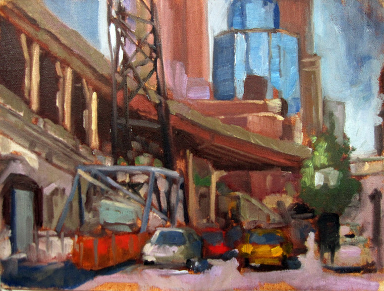
| Home port, by Carol L. Douglas |
In the South, kitchens were often separated from the main house. In Maine, farmsteads were built as
connected farms. The house is connected to a shed, then to a carriage house, and finally a livestock barn. A characteristic Maine home is a story-and-a-half cape with Greek Revival details. Where most American cellars were built from fieldstone, old homes here often have granite block foundations. I pointed that out to a visiting architectural historian, who was more interested in the bargeboards. “They’re waves!” she exclaimed.
In western Massachusetts and New York, a different kind of 19
thcentury structure is common—square houses with hipped roofs and a cupola centered on the roof. They are frosted with Carpenter Gothic excess. However, the essential form is not Victorian, but rather something new. This basic shape would blossom in the next century as
American Foursquare, our first truly-American architectural form. I grew up in one of these houses. It’s as much of a pastiche as any mini-mansion from the 1980s—Federal-style windows, elaborate Carpenter Gothic brackets, and an Italianate cupola, all pasted on that resolute squareness.
 |
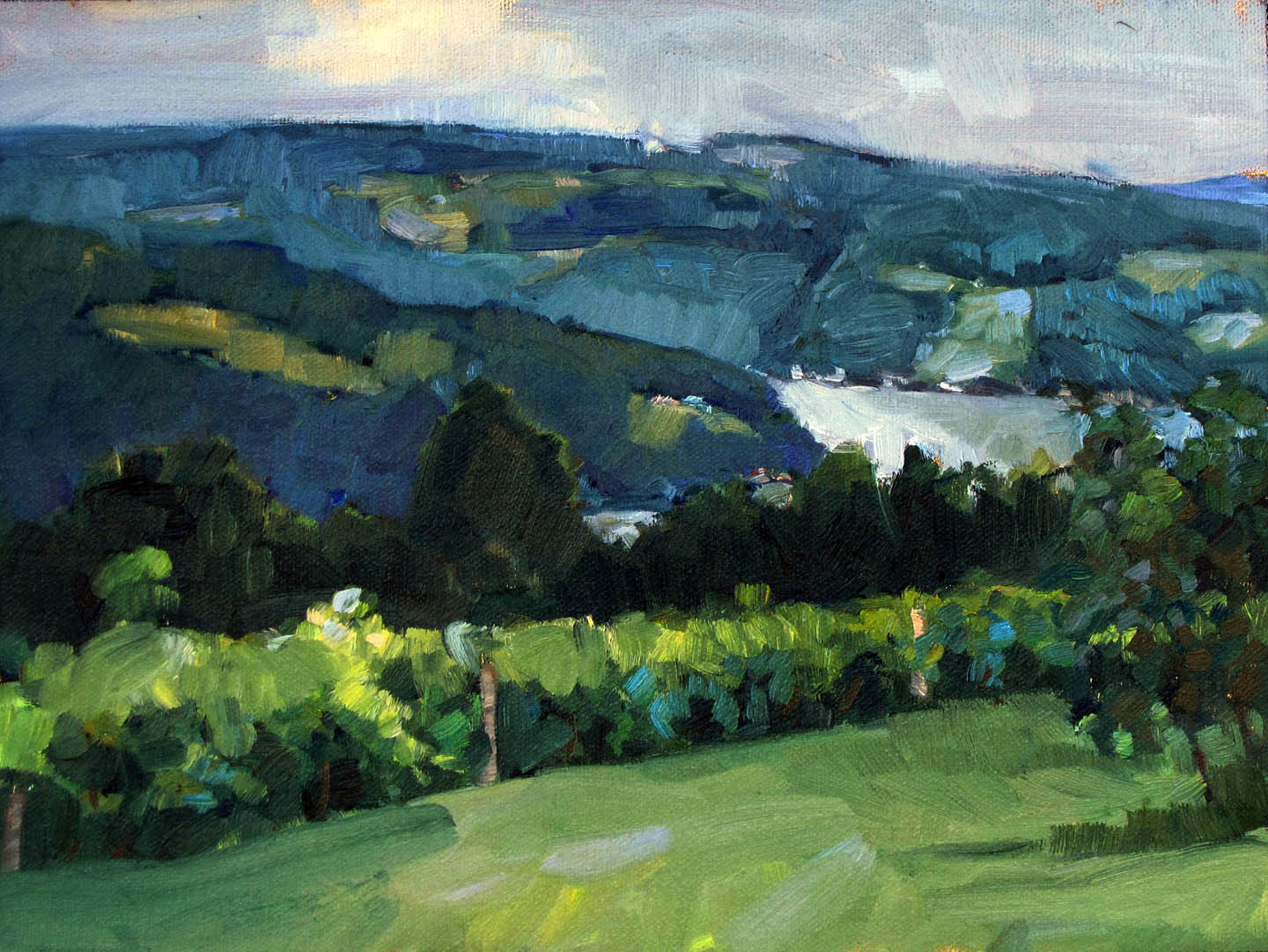
| Field in Paradise, by Carol L. Douglas |
These architectural anomalies are as much a part of the landscape as the hills, rocks, trees and meadows that surround them. My personal instinct is antisocial, to pull back from people to look at nature. However, that’s a painting error, one I fight against. Most of the paintings I love are not of nature alone, but the built environment—Corot’s
The Bridge at Narni (1826) being an excellent example.
I know the Mohawk Valley intimately, and yet there’s always something new to see. These can be teaching moments in our paintings, if only we can slow down enough to see before we paint.


