fbpx

Monday Morning Art School: softly, softly

The edge is where everything is happening. There are many ways to control it.
Brad Marshall’s painting of coral in Maui (unfinished).

Edges are where one shape ends and another starts. This might mean a border between two things, or it might be a fold or shadow within an object. Either way, there are many ways to approach edges. One way to control the line is the lost and found edge.  Softness is another.

My friend Brad Marshall is working on a painting of a coral reef right now, and it’s a stellar example of keeping it soft. He graciously allowed me to use his work here.
Brad Marshall’s color block-in. He’s soft right from the start.
We’ve talked a lot about the importance of line in painting. Sharp edges with high contrast draw your attention. But to be effective, they require other passages where edges aren’t as crisp. In the case of this reef, Brad was seeking a special optical effect of being underwater, where things are blurry and greenish-blue.  
Looking at the screen on which you’re reading this, you’ll note items in the periphery of your vision. The screen is in focus, but the items on the edges are blurred. This is how our eyes work—we have a highly developed cone of vision, and some peripheral vision to keep us oriented. You can take that same principle into your painting, to direct the eye into looking at what you want it to notice.
“Painted midground coral (except for that little one in the crevice. Keeping edges on soft. A little lighter and darker to push it forward from the background,” said Brad.
Brad started his painting softly because of the subject. But it’s also important because the coral at the bottom of the canvas has the potential to be the strongest draw. It’s lighter in color, and it’s closer to the viewer. But Brad, being a pro, isn’t going to be suckered into that rookie mistake. By keeping the painting very soft at the beginning, he is able to control where and what he concentrates on.
This is a studio painting being built in layers. That gives Brad ample time to work with thin paint handled wet-on-wet. In addition to his brushwork, he developed softness by carefully controlling value and hue shifts. Even in his central motifs he started with an underlying natural blur.
“Here is a close-up detail. I wanted to give it a soft-focus look.”
In oil painting, soft edges can be made by dragging a brush from one color to another, or painting directly into another color. Oil paints are absolute champs at blending and softening. So too is watercolor: washes and wet paper will assure you that edges stay soft until you want them to be defined.
Gouache and acrylic (correctly applied and not just mimicking watercolor) are not nearly as useful for blending. However, you can achieve the same effect of softened edges by employing optical blending.
In fact, since the 19th century, many oil painters (myself included) have generally eschewed the broad range of blending that oil paints offer. We’ve been influenced by Impressionism. We use flat blocks of closely analogous color to get the effect of blending without the brushwork.
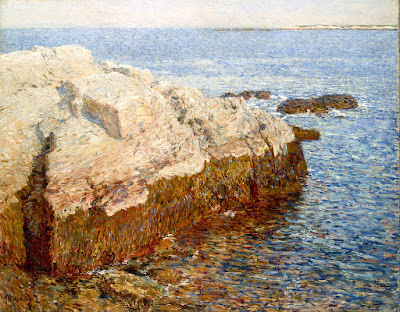
Cliff Rock, Appledore, 1903, Childe Hassam, courtesy Indianapolis Museum of Art
Consider the Childe Hassam painting, above. He used optical blending to create the effect of blurriness that Brad is getting with brushwork. Note that the top of the rock outcrop is the same value as the sea. Your eye doesn’t notice the edge any more than it would have had he blended the edges with a brush.
Hassam used a staggering array of brushwork in his painting to create a variety of edges. However, none of it was done with traditional blending. Looked at closely, each color is distinct from its fellows.

The first day is always the hardest

The coldest winter day I ever painted in Maine was actually in the Brandywine valley in October.
Morning Flight Path, 16X12, by Carol L. Douglas.

I’m at Brandywine Plein Air. We must paint in specific venues each day. That’s a good thing. Chester County, Pennsylvania is historic and hilly, and has no two roads that run in the same direction. I’d spend the whole week lost were it not for good navigation points.

We also must hand in no more than three paintings a day, but are expected to produce between four and ten over four days. This is a clever rule. It prevents an onslaught of paintings at the last minute, which then must be labeled and merchanidized by the organizers. It also stops the artist from endless dithering at the last minute. “Set it and forget it,” as the Ronco rotisserie adsonce famously said. 
Of course, handing off paintings at a designated site requires more driving through the maze of Brandywine roads. I’m not sure this event was doable before the advent of cell phones.
It was cold, dark and miserable. On the rare moments the sky appeared, I rushed to add it.
The proper cure for a head cold is the “two-hat cure,” wherein one lies on one’s four-poster bed consuming Hot Toddies until the hat on the footpost morphs into two. (I got that directly from my doctor, by the way.) Instead, I’m dosing myself with Zicamand shivering in the wind. I should have stopped at CVS and bought Depends before I started coughing. If I weren’t 600 miles from home I’d have quit and gone to bed. On the road there’s no choice but to paint.
Enter Bruce McMillan, a fellow Mainer with an oversized Icelandic sweater and an exuberant personality to match. Without him, I might have died of grumpiness yesterday. I found myself kvetching about the light, the wind, and my lousy painting. He smiled and opened his arms as if to embrace the entire world, yelling into the wind, “What? It’s beautiful here!” He’s right, of course, and it didn’t take much to jolly me back into loving my life.
Blustery day, 12X16, by Carol L. Douglas. Same hedgerow, different angle. The black walnuts always lose their leaves first.
Still, I was—as Brad Marshall so memorably once said—“flailing around.” I texted my first painting to Bobbi Heath at noon, with the note, “crap composition, no focal point. It’s not inaccurate, it’s just ugly.” Well, days like this happen, and the only answer is to get up the next morning and do it again, only better this time. So here I go.
Note: if you enjoy this blog, could you please subscribe in the box on the right? I’ve never worried about subscriptions because most of my readers come from social media. But Facebook, et al, have the power to make me vanish at a single click. Don’t give that to them. You can always just delete the email on the days you don’t feel like reading.

A common footman in the army of art

Plein air painting isn’t highbrow, but it speaks to my soul.
La casa de los abuelitos, by Carol L. Douglas
“You’re lucky to love to do something that people love,” Clif Travers told me soon after we’d met. He meant that sincerely. It’s easier to sell landscape paintings than the large-scale installation piece he’s working on.
The earliest known “pure landscapes” (with no human figures) are Minoanmurals dating from around 1500 BC. Landscape flowered in Rome, Egypt and China. It died out in western art and was rediscovered in the Renaissance.
Rocky, by Carol L. Douglas
In China, the mountain-water ink painting was traditionally the most valued form of picture. Here in the west, landscape occupied a low position in the accepted hierarchy of genres, which went:
  1. History, including all that allegorical stuff;
  2. Portrait;
  3. Genre painting, or scenes of everyday life;
  4. Landscape;
  5. Animals;
  6. Still life.
This hierarchy was established in 16th century Italy. It elevated those things which rendered the universal essence of things (imitare) over the mere mechanical copying of appearances (ritrarre). While the Impressionists did much to knock this on its head, there’s still a decided whiff of lowbrow to landscape painting, particularly the plein air variety. I think it’s because people actually like it.
Some days it rains, by Carol L. Douglas
The 17th century Dutch Golden Agepainters were among the first artists with middle-class customers, so it’s no surprise that they painted lots of landscape. But they were conflicted about it. Samuel Dirksz van Hoogstraten was the century’s most important art critic. He called landscape paintings “the common footmen in the army of art.” But he also recognized that landscape “provides scope for artistic freedom, for coloristic virtuosity and for chance: for a dialogue between Mother Nature and the artist’s own innate ability.”
It’s surprisingly difficult to find data on what genres of art sell the best, but I did find this top-ten list from Art Business Today. It’s for the UK art market, but ours isn’t much different:
  1. Traditional landscapes
  2. Local views
  3. Modern or semi-abstract landscapes
  4. Abstracts
  5. Dogs
  6. Figure studies (excluding nudes)
  7. Seascapes, harbor, and beach scenes
  8. Wildlife
  9. Impressionistic landscapes
  10. Nudes

Beach Grass (Goosefare Brook) by Carol L. Douglas
Obviously, none of us invented landscape painting, but each of us invents ourselves as landscape painters. When we start out, there’s absolutely no market for our work. We create that market through dialogue. We produce our first paintings, gauge the audience’s reaction (through sales and critiques), and then refine our message and reenter the fray with new work. That’s an ongoing process throughout our careers. It’s no different from many other lines of work.
There are artists working out there in splendid isolation, not caring what the audience thinks, but they’re very rare. For most of us, painting is a dialogue, and the other half of the dialogue is the buying public.
Bracken Fern, by Carol L. Douglas
Most artists don’t shape their work because a certain kind of landscape painting will sell better (although we are influenced by our peers and gallerists). But the best feedback we get is often in the form of a purchase.
I don’t paint en plein air because I think it’s somehow higher on a hierarchy of landscape. I do it because it appeals to me on a soul level. My friend Brad Marshall once said, “My clients don’t care if I did it in the studio or out. They only care about the quality of the work itself.” Plein air is not, in itself, a virtue. It’s only when it helps the painting become transcendent that it matters.

Yupo this!

It has all the charm of a milk jug but takes watercolor beautifully.

Marshall Point, oil on Yupo vellum. The bottom right corner was spoiled by potato chip grease.

I’ve been carrying around a package of Yupo translucent watercolor paper all summer, but lacked an opportunity to work with it in any systematic way. Yupo is billed as an acid-free, archival synthetic surface. It has the hand-feel of a milk jug, and a similar milky translucent surface. That’s because it’s made from polypropylene pellets extruded in a factory in Chesapeake, Virginia. So much for my hemp-wearing Green credibility.

The initial wash for the above. It has possibilities.

I find the surface seductive and deep, for many of the same reasons I find cold-wax medium compelling. I’ve been turning over the idea of working with it during my residency at the Joseph A. Fiore Art Center at the Maine Farmland Trust. The point of a residency is exploration, after all.

A detail of the spruces before I started cutting back in. It’s all experimentation, but I liked them better at this phase.
Before I started planning a major project, I needed to prove to myself that the product wasn’t just a gimmick. My main watercolor palette contains a mish-mosh of different paints acquired over decades. That’s not very scientific, but I do know how they behave on both hot- and cold-press watercolor paper.
Brad Marshall got surprisingly similar intensities on the Yupo (left) and cold-press (right). That, I think, is a function of the paint he was using.
Brad Marshall’s scientific control was much better; he pulled out the same Winsor & Newton pocket field kit he used on Wednesday. That’s a good solid kit; I have a similar one. However, it tends to a lighter pigment load than my tube watercolors.
Brad didn’t much like the vellum, but he’s a far more controlled painter than me. I think it works better for the Pig-Pen temperament.
Marshall Point lighthouse. There was no glazing possible in the dark passages; the water simply lifted the paint and redistributed it.
The sheet marks very easily. Next time I work with it, I’ll mount pages on drawing boards while wearing cotton gloves. Yesterday, I worked straight on the tablet with no board at all. It was windy and I found myself using my forearm and fingers to prevent fluttering. My sunscreen and skin oils created a film resist that I could lift with a paper towel and much scrubbing. The potato chip grease, however, made a far more permanent mark. I let paint pool over, but it had absolutely no tooth.
Of course, the same bad practice would mark rag paper as well, waiting to wreck the paper over time.
More rocks at Port Clyde. I found the separation between foreground and background difficult to control. That may mean there are no midtones possible.
Yupo’s main selling point is that you can lift paint up, solving the most significant challenge in watercolor painting. It’s fun, but I don’t think it’s any substitution for thinking out a good value structure in advance. As with all watercolor paintings, lifting affects the paints next to the paint being lifted, and the edges it leaves can be over-pigmented and gummy.
Glazing is next-to-impossible; with few exceptions, it just lifts the bottom layer back up. Glazing is such a fundamental part of watercolor technique that this changes the process altogether. Resign yourself to getting the value and hue right the first time, because you won’t be able to do the small modulations that make watercolor painting such a joy.
In some ways, the process felt like alcohol-marker drawing. At the same time, it encouraged me to finer drawing than cold-press paper ever does. The manufacturer says the paint can be fixed with Krylon Matte Finish. I’ll try that, because some method of permanent fixing is necessary before this product is useful. Putting it under glass would obscure its beautiful surface.

Don’t suck

Brad Marshall gives me some trenchant painting advice.
On the wall at Camden harbor, watercolor sketch, Carol L. Douglas.

I paint with my pal Brad Marshall about once a year—generally at Rye Art Center’s Painters on Location, and occasionally here in Maine. He’s retired from his day job as a sign-painter in New York City, and his paid gig these days is teaching watercolor on cruise ships. That’s influenced his practice. Instead of hauling his big field kit up to Maine in a minivan, he brought a small shoulder bag full of watercolor supplies in a Honda Civic.

This spring, the organizers at Parrsboro International Plein Air Festival gave each participant a hot-press watercolor block from Winsor & Newton. At 7X10, it’s the perfect size to slip into a backpack with my sketchbook, and this seemed like the perfect opportunity to try it.*
The big dark hull conundrum. I still don’t like the solution. It wasn’t until after I made the fatal brushstroke in the far water that I remembered this was hot-press paper. It, urm, doesn’t scumble well.
Since I don’t sell my watercolors, I give them less attention than they deserve. Still, I do a lot of them over the course of the year—as value sketches for bigger oil paintings, to work out composition issues, or when I just don’t have the steam to set up my full oil-painting regalia. Watercolor is a great medium for experimentation.
We painted in Camden, on a dinghy dock. All floating docks drop with the tide, but this dock is accessible by ladder instead of a ramp. It limited my time. Once it was at the point where I could no longer toss my stuff up and over onto solid ground, I was going to have a harder time climbing back up. It would be ignominious in the extreme to have to ask the harbormaster to rescue me.
But it’s all just an excuse to stick our feet in the water anyway. Photo courtesy of Kathy Jalbert.
In a tight harbor like Camden you’ll usually see big visiting boats on the nearest docks. These are too close for a good composition (unless you’re doing a boat portrait) and obscure the boats on moorings. Still, that overlapping jumble of hulls is the nature of the scene. I’ve been experimenting recently on using parts of boats, cropped tight, to suggest that jumble.
Dark hulls, close up, are not an inherently attractive composition. They make for a boring dull strip across the lower half of the paper. If there’s to be any background at all, all that darkness lands on one side and unbalances the painting. Still, it’s such a common situation, and I’d like to devise ways to deal with it.
I’m a mutterer when I paint, I’m sorry to admit. I wrestle through my ideas and problems out loud. Finally, Brad looked over at me and said, “Just don’t suck.” It seemed as good as any other advice, so I took it.
*I think this W/N sample block could convert me to hot press paper, if I can figure out the scumbling question. It’s a nice, flat sheet, easy to handle, and it tolerated the sea mist better than my usual Arches cold press does.

A love affair that’s ended

New York City is no longer the center of the known world for me. How did that happen?
Queensboro Bridge Approach, by Carol L. Douglas

My dream job, when I was young, was to be a cabbie in New York. That had nothing to do with going fast, and everything to do with being aggressive, and in being able to squeeze myself and my car through knot-holes.

I told this to Cornelia Foss one time, as we were scooting north along Madison Avenue. She shuddered. Now I realize that’s because she was older and wiser. (I wish I could take another class from her. At 86, she continues to break new ground as a painter.)
Today I live in a state where the locals, by and large, drive the speed limit and are polite. You’ll never get anywhere here in Maine by driving aggressively. Jump the queue and there will just be another slow-moving vehicle ahead.
Under the Queensboro Bridge, by Carol L. Douglas
This was a strange concept in driving, but I learned to embrace it. Now I roll down my windows and enter that quiet state of pokiness that drives the visitors crazy.
Last time I drove to Queens to meet my pal Brad Marshall, I found myself really irritated with New York drivers. That same exuberance that once goaded me to pass on the right, to joyously sound my horn for no reason, to budge into the box at intersections—it all just annoyed me. We had somewhere to go, and Brad offered to drive. Rare for me, I happily agreed.
In my youth, I said that I would stop going to New York if the vista crossing the George Washington Bridge failed to move me. I saw it a lot in my younger days. I commuted from Rochester to take classes at the Art Students League. I had a crash pad with my friend Peter, on the Upper West Side. We would take classes all day and then I would drive home to Rochester. Rinse and repeat. If I die young, it will be with the consolation that I lived my life very fast.
Underpass, by Carol L. Douglas
I voided that test by moving east. I no longer use the GW to get into the city. Instead, I come down through Massachusetts and Connecticut. There’s no astonishment along that route.
The first sign I was growing cynical about New York came a few years ago, when I met a Southerner for a weekend. She remarked, in passing, at how filthy the city is. That’s one of those things, like your aunt’s fascinating chin hair, that everyone sees but doesn’t mention. But once she commented on it, I began to see detritus everywhere.
I used to love to paint in the city. Now I understand that was the granite calling to me. Much of New York, Washington and Chicago are built of Maine granite. Somehow, I enjoy it more in its natural state.
Staples Street, by Carol L. Douglas
This morning I’m heading back down to Westchester County for Rye’s Painters on Location. Brad’s floating around in the North Atlantic somewhere, but he loaned me his flat. I’m on my own for both painting and driving. Luckily, Painters on Location is always a blast, and I’ll see lots of other friends there.
I still admire New York City, but I’ve met other art scenes that match my personality better. I’ll visit for a blockbuster show, or to see friends. But, as for it being the center of the known world, those days are, sadly, gone for me.

Laid low

Asthma. My body has just told me to spend a little time on self-care. I think that means a pedicure.
Painting at the American Yacht Club with Brad Marshall. (Courtesy Rye Arts Center)

I spent the weekend dealing with asthmatic bronchitis, and yesterday at the ER having it calmed down. This happens. Providing it’s managed, it’s not going to kill me. But it is a sign of fatigue, and it means that I won’t be teaching my regularly scheduled class this morning.

Asthmatic bronchitis is not contagious, but it can be rude. There’s no reason to douse my students with spittle. That’s a pity, because I had a nefariously challenging idea and just the students to rise to the challenge.
One year I shared my painting location at Rye with this fisherman. He explained surf casting in great detail, none of which I remember.
Speaking of this class, there are a few openings. It meets locally in Rockport, ME—outdoors when the weather is fine, and in my studio when it’s not.
Visitors may go home at Labor Day, but we know that the weather in the northeast is at its most beautiful in September and October. It’s cool and crisp. The trees turn in a brilliant panoply of color that contrasts with the lakes and ocean.
The tuition for a six-week session is $200. You can contact me here if you’re interested.
Meanwhile, I’ve cancelled today’s class and I feel badly about it. I have an assignment for my students which I’ll share with you. I will ask them to clip off a bud from an Eastern White Pine and a Black Spruce and render each, in detail, in watercolor, before our next class. If you don’t have watercolor, do it in pencil. This is an exercise in observation, not in artistic sensibility. Assuming I can get out to collect samples, I’ll be doing the same thing.
I must feel better soon because it’s nearly time for Rye’s Painters on Location, September 15-16, in Rye, NY. This show was launched in 2001, making it a granddaddy among plein air events. It certainly has been a major fixture in my calendar. I love going back and seeing old friends in the community and among the artists.
My favorite thing I ever painted at Rye was this painting of the bridge at Mamaroneck. This, alas, is the only photo I have of it.
We set up our easels on Friday and Saturday, September 15-16. For the first time, the Rye Arts Center will post our locations on a Google Map so we can be more easily found. This, I suppose, requires some planning on my part.
I usually paint with my pal Brad Marshall, but he will be in Britain at that time. That leaves me on my own to choose a site. I’m still dazzled by the choices, despite the better part of two decades’ experience: beautiful architecture, a historic amusement park, lots of boats and Long Island Sound itself.
Spring at the boatyard, 14X18, is my silent auction piece. You can bid on it by contacting the Rye Art Center.
Two years ago, Brad and I prepared to paint into a hurricane, but it fizzled. I’m watching the weather reports now, since we seem to be in another season of high activity.
Yesterday I got a note from a reader who lives on St. Martin in the Caribbean, thanking me for publishing Lauren R. Lewis’ information about rescuing water-damaged artwork. The eastern Caribbean islands are, according to the National Weather Service, just now being mauled by this Category 4 hurricane. This isn’t an abstraction. I know people along that string of islands. I pray for their safety. 

Flat-packing the landscape

Painting composition is all about ruthless editing. It’s a creative process, and it’s based on seeing.

Bill’s Yellow (with Admiration), 2005, Cornelia Foss, Houston Museum of Fine Art
Sometimes I hand out little plastic viewfinders to my students. Mine are made of Plexiglas, roughly along the lines of this one. But they are for beginners, to help them start to break down the vastness of the landscape into palatable bites. I don’t encourage reliance on viewfinders, any more than I like working from photos. Art is based on seeing.  Seeing isn’t a mechanical process; it’s a learned art.
Artwork Essential’s viewfinder is based on the Rule of Thirds. When I was in school, I was taught to divide canvases using the Golden Mean. It’s imprinted in my aesthetic, so I still see it as the most graceful compositional device.  Later, I learned about Dynamic Symmetry. All of these are good working systems, and all of them are based on mathematics.
The Golden Mean is closely related to the Fibonacci Sequence.
The human mind, in receiving mode, likes to tarry on puzzles. That’s why we use these complex mathematical systems to compose our paintings. In sending and processing mode, however, the mind ruthlessly regularizes thoughts. If you’ve ever tried to paint a screen of branches as in the Klimt painting below, you know this to be true. You must fight to keep them honest. Left to its own devices, your subconscious mind will line them up like little soldiers.
We “know” compositional rules, and then we see a painting like Cornelia Foss’ Bill’s Yellow (with Admiration) and we realize that all such rules can be set on their heads. Ms. Foss isn’t ignorant of design systems; in fact she knows them so well that she can play with them. Bill’s Yellow wouldn’t have been nearly the painting had she offset the brush and tree in a conventional way. It is monumental because she centered and overlaid them.
Beech Grove I, 1902, Gustav Klimt, New Masters Gallery, Dresden.
Compositions designed with mechanical devices are ‘safer,’ but they eliminate the space needed to make creative discoveries.  I greatly admire the work of painter Mary Byrom. Having now known her personally for several years, I know she endlessly experiments with composition and form. She isn’t getting those arresting compositions by setting up with a viewfinder; she gets them by slogging through damp marshes at twilight, and endlessly tinkering.
Early Dusk, Mary Byrom
“Plein air painting is like a test you take in class,” Brad Marshall told me. “You have to use your knowledge and finish by the end of the class period. There’s no credit for incomplete answers.
“Studio paintings are like essays. You have enough time to do your research, write and rewrite until the work is good enough to turn in.”
There’s room for both in professional painting, but for learning and growth, working from life is critical. That’s why I strongly discourage working from photos in my studio classes. Photos have already done the most important job for the painter: flat-packing the scene.
Confronted with the vastness of reality, all artists must relentlessly, ruthlessly edit what they see into a working design. With photographs, that is already done. And there’s no guarantee that it has been done well.

Come paint with me in my studio in Rockport, ME or my workshop at Acadia National Park.

It’s not me, it’s the light

"Dyce Head Light," by Carol L. Douglas

“Dyce Head Light,” by Carol L. Douglas
In the past year, many people have talked to me about how my paintings have changed. This week I have a visitor from near Ithaca, NY. She’s a painter, so she’s visually observant. She talked about her impressions driving up the coast.
“While the leaves are gorgeous in New York right now, the light and clouds are different here,” she mused. “And the colors are different. We don’t get the clarity of light in New York. There is too much haze.” She went on to describe the light spilling through the clouds as the sun set, the warm golds of the reeds and marshes set against the blue-purples in the shadows and the slate gray of the clouds. It was a lovely word-sketch and it got me thinking.
"Nunda Autumn Day," by Carol L. Douglas

“Nunda Autumn Day” (pastel), was painted before I moved to Maine.
There is nothing wrong with the filtered light of the mid-Atlantic region; it’s why my skin is so flawless going into old age. But there is less contrast in the landscape. Consider the work of Cornelia Foss, with whom I studied and greatly respect as a painter. She is the person who has had the greatest influence on me in terms of thinking about color. Her landscapes are absolutely accurate for Long Island, but they would be flat here in Maine.
"Behind the schoolhouse" was painted as a storm moved in on Monhegan, but the light is still stronger than it would have been in New York (painting by Carol L. Douglas)

“Behind the schoolhouse” was painted as a storm moved in on Monhegan, but the light is still stronger than it would have been in New York (painting by Carol L. Douglas)
I’ve been vaguely aware that I’m focusing more on value in my paintings these days, but I haven’t thought much about why that is. While talking to my guest, I realized it’s just a response to the high-key light of Maine.
"Keuka Lake" is an example of a lovely milky New York sky.

“Keuka Lake” is an example of a lovely milky New York sky.
I’m not really doing anything differently; I’m painting something different. It would be a sign of failure if my Maine looked like my New York, wouldn’t it?

Blown off course

"Shelter," by Carol L. Douglas

“Shelter,” by Carol L. Douglas
When I was younger, my dream job was to be a New York City cabbie. At that time, there was no GPS, so cabbies had to learn the city by heart. Driving in the city was like rolling around in a giant pinball game, and it was fun. Either Maine or old age has softened me up. Coming into Queens on Friday night, I found myself taking the innumerable small rudenesses personally, instead of answering them in the spirit in which they were intended.
In Queens the traffic problem is exacerbated because there’s no way off Long Island except through New York City. There have been Long Island Sound bridges and tunnels proposed since the 1950s, but they never get built. I’m not sure a bridge would do much except allow the metropolis to slop further out of its jar. It sure would change the view.
Brad Marshall and his painting.

Brad Marshall and his painting.
Long Island Sound is an estuary. That makes it an important feeding, breeding and nursery area for migratory fish and birds. It is also among the earliest and most densely settled areas in the United States. Somehow that tension between 400 years of human habitation and nature works to make it a very beautiful place.
I went to Rye intending to paint boats, which are one of my favorite subjects. The American Yacht Club has an anemometer, and on Sunday, winds were gusting up to 45 mph. My canvas would have made a nice little sail that sent my easel flying into the Sound. Instead, Brad Marshall and I hunkered down in the lee of the building, giving us a view of the beach and its riprap breakwater but, sadly, no boats. Still, we both managed to turn out credible compositions.
The American Yacht Club owns this terrific painting of tugs by Jack L. Gray.

The American Yacht Club owns this wonderful painting of tugs by Jack L. Gray.
Between painting and the reception, artists mostly want to stay out of the way. Luckily, the yacht club has a great selection of art, including a terrific model of the America and a lovely painting of tugs by Canadian maritime painter Jack L. Gray. We pottered about peering at things and were very happy.
At the reception, a couple told me that my painting reminded them of the Group of Seven. Tom Thomson and the Group of Seven are my artistic ideal; I think and write about them frequently. It turns out that my new friends are Canadian, and know my home town of Buffalo very well. My painting went home with them and I headed back north, grateful to be driving gently once again.