fbpx

A paean to black paint

Avoiding black keeps you from some of the most elegant colors available in painting.

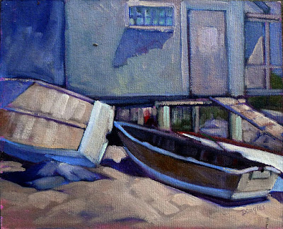
Vineyard, 30X40, oil on canvas, available. Black can make a whole array of beautiful greens.

One of the absurdities of 20th century art education was the injunction to ‘never use black.’ That limits artists from some of the most elegant colors available in painting. The argument is supposedly based on Claude Monet’s palette; he never used black and you shouldn’t either. Like the so-called Zorn Palette, that’s a stew of half-truth and myth. Most artists’ palettes shift over time.

Asked in 1905 what colors he used, Monet said: â€œThe point is to know how to use the colors, the choice of which is, when all’s said and done, a matter of habit. Anyway, I use flake white, cadmium yellow, vermilion, deep madder, cobalt blue, emerald green, and that’s all.” But earlier in his career, he certainly used a wider palette, including black.

The Servant, 36X40, available. Black is invaluable in creating skin tones.

The argument went that Impressionists avoided black because it doesn’t exist in nature. Black certainly does exist in nature: in basalt, in deep shadows, and in the subtle undertones in animals and people.

Moreover, it was argued, the painterly effects created by managing warm and cool hues are richer and brighter than those created by manipulating tones and shades. They’re more brilliant, certainly, because adding black (or white) always reduces chroma. But part of painting is the dance between high chroma and neutrals.

Anyway, Monet’s buddy and fellow founder of Impressionism Édouard Manet used black paint by the bucketful.

Monet said a mouthful in that quote, however, and it wasn’t the list of colors (most of which would not be great choices in the 21stcentury). Most of us choose paint colors purely out of habit. We become familiar with them and develop deep loyalty to them. That’s smart, as long as we choose wisely to start with.

But then the painter often gets into the bad habit of only mixing colors in a certain way. And that, in the tail end of the 20thcentury, meant never using black.

Obviously, you should never make grey by mixing black and white, because it’s lifeless. But there are many subtle colors available only through black admixture.
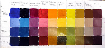
Black admixture chart of my palette. You should make one too.

In painting:

  • Tint is a mixture of a color with white;
  • Tone is a mixture of a pigment with grey (black plus white);
  • Shade is a mixture of a pigment with black.

What we consider acceptable in color-mixing is style-driven, just like everything else. For example, see the Permanent Pigments Practical Color Mixing Guide of 1954, below. It’s all about making shades and tints. That’s a hint about why mid-century paintings looked so grey, and probably why the pendulum then swung so far in the other direction. A little shading goes a long way.
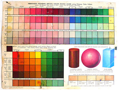
Yes, it’s a mess. It’s been kicking around various paint boxes in my family since 1954.

This antipathy to carbon-based blacks resulted in Gamblin’s introduction of chromatic black, which is a convenience mix and thus a waste of money. Like all ‘hues’ It simply doesn’t mix true.

This product was a response to market demand. It’s very hard to paint without some black on your palette, and the real stuff was banned by the cognoscenti. But when I was in school (she says with a geriatric cackle) chromatic black was something we were taught to mix. That’s a valuable exercise in complements. Buying it premixed in a tube circumvents the point.
Breaking rules

True to a degree, these rules should be taken with a grain of salt.

Cotopaxi, 1862, Frederic Edwin Church, courtesy Detroit Institute of Arts


Objects in the distance are cooler, blurrier, and lighter than objects in the foreground

That is atmospheric perspective in a nutshell, and in most cases, it’s true. But when an artist suspends that rule, we know we’re in for a major freak show. Frederic Edwin Church’s Cotopaxi (1862), is a great example of atmospherics being tossed to the wind. How else would we have known that we were in the presence of a world-changing event?

Bill’s Yellow (with Admiration), 2005, Cornelia Foss, Houston Museum of Fine Art

Never center your composition.

Artwork Essential’s viewfinder is based on the Rule of Thirds. I was taught to divide canvases using the Golden Mean. Later, I learned about Dynamic Symmetry. All of these are good working systems, and all of them are based on mathematics.

The human mind, in receiving mode, likes to tarry on puzzles. That’s why we use these complex mathematical systems to compose our paintings. In sending and processing mode, however, the mind ruthlessly regularizes thoughts. If you’ve ever tried to paint a screen of branches or flowers, you know how true this is. You must fight to keep them honest. Left to its own devices, your subconscious mind will line repeating objects up like little soldiers.

We “know” compositional rules, and then we see a painting like Cornelia Foss’ Bill’s Yellow (with Admiration) and we realize that all such rules can be set on their heads. This wouldn’t have been nearly the painting it is, had she offset the brush and tree in a conventional manner. Centering them makes them monumental.

Lemon Series #4, Dennis Wojtkiewicz, courtesy of the artist. 

Simplify

Hyperrealism has its roots in what Jean Baudrillard called, “the simulation of something which never really existed.” It could not have happened in its current form without the advent of computers and digital photography. They have created a false reality, an illusion of something more perfect than what is actually here. Digital images are, generally, created very quickly. To mimic them in paint requires time and advanced painting skills, including flat, accurate paint handling, modeling, and draftsmanship.

You don’t get to that level of skill overnight. Dennis Wojtkiewicz is one of these masters of the meticulous, best known for large-scale paintings of fruit and flowers. He earned his MFA in 1981, and has taught at Bowling Green State University since 1988.

Michael Simpson, 2007, by Paul Emsley, courtesy Redfern Gallery

Don’t use black.

This myth of modern painting is based on the Impressionists’ avoidance of blacks for shadows. But modern painting can and does use black, which is the basis of shades and tones.

Paul Emsley’s portrait of fellow painter Michael Simpson, above, was painted with just two colors—Mars Violet and blue-black—plus white. “The variety comes from how much the colour is diluted, the extent of the overlaid colour, and the proportions of colours used in the mixes. In my experience, the fewer colours you use, the more shocking are the reactions when you do make subtle changes. Until you begin to experiment, you don’t fully realise how much variety can be achieved with just two colours!”

Wilma, 1932, Albert Carel Willink 

Paint loose.

Magical realism is an art genre that comments on the real world through the addition of magical elements. In highbrow literature think of Haruki Murakami or Salman Rushdie. Much current pop literature, including JK Rowling’s Harry Potter series, could also be described as magical realism.

In some ways, William Blake was the progenitor of Magical Realism painting, because he commented on morality and theology through a fictional universe. I admire him tremendously, but my own efforts in that direction have been failures. My painting style is too loose for subtle expression. To tell a convincing lie, you must have detail.

The lies we tell ourselves about painting

Some have a germ of truth; some are out and out wrong.

Île d’OrlĂ©ans waterfront farm, by Carol L. Douglas. ‘Immediate’ shouldn’t mean half-baked.
Don’t overwork it:This is the most common bromide I hear. I hate it. It encourages painters to stop prematurely, and to not work out the latent potential or problems in the work.
It’s far better to go too far and need to fix your mistakes than never understand your limits or see where you might end up. “Don’t overwork it” is a great way to permanently stunt your growth as a painter.
Replace it with this: “If you can paint it once, you can paint it 1000 times.” It liberates you to scrape out, redraw, paint over, scribe across your surface and otherwise really explore your medium. And it’s actually true.
Cirrus clouds at Olana, by Carol L. Douglas. I couldn’t have painted this had I not learned how to marry edges.
That’s your style: When I was a painting student, I had a teacher tell me that heavy lines were my ‘style’. They weren’t; I just hadn’t learned how to marry, blur or emphasize edges. These are technical skills, and to master them I had to move on to the Art Students League and teachers who understood the difference between technique and style.
Ultimately, we all end up with identifiable styles, but they should be un-self-conscious, the result of putting paint down many, many times. Anything that we do to avoid learning proper technique is not a style, it’s a failure.
Blues player Shakin Smith once told me that his style was the gap between his inner vision and his capacity to render it. That made me stop worrying about style at all.
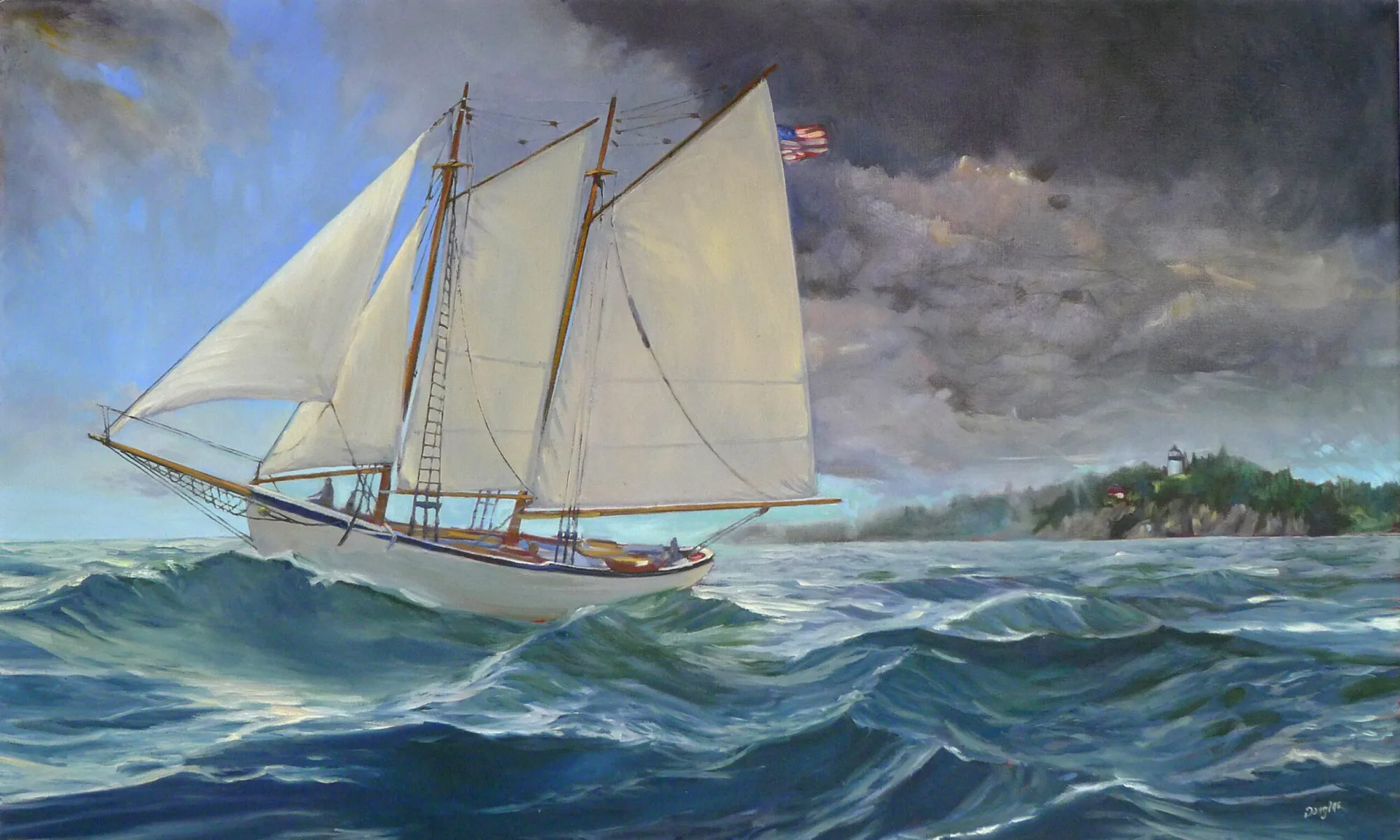
Vineyard, by Carol L. Douglas, courtesy of Kelpie Gallery. The dominant greens in this painting are based on ivory black.
Don’t use black: “Monet didn’t use black, and you shouldn’t, either!” That’s true, but only after 1886, when Monet (apparently) adopted a limited palette. On the other hand, his palette included emerald green, which was copper-acetoarsenite, the killer pigment of the 19th century. There are limits to aping the masters of the past.
Monet made chromatic blacks, which are mixtures of hues that approximate black. Every artist should learn how to make neutrals, and not rely on buying Gamblin’s premix. But there are places where black is useful. One is in mixing greens. Another is in mixing skin tones. Contemporary painting is all about the tints (mixing with white) but ignores shades (mixing with black) and tones (mixing with black and white).
Back in the day, art students learned not just tints, but shades and tones.
Pros use more paint:Beginning artists generally don’t use enough paint, so it’s useful to tell them to increase the amount of paint. However, there are some great painters out there who work very thin—Colin Pageis an excellent example. The problem is in getting to that point. It’s a mastery born of years of experience. To get there you need—annoyingly—to start with more paint.
Fish Beach, by Carol L. Douglas.
If it’s not beautiful, you’re doing something wrong: Seeking beauty instead of truth is a great way to make static paintings. Paintings go through many ugly phases before they’re finished, and sublimating their ragged edges is a great way to drain all the juice out of your painting.

I’ve got one more workshop available this summer. Join me for Sea and Sky at Schoodic, August 5-10. We’re strictly limited to twelve, but there are still seats open.