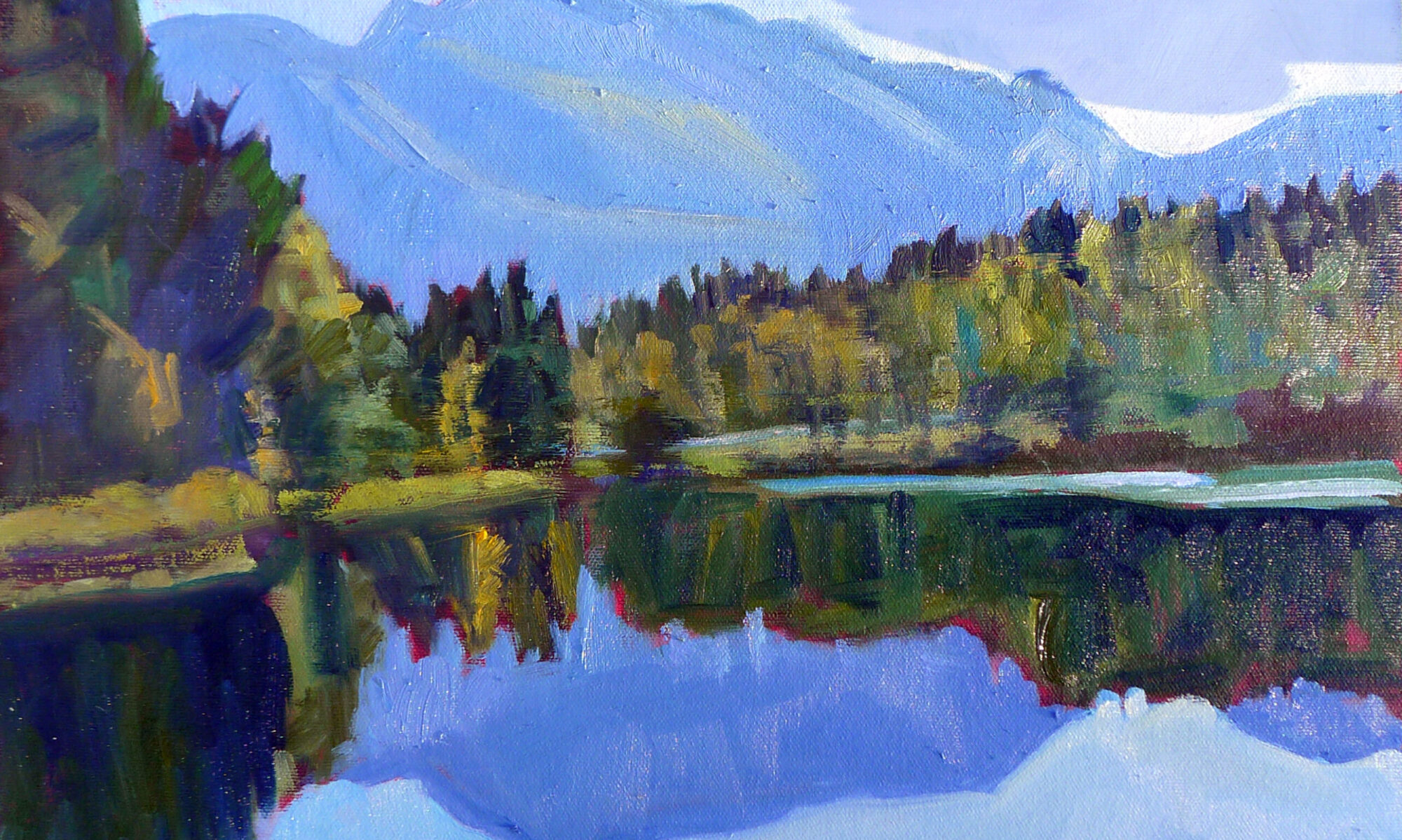
What’s important in painting? It all comes down to drawing and composition.
| Weymouth Bay, 1916, John Constable, uses closely analogous colors to create cohesiveness in a painting of raw natural elements. |
We enter every painting at some point, although there doesn’t need to be a literal ‘path in’ to a painting. It’s more typical (and interesting) that there are a series of focal points that the reader notices and absorbs in order. These are supported by incidental matter that contributes tone and information. A good artist doesn’t leave this to chance. It’s organized in the composition phase and supported in the painting phase. The artist has a set of tools to drive us through his composition. They are:
Value: A good painting rests primarily on the framework of a good value structure. This means massed darks in a coherent pattern, simplified shapes, and a limited number of value steps. In a strong composition, one value generally takes precedence over the others. It in effect ‘sets the mood.’
|
Mother of Pearl and Silver: The Andalusian, 1888–1900, James Abbott McNeill Whistler, National Gallery of Art, Washington, DC. This painting demonstrates the power of value. |
Color: Right now, we focus on color temperature, but that hasn’t always been the case. Every generation has had its own ideas about color unity, contrast, and cohesion. A good color structure has balance and a few points of brilliant contrast to drive the eye. It reuses colors in different passages to tie things together.
Movement: A good painter directs his audience to read his work in a specific order, by giving compositional priority to different elements. He uses contrast, line, shape and color to do this. If nothing’s moving, the painting will be boring.
 |
|
Even the most linear of painters uses movement to direct the viewer in reading his work. The Valpinçon Bather, 1808, Jean-Auguste-Dominique Ingres, the Louvre. |
Line: These are the edges between forms, rather than literal lines. These edges lead you through the painting. They might be broken (the “lost and found line”) or clear and sharp. Their character controls how we perceive the forms they outline.
Motive line: that’s the fundamental line that draws you through the painting, and it’s explained here.
Form: Paintings are made of two-dimensional shapes, but they create the illusion of form. That is the sense that what we’re seeing exists in three dimensions. While some abstract painting ignores form, a feeling of depth is critical in representational painting.
 |
|
Loose brushwork does not mean lack of drawing or preparation. Vase of Sunflowers, 1898, Henri Matisse, Hermitage Museum, St. Petersburg, Russia. |
Texture: A work is called ‘painterly’ when brushstrokes and drawing are not completely controlled, as with Vincent van Gogh. A work is ‘linear’ when it relies on skillful drawing, shading, and controlled color, as with Jean-Auguste-Dominique Ingres.
Unity: Do all the parts of the picture feel as if they belong together, or does something feel like it was stuck there as an afterthought? In realism, it’s important that objects are proportional to each other. Last-ditch additions to salvage a bad composition usually just destroy a painting’s unity.
Balance: While asymmetry is pleasing, any sense that a painting is heavily weighted to one side is disconcerting.
Focus: Most paintings have a main and then secondary focal points. A good artist directs you through them using movement, above.
Rhythm: An underlying rhythm of shapes and color supports that movement.
Content: I realize this is a dated concept, but it’s nice if a painting is more than just another pretty face, if it conveys some deeper truth to the viewer.

