fbpx

Monday Morning Art School: how to draw an angel

Angels are devilishly difficult to draw, even though we all ‘know’ what they look like.
Choir of angels from the Ghent Altarpiece, early 15th century, by Jan van Eyck, courtesy Sint-Baafskathedraal, Ghent
The Bible is notorious for its lack of description when it comes to celestial beings. The Archangel Michael appears to Daniel and all the prophet can say is that Michael looked like a man. The angelic form also differs depending on context. Mostly, though, angels are spirit beings. You, the artist, have a lot of latitude in drawing them.
Still, we all ‘know’ what angels look like: they are infinitely sweet, sing in choirs, have wings and ringlets and wear white robes.
Wing of a European Roller, watercolor on vellum, 1510-12, Albrecht DĂźrer, courtesy of the AlbertinaVienna
The gap between the Biblical text and tradition has bedeviled artists through history. For example, who says that angels have to have bird wings? I’m not the first person to note this. Jan van Eyck gave the Archangel Gabriel fabulously iridescent wings in the Ghent Altarpiece, just like a bug. William Blake, that old curmudgeon, gave the angel of Revelation no wings at all.
Albrecht DĂźrer painted a dead European (blue) roller twice, meticulously observing its plumage and structure. His research paid off: his angels never suffer from static, limp wings.
Dead bluebird, watercolor on vellum, 1510-12, Albrecht /DĂźrer, courtesy of the Albertina, Vienna
If you try this at home, a turkey or chicken won’t do. The modern grocery store versions have had the flight bred out of them. A bird’s shoulders—or scapula—are actually part of its wings. In the wild, they’re strong and muscular. After all, most birdlife revolves around flight. If angels are to fly, their wings must be part of their structure, not just pinned on as in a Christmas play.
The Expulsion from Paradise, 1510, woodcut, Albrecht DĂźrer. He’d studied wings enough to know how the different coverts, or sets of feathers, move.
Human shoulders are adapted for operating our arms and hands. Winged angels must have two sets of scapula and the muscles to operate both. That’s hard to imply in a painting, but the best ones have the wings operating in parallel with the shoulders.
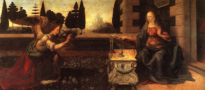
For most of art history, angels were depicted wearing the luxurious robes of the high princes of their day. The Renaissance artist often didn’t give a lot of consideration to tailoring wing-sleeves into these gowns. Sometimes they look as if the wings are sprouting from the drapery.  Leonardo da Vinci (as usual) had an ingenious solution in his Annunciation. The archangel Gabriel wears feathers around the base of his wing that echo the poufs of his sleeve. Tres chic!
The Annunciation, 1474, Leonardo da Vinci, courtesy the Uffizi Gallery
Angels were depicted in togas—the garb of ancient, pagan Rome—in the fifth century mosaic cycle of the Basilica di Santa Maria Maggiore in Rome. I particularly like the contrast with the hipsters in their modern dress at the bottom.
Angels in togas from the Basilica di Santa Maria Maggiore, Rome.
If you extend that to modern life, you’ll dress your angels in jeans and a t-shirt. These, however, can be unsatisfying to draw. Here is a quick lesson on drapery if you want to be traditional.
Halos were used in the iconography of many ancient people, including the Romans. Halos were adopted by early Christian artists to indicate that here was something worthy of veneration. The new naturalism of the Renaissance pretty much did away with them. If you want to add one to your angel, make sure you get your ellipse right by following the instructions here.
Song of the Angels, 1881, by William-Adolphe Bouguereau, courtesy of the Getty Center.
By the time William-Adolphe Bouguereau painted Song of the Angels in 1881, angels had been sanitized and softened, undergoing a gender transition in the process.
Historically, angels were depicted as male and terrifying. However, the paucity of description in Scripture allowed artists wide latitude. With the Enlightenment, angels became less frightening. This is when they began to transition into females in popular culture. (A classic case of a profession letting women in after its power has diminished.)
Worse, they started showing up as infants, in the form of putti.
Eastern Orthodox icon of a tetramorph cherub, depicting four essences in one being. Is there anything cute about this? 
Putti were originally meant to symbolize the profane passions of the pagan Romans. That’s why Cupid is frequently depicted as a winged boy. In the Baroque period, however, putti came to represent the omnipresence of God. Weirder, they became conflated with the Biblical cherubim. How cherubim—the fierce, serious beings that guarded the Garden of Eden—became fat little boys is one of the enduring mysteries of art.
This post first appeared last Christmas. I solemnly promise that my vacation ends after the new year, and I’ll be back with more art instruction, art history, and art criticism. Happy New Year, one and all!

Monday Morning Art School: how to draw an angel

Angels are devilishly difficult to draw, even though we all ‘know’ what they look like.
Choir of Angels from the Ghent Altarpiece, early 15th century, by Jan van Eyck, courtesy Sint-Baafskathedraal. Ghent

The Bible is notorious for its lack of description when it comes to celestial beings. The Archangel Michael appears to Daniel and all the prophet can say is that Michael looked like a man. The angelic form also differs depending on context. Mostly, though, angels are spirit beings. You, the artist, have a lot of latitude in drawing them.

Still, we all ‘know’ what angels look like: they are infinitely sweet, sing in choirs, have wings and ringlets and wear white robes.
The gap between the Biblical text and tradition has bedeviled artists through history. For example, who says that angels have to have bird wings? I’m not the first person to note this. Jan van Eyck gave the Archangel Gabriel fabulously iridescent wings in the Ghent Altarpiece, just like a bug. William Blake, that old curmudgeon, gave the angel of Revelation no wings at all.
Wing of a European Roller, watercolor on vellum, 1510-12, Albrecht DĂźrer, courtesy of the AlbertinaVienna
Albrecht DĂźrer painted a dead European (blue) roller twice, meticulously observing its plumage and structure. His research paid off: his angels never suffer from static, limp wings.
Dead bluebird, watercolor on vellum, 1510-12, Albrecht /DĂźrer, courtesy of the Albertina, Vienna
If you try this at home, a Christmas turkey won’t do. They’ve had the flight bred out of them. A bird’s shoulders—or scapula—are actually part of its wings. In the wild, they’re strong and muscular. After all, most birdlife revolves around flight. If angels are to fly, their wings must be part of their structure, not just pinned on as in a Christmas play.
The Expulsion From Paradise, 1510, woodcut, Albrecht Dürer. He’d studied wings enough to know how the different coverts, or sets of feathers, move.
Human shoulders are adapted for operating our arms and hands. Winged angels must have two sets of scapula and the muscles to operate both. That’s hard to imply in a painting, but the best ones have the wings operating in parallel with the shoulders.
The Annunciation, 1474, Leonardo da Vinci, courtesy the Uffizi Gallery
For most of art history, angels were depicted wearing the luxurious robes of the high princes of their day. The Renaissance artist often didn’t give a lot of consideration to tailoring wing-sleeves into these gowns. Sometimes they look as if the wings are sprouting from the drapery.  Leonardo da Vinci (as usual) had an ingenious solution in his Annunciation. The archangel Gabriel wears feathers around the base of his wing that echo the poufs of his sleeve. Tres chic!
Angels in togas from the Basilica di Santa Maria Maggiore, Rome.
Angels were depicted in togas—the garb of ancient, pagan Rome—in the fifth century mosaic cycle of the Basilica di Santa Maria Maggiorein Rome. I particularly like the contrast with the hipsters in their modern dress at the bottom.
If you extend that to modern life, you’ll dress your angels in jeans and a t-shirt. These, however, can be unsatisfying to draw. Here is a quick lesson on drapery if you want to be traditional.
Halos were used in the iconography of many ancient people, including the Romans. Halos were adopted by early Christian artists to indicate that here was something worthy of veneration. The new naturalism of the Renaissance pretty much did away with them. If you want to add one to your angel, make sure you get your ellipse right by following the instructions here.
Song of the Angels, 1881, by William-Adolphe Bouguereau, courtesy of the Getty Center.
By the time William-Adolphe Bouguereau painted Song of the Angelsin 1881, angels had been sanitized and softened, undergoing a gender transition in the process.
Historically, angels were depicted as male and terrifying. However, the paucity of description in Scripture allowed artists wide latitude. With the Enlightenment, angels became less frightening. This is when they began to transition into females in popular culture. (A classic case of a profession letting women in after its power has diminished.)
Eastern Orthodox icon of a tetramorph cherub, depicting four essences in one being. Is there anything cute about this? 
Worse, they started showing up as infants, in the form of putti.
Putti were originally meant to symbolize the profane passions of the pagan Romans. That’s why Cupid is frequently depicted as a winged boy. In the Baroque period, however, putti came to represent the omnipresence of God. Weirder, they became conflated with the Biblical cherubim. How cherubim—the fierce, serious beings that guarded the Garden of Eden—became fat little boys is one of the enduring mysteries of art.
May you have a blessed Christmas and great peace today, tomorrow and in the year to come.

On Art and Culture

Marc Quinn’s sculpture Alison Lapper Pregnant was the first commission for the Fourth Plinth Project in Trafalgar Square (2005-2007). It combines the best of audacity and craftsmanship.

This weekend I had the good fortune to see the great Irish-American band Solas on the second stop of their “Shamrock City” tour. Solas quarries material earlier explored by the Irish band Horslips: the Irish immigrant experience.
While Horslips were pioneering Celtic rock in the 1970s, Solas is more or less a straight-up Irish traditional band, a tradition that extends back before the mists of time. But layered on top of the music, “Shamrock City” includes a video projection in the style of Ken Burns’ “The Civil War,” which was a groundbreaking documentary released in 1990. I felt in some ways that I was in a cultural time warp.
 
On the way home, we launched into a spirited discussion in which we weighed the superior musicianship of Solas against the innovations of Horslips. Which was absolutely the “better” band? The answer, of course, is both and neither, because all such debates are ultimately pointless—both bands are poetic and moving and justified in their place in musical history.
The experience got me thinking about the ways in which art is and isn’t temporal. Is Bach any less of a genius because the Baroque was in decline at the time he was writing? Time has a way of leveling these bumps in the road. I keenly appreciate the difference between skinny jeans and parachute pants, but I’ll be darned if I can identify the difference between various phases of Regency dress. It’s of absolutely no moment to me that Bach didn’t invent the fugue—when I’m feeling fugal, he’s my go-to guy.
On the other hand, art is also nothing if not relative to its time and place. I was looking at a highly mediocre photo manipulation on Facebook yesterday. It had a middle ground of golden trees, some lavender action in the far distance, and the requisite figure on the foreground.  I said to myself: “That would make a very marketable painting.” Photoshop has, no doubt, affected the way we paint.
There is nothing new in technology driving art. The introduction of new pigments in the 19th century drove French impressionism and indeed made alla prima painting possible. But that is a matter of materials, not outlook. What has changed with the recent acceleration of interactive media is how viewers perceive the world.
We are all familiar with the idea that photography liberates the visual artist from the need for representation. We’re less easy with the idea that it also creates other obligations. What magic can painting create to compete with Peter Jackson’s “The Lord of the Rings” trilogy?
At first glance, heeding the siren call of mass media seems like inspiration, but it stops the artist from looking for their internal voice. Despite any other consideration, that internal voice must be individual; it must have the attitude of “f— it all,” which is the polar opposite of whatever mass media is driving toward. In fact, that inner “f— you” is the most important tool an artist has.
We live in one of the most beautifully-designed worlds in history, certainly the best-designed period in my lifetime. One need look no further than modern cars on the highway. With the exception of the Nissan Juke, cars are far more beautiful than they’ve ever been before. Modern architecture is beautiful, modern highways are lovely, and if I compare the humble disposable pen of today to that of my youth, I’m practically transported.
Part of the improvement is in materials, part is because we’ve shaken off the thrall of modernism and are again paying attention to history, and part of it is computer design. Part of it may also be a first glimmer of a change in attitudes about art—the end of the cult of genius.
Not comfortable? You’re not smart enough!
Frank Lloyd Wright—peace be upon him—was unquestionably a 20th century genius. In fact, he was such a genius that all minor matters such as livability, waterproof roofs, etc., were subservient to his brilliance. Heaven help you if you found his interiors damp, dark, or uncomfortable, or couldn’t read a trashy novel seated in one of the chairs you were required to keep in situ. Elevate your thinking!
However, nobody could accuse him of ignoring craftsmanship, which sets him apart from many other geniuses. In visual arts for the last century, audacity has generally been revered above craftsmanship.
This semester, my Sandy was required to watch a movie in her graduate-level Art Theory and Criticism class. I repeat her description, because I cannot find the actual video without wading through a lagoon of porn: “Naked men smeared bright red lipstick slowly, erotically, all over the lower half of their faces, then danced naked. In the next scene, they were in a pile, naked. Then one man grabbed another’s penis and flung it.”*
The point of showing this movie in an art theory class was that audacity quickly pales. One must constantly accelerate the offensiveness of the material to engage the viewer. But where is craftsmanship in this? If American teens can effortlessly film their own naked bodies with their phones, how can it be a question of skill?
Jake and Dinos Chapman’s Turner Prize-winning sculpture, entitled Death (2003). Yes, they’re audacious,
but it makes me think that if you’ve seen sex once, you’ve seen it a thousand times.
There was a proverb that still had some currency when I was young: “He that touches pitch shall be defiled.” This proverb presumed that purity is a value worth preserving. A Victorian could not have seen that video without feeling that he had “touched pitch,” but I can’t imagine an American born after 1960 who has any clue what that proverb means. But this too—as every paradigm ever has—shall pass.
So how does one move past audacity? Marc Quinn’s “Alison Lapper Pregnant” to me is the apotheosis of the modern ideal. The model is obviously handicapped, suffering from a congenital disorder that left her without arms and with truncated legs. She was raised in an institution. This is, frankly a far more brutal reality than any mincing, lipstick-wearing penis-slappers could ever attain. And the sculpture itself—carved from Carrara marble, is technically beautiful.
*You try searching for this on the net!