Here are some easy ways to condemn your outdoor painting. Try to avoid them!
 |
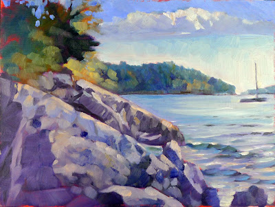
| October afternoon at Beauchamp point, by Carol L. Douglas. The weight is off the edge, and the rocks are accurate. Now if I could just remember what I did with this painting. |
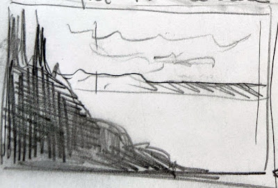
Weight all to one side. Often, we’re attracted to a scene where a large, dark mass in the foreground breaks to show us a distant, high-key vista, like mountains or the sea. That is very appealing in life, but plopping a large object on the far side of your canvas is simple bad design. Look for ways to balance lights and darks. Breaks in the tree screen, changing the angle, or some value adjustments will make it flow better.
 |
| It’s easy to throw all the weight on one side when drawing a shoreline or a mountain vista. |
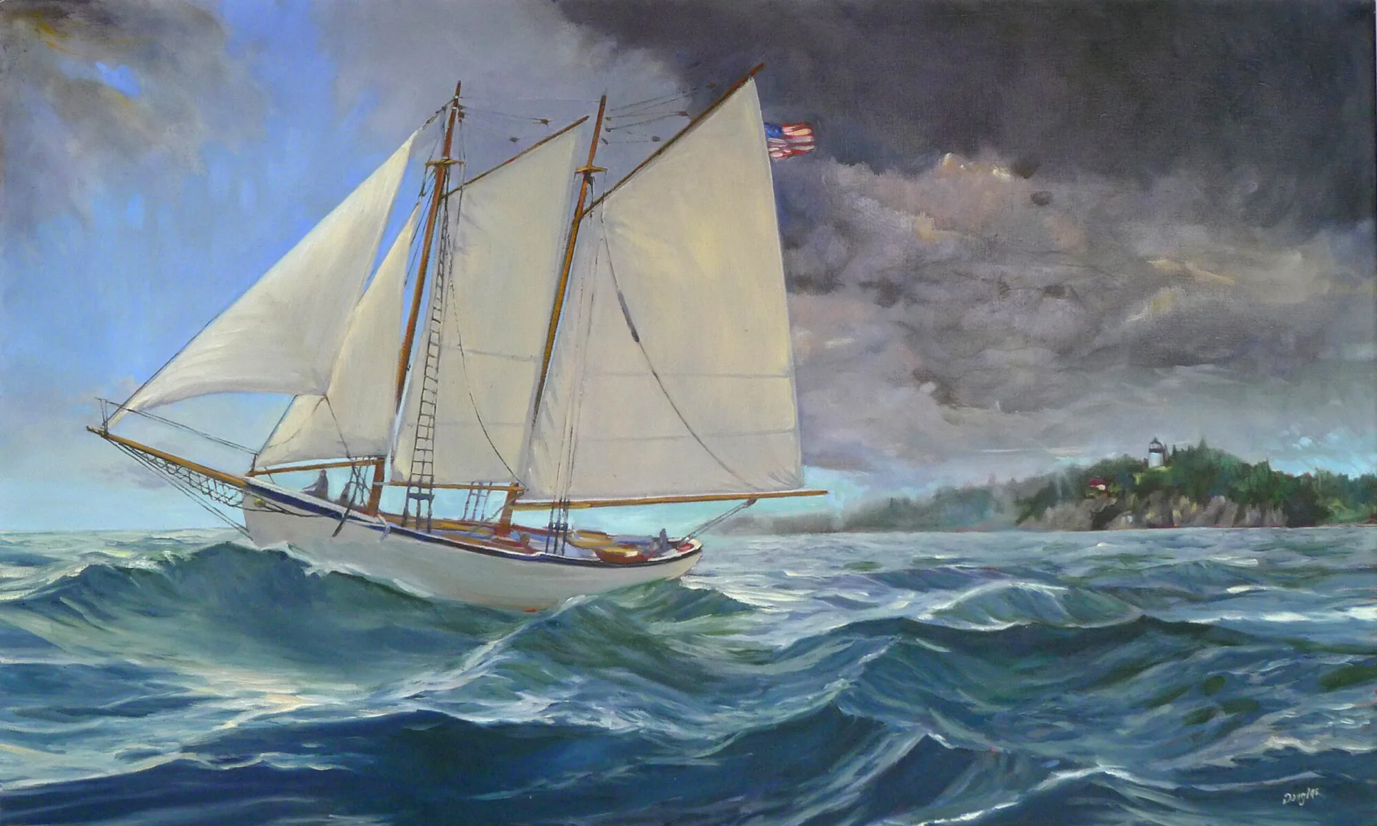
Tchotchkes to try to fix a bad composition. Yes, there are boats, branches and gulls in nature, and they have a place in your painting. They shouldn’t be added at the last minute to fix an unbalanced composition. If you find yourself frequently tempted to add ornaments at the last minute, you’re probably not spending enough time on your drawing.
| Tossing a gull, a branch, or a boat in there at the last minute is just going to look goofy. |
Going straight to canvas. A good drawing—in a sketchbook, not on your canvas—sometimes seems like a waste of time, but it serves three important purposes. It’s how you sort out good vs. bad compositions. It gives you a chance to explore the subject without making a muddy mess with paint. And it gives you reference that can outlast changes in the weather, the light, or even your subject leaving.
Marking outlines on a viewfinder is no substitute for a good sketch, which is why I don’t permit them in my classes. The primary point of a sketch is to think.
No focal point(s). A painting is read by its viewers, and part of your job is to control how they do that. You may have only one focus, or you may have several that are noticed in order of importance. Your preparatory drawing should have helped you narrow this down. Now it’s your job to make those points draw your viewer. How do you do this? You have color, line and detail to drive the viewer’s eyes.
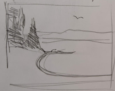
| Shorelines are not perfect ellipses. |
Too much detail too soon. Detail is the last thing you should worry about when painting. Your masses should be blocked in, shadows laid down, and colors organized before you worry about the texture of trees, rocks and grass.
Think for a moment what it would be like if you could see every leaf and blade of grass simultaneously. Our eyes protect the brain from snapping with overstimulation by only focusing on one thing at a time. Do your viewers a favor and make those choices when you’re painting. Apply detail sparingly.
Not seeing past the shore ellipse. Perfect ellipses are lovely in painting, but they’re not great for shorelines. Most shorelines don’t curve perfectly, but are broken by irregularities. Even when they’re perfectly smooth, they curve less at the top than at the bottom—that’s perspective. And within the curve of a cove, there are waves and tidal lines that break the regularity. If you’re going to draw the long curve of a shore, take the time to learn its real shape. And you don’t need to include the whole, long edge for the viewer to get the point.
 |
| A trifecta of bad design: a goofy ellipse, all the trees on one side, and a gull added to try to balance the composition. |
Rocks are not potatoes, and trees are not popsicles. When I painted in Scotland last month, the first thing I noticed is that the granite rising out of the North Atlantic wasn’t exactly the same as the granite on the American side. The Iona stone is pinker and studded with greenstone.
Different minerals cleave and erode differently. How they break and tumble gives rock faces their character. Rocks are almost never brown or simple grey. They’re an amalgam of beautiful colors ranging from blue-green to burnt orange. Likewise, trees branch very differently depending on their species. Foliage colors vary, as does the density of the canopy.
You don’t need to be a geologist or botanist to notice and appreciate these differences, and getting them right is what gives a painting authenticity.
