fbpx

Look in your own backyard

I don’t need to go anywhere to see the beauty of autumn. It’s right here.

Thicket, by Carol L. Douglas

Maine’s official state motto is Dirigo, which means, “I lead… slowly.” Or, as our unofficial state motto reads, “35 mph was good enough for my grandfather, and it’s good enough for me.” Route 1, the state’s major north-south (or east-west, depending on how you look at it) road, is mostly a twisty two-lane highway. For the most part, you can’t pass. It’s pointless to try, because there’s another slowpoke a mile ahead. Except when you get to Portland, where 55 means 77. Sometimes I go there just to remember how to drive fast.

As a recovering New Yorker, I’ve learned to slow down. In the summer, there will be out-of-staters bearing down on my bumper, and a few local idiots as well. They are often boiling more merrily than a lobster boil, waiting impatiently for their chance to pass.

Autumn Farm, by Carol L. Douglas. Available through Maine Farmland Trust Gallery.

In the early stages of pandemic, my car went weeks without a fill-up, but recently I’ve been driving more—up to Schoodicto teach, and down to Portland for doctors’ visits. This week I painted with Plein Air Painters of Maineat a roadside rest stop in Newcastle. It’s about 45 minutes from my house. Alas, it was a misty, overcast day, and the marsh grasses’ color was muted. I painted a wild apple tree instead.

Engine lights came on as I headed home. I stopped and read the codes. There were twelve of them. My poor old Prius has 276,000 miles on it, and it’s getting fragile. No more long trips until I figure this out.

The Dugs, by Carol L. Douglas. Available.

We’re at a glorious moment in the seasonal pageant. The maples have stopped flaming red and yellow. Now the oaks are doing their star turn, arrayed in burnished gold. The other reticent tree that shines this time of year is the wild apple tree. They don’t have much color in their leaves, but they’re covered with bright red fruit. Johnny Appleseed may never have visited Maine, but his influence was certainly felt.

I usually don’t have red on my palette for landscape painting, since most reds in nature can be approximated with cadmium orange and quinacridone violet. However, there was a small ironwood tree in Wednesday’s painting. Its foliage was so intense that I couldn’t hit that note without a spot of naphthol red.
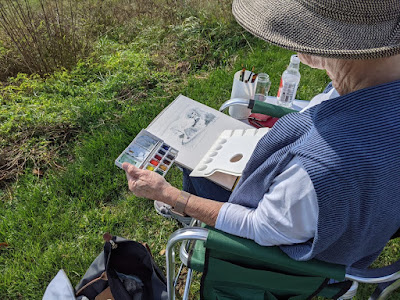
Annie Kirill doing a value study in plein air class at Thomaston. It’s been a spectacular year, weather-wise.


This week, my plein air class went to an unofficial pocket park in Thomaston. It’s not on any maps, but it’s behind the Maine State Prison Showroom It has a lovely view of the St. George River, but you would never know about it if you didn’t have inside information.

The gold of the oaks is gorgeous, but it’s the last player on the autumn stage. In a few weeks, empty branches will be rattling in a fierce November wind, and these beautiful days will be a memory.

Autumn is my favorite time of year, but I never seem to get much painting done. I’m committing myself to being out there on every good day from now until the snow flies, capturing the last glimmers of summer beauty before it goes. And not wasting my time driving, either, but setting up in my own backyard.

A side note: with all the conversation about COVID, we forget the very real threat of Lyme Disease. This morning my husband found a tick embedded in his leg. Even after the first frost, they’re still hanging around. Have a care.
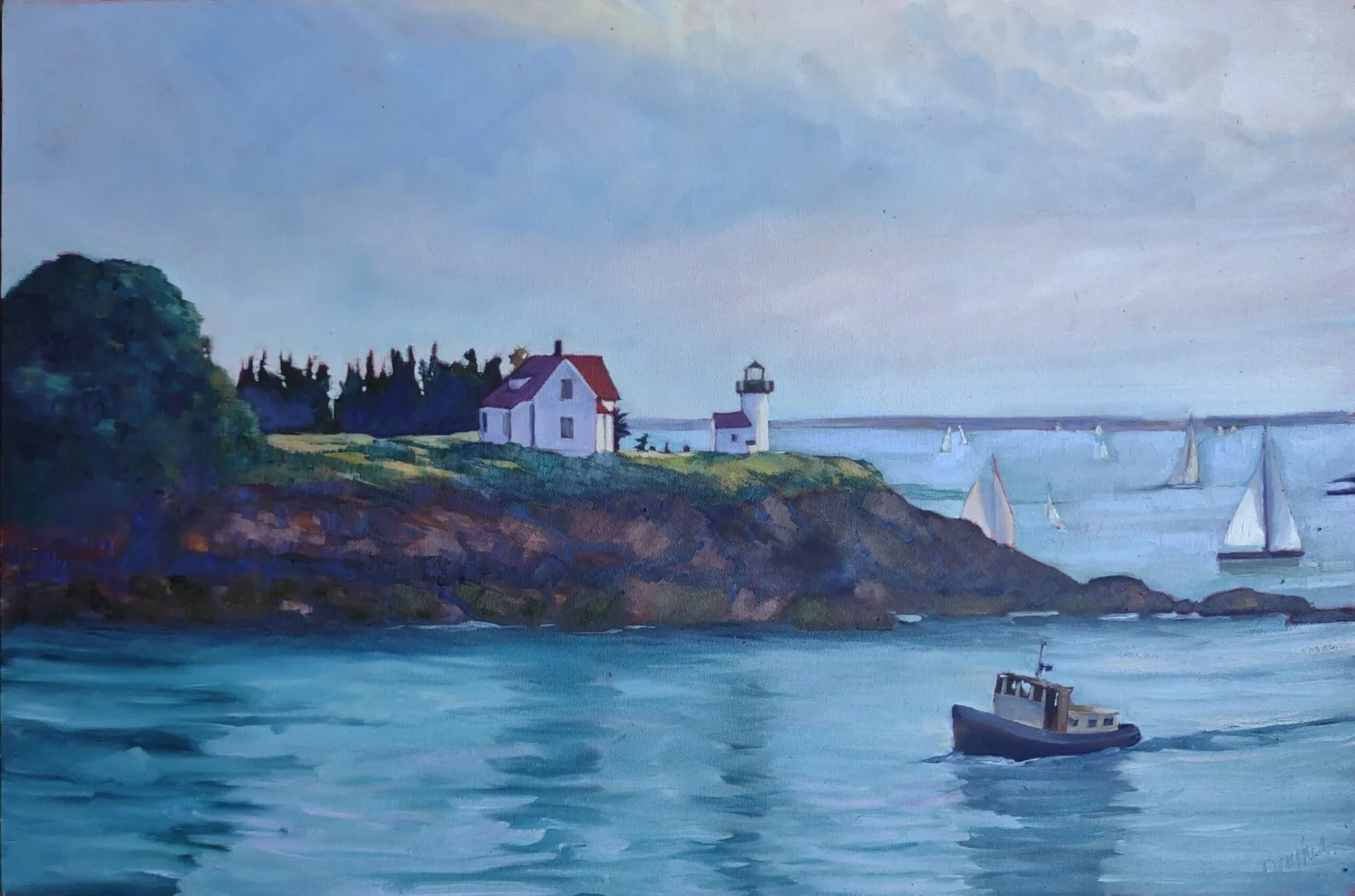
Monday Morning Art School: The color of light

The season of mist and mellow fruitfulness is upon us. Let’s talk about the color of light.
Boys on the Beach, JoaquĂ­n Sorolla, 1908. There is warm light with cool shadows, but there’s also a strong warm reflection from the sand on which the figures are resting. 
What we call “light” is really the narrow band of electromagnetic waves that our retinas can perceive. This narrow band is comprised of the colors of the rainbow, or what we sometimes call ROY G BIV. (There really isn’t an indigo; it’s there so that Roy has a pronounceable surname.) Each of Roy’s color names corresponds to a specific wavelength. For example, blue is about 475 nm; red is about 650 nm.
Valencian Fishwives, JoaquĂ­n Sorolla, 1903. Here the light is cool and the shadows are warmer.
When the whole visible light spectrum strikes your eye at the same time, you perceive white. This is not a color in itself, but the admixture of a bunch of colors. In the real world, this is never a pure mix. The atmosphere bends light just like a prism does, so what you see is always tinted. The light might be gold and peach at sunset and blue at midday. Impurities in the atmosphere also give us the energetic indigo-violet of the far distant hills—the farther away something is, the more likely dust has filtered out the higher wavelengths (the warm colors).
Return from Fishing, JoaquĂ­n Sorolla, 1894. The light is warm, the shadows are cool, and the places where the light is going through the sails are warmer still, since they’re filtered by the off-white fabric.
Just as all the colors together form white light, the absence of light is total blackness. But unless you’re in a cave or darkroom, that’s a theoretical construct. There’s always reflected light bouncing around in the shadows, and that light gives the shadows its color. It’s never black and it’s unlikely to be grey, either.
Looking for Shellfish, JoaquĂ­n Sorolla, 1905. A warm light comes from our side of the figure, but there are warm shadows—the result of local color reflection from the rock. Likewise the bottom half of the torso reflects strong cool tones from the water and anchors the boy into the sea.
If the color of the light is essentially warm, the color of the shadows is almost always going to be cool, and vice-versa. Knowing this and identifying the color of the light and shadow is the first step to a good landscape painting.
Catalonia: the Tuna Catch, from Visions of Spain, JoaquĂ­n Sorolla, 1919. In this case, most of the painting is in shadow, and what light there is, is filtered through the yellow awning. It is the distortion of the light-dark color scheme that tells us viewers that we are in an enclosed space.
The exception to this is an object in filtered light. Its shadows and lighter passages will be variations of the same color temperature. This is how we instinctively know that something we’re seeing is under an awning, for example.
Study the Spanish painter JoaquĂ­n Sorollato understand the color of light. He was a master at painting white fabric in a variety of circumstances, and comparing the light passages to the shadow passages will tell you much about managing the color of light in your painting.
This post was originally published in 2015. Let me know if you’re interested in painting with me aboard the schooner American Eagle in late September.