fbpx

Monday Morning Art School: repetition, pattern and rhythm

Variation is your friend when you’re striving for movement in your painting.
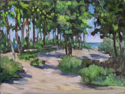
Beach Saplings, Carol L. Douglas
“You have a great sense of visual rhythm,” I told the young artist.
“I’m not sure I even know what that means,” he answered.
“Well, I’m not sure I do either, but I’m sure that between the two of us, we can figure it out,” I replied.
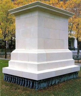
Public Figures, Do-Ho Suh 2001 Art Experience:NYC. The artist understood how to create movement enough that he intentionally suppresses it for a powerful political statement.
Rhythm creates visual tempo that provides a path for the viewer’s eye to follow. It’s closely aligned to movement and action, and it’s usually achieved through the repetition of lines, shapes and colors.
Rhythm builds on two other artistic concepts: Repetition, which is one object or shape repeated, and pattern, which is a combination of elements or shapes repeated in a recurring and regular arrangement. Rhythm is the song produced from these elements. It can be random, as in a pottery glaze, or obviously patterned.
The basic building block of rhythm is a motif. It need not be a real object. It can just as easily be an abstract shape.
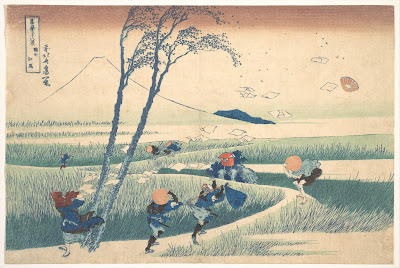
Ejiri in Suruga Province, c. 1830, Katsushika Hokusai, courtesy Metropolitan Museum of Art
Ejiri in Suruga Province demonstrates the importance of motifs, rhythm and repetition in creating a sense of movement. Katsushika Hokusai wanted us to understand that it was a very windy day. The blowing papers, the pattern of the grasses, the figures themselves and the doubled tree trunks are different motifs. They’re running across each other in different rhythms, giving an intense sense of motion to the foreground. This contrasts with the utter stillness of Mount Fuji in the background.
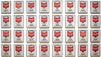
Campbell’s Soup Cans, 1962, Andy Warhol, courtesy MoMA

Repetition can lift the prosaic into a new level, as Andy Warhol’s Campbell Soup Cans illustrate. Warhol went to his local grocery store and bought every flavor of soup Campbell was then making, 32 in all. Alone, one can of soup was meaningless; blocked together on shelves as at a grocery store, they created an immediately-recognizable symbol of the plentitude of American culture. (When asked why he painted soup cans, Warhol said, “I used to drink it, I used to have the same lunch every day, for twenty years.”)
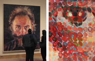
Lucas, 1986-87, by Chuck Close, fair use. His changing mark-making provides the only relief in these remarkably static portraits.
The work of American painter Chuck Close demonstrates the ability of rhythm to gin up an otherwise static painting. His first  paintings were monumental monochrome hyperrealistic portraits. By the 1980s, he was superimposing a grid over them, breaking down the image into a series of dashes, dots, thumbprints, paper, or shapes. The pixelization gives them a degree of dynamism the earlier paintings don’t have.
How can you apply those principles of rhythm to your work?
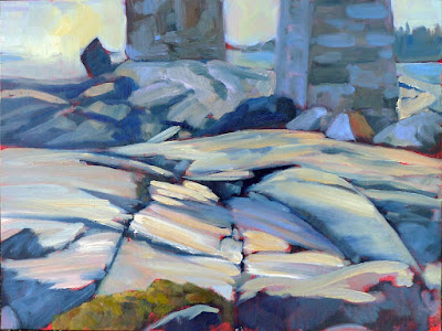
Under the Marshall Point Light, Carol L. Douglas
Don’t be so quick to eliminate all evidence of the built world from your landscape paintings. Cars, telephone poles, houses and roads all create interesting visual patterns.
Be conscious of the rhythmic motifs in your subject before you start painting. Overlapping hills, granite outcroppings, tree patterns, and water ripples are all complex rhythmic patterns. Rhythm is a fundamental attribute of nature. Focus on it.
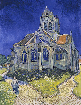
The Church in Auvers-sur-Oise, View from the Chevet, 1890, Vincent Van Gogh, MusĂ©e d’Orsay
Mark-making is an excellent way to insinuate rhythm into a painting. You can drive the viewer’s eye around your canvas by changing the thickness, length and direction of your strokes. The greatest practitioner of this was Vincent van Gogh; study his work to see how you can apply this technique.
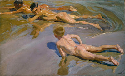
Children on the beach, 1910, JoaquĂ­n Sorolla, Museo del Prado, Madrid

Color is a powerful tool for repeating motifs. See how JoaquĂ­n Sorolla uses color temperature alone to make a pattern of ripples around his bathing children, above. Understand and use color temperature.
Your assignment—should you choose to accept it—is to find and draw a naturally recurring motif in your immediate environment.

Party dogs

What is art? That’s something nobody can agree on.

Great Danes and Doberman Pinschers talk about what they plan to wear to my daughter’s wedding.
Last night I assembled an august panel of artists to help me with a project. Barb is a printmaker with an art degree from University of Maine. Sandy is a gallerist with degrees from Pratt and Hunter College. Together, we dressed 42 dogs in wedding finery. (As so often happens in sweatshops, I ‘forgot’ to pay them.)
“Is this art?” I asked two other artist friends.
“It’s like asking if a soy product in the shape of a chicken leg is food,” said one. “Technically, yes, but it’s bad food.”
“I guess the individual sculptures are art,” hedged the other, who then raised the question of whether they’re craft or even, just possibly, crap.
Two coats of silver and three of glitter… good taste, by the way, is repressive at times.
‘Artistry’ is easier to define than art itself. That means the skill necessary to produce a work of the imagination. But what defines the product of the imagination as art rather than engineering or craft?
Ars longa, vita brevis, wrote Hippocrates. He probably meant that it takes a long time to acquire and perfect artistry, but that the practitioner has only a short lifespan in which to practice. We repeat it, instead, to mean, “art lasts forever, but life is short.” That is, of course, a modern conceit. The ancients understood that “what is seen is temporary, but what is unseen is eternal.” (2 Cor. 4:18)

Barb felt that a DeWalt glue gun was not the tool for the job.
Platosaid that art is always a copy of a copy, an imitation of reality. This leads us from the truth and to illusion, making art inherently dangerous. (Rich words from a philosopher!) Elsewhere, he hinted that the artist, by divine inspiration, makes a better copy of truth than may be found in everyday experience. This makes artists prophets of sorts.
A lot of artists have had a go at defining art. Many are coy, like Marc Chagall, who said that “Art is the unceasing effort to compete with the beauty of flowers–and never succeeding.”
Even in non-traditional art, imitation is a recurring theme. “Art is either a plagiarist or a revolutionary,” said Paul Gauguin. What makes an Andy Warhol painting of soup cans different from the soup cans themselves? Intent and meaning. Pablo Picasso said that art is a lie that makes us see the truth.
In some way, art is the taking of an idea and making it manifest. Otherwise, it’s just a fleeting thought.
Sandy and I sewed their garments, Barb dressed them.
People frequently debate the line between art and craft. Art is useless in practical terms; it exists solely to drive emotion and thought. Fine craft does that and more. It must serve a practical purpose along with being beautiful. Since I didn’t drill their noses out to hold flowers, my party dogs fall on the side of art. 
Neither fine art nor fine craft are mass-produced, however. That is manufacturing. Those brass birds from Home Goods, as inscrutable as their meaning and purpose might be, qualify as neither art nor craft.
“The craftsman knows what he wants to make before he makes it. The making of a work of art
 is a strange and risky business in which the maker never knows quite what he is making until he makes it, wrote R.G. Collingwood in The Principles of Art. That sounds very nice, until I think of dye-master Jane Bartlett throwing pots of color into the snow to see what shows up. Her textiles end up as clothing, but her process is wildly unpredictable.

Art and advertising

An amendment to the Rockland building code brings us full circle back to Pop Art.

Robert Indiana’s art sign is on the left and the commercial Strand sign on the right. Which is art? Photo courtesy of Coastal Maine Realty.

 Heading into Rockland, ME from the south, you can’t help but notice Robert Indiana’smassive Electric Eat sign on the roof of the Farnsworth Art Museum. It’s been there since 2009 and has become a fixture of the local skyline.

The piece was initially commissioned for the New York State Pavilion at the 1964 World’s Fair. Fair attendees immediately queued for the non-existent restaurant. After a day of frustration for all concerned, the sign went dark. It wasn’t relit again until it moved to Maine.
In its original setting, the piece blurred the line between art and life a little too effectively.
While the piece is unequivocally good for Rockland’s cityscape, it was also the bellwether for an issue recently facing Rockland’s town board: when is a sign a sign, and when is it art?
The question facing code enforcement officer John Root was whether a sign proposed for the front of Ada’s Kitchen constitutes art or advertising. It will read, simply, “East.”
Ada’s Kitchen is owned by Jen and Rick Rockwell. “There’s no such business as EAST,” Rick Rockwell told the Pen Bay Pilot. â€œEAST is a concept. It’s a general direction. The object of this piece is to celebrate the past of Rockland. It speaks about our proximity as being in the eastern part of our country, in the most eastern parts of our state.”
I Saw the Figure 5 in Gold, 1928, Charles Demuth, Metropolitan Museum of Art. This is proto-pop.
The paper reported that Jen Rockwell told the City Council, “further north, toward her establishment, drivers start speeding up due to their perception that there’s nothing more to look at until the ferry terminal.” Well, now she’s talking about advertising. I’d have to disagree with her anyway, because one of my favorite signs in town is for the Rockland CafĂ©. That’s very close to their location.
But Ms. Rockwell was right that the visual concentration is weighted to the south end of town. She was, in essence, critiquing Main Street as a work of art in itself, and saying its balance is off. 
Rockland has successfully recreated itself as the northeast’s art mecca. With art sales, I suppose, comes public art. Not all of it is going to be by artists of the stature of Robert Indiana, but a Code Enforcement Officer isn’t qualified to judge aesthetics. Nor, I suppose, does he want to.
Campbell’s Tomato Juice Box, 1964, Andy Warhol. Synthetic polymer paint and silkscreen ink on wood. Museum of Modern Art. This is full-blown Pop Art
He does need to assess whether the sign is properly sized, lighted and hung, and to be sure that it won’t swing loose in a Nor’easter or fall and crush visitors. To do that, he needs a specific code addressing art signs, and now he has one.
My own definition of art is that it’s something that’s useless for any practical purpose. The Rockland City Council came close to the same conclusion when it concluded that a sign is art if it doesn’t advertise the product being sold by the business. In other words, you can hang an art lobster up if your business is selling hand-knitted scarves, but you can’t hang a lobster up if you actually sell lobsters.
Then one looks at the sign for the Strand Theatre and realizes that it’s as much an art statement as anything on Main Street, even though it advertises their specific business. That brings us full circle to Robert Indiana’s work and the whole Pop Art movement of the 1960s. Their goal was to blur the line between mass culture and fine art. And now it is done.