fbpx

Ten days on the road

Painting John Porter on the porch of the Irondequoit Inn. Normally, you develop a painting all over, in layers, but not if your model has temporarily disconnected his oxygen to pose. (Photo by Carol Thiel)

September and October are New York’s grandest months, when our state throws off its sartorial rectitude and arrays itself in scarlet, purple, and cloth-of-gold. And the last week in September was the best possible time to be at the Irondequoit Inn with 14 of my fellow New York Plein Air Painters (NYPAP). This organization is being wonderfully revived by painter Marilyn Fairman, who organized the event.

A tiny study of trees and reeds, by me.
However, there’s a reason Native Americans considered the Adirondacks their summer home. Its cold is brooding, often accompanied by rain and mist, and the weather is fickle.  Last autumn, the mercury was hitting 80° F, but this year it was pouting in the 40s and 50s, with rain and wind. That often corresponds to the best fall color, but it’s chilling to work in. However, we are all dedicated outdoor painters, so of course we soldiered through.

Painting at Oxbow Inlet
(Photo by Mary Beth Vought)
At one point, I trekked through a drenching downpour to find Janet Yeates turned out like the Gloucester fisherman and Ruth Crotty in knee-high Wellingtons, the hood of her rain slicker pulled tight around her face. Both, of course, were too stubborn to quit. Ruth was tarping down her easel under a pine tree, muttering, “What else could possibly happen?”

“Lightning?” I asked.

Mercifully, I was wrong.

The start of our retreat coincided with the end of a workshop given by National Geographic photographer Ralph Lee Hopkins. The end of it coincided with the start of my painting workshop. The Irondequoit Inn was a whirling parade of the visual arts, running for two weeks straight, and it would be difficult to express just how energizing it was.

Snag at Piseco Outlet, by me.
My trip started with Bruce Bundock’s opening at Locust Grove in Poughkeepsie. The show should have been called Friends in Low Places, because Bruce’s gift is finding the sublime in the pedestrian. This review features one of his finest paintings, but this painting currently is my favorite: a classic composition that might typically be used for a villa on the French Riviera, but which he translated to a raised ranch along the Hudson, with a tanker in the background. Since it’s Bruce’s day in the sun, I might as well add that he was recently profiled for his day job as a preparator at Vassar, here.

Value study by workshop participant Carol Thiel.
For several years, my goal in landscape painting has been to capture the sense of tapestry rather than the sense of distance.  I find that much more difficult than building a global scene comprised of discrete objects like buildings, islands, lakes and hills. I’ve gone past the point of liking or disliking the results; I am simply compelled to paint this way. Nothing was different this week: as my friends and then my students turned out fantastic paintings of the woods, fields and lakes, I continued to slash and burn amongst the trees.

One afternoon we finished up early and took a canoe trip in Piseco Lake and up the mouth of Fall Stream. We each brought small watercolor kits, but no painting was done (although the paper was certainly damp by the time we finished). But we did look at the mists, the black water, and the gold-drenched grasses on their earthen hummocks.

Watercolor of Piseco Outlet by workshop participant Shirley Ernst.

At 94, John Porter is the Piseco Company’s oldest living shareholder. I’ve had the good fortune to spend time with him during the last three autumns. He’s a retired woodsman, and wonderfully knowledgeable about both natural and human history. He’s getting a bit frail these days, and mostly looks at the woods from the front parlor. On the last afternoon of my workshop, we were working on architecture. I had set up a painting of the lovely old green chairs and dinner bell on the Inn’s commodious porch. The rain vanished, the sun came out, and it was suddenly warm. John joined us for a few minutes, so I put him in my painting. I’ll share it with you when it’s done, because to me it’s a wonderful memory of a precious day.

Oh, my! What should I buy?

My basic palette in my pochade box. 

I am happy to share my plein air supply lists with both my own students and others:

·         Watercolor supply list.
·         Oil painting supply list.
·         Pastel supply list.
I have friends who are tremendously efficient plein air packers. I freely admit I’m not up to their standard, but I do paint outdoors a lot, and successfully. Consider these lists not as gospels, but as starting points.
There is no one “best” palette for plein air (or any other kind of) painting. There are so many pigments available today that the artist is faced with—literally—millions of possible combinations. The medium you’re using, your own taste in color , what you want in opacity and drying time all affect your final choices.
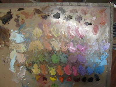
And the exact same paints being used for figure painting.
A little knowledge of pigment development is helpful in whittling down selections. The newer the pigment, the more intense and more durable it will be. A palette of earth tones might have a hard time coping with the addition of dioxazine purple or phthalo blue, whereas a vivid 20th century palette will fail to notice a delicate Renaissance lake color.
This is not to say that you should choose only an “Old-Masters” or an “Impressionist” palette—my own palette has paints from every period. But you can avoid a lot of waste by avoiding obvious mismatches.
The earths and earliest synthesized colors:

The oldest pigments are the earth pigments: the ochres, siennas, umbers and carbon blacks. These have been in use more than 15,000 years. They are as solid and everlasting as dirt. Over time artists have been tremendously wily about expanding their narrow range.
The Egyptians created the first chemical pigment, Egyptian Blue, around 5000 years ago. They also pioneered the use of minerals as pigments with malachite, azurite and cinnabar, and devised a method of fixing dyes to solids (“lake making”) which is still in use today. The Chinese created vermilion and the Romans gave us lead white.
Renaissance alchemists must have been more focused on turning lead into gold, because although they made a few refinements to paints, they left the fundamental kit unchanged.
The industrial revolution:

The Industrial Revolution brought us a pigment revolution. Just a few examples are:
Cobalt Blue – 1802
Cerulean Blue – 1805
French Ultramarine – 1828
Zinc White – 1834
Cadmium Yellow – 1846  
Aureolin – 1862
Alizarin Crimson – 1868
Without the explosion of brilliant color in the 19thcentury, there could have been no Impressionism, no modern art.
Modern pigments:

The third tier of pigments are the highest-stain, most durable of colors, developed mainly for industry: “Hansa” yellows, titanium white, synthetic iron oxides (the “Mars” colors) phthalocyanines, quinacridones, perylenes, and pyrrols. Some have replaced 19thcentury colors that have proven to be fugitive (such as quinacridone violet to make “permanent” alizarin crimson). Some have an uneasy place on the palette because of their extremely high stain, such as phthalo blue.
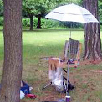
My basic field kit.
References: “Bright Earth: Art and the Invention of Color,” by Phillip Ball. It is certainly the most fun book about color ever printed.

Gamblin Artist Colors has optional palettes here. (What is true for oils is generally true for acrylics.)
The most comprehensive guide to watercolor pigments I know of is here.
And my favorite resource for pastels is here.
Some Days, You Just Can’t Get Rid of a Bomb

“Loren’s farm,” oil on canvasboard, 12X16

 At our last painting session, Marilyn whipped out her grayscale markers (making me instantly regret that I hadn’t brought mine along). The forest was remarkably dark and moody this week, and the spring foliage far less advanced than down on the lake plains, and I was finding it difficult to find a range of values.

Marilyn Fairman sketching in grayscale markers.
A tonal drawing immediately reveals the strengths and weaknesses of one’s composition—if it doesn’t work in the simplified view, it isn’t going to work after you’ve invested hours painting, either. In fact, the painting I did in that last session ended up mired in a compositional issue that would have been immediately apparent had I done some fundamental drawing before starting, but I was tired and cutting corners. 
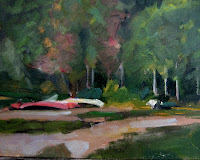
“Canoes at Irondequoit Inn,” oil sketch
To me, the difference between an adequate painter and an excellent painter is the amount of time said artist spends drawing. I wrote earlier this week about watercolor sketching, and have written frequently about drawing with a plain, ordinary graphite pencil.
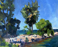
“Breakwater at Irondequoit Bay,” oil sketch
In the field, however, I most often sketch with oils on small canvases. Here is a sketch I did of the canoes at the Irondequoit Inn, and another of the breakwater at Irondequoit Bay.* They took about as long as a graphite or watercolor sketch would have, but their purpose is somewhat different: they are simplified and monumental in the same way as the tonal grayscale marker (which is by far the fastest way of sketching). 

And the painters home from the hill…
I did three other paintings in the Adirondacks. One was a complete bomb (despite having spent a long time drawing and an equally long time painting).  I followed that up by inadvertently discharging the battery of my car outside of cell-phone range, leaving me stranded with a dead car with its keys stuck in the ignition. Marilyn set off on foot to get help while I dug out the battery—not as obvious as you might think, since it’s stowed in the side of the trunk. But a bad painting and a dead battery did nothing to dampen my high good spirits.

I’m struggling with something, which is by no means uncomfortable when you’re not fixated on the results. I have been working for the past few years on patterning my paint-handling in a more abstract way, but in the process I’ve lost some of the depth that a more traditional landscape approach gives. Now that has to be reintroduced.

“Mountain meadow,” oil on canvasboard, 12X16
But my hermitage (which became less hermit-like as the week went on) is over and I’m happy to be back in Rochester, in my studio, surrounded by my family, friends, and students.
*An alert reader will note that the Irondequoit Inn and Irondequoit Bay are about 200 miles apart. I leave that mystery to you to decipher.

There just might be something to this.

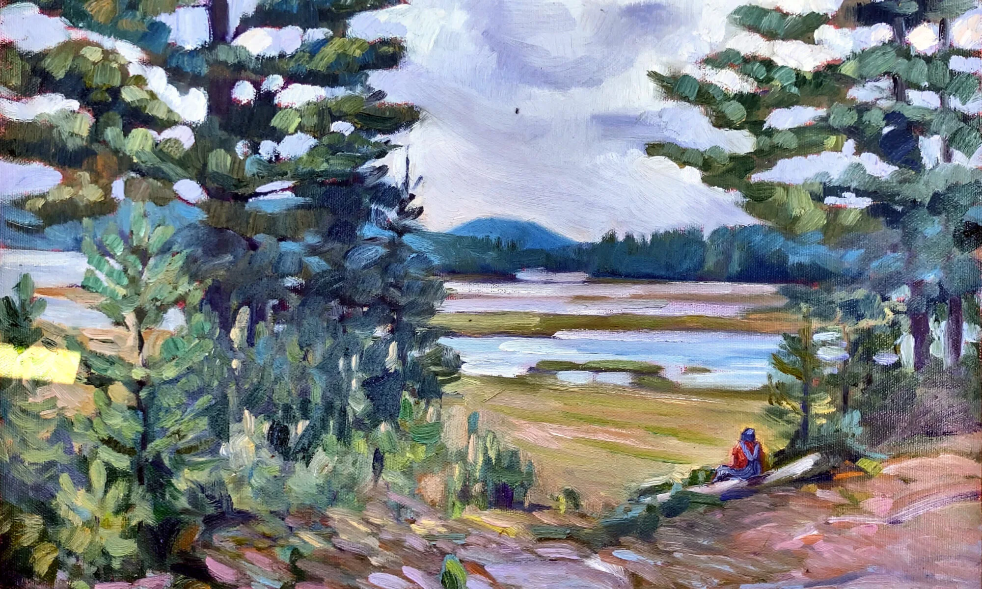
Early spring morning, Piseco Lake, oil on canvasboard, 12X16

Yesterday, I wrote about a Stillman & Birn Alpha Series sketchbook that Jamie Grossman gave me, and my first attempt to pre-sketch my paintings in it in watercolor.
This morning as I walked my appointed rounds, I carried the sketchbook and watercolors instead of my camera. The first thing I noticed—of course—is that it took rather longer to make my circuit than it usually does.
I’ve had my eye on this lovely house set on a hill for a few years, and there being a convenient bench, I sat down to sketch it. (I decided that it will be a better painting when the leaves are leafed out.) From there, I moved to a tree in the deep woods with a triple trunk, which proved to be very difficult, but which was good observationally. In both cases, I was approaching the project too much like real painting, which just irritates when all one has is one small brush.
My sketch, a bench.
This last sketch I did much more quickly, just ripping off a pencil drawing and then flooding the sheet with a color map. And it is frankly more satisfying than either of my earlier sketches (which you can’t see because I finished my day after dark and forgot to photograph them).
Transcribed directly
to canvas
Because I didn’t have a toned canvas, I decided to underpaint my finished study in alkyds. (By this point, time had ceased to be a meaningful constraint.) And it was a good day for them, too—the wind whipping off the lake dried them in no time. My alkyd painting is a simplified but direct rendition of the watercolor sketch.
In the end, this painting took me about four hours, and that is about what I’d expect for a field sketch of this size (12X16). So whatever time I spent on the watercolor sketch was saved on the final project.

Alkyd underpainting, transcribed from
watercolor sketch.

 Marilyn Fairman has joined me in the hermitage, and we spent the afternoon painting intensively. Tomorrow, we have all day to paint. What a joy that will be.

Then there’s that matter of inspiration

Deer in my brother’s yard, an exercise done several years ago

This Sunday, I was doodling in church when a painting dropped full-blown into my head. That isn’t common, but is always exciting. And in this case, it was fortuitous since I just finished several weeks of flailing around on the previous piece.

Where does a fully-realized idea spring from? First, a thought: in this case, a dilemma that has bedeviled me for almost a year. Then, visual input that is usually jumbling around in one’s cranium solidifies into a concept. In this case:

  1. An email sent by my pal Garrett about how big wolves really are;
  2. A painting I did several years ago as an exercise for my class on how to paint the traps between trees;
  3. A photo taken by my friend Jamie of a waterfalls near her house;
  4. William Holman Hunt’s “Our English Coasts (Strayed Sheep),” which set the light tone for the uplands.

Bold

My sketch done in church last Sunday.

When I’m painting observationally, I follow the traditional rules of alla prima painting: dark before light, big masses divided into small masses, fat over lean. When I’m painting from an interior vision, I paint indirectly, starting with a color map, and then modulating with opaque paints.

My color map.

As far as I got today. Tomorrow, I’ll start looking at real reference.

BTW, this is my current easel setup—electronic reference to the left, paper reference to the left.


Urban painting/Queensboro Bridge

Usually, when we say “field sketch,” people think of pastorals, but the term can apply equally to urban landscapes. I went on a tear painting the Queensboro (or 59th Street) Bridge with my friend Kristin. Here are a few examples.

Construction on the Queensboro Bridge, oil on board, 12X9

Just as urban plein air painters complain about the “endless green” of the woods, pastoral painters are overwhelmed by the grey of the city. But just as there are many different greens, there are many different greys. The trick is to find them, and to find the accidental notes in either landscape.


Queensboro Bridge approach, oil on canvasboard, 16X20

How do you avoid dreary, dull greys? First, avoid using black as a base. I was taught that this was because of the large grains in carbon-based blacks, which may or may not be true. But for whatever reason, black has a way of making cool colors look muddy and warm colors look more opaque, and that’s a bad basis for greys.

Under the Queensboro Bridge, oil on canvasboard, 12X16

I normally paint foliage using a matrix of nine mixed greens plus one from a tube (chromium oxide). There are at least that many greys present in the urban landscape. I prefer to mix them not in matrices, but in threads, so that every permutation is easily available.

Some of my favorite grey threads, from left to right:

Cadmium orange and Prussian blue;

Raw sienna and Prussian blue;

Yellow ochre and quinacridone violet;

Burnt sienna and ultramarine blue.

Remember, every manufacturer’s paint handles somewhat differently, and unless you’re using RGH paint, you’re unlikely to duplicate my results exactly. But the principle is simple: just choose two colors from opposite sides of the color wheel and add white.

In addition, I think it’s very helpful to use a warm-toned canvas or canvas board.

A more formal figure painting


This commissioned work is a formal portrait of a mature woman who desired a nude painting reflecting her Central American heritage. The client wanted an impression of the beauty of a woman not matching the cliché of the commercialized American ideal of willowy, leggy and fair female imagery.

The composition features an S-curve created by the background and gold lace mantilla and subtly reinforced by the rim lighting bathing the model’s knees and leg.

Meme of the Day—Kim Jong Il Looking at Things

Abi’s stuffed opossum and green wine glasses, 8X6″, oil on canvas

Kim Jong-Il Looking at Things is my current favorite blog. I suppose it amuses me because it reduces a frightening, insane tyrant to an object of ridicule. (I sure hope he doesn’t see it and melt half of Asia in response.)

Much of the time, he’s wearing a grey-and-lavender parka similar to one my dad used to wear. I assume they have no heat in North Korea and his factotums freeze during these photo ops, but, hey, he’s the dictator.

It dawned on me that in his parka he looks just like the opossum who was camping out in our basement, so that’s how I painted him. Used Abi’s “pet” opossum because the live one has been relocated to public housing elsewhere in the county.

Meme of the day–Back it up!

My new hard drive that just arrived in the mail, 6X8, oil on canvas

A note about these still lives: they’re exercises before my “real work”, a sort of a meme-inside-a-meme, considering how popular the painting-a-day movement is. They take an hour, more or less. And I do them because I find the classic still life boring to paint, but it’s too cold for me outside to paint plein air.

I figure by the time spring comes, water reflections will seem awfully simple in comparison to all this plastic wrap, tinfoil and bubble wrap.