fbpx

A new system of training new painters

I’m confident this approach will prepare confident, competent painting students ready to tackle higher-level observational painting, composition, color theory and mark-making.

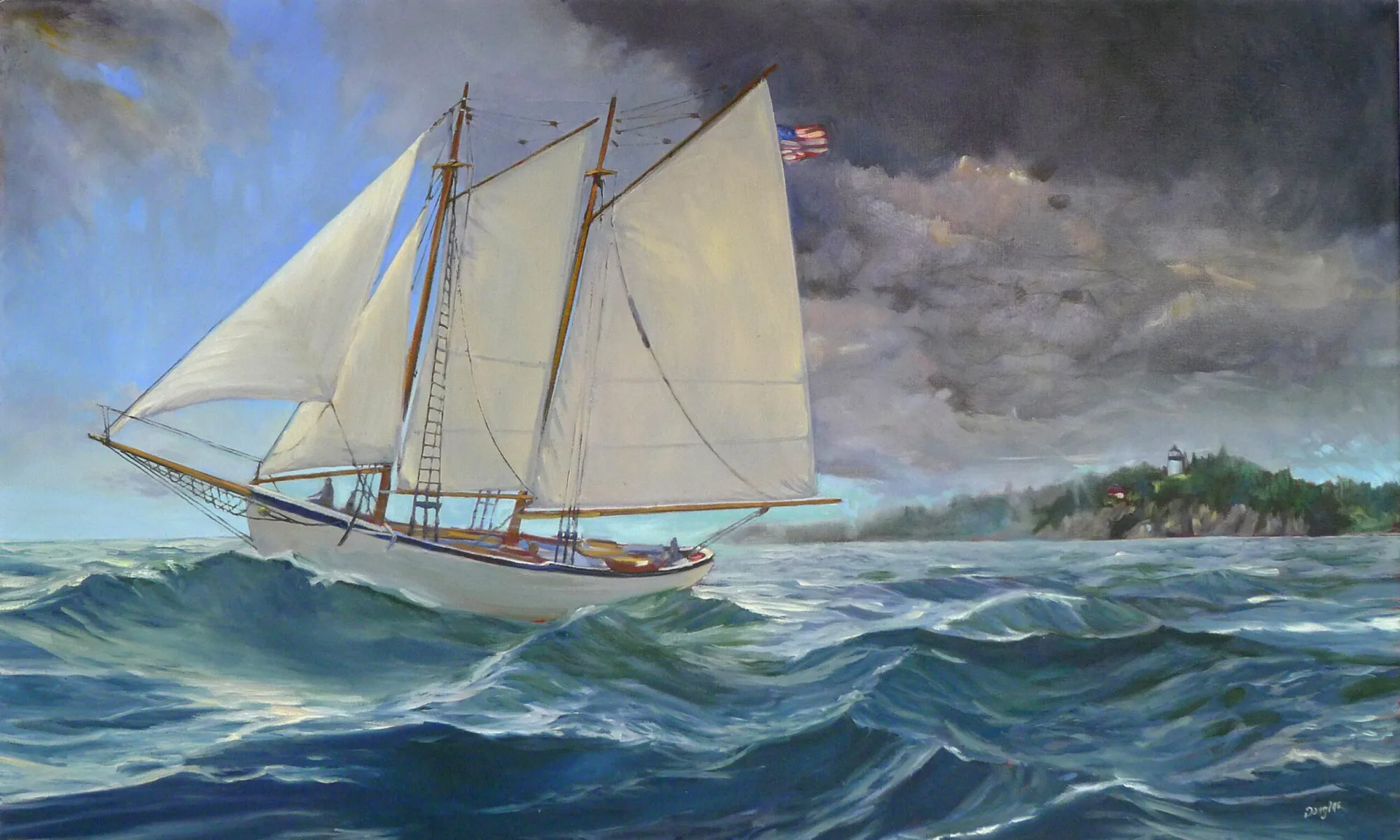
Breaking storm, 48X30, oil on canvas, Carol L. Douglas, available through Folly Cove Gallery, Rockport, MA

After this session of painting classes, which ends on November 2, I will no longer take beginning painters. I’m simply stretched too thin. Instead, I’m going to send brand-new painters to two excellent teachers. That’s a simple, six-week process in which they will learn the rudiments of paint application, brush-work and color mixing. When they’ve completed this preparatory work, I’ll welcome them back into my classes.

That doesn’t mean every new student must start this way. If you already know the fundamentals of applying paint, I’m happy to work with you, whether you are self-taught or you started in another class. And en plein air, I’m happy to welcome painters of all levels.

Michelle Reading, oil on linen, Carol L. Douglas available through Rye Arts Center.

I’ll be sending oil and acrylic painters to my old friend, Bobbi Heath. I’ve taught students prepared by her and they’ve come to me knowing the order of operations in solid-media painting. Bobbi painted on the side during a long and successful business career. That shows in the workmanlike way she trains new painters. You won’t get a lot of rhetoric from her, just a good step-by-step introduction in how alla prima painting is supposed to be done.

I’ll be sending new watercolor painters to one of my own students, Cassie Sano. Cassie has experience teaching, but she developed a syllabus specifically to train new painters for me. She too is a very logical thinker, and a person of great compassion and kindness. She’s a crackerjack watercolorist, and, more importantly, she can explain how each step works. She’ll demystify watercolor for the beginner.

Main Street, Owls Head, 16X20, Carol L. Douglas, oil on gessoboard, $1,623 unframed.

Where does this leave me? Relieved. My students have been galloping forward for the past few years, working on higher-level observational painting, composition, color theory, and mark-making. It’s unfair to the new painter to be thrown into this melee without the basics under his or her belt.

Alla prima painting comes under many names, including wet-on-wet, direct painting or au premier coup. That French version means ‘at the first strike’, and it’s a perfect description of what has to happen to get the freshness that alla prima painting promises.

Wreck of the SS Ethie, oil on canvas, Carol L. Douglas, 18X24, $2318 framed.

To hit it right on the first strike means a lot of things have to have become second nature—drawing, color mixing, and brushwork. The whole point is to keep do-overs to a minimum. That requires preparation and confidence. I’m confident that this new system of training will enhance both.

Monday Morning Art School: the value of value

Why do teachers harp on value? Because it drives everything else in the painting.

Belfast harbor, 11X14, oil on canvas, Carol L. Douglas. Available framed $1087.

You cannot overstate the importance of value in visual art. It drives our perception and guides us through the painting. There are various ways to focus on value: notans, value sketches, and grisailleunderpaintings being the most popular. However we get there, the first step of a good painting is to see each composition in terms of its value structure.

Claude Monet was the greatest optics experimenter of Impressionism (and probably of art history in general). He visited the question of value over and over—in his haystacks, his waterlilies, his series in the Gare Saint-Lazare. We have been happily exploiting his discoveries ever since. We’ve learned that we can substitute color temperature for value, but the value structure remains the most important part of the painting. Even when the dark shapes are not literally dark, they have a form.

Haystacks, (Midday), 1890–91, Claude Monet, courtesy National Gallery of Australia

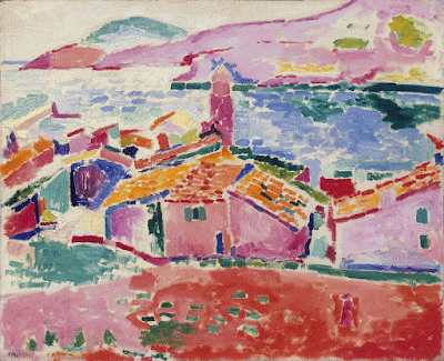
Just as the human mind can interpolate blue as dark, it has a great capacity to read red for blue as long as the values are true to the scene. The Fauvesexperimented with this, painting skies pink and faces green. We have no trouble identifying what they’re painting. However, it’s an either-or proposition. We can substitute hue for value, or we keep the values accurate and mess with the hues. Mixing them both up together makes an unintelligible mess.

Alla prima painting requires great skill in color mixing, because the goal is to nail it on the first strike. That goes not just the for darks, but every color in the picture. Even a painting with wonderful shadows and lights will have many middle tones, often closely related in value. These are actually the most difficult colors to mix accurately. If you have a painting that isn’t working, ask yourself if it has a full tonal range, or is it simply hitting the highs and lows. For example, when people get in trouble painting texture, it’s usually because they’re overstating the contrast.

Les toits de Collioure, 1905, Henri Matisse, courtesy The Hermitage

All color is relative, meaning it depends on its neighbors. That’s particularly true when it comes to value. Below see a plate from Joseph Albers’ groundbreaking Interaction of Color. The inner violets are the exact same value. But the framing color influences how we see those values, so one looks much lighter than the other.

To mix paint accurately you must become absolutely conversant with the colors on your own palette. The first step is to identify the natural value of your paint, straight out of the tube. No pigment can go darker than its natural hue without the addition of another color. That’s why it’s so difficult to make shadows on lemons.

Plate IV-4 from Joseph Albers’ Interaction of Color, demonstrating how all color is relative. The inner violet colors are the same exact value, but what surrounds them influences how we perceive them.

For oil painters, figuring out the natural value of a pigment is easy. For watercolorists, it’s a bit of work to figure out what that really darkest point is, because it’s never the same as it appears on your palette. The colors wetted are a better guide, but you’ll need a test paper handy to experiment.

When you figure out the darkest natural position of each pigment, you need to see how it tints. For watercolorists, that means dilution. For oil and acrylic painters, that means mixing with white. Every paint has a natural tinting strength. That’s determined by the type of pigment, the amount of pigment and how fine it’s been ground.

There are three things to remember:

¡        Value judgments are subjective. There’s no reliable way to measure the value of a color. The camera is as subjective as the human eye.  

¡        You can’t get a color to go darker than its ‘natural’ value without distorting the hue or chroma. Thus, there is no natural dark version of cadmium yellow, so the shadows in a yellow object require a workaround.

¡        All pigments can make about the same number of discrete steps. While the yellows have a shorter range, the steps are more noticeable. Blues can mix from almost-white to almost-black, but the middle points are very similar. 

Monday Morning Art School: take a walk on the wild side

We’re products of our times, which are shifting rapidly. Why not cross the direct-indirect painting line and see if the other side speaks to you?

Bluebird and Cottonwoods, 1917, Charles E. Burchfield, is a direct water-media painting. Done with watercolor, gouache and graphite on joined paper mounted on board. Courtesy Burchfield-Penney Art Museum.

There is nothing inherently wrong with indirect painting; it’s how I initially learned. Indirect painting is useful in portraiture, still-life, or the big tableaux of Peter Paul Rubens. It’s less useful in plein air because it’s so slow. Moreover, the same dark shadows that are mesmerizing in Rembrandt’s self-portraits can be stultifying in landscape.

In every medium, the major division in technique is between direct and indirect painting, although that line is porous. Modern alla prima oil painters still lay out their paintings as a grisaille; we work thin in the underpainting, reserving thicker paint for the top layers. Except in plein air, few of us are fast enough to finish a painting entirely wet-on-wet. We sometimes glaze to correct color or deepen shadows. Conversely, masters of the Renaissance like Jan van Eyck  Rogier van der Weyden and Rembrandt used wet-on-wet passages in their paintings. Frans Hals worked almost entirely alla prima.

Study of clouds above a wide landscape, 1830, John Constable, is an example of a transparent watercolor. Courtesy Victoria and Albert Museum.

In direct painting, the artist attempts to hit the proper color (hue, saturation and value) on the first stroke. We sometimes call this alla prima or au premier coup. Regardless of the name, the goal is minimal modification and correction, leading to fresh, open brushwork. That’s true in oils, watercolor and acrylics.

Direct painting is largely the legacy of the 19th century, facilitated by a dizzying array of factors including paint tubes, railroads, modern chemistry, and the mindset of the Impressionists. Modern chemistry also brought us alkyd and acrylic paints. These are tailor-made for indirect painting, but the technique still sits on the sidelines. That’s largely because of our collective temperament.

Indirect painting is done with multiple thin layers of paint. Each subsequent layer is intended to modulate, rather than cover, what’s below. These layers usually dry between coats, but not always; you can achieve remarkable effects by painting into wet transparent passages with opaque paint. But in general, indirect oil painters start with a dark transparent layer, followed by a middle layer of opaque color. These are allowed to dry and the final modulation of color is done by glazing thin layers of color on top. At the very end, the artist will add highlights and opaque or semi-opaque scumbling in some passages. The contrast between opacity and transparency can be very beautiful.

Self portrait, 1659, Rembrandt, courtesy National Gallery of Art, is an example of indirect oil painting.

In watercolor, the order of operations is somewhat reversed: traditionally, watercolor starts with light glazes and then adds darks at the end. But watercolor need not be applied in a series of discreet glazes any more than oils must be.

Glazing, however, allows the artist to work thin, slowly, and thoughtfully. Indirect painting allows for meticulous detail that can never be achieved in direct painting.

Self-Portrait with Two Circles (detail), c.1665–1669, Rembrandt, courtesy Kenwood House. This shows the scumbling, impasto, and opaque painting that the best indirect painters used on their top layers.

A glaze is just a thin, transparent layer of paint. It gets thinned with medium (oil) in oil painting, with water in watercolors, and with a combination of water and medium in acrylics. It’s hardly worth taking a class to learn to do it, although I can certainly show you. Here are the general rules:

  1. The fat-over-lean rule is imperative in solid media. Scale up the amount of medium in each successive layer, and keep it as lean as you can;
  2. Glazing works best with transparent pigments;
  3. If you must glaze with white, use zinc white instead of titanium (and it’s the only application for zinc white in oil painting);
  4. Glazing over impasto gives you a very irregular finish. Unless that’s your goal, avoid it.

In good glazing, light is able to bounce back from whatever is below the surface—the substrate or opaque layer in oils and acrylics, or the paper in watercolor. That’s why opaque pigments—especially titanium white—don’t work well. What remains visible at the end is a combination of all the layers. The colors in all layers appear to mix, although they are, in fact, physically separate.

Stag at Sharkey’s, 1909, George Bellows, courtesy Cleveland Museum of Art, shows the immediacy and power of direct painting.

Mainstream oil painters have been painting directly for nearly 150 years. Mainstream watercolor painters, on the other hand, sometimes seem stuck in a sea of indirect glazes. We’re in a rapidly-shifting period in history. Why not experiment with the other side and see if it speaks to you?

Monday Morning Art School: losing your drawing

You do a lovely underpainting and you lose it in the top layers. Why does that happen?
Home Farm, by Carol L. Douglas. Painted at Winterthur in Delaware.

The human mind loves complex, irrational space divisions. The same mind perversely regularizes what it paints and draws. A split-rail fence, where the gaps between posts diminish haphazardly into infinity, attracts us when we see it. However, unless we’re mindful, when we paint it, we regularize the spacing. The same thing happens with trees, flowers and clouds. In nature, they’re artfully erratic. We too often space them in neat lines. Bobbi Heath calls this anti-entropy. It’s a good description of the brain’s powerful impulse to push ideas, images and tones into patterns.

We’re best at drawing when we’re fresh. The challenge is to keep that freshness throughout the finished layers of a painting.
Visan Vineyard underpainting, by Bobbi Heath
Bobbi graciously allowed me to share an example for this post. She painted the underpainting above last year in France and finished the work this month in her own studio. That in itself is a challenge. No matter how good your visual memory is, it diminishes over time. You’ll always be most accurate if you finish work quickly.
Visan Vineyard, by Bobbi Heath
Bobbi made significant changes between the drawing and the final work. The far hill doesn’t rear up as energetically. The ends of the rows are lower on the canvas, and thus less important. More critically, she reduced the contrast, softened the perspective lines, and the ends are less incisive. She also changed the value of the midfield. In my opinion, the painting was weakened by these changes (although it’s still beautiful).
I stress drawing on paper before painting, instead of going straight to the canvas. It’s important to work out the compositional questions before you pick up a brush. It’s just as important to have reference to consult when the light changes or your painting gets distorted. A photo on your phone will just tell you what was there, not how you drew it.
Avoid too much solvent in the bottom layers. In alla prima painting, the bottom layer should have enough OMS in it to move fluidly, but not enough to run. You cannot keep a tight drawing if you’re painting over mush, nor can you keep the colors separated and bright.
Detail from Home Farm, at top.
It’s a fallacy to think that you draw first and paint second. Painting is continuous drawing, and the initial drawing must be restated constantly. I leave important lines showing until I’m certain I have finished the passage, and sometimes (as in the detail above, from the painting at the top) I don’t obliterate them at all. You can’t cover your drawing and expect to reiterate the freshness of the original line. That early drawing will always be your most delightful.
I prefer to work large in general. It’s easier to be accurate and poetic with a large sweeping line. The smaller the canvas, the more jarring small errors of measurement become. For most brushwork, I recommend holding the brush at a point more than halfway back from the ferrule. That gives your brushwork bounce and grace. But for accurate fine drawing, hold it like a pencil.
Kudos to Bobbi for offering to let me critique her painting publicly. “I wish I’d showed it to you earlier so you could have told me to restate the drawing,” she said. That’s a pal.

Why the details matter

Super-simplified paintings may intrigue at first, but do they have enough information to satisfy over time?
Snow at higher elevations, by Carol L. Douglas

Yesterday we let the software engineer out of his cage. He traveled down to Pecos National Historical Park with us. He could get a signal enabling him to work. Meanwhile, we painted a snow squall approaching across the Sangre de Cristo mountains. (We’re limited to satellite here on the ranch and a tethered hotspot is faster.)

As is true on the ocean, the sight-lines in the west are extended. You have hours to watch weather unfold. It made for great painting for us, and a nice work setting for him.
A friend once told me, “I’d never date an engineer; they’re too boring.” I’ve found exactly the opposite to be true. This one has an undergraduate arts degree and is a serious musician as well as being a programmer. When he talks about aesthetics, I listen.
An abandoned farmstead in the Sangre de Cristo Mountains.
We took him for a brief walk through a small, abandoned farmstead with log and stone barns. It was where I’d spent most of my time during Santa Fe Plein Air Fiesta last April. The difficulty, I’d found, was in the surfaces, which are textured and edgy and needed more definition than my usual painting style. How could I paint them convincingly without being too detailed?
“Alla primapainting applies a low-pass filter over everything,” he told me. “You need a way to convey high-frequency information in some places.” Huh?
Think about the sound of clapping. It’s impulsive and unexpected. If you were to look at a graph of it, you would see a spike. That’s what they call a high-frequency sound, and it’s exactly the same as a line, a dot, or an edge in your painting—in other words, it’s a big, sudden, value shift, packed with information. It gets your attention. It’s the opposite of low-frequency sounds, which are more like the hum of your dishwasher in the background.
Our office on the road. My trusty Prius is not up to this terrain. (Photo courtesy of Douglas Perot)
There are low-frequency passages in painting, too. A grey sky is an extreme example. Nothing much changes there. When you save a photo at too low a resolution and it gets blurry, it’s essentially been subjected to a low-pass filter.
When your teacher tells you, “focus on big shapes,” or “ignore the detail,” he or she is telling you to apply a low-pass filter to your painting. In general, that’s good advice—within limits.
And then there was snow, and a gravel road up a mountain ridge. (Photo courtesy of Douglas Perot)
In photography, those blurry, low-resolution photos may intrigue at first glance, but they aren’t that satisfying over time. In the long run, that may be true of paintings as well.
The trick, I think, is to vary high information passages with super-simplified ones. It’s a good goal but it’s not always possible in plein air painting, where you often have to quit before you think you’re finished.
Horno in the snow, by Carol L. Douglas. I haven’t looked out yet to see how much stuck.
And that was exactly what happened to us. One minute, it was dark and cold, and the next, snow was swirling everywhere, obscuring our view.  We slipped up the road back to the ranch. I’m hoping for snow-cover to last through today. If it doesn’t, I’m sure we’ll find something to paint.

How to hold a paintbrush

Technique is one thing; the zeitgeist is another.
Dry Wash, painted earlier this year, is most indicative of where I’m going right now, but I didn’t even include it at the event where I painted it. Oops.

 Last week I showed Roger the proper way to hold a paintbrush. “At its end, like a baton,” I said. “Not like a pencil.” I demonstrated how much more swing you get when you hold it like that.

Of course, there’s no one right way to hold a paintbrush. It’s just that every new painter thinks of it as an extension of their pencil and clutches it up near the ferrule in a three-finger choke hold, as if they’re about to work on their Palmer Method of Penmanship. That was adopted because it was hyper-regimented and would improve discipline and character. It was even believed it could reform delinquents.
Holding a brush like a pencil gives you a lot of precision but very little range. Holding it like a baton at the end gives a lot of lyrical movement and less precision. You can do both, but you’ll have much more energetic brushwork if you start off with it held farther back.
Roger’s a thoughtful guy. “This is all part of the idea of working in big, broad, patterns, rather than focusing on the details,” he mused.
I don’t remember where or when I painted this, but I like it today. It’s almost impossible to judge change in real time.
Yesterday I wrote about alkyd media and glazing. I got an interesting response from Bruce Bundock, a fine acrylic painter who works as a preparator at the Frances Lehman Loeb Art Center at Vassar College. “Seems to me painting is the one discipline where there is no ‘last word.’ It’s what works for each individual,” he wrote.
Technique is one thing, the zeitgeist is another. The majority of painters since the mid-19th century have worked alla prima, directly and expressively. Glazing has no place in that system.
Painting movements are pushed along by both culture and technology. The Pre-Raphaelite Brotherhood was born in Victorian Britain. Queen Victoria’s early reign was marked by rapid industrialism and social and political upheaval. The nostalgia of its painters was reactionary, an effort to cope with overwhelming change.
Ruth, by Carol L. Douglas. Yes, I can glaze; no, I don’t like doing it.
The Impressionists were firmly grounded in technology. The vivid synthetic pigments that characterize their work were developed in the 19thcentury. They were able to paint outside extensively because of the invention of the paint tube in 1841. Emerging color theory shaped their thought.
Our own times have been rapid and anxious, which is reflected in our direct technique and in Expressionism. However, a young person would be a fool to tie himself to the last century. Nobody can predict where the spirit of the times is heading; we can only swim like mad and chart an uncertain course between fickle fashion and the past. And that is, as Bruce said, highly individual.
Alkyds may be the technological advance that ushers in a new period of indirect painting. After all, the Pre-Raphaelites were living in tumultuous times, and they glazed like mad. If you’re painting glowing, detailed interiors like William Holman Hunt’sThe Lady of Shalott, you’re definitely going to hold your fine brush like a pencil.
Wildfire, western Canada, painted during my 2016 road trip. Change isn’t always pretty.
But that’s not where we are today, and all I can do is teach my students the best technique rooted in our times. “Why didn’t you ever tell me this before?” Roger asked.
“I really thought I had,” I said apologetically. Painting instruction is so individualized that you can easily miss something like that. “But I’m still not refunding your tuition,” I added.
That was my last local (Rockport, ME) class of the summer. We start back up in October, on Tuesdays from 10-1. If you want a place in that session, email me.

There’s nothing new under the sun, and that includes glazing

Is it true that the fat-over-lean rule is suspended when using alkyd paints and mediums?

Grain Elevators, by Carol L. Douglas, is an example of a cold-wax medium painting. I used it to add the rough texture of a beaten down industrial setting to the sky.
 Oil paints are pigments suspended in vegetable oil. These drying oils are most commonly linseed oil but also may be walnut oil or tung, poppy, or perilla seed oils. They do not dry by evaporation, but by oxidation. To speed up the drying process, metal salts are sometimes added. 
In my youth, we made our own medium with equal parts linseed oil, turpentine, damar varnish and a few drops of cobalt drier. After seeing the condition of some 20th century masterpieces, cracked and brittle after less than a century, I stopped making my own and started to use commercially-prepared medium instead.
Alkyd mediums have almost completely taken over the industrial coating world. They dry more quickly than old-fashioned drying oils. There are many ways to make an alkyd medium, but they all involve cooking a vegetable oil with a polyol like glycerine. Before you consider eating the results, however, alkyds generally have Xylene added to control the viscosity. Alkyds for decorative painting have extra oil cooked in to lengthen the oil strands and to make a more durable finish.
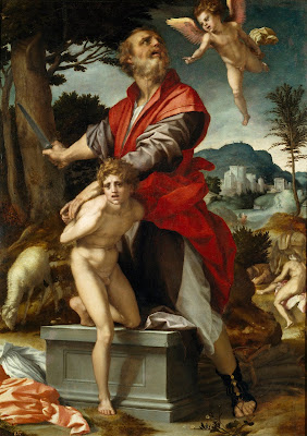
The Sacrifice of Isaac, c. 1527, by Andrea del Sarto, courtesy of the Cleveland Museum of Art, shows a painting at the pre-glaze point.
I’m seeing more and more students come to class with alkyd-based products like Galkydor Liquin. I’ve used both and like them well enough; they don’t feel significantly different from conventional media. But I’m skeptical of replacing something proven with something unproven to save dry time, which is relatively unimportant in alla prima painting. Classic painting mediums last for centuries when properly applied.
It’s claimed by some teachers that alkyd media allow you to ignore the fat-over-lean rule in painting. That’s the principle that higher-oil paints (i.e., mixed with medium) belong on the top levels, whereas lower-oil mixes (i.e. cut with turpentine or OMS) belong in the initial underpainting. 
The Sacrifice of Isaac, c. 1522, by Andrea del Sarto, courtesy of the Prado, shows the same subject in what del Sarto would have called its finished form, after meticulous glazing.
Pigments affect the dry time of paints as much as the oil binder does. However, as a general rule, the more oil, the longer it takes for paint to dry. The less oil, the faster the paint dries, but this produces a more brittle film. That’s one reaason we use thin layers at the bottom and save the juicy paint for the top.
There’s been a trend toward painting techniques using glazing layer after glazing layer of thin pigment dissolved in alkyd media. I’ve even seen paintings done by laying down layers of alkyd medium and then painting into that. None of that is proven technology, and won’t be in our lifetimes. It will take another few generations before the durability of indiscriminate alkyd glazing is proved.
Self-portrait, c. 1655, Rembrandt van Rijn, courtesy Kunsthistorisches Museum. His technique involved painting impasto passages above transparent ones, or the opposite of glazing.
Glazing has been used since oil painting was invented. It was traditionally done by applying transparent colors over an opaque monochromatic grisaille or colored foundation. That doesn’t mean the masters just indiscriminately glazed everything. Most passages were painted alla prima, just as we do today. Glazing was restricted to dynamic passages and fine modulations.
To do it right is very tricky; I’ve never mastered it. It’s hard to predict how a passage will look when dry. You get no second try at the underpainting, so if it’s wrong, too bad. And the thickness of the glaze affects not only the paint’s tonal value, but its surface finish.
Still, pigment suspended in a binder is very beautiful. If you’re interested in this effect, you might try cold-wax mediuminstead. Unlike encaustic, which uses heat to thin the wax, cold-wax medium is whipped with mineral spirits. It has a milky, soft, appearance. You can sand it, scrape it, and rework it to your heart’s content, and it’s thoroughly modern in its final appearance.

How do you get to Carnegie Hall?

Barnyard at G and S Orchards, by Carol L. Douglas. 9X12, oil on canvas, $450, framed.
During Saturday’s class at G and S Orchards, my goal was to solidify the lesson from the prior week about painting into a monochromatic grisaille. This was something I used to do but had abandoned until I painted with Jamie WilliamsGrossman earlier this month. Then I remembered how much I enjoyed it.
Step one is a very rude value study. This gets simplified and refined with brush and rag.
One student went from his drawing right to masses of solid color. Nothing wrong with that, but I was a bit frustrated that he was totally ignoring my instructions. Eventually I realized he’d missed last week’s class because he had to sit for his SATs. But it was too late to show him on his canvas.
Step two is the addition of thin masses of color.
I quickly set up a demo for him. It was a small class so I was able to do rounds, come back and paint a bit on my canvas, call my student over to discuss what I’d done, and then repeat—over and over. I like being very busy and this was energizing. We did run over (about an hour and a half) because of this but nobody appeared to mind.
Here is Nina Koski’s monochromatic painting. She was able to correct a composition problem very early on, rather than have it dogging her through the whole painting.
Meanwhile, Nina Koski had taken my instructions of last week very much to heart and was turning out quite a lovely painting of roses along the barnyard. I managed to get some intermediate photos of hers as well, so you can look at two different painters using the same technique.
Here Nina Koski is starting to add color.
Nina, by the way, painted a small plein air painting almost every day last week. She’s an exemplar of that old joke:
“Excuse me sir, but how do you get to Carnegie Hall?”
“Practice, practice, practice!”
And here is her finished painting. She’s only been painting a few months!
I have three openings left for my 2014 workshop in Belfast, ME. Information is available here.

Memories of Maine…

When I was in Maine I was interviewed by a reported from the PenBay Pilot… and here is the story. I’ll be teaching workshops in this area next summer; I can’t wait to get back!

On Art and Culture

Marc Quinn’s sculpture Alison Lapper Pregnant was the first commission for the Fourth Plinth Project in Trafalgar Square (2005-2007). It combines the best of audacity and craftsmanship.

This weekend I had the good fortune to see the great Irish-American band Solas on the second stop of their “Shamrock City” tour. Solas quarries material earlier explored by the Irish band Horslips: the Irish immigrant experience.
While Horslips were pioneering Celtic rock in the 1970s, Solas is more or less a straight-up Irish traditional band, a tradition that extends back before the mists of time. But layered on top of the music, “Shamrock City” includes a video projection in the style of Ken Burns’ “The Civil War,” which was a groundbreaking documentary released in 1990. I felt in some ways that I was in a cultural time warp.
 
On the way home, we launched into a spirited discussion in which we weighed the superior musicianship of Solas against the innovations of Horslips. Which was absolutely the “better” band? The answer, of course, is both and neither, because all such debates are ultimately pointless—both bands are poetic and moving and justified in their place in musical history.
The experience got me thinking about the ways in which art is and isn’t temporal. Is Bach any less of a genius because the Baroque was in decline at the time he was writing? Time has a way of leveling these bumps in the road. I keenly appreciate the difference between skinny jeans and parachute pants, but I’ll be darned if I can identify the difference between various phases of Regency dress. It’s of absolutely no moment to me that Bach didn’t invent the fugue—when I’m feeling fugal, he’s my go-to guy.
On the other hand, art is also nothing if not relative to its time and place. I was looking at a highly mediocre photo manipulation on Facebook yesterday. It had a middle ground of golden trees, some lavender action in the far distance, and the requisite figure on the foreground.  I said to myself: “That would make a very marketable painting.” Photoshop has, no doubt, affected the way we paint.
There is nothing new in technology driving art. The introduction of new pigments in the 19th century drove French impressionism and indeed made alla prima painting possible. But that is a matter of materials, not outlook. What has changed with the recent acceleration of interactive media is how viewers perceive the world.
We are all familiar with the idea that photography liberates the visual artist from the need for representation. We’re less easy with the idea that it also creates other obligations. What magic can painting create to compete with Peter Jackson’s “The Lord of the Rings” trilogy?
At first glance, heeding the siren call of mass media seems like inspiration, but it stops the artist from looking for their internal voice. Despite any other consideration, that internal voice must be individual; it must have the attitude of “f— it all,” which is the polar opposite of whatever mass media is driving toward. In fact, that inner “f— you” is the most important tool an artist has.
We live in one of the most beautifully-designed worlds in history, certainly the best-designed period in my lifetime. One need look no further than modern cars on the highway. With the exception of the Nissan Juke, cars are far more beautiful than they’ve ever been before. Modern architecture is beautiful, modern highways are lovely, and if I compare the humble disposable pen of today to that of my youth, I’m practically transported.
Part of the improvement is in materials, part is because we’ve shaken off the thrall of modernism and are again paying attention to history, and part of it is computer design. Part of it may also be a first glimmer of a change in attitudes about art—the end of the cult of genius.
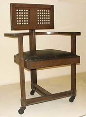
Not comfortable? You’re not smart enough!
Frank Lloyd Wright—peace be upon him—was unquestionably a 20th century genius. In fact, he was such a genius that all minor matters such as livability, waterproof roofs, etc., were subservient to his brilliance. Heaven help you if you found his interiors damp, dark, or uncomfortable, or couldn’t read a trashy novel seated in one of the chairs you were required to keep in situ. Elevate your thinking!
However, nobody could accuse him of ignoring craftsmanship, which sets him apart from many other geniuses. In visual arts for the last century, audacity has generally been revered above craftsmanship.
This semester, my Sandy was required to watch a movie in her graduate-level Art Theory and Criticism class. I repeat her description, because I cannot find the actual video without wading through a lagoon of porn: “Naked men smeared bright red lipstick slowly, erotically, all over the lower half of their faces, then danced naked. In the next scene, they were in a pile, naked. Then one man grabbed another’s penis and flung it.”*
The point of showing this movie in an art theory class was that audacity quickly pales. One must constantly accelerate the offensiveness of the material to engage the viewer. But where is craftsmanship in this? If American teens can effortlessly film their own naked bodies with their phones, how can it be a question of skill?
Jake and Dinos Chapman’s Turner Prize-winning sculpture, entitled Death (2003). Yes, they’re audacious,
but it makes me think that if you’ve seen sex once, you’ve seen it a thousand times.
There was a proverb that still had some currency when I was young: “He that touches pitch shall be defiled.” This proverb presumed that purity is a value worth preserving. A Victorian could not have seen that video without feeling that he had “touched pitch,” but I can’t imagine an American born after 1960 who has any clue what that proverb means. But this too—as every paradigm ever has—shall pass.
So how does one move past audacity? Marc Quinn’s “Alison Lapper Pregnant” to me is the apotheosis of the modern ideal. The model is obviously handicapped, suffering from a congenital disorder that left her without arms and with truncated legs. She was raised in an institution. This is, frankly a far more brutal reality than any mincing, lipstick-wearing penis-slappers could ever attain. And the sculpture itself—carved from Carrara marble, is technically beautiful.
*You try searching for this on the net!