Grey is a beautiful color, but it doesn’t stand out in a crowd. Neither does weak design.
 |
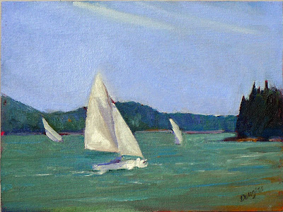
| Jonathan Submarining is one of my all-time favorite paintings, but it didn’t impress jurors overmuch. |
I’ve promised several readers I’d get back to them about my sketchbook choice for my Age of Sailworkshop. I’m supplying the materials, so they must be good. I wanted to talk to Mary Byrom before I reported back. She teaches a sketchbook class in York, ME. Our technique is not the same; she works mainly in pen-and-wash; I prefer straight-up watercolor. But there’s overlap, especially when the problem is keeping supplies contained for travel.
We agreed that the top sketchbook we’d tried was Strathmore’s Series 400 watercolor journals. While I prefer ring bindings, this notebook’s soft backing made it possible to hold back pages with clips. I’m a very wet watercolor painter, so if I can use it, nobody will have a problem.
| And the winner is, the Strathmore 400 series watercolor journal and a clip. |
That was the last fifteen minutes of a two-hour phone call. Most of it was spent on that eternal question: how to choose the best paintings to submit for jurying. My strategy has always been to put my top work from the prior year into a folder and look at it and whine.
I’m drawn to the paintings in which I perceive a struggle. An example is Jonathan Submarining,which I painted at Castine Plein Air. This is one of my personal favorites. Poppy Balser and I had our feet in Penobscot Bay. The kids in their sailing class were rampaging about in a stiff wind. It was hard work to be accurate while capturing their excitement. Apparently, jurors did not share my enthusiasm. I didn’t get into many shows for which I used it.
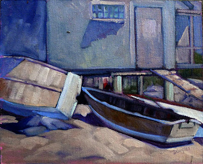
| Lobster Pound at Tenants Harbor is well-drafted and strong, but I don’t think its grey tones will work for jurying. (Courtesy the Kelpie Gallery) |
All of us have emotional connection with our work. It distorts how we see things. To overcome this, I traded the final-pick task with Bobbi Heath. She reviews my submissions; I review hers.
Mary Byrom and I came up with another strategy. Next year, I’ll create a folder containing my own best picks alongside paintings by artists with whom I will be competing to get in. (If you don’t know who these people are, you haven’t done your homework.) I did a snap search after our conversation. It was sobering.
 |
| Fish Beach, by Carol L. Douglas. |
It’s all about design and composition, which is why value sketches are such a necessary step in plein air. Aline Ordman said that a painting must compel at 300 feet, 30 feet and 3 feet. The 300-feet test is the same as the thumbnail-on-the-screen test. Depending on the popularity of the show to which you’re applying, the jurors may be looking at thousands of the little buggers. If your painting doesn’t stand out as a thumbnail, it’s not going to compel at any size.
Color matters, too. Grey just slumps back into my monitor. There are some paintings in my folder that are strong, but I won’t be using them for future submissions. Nor will I design a composition around neutrals for an auction-based event, for the same reason. Lovely grey tones sell just fine; they just don’t stand out in the maelstrom.
It’s about time for you to consider your summer workshop plans. Join me on the American Eagle, at Acadia National Park, at Rye Art Center, or at Genesee Valley this summer.
