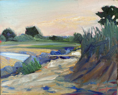
It’s been said that a painting needs to be compelling at three inches, three feet and thirty feet. That’s simple enough, but how does the artist make that happen?
 |
| Erosion, 9×12, by Carol L. Douglas, available through Ocean Park Association. |
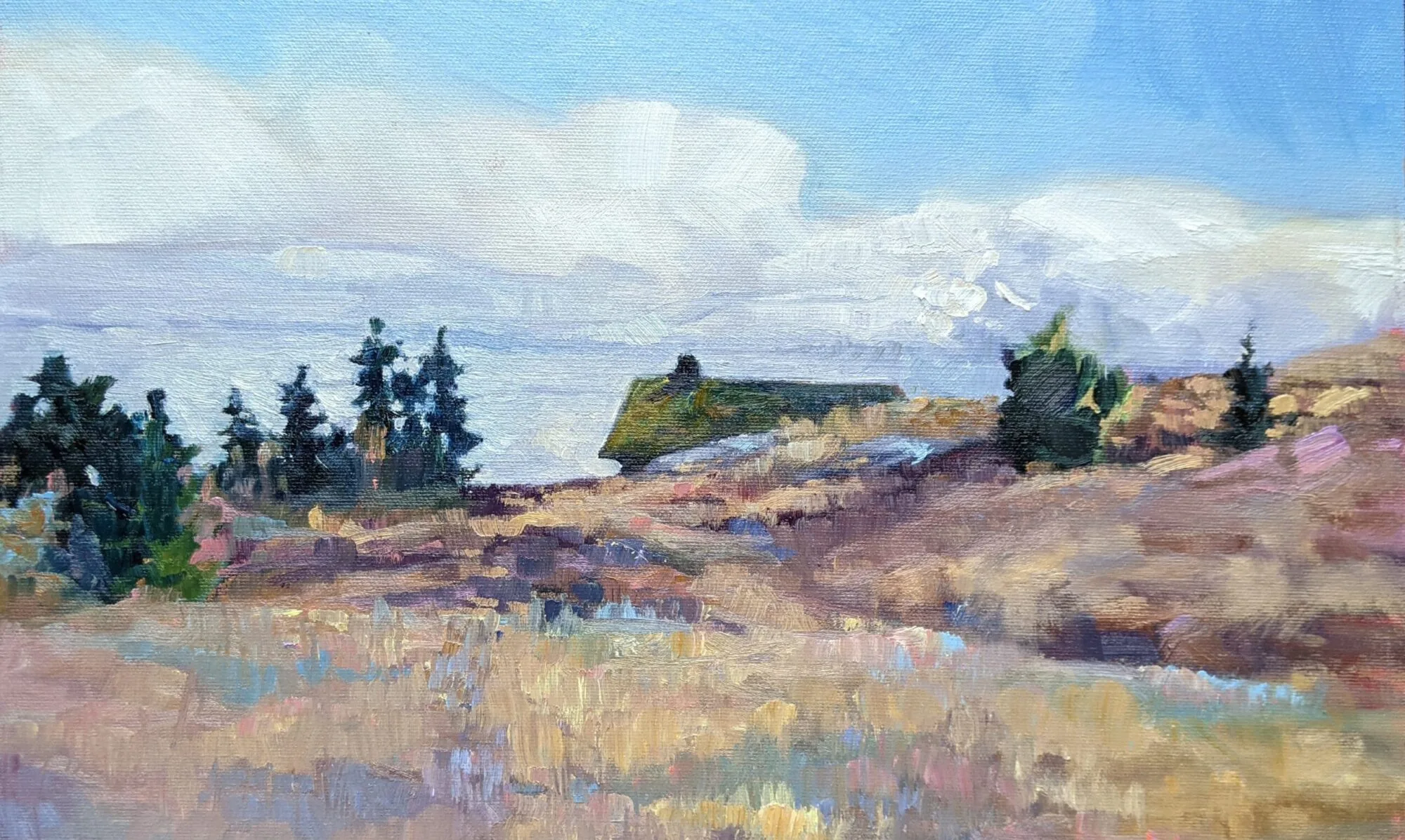
Looking at a painting from a distance (or on the tiny screen of your phone), you’re not compelled by brushwork or even—mainly—by subject matter. You’re being drawn by the internal structure and abstract masses of value and hue on the canvas.
Music, sculpture, poetry, painting, and every other fine art form relies on internal, formal structure to be intelligible. This is easiest to see in music, where even the rank beginner starts by learning chords and patterns. These patterns are (in western music, anyway) pretty universal, and they’re learned long before the student transforms into another Bach or Ray Davies. In other words, you start at the very beginning.
 |
| Mountain Fog, by Carol L. Douglas, available from the artist. |
This structure has nothing to do with the subject matter and everything to do with inherent beauty. It starts before the artist first applies paint, in the form of a structural idea—a sketch, or a series of sketches in monochrome, that work out a plan for the painting.
What composition isn’t is the sudden realization, when you’re halfway finished, that you have a lot of boring canvas with nothing going on. Slapping a sailboat in there isn’t going to fix an essentially deficient construction.
| Hiking boots and toilet paper, by Carol L. Douglas. Boy has this become the symbol of my past year! (Available from the artist.) |
Music is an abstract art because it’s all about tonal relationships, with very little realism needed to make us understand the theme. (Think of the cannonade in the 1812 Overture, which comes at the very end, but we’ve all gotten the point long before that.) A composer doesn’t need little bird sounds to tell us he’s writing about spring, although they can be cute. Done right, the painter doesn’t need to festoon little birdies on his canvas to tell us he’s painting about spring, either. That should already be apparent in the light, structure and tone of his work.
Abstraction is harder for the representational artist to grasp, even when we understand the critical importance of line and abstract shapes. We still have to stuff a huge three-dimensional reality into a two-dimensional picture plane. That’s a big job and it must be handled with deliberation.
| Inlet, by Carol L. Douglas, available from the artist. |
Just as with everything else, some of us are naturally better composers than others, but that only takes us so far. We all fail when we don’t put composition at the beginning of our painting process.
All of us have closets full of bad paintings we can’t resolve. (“How long did that take you?” “Just the ten bad ones I did before I did this one good one.”) In almost every case, the problem is far deeper than modeling or paint application—it comes from ignoring the fundamentals of composition.
How can you avoid this and reduce the number of bad starts in your painting collection?
Respect the picture plane: the four ‘walls’ of your canvas are the most important lines of your painting. All composition must ultimately relate to them.
Armature: the fundamental lines of movement that connect the main elements of the painting must be dynamic and clearly articulated;
Abstract shapes: these are the building blocks of painting; they must relate as values and colors before they ever become real objects.
Then, and only then, can you move on to specific subjects and painterly detail.
“Remember, that a picture, before it is a picture of a battle horse, a nude woman, or some story, is essentially a flat surface covered in colors arranged in a certain order,” wrote one of the fathers of modern painting, Maurice Denis. As the direct heirs of Modernism ourselves, we would do well to listen.
