Use the code XMAS100 to take $100 off the price of any painting. This code is valid for any painting, from the smallest to the biggest, for a limited time.
This week, my four-year-old grandson and I have been playing with Matchbox cars and Legos. In my spare time, I’m doing a little online Christmas shopping, and listening to heavy-handed hints from the eight- and nine-year-old. That’s gotten me thinking about what would make a good gift for each person on my list.
The best gifts thoughtfully match the recipient’s personality, interests, and needs. They reflect our understanding of our loved ones and show that we put in the effort to select something meaningful.
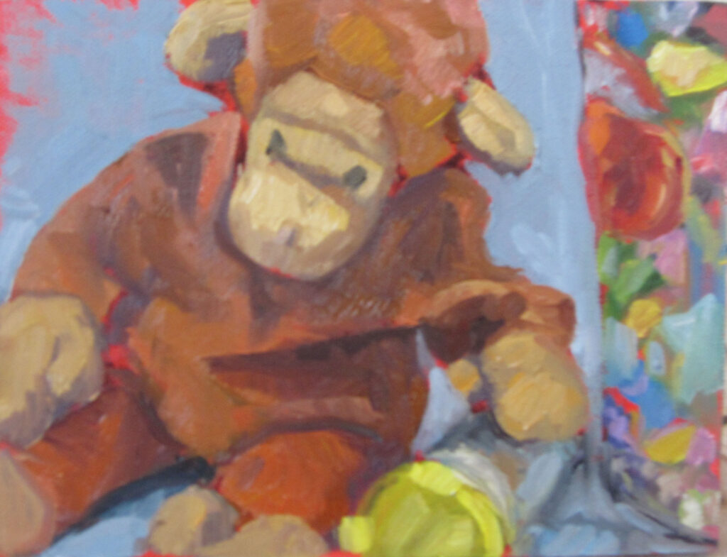
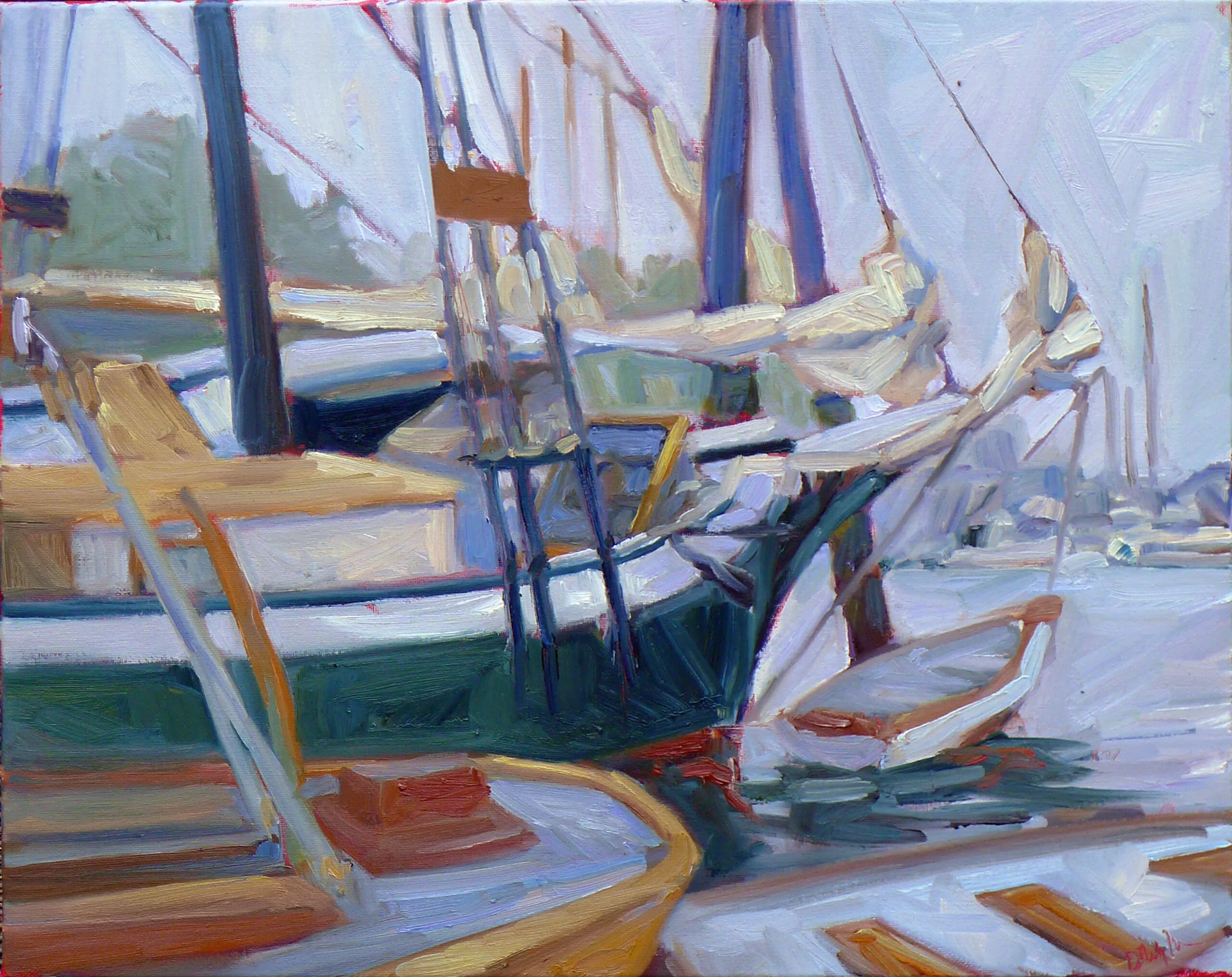
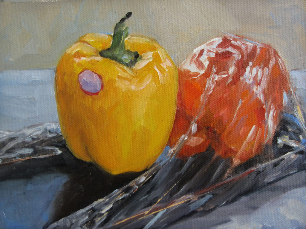
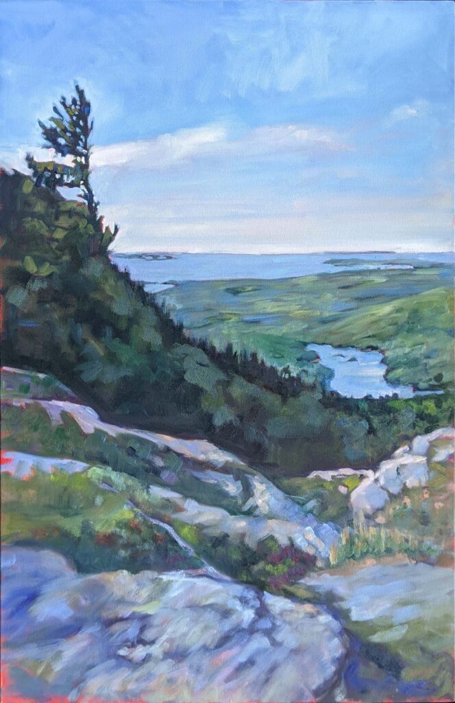
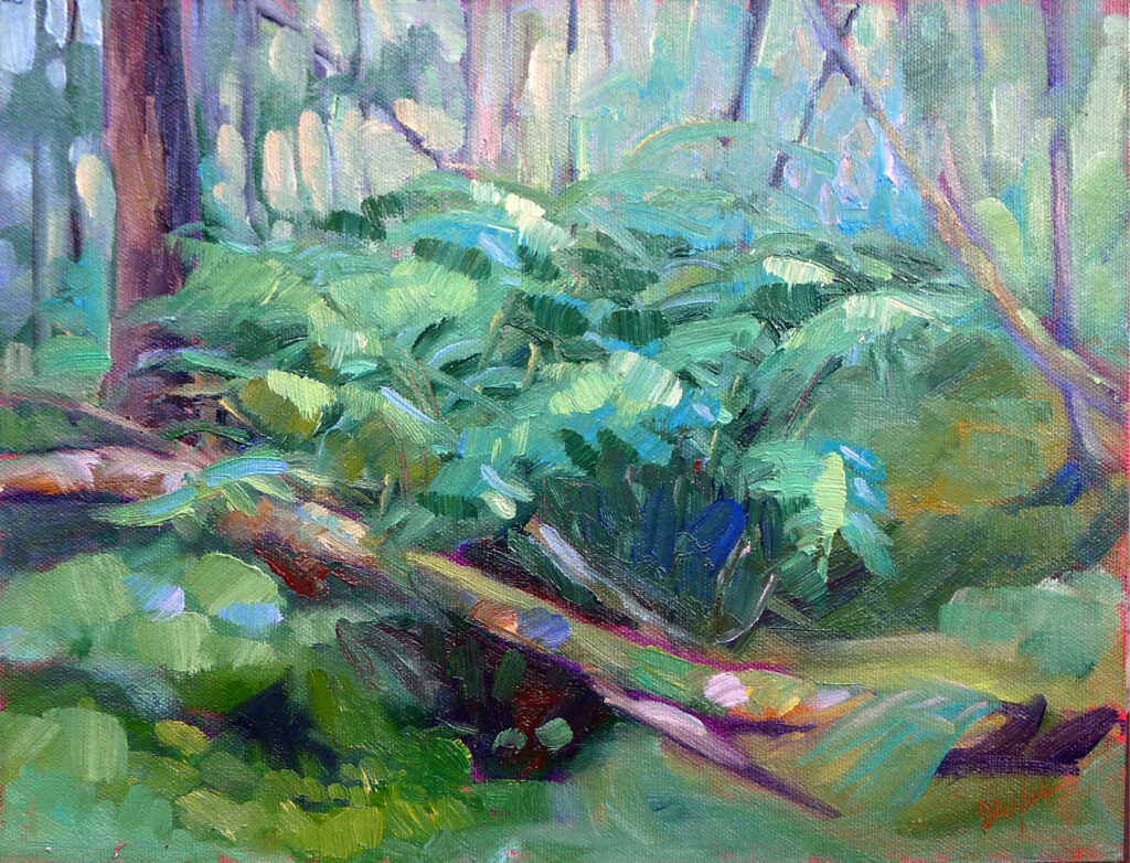
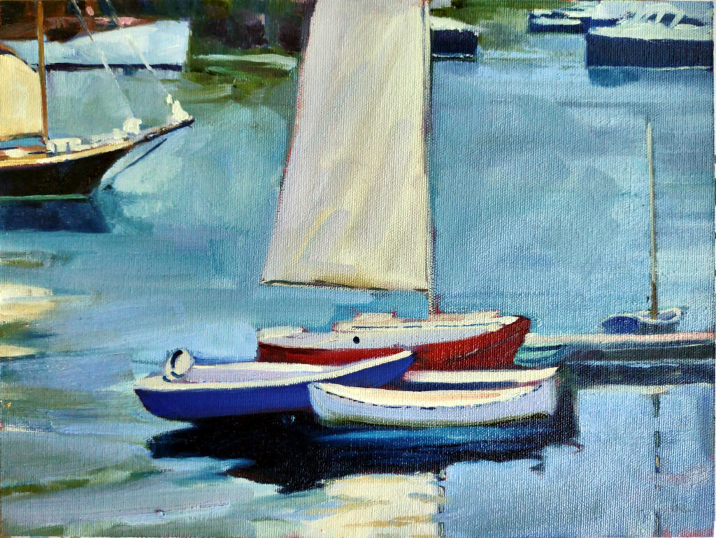
A great gift is personalized. It speaks to the recipient’s tastes, hobbies, and life experiences. You wouldn’t buy a painting for someone who has no interest in fine art, but anyone with walls can aspire to more than the ‘art’ available at TJ Maxx. You might tailor a painting to the recipient’s love of cooking, boats, nature, or shoes, or in the understanding that they might laugh at the absurdity of a tin-foil hat. You know the places he or she finds special: the shore, the desert, or the Great White North. That’s a sign that you’ve both listened and remembered.
A great gift has an emotional connection. That’s why concert tickets are such a wonderful present: they share feelings. Whether that’s joy, nostalgia, or excitement, gifts that remind us of shared experiences are often the most valued gifts.
A great gift emphasizes quality over quantity. Years ago, I saved my pennies and bought my mother her first and only strand of real pearls. She kept them until her death, and I have them now. I bought her many other gifts over the years, and I can’t remember many of them, but that strand of pearls was a winner.
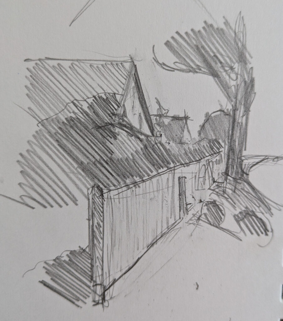
A great gift is unique
One of the gifts I’ve received that gives me the most joy is a high-tech hip flask, which was my 65th birthday gift. Another is the tactical backpack which travels around the world with me. They’re not exactly the gifts most grandmothers covet, but they were both unique and very targeted.
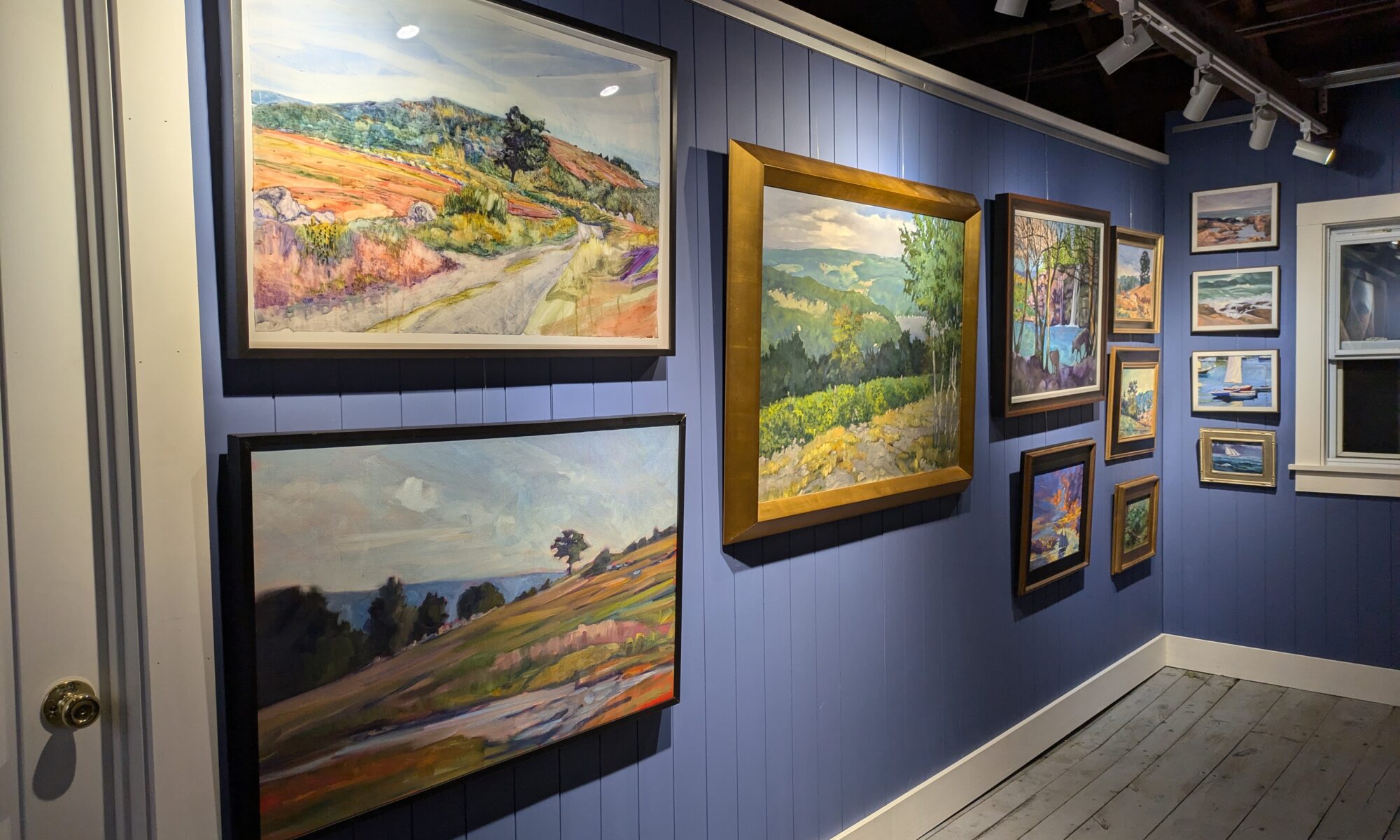
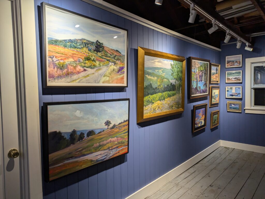
And of course I own paintings by many of my peers, including Tom Conner, Bobbi Heath, Barbara Tapp, Bruce McMillan, Bruce Bundock, Chrissy Pahucki and others.
Paintings are one-of-a-kind, and many people get a thrill knowing they have given or received something nobody else owns.
By the way, this is why I don’t sell NFTs and no longer sell prints of my work. Paintings are one-off, tactile objects of craftsmanship, and images of them are pale imitations.
A great gift has long-term significance
My grandkids have lots of grandparents, aunts and uncles. On Christmas, I sometimes wonder if they remember what they opened five minutes earlier. The thrill at their age is in the unwrapping, not in the plastic toy.
Nothing lasts forever, but a carefully-chosen painting has value for years to come, and can be enjoyed by generations.
You can take $100 off any of my paintings
If you’d like to give a painting to a loved one (or even to yourself), you can use the discount code XMAS100 for $100 off any painting on my site. As you look through the collection, consider what resonates with you and what might resonate with the people on your list. Read the stories behind the paintings. Ask me questions, and use this opportunity to make this year especially memorable.
Reserve your spot now for a workshop in 2025:
- Advanced Plein Air Painting, Rockport, ME, July 7-11, 2025.
- Sea and Sky at Acadia National Park, August 3-8, 2025.
- Find Your Authentic Voice in Plein Air, Berkshires, MA, August 11-15, 2025.
- Immersive In-Person Fall Workshop, Rockport, ME, October 6-10, 2025.