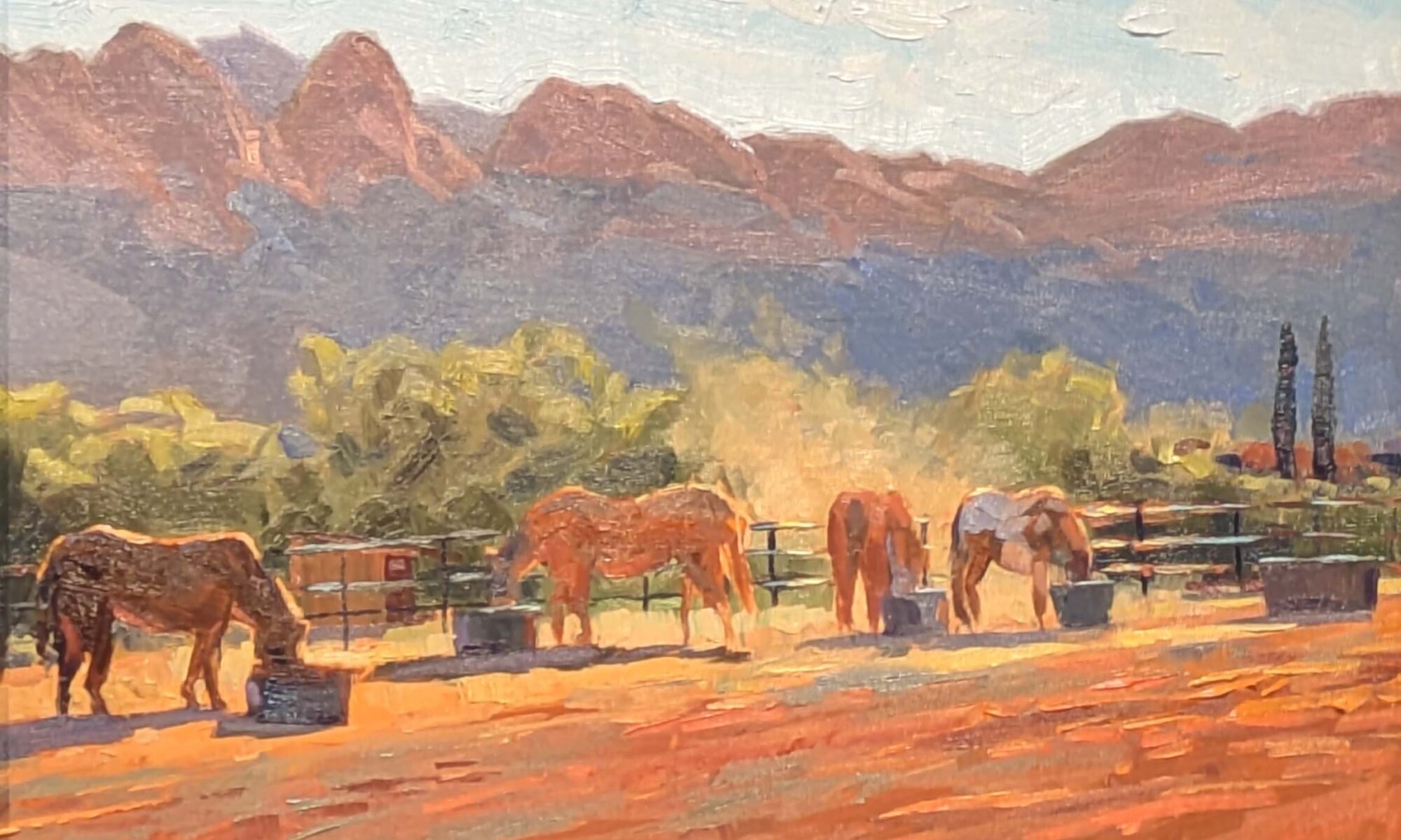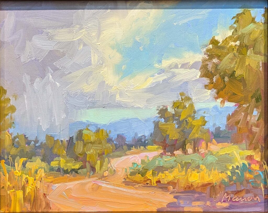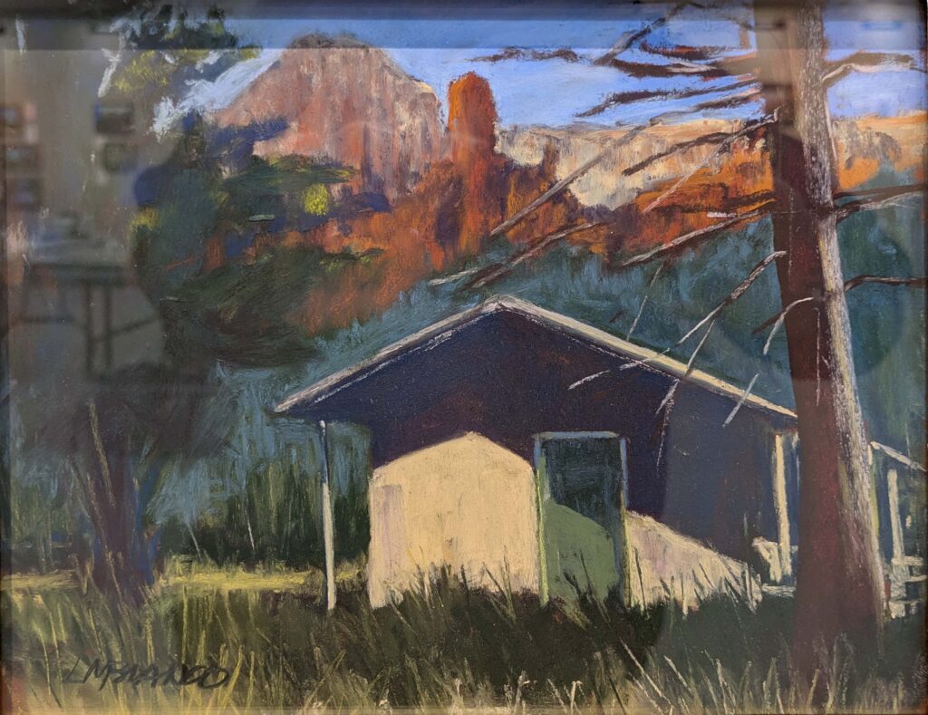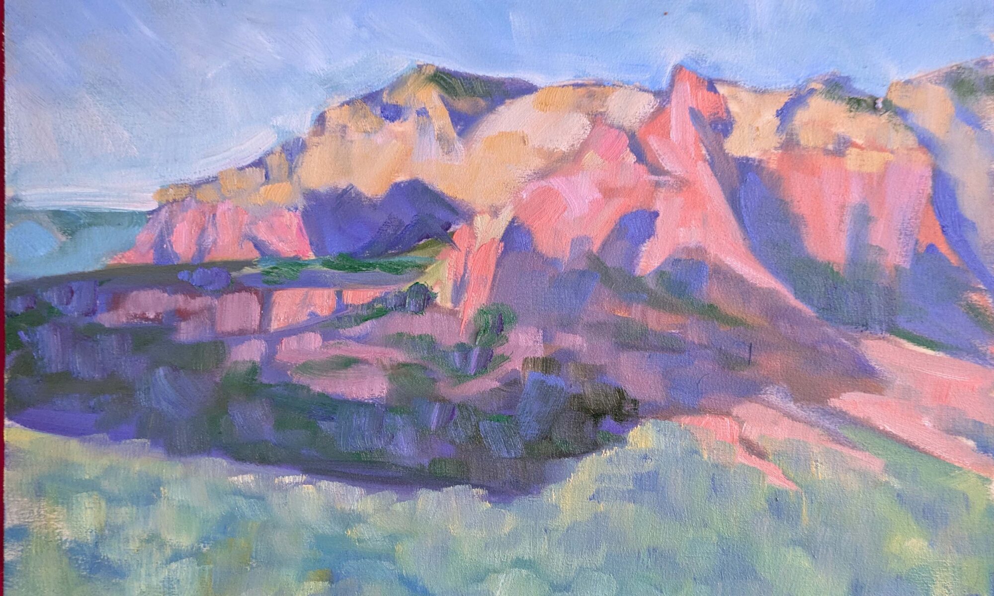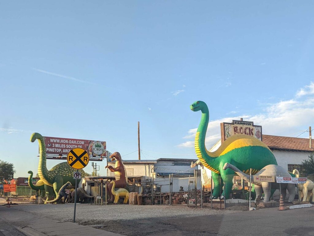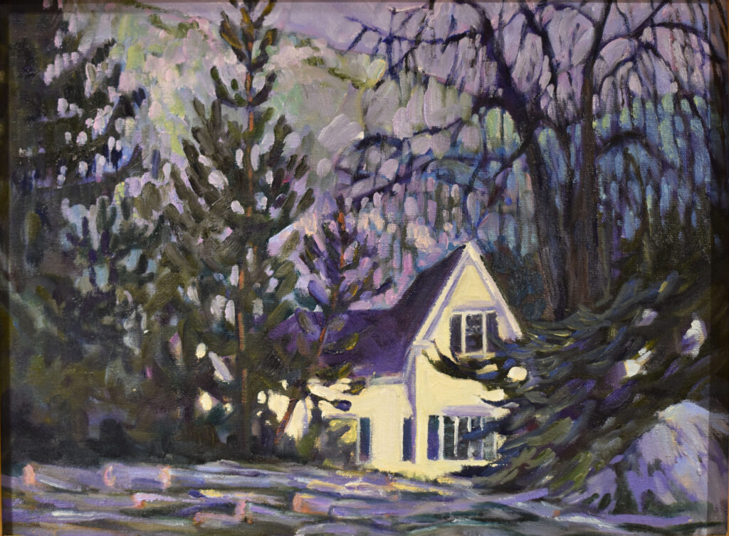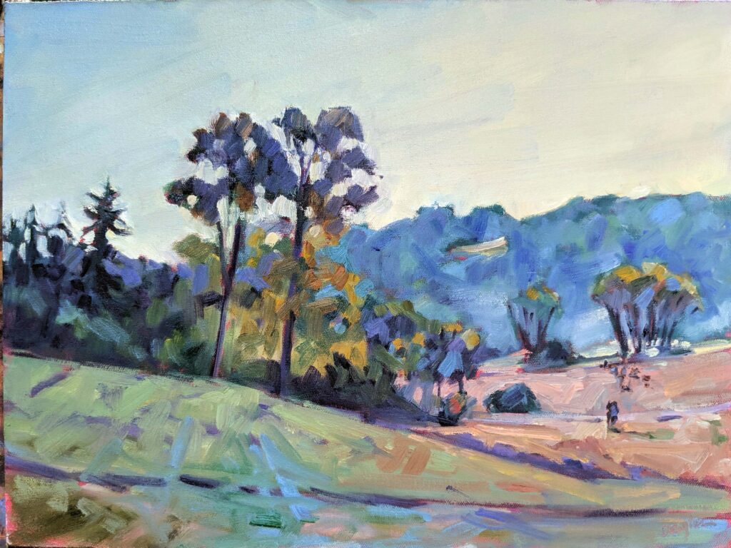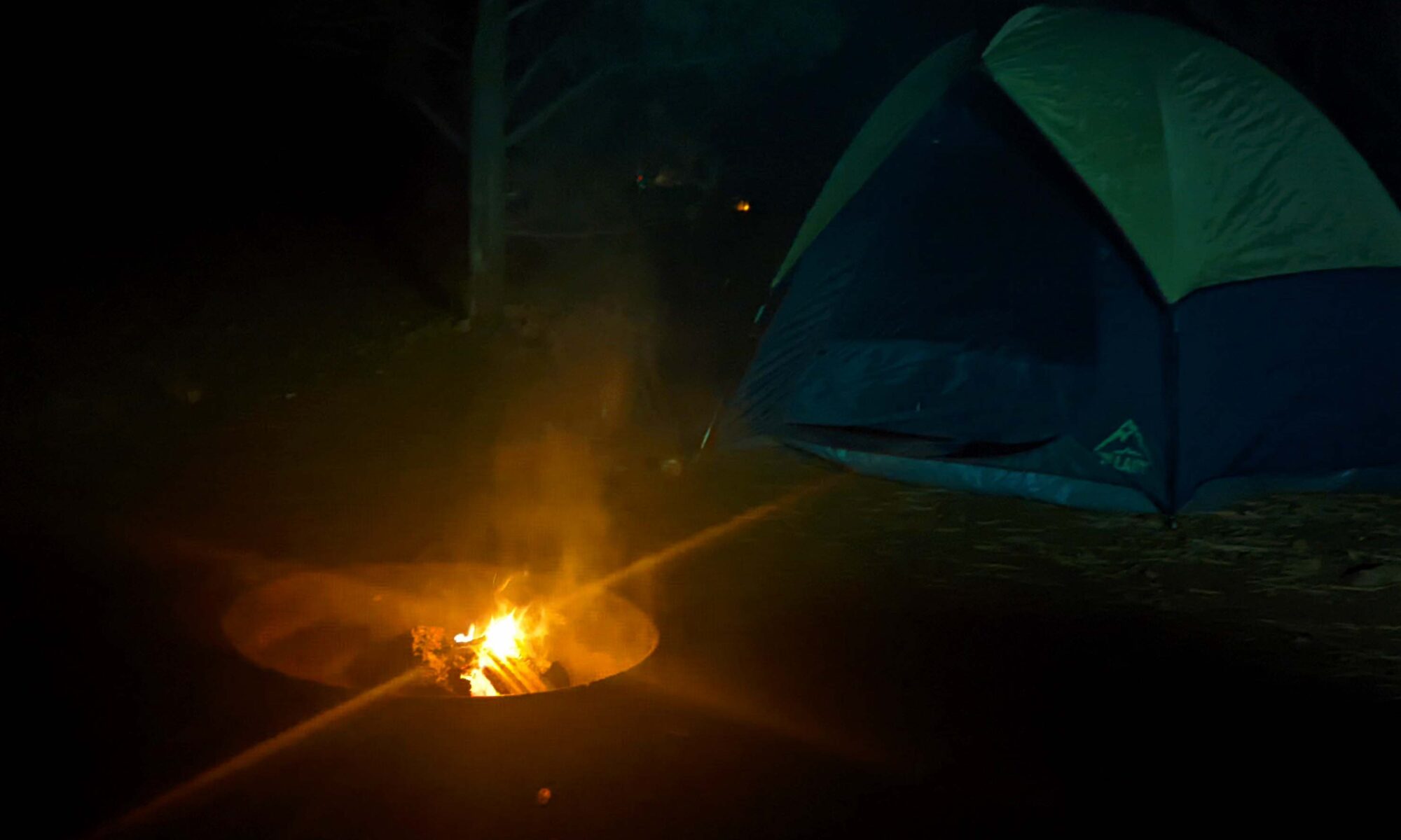
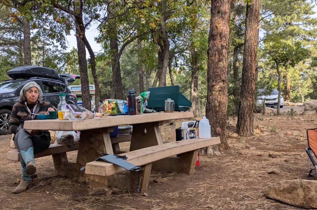
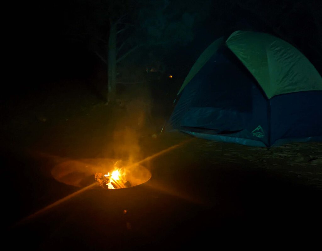
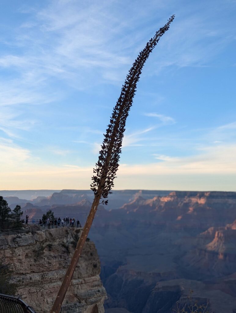
Laura Martinez-Bianco, my husband and I left Sedona Arts Center at 2:05 PM Saturday, heading toward Mathers Campground at the Grand Canyon. The last time I did this was with painting student Kamillah Ramos two years ago. I had a pretty good idea that we’d arrive just as the sun threw the last light onto the rim of the canyon, and so it proved.
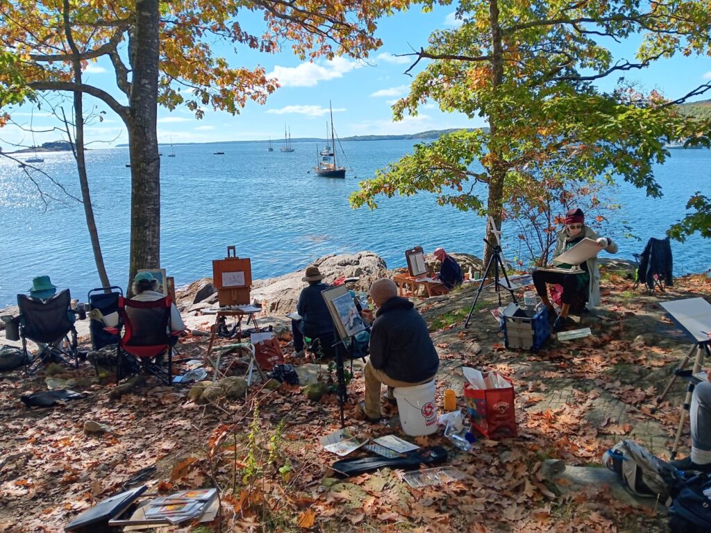
For the past quarter century, the world’s beauty spots have been infested by digital photographers. I first saw this in 2008 at Phillip Island in Australia, where the evening march of the fairy penguins to their nests was obscured by tourists jostling to grab the perfect shot. “It happens every time,” my Aussie cousin told me.
The selfie stick and influencer-wannabes have made this worse. At Mathers Point, we could have tried to thread through the selfie photographers, but instead we just stood at the rim. “Pity the poor people at home who have to look at those vacation photos,” my husband commented about one particularly obnoxious man. “Hundreds of views of the same guy’s face.”
There’s more to life than your smart phone and selfie stick
Prior to 2000, people shot photos on film, which was expensive. When I visited the Grand Canyon, Bryce Canyon and Zion National Park in 1992, we shot three rolls of 36 exposures, or 108 images. Much more time was spent seeing than shooting.
Photography is so easy that pictures have become more about sharing on the internet than as a record for posterity. You can’t really see natural beauty through the screen of your phone, and nobody else is that interested in your vacation pictures. Yes, digital pictures are ‘free,’ but if you’re always looking at the screen of your phone, they steal the experience.
Your camera is making a sucker out of you
Last month, when the aurora borealis was peaking in North America, several people told me, “I saw them, but they weren’t as bright as I thought.” That’s because our expectation has been shaped by cell-phone photography. (I grew up in the Great Lakes region, and I’ve seen them many times.)
People will say, “I took that without a filter!” Unless you’re savvy enough to override the controls on your cell phone, it is, essentially, a filter. The aurora borealis looked brilliant on the internet because cell-phone (and digital) cameras automatically adjusted the exposure.

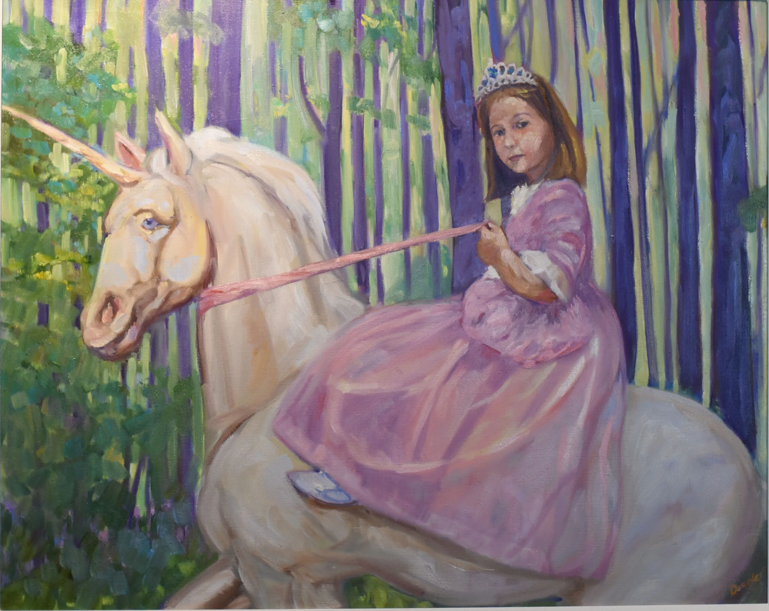
How modern photography has changed painting
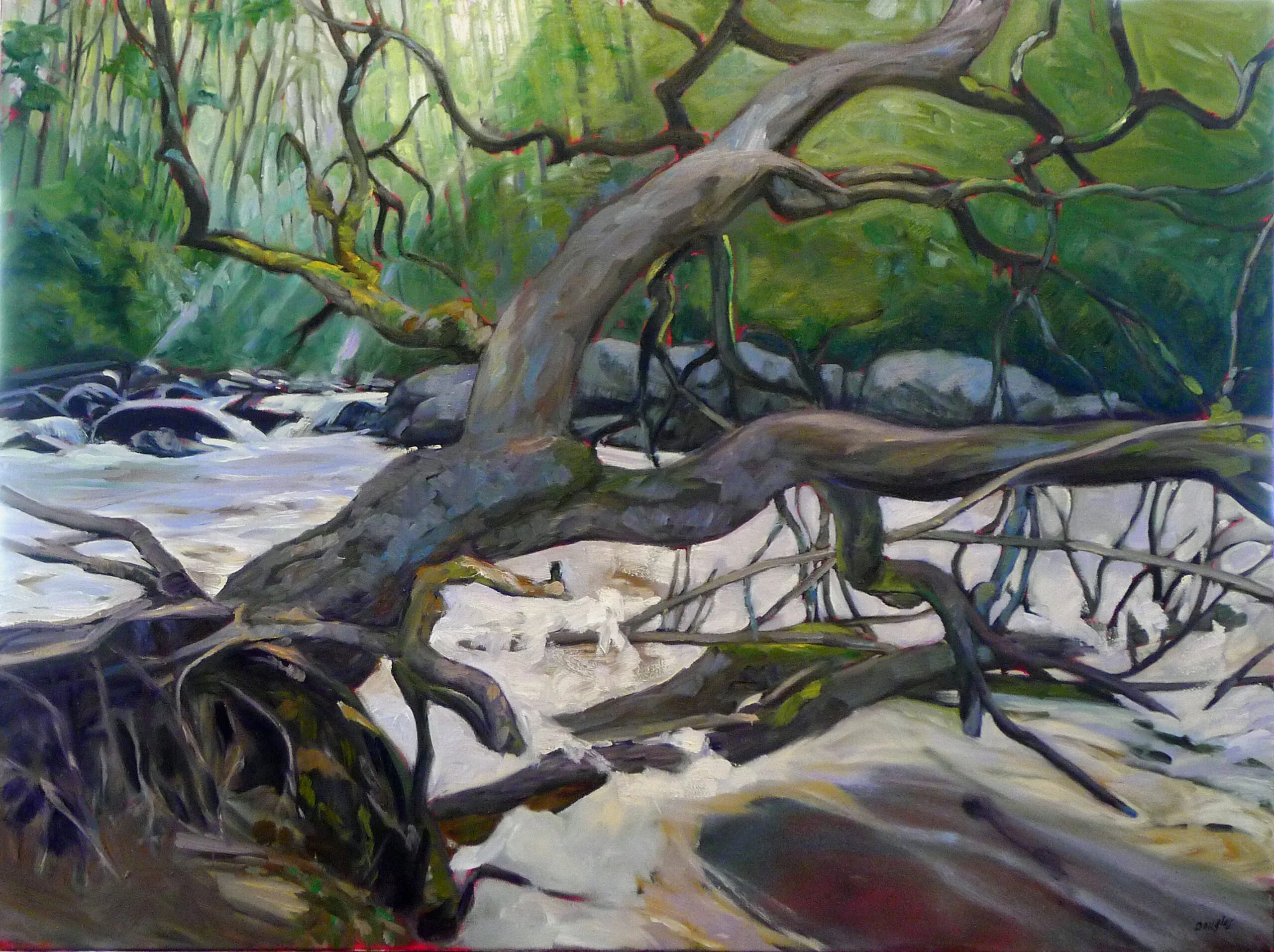
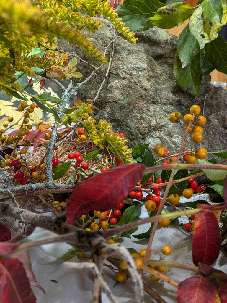
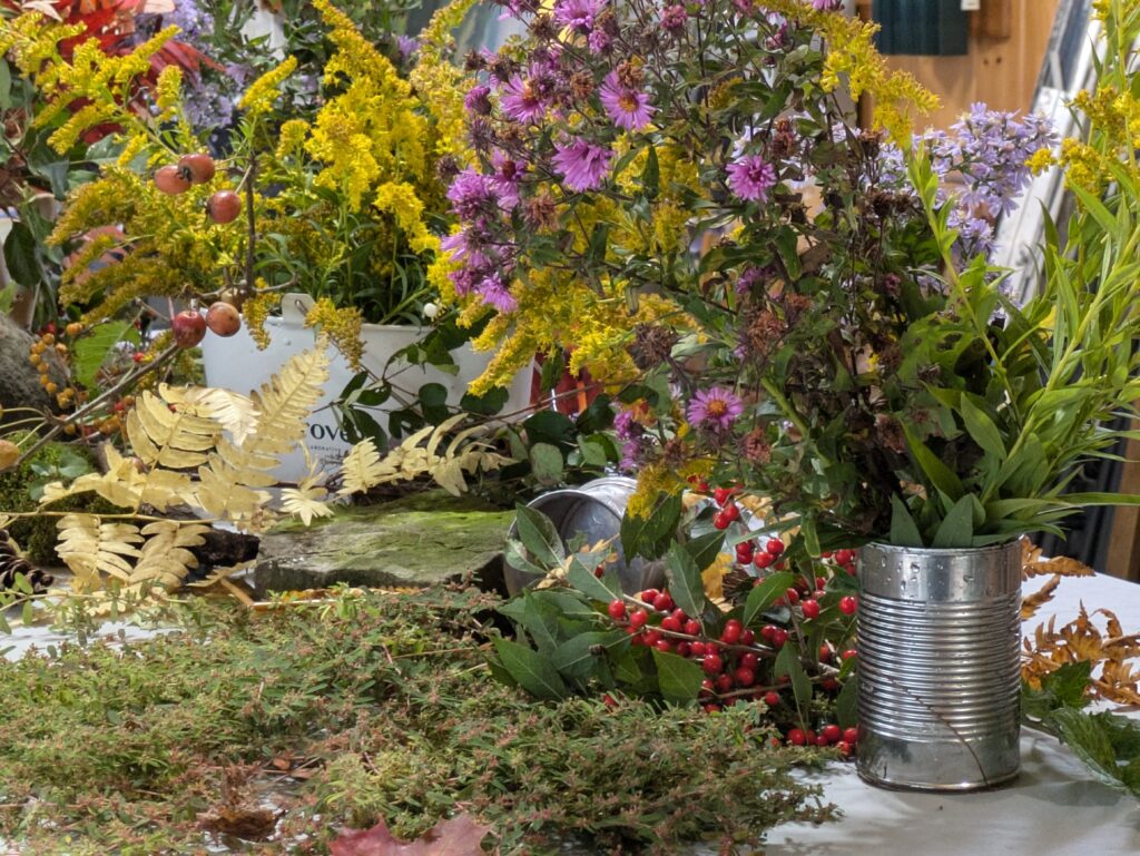
It’s easy to oversaturate digital photography, and high chroma looks great on a video screen. That is in turn pushing modern painting into higher saturation. I like it, but it’s no more natural than my eyebrows.
Put down the camera… and the brush
“Do you want to go out at dawn to paint?” Laura asked me on Sunday morning. I had a long drive ahead of me, and, alas, we had to tear down our camp before hitting the road.
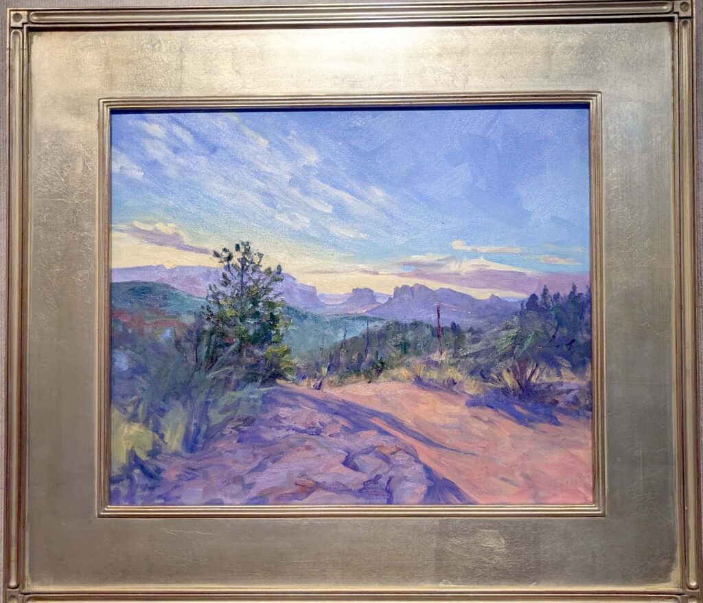
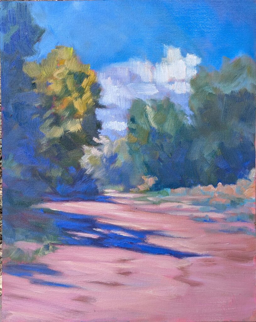
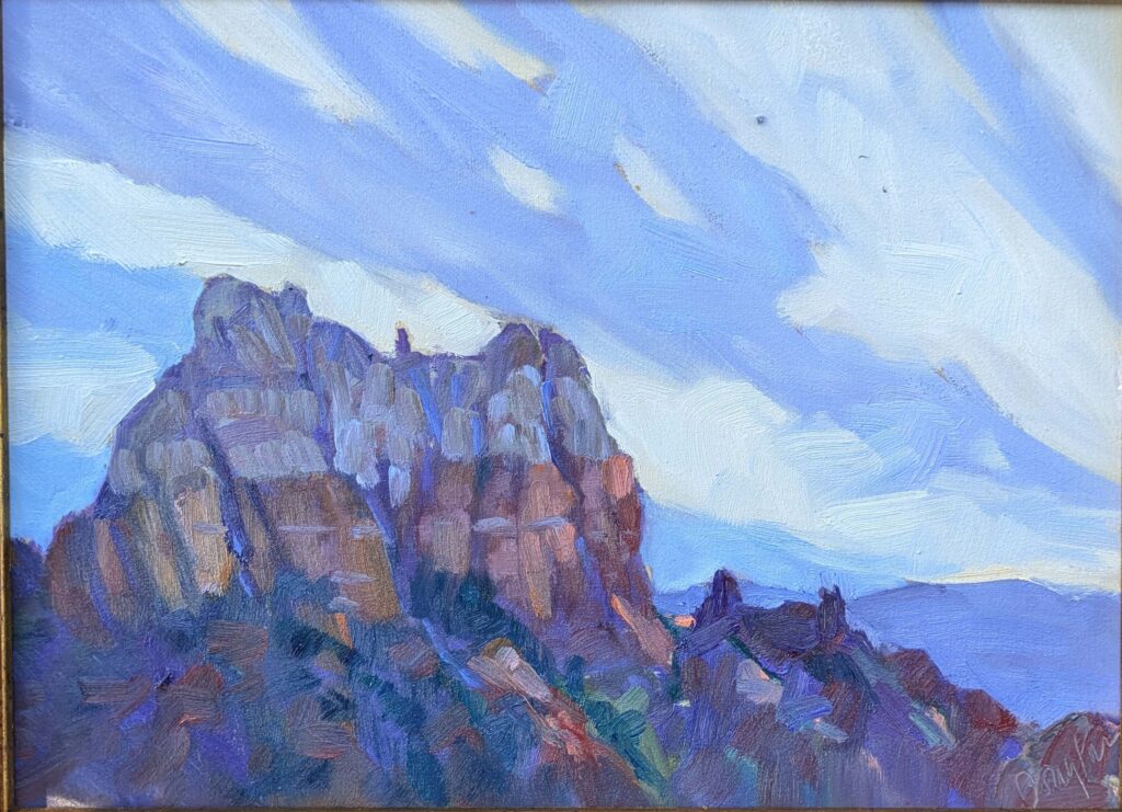
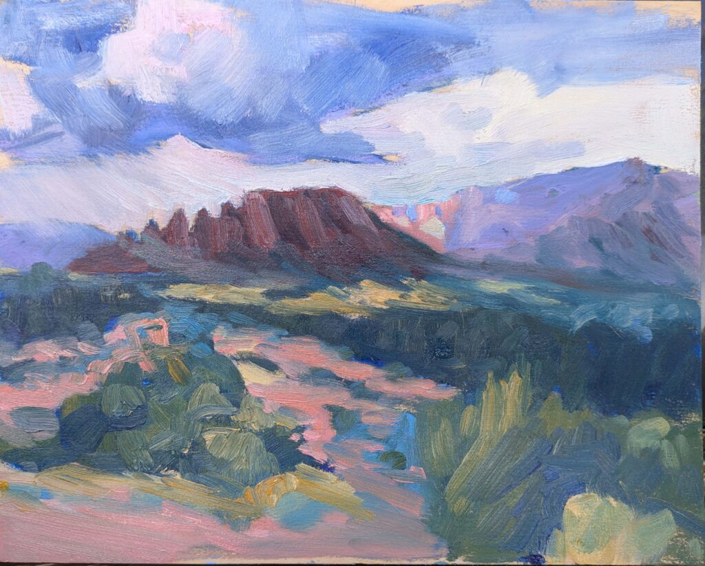
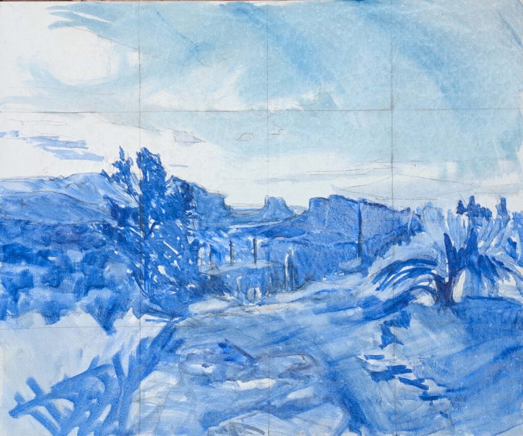
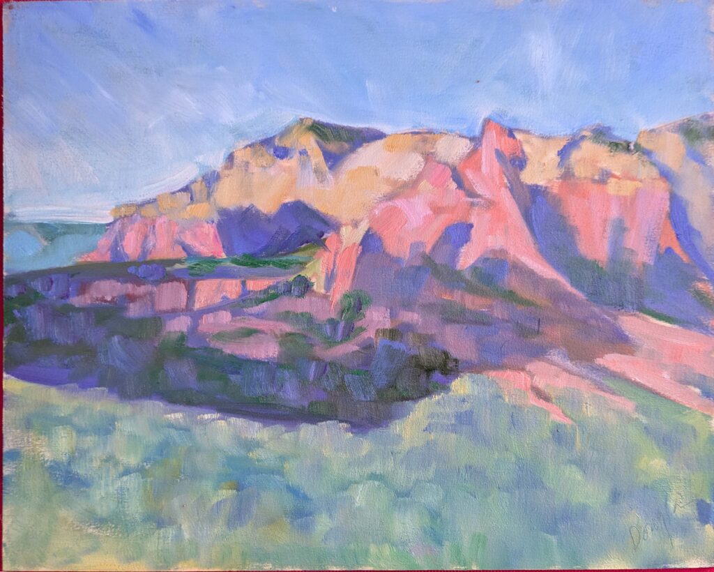
“Besides,” I told her, “My eyes and brain are tired.” Including all the events, Sedona Plein Air is nine days long, after all. Just like photography, the act of painting changes how you look at the world around you. I needed a reset.
I then drove hundreds of miles across the Kaibab Plateau and then north on US 89 between Bryce Canyon and Zion National Park, before finally hooking up with the interstate system. Since I was behind the wheel, I didn’t take a single photograph, but I saw dusty blue vistas that stretched forever, snow on high peaks, magnificent yellow cottonwoods, and hoodoos and hillsides scoured by the wind. It’s one of the most fantastic drives in this country, and it’s printed in my memory in a way that cell phone photos just can’t touch.
Sometimes, you have to put the phone—and the paintbrush—down and take time to just look.
Reserve your spot now for a workshop in 2025:
- Advanced Plein Air Painting, Rockport, ME, July 7-11, 2025.
- Sea and Sky at Acadia National Park, August 3-8, 2025.
- Find Your Authentic Voice in Plein Air, Berkshires, MA, August 11-15, 2025.
- Immersive In-Person Fall Workshop, Rockport, ME, October 6-10, 2025.