fbpx

Monday Morning Art School: a brief history of color

Most of us use a mixture of modern and antique colors. We stand on the shoulders of giants, after all.

Best Buds, by Carol L. Douglas. Available. Like most modern artists, my palette is a combination of historic and modern colors.

Minerals have been used as pigments since prehistory. What our ancestors did with color is largely a mystery, but pigments and paint-grinding equipment dating between 350,000 and 400,000 years old have been found in a cave in Zambia.

Most of these earliest colors are warm, and most are named after cities where they were mined and milled. Thus we have the siennas, from Siena, Italy, and the umbers, from Umbria. Siennas are warmer and lighter than umbers; the difference comes from the introduction of manganese to the umbers, either naturally or in the milling process.

Vineyard, by Carol L. Douglas. Available. This painting could have been executed in purely mineral pigments, but it was not.

This ancient family of pigments also includes red and yellow ochre. What they all have in common is the presence of iron oxide. In its most common form, that’s plain old rust.

The last pigment our prehistoric ancestors used was charcoal, which they discovered along with fire. That comes down to us as modern ‘carbon black.’

There is one cool pigment that was available to the ancients: the semi-precious stone lapis lazuli. This comes down to us as the pigment ultramarine blue, so named because it came from ‘beyond the sea’. Needless to say, when you were grinding up the family jewels for color, you used it sparingly.

Striping, by Carol L. Douglas. Available. The search for blue drove pigment synthesis.

That limited palette frustrated our intrepid ancestors as much as it would frustrate us today. They experimented with synthesizing pigments as early as 2000 BC. The earliest of these synthetic pigments were Egyptian Blue, which we still only imperfectly understand, and lead white. By the time of the Renaissance, vermilionverdigris, and lead-tin-yellow had been added to the paint box. These were made from mercury, copper and lead, and were all deadly.

Indian yellow is another pre-modern pigment. Legend had it being produced from the urine of cattle on the Indian sub-continent. Its actual source remains a mystery. Unlike its modern analog, it was fugitive (meaning it faded).

The expense and rarity of lapis lazuli drove the discovery of modern blue pigments. Prussian blue was discovered by accident in 1704, and ultramarine was being synthesized by the turn of the 19th century. Cobalt (cobalt and aluminum) and cerulean (cobalt and copper) blues are about the same vintage. I’m vastly oversimplifying here, but scientists were tinkering with the whole notion of chemistry, mixing up minerals to see what happened. And a lot of what happened were new pigments.

Marshall Point rocks, by Carol L. Douglas. Available. Impressionism would not have been possible without modern chemistry.

In 1856, William Henry Perkin was attempting to make a cure for malaria when he accidentally created the first aniline dye, mauveine. This was the forerunner of hundreds of synthetic dyes and pigments, and the basis of modern organic chemistry.

It is no coincidence that Impressionism was invented simultaneously with organic chemistry. It would not have been possible without the new colors being synthesized in the laboratory.

The last explosion of color happened with mass industrialization in the 20th century, as science searched for coatings for steel. While cadmiumhas been known as a pigment since the 1840s, it was rare. It wasn’t until industrial chemistry found a way to isolate the metal in the 1930s that cadmium became cheap enough to use as a pigment. Phthalo blue is another pigment that is a by-product of industrial science.

Everything I know about color history comes from Philip Ball’s Bright Earth: Art and the Invention of Color, and Victoria Finlay’s Color: a Natural History of the Palette. Of the two, I prefer the former, but both are good reads.

Gamblin publishes an excellent chart of colors, classified as either mineral (Impressionist and Classical) and organic (20th century). Your assignment is to look through your paint box and list where your paints came from. Are they:

  • Classical
  • Impressionist
  • 20th Century

If you’re using a classical palette, it will probably be made of modern pigments, because most of the toxic or rare older colors have been replaced. But these analogs have been designed to mimic the historic colors as closely as possible.

If you’re trying to paint like Rembrandt, but are using Van Gogh’s palette, you’re going to fail. Rembrandt painted indirectly, in transparent layers, and Van Gogh painted alla prima. You need to match your paints to your desired outcome.

That doesn’t mean that every pigment you use has to slavishly match some historic period. Most of us use a mixture of mineral and organic colors. We stand on the shoulders of giants, after all.
Loss and love

We think of it as a political problem but every single coronavirus death in America is, first and foremost, a personal tragedy.

My late Aunt Mary, painted a long time ago by me.

I’m in Buffalo for a memorial service. My uncle was in fine fettle when I was in Argentina in March, texting me about my trip. A few days later, he was dead. Yes, I’m aware that he had lived a rich, full life, but that is small consolation for the sudden loss of someone I loved very much.

My cousins endured their father’s death in the worst parts of the epidemic, separated and unable to comfort him or each other. They’re no strangers to loss; their mother (my aunt Mary) died the day before her sixtieth birthday. I am comforted by the idea that my aunt and uncle are reunited now, along with the infant son they lost so many years ago.

Like my whole extended family, my uncle was a committed Catholic Democrat. I’m sure he was puzzled when I ended up a born-again Reagan Republican. But that was never a factor in our relationship. It puzzles me when people use politics or religion as an excuse to fight with their families.

Grain Elevators, Buffalo, by Carol L. Douglas. The waterfront in my hometown looks so much better than when I painted this. I really should teach a workshop there sometime soon.

A friend sends me videos every day criticizing our government’s response to coronavirus. I delete them without responding. The last emperor to be criticized for his response to plague was Pharaoh, and that was by his escaped Hebrew slaves; his subjects certainly didn’t mention it. Was the Emperor Justinian castigated for allowing bubonic plague into Europe, or Edward III deposed because he didn’t prevent the Black Death?

Mankind’s historic understanding has been that there are only two possible tools against plagues: prayer and science. The Ghost Map is an excellent read about the origins of epidemiology. In 1854, people were more interested in containing cholera than blaming their political opponents for its rise.

First ward, Buffalo, oil with cold-wax medium on gessoed paper, by Carol L. Douglas

Still, there are questions that require communal response. What we do with kids in a few weeks’ time, when they’re supposed to return to their classrooms? How do we protect our elderly? Perhaps both of these questions really point up that we have gotten a little too reliant on large institutions.

None of my kids were born in Buffalo, but they are all traveling back to pay their respects to a man I loved. I’m very touched by this. Last night I went for a walk with my oldest grandchild. He may be only five, but he has insights into complex concepts. If he never spends another day in a classroom, he’ll be fine. Both parents are engineers and quite able to teach him all the way up through multivariable calculus.

When my mother started kindergarten, she did not speak English. Her own mother was illiterate. Public school was a lifeline and the way out of poverty for my mother and her siblings. The same is true of my goddaughter, whose parents are Chinese-speaking former refugees. We have record-high levels of immigrants in the US today. They need public school. The same is true of native-born kids whose parents didn’t have good educations. We must find ways to teach them.

I’ve watched many small businesses close this year. Many of them were already struggling. Lockdown was the coup de grace that brought them down. This is economic pruning. It may yet prove to be a healthy thing for our economy, just as the Black Death ultimately resulted in the end of serfdom in Europe. I remind myself of that every day. Crisis is opportunity. Either we adapt, or we retire from the field.

But all of that is political. Every single coronavirus death in America is, first and foremost, a personal tragedy. This weekend, I’ll be thinking of my uncle and what a fine man he was, and how immeasurable a loss his death is to me, and to a whole community.

Water everywhere

What is the dominant theme that threads through your work?

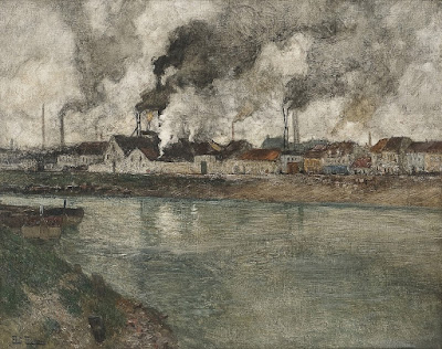
La Dordogne, c. 1902, Frits Thaulow

I stopped in the western Berkshires to collect eggs for my daughter. (She has pullets who are just learning to lay and she is out of town.) The leading edge of Tropical Storm Isaias had arrived. There was water everywhere, making a river of her driveway, washing the birds’ run clean. After a few moments, it didn’t much matter to me if I was running in the rain or swimming in nearby Kinderhook Creek. I loved every second.

Western New York (where I’m from) gets so much precipitation that it would be a temperate rain forest if it weren’t domesticated. It has a filtered light that has much in common with northern Europe. That can be tough to translate onto canvas. This is part of the reason I moved to Maine. I needed to escape the 200-or-so days a year when the eastern Great Lakes sit under a fat, wet cloud.

A River, c. 1883, Frits Thaulow, courtesy the Hermitage

Low light is difficult to paint and difficult to sell. Every time I suggest we go out and paint on a misty day, Ken DeWaard tells me, “I already have a closet full of paintings done on grey days.” That has an element of truth to it, but it’s not a universal rule. My own Tricky Mary in a Pea-Soup Fog was painted on a very dull day in Camden, and it was just purchased by a collector who likes the indirect light.

I think that light is in part what has denied Scandinavian Impressionists, in particular the Skagen Painters, their due prominence in art history. (The other reason is regional bias, which is why the Heidelberg Painters, the Group of Seven, and the Peredvizhnikiare not as famous as the French Impressionists.)

Norsk vinterlandskap, 1890, pastel, Frits Thaulow

Frits Thaulow was among the earliest painters to go to Skagen (Denmark’s northernmost town). At age 32, he sailed from Norway with his friend and fellow painter Christian Krohg. They spent the summer months painting the fishermen and boats of Jutland before returning home.

Thaulow was from an affluent family and had the advantages of a good art education. He studied with C.F. Sorensenand Hans Gude. With Sorensen as his mentor, it’s no wonder he could paint water.

Winter at the River Simoa, 1883, Frits Thaulow, courtesy National Gallery of Norway

He then spent four years living and working in Paris. His return to Norway coincided with a general rise in interest in Impressionism in Scandinavia. He rapidly established his reputation as one of Norway’s best young painters, turning out beautiful canvases that combine the low light of winter with beautifully-reflective water. But being a big fish in a small pond was not enough. In middle age, Thaulow moved himself and his family back to France.

There, he quickly discovered that he had no taste for life in Paris. While it may have been the center of the painting world, it was too urban. Thaulow packed his family to the small town of Montreuil-sur-Mer, in the north of France. It is not, despite its name, on the sea; it’s located on the Canche River. From there, he relocated to Dieppe in Normandy, and then to Brittany, and then in central France.

The Smoke, 1898, Frits Thaulow

I don’t know what drove his restlessness, but through all of his moves, his paintings were grounded in his primary interest: the play of light on water. Wherever he painted, the foreshortened path created by rivers and creeks was his main design element, and the water itself is what elevates the work.

In many cases, the backdrops to his rivers and creeks are, in fact, mundane. But Thaulow excelled in low-light situations where the power of water overshadows the sky, the landscape, and human activity. One could learn everything one needs to know about painting water by studying these canvases. In fact, the only painter who measures up to him in his ability to capture the reflectivity of water is his fellow Scandinavian, Anders Zorn.

In many ways, man has formed his landscape; the vast majority of us live, after all, in a highly-artificial, built environment. But it’s every bit as true that the landscape forms the man. Thaulow abandoned the maritime painting of his youth, but rushing water stayed with him all of his life.

What is the dominant motif that threads through your work? It may not be as tangible as a stream of water; it may be an idea like solitude. I don’t find it an easy question to answer, especially as I’m not much like the person I was when I started painting. However, I do think it’s a worthwhile question, and I think I find echoes of an answer in the same rushing water that drove Frits Thaulow.

Monday Morning Art School: Tone your canvases

Toning makes a difference in how you see lights and darks.

Bracken fern, by Carol L. Douglas. Available through Maine Farmland Trust, Portland, ME.

Imprimatura is the initial stain of pigment painted on a gesso ground. In indirect painting, this color is left open where possible, reflecting back up through the paint layers and creating a cohesive tonal structure.

We don’t paint indirectly in the field, so why do we still tone canvases? Toning is invaluable in the initial stages of work. Not only will a white canvas blind you on a sunny day, it changes how you perceive darks and lights. The tendency when painting on a white board is to start your darks too dark. A toned canvas helps the painter establish a pleasing value structure. We touched on this in our Monday Morning Art School lesson based on Josef Albers.

I use a clapped-out oil-painting brush, but a 2″ wall brush works just fine and is cheaper.

Traditionally, artists chose a warm earth tone like a sienna or ochre, diluted it half-and-half with turpentine, applied it on the canvas with an old brush, and then wiped the residue off with a rag. This is still the best way to tone, since it leaves a layer porous enough to grab the gesso, but in a light, sparkling manner.

With oil-primed canvas and boards, you absolutely must tone that way. While oil paint can be applied over acrylic, acrylic must never be applied over oils. It delaminates. There are some fine painting boards with oil primer, and it’s easy to confuse them with the more common acrylic-primed boards. Read the labels. 

If you’re painting in acrylics, you must use acrylic primer and you cannot use an oil-primed board.

A more traditional toning color, and a frankly bad application. I can say that; I did it.

There is no reason that oil painters can’t also tone acrylic panels with oils, however. It will give you a slightly smoother painting surface, and it’s a good use for leftover paint. However, to save time, we often tone acrylic-gesso boards with acrylic, treating the tone as an extension of the ground rather than as the first layer of the painting.*

Alla prima painters often let the board show through in some passages. What color you want to show depends on your own taste, so I recommend experimenting. Traditionally, painters used earth tones—the ochres, umbers and siennas. I prefer 20th century pigments, so I’ve tried red, lavender, orange, yellow, and blue. I think our predecessors had it right: warmer tones work better.

Birch board is sealed, not toned, allowing the wood color to shine through.

I toned with naphthol red for several decades. I got that idea from Steven Assael, who probably got it from someone else. It’s a good counterpoint to green and blue, the dominant colors of our northeastern environment. It’s energetic, which I aspire to be, and it makes me immediately think in terms of all the accidental colors in the environment.

However, I’ve been experimenting with painting on plain birch panels for the past two seasons. These come naturally-toned, as long as one uses a clear sealant. That points out the basic character of imprimatura—the hue doesn’t matter nearly as much as the value does.

Safety check, by Carol L. Douglas. Available.

Toning makes a terrific mess. Cover your work surfaces. Smooth application isn’t a priority. If you’re toning with acrylics, you don’t want to wipe out the excess so much as mix it to the proper consistency at the beginning, paint it on, and let it dry. In either case, don’t over-coat your canvas; you still want the luminosity of the board to show through.

Acrylic paint manufacturers say you shouldn’t dilute acrylic paint more than 50-50. That’s true even at the toning level. If it’s breaking down into droplets, it’s got too much water in it.

*I recently had a student underpainting in acrylics. I investigated this myself a long time ago and abandoned it for two reasons. The first is that it requires two full paint kits in the field. More importantly, the underpainting becomes part of the ground, rather than the painting. If these are separated for some reason (like relining), there goes the bottom layers of the painting. Far better to just learn to apply the underpainting properly in oils.

Stop thinking like a wage slave

You have to be an entrepreneur if you want to succeed in the arts.

Tricky Mary in a Pea-Soup Fog, by Carol L. Douglas, available.

My parents were the children of immigrants and were raised in great poverty. My mom went on to be one of the first class of nurse-practitioners graduated by University of Buffalo. My father was a child psychologist. Mom worked at the local hospital for her whole career; my father moved around a little, but always within the state system. They aspired to stability. In mid-century America, a job meant a trade-off of loyalty for a good salary and pension. It wasn’t a bad system, as long as it worked. It created a stable community, albeit one where economic mobility was not particularly coveted.

I don’t remember any entrepreneurs among my parents’ friends. The adults around me worked in jobs or professions. Even highly skilled machinists—much in demand—didn’t hang out their own shingles. They went to work in factories, where they were paid very well.

Parrsboro at Dawn, by Carol L. Douglas, available.

In fact, my father was a talented photographer and painter. He had his own studio before he married, but he didn’t know how to build a business. He had no role model for self-employment, so he wisely went back to school and got what he and his peers called a ‘real job.’

That economic system is broken now. Even wage slaves must be entrepreneurial. Young people think of the corporate ladder more as a jungle gym, where they swing from place to place rather than climb vertically.

Blueberry Barrens, by Carol L. Douglas, available.

My goddaughter is also the child of immigrants, but her history is different. Her family escaped the Communist revolution when her father was a young child. They moved to Vietnam and took up the family trade of cooking. After the fall of Saigon, they were again refugees, ultimately washing up in America. They’ve run a small restaurant for decades.

My goddaughter Sandy has a master’s degree and is working on a second one. But when COVID-19 knocked her out of her job, she didn’t go on unemployment. Instead, she’s been cleaning houses. She knows how to use a crisis, so she’s charging the earth in exchange for the risk. In fact, she’s never been shy about telling others how much she’s worth.

After one of her graduations, we went to Chinatown. Her mother and aunt stood listening as she haggled over the price of luggage. Finally, they nodded and the deal was done. She’d just been handed a diploma from one of America’s most prestigious art schools, but—more importantly—she’d demonstrated that she could negotiate a business deal.

Downdraft snow, by Carol L. Douglas, available.

That’s a real skill, and it’s something we don’t come by naturally—it’s learned, as much as calculus or drawing are.

I talked with a talented friend last week. She’s stuck in a low-paying job although she has good writing, video and design chops. When I suggested that she market her own videos, she quickly demurred. Without knowing how to be entrepreneurial, she’ll never escape the soul-sucking, 9-to-5 job.

That’s the bottom line for an art career in modern America. Your success or failure depends, not primarily on your painting skills, or your ‘talent’, but on your ability to sell yourself. If you don’t have that, don’t just give up—learn. Be more like Sandy.

Breaking rules

True to a degree, these rules should be taken with a grain of salt.

Cotopaxi, 1862, Frederic Edwin Church, courtesy Detroit Institute of Arts


Objects in the distance are cooler, blurrier, and lighter than objects in the foreground

That is atmospheric perspective in a nutshell, and in most cases, it’s true. But when an artist suspends that rule, we know we’re in for a major freak show. Frederic Edwin Church’s Cotopaxi (1862), is a great example of atmospherics being tossed to the wind. How else would we have known that we were in the presence of a world-changing event?

Bill’s Yellow (with Admiration), 2005, Cornelia Foss, Houston Museum of Fine Art

Never center your composition.

Artwork Essential’s viewfinder is based on the Rule of Thirds. I was taught to divide canvases using the Golden Mean. Later, I learned about Dynamic Symmetry. All of these are good working systems, and all of them are based on mathematics.

The human mind, in receiving mode, likes to tarry on puzzles. That’s why we use these complex mathematical systems to compose our paintings. In sending and processing mode, however, the mind ruthlessly regularizes thoughts. If you’ve ever tried to paint a screen of branches or flowers, you know how true this is. You must fight to keep them honest. Left to its own devices, your subconscious mind will line repeating objects up like little soldiers.

We “know” compositional rules, and then we see a painting like Cornelia Foss’ Bill’s Yellow (with Admiration) and we realize that all such rules can be set on their heads. This wouldn’t have been nearly the painting it is, had she offset the brush and tree in a conventional manner. Centering them makes them monumental.

Lemon Series #4, Dennis Wojtkiewicz, courtesy of the artist. 

Simplify

Hyperrealism has its roots in what Jean Baudrillard called, “the simulation of something which never really existed.” It could not have happened in its current form without the advent of computers and digital photography. They have created a false reality, an illusion of something more perfect than what is actually here. Digital images are, generally, created very quickly. To mimic them in paint requires time and advanced painting skills, including flat, accurate paint handling, modeling, and draftsmanship.

You don’t get to that level of skill overnight. Dennis Wojtkiewicz is one of these masters of the meticulous, best known for large-scale paintings of fruit and flowers. He earned his MFA in 1981, and has taught at Bowling Green State University since 1988.

Michael Simpson, 2007, by Paul Emsley, courtesy Redfern Gallery

Don’t use black.

This myth of modern painting is based on the Impressionists’ avoidance of blacks for shadows. But modern painting can and does use black, which is the basis of shades and tones.

Paul Emsley’s portrait of fellow painter Michael Simpson, above, was painted with just two colors—Mars Violet and blue-black—plus white. “The variety comes from how much the colour is diluted, the extent of the overlaid colour, and the proportions of colours used in the mixes. In my experience, the fewer colours you use, the more shocking are the reactions when you do make subtle changes. Until you begin to experiment, you don’t fully realise how much variety can be achieved with just two colours!”

Wilma, 1932, Albert Carel Willink 

Paint loose.

Magical realism is an art genre that comments on the real world through the addition of magical elements. In highbrow literature think of Haruki Murakami or Salman Rushdie. Much current pop literature, including JK Rowling’s Harry Potter series, could also be described as magical realism.

In some ways, William Blake was the progenitor of Magical Realism painting, because he commented on morality and theology through a fictional universe. I admire him tremendously, but my own efforts in that direction have been failures. My painting style is too loose for subtle expression. To tell a convincing lie, you must have detail.

Monday Morning Art School: using design elements in painting

The artist’s job is to invite the viewer into his world. That doesn’t happen by accident.

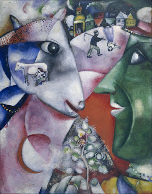
I and the Village, 1911, Marc Chagall, courtesy MOMA. In this painting, line is a dominant design element, articulating the relationship between man, beast and place. However, proportion (relative size of the objects) is playing a part as well.

Line

In math, a line is straight, has no thickness and extends in both directions through space. Sometimes that’s what we mean by a line in art—for example, a horizon line.

More typically in art, a line is just a path through space. Wherever you have an edge, you also have a line. However, lines also refer to mark-making, so in that sense they can be fat, thin, punctuated, tapering, diffident, bold or whispering.

Diagonals and curves seem to keep us more engaged than unbroken verticals, as they’re more difficult for the eye to ‘solve.’

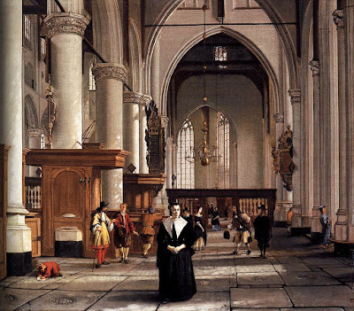
Interior of the Laurenskerk in Rotterdam, 1664-66, Cornelis de Man, courtesy Mauritshuis. The illusion of three-dimensional form is created with perspective and value.

Shape and form

Shape and form define objects in space. Shapes have two dimensions–height and width–and are bounded by lines. Forms are three-dimensional. The artist’s dilemma is to give the illusion of three-dimensional form in a two-dimensional painting.

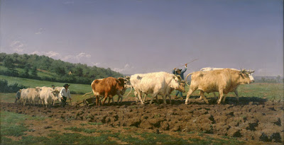
Ploughing in the Nivernais, 1849, Rosa Bonheur, courtesy MusĂŠe d’Orsay. The vast sky and field create as much narrative as do the team of oxen.

Space

Space in the real world is three-dimensional. In art, the term refers to a sense of depth, or the artist’s use of the area within the picture plane. The illusion of three-dimensional space is created with perspective drawing, atmospherics, relative proportion (size), positioning, and defining volume through modeling.

Sometimes we refer to negative and positive space, which means the division between the primary object(s) and what we perceive as the background. Positive and negative space were a very big deal in much twentieth-century design, which often used the vast emptiness of the page as a counterweight to the primary object.

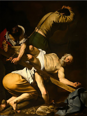
The Crucifixion of Saint Peter, 1601, Caravaggio, courtesy Cerasi Chapel. Chiaroscuro relies primarily on value to drive the eye.

Color

Color has three essential characteristics:

Hue—where it falls on the color wheel (red, blue, etc.),

Chroma—how brilliant or dull it is,

Value—how light or dark it is.

Color is also described as ‘warm’ or ‘cool,’ but these are useful artistic conventions and not measurable as fact.

Historically, value did much of the heavy lifting in painting. The Impressionists began using hue and chroma to define volume, and that is essentially how most alla prima painters work today.

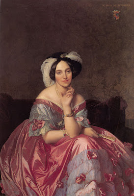
Portrait of the Baronness James de Rothschild, 1848, by Jean-Auguste-Dominique Ingres, private collection. We see satin, lace, tulle, feathers and jewels primarily due to Ingres’ exquisite control of reflected light.

Texture

Texture refers to the surface quality of an object. Paintings have implied texture, conveyed by color, line and brushwork. They also have real texture in the form of smooth or impasto surfaces.

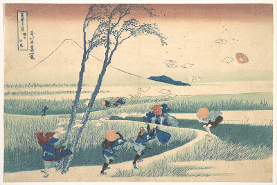
Ejiri in Suruga Province, 1830, Katsushika Hokusai, courtesy Metropolitan Museum of Art. Great winds have blown away the clouds on Mount Fuji, and they’re also blowing the travelers and their packs around. This movement is echoed and amplified by the brushstrokes.

Movement

Movement can be either suggested or depicted—as in the wind in the painting above—or implied by brushwork. Most paintings have a major thrust of energy, which I call its motive line.

Your assignment is to take one of your own paintings and subject it to formal analysis. Consider each of these elements of design in turn. How are you using them? How could you use them better?

The first hundred years

I plan to bump up against the century mark with my brushes firmly in my fist.

Boston Creams, 1962, oil on canvas, Wayne Thiebaud, courtesy Crocker MuseumHe painted these cakes and pies from imagination, rather than live models. Maybe that’s how he’s lived so long.
Preparing a lesson on abstraction and simplification, I looked up Wayne Thiebaud’s Boston Creams, above. It’s a painting one can learn a great deal from. The color is in the blue shadows and red cherry filling, set against luscious creams and tans. There’s nothing static about it; the rotation of the slices makes a light pattern that swirls with energy. It’s reminiscent of nothing so much as an American flag.

I was amazed to realize that Thiebaud is still with us—he turns 100 this November. Even more amazing, he’s been painting all along. At age 98, he curated a show for the San Francisco Museum of Modern Art, viewing thousands of images to select work to hang alongside his own.

Three Donuts, 1994, oil on canvas, Wayne Thiebaud, courtesy Sothebys.

Thiebaud is a son of the Great Depression. He was raised in Southern California, where his father was a mechanic and local Mormon bishop. Thiebaud worked his way through high school at a restaurant in Long Beach. The pies and doughnuts in their glass cases must have etched themselves on his teenaged brain, because they became the cornerstone of his ouevre.

He apprenticed at Walt Disney Studios while still in high school. After graduation, he enrolled at the Frank Wiggins Trade School in Los Angeles, intending to be a sign painter. He worked as an artist for the United States Army Air Forces during WWII.

After the war, Thiebaud returned to commercial art. His friend and co-worker at Rexall Drugs, Robert Mallary, encouraged him to take advantage of the GI Bill. Thiebaud started college at almost thirty years of age. He earned his MA in 1952.

River Bend Farms, 1996, oil on canvas, Wayne Thiebaud, courtesy Christies. Thiebaud’s impeccable draftsmanship translates to great landscape paintings.

That took him to a faculty position at Sacramento City College and University of California, Davis, where he taught until 1991. For most of his career as a painter and teacher, he was out of sync with his time. He was more interested in traditional painting and realism than conceptual art.

Commercial art may be thought lowbrow, but it develops impressive technical chops. Thiebaud drew on them when he started to paint his pies, cakes, candy and ice cream cones. He arranged them just as they would be displayed on restaurant counters or in bakeries. He used the multicolored outlines and extreme shadows of contemporary commercial art. Take away the luscious impasto in Boston Creams, and you could have an advertisement from Better Homes and Gardens.

Two Meringues, 2002, Lithograph on Arches paper, Wayne Thiebaud, private collection. Thiebaud is an accomplished printmaker.

California had no real art scene at the time, so Thiebaud’s paintings were displayed rather haphazardly, in restaurants, studios, or wherever he could find viewers. It was not until he went to New York and met the dealer Allan Stone that he found his national audience. His first show in New York, in 1962, sold out.

Why did his work resonate so well? Although very much a traditional painter, he was mining the same mass culture as Andy Warhol and Roy Lichtenstein.  However, Thiebaud never embraced the cynicism of Pop Art. He thought of himself as a traditional painter, and he viewed the American scene with affection and respect.

Artists frequently refuse to retire in old age. Sometimes, they meet their greatest success just when they’re expected to find a bed in a senior living facility. Let Wayne Thiebaud be your role model. I’m already planning my show for 2059, Carol Douglas: the first hundred years.

Our time is not unlimited here

We must set priorities if we are going to actually do the things we want.

Catskill Farm, pastel, by Carol L. Douglas, long gone to a happy home somewhere.

I mentioned to my Tuesday morning Zoom class that I needed to run over to the hospital for a medical test after we finished, but that I wasn’t unduly worried.

“Worrying is like praying for something you don’t want,” said one.

“Worrying is the misuse of imagination,” said another.

“Worrying is paying interest on a debt you don’t owe,” said a third.

Demoing painting.

These were brilliant bits of folk wisdom and I wrote them down, to add to the one I always quote, Matthew 6:34. Later, when the radiologist told me I need more testing than they can do locally, I took a deep breath and recollected them.

I’ve already gone two rounds with cancer, so I’m pretty good at gauging what I’m seeing and hearing. There’s cause for some concern, but not for panic. I went for a very brisk walk to work through my reaction. Then I headed to bed remembering one of my favorite aphorisms: “Tomorrow is another day.”

An occasional brush with our own mortality is useful. It reminds us that our time here is not infinite. I suffer from a bad case of believing I can fit in everything. When I wrote about the volunteerism trap, it was partly in response to frustration at having so little time to paint.

That’s my friend Boo.

I’m not a worrier, but I am a planner. I’m planning a show on August 15 featuring work by students from the past five years. To invite them, I had to make a list. I was astonished at the number of people who’ve come through my studio. Many of them started as students and became friends. There is something about learning together that forges relationships.

I’ve known that to be true in real life, but am surprised to realize it’s also true in Zoom classes. That puts me in a happy dilemma. I’d like to collapse my classes down to two a week, but there are people in each class for whom the schedule works best the way it is. I like spending time with them.

Tom Sawyer’s Fence, oil on canvas, by Carol L. Douglas. Available.

So, for now, I’m going to continue to teach three classes—two on Zoom, and one live—and hope I can get some painting done in my spare time (proving that the “you can’t have it all” lesson is a hard one indeed).

I’ve appended the schedules to the end of this post. The dates take us all the way to the “season of mists and mellow fruitfulness,” as John Keats described Autumn. That is, by far, plein air painting’s best season.

I wish I could spend all of September in New Mexico. I’d try to kill myself with hot food at the Hatch Chili Festival. And Fiesta de Santa Fe is America’s oldest continuous festival, running since 1712.

I’ll be there to paint and teach in the Pecos Wilderness September 13-18. The aspen and cottonwoods will be turning gold, set off against the cool greens of spruce, firs and pines. And the heat of summer will have dissipated, making it perfect painting weather.

I have taught Sea & Sky in Acadia National Park in the first week of August for years. But COVID-19 forced me to move it to October 4-9. I like to think of myself as an agile thinker, but I wasn’t happy.

The Dugs, by Carol L. Douglas

I finally remembered how many times I’ve snuck off to Acadia myself in October, because that’s really the most beautiful time of year in Maine. To call the color “eye-popping” does not do justice to the grandeur of a New England autumn. The ocean is warm and the air is clear. If you’ve never seen the northeast in its Autumn finery, this is a great chance to discover it.

Another thing I’ve revisited has been my hesitance to teach in the South, which was just plain stupid. So, when Natalia Andreeva invited me to teach in historic Tallahassee, I jumped at the chance. Around the time the first snows hit the coast of Maine in early November, I’ll be sneaking off to Florida to teach Find Your Authentic Voice in Plein Air, enjoying the spreading live oaks and Spanish moss.

All of these workshops are on my website, of course. And you can read more about upcoming weekly classes here.

Tuesday morning ZOOM classes, 10-1, open to interested painters from anywhere

August 11

August 18

August 25

September 1

September 8

September 22 

Thursday morning plein air classes, 10-1, open to painters in the midcoast Maine region

August 13

August 20

August 27

September 3

September 10

September 24

Monday evening Zoom classes, 6-9 PM

August 17

August 24

August 31

September 14

September 21

October 12

How did you get that color?

While materials are important, how you lay paint down has a big effect on the purity of your color.

Summer Sky Summer Field, on a ponds walk behind my home on July 1, 2020, painted July 6, 2020 10″ x 8″ (w x h), Daniel Smith, Schmincke Horadam, and Winsor & Newton watercolors, and Uniball waterproof fade proof ink on 140 lb. Fabriano Artistico cold press rough 100% cotton extra white watercolor paper framed, available.

I’ve read somewhere that there are 18 million different palette permutations available to modern painters. I have a rationale for those I recommend. They are paired primaries based on color temperature. That doesn’t make them the only right option, just one that works for me (and my students).

Today I’d like you to look at a radically-different way of organizing color, that of children’s book writer and avid watercolorist Bruce McMillan. In watercolor, there’s a rationale for having more pigments at hand than one needs in oil painting. Different pigments have different particle sizes. That makes them behave differently in suspension in water, and they are absorbed differently into the paper. They also precipitate differently as they dry, leading to fantastic textural combinations.

Nubble’s Light Keeper’s House, at sunset as Georgia O’Keeffe would have seen it during her 1920s visits, as seen from Sohier Park on the Cape Neddick peninsula between Long Sands and Short Sands beaches in York, Maine. Commonly called Nubble Light or The Nubble, it’s officially named Cape Neddick Light, on Nubble Island, on October 25, 2014, painted April 19, 2020 7″ x 5″ (w x h), Daniel Smith, Schmincke Horadam, and Winsor & Newton watercolors, and Uniball waterproof fade proof ink on 140 lb. Fabriano Artistico cold press rough 100% cotton extra white watercolor paper framed, available.

Bruce has a fantastic ability to create deep, jewel tones in watercolor, and he always seems to hit a vibrant color in the first pass. That’s based partly on the pigments he chooses and partly on how he applies them.

You can watch Bruce painting and talking about color in this demo he recorded on Cape Porpoise.

Buoys from the Sea, at the Cape Porpoise Pier in Kennebunkport, Maine on March 1, 2019, painted March 18, 2019 12″ x 9″ (w x h), Daniel Smith, Schmincke Horadam, and Winsor & Newton watercolors, wax resist, and Uniball waterproof fade proof ink on 140 lb. Fabriano Artistico cold press rough 100% cotton extra white watercolor paper framed, available.

Using quality materials is important, and it’s doubly crucial for students. It’s tempting to buy dimestore paints until you know if you’re going to be serious about painting, but you start at a severe disadvantage. If your paints aren’t decent quality, there’s no way you can get good color in your paintings.

In watercolor, there’s another issue—pigments fade faster in watercolor than they do in oils. That’s why watercolorists are so fiendish about lightfastness tests.

Snow Stuck Opal Apple Study 1, on a sunny day behind my home in Shapleigh, Maine on December 4, 2019, painted December 12, 2019 7″ x 5″ (w x h), Daniel Smith, Schmincke Horadam, and Winsor & Newton watercolors, and Uniball waterproof fade proof ink on 140 lb. Fabriano Artistico cold press rough 100% cotton extra white watercolor paper framed, available.

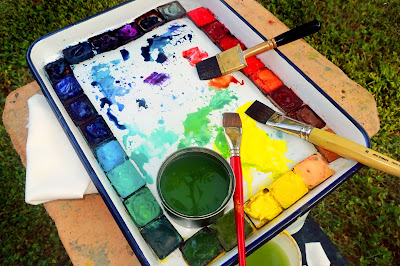
Appended to the end of this post are Bruce’s pigments. Those he uses regularly are highlighted in red. Those he carries around but seldom uses are in grey.

“These were only selected after looking at all of the archival/permanence data available. I use colors from three brands, Daniel Smith, Schmincke Horadam, and Winsor & Newton,” he said. “I used to use Holbein, fun colors, but they don’t pass the archival test.”

Bruce noted the manufacturer of each paint on his list. “Colors are not the same going from brand to brand, and not only in color but also in permanence,” he said.

“I always have a half-sheet of Viva Signature Cloth paper towel in hand to adjust the water on my brush. And that brand is also perfect for lifting. And while I do mixing on my tray, I do a lot on paper, either wet-in-wet or wet-on-dry layering, many times painting after dipping my brush right from the color well.”

Bruce’s palette is large enough to allow him to mix enough paint for each full pass. He has bigger brushes at hand and bigger puddles of color available. Anemic color comes from not having enough of the color in question at hand, and then from applying it too sparingly. Bruce can hit strong colors because he makes enough of them to start with.

Paint glazed in numerous thin layers is not darker or more saturated than a single layer of the same paint applied right the first time. That’s a myth. In fact, multiple applications just muck up the surface of the paper, reducing its reflectance. Part of the reason Bruce’s colors sing is that he hasn’t ruined the paper with excessive layering.

Your assignment is to copy one of Bruce’s paintings—you can choose which one—trying to get the same intensity of color on the first pass, using the paints you have on your own palette. (If you use my palette, you should have no problem hitting all the points in his paintings.)

I’m hearing the oil-painters chuckling, thinking ‘this is so easy.’ Try it first.

—————————————————–
Cadmium Red   W&N
Permanent Alizarin Crimson   W&N
Quinacridone Coral   DS
Pyrrol Orange   DS
Permanent Orange   DS
Burnt Sienna   W&N
Raw Umber   W&N
Yellow Ochre   W&N
—————————————————–
Naples Yellow   DS
Hansa Yellow Medium   DS
Lemon Yellow   DS
Olive Green Yellowish   SH
Permanent Sap Green   W&N
—————————————————–
Hooker Green   W&N
Cobalt Green   W&N
Cobalt Turquoise   SH
Cerulean Blue   W&N
Phthalo Blue Green Shade   DS
Phthalo Blue Red Shade   DS
French Ultramarine   W&N
Prussian Blue   W&N
—————————————————–
Payne’s Gray Bluish   SH
Quinacridone Purple   DS
Cobalt Violet Deep   DS
Davys Grey   W&N
Ivory Black   Winsor & Newton