fbpx

Choose your friends wisely

The people you paint with will influence your work and your attitudes toward success.

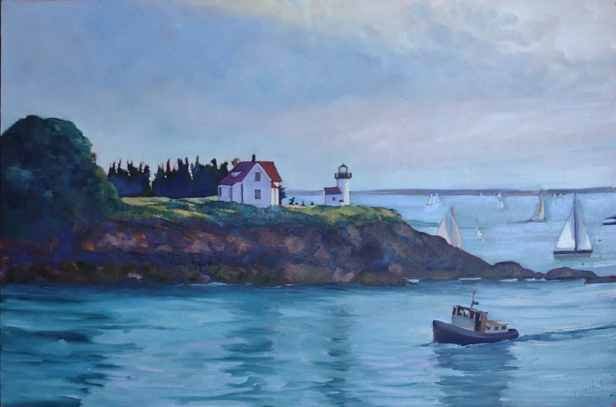
Channel Marker, 9X12, Carol L. Douglas, available.

If you’ve ever felt the powerful need to adjust your thinking to fit in, it’s not just moral weakness. We’re designed as herd animals, and that need to conform is built into us on a neural level. Disagreeing with our friends and neighbors makes us physically, emotionally and mentally uncomfortable.

Social norms are the rules that govern our group behavior, and they’re important. They’re how we all agree to forgo self-serving behaviors for the good of the group. These social norms—more so even than the force of law—govern our society.

Fog Bank, 14X18, Carol L. Douglas, available.

Some social norms (“thou shalt not kill”) are static, but others are fluid; for example, we’ve decided over the last three hundred years that child labor is morally wrong.

Group norming affects artists as much as anyone. We tend to slip into painting like our friends and neighbors. That’s why we develop painting schools like the Group of Seven. Artists working together subtly create a stylistic group norm.

This was demonstrated to me over the past weeks as we studied composition. There are rules we accept today that wouldn’t have occurred to a Manneristpainter.

Midsummer, 24X36, Carol L. Douglas, available.

Groupthink is aspirational, too. Successful thinking can be transmitted through a group as surely as clothing choices can.

I’ve just finished a year-long session with two very successful groups of students. Mary Silver found representation in a gallery in downtown San Antonio. Patty Mabie won “best floral” in the April Plein Air salon. Lori Capron Galan was juried into the Rochester Art Club. Several sold paintings over the past few months. All painted consistently to a high level. They created a culture of success, and that has pushed all of them to a high level of performance.

There are times when artists feel very alone. I felt stylistically isolated in western New York because my own painting was based on different norms. That went away when I moved to coastal Maine. Coastal Maine is inherently no better than western New York, but my own painting ethos was there, rather than in the Hudson River School.

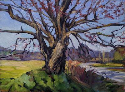
Sometimes it rains, 8X10, Carol L. Douglas, available.

This points to the conundrum of the artist’s way, which is two-fold. Our work is communication, but it must be done very much alone. Moreover, we are part of a social continuum, but we strive to say something unique.

In the end, that’s the definition of leadership. That has nothing to do with seniority, titles, wealth, or management. It’s a process of social influence, and it’s a great responsibility.

Mixing beautiful greens

The rookie error for summer is to paint all foliage using the same basic color. You lose more points if it’s sap green.

Bracken Fern, by Carol L. Douglas, 9X12, oil on canvasboard, $869.

This weekend, the mercury climbed to 70° F., which forced the “wall of green” into budding. New England is now in her summer raiment, although it will get a bit deeper and more solid. It’s time to talk about mixing pretty and varied greens.

Michael Wilcox published a famous watercolor pigment guide called Blue and Yellow Don’t Make Green. It’s where I first got the idea to add back the banned black.

Mixed greens. Almost a salad.

His point was that there are many routes to the same destination, and that to really mix colors, you need to understand what pigments you’re using, not work from trade names for colors. Consider sap green, for example—a staple of many plein air painters’ toolkit. It’s really a convenience mix. The same is true of Hooker’s Green in watercolor.

The single-pigment (‘true’) greens available are chromium oxide green, viridian, and cobalt green. Chromium oxide green is a lovely, heavy, natural green. Unfortunately, it outweighs everything it’s mixed with. Viridian and cobalt green are lovely, but expensive. Beware viridian hue—it’s just another phthalo in disguise.

Chart courtesy of Victoria Brzustowicz

The rookie error is to paint all your greens using the same hue, modulating lighter or darker for highlights and shadows. You’ll have much more life in your trees if you know all the different ways you can get to leafy green. One of the most useful greens is black plus cadmium yellow lemon (or Hansa yellow).

The best way to navigate the colors of foliage is to avoid greens out of a tube altogether. A system of paired primaries gives you more options, avoiding the acidity of phthalo, the weight of chromium oxide green, or the soul-sucking darkness of sap green.

In my experience, bad paint mixing causes paintings to go wrong faster than anything else. Constantly over-daubing to modulate the paint color distorts the original drawing and makes a grey mush. If you’re confident of the color, you can apply it fast and accurately.

I make my greens on a matrix, which I’ve shown you both mixed and on a chart. Note that blue/black pigments are much stronger than the yellows. You need about half the amount of blue or black as you do yellow.

Swatches by Jennifer Johnson

First mix greens according to the chart, and then modulate your resulting greens with tints (meaning a mix of white and a color). The specific tints are unimportant, but the most useful one for landscape is a mix of white, ultramarine and quinacridone violet, making a pale lavender. It is great for atmospheric perspective.

Your assignment is to hit paint swatches as closely as you can. 
The second exercise involves stopping at your local hardware store for a few paint swatches. These are Benjamin Moore brand, but you should be able to find similar ones elsewhere. There are two off-whites: one cool and one warm. There’s yellow, green, and two soft blues. Your assignment is to mix until you think you’ve hit the exact color. Then put a dot of it on the card to see how close you got. (If you’re working in watercolor, the dot goes on paper instead.)
Detail of Jennifer's chart, above.

I also have my students make neutrals using combinations of ultramarine blue with burnt sienna and raw sienna. I use ultramarine blue and burnt sienna as my standard dark-neutral, because it can go to the warm or cool side depending on how it is mixed. Raw sienna plus ultramarine is my go-to starting point for granite and the sands of our northern beaches.

My 2022 workshop schedule can be found here. That includes the beautiful red rocks of Sedona, urban painting in Austin, TX, June and September workshops aboard schooner American Eagle, mountain vistas in the Berkshires, and our ever-popular Sea & Sky at Schoodic in Acadia National Park.

Penny-wise, pound foolish

Cheap materials or weird deviations from process inevitably lead to disastrous results, but artists keep doing it.

Untitled (Floral), 1960, Morris Louis, showing deterioration of untreated cotton duck ground, courtesy the Museum of Fine Arts, Houston (it’s since been restored).

This week, I’m assembling materials for my watercolor workshops aboard schooner American Eagle. I’m giving them QOR watercolors by Golden. These are professional-quality paints, not student-grade—even though some of my students will have never painted before. I want to create impassioned painters, and bad materials are the best way to nip creativity in the bud.

Cheap materials are only part of the problem. There’s a mistaken association between ephemeral materials and ‘authenticity’ that arose in the latter part of the 20th century. It echoes today, and drives artists to experiment with painting on cardboard, collaging paper with oil paints and other unstable methods.

Misty Moonlight, c. 1885, Albert Pinkham Ryder, courtesy Crystal Bridges Museum of American Art

“I was beginning to wonder if it was just the art historian in me, but I see people using such unbelievable crap in their artwork and it makes me shake my head,” a reader wrote.

There are vogues that sometimes result in spurious results. Oiling out is a traditional technique where a hint of linseed oil is applied to a dried layer to make the next layer appear to sink into it. A variation appeared about a decade ago. Painters would paint into a soup of wet medium. It was supposedly okay because the medium was fast-drying alkyd, and it allowed mediocre painters to produce something that looked like Tonalism.

Moonlight, c. late 1880s–1890s, Ralph Albert Blakelock, courtesy Phillips Collection

I was immediately reminded of the sad fate of Ralph Blakelock’s paintings. He was a Tonalist, also interested in luminosity. He tinkered with his paint application in search of new effects. Unfortunately, many of his canvases are badly deteriorated because of it.

Another painter whose work has rotted out because of bad technique is Albert Pinkham Ryder. Ryder built up his paintings with layers of paint, resin, and varnish applied haphazardly on top of each other. He painted into wet varnish and disregarded the different dry times of his pigments. He experimented with candle wax, bitumen and novel oils. That gave his paintings the luminosity that he was aiming for, but at a price.

Paintings by Ryder are consistent only in their instability. They’ve darkened seriously over time and developed terrible cracks and crazing. In some cases, they’ve never fully dried or have completely disintegrated.

There are only a few oils with natural drying properties. These are linseed, tung, poppy seed and walnut oil. Non-drying oils like almond or olive oil are never suitable for oil painting

Similarly dubious is the process of starting a painting in acrylics and then finishing it with oils. It’s unnecessary once the painter masters the process of wet-on-wet painting, and it has no long history proving it to be archivally sound. We know that the reverse (acrylic over oil) delaminates almost immediately. That means the layers do not bond.

I learned to paint back in the 1970s with a homemade medium comprised of turpentine, Damar varnish, linseed oil and a drop of cobalt drier. It was fairly standard for the time. I used it until I spent a day wandering around the Albright-Knox Art Gallery looking at the terrible cracks and crazes in Clyfford Stillpaintings. The 20th century masters are not paradigms of painting technique; many of their paintings are now in terrible shape. Zinc oxide grounds were much in vogue at the time, and the heavier cadmium pigments are pulling away from them now.

Companies like Grumbacherand Gamblin hire chemists to make and test materials. I trust them far more than I trust my own judgment in chemistry.

Bad grounds are a chronic problem for conservators. “Morris Louis did wonderful color work on unprimed canvas,” my reader noted. “Museums tear their hair out.” Yes, a good ground can be expensive, but it will extend the life of your paintings—and make the painting itself easier. If you insist on painting on cardboard, make sure you insulate it from your paint with an acrylic or PVA sealant.

Oil painting is 1400 years old. There’s not much that hasn’t been tried in that time, and the standard protocol we use today is the result of that trial-and-error. Cheap materials and weird deviations inevitably lead to disastrous results, but artists keep doing it. That’s a misdirection of creativity.

Tone your canvas, trick your eyes

There’s science—okay, at least pop science—behind the idea that a bright white canvas will distort your painting.

One example of the Delboeuf Illusion, courtesy Wikipedia.

“Why tone my canvases?” is perhaps the most common question oil-painting students ask me. It’s all about optical illusion. The size, shape and color of the objects we paint are influenced by their background.

The Delboeuf illusion is a distortion of relative size. In the illustration above, the two black disks are the same size, but one is surrounded by a tight ring; the other by open white space. The human eye sees the surrounded disk as larger than its non-surrounded twin.

The Delboeuf Illusion is in pop-science news these days because psychologists have found that people who eat meals served on smaller plates have a tendency to feel fuller faster. Oddly, animals also display food preferences based on plate size, but they don’t always correlate to our reactions. Dogs, for example, go for bigger plates. Dogs are such unwilling dieters.

One example of the Ebbinghaus Illusion, courtesy of Wikipedia.

Closely related is the Ebbinghaus Illusion, in which perception is influenced by the presence of nearby shapes. In the example above, the circle surrounded by a ring of large shapes appears smaller; that surrounded by a tighter ring of smaller shapes appears larger.

In both examples, if the shapes were all on a neutral-value ground, the contrast would disappear and the illusion would be broken.

Susceptibility to the Ebbinghaus Illusion is strongest in those with highly-developed visual cortexes (such as artists). It’s context dependent, so little children fall for it less often than adults. That would indicate that these visual cues are part of how we learn to navigate our environment. Relative size is a big clue to how far away an object is.

Sarcone’s Cross Illusion, courtesy of Wikipedia.

Sarcone’s Cross is an illusion that works in the opposite way. The cross dwarfed by large black squares appears larger, not smaller. The takeaway lesson for artists is that there isn’t an easy way to predict how the color and value of neighboring objects will influence what we next put down on paper or canvas. However, we can be sure that they will. This is why value studies are such an important part of painting design.

All of these optical illusions are explored in color in Josef Albers’ classic textbook, Interaction of Color. It may not be that much help on a practical level, but it’s great fun to think about.

One of Josef Albers’ experience on space illusions, from Interaction of Color, courtesy Yale University Press.

So, what does this have to do with toning? Toning is invaluable in the initial stages of a work because it changes how you perceive masses placed on the canvas. A toned canvas helps the painter establish a pleasing value structure.

There are many fine painters who don’t need a toned ground to produce a fine painting. If our reactions to these optical illusions are learned, then it’s possible to unlearn them (or at least learn to compensate for them). But why work that hard when a simple sweep of color on your canvas will save you a lot of work?

None of this pertains to watercolorists, of course. The white of their paper is part of the design, and that makes the illusions part of their magic.

Monday Morning Art School: color harmony

Color harmony is not just a question of placing or finding objects that look good together; it means using those colors within your painting to build a great composition.

Rachel Carson Wildlife Refuge, by Carol L. Douglas

Nearly all beginning painters focus primarily on matching local color. That’s an important skill, but it is just a bare beginning. To make paintings sing, one must think carefully about color schemes. Sometimes a subject can achieve color harmony naturally, but most of the time we need to think through our color choices and placement.

In painting, local color means the natural color of an object, unmodified by lighting. Leafy trees are green, for example. But there are circumstances where they can appear black (at sunset, for example), golden or even orange. There are other circumstances in which, for compositional purposes, it is better to paint them blue or lavender. The rookie error is to persist in what we know—that trees are green—instead of what we see or would be more visually appealing.

Self portrait, by Tom Root. Courtesy of the artist.

Colin Page is a master of color harmony; I encourage you to study his work. Above is another excellent example, a recent self-portrait by artist and teacher Tom Root. He’s a fabulous portrait painter; I’d take a workshop from him.

I could go on and on about the virtues of this painting, which are legion. For now, I’ll talk about his color use.

Isolated colors from Tom Root’s painting, above.

The background and shirt are tied together in a tight arrangement of blues and greens. The face and jacket, meanwhile, are equally tightly-grouped. Photoshop allows me to check the inverse of any color. The blue-greens and flesh tones are almost exact complements, making this a classic complementary color scheme. These complements are arranged in a pleasing, slightly asymmetrical triangle. Tom’s drawing, in a blue-violet, stands outside this color scheme, giving it great impact.

Monochrome reduction of the painting above.

Tom uses hue as much as value to model. (If you need a refresher on what this means, see here.) That gives his painting a solid contemporary feel. But that doesn’t mean he uses no value. In fact, if you look at the monochrome reduction of the painting, you’ll see a beautiful sweep of darks from the bottom left to the upper right. That creates contrast to drive our eye to the most important part of his painting: the face.

I didn’t ask Tom how he arrived at this color scheme; by the time you’re at his level of expertise it’s intuitive anyway. But it doesn’t start off that way. To master color harmonies, you must spend a great deal of time thinking about color and practicing it.

All color schemes rest in the standard 12-color wheel that’s been kicking around for centuries. I’m a fan of the Quiller Wheel because it’s based on paint pigments, but you can just as easily make your own. That gives you the advantage of understanding the paints you’re actually using. (Many store-bought wheels are overloaded with useless information, making them more trouble than they’re worth.)

Tinfoil hat, by Carol L. Douglas. The color scheme shouldn’t be primarily about the objects, but about how you use the colors in your painting.

Here’s a link that gives you a complete description of the classic color harmonies, but let’s review them here:

Complementary

These are colors that lie opposite each other on the color wheel. The most famous example is Christmas’ red and green.

Analogous

Analogous color schemes use colors that lie next to each other on the color wheel. Using analogous colors can make what might be a garish scene (a sunset, for example) more serene.

Peppers, by Carol L. Douglas. Every once in a while I paint something very realistic, just to remind myself that I know how.

Equilateral Triad

This uses colors that are evenly spaced on the color wheel. The most well-known example is the primary combination of red-blue-yellow.

Harmonic triads

This variation counts 3-4-5 in either direction on the color wheel. Start with a key color, and count from there. This is a sophisticated variation on the equilateral triad.

Split-Complementary

This is a variation of complementary colors. It either substitutes for the complement or includes the complement’s adjacent hues.

Double complements

The rectangle or tetradic color scheme uses four colors arranged into two complementary pairs. The colors can be in a rectangle or in a square.

As nice as that information is, color cannot be learned from reading, but only through trial and error. Your assignment this week is to set up a small still life in one of these color schemes and paint it, paying careful attention to how the lighting unifies the scene.  Remember, it’s not just a question of placing objects in a pleasing array; it’s a question of using colors within your painting to make a great composition.

This post originally appeared on May, 4 2020.

The Zeitgeist

We’re all saying something with our paintings. Do we have the courage to buck the times and paint reverence, happiness, and kindness?

American Eagle in Drydock, 12X16, oil on canvasboard, sold. I’ll be down at the boatyard this morning to paint Heritage on the ways.

This month’s discussion of the picture plane in painting inevitably ended up including Philip Pearlstein, who wrote:

“Photographs do not break the picture plane, and so they parallel one of the great dictums of 20th century modernist art, which is that form follows function. The paper is flat, that is, the picture plane is flat, therefore the artist must keep his picture flat. Therefore the photograph is accepted as modernist art. Therefore one of my aims in painting is to break the picture plane.”

Striping, 6X8, oil on canvasboard, $435 framed.

By which—practically speaking—he let heads, arms, etc. escape out of the picture, in much the same way as a child takes a snapshot.

“I was strictly interested in the way ordinary people looked.  And that became part of the kind of philosophy in a sense, to paint the ordinary, the everyday, not to go out of my way to make them tell some kind of story,” he saidin 2006.

Pearlstein is a lauded American painter, on the forefront of modern realism, and he deserves credit for that. But I cannot look at his huge canvases of naked people and not wince. They’re technically admirable, and yet they’re so unlikeable. Human beings, he seems to say, are just so much meat spread around the room. That’s especially true in canvases with more than one figure, pointedly not engaging with each other even when they’re buck naked in a small space. When their heads are cut off, their character, emotion and dignity are rendered inconsequential. We humans interact mostly through our faces, after all.

Captain Doug Lee (chasing the rats), 6X8, oil on canvasboard, $435 framed.

That is, of course, the Zeitgeist, the spirit of our age, so Pearlstein gets full marks for relevance. The German Romantics who coined that phrase had some strange ideas, and they were talking of a literal, invisible force that shaped the time and place. Today we think of it as our common ethos, but either way, we’ve been living in a demeaning culture for decades now.

I don’t watch TV, but my goddaughter tells me that the heroes of modern television are sarcastic and cynical. “Nasty” is the word she used. Certainly, you see that in our so-called leaders, and it’s in full bloom in popular music.

I occasionally reference the painter Tom Root, who my pal Eric Jacobsen calls “a national treasure.” His Holiday (Rest on the Flight to Egypt) is one of the few paintings that carries the western tradition of religious painting successfully into the modern era. Technically, he’s superlative—far more assured, in fact, than Pearlstein. And yet he labors in far greater obscurity than does Pearlstein, with all his honors.

Rising Tide at Wadsworth Cove, 12X16, oil on canvasboard, $1159 unframed.

Root paints the dignity of the human being, and that’s just contrary to the spirit of our age. Not that he can help it; he can no more embrace nihilism than I can. But it raises the question of how much we conform to our times, and why. People do that, of course, for reasons other than fame or fortune.

I don’t suggest that people should steer away from difficult subjects in paint. I spent several years painting on the subject of misogyny. They’ll be at the Rye Arts Center in 2022, by the way.

We’re not mere products of our times, we also shape them. The painter may hide behind the non-verbal nature of our art to deny responsibility for the culture, but we’re all saying something with our paintings. Do we have the courage to buck the times and paint reverence, happiness, and kindness?

Losing yourself in paint

The time you spend painting is not deducted from your lifespan.

One of my Monday night students told me her father lived to 107. He said, “the time you spend sailing is not deducted from your lifespan.”

He also believed that oatmeal every morning and a wee dram before supper would extend your life. I’ve got that part half right. Unfortunately, it’s the oatmeal; I eat it every morning.

I told my other class this and we speculated on what other activities might qualify. “Cocktail hour,” one suggested. I’m afraid that’s probably situational; some cocktail hours are fraught.

I think there’s something to Carol’s dad’s theory. There are activities that are so deeply satisfying that they flush the cares of the day right out. I’m not saying they’re easy; they are, as my friend Martha said of sewing, both mindful and mindless at the same time. Time doesn’t stand still; it vanishes. We each have our own list. For many, that includes painting. Like sailing and sewing, it rests on a firm technical foundation. It engages the mind and yet lets it roam.

Numerous studies have shown that engaging with the arts increases lifespan,  soothes chronic pain, staves off symptoms of dementia and accelerates brain development in kids.

My next session of classes is starting soon, and the exciting news is that we’ll be painting en plein air in the Rockport—Rockland—Camden area again. These classes will be Thursdays from 10-1 AM. The dates are:

  • May 27
  • June 3, 10, 24 (skips 17th for Age of Sail workshop)
  • July 1, 8

The fee for the six-week session is $210.

If you’re in the midcoast area and want to sign up, please contact me soon. As of last night I had four openings left. These classes are strictly limited to 12 people, because my legs can carry me only so fast. As always, we’ll be focusing on the water, shoreline, boats, architecture, and outstanding natural beauty of this place we’re blessed to call home.

If you’re not in midcoast Maine, you can sign up for another session of weekly classes by Zoom. Since some of my local students will be moving to the plein air group, there should be a few seats in each online class. These are limited to 14 people per session.

ZOOM morning Session

We meet on Tuesdays from 10 AM to 1 PM EST, on the following dates:

  • May 25
  • June 1, 8, 22, 29 (skips 15th for Age of Sail workshop)
  • July 6

The fee for the six-week session is $210.

ZOOM evening Session

We meet on Mondays from 6 to 9 PM EST, on the following dates:

  • May 24, 31
  • June 7, 21, 28 (skips 14th for Age of Sail workshop)
  • July 5

The fee for the six-week session is $210.

You don’t need to be in Maine to take these classes. We have students from Texas, Indiana, New York and elsewhere joining us.

As always, registration priority will be given to current students; if you’re interested, contact me to be put on a waitlist.

About these classes:

We cover the same subjects indoors and outdoors:

  • Color theory
  • Accurate drawing
  • Mixing colors
  • Finding your own voice
  • Authentic brushwork

We stress painting protocols to get you to good results with the least amount of wasted time. That means drawing, brushwork and color. I’m not interested in creating carbon copies of my style; I’m going to nurture yours, instead. However, you will learn to paint boldly, using fresh, clean color. You’ll learn to build commanding compositions, and to use hue, value and line to draw the eye through your paintings.

Watercolor, oils, pastels, acrylics and—yes, even egg tempera—are all welcome. Because they are small groups, I can work with painters of all levels.

All my classes are strictly limited to 14 people.

Email me for more information and supply lists.

Monday Morning Art School: the silhouette

Want to paint like John Singer Sargent? Start by learning to draw like him.

Singer with a Glove, 1878, pastel, Edgar Degas, courtesy Fogg Museum

In Edgar Degas’ Singer with a Glove, above, the model’s hand has no volumetric form. There is almost no shading in that hand, merely a silhouette. Yet our minds can immediately decode the image. We understand it because of its context and the accuracy of its drafting. It’s a silhouette of a hand, and it illustrates an important point in painting. The accuracy of drawing matters.

In this painting—so remarkable in many ways—there is, in fact, a carefully-plotted harmony of silhouettes. There are the dark outlines of her cuff and bodice, the inverted triangle of her torso, and the long stripes of color in the background. In fact, very little of this painting relies on modeling; most of it is a series of shapes. Volume is secondary to that dazzling array of shapes and color.

The Valpinçon Bather, 1808, Jean-Auguste-Dominique Ingres, courtesy the Louvre

I used this painting as an example because it’s overwhelmingly obvious. However, in the context of painting, silhouette does not mean a solid shape of black. It means the major shape(s) within a painting. In Ingres’ The Valpinçon Bather, above, the body is the silhouette—solid and tangible. You could almost cut it out with scissors and paste it in a book.

To lead with silhouette, the artist must get the line as perfect as possible from the beginning. That means drawing a proper line, with all its jots and tittles. Want to paint like John Singer Sargent? Start by learning to draw like him.

W. B. Yeats, charcoal on paper, 1908, John Singer Sargent, Private collection.

The two ideas—volume and silhouette—are the fundamental elements of painting. The silhouette is simply the outer contour of the modeled shape. If you draw it perfectly, you can suggest the form with minimal modelling. But it’s through modeling that the form becomes expressive and we have a sense of reality.

In general, artists choose to emphasize either volume or silhouette, but they both exist in most paintings. You can see that co-existence quite clearly in Bruegel’s Peasant Wedding, below. It’s a positive cornucopia of dazzling shapes. Still, the faces are fully formed and evocative, and the figures have volume.

The Peasant Wedding, 1566-69, Pieter Bruegel the Elder, courtesy Kunsthistorisches Museum

It’s tempting to think of silhouette as intellectual and volume as intuitive, because in practical painting, that’s often how they progress. We work from big shapes down to little shapes (‘modeling’) and as we progress, we’re drawing more and more from our non-intellectual reserves.

This post was drawn from a long Facebook discussion between artist Tom Root and his friends. Thanks, Tom!

Best new toy ever!

Even though this truck and I have only been shacking up for a few months, it feels like we’ve known each other forever. We’re soul mates.

Painting from the bed of my truck yesterday. Note the dog in the back window. (Photo courtesy Eric Jacobsen)

I’m a little under 5’6”, which is two inches taller than the average American woman (whoever she is). That makes me, objectively, not short. But I married a tall man. Predictably, all my kids are tall. I’m always craning my neck to natter at them, and bustling along when we walk. It’s given me a complex.

It doesn’t help to paint with Ken DeWaard and Eric Jacobsen. Ken’s nearly a foot taller than me, and Eric’s just a smidge less lofty. For me to paint the view they see, I need to stand on a box. That’s inconvenient. Last week, Ken and I painted a pile of glorious orange lobster buoys. His angle was perfect, but mine was obscured by a kid’s slide.

Three Chimneys, oil on canvasboard, 11X14, $869 unframed, was painted from the bed of my pickup truck this week.

My trip to Wyoming in January was two-fold. I explored a ranch in Cody that I’ll be using as a base for a workshop this September. And I collected a 2010 Toyota Tundra that previously belonged to my pal Jane Chapin.

This truck and I had a history. Jane and I once nearly drove it off a cliff-edge. We then backed out through a thicket of piñons. It’s only fitting that they’re my scratches now.

I also painted Hermit Peak from its bed. Jane was too cool to paint from a lawn-chair in a pickup truck so she stood in a snowdrift and froze. That day was when I realized that I desperately wanted a pickup truck. It was pure chance that it ended up being the same truck.

Maple, oil on canvasboard, 12X16, $1159 unframed, was painted from next to my truck. I did get stuck in the mud and had to use 4WD to get out.

Maine has eco-warriors in their hybrids and sensible Subarus, but get out of the bigger towns and pickup trucks abound. I drove a Prius for 278,000 miles and my son now has it. But the pickup truck provides protective coloration when I’m loitering around docks and country roads. Think of me as a toad blending in with the forest floor.

Plus, it makes me feel really, really tall.

All I need is a cooler and an awning. (Photo courtesy of Eric Jacobsen)

Eric—coincidentally—has the same make and model truck. His has a cap, which is convenient because he never has to put anything away; he just tosses wet paintings inside and they’re there weeks or months later when he feels like finishing them. But the cap means Eric can’t stand in the bed of his truck and paint. That’s a major disadvantage.

Still, they’re awfully cute parked next to each other. We painted at Owls Head this week—me in the bed of my truck, he with his easel set up nearby (making us almost exactly the same height, dammit). It occurred to me that our trucks looked just like cruisers in their little slips in Wilson Harbor. In the evening, yachters would set up their deck chairs, pop beers, and chit-chat across the docks. As a teenager, I sneered. Today, I love the idea.

Fishing shacks at Owls Head, not yet finished.

“All I need is a cooler and an awning,” I told Eric. A bimini top? It would be cute but expensive. A party tent? A ladder rack with a fabric awning attached with Velcro? Extra points if I can find Sunbrella™ in camo.

But wait, there’s more! The jump seat in the back folds up, and the space it leaves is just the right size for a primitive porta-potty. It might not be quite the thing for downtown Portland, but it works just fine in rural Maine.

A bucket with a toilet seat… and tinted windows.

Sigh. Even though this truck and I have only been shacking up for a few months, it feels like we’ve known each other forever. We’re soul mates.

Respecting the picture plane

I was momentarily surprised, because I’m subsumed into the cult of the picture plane and my correspondent isn’t (yet).

The Alaska Range, 12X16, oil on canvasboard, $1159 unframed

In 1960, art critic Clement Greenberg coined a phrase, “the integrity of the picture plane.” What he meant by picture plane is the slice of space in which the image hangs. There’s three-dimensional reality behind it and in front of it, but for our purposes, all that exists is what’s on that screen.

Since then, an enormous amount has been written supporting or refuting Greenberg’s thesis (which is interesting, wordy and doesn’t concern us here). His critics countered that the artist can do whatever the #$% he wants with the picture plane. (Hey, it was the Sixties.)

But for practical painting purposes, that rectangle of space remains paramount. It has its own life, separate from the things that are depicted on it. It has primacy. That’s why we design paintings to look good in that rectangle, after all.

Blueberry Barrens, oil on canvas, 24X36, $3188 unframed.

I was recently asked, “which do you paint first, the foreground or background?” The question momentarily surprised me. That’s because I’m subsumed into the cult of the picture plane and my interlocutor isn’t (yet).

The answer is: “Neither. Both.”

The primacy of the picture frame overrides the relationships between foreground and background. In modern alla prima painting, objects and non-objects alike are tesserae placed in a mosaic. Background and foreground are developed together because they’re equal parts of the same visual illusion.

Downdraft snow, oil on canvasboard, 9X12, $696 unframed.

That doesn’t mean there isn’t an order of operation to oil painting:

  1. Dark to light (to prevent hopeless muddying of color);
  2. Big shapes to small shapes;
  3. Fat over lean (the amount of solvent/oil you’re using in each layer);

Just as there is a general order of operations of watercolor painting:

  1. Underwash;
  2. Broad washes;
  3. Detail
Parrsboro at Dawn, oil on canvasboard, $869 unframed.

But those orders are based on the working properties of paint, not on aesthetic or compositional issues. There may be practical reasons to deviate from these orders, but they were worked out because they give you the best results in the fastest time.

Nowhere does the relative importance of one object in the painting take precedence over another. We dart around the painting and finish it to one level, then to the next, then to the next. We think about passages of light and dark and how they interact to drive the eye. The subconscious mind will generally take care of the detail anyway, returning to those passages and poking at them until they’ve achieved some level of finish.