fbpx

Another gallery bites the dust

The galleries and artists who will succeed now are the ones who can sail the internet, constantly shifting tack and adjusting their sails.

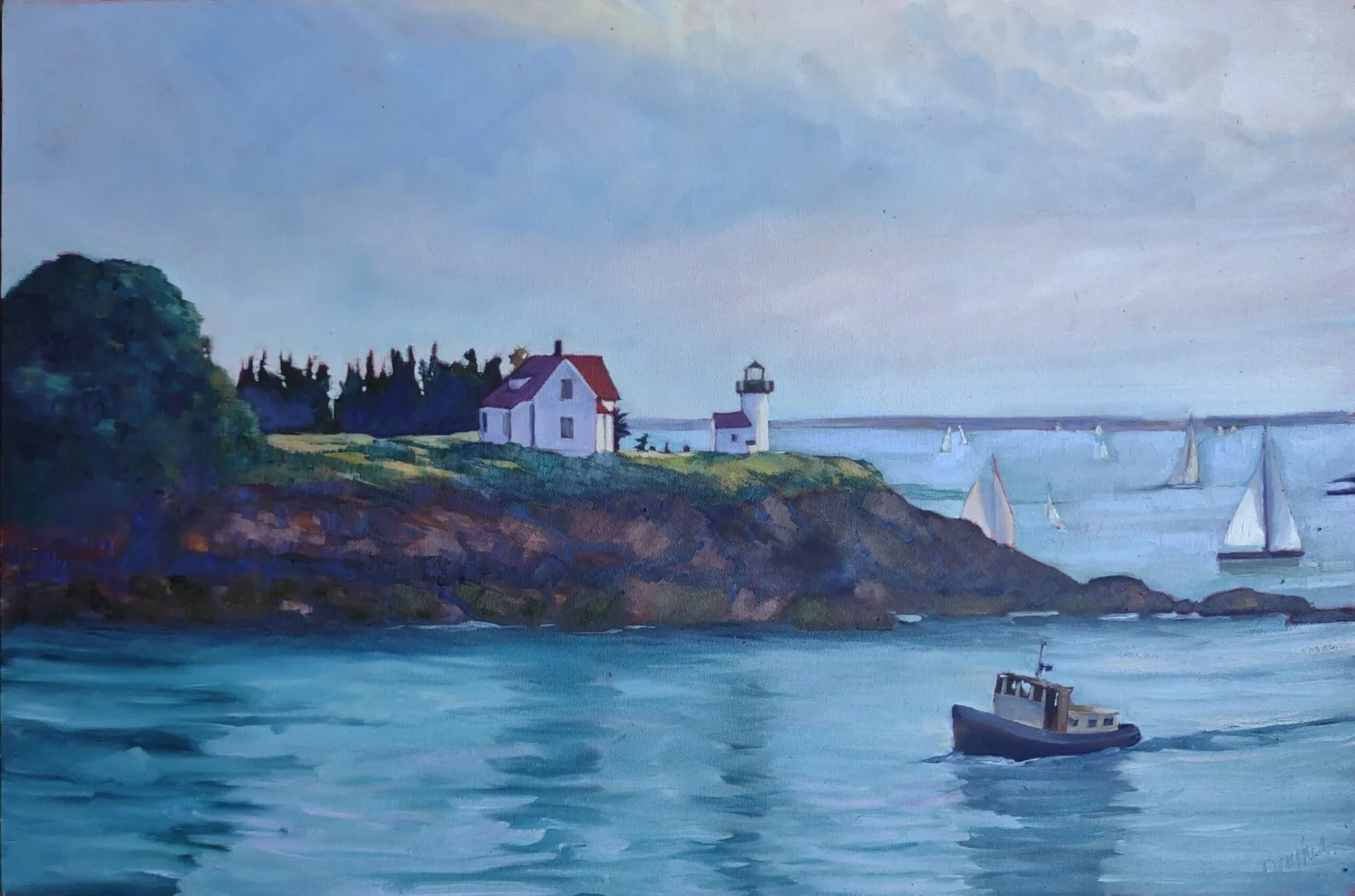
Blueberry Barrens, Clary Hill,  oil on canvas, 24X30, available.

This week I learned that a fine coastal Maine gallery, associated with two other exhibition spaces besides its home shop in Belfast, is closing this Friday. Their gallerist, whom I like and admire, is now unemployed.

This gallery had a good reputation among knowledgeable art connoisseurs, but was hampered by its physical space. It simply could not host visitors in a safe, socially-distanced manner. Maine’s business season is ruthlessly short, so they wisely closed before the season opened.

Bracken Fern, 9X12, oil on canvasboard, available.

This is the third gallery I’ve been associated with that’s closed since the start of the pandemic. I’m not taking credit; it’s the times. But I’ve hated to watch them close.

I was halfway through writing this when I received an email cancelling a plein air event for the second year in a row. “The driving force is finding hosts for our artist friends who travel great distances… In addition, we cannot be sure what restrictions will be lifted, or re-enforced come July 1,” wrote the organizer.

Let’s be brutally frank here: it’s unlikely that the events or galleries that miss a second season will survive. Their customers will move on to other venues, other products, and other interests. 

Beaver Dam, oil on canvasboard, 11X14, available.

These changes are no surprise to those who watch the art market. Although no systematic count has been made of attrition in galleries, the American art market is estimated to have shrunk 24% during 2020. That’s the worst contraction since the crash of 2008. There’s one light in all this, but it’s a dim one: online sales doubled in 2020. It’s clearly the direction in which art sales are moving.

“Build a better mousetrap, and the world will beat a path to your door” is a quote attributed to Ralph Waldo Emerson. It may have been true in the 19th century, when economies were local, but it’s not true now. In modern America, the quality of your product is no more important than your marketing skills.

Home Farm, oil on canvasboard, 20X24, available.

That marketing happens increasingly on social media. The difficulty is that social media is relatively new, so it is constantly being tweaked. Its constantly-shifting algorithms mean that yesterday’s strategy won’t work today.

Compared to most artists, I know a lot about digital marketing. That’s not very good, because compared to the worst-run big box store, I know almost nothing at all. I’m a one-woman shop, and I don’t have all day to research and tinker with my website, email, blog and Instagram. I can’t even fix the deficiencies I know about, because I also need to paint.

But I know that the galleries and artists who will succeed now are the ones who can sail the internet, constantly shifting tack and adjusting their sails. There is no other answer.

Monday Morning Art School: notan

Notan differs from value study because it is based not just on what we observe. It is the orderly restriction of shapes into patterns. It is reality subservient to beauty.

Sextant, c. 1917, Marsden Hartley, oil on panel, courtesy Philadelphia Museum of Art


When I saw this collection of eight paintings based on the color orange, I realized they could demonstrate notan as neatly as traditional value-based examples do. Orange is uniquely high in chroma, so it’s easy to notice. It’s easy to see how the artists made a pattern based on it. From there, it’s not a great leap to see how great paintings can be constructed around a value-pattern too.

The Gossip, 1912, John White Alexander, oil on canvas, courtesy Philadelphia Museum of Art 

Notan is a traditional concept that refers to the harmony of light and dark elements in a painting. It’s been integral to East Asian art for centuries, and it was introduced in the West in the middle of the 19th century.

On paper it is easy to see that dark shapes do not exist without boundaries, which are made by a surrounding area of light. Equally, light shapes don’t exist without dark to define them. (This is the Chinese philosophical construct of yin-yangin a nutshell.)

Card, 1971, Helen Frankenthaler, color lithograph with crayon, courtesy the Art Institute of Chicago

This concept of notan reached its apogee in the East Asian artform of brush painting. This was the fourth and final discipline a Chinese scholar-gentleman was expected to learn, because it was the most difficult. Through brush painting, a Chinese noble demonstrated his mastery over the art of line, which had supreme artistic (and cultural) importance.

Excavation at the White House, c. 1941, Mitchell Jamieson, watercolor on paper, courtesy Smithsonian American Art Museum

The idea of notan came to the west with our 19thcentury mania for all things Asian. It was introduced as a teaching system by Arthur Wesley Dow, who wrote the definitive book on composition for twentieth-century painters. He taught students to restrict the infinite range of tonal values in the visible spectrum to specific values—perhaps black, white and one grey. He wanted students to realize that all compositions are, underneath, a structure of light and dark shapes.

Beth, 1960, Morris Louis, acrylic on canvas, courtesy Philadelphia Museum of Art

But before Dow ever let his students get that far, he had them start with line drawing. Composition is above all about cutting the picture frame into shapes, which Dow called “space cutting.” We’re doing that every time we think about negative space, for example.

Untitled, 1958, Kenneth Noland, acrylic on canvas, courtesy Smithsonian American Art Museum

Only when his students had created beautiful shapes did he allow them to start adding value. First black, then greyscale, and then—step by slow step—they could add color.

Child in Orange Dress with White Pinafore, 1911, Egon Schiele, gouache, watercolor and pencil on paper, courtesy Sothebys

Today we use the word notan as a noun, as a substitute for a value study before we paint. But the word never meant that to Dow or in the eastern cultures from which he borrowed it. Notan differs from value study because it is based not just on what we observe. It is the orderly restriction of shapes into patterns. It is reality subservient to beauty.

Church with Red Roof and White Walls, 1914, Maurice Utrillo, oil on canvas, courtesy Barnes Collection

Of course, notan encourages a specific aesthetic, one that we’ve pretty much abandoned over the last century. But it’s worth practicing and understanding, as a way to start thinking about the important tenets of composition.

A special thanks to Bruce McMillan, for cheerfully sharing his collection of orange paintings.

The trouble with Paradise

Choosing a subject can be difficult when you live in the most beautiful place in the world.

American Eagle in Drydock, 12X16, oil on canvasboard, by Carol L. Douglas. Available.

This winter I’ve been painting with Ken DeWaard, Eric Jacobsen, and Björn Runquist. None of us were born in Maine; we all choose to live here: for the fabulous light, unspoiled little villages, boats, and the rockbound coast. We all love to paint outdoors. So how does a typical morning conversation go?

“Got any ideas?”

“I dunno… don’t have a plan. How windy is it, anyway?”

“Miserable. My dog blew over.”

“Well, how about the creek?”

“Snow’s too deep. Next week. Is that where you’re headed?”

“I was thinking about it. Unless you can think of someplace better.”

Coast Guard Inspection, 6X8, oil on canvasboard, by Carol L. Douglas, available.

This can go on for a silly amount of time. The problem is, we’re spoiled for choice. If we lived somewhere else, we’d head out to that place’s one beauty spot and be happy.

Nevertheless, we did manage to agree on a spot in Spruce Head. It was crisp and brilliant, and there are enough subjects in that one small curve of coast to last us for a whole painting season. Of course, that doesn’t mean we won’t have the same loopy conversation next week.

Changing Tides, 16X12, oil on canvas, by Lori Capron Galan.

On Wednesday I wrote about an exercise in my class, where I asked my students to start with abstraction. Lori Capron Galan did it wrong, but it turned out weird and wonderful: she turned her canvas and reference 90° and painted the whole thing sideways.

That took her to the same place I was trying to get my students—to divorce themselves from slavish fidelity to reality, and to start thinking about shapes, colors and movement instead of simple pictorial representation.

The resulting painting, above, is so inspiring that I intend to try it myself soon.

Breaking Storm, by Carol L. Douglas, 24X36, available from Folly Cove Fine Art.

This Tuesday, Captain John Foss of schooner American Eagle will appear on Captains’ Quarters, a Zoom presentation of the Sail Power and Steam Museum. The captain is a witty and smart fellow, and sailing with him is always a lark. (That’s the boat on which I teach my twice-a-year watercolor workshops.)

I wanted to email people who might want to tune in—those who’ve sailed with him, ought to sail with him, love wooden boats, etc. Then I realized it was most of the people I know.

That’s Tuesday, March 23, 2021, from 6:30 to 7:30. More information is here. To go directly to the registration, click here.

Launched in June of 1930 in Gloucester, MA, American Eagle was originally named Andrew and Rosalie and was the last of the Gloucester fishing schooners.  Renamed American Eagle by a new owner in 1941, she fished until 1983, when she was purchased by her current owner and captain, John Foss.  She arrived in Rockland in 1984 where Foss led her multi-year restoration at the North End Shipyard.  She was relaunched in 1986 and began her new career, carrying passengers along the coast of Maine.

Alien Mango Tree Progression

The first rule of composition is, “don’t be boring.”

Step one of Maggie Daigles Alien Mango Tree Progression, as she called this exercise. She drew 90° from this, and flipped it because she liked this view better.

Composition is an enormous subject, rather like the Chinese language, and it is hard to shoehorn into a single class or blog post.

The first step is to unlearn what we think we know. We’ve all been corrected and criticized with petty compositional ‘rules’. Heck, I preach petty rules myself. But most of them are, to some degree, questions of fashion. All are breakable—once you understand why they were formulated in the first place.

Step two of Maggie’s process; she saw the large shape at left as a rock but didn’t like it.

Consider the rule that tells students to not center their subject, or to follow the Golden Ratio or the rule of thirds in space division. The point is to be interesting, but it would be far more sensible to ask yourself: “What’s the best way to include everything that needs to be in my painting, and nothing more?”

The mathematical approach is dogmatic, rigid and boring; asking yourself the compositional question provokes thought. In freeing ourselves from those rules, we might just realize that symmetry can be visually powerful, especially in an age that rejects it.

Maggie’s finished painting. Since I have no idea what a mango tree looks like, I can’t judge its realism, but I can say it’s much more interesting than your typical painting of a beach.

I teach realistic painting, but that’s no reason to disregard abstraction. I’ve written before about my admiration for the color-field painter Clyfford Still. I learn a lot from his paintings because they’re all about composition, with no pesky details thrown in.

In class this week, I resurrected an old exercise I haven’t used in at least a decade (and never on Zoom). I asked my students to create monochrome abstractions and then turn them into realistic paintings. The details of that realistic framework didn’t matter, but I chose the beach as our subject. That’s because the beach is an amorphous concept. It can be anything you want it to be. The clouds, the surf, the dunes, the rocks, and even the sun are all manipulable. Put them anywhere you want.

Paula Tefft did the same exercise in watercolor.

If you doubt that’s true, look at the mature work of Winslow Homer through a very blurry lens. He’s nominally painting the coast of Maine but what he’s really doing is experimenting with the play and placement of light and dark, particularly the relationship between diagonals.

Reality should not be the artist’s guiding light. Nor should another painter. What separates you from the masses of other aspiring painters is what comes from within—the entirety of your experience and learning up to the point at which you pick up a brush.

Paula’s finished beach scene.

“Students of painting should devote more energy to educating themselves about their own idiosyncrasies and less energy on trying to find that perfect paintbrush, brand of paint, canvas etc. that will make them be able to paint like ‘so and so’,” Kyle Buckland wrote recently. “You can paint a compelling design with mud on a stick if you know what you want to do.”

The only absolute compositional rule I believe in is, “don’t be boring” (although heaven knows I break it enough). Of course, I can make some practical suggestions to help you avoid lack of excitement, but if your design isn’t thrilling to you, it won’t be to anyone else, either. That requires digging in, and that’s best done in the design phase, not when you’re being bothered by the pesky details of reality.

Monday Morning Art School: the fundamentals of a good painting

What’s important in painting? It all comes down to drawing and composition.

Weymouth Bay, 1916, John Constable, uses closely analogous colors to create cohesiveness in a painting of raw natural elements.

We enter every painting at some point, although there doesn’t need to be a literal ‘path in’ to a painting. It’s more typical (and interesting) that there are a series of focal points that the reader notices and absorbs in order. These are supported by incidental matter that contributes tone and information. A good artist doesn’t leave this to chance. It’s organized in the composition phase and supported in the painting phase. The artist has a set of tools to drive us through his composition. They are:

Value: A good painting rests primarily on the framework of a good value structure. This means massed darks in a coherent pattern, simplified shapes, and a limited number of value steps. In a strong composition, one value generally takes precedence over the others. It in effect ‘sets the mood.’

Mother of Pearl and Silver: The Andalusian, 1888–1900, James Abbott McNeill Whistler, National Gallery of Art, Washington, DC. This painting demonstrates the power of value.

Color: Right now, we focus on color temperature, but that hasn’t always been the case. Every generation has had its own ideas about color unity, contrast, and cohesion. A good color structure has balance and a few points of brilliant contrast to drive the eye. It reuses colors in different passages to tie things together.

Movement: A good painter directs his audience to read his work in a specific order, by giving compositional priority to different elements. He uses contrast, line, shape and color to do this. If nothing’s moving, the painting will be boring.

Even the most linear of painters uses movement to direct the viewer in reading his work. The Valpinçon Bather, 1808, Jean-Auguste-Dominique Ingres, the Louvre.

Line: These are the edges between forms, rather than literal lines. These edges lead you through the painting. They might be broken (the “lost and found line”) or clear and sharp. Their character controls how we perceive the forms they outline.

Motive line: that’s the fundamental line that draws you through the painting, and it’s explained here.

Form: Paintings are made of two-dimensional shapes, but they create the illusion of form. That is the sense that what we’re seeing exists in three dimensions. While some abstract painting ignores form, a feeling of depth is critical in representational painting.

Loose brushwork does not mean lack of drawing or preparation. Vase of Sunflowers, 1898, Henri Matisse, Hermitage Museum, St. Petersburg, Russia.

Texture: A work is called ‘painterly’ when brushstrokes and drawing are not completely controlled, as with Vincent van Gogh. A work is ‘linear’ when it relies on skillful drawing, shading, and controlled color, as with Jean-Auguste-Dominique Ingres.

Unity: Do all the parts of the picture feel as if they belong together, or does something feel like it was stuck there as an afterthought? In realism, it’s important that objects are proportional to each other. Last-ditch additions to salvage a bad composition usually just destroy a painting’s unity.

Whalers, c. 1845, oil on canvas, JMW Turner, courtesy Metropolitan Museum of Art. There are only three intelligible passages in this painting—the whale, the whalers in their dories, and the ship. Yet we infer the rest from those profound focal points.

Balance: While asymmetry is pleasing, any sense that a painting is heavily weighted to one side is disconcerting.

Focus: Most paintings have a main and then secondary focal points. A good artist directs you through them using movement, above.

Rhythm: An underlying rhythm of shapes and color supports that movement.

Content: I realize this is a dated concept, but it’s nice if a painting is more than just another pretty face, if it conveys some deeper truth to the viewer.

Artist with the soul of an accountant

There are some unique lessons to be found in the detritus of our COVID-year returns.

Cerro Fitz Roy and Cerro Electrico, painted in my extended sojourn in Patagonia last year. Available.

I like to tell people I’m an artist with the soul of accountant. This isn’t really true; I’m just making fun of my painting. I hate bookkeeping as much as the next guy.

This time of year, my accountant friend Laura Turner is doing a lot of tax returns. She likes it because each one is a small bit of history. I don’t share her enthusiasm for slogging through the minutiae of the tax code (which changes constantly), but auditing your own books does take you back.

Last year I wrote a lot of refund checks—$4,550.40 worth, to be precise. These were deposits for workshops, and they all went in a flurry in late Spring, as we realized the world was not going to open back up again. They represented future payments as well. Compared to others, my losses were small, but for me they were painful.

Cliffs, painted in Patagonia last year. Available.

My computer tells me to whom I issued those refunds. More than 80% of them turned around and bought something else from me during 2020—another workshop, a class, or a painting. There’s a lesson in that, one we can learn from our retail neighbors.

Modern big-box stores are open and easy about taking returns. Buy it, take it home and contemplate it. If you don’t like it, return it. My late friend Gwendolyn used to call it “buying on the American plan,” which tells you it’s not universal. It’s possible here because these retailers work in volumes so large that the cost of this goodwill gesture is relatively small.

Powerhouse on the Rio Blanco, painted in Patagonia last year. Available.

That is not true for the sole proprietor, whose operation may include unrecoverable deposits and expenses. But it’s still a good idea to issue refunds cheerfully when you can. It establishes your integrity and goodwill.

I’m conservative by nature. I prefer to do business as I always have. But in April 2020, I was forced to rethink that. Every gallery I did business with was closed, either permanently or temporarily.

I made my first diffident step in buying a license for something called ‘Zoom’. By June, I was confident enough to convert that to an annual license. It was the best investment I’ve ever made.

Rain, painted in Patagonia last year. Available.

That month, I also bought a party tent and opened an ad hoc gallery in my driveway. I went on to have the best sales year I’ve ever had. Nobody is more surprised about that than me, but it speaks to a second essential truth: we usually have to be smacked upside the head to make positive change.

I think citizens should prepare their own tax returns so they have a notion of how the tax code actually works. My fellow Americans don’t agree; in 2018, only 43% of electronic filers did their own returns. Even those who use a tax preparer are responsible for laying out the bones of their story. Garbage in, garbage out, as they say.

I always hover above the ‘send’ key for a few moments, hoping I’ve remembered every important thing. Itemized returns are never perfect; there are always bits and bobs you mislaid and just don’t recall. But hopefully, I’ve written it more as a memoir and less as a novel.

From hard times, great art

Two artists whose paintings in adversity remind us that we don’t always have to paint from our happy place.

Forgotten Man, 1944, Maynard Dixon, courtesy Wikiart

Maynard Dixon

Maynard Dixon is less remembered than his second wife, photojournalist Dorothea Lange, but they shared the same social justice concerns. Dixon had just finished a mural for the Biltmore Hotel in Phoenix and was scheduled to start its mate when the stock market crashed in October of 1929. The Great Depression defined life in the 1930s, for artists as much as anyone.

Dixon finished 282 pieces from 1930 to 1935. He sold just five. That wouldn’t have even covered the cost of the paint.

Dixon, Lange, and their children lived from 1929 to 1931 in a borrowed adobe building in Taos. “Well, if we can drag it out here until Christmas I may show something myself—though it will be hell trying to out it.  Other than financially we are going fine and wish you the same,” he wrote a friend in 1931.

Abandoned Ranch, Maynard Dixon, 1935, courtesy Wikiart

Today we remember Lange as the voice of the downtrodden, but Dixon was equally passionate about their plight. Although he was a well-known painter of the southwest, he began to paint his fellow sufferers, particularly those encamped near his California studio.

 “The most interesting thing in this country for me is a sense of dark tragedy, imminent, and just beneath the light surface: the unchangeable Indians, always facing toward death, the starving Mexicans, already half dead, and the garrulous gringos oppressed by a vague feeling of impending doom,” he wrote.

During the summer of 1933 Dixon and his family camped through southern Utah. They stopped at Boulder Dam to observe its construction. Six months later, Dixon returned with a Public Works of Art project grant to document the project. This combined Utah work was exhibited in San Francisco the following year. Not one of the forty paintings sold.

Algernon Newton

The Surrey Canal, Camberwell, 1935, Algernon Newman, courtesy of the Tate

Algernon Newton had a wonderful pedigree as a painter; he was the grandson of one of the founders of Winsor & Newton. However, he learned to paint in an atypical way, avoiding the straight route through the Academy. That allowed his own interests to blossom. While his peers were immersed in abstract-expressionism, he was studying Canaletto.

Invalided out of service at the end of the Great War, he was reduced to selling pictures on the street. It was a horrible time, when his fellow veterans were begging. And then there was a new, unseen enemy, the Spanish flu.

The Regent’s Canal, Twilight, 1925, Algernon Newton

Newton’s sympathies were very much with the common man and his environment. “There is beauty to be found in everything, you only have to search for it; a gasometer can make as beautiful a picture as a palace on the Grand Canal, Venice. It simply depends on the artist’s vision,” he wrote.

In America, he would have been following in the footsteps of the Ashcan School. In London, he chose a middle way, creating empty, eerie portraits of somewhat-dilapidated Regency and Victorian terraces, preferably fronting bodies of water. Unlike Canaletto’s compositions, his are curiously uninhabited, which gives them a strange modernity. As Martin Gayford wrotethis week, “Especially now, in this odd era of daily walks in semi-deserted towns, he often comes to mind.”

Monday Morning Art School: clouds are not flat

Clouds have volume and are subject to the rules of perspective.

Clouds over Whiteface Mountain, oil on canvasboard, available.

Clouds are not flat. The same perspective rules that apply to objects on the ground also apply to objects in the air. We are sometimes misled about that because clouds that appear to be almost overhead are, in fact, a long distance away.

I’ve alluded before to two-point perspective. I’ve never gotten too specific because it’s a great theoretical concept but a lousy way to draw. Today I’ll explain it.

A two-point perspective grid. You don’t need to draw all those rays, just the horizon line. The vertical lines indicate the edges of your paper.

Draw a horizontal line somewhere near the middle of your paper. This horizon line represents the height of your eyeballs. Put dots on the far left and far right ends of this line, at the edges of your paper. These are your vanishing points.

All objects in your drawing must be fitted to rays coming from those points. A cube is the simplest form of this. Start with a vertical line; that’s the front corner of your block. It can be anywhere on your picture. Bound it by extending ray lines back to the vanishing points. Make your first block transparent, just so you can see how the rays cross in the back. This is the fundamental building block of perspective drawing, and everything else derives from it. You can add architectural flourishes using the rules I gave for drawing windows and doors that fit.

A cube drawn with perspective rays. It’s that simple.

I’ve included a simple landscape perspective here, omitting some of the backside lines for the sake of clarity.

As a practical tool, two-point perspective breaks down quickly. In reality, those vanishing points are infinitely distant from you. But it’s hard to align a ruler to an infinitely-distant point, so we draw finite points at the edges of our paper. They throw the whole drawing into a fake exaggeration of perspective. That’s why I started with a grid where the vanishing points were off the paper. It doesn’t fix the problem, but it makes it less obvious.

All objects can be rendered from that basic cube.

(There is also three-point perspective, which gives us an ant’s view of things, and four-point perspective, which gives a fish-eye distortion reminiscent of mid-century comic book art. And there are even more complex perspective schemes. At that point, you’ve left painting and entered a fantastical world of technical drawing.)

Basic shapes of clouds using the same perspective grid.

Still, two-point perspective is useful for understanding clouds. Clouds follow the rules of perspective, being smaller, flatter and less distinct the farther they are from the viewer. The difference is that the vanishing point is at the bottom of the object, rather than the top as it is with terrestrial objects.

Cumulus clouds have flat bases and fluffy tops, and they tend to run in patterns across the sky. I’ve rendered them as slabs, using the same basic perspective rules as I would for a house. They may be far more fantastical in shape, but they obey this same basic rule of design.

You can see that basic perspective when looking at a photo of cumulus clouds.

A flight of cumulus clouds or a mackerel sky will be at a consistent altitude. That means their bottoms are on the same plane. However, there can be more than one cloud formation mucking around up there. That’s particularly true where there’s a big, scenic object like the ocean or a mountain in your vista. These have a way of interfering with the orderly patterns of clouds.

I don’t expect you to go outside and draw clouds using a perspective grid. This is for understanding the concept before you tackle the subject. Then you’ll be more likely to see clouds marching across the sky in volume, rather than as puffy white shapes pasted on the surface of your painting.

Traveling with wet paintings

You’ll need a wet-painting carrier, a drying rack, some wax paper… and plenty of ingenuity.

Confluence, by Carol L. Douglas, is the Athabasca River in Canada. Available.

“What do you use to carry wet paintings?” a student asked. He’s outfitting a new RV in advance of retirement.

For carrying work back and forth from the field, I like panelpak wet panel carriers. They’re lightweight and when you lose or break the rubber bands (which you inevitably will) the company replaces them at a reasonable cost. They come in many sizes, but only one dimension need match the carrier for it to work. For example, I use my 12X16 to also carry 9X12 panels. Since plein air painters usually work on standard size boards, three carriers cover me through almost all circumstances.

The Whole Enchilada, by Carol L. Douglas, was painted in Santa Cruz province, Patagonia, Argentina. Available.

Another good option is Raymar’s wet painting carriers, which are made of corrugated plastic. They hold three wet boards or six dry boards.

If you feel compelled to paint on stretched canvas instead of boards, there are canvas carriers that hold two canvases together so they can ride face-to-face without touching. They’re hard to get in place, and I think they’re more appropriate for the art student carrying work home on the subway than for a plein air painter. The traveling painter is far better off working on boards.

Tie rack as panel drying rack.

These carriers get you from your painting site back to your RV or hotel room. There, you’ll need a drying rack, unless you want to litter your space with drying canvases. In their simplest form, they’re a set of grooved rails that the paintings stand up in. Panelpak and Raymarboth sell versions of this, but I use a ClosetMaid tie rack I bought at Home Depot.*

If you’re on the road for a long time—as I’ve been lucky enough to do—you’ll need a way to carry half-dry paintings. My first stop after the airport is a supermarket where I buy baby-wipes, wax paper and a roll of cheap masking tape. The baby wipes are—obviously—for painting, but the waxed paper and tape are to package partly dry paintings. If they’re dry or almost-dry to the touch, they can travel back-to-front as long as they’re separated by a layer of waxed paper. The tape is to stabilize them on the journey.

I mark these bundles of paintings clearly before flying. The TSA agents don’t want to get covered in wet paint any more than you want them messing up your work.

What if they’re still very wet and it’s time to move on? Your only recourse is to order a pizza. The box is your prize; the meal is a side-benefit. You can stack a lot of pizza boxes in a corner and your paintings will dry peacefully within them.

Sometimes even that can get out of control. When I was driving across Canada, I generated something like 45 paintings in a five-week period. I stopped at a big-box store and bought a plastic bin in which I corralled the loose work between waxed paper. Only one painting—done in very frigid conditions and fairly impasto as a result—suffered any surface damage.

Maureen Hart (r) helping Nancy Huson make a painting box with which to fly at my Sea & Sky workshop of 2017. A little ingenuity will carry you a long way.

There’s nothing like ingenuity, however. I’ve made spacers from old Coroplast yard signs. One of my favorite painting boxes is an old FedEx box for which I rigged handles with duct tape.

*I was shocked to realize I paid $7.98 for them in March, 2017. Today they’re $9.66. That’s up 21%, much higher than the official 6.7% cumulative inflation rate for the same period. Having priced 2X4s, houses and gasoline in the recent past, it’s clear to me we’re entering an inflationary period.

Battery backup

In the age of the internet, what happens to your social and work connections when the power goes out?

Cliffs, oil on canvasboard, by Carol L. Douglas, available.

I seldom get premonitions, so I’ll classify my unease about yesterday’s windstorm as logical. Despite what the experts said about the trees being frozen in place, it seemed like 50 MPH gusts stood a good chance of uprooting something. My home-above-the-shop is on Route 1, just up the road from the hospital. We don’t lose power often, and when we do, it’s mercifully brief.

At 8 AM, the lights flickered and died. My painting students are very nice people, and we’ll just reschedule our regular Tuesday-morning Zoom class. But the experience revealed a weakness in my business plan.

Thirty years ago today, Rochester, NY had a cataclysmic ice storm that paralyzed the city for weeks. Hundreds of thousands of homes were without power, some of them for almost two weeks. The storm caused an estimated $375 million in damage (in 1991 dollars).

Woodshed, oil on canvasboard, by Carol L. Douglas, available.

Most homes built after 1900 have no real way to heat in the absence of electricity. My friend Judie shivered for two weeks next to a lovely, non-working fireplace. Ed’s collection of hundreds of tropical fish died from the cold.

Since then, we have had a secondary heat source (a woodstove) and the lanterns, batteries, and cooking tools necessary to survive a long power outage. When the power flickers, it’s no big deal. I can cook as badly on a woodstove as I do on our electric range.

But that doesn’t address the sea-change in our work habits since 1991. My husband telecommutes to an office in Rochester, where an unattended computer compiles his instructions. I’ve used social media for business for a decade. When the power went down, we both had laptops with long battery life, but we were as cut off as if they’d just collapsed.

Downdraft snow, oil on canvasboard, by Carol L. Douglas, available.

Our server and router have battery backups, but neither are designed for a long-term outage. We can both use our phones as hotspots, but the drop-off in performance was striking. And even the best cell phones really have a working life of only about ten hours between charges.

Still, I’m a painter, which is one of the oldest technologies in the world. The sunlight was beautiful. Ken DeWaard texted to see if I wanted to paint outside, but reconsidered once he’d gone out and felt the wind. It was a studio day.

I sat down at my easel, only to realize that all my reference photos are on another computer. In the old days, I painted from photos, but no more.

Snow at higher elevations, oil on canvasboard, available.

Yes, I could have devised some work. I have a copper plate sitting on my desk waiting for me to cut and print. I could have made a still life. I could even have organized receipts to do my taxes. Instead, I took a long winter nap.

I woke up to realize the power was back on, but it was a caution. Just as we rethought our dependence on the grid thirty years ago, we need some kind of backup plan to access the internet today. And perhaps a little less dependency, as well.