fbpx

The four steps of landscape drawing

Being technically accurate frees up your subconscious mind to analyze and interpret what you see.

Main Street, Owls Head, 16X20, oil on gessoboard, $1623 unframed.
Observation

I once took an artist on a long loop to see all my favorite painting sites here in midcoast Maine. “But there’s nothing to paint,” she wailed. She was suffering an extreme case of sensory overload. We all experience this to some degree when we’re forced to buckle down to work. We’re asking ourselves to choose one subject among an infinite number of possibilities. And the obvious and iconic may not make the best (or most interesting) painting.

We all want to jump quickly into painting, but the better path is to spend some time relaxing and looking. I prefer to do this with a sketchbook and a lawn chair. If you’ve spent 10 minutes just drinking in the beauty, and then do four thumbnails of different scenes, you haven’t ‘wasted time.’ You’ve saved yourself immeasurable amounts of work on mediocre paintings, by answering the following questions:

  • Where does the visual strength in this composition lie?
  • How can the picture plane be broken into light and dark passages?
  • How can I crop my drawing to strengthen the composition?
Belfast Harbor, 14X18, $1594 framed.

Measurement

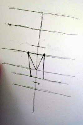
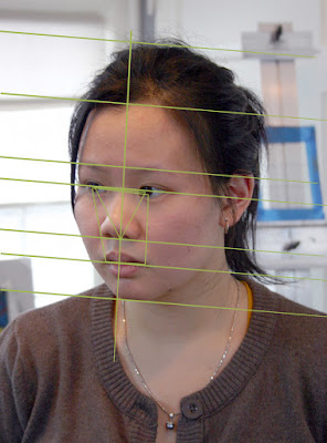
At some point, you need to get precise. Fast, loose painting rests on a base of good drawing. If you haven’t been taught to measure with a pencil, start here, hereand here.

People tell me all the time, “I can’t draw a stick figure.” It depresses me, because drawing is a technical exercise, and anyone can learn it, just as they learn to write or do arithmetic.

I recommend the book Sketching from Square One to Trafalgar Square, by Richard E. Scott. It’s a comprehensive introduction to drawing from observation. Books and classes that focus on the interpretive side of drawing are not useful for the artist who needs to get things right, so before you sign up, make sure that teacher, video, or book is actually teaching drawing, not some form of self-analysis with a pencil.

Beach erosion, 8X10, oil on canvasboard, $522 unframed.

Interpretation

Being technically accurate, oddly enough, frees up your subconscious mind to analyze and interpret what you see. We all paint through the filter of our own experience, values and aspirations. That’s why one artist will edit out the power lines and trash cans on a street scene, and another will focus on them.

But there’s a deeper level at which this happens, and that’s in the colors, forms and shapes themselves. They’re tied to your subconscious. Within the rubric of ‘good composition’ or ‘good taste’ are infinite variations. What you perceive is highly individual, so your interpretation will also be individual.

Marshall Point, 12X9, oil on canvasboard, $696 unframed.

Reiteration

The first three phases are all essentially input—identifying, measuring, and analyzing the subject you’re painting. The final business of producing a work of art is collecting all that input and restating it on your canvas or paper. If you’ve done the first three steps conscientiously, this last step should be relatively relaxed and free. It should also go quickly. Your own ‘handwriting’, in the form of brush or pencil work, will be unfettered and loose.

Before we were plein air painters

Ernie Pyle interviewed a local artist in Brown County, Indiana in the late 1930s. You might recognize a bit of yourself in him.

Sunshine and Hollyhocks, 1925, Will Vawter, courtesy Indiana Historical Society

Ernie Pylewas America’s most-famous WW2 correspondent, but before that, he already had a popular column for Scripps-Howard newspapers. Between 1935 and 1940, sick of his desk job as an editor, Pyle went out on the road to write human interest stories under the title Hoosier Vagabond. Eventually, he drove through all 48 states, the territories of Alaska and Hawaii, and several other countries.

After his death in the Pacific theater, Pyle’s American columns were assembled in a book called Home Country. It’s full of sharply-drawn small portraits, including the following, of artist Will Vawter of Brown County, Indiana.

A Sunny Day in Springville, Will Vawter, courtesy Indiana Historical Society

Vawter doesn’t call himself a ‘plein air painter,’ but it’s what we’d call him today. His lifestyle and attitude are familiar to me, and I thought you’d enjoy meeting him through the immortal prose of Ernie Pyle:

“You didn’t see artists trailing around Nashville in arty clothes. They didn’t have a favorite bar where they congregated to discuss their genius in mystic tongues. They simply worked hard and lived like normal people, and hoped to Heaven somebody would buy their stuff. And practically all of them were self-supporting through their art—which speaks for itself…

Brown County Landscape, 1920, Will Vawter, courtesy Indiana Historical Society

“Will Vawter [was] of all the artists probably the most loved by the townspeople. He was a big man, heavy, with a large head made even larger by an immense thatch of white hair. He and Schulz both looked like artists, and yet Will Vawter also looked just like somebody’s nice grandpa. Vawter illustrated one edition of Riley’s poems. He had a nice sense of sarcastic humor about himself. Somehow we got to talking about smoking. He didn’t smoke, but he chewed gum avidly and constantly, even when he was at a funeral looking at the corpse. He used to smoke cigars. He said he never could smoke halfway; he had to smoke perpetually or not at all, and it used to interfere with his art. He would load up his car of a morning with all of an artist’s necessary junk, drive out in the country and find himself a likely spot to paint, then unload everything and set it up. ‘It was like setting up a circus,’ he said. ‘I’d get out my easel and fix it just right. And then the canvas. And then get my paints and brushes all out and ready. And then my stool. And finally set up a big umbrella over the whole thing, practically like a tent. Then I’d sit down to paint, and reach in my shirt pocket for a cigar. And of course I’d have left them at home. And do you know, I couldn’t paint a stroke. So I’d jump in the car and rush back to town, taking corners too fast, killing chickens on the way, and being a general public menace. I’d lose an hour getting back to get those cigars so I could paint. So I just quit, and took up chewing gum.’

Along the Coast, Will Vawter, courtesy Indiana Historical Society

“Will Vawter talked about art the way I like to hear people talk. He said you go out and paint something the way you see it; somebody comes along to look at it, and if that scene happens to strike some memory, or cherished little scene, or a spot of appreciative beauty in whoever is looking at it, then he likes the picture, and if he’s able he buys it. That’s all there is to art. Nothing mysterious about it. When a man can talk like that, and still have no sense of time or direction whatever, and doesn’t recognize his own house half the time when he sees it, then I say he has combined the functions of artistic detachment and common horse sense to a degree that nearly reaches perfection.”

Monday Morning Art School: Precision

A good painting requires a good plan. What does that mean? 

This last weekend I was painting in the 14thannual Paint for Preservation for the Cape Elizabeth Land Trust. This always involves a big canvas, and this year was no exception: I painted 30×40.

I always start with a drawing in my sketchbook; when I’m working this large, the drawing becomes paramount. To look at my canvas from a distance meant climbing down into a small ravine and back up the next finger of rock, so I didn’t do it often. Accuracy in that situation requires planning. I transfer the drawing faithfully to my canvas, gridding if necessary. Then the sketchbook lies at my feet so I can consult it for values if necessary.

Foghorn Symphony, 36×40, by Carol L. Douglas, will be available through the Cape Elizabeth Land Trust in late August.

“You write numbers on it?” said Ken DeWaard, who’d stopped by with his morning coffee.

“Numbers and colors,” I said. That’s not my idea; it’s one I stole from an old guy named Vincent van Gogh, who often wrote the colors alongside his sketches. The sun at dawn on Saturday was a lemony yellow, and it would have been easy to remember it as richer and deeper. That would have overridden the sense of a transient sea-fog in the distance, which was causing the five lighthouses of greater Portland to play a fog-horn symphony.

Plein air events like Paint for Preservation have no do-overs. We’re required to put out a good painting. There are two options. You can paint more than one, and choose the best. That seldom works for me, since I’m no judge of my own work in the thrust-and-flow of an event. It’s also a lot of work.

Zeb Cove, 40×40, was my 2020 painting for CELT’s Paint for Preservation.

.
I go with the second, which is to paint one good one from the start, using all the tools at my disposal. Since a painting always goes wrong in the planning stages, I make sure my plan is solid, and then I stick with it.

What makes a good plan?

Precision of drawing

This means proper perspective and measurement. You might think this is irrelevant when the subject is rocks and the sea, but it’s as important there as with architecture. Drawing is the only clue about the distances involved. There’s a contemporary Maine style, which involves fast, loose brushwork, but it rests on a foundation of perfect drafting. In fact, bad initial drawing is a great way to end up with a tight painting, since you’ll constantly have to redraw with your brush.

Four Ducks, 30×40, was my 2019 painting for CELT’s Paint for Preservation.

Precision of composition

This means understanding the motive line, energy, and value structure of your painting from the beginning. A 30×40 painting will take from 8-12 hours to finish. The tide will have gone through one full cycle, and the sun will beat its way across the sky as you’re painting. In order to retain the light structure you started with, you must lay it out in advance—and then you must stick with it.

Precision of color

Nothing makes for a muddier painting than constantly restating colors because you didn’t get them right on the first try. Make a grisaille, and check your mixed colors against it.

Rocky, 36×36, was my 2018 painting for CELT’s Paint for Preservation. I’m detecting a theme here.

To mix color properly, you must be absolutely conversant with the pigments on your own palette. This requires practice. The goal is au premier coup, or to nail it on the first strike. That goes not just the for darks, but every color in the picture. Even a painting with wonderful shadows and lights will have many middle tones, often closely related in value. These are actually the most difficult colors to mix accurately. If you have a painting that isn’t working, ask yourself if it has a full tonal range, or is it simply hitting the highs and lows. 

Learning to critique paintings

When someone disregards all the voices telling them they can’t do something, and they challenge themselves with hard work and dedication, they ought to be encouraged.

Beth Carr
Linda DeLorey

I’m up at Schoodic Institute teaching my Sea & Sky workshop. We’ve had four days of fog, but my students have responded beautifully, working hard and turning out some wonderful paintings. It helped to remember that the fog is the product of the heat wave blanketing the rest of the northeast right now. We’re standing in Mother Nature’s air conditioner, where all that hot air meets the cold North Atlantic.

Hayley R.

Last evening, we had a critique session. This isn’t just about learning what’s wrong with our paintings. It’s also about learning what’s right. I want students to learn to read and write artwork that is clear, strong and intelligible.

Becky Bense

To this end, we considered formal structure, including:

  • Focal point
  • Line
  • Value
  • Color
  • Balance
  • Shape and form
  • Rhythm and movement

Carrie O’Brien

We could have equally asked:

  • “What do you notice first? Second?”
  • “Why did you see those things in that order?”
  • “Does this evoke a feeling or response in you?”
  • “What is the point of this work?”
Leanne Nickon

The first set of questions are objective. The second, while subjective, are not judgmental. Rather, they ask us to observe our responses to the paintings. That’s intentional. “Do you like this?” is not going to garner useful responses.

Terrie Perrine

As a teacher, I generally use the “sandwich rule” to critique paintings. I start by pointing out something the person did well. We then discuss what might have been handled differently. I finish by pointing out something else that the person did well, so that each session ends on a positive note.

Robert Tyzik

This method has been mocked as “fluffy bun—meat—fluffy bun,” but that misses the point. Most people are all too aware of their failures and not aware of their strengths. Their own self-doubt gets in the way of seeing what is successful in their painting. That needs articulation as much as the negatives do.

Lauren Hammond

Last night, one student said she has a hard time taking criticism. “You can say a hundred good things about me and one negative thing, and all I remember is the negative,” she said. She’s not alone in that; it’s how we’re all wired, and it takes a lot to work past our natural defenses.

Nancy Lloyd

It’s a sign of how well these students trust each other that they put in not their best paintings, but the ones where they felt they needed another person’s insight. And I apologize for the photo quality; Jennifer took the photos under incandescent light, which wrecks the color.

Jennifer Johnson

People are capable of wonderful things, but our society routinely discourages us from daring to be great. When someone disregards all the voices telling them they can’t do something, and they challenge themselves with hard work and dedication, they ought to be encouraged.

Making a good workshop great

Your teacher is important, but the students turn a good workshop into a great one.

Students painting at Schoodic Point this year. That was the last sun we saw. (All photos courtesy Jennifer Johnson.)

I’m teaching in Acadia this week, and it’s fog-bound and rainy. But this is a great group—intrepid and interested. They’re learning a lot despite the unseasonable dampness, and I’m having a blast teaching them.

How can you get the most from a workshop or class? Here are some simple suggestions:

Study the supply list.

Note that I didn’t say, “run right out and buy everything on it.” Every teacher has a reason for asking for those materials. In my case, it’s that I teach a system of paired primaries. You can’t understand color theory without the right starting pigments. Another teacher might have beautiful mark-making. If you don’t buy the brushes he suggests, how are you going to understand his technique?

A tube of cadmium green that I once bought for a workshop and never opened still rankles. I never want to do that to one of my students. When you study with me, I want you to read my supply lists. If something confuses you, or you think you already have a similar item, email and ask.

Paula Tefft working in watercolor.

Bring the right clothes.

It’s been ranging between the 50s and 80s in Maine this summer. If you come north without a hoodie, you will be chilled in the evenings, but you need shorts and a tee-shirt during the day.

I send my students a packing list for clothes and personal belongings. If you’re going on the Age of Sail, Shary will send you a different list, meant for a boat. Follow these instructions, especially in the matter of insect repellent. I didn’t, because I am seldom bit, but I have whackin’ great blisters on my ankles right now. With all the rain we’ve had, the mosquitoes have been voracious.

Know what you’re getting into.

“How can you stand this? It’s all so green!” an urban painter once said to me after a week in the Adirondacks.

There are no Starbucks in Acadia National Park, in the Pecos National Wilderness, or on the clear, still waters of Penobscot Bay. If you’re dependent on your latte macchiato, you may find it uncomfortable at first. (Somehow, there’s always coffee, even without cell-phone reception.) However, the seals, dolphins and eagles are ample compensation.

Hayley R. painting in Paradise.

Be prepared to get down and dirty.

I’m not talking about the outdoors here, I’m talking about change and growth. I am highly competitive myself, so it’s difficult for me to feel like I’m struggling. However, it’s in challenging ourselves that we make progress. Use your teacher’s method while you’re at the workshop, even if you feel like you’ve stepped back ten years in your development. That’s a temporary problem.

You can disregard what you learn when you go home, or incorporate only small pieces into your technique, but you traveled to be challenged, and you can’t do that if you cling to your own technique.

Connect with your classmates

I know painters from all over the US. I met most of them in plein air events. There’s power in those relationships. Exchange email addresses. Keep in contact. Follow them on Instagram or Twitter.
Take good notes.

Listen for new ideas, write down concepts, and above all, ask questions. If your teacher can’t stop and answer them mid-stream, save them for after the demo.


Monday Morning Art School: how to get the most out of a workshop

The important thing you bring to class is not your prior painting experience, but your attitude.

I’m at Schoodic Institute in Acadia National Park this week, teaching my annual Sea & Sky workshop. The following is what I tell my students on the first day:
To teach painting effectively, one must not only know how to paint, but be able to break that down into discrete steps and effectively communicate those steps to students. That’s straightforward, right?
What isn’t so straightforward is how one prepares to be a good student. Learning is a partnership, and students always bring attitudes, personality and preconceptions to the mix. Unless a class is marketed as a masterclass, you don’t need to worry overmuch about your incoming skill level. However, some rudimentary drawing experience will make you a stronger painter.
Photo courtesy of Jennifer Johnson.
More important is intellectual openness. This means the ability to receive correction and instruction without being defensive. (I’ll freely admit I came late to this myself.) The greatest teacher in the world is useless if you’re not prepared to hear what he or she has to say.
Nobody ever paints well when they’re integrating new ideas; it’s far easier to stick with the same old processes even when they don’t work particularly well. They’re familiar. Students should come to class expecting to fail, and even to fail spectacularly. “When I take a class, I produce some of the worst crap in the world, but I will have experimented,” one artist told me. The people who produce pretty things in class are often playing it safe. They’re scared of pushing themselves past what’s comfortable.
Are you worried that you’ll lose your style if you do it the teacher’s way? Your inner self will always bounce back, but hopefully you’ll have learned something that enhances that.
What we teach is a process. The primary goal is to master that process, not to produce beautiful art in any style. If that happens, it’s a bonus, but the real takeaway ought to be a roadmap you can follow long after your teacher is gone.
Photo courtesy of Jennifer Johnson.

The student has some basic responsibilities to his fellow students. He should be on time and bring the proper equipment and supplies. Furthermore, he should be polite, friendly, and supportive to his fellow students. The importance of this latter cannot be overstressed. An overly-needy or unfriendly student can ruin a workshop for everyone, as there’s no getting away from him.

I’ve written before about the pernicious practice of negative feedback, but it’s pervasive in our teaching culture. It takes a while for students to get the hang of recognizing their successes. Before we talk about what needs fixing, we need to trust each other. One way we learn distrust is the idea that, in a critique, we are required to say something unfavorable. Only talk about what’s broken if, in fact, it’s actually broken.
Photo courtesy of Ellen Trayer.
It helps progress to be optimistic, excited and motivated. I’m blessed with an unusually great class this session, and one of the things that distinguishes them is that everyone really wants to excel in painting. They all have a strong work ethic.
Lastly, I think a good student brings a measure of self-advocacy to class. I’m listening hard, and I’m watching carefully, and I still sometimes miss things. I like it when people bring problems or concerns to my attention. It makes me a better teacher.

Time management for artists

The temptation to say yes to every opportunity that comes your way is strong, but it will wreck your focus.

Skylarking 2, 18X24, oil on linen, $1855 unframed.

This week, I cancelled my Cody, WY, workshop. There was nothing wrong with it in concept; it generated a lot of interest. The trouble started when students looked for rental cars. There weren’t any available, and in the nearby larger markets, rental rates were extortionate.

This is nobody’s ‘fault’; it’s an unforeseen result of COVID. However, that doesn’t give me a free pass to ignore the consequences. I still had a lot of clerical work to do to make the cancellation. That—along with the lost work and expense of setting up the workshop up in the first place—is part of the cost of doing business.

This is the time of year when I suddenly notice that I’m making lots of mistakes. That’s because I’m working myself too hard. That’s partly because of summer visitors, but it’s also because of my business model. I live and work in a tourist town, where we make hay while the sun shines.

Skylarking, 24X36, oil on canvas, $3985.

Every year at this time I reach a point where I can’t manage the clerical stuff on my own. There are only two solutions:

  • Scale back, or
  • Hire some of it out.

There are good arguments against either. Scaling back would reduce my income. Hiring is difficult in this market, and it would require raising prices.

To be self-employed without a secretary has only possible because of the remarkable improvement in business efficiency in the last few decades. Take paying bills, for example. It used to be a half-day affair that involved writing checks, addressing and mailing envelopes, and a quaint bookkeeping activity called “balancing the checkbook.” Now I can do it—including checking all accounts for fraudulent activity—in an hour every other week.

Belfast harbor, oil on canvasboard, $1594, framed.

Unfortunately, that has been replaced by other activities that are equally time-consuming. The biggest of these is social media, but it’s the best advertising at our disposal. When artists tell me, “I don’t have time for that,” they’re ignoring the first requirement of business, which is marketing.

Still, the reality for all self-employed people is that there are only 2000 working hours in the year. You have to be able to do all your tasks in that allotted time, or you’ll fail. Years ago, my friend and fellow painter Bobbi Heath taught me a simple time-managementsystem. The take-away lesson is that not everything will get done. Your job as a manager is to figure out which needs to be done most urgently, and to let the chaff fall.

Owls Head, 8X10, $652 framed.

Like most of us, I have a hard time saying no, but saying no doesn’t make me a failure or a bad person. It means I’ve prioritized other activities.

The temptation to say yes to every opportunity that comes your way is strong, especially when you’re just setting out. People will ask you to paint all kinds of things, in all kinds of places. “Your dog, at your wedding reception? What time should I be there?”

But many of these ‘opportunities’ are really just cul de sacs that will spread you too thin, and cost you your focus. If they can’t be done well, don’t do them at all.

The viewer wants to know

Which is more important, narrative or design? The answer is yes.

Main Street, Owl’s Head, 16X20, oil on gessoboard, $1623 unframed.

Thomaston, ME, is a community of lovely, large Victorian homes that somehow maintain a whiff of the 19th century. It’s a little off the beaten path and the streets are quiet. I try to teach there at least once a season, focusing on perspective and architecture.

Ann Clowe and Cassie Sano had elected to paint the same house on Knox Street, an 1851 Cape that’s dwarfed by its attached barn (in the Maine way). It’s a strange shade of red that looks warm in some places and cool in others. Ann had painted it unsuccessfully three times before. She refused my suggestion that she look at other houses on the street. She was making her stand; she was going to defeat those red walls.

Victoria Street, 14X18, oil on linen, $1275 unframed.

One of the most common questions students ask me about architecture is whether they should include that door, that window, or that bit of moulding. The answer depends on the design and focal point of the painting. If one is focused on the house, the details are important. If the house is an incidental part of the landscape, it’s possible to reduce it to a mere silhouette.

Every painting—even stark hyperrealism—has some extraneous detail edited out. One of the great virtues of painting over photography is that we can eliminate the telephone lines, gas grill and other impedimenta of modern life. We do this both for design reasons and to make the narrative stronger.

Fishing shacks, 11X14, oil on canvasboard, $869 unframed.

Cassie, in asking me whether she should include a door, said, “but the viewer wants to know how these people get in to their house.” She’d answered her own question, and created a good test for whether to include something:

  • If it’s an important part of the narrative, leave it in.
  • If it’s not, make your choice based solely on design criteria.

In the 20th century, narrative became a bit player in painting; abstract design was key. Only the reactionary Wyeth family and a few others were still telling stories in their paintings. That impulse hasn’t totally died, but it’s a trend, not an eternal verity. Storytelling appeals to something so primary in our psyche that we’ll never eliminate it entirely from painting.

Three Chimneys, 12X16, oil on canvasboard, $1159 unframed.

Storytelling ought to include telling the unvarnished truth about our current reality. That sometimes includes gas grills, cars, and telephone poles. As Cassie joked, “the viewers might want to know how they get their mail.”

The red house has a handicapped-access ramp running to the side door. It made a brilliant diagonal slash of light in the painting, but it was hardly in keeping with the house’s original design. It also told a story that’s achingly familiar to many of us. If it had been my painting, I would have included the ramp, and even focused on it. It says something laudable about our moment in history: we want to keep the elderly in their own homes as long as possible.

Monday Morning Art School: Basic elements of design

The artist’s job is to invite the viewer into his world. That doesn’t happen by accident.

I and the Village, 1911, Marc Chagall, courtesy MOMA. In this painting, line is a dominant design element, articulating the relationship between man, beast and place. However, proportion (relative size of the objects) is playing a part as well.

Line

In math, a line is straight, has no thickness and extends in both directions through space. Sometimes that’s what we mean by a line in art—for example, a horizon line.

More typically in art, a line is just a path through space. Wherever you have an edge, you also have a line. However, lines also refer to mark-making, so in that sense they can be fat, thin, punctuated, tapering, diffident, bold or whispering.

Diagonals and curves seem to keep us more engaged than unbroken verticals, as they’re more difficult for the eye to ‘solve.’

Interior of the Laurenskerk in Rotterdam, 1664-66, Cornelis de Man, courtesy Mauritshuis. The illusion of three-dimensional form is created with perspective and value.

Shape and form

Shape and form define objects in space. Shapes have two dimensions–height and width–and are bounded by lines. Forms are three-dimensional. The artist’s dilemma is to give the illusion of three-dimensional form in a two-dimensional painting.

Ploughing in the Nivernais, 1849, Rosa Bonheur, courtesy MusĂŠe d’Orsay. The vast sky and field create as much narrative as do the team of oxen.

Space

Space in the real world is three-dimensional. In art, the term refers to a sense of depth, or the artist’s use of the area within the picture plane. The illusion of three-dimensional space is created with perspective drawing, atmospherics, relative proportion (size), positioning, and defining volume through modeling.

Sometimes we refer to negative and positive space, which means the division between the primary object(s) and what we perceive as the background. Positive and negative space were a very big deal in much twentieth-century design, which often used the vast emptiness of the page as a counterweight to the primary object.

The Crucifixion of Saint Peter, 1601, Caravaggio, courtesy Cerasi Chapel. Chiaroscuro relies primarily on value to drive the eye.

Color

Color has three essential characteristics:

  • Hue—where it falls on the color wheel (red, blue, etc.),
  • Chroma—how brilliant or dull it is,
  • Value—how light or dark it is.

Color is also described as ‘warm’ or ‘cool,’ but these are useful artistic conventions and not measurable as fact.

Historically, value did much of the heavy lifting in painting, and it remains the most important characteristic in your painting. The Impressionists began using hue and chroma to define volume, and that is essentially how most alla prima painters work today.

Portrait of the Baronness James de Rothschild, 1848, by Jean-Auguste-Dominique Ingres, private collection. We see satin, lace, tulle, feathers and jewels primarily due to Ingres’ exquisite control of reflected light.

Texture

Texture refers to the surface quality of an object. Paintings have implied texture, conveyed by color, line and brushwork. They also have real texture in the form of smooth or impasto surfaces.

Ejiri in Suruga Province, 1830, Katsushika Hokusai, courtesy Metropolitan Museum of Art. Great winds have blown away the clouds on Mount Fuji, and they’re also blowing the travelers and their packs around. This movement is echoed and amplified by the brushstrokes.

Movement

Movement can be either suggested or depicted—as in the wind in the painting above—or implied by brushwork. Most paintings have a major thrust of energy, which I call its motive line.

Your assignment is to take one of your own paintings and subject it to formal analysis. Consider each of these elements of design in turn. How are you using them? How could you use them better?

(This post originally appeared in July, 2020.)

Painting in strange places

Boats, mountains, glaciers—I like painting off the beaten path.

I don’t worry about much, but setting up the coffee this morning I was stopped by the sound of running water near the sink. It was rainwater coursing down the window in great gouts. Not a domestic problem, but it’s a hard start for the inaugural Camden on Canvas, which has brought top-tier artists to paint in our little burg.

Camden on Canvas is the pet project of Colin Page, and it’s a fundraiser for the Camden Public Library. Colin’s got bigger worries this morning than where he himself will paint. Anyway, he could paint Camden harbor blindfolded and with a sling on his good arm—after all, it’s his home harbor. As for the rest of us, we’re professionals, and we have two days to finish our paintings.

I’ll be heading down to Camden a little later this morning and setting up on the docks on the harbormaster’s side. I’ll work on a harbor painting today, but tomorrow my real adventure starts. I’m climbing to the top of Bald Mountain early in the morning and painting the vista of Camden from a high peak. Any fool can drive up Mt. Battie and paint from the parking area at the summit, but it makes a mediocre picture, having no foreground. Bald Mountain is a 2.6-mile round-trip hike of moderate difficulty (although it will be slippery after all this rain).

View from Bald Mountain.

If you plan to go up there to watch me paint, bring your own chair. I’m not carrying one up for you. You don’t have to work that hard, however; last time I checked, the signal on Bald Mountain was great. I’ll live-broadcast my painting on Facebook. It’s hard to predict an exact time, but expect me to start early, while the sun is still low in the east. I’ll update times on my Facebook page.

Speaking of video, my friend and student Terri Lea Smith made this wonderful video of schooner American Eagleduring our June workshop. If you’ve ever wondered why I have a crush on this particular boat, her film should answer that question. Boats, mountains, glaciers—I like painting off the beaten path.

On that note, students interested in my Pecos workshop might be happy to learn that Our Lady of Guadalupe Abbeyhas added camping spots to their accommodations. It’s a stunning location along the Pecos River and very convenient to all our painting sites. If you’re interested, I’d call them—quickly—at 505-757-6415. And then let me know, too.

My 2020 painting for Cape Elizabeth’s Paint for Preservation.

Cape Elizabeth’s Paint for Preservation is August 13-15. We’re assigned sites to paint, and these came this week. I’ll be at Trundy Point, which is a massive rock jutting out into the ocean. It’s got surf, beach roses, scree, and beautiful rocks.

I’ll only be there on Saturday, as I’m finishing my workshop in Schoodic that Friday. That occasional problem of unavoidable schedule conflicts is another reason they give us two days to paint at these events. As you can imagine, I’m praying for no rain.