fbpx

Afraid of the darks

It’s only when you’re no longer struggling to manage the technical problems that you can start telling a story with your brush.

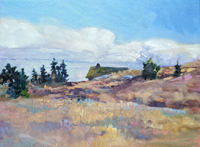
Northern  New Mexico, 8X10, oil on Ray-Mar board, $522 unframed.

When teaching, I usually find myself sounding out little ditties with my brush rather than playing through the whole score. Nobody can absorb all the nuances of painting in one marathon demonstration; if that’s what they want, they’re better off buying a video and watching it repeatedly. I prefer to paint a passage that shows a solution to whatever problem is bedeviling my class at the moment. Rarely does that result in a fully-realized painting, but I feel that it’s the best way to teach.

Students setting up to paint in a quiet hamlet. What a paradise New Mexico is!

I was doing that yesterday, demonstrating how to hit a dense, rich color on the first strike. Watercolor students are often afraid of the darks, because they know there’s no going back from an incorrectly-placed deep passage. With few exceptions, watercolor doesn’t take correction well.

“That’s the bitch of watercolor,” I said, sadly.

“Ohhh, the Bitch of Watercolor!” someone riposted. “What a great title!”

My students. I love them.

“Enough of that stupid horse!” said Jimmy the Donkey. “Look at my beautiful Roamin’ Nose!” That was the end of that painting.

The diffident watercolorist tries to circumvent their fear of darks by substituting a series of glazes. Glazing has its place, but you can’t use it in lieu of courage. Excessive glazing makes for muddy color and indistinct edges. The end result is lifeless. Paradoxically, that struggle against the darks sucks all the light out of the painting.

Just as watercolorists have problems with darks, some oil painters have an equal and opposite problem with light. They understand intellectually that they work from darks to lights, but they’re somehow unable to make the jump. Sometimes that’s caused by working in bright sunlight, which lies about the true values in our paintings. Or the painter thinks they should lay down a bunch of dark color and then lighten things by adding white into them. That’s a misunderstanding of indirect painting.

White, incorrectly used, makes for chalky color.

New Mexico can sure put on a show with her skies.

The problem may also be that they have too much solvent in the bottom layers. If those layers are too wet, nothing above them stays separated and clean. A good rule of thumb is that solvent gets used in the bottom layer only (and sparingly), paint in the middle layer, and paint and medium in the top layer. The fat-over-lean rule is not only archivally sound, it’s easier to manage.

Confident color is integral to alla prima painting. There is only one way to achieve this:

  • Draw well enough that you have confidence in where you’re placing your color, and,
  • Mix and test your color so you’re sure of it before it hits your finished painting.
My dog buddies came out to visit me, as they do every year. It’s painful to see the grey in their muzzles and the hitch in their gitalong.

“Why this emphasis on process?” a student once asked me. “Shouldn’t art be about freedom of expression?” Well, yes and no. All expression rests on a firm foundation of technique. It’s only when you’re no longer struggling to manage the technical problems that you can start telling a story with your brush.

I’m teaching in Pecos, NM this week. Yee-hah!

Monday Morning Art School: the color of earth

The earth pigments are our oldest colors, and they’ve served humanity well.

Dry Wash, oil on canvasboard, 12X16, $1159 unframed.

Years ago, I met an artist in Taos who told me that he never used the earths—siennas and umbers—in his paintings. I don’t remember his name, but I vividly remember his rationale. They were too close in color to the rocks of New Mexico. He did better to mix those warm shades.

That is very close to my own rationale for not having greens on my palette. The East is a predominantly-green environment. Using greens straight out of the tube is the best possible way to deaden your painting into a universal dull greenness without variety, sparkle or light.

Old Barnyard in New Mexico, oil on canvasboard, 12X16, $1159 unframed.

I’m teaching in New Mexico this week, so I have to adjust my own palette. My reliance on the earths has to ease up. However, my students are all from the south or east, meaning they’ll go back to a green landscape. I want them to take home the logic behind my palette, not an arbitrary rule.

The earth pigments are minerals that have been used in painting since prehistoric times. They’re primarily iron oxides and manganese oxides. We know them as the ochres, siennas and umbers. They’re extremely lightfast. In watercolor they granulate beautifully because of their large particle size. They’re relatively non-toxic* and they’re cheap. Those are all valuable properties to the painter, which is why they’re so widely used.

On the other hand, they look just like the earth because they’re made of dirt and rust (although we synthesize some of them today). They’re complex colors with lots of overtones. In mixtures they stubbornly retain traces of their own character. In a painting predominated by the natural reds and browns of the west, that can get pretty dull, pretty fast. If you want to know how a reliance on the earth pigments will turn out, see Rembrandt—great for Dutch interiors, not so good for American landscape.

Downdraft snow, oil on canvasboard, 12X16, $1159 unframed.

The world of greens cannot be simulated by something taken from nature. The pigments that give us green in nature—chlorophylls—are not lightfast. Instead, painters rely on an inorganic compound, chromium oxide green, which we know as viridian or chrome green. Chromium oxide is synthetic, but it does appear in nature as a rare mineral. It is relatively low-stain and inexpensive. It too granulates, which makes it valuable to watercolorists.

Chromium oxide green is a good workhorse pigment, far preferable to the deadening sap green that so many painters love. Sap green started as an unstable extract of buckthorn berries. What we buy today is a convenience mix based on phthalo green. That’s also true of the mixture marketed as ‘viridian hue.’ Paints based on phthalocyanine dyes are very high-stain and have a different color profile than the pigments they’re mimicking. That’s not to disparage the phthalo blue and greens; in themselves they’re lightfast, cheap, and have transformed the modern world.

Spring thaw along the upper reaches of the Pecos River, oil on canvasboard, 12X16, $1159 unframed.

Hooker’s Green is another convenience hue. It’s named after an English botanical illustrator, William Hooker, who first put Prussian blue and gamboge together to make a clear, light green. There’s nothing wrong with that mixture—but you should be able to make it yourself, not buy it out of a tube.

That’s true across your palette. You’ll have more flexibility and less expense if you stop buying convenience mixes and ‘hues’.

*Don’t ever fall for the idea that if it’s natural, it’s non-toxic. Mother Nature has hidden a lot of dangerous minerals in this beautiful earth, including cinnabar, galena, lead, asbestos and more.

I used to know everything

Who cares if the Dunning-Kruger effect is measurable? We’ve all known people for whom it’s true.

Wreck of the SS Ethie, oil on canvas, 18X24, $2318 framed

When I couldn’t paint, I thought I knew everything. The more I learned, the more I realized I didn’t know. Now, I often finish a painting wondering if it’s any good at all.

I’m not unique in that—many experienced painters recount similar metamorphoses. I learned from author Van Reid that there’s a name for this: the Dunning-Kruger effect. Psychologists found that low-ability students thought they were much better at their subject than they actually were, while high-ability students downplayed their own skills.

Deadwood, 30X40, oil on linen, $6231 framed

It’s a hypothesis, because it hasn’t been proved yet, but it sure feels right.

An answer that “feels right” is one example of the kind of heuristic reasoning that inevitably leads to the Dunning-Kruger effect. Heuristics are mental shortcuts that match our current question to our prior experience. They may not provide perfect answers, but they give us quick ones. If it looks like a duck and quacks like a duck, we generally assume it’s a duck. If it turns out to be a shelduck instead, well, the error probably isn’t that important—unless you’re an ornithologist, in which case you already knew and thought the rest of us did, too.

The human mind is programmed to see patterns even where none exist. Modern life throws an amazing array of information at us every day. It’s no surprise that our overtaxed minds try to cut through the welter by using mental shortcuts. Sometimes they go spectacularly wrong.

Quebec Brook, oil on canvasboard, 12X16, $1449 framed

This phenomenon is something you’ve likely experienced in real life, especially if you spend much time on social media. A self-proclaimed ‘expert’ will begin spouting off at length, blissfully unaware of how silly he or she sounds. It might even be me.

As originally described by psychologists David Dunning and Justin Kruger, the bias results from two different problems. Low-ability people don’t perceive their own incompetence. “If you’re incompetent, you can’t know you’re incompetent, wrote Dunning. “The skills you need to produce a right answer are exactly the skills you need to recognize what a right answer is.”

On the other hand, people of high ability consistently overestimate the abilities of others. They erroneously presume that tasks that are easy to them will be easy for others as well.

Skylarking, oil on canvas, 24X36, $3985 framed

The Dunning-Kruger effect has nothing to do with intelligence; in fact, really smart people are often supremely overconfident. That leads them into making complete asses of themselves in fields outside their own competence. Think, for a moment, of William Shatner’s music career, or Richard Dawkins on theology.

Who’s happier: the cock-sure, incompetent young painter, or the self-deprecating master? It’s a question nobody can answer. We can’t look at the past except through the filter of what we now know. As a teacher, I would hate to ruin anyone’s enjoyment of painting by making them a better painter. But there’s consolation in knowing that there are paint-and-sipnights for those who really don’t want to know what they’re doing.

Cutting it fine

Why do some Americans work so darn hard?

Best Buds, 12X16, $1449 framed

I don’t typically travel for fun in the summer, but with my Cody workshop cancelled due to the national car rental shortage, I had a few free days. Of course I filled them in with another trip. It wasn’t until I was unpacking my truck last night that I realized that I left my watercolor kit at my daughter’s house in New York. Oops.

 â€œDo nothing, say nothing, and be nothing, and you’ll never be criticized,” wrote Elbert Hubbard.

In 1913, Hubbard pleaded guilty to six counts of using the US mail to distribute “obscene, lewd, lascivious, filthy and indecent material.” He was fined $100 and surrendered his rights as a citizen.

Apple Tree with Swing, 16X20, $1623 unframed

Here is one of the jokes that earned him disgrace:

“The bride of a year entered a drugstore.  The clerk approached.  â€˜Do you exchange goods?’ she asked. ‘Oh, certainly! If anything you buy here is not satisfactory we will exchange it.’ ‘Well,’ was the reply; ‘here is one of those whirling-spray [contraceptive] affairs I bought of you, and if you please, I want you to take it back and give me a bottle of Mellin’s [baby] Food, instead.’ And outside the storm raged piteously, and the across the moor a jay-bird called to his mate, ‘Cuckoo, cuckoo!’”

Another concerned “the new stenographer whose name was Miss Mary Merryseat. But Old Man Lunkhead, Senior member of the firm of Lunkhead Sons & Co., Ltd., never having taken a course in Dickson’s Memory Method, called her Gladys.”

Owls Head Fishing Shacks, 9X12, $869 framed

Leaving aside his penchant for criminally-bad jokes, Hubbard was a busy man. He is credited with the aphorism, “If you want something done, ask a busy person.” He’s best remembered for founding the Arts and Crafts Movement called Roycroft. Based on the ideas of William Morris, it was a community of printers, furniture makers, metalsmiths, leathersmiths, and bookbinders in East Aurora, NY.

Roycroft’s creed was a quote from John Ruskin: “A belief in working with the head, hand and heart and mixing enough play with the work so that every task is pleasurable and makes for health and happiness.”

It’s the ‘play’ part that is frequently neglected by Americans. I found, during my four-day interlude in New York, that I kept falling asleep. That’s a sign of exhaustion, and it’s no way to do art or anything else.

Belfast Harbor, 14X18, $1594 framed

Why do we live like this? In part, it’s training and competitiveness. And in part it’s the culture. Americans have long been the hardest-working people of all the industrialized nations

The middle class bears the brunt of our work-mania. “The average middle-class married couple with children now works a combined 3,446 hours annually, an increase of more than 600 hours—or 15 additional weeks of full-time work—since 1975,” according to the Brookings Institution.

In 1960, when I was learning to toddle, only 20% of women with children worked outside the home. Today, 70% of American children live in households where all adults are employed. That means all the unpaid work of the household is now done by parents after work and on weekends.

I’m a product of my culture, so I beat myself up for forgetting my watercolor kit. I leave to teach back-to-back workshops on Friday. I need it, and there’s no chance I can get it back in time.

Had I stayed home over the holiday weekend, I never would have mislaid it. I would have opened my gallery and maybe sold a painting. I’d have finished projects to button up for winter.

And I’d also have missed my granddaughter’s sixth birthday party. Relax, Carol, and learn to play a little.

The pernicious practice of group norming

Feeling out of place, like a failure? Perhaps the problem isn’t you, but your tribe.

The Late Bus, 8X6, oil on canvasboard, $435 framed

This week, kids start trickling back to school in the northeast. Every year at this time, I’m pensive. I was never one of those mothers who celebrated the first day of school; I regretted the end of summer and the loss of freedom it represented. I hated school myself; I wasn’t good with rigid structure. As a parent, I felt that the system skirted on the thin edge of abuse, battering down individuality, curiosity and creativity. (That goes for the teachers as well as the kids.)

“We’re trying to prepare your child for the real world,” a principal once lectured me, ironically unaware of how little reality intruded into his neat little building. Long before COVID forced a reckoning, he couldn’t conceive of success outside of reporting to a white-collar office job punctually every morning.

Wreck of the SS Ethie, oil on canvas, 18X24, $2318 framed

I left New York in part because I can’t paint like a Hudson River School painter. It is a continuous tradition dating back two hundred years, and there’s absolutely nothing wrong with it. I admire it, but it’s not how I see the world.

There is a distinctive Maine style as well: higher in chroma, looser in execution, not as interested in modeling, and verging on abstraction. It relies on accurate drawing to allow for loose brushwork. Not only do I like it better, it’s a better fit for me.

Vineyard, 30X40, oil on canvas, $5072 framed

As long as I painted en plein air in New York, I was pushed toward painting within that New York style. How does that happen? Galleries seek it out, jurors award it, painters you admire work that way. Above all, collectors buy it.

Human beings are social beings. We have a powerful need to belong. This makes us vulnerable to the influence of others. This is called normative social influence, or group norming, and it’s a powerful force in all social units from the family on up.

This is built into us because we’re herd animals. Group norming promotes social cohesion, which confers stability, safety, and harmony. But this cohesion has a cost, and that’s the sacrifice of individualism.

Deadwood, 36X48, oil on linen, $6231 framed

It can be extremely painful to be on the outs with your tribe. Whistleblowing is an example. Consider the story of Lindsey Boylan, the first woman to accuse Andrew Cuomo of sexual harassment. Cuomo was a star of Boylan’s own political party, the winner of an Emmy, the darling of celebrities and power brokers. Boylan was smeared in the press with the release of supposed confidential personnel records. Even Times Upleader Roberta Kaplan, nominally a spokeswoman for sexually-harassed women, colluded with the governor to discredit Boylan.

We give lip service to the idea of “thinking outside the box,” but in fact nobody much likes having their own pet prejudices challenged. Society routinely ostracizes those who dare to be different, and that’s true of artists as much as anyone.

This is where a good knowledge of art history proves useful. It allows you to see over the lip of the basket you live in, to see where you fit in the greater scheme of things. If you’re constantly feeling wrong-footed or inadequate, perhaps the problem isn’t with you, but your tribe.

A difference of intention

There’s a difference between painting fast and phoning it in.

Main Street, Owls Head, 16X20, oil on gessoboard, $1,623 unframed

The hiker makes constant adjustments to his course, although he does most of them automatically. When sailing, the helmsman trims frequently to follow changes in the wind. On a zip line, a person makes one decision (to jump) and then hangs on for dear life. As our speed increases, our control decreases.

That’s as true for painting as anything else in modern life. It’s one reason why so much modern art has been about expression of a single idea or feeling, rather than craft. It’s a true representation, in tangible form, of the chaotic speed at which we hurtle through life.

Apple Blossom Time, 9×12, oil on canvasboard, $696 unframed

If that’s your schtick, there’s not much a traditional painting teacher can offer you. We’re no substitute for the creative genius that will motivate you to vomit pigment onto a canvas. What we teach is rather shopworn: a process by which you can transfer ideas onto canvas, using technique that’s more than a thousand years old. It’s not for the easily-bored, because it takes time to master. And even when it’s mastered, it takes time to execute properly.

That doesn’t mean that good paintings are necessarily slow paintings (or vice versa). “How can you finish a painting that fast?” is a question every plein air painter has heard many times. We’ve learned an efficient way of approaching the problem. If we deviate too far from it we get bogged down in the process of painting, at the expense of our personal vision.

Autumn blues, 12X16, oil on canvasboard, $1449 framed

When my advanced watercolor students have finished a long project, I’ll sometimes tell them, “Now, paint it again in ten minutes.” They’re often surprised that the second, fast painting is better than the one they spent so much time on. But that second painting didn’t take them ten minutes—it took them that plus all the time they spent on the first one. It’s just a second iteration of the same work.

There’s a difference between painting fast and phoning it in. It’s a difference of intention. I was dissing a well-known artist with an avid collector at a reception last week. “His new work has become
” He paused, unable to think of how to finish his sentence.

“A schtick?” I suggested.

His eyes widened. “I own one of his paintings from the ‘90s,” he protested, “and it’s really good.”

“That’s because he wasn’t copying himself yet,” I said.

Fallow field, 12X16, oil on canvasboard, $1449 framed

It happens to many excellent painters—they figure out a motif that sells, and produce a lot of it, and then suddenly, it’s ‘what they do.’ They’re no longer engaged on a deep level; they’re phoning it in, either out of laziness or fear of losing their audience.

Galleries don’t help, because they want painters to produce shows that are unified and coherent. There’s visual impact to twenty almost-identical paintings, especially if they lean heavily on graphic design. But that’s only true in the showroom; take one home and it loses that impact. Then it must stand or fall on its own merit.

That doesn’t mean that we artists don’t have one finger raised to the wind of painting fashion. Obviously we do, or we would still be painting like Mannerists. But within our time and place, we have great scope for personal creativity, exploration, and deep thinking. The artists with long-term staying power are those who never forget that.

Monday Morning Art School: white on white

The color of white is the color of light. Mastering that will make all your paintings more exciting.

Girl Arranging Her Hair, 1886, Mary Cassatt, courtesy National Gallery of Art

Do you remember learning that “white is not a color; it’s the combination of all the colors”? That’s malarkey, although it’s based on a truth. Yes, Isaac Newton demonstrated that white light is a reflection of all the visible light spectrum. That doesn’t change the fact that white is a perceived color (as is black). Our perception is based not just on the physical light bouncing from the surface of an object, but on a whole host of contextual cues, which is why our brain is so easily fooled by optical illusions.

White is, in theory, a reflection of all the visible light spectrum. But that is never true in real life. Inevitably, all light shifts to either the cool (blue-violet) or warm (golden) side, depending on the time of day, season, and atmospheric conditions. Artificial light is even more limited in spectrum than sunlight, which is why it kills the colors in paintings, textiles, and human skin.

Sita and Sarita, 1896, Cecilia Beaux, courtesy National Gallery of Art

At the end of the 19th century, the Impressionist revolution in color had spread to painters like Anders ZornJoaquĂ­n Sorolla and John Singer Sargent. Nowhere does this show more than in their handling of white.

The colors in her gown.

Sorolla was painting in the brilliant light of his native Valencia. Zorn lived in Sweden, and many of his scenes have flat light. Sargent lived most of his life in western Europe. None were working in the same lighting conditions, but all of them adopted the same approach to color and light. It was a marriage of Impressionist color theory to more traditional brushwork. The combination still works today.

Helen Sears, 1895, John Singer Sargent, courtesy Museum of Fine Arts, Boston

By adding color to white, these painters were able to give their subject the sparkle and truth of natural light. To have painted their whites with just white or grey would have resulted in flat, dull canvases. This is because convincing whites, in the real world, are actually quite colorful.

The colors in her dress.

Sargent’s portrait of Helen Sears was painted under gaslight (and what a patient little child she must have been to tolerate all that primping and then all that standing). The little girl is thrown into stark relief by the dark interior, and the whole painting is drenched in warmth. What we perceive as blue is mostly a cool neutral. (Here is a photo of the girl taken by her mother, so that you can see Sargent’s liberal editing.) Even the blue-and-white hydrangeas are actually comprised of mostly warm tones. In this painting, the whites are influenced primarily by the light source.

Mending the Sail, 1896, JoaquĂ­n Sorolla courtesy Museo d’Arte Moderna di Ca’ Pesaro. This is a warm-light, cool-shadow combination.

Zorn’s portrait, on the other hand, is mostly influenced by reflected color. It is set against a rich orange floor that influences everything in the foreground. The older girl’s dress is washed in its pinkish tones. The younger daughter recedes in space because of the less-saturated color in her clothes and the grey drapes. Despite all the warmth in the painting, we understand it’s under natural light by the cool highlights. It’s a masterful composition, a brilliant use of color, and above all, an insightful glimpse into the childish mind.

The colors in Sorolla’s sail.

I’ve picked six random ‘whites’ from each painting to show you just how varied whites could be in the hands of accomplished painters. Had I used Impressionist paintings, the tints would have been clearer and brighter.

A Portrait of the Daughters of RamĂłn Subercaseaux, 1892, Anders Zorn, private collection

I strongly encourage my students to premix tints (the tube pigment plus white) of every color except black on their palette, and then to ignore pure white. Their assignment this week—and now it’s your assignment too—is to paint a white object without using any straight white paint at all. It should go without saying that your neutrals (greys) should not be mixed with black, either. Everything in this exercise should have color.

The colors in the older girl’s dress. It’s picking up the warmth from the carpet, which is in turn unifying the painting.

The addition of white makes any other pigment opaque and somewhat cooler, since titanium white is cool in its pure state. Add too much white, and you’ve got a bleached, dull image. When you start this exercise, it’s best to err on the side of too much color, rather than too little.

The tints in the second line drive this exercise. Graphic courtesy of Victoria Brzustowicz.

What are some good white objects to paint? Eggs, roses, china dishes, clothing or sheets on the line are all options.

This post was revised from one originally appearing in 2019.

Painting after retirement

What’s the good of self-discipline if you can’t even figure out a plan? And the plan itself requires time, attention and work.

Morning at Spruce Head, 8×10 oil on canvas, $522 unframed. This was a class demo on color management, and I wish you could see all the color swirling through it, but my camera insists on flattening it out.

“I just cannot seem to create structure in my life now that it really is up to me and not something imposed by work or child-rearing,” wrote a student. “A—is doing great on her own. She’s launched into adulthood and all that entails. Bittersweet. And now for me to create my next chapter. Yikes.”

I’ve floundered several times in my life. When I transitioned to painting full time, I had no idea how to create artwork that wasn’t paired with words. I illustrated two books before realizing that children’s literature wasn’t my mĂ©tier.

Many people grapple with issues of organization after retirement. Some fail. My father had passionate avocations, including painting. All his life, he managed to squeeze them into his free time. But upon retirement, he simple wasn’t able to organize himself. He found himself rooted to the spot, getting progressively more depressed and less productive.

Rosy sky at Owls Head, 8×16, oil on linenboard, $722 unframed.

I plan—like Wayne Thiebaud and Lois Dodd—to work into my dotage. That makes me singularly unqualified to give advice about retirement to anyone.

But making a good retirement seems—to me—to be much like self-employment. Obviously, you don’t need to work 80 hours a week, but you do need to create order, process and clarity in your day-to-day existence.

I’ve been self-employed since I was thirty. I vividly remember that feeling of shock when I sat down to my spiffy, brand-new computer (that I’d borrowed to buy) and realized that I had to go get customers, estimate the jobs and do the work, all on my own. I was terrified at the prospect of making sales calls. Knowing how to do the work is the first prerequisite to self-employment, but hardly the most important thing. The entrepreneurial spirit is more important and more elusive.

Skylarking II, oil on linen,18 x 24 inches, $1,855 unframed. 

I’m the grandchild of the Great Depression. I came of age during double-digit unemployment in my hometown of Buffalo, NY. I have all the traits of a successful wage slave—keep your head down, show up on time, do your work responsibly, don’t call in sick, don’t quit one job until you have another. None of them prepared me for self-employment.

A strong work ethic is a start, but deep passion is more important. Art is as much a calling as it is a job. That’s the only thing that takes you through the lean years.

As a one-man shop, I constantly struggle with questions of organization. I find a to-do list helps, but at this point in the summer, I’m hopelessly muddled and behind. I cannot work without structure, so I make structure a priority. But what’s the good of self-discipline if you can’t even figure out a plan? My mistake when I started out was not realizing that the plan itself required time, attention and work. I got it in the end, but more thought at the beginning would have saved me a lot of flailing around.

A certain amount of cheerful competitiveness helps. It keeps your eyes focused on what the people around you are doing, which helps you see the path to excellence for yourself. That requires the courage to assess yourself squarely against others. You can either be envious and bitter that they’re ‘better’ than you, or you can learn from them. The choice is yours, but to me it’s a no-brainer.

The art of trees

Please stop cluttering up the forest with silly signs.

Bracken Fern, 9×12, oil on canvasboard, $869 in gold plein air frame.

I like the written word almost as much as I like paint. I spend a lot of my time reading it, and sometimes I write it.

I also like the lonely paths through verdant forest, the high ridges from which I can see the sea and sky. During the week, my hikes are limited to places that I can reach in a few minutes from my home. That means Land Trust properties. I’m grateful that these lands are being maintained as open space by citizen-consortiums, especially with the proliferation of summer homes along the coast.

Spring on Beech Hill, 8×10, oil on canvasboard, $522 unframed.

The occasional blue diamond to keep us on the straight-and-narrow is a good thing. However, most of the signage along the trails near my house has nothing to do with safety. Most of these intrusive signs are ‘informative’, telling us the life-cycle of the blueberry or expounding on the need to regenerate meadows. There are the inevitable and necessary posts about rules, of course.

But strung along a path close to my house are a series of signs with revolving displays of—of all things—poetry. I close my eyes tightly as I walk past, but I inevitably catch some of the words, which in turn intrude into my private thoughts. I avoid this path when I can, but there are times when it’s inevitable.

Still, they’re only a few signs—perhaps a half dozen or dozen in all—so why do they get my back up? And they do regardless of the content, which can range from the pixieish to the political.

Glaciar Cagliaro from Rio Electrico, 12X16, oil on birch, $1159 unframed.

We are drowning in a surfeit of words. They chase us from the time we open our eyes until we rest at night—or in my case, since I read at night, even into my dreams. Our homes are full of written words, with the signage wall-decor trend showing no sign of abating. (One tiny landscape photograph will have far greater impact than that big ‘live, love, laugh’ sign at TJ Maxx, but the shelves are still full of them.)

Nature should be a place where those things are left behind. As the poet Wendell Berry wrote:

To come in among these trees you must leave behind
the six days’ world, all of it, all of its plans and hopes.
You must come without weapon or tool, alone,
expecting nothing, remembering nothing,
into the ease of sight, the brotherhood [and sisterhood!] of eye and leaf.
(Wendell Berry)

We go to the woods to sort out the jumble of our thoughts, to refresh ourselves for living, to chat quietly with a friend, to watch birds and other wildlife, to watch our dogs look at the world. None of that is enhanced by having someone else’s thoughts written over ours.

Beaver Dam on Quebec Brook, 12X16, oil on canvasboard, $1449 in plein air frame.

Henry David Thoreau was a poet, essayist, philosopher, and leading Transcendentalist(a philosophy that could use revisiting these days). He could be considered the father of modern conservation. Thoreau’s life revolved around words, but he turned to nature to concentrate his mind. It was his exemplar and reference point. As he famously wrote:

I went to the woods because I wished to live deliberately, to front only the essential facts of life, and see if I could not learn what it had to teach, and not, when I came to die, discover that I had not lived.

Every time I see those blasted signs along my walk, I sigh and wonder, “what would Thoreau think?”

Monday Morning Art School: accidental color

Color harmonies are easy enough for a kindergartener to understand, but devilishly difficult to apply in paint.

Landscape at Saint-RĂ©my (Enclosed Field with Peasant), 1889, Vincent van Gogh, courtesy Indianapolis Museum of Art at Newfields

In music, an accidental is a note that is not part of the scale indicated by the key signature. (The sharp, flat, and natural symbols mark them, so those symbols are also called accidentals.) Accidental notes make music more beautiful, complex and intriguing.

In art, we sometimes work within structured color in the form of color harmonies. But too strict a reliance on color harmonies may result in static painting. We need to deviate from these strict concepts with the addition of other color notes. I call these ‘accidental colors.’

Half-Length Portrait of a Lady, Francis Campbell Boileau Cadell

Color harmony isn’t a simple question of matching up complements or a triad. We respond to color emotionally and cognitively, just as we respond to music. We’re influenced by our age, gender, mood, culture, and our learned responses. Then there’s the question of context. Fashion has always played a big part in color awareness, as has the availability of pigments. In that the healthy human eye can perceive millions of variations of color, it’s impossible to quantify every possible combination.

The Yellow Curtain, 1915, Henri Matisse, courtesy Museum of Modern Art

When I was young, I learned that red was the color of rage, blue of calm. That was based on Wassily Kandinsky’s Concerning the Spiritual in Art. Kandinsky was under the influence of a 19th century cult leader, Madame Helena Blavatsky, and everything he wrote about color was total hokum, but it continues to be parroted to this day.

I mention this because there’s no real ‘science’ behind color harmonies as we currently perceive them, any more than there is behind the scales we use in Western music.

Moonrise by the Sea, 1822, Caspar David Friedrich

Still, there are color harmonies that appear to work, so we continue to use them. They’re easy enough for a kindergartener to understand, but devilishly difficult to apply in paint. Two errors I commonly see are:

  • Thinking that the color harmony you chose includes the only colors permissible in your painting, so you don’t put other colors on your palette;
  • Thinking that the colors you chose are the basis of mixing. That’s just an extreme extension of limited palette.

Winter comes from the Arctic to the Temperate Zone, 1935, Lawren Harris. I’m having a terrible time finding attributions this morning; I’m sorry.

Most masterworks include color notes that are outside the strict color harmony chosen by the artist. When they don’t, it’s to set a mood, for example with nocturnes and sunset paintings.

I’ve included five masterworks from different periods in this post. Your assignment is to identify the color harmony the artist was working within, and then find the accidental notes within the painting.