fbpx

In memory of a former gangbanger

How can she be gone when there’s so much work still to be done?

Grain elevators, Buffalo, by Carol L. Douglas.

I can’t remember when or why I first met Helen McCombs, but I do remember who introduced us: Dr. Jennifer Kruschwitz. That a self-described former gangbanger would know an optics professor is surprising, but Helen was like that. She also called Pennsylvania’s lieutenant governor, John Fetterman, her friend.

Helen was excitable, easily angered, and wrote in the worst pidgin English. At the same time, she had a penetrating intelligence. She’d been coded as ‘learning disabled’ as a kid. It’s more likely that she was traumatized.

First Ward, Buffalo, by Carol L. Douglas.

“You really don’t think I’m stupid?” she’d often ask me.

“No, but I think whoever gave you that high school diploma really ripped you off,” I’d answer.

She took an entrance exam for community college and failed dismally. We hatched a remediation plan, starting with basic arithmetic. I gave her homework and she did it faithfully. She consumed western history voraciously. Her reading and writing skills improved with exposure to great literature.

You can’t work with someone that closely and not become good friends. Helen was a newly-hatched Christian, so we started reading the Bible together. Two chapters a night, week by week, month by month, year by year. Let God speak for himself, I reasoned.

And he did. Helen began to look at ghetto life in a different way. We had long discussions about anger and forgiveness, in particular. Swearing and yelling and getting mad was cultural, she told me. “No matter what you call it, it’s sin, and it’s self-destructive,” I’d counter.

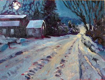
North Rochester, by Carol L. Douglas

Go ahead and accuse me of cultural imperialism. But if you’d listened to her agonize over the violence and loss in her daily life, you might feel differently. The blood feud is alive and well in inner-city America. It manifests itself in casual killings that have become so routine that we no longer even notice them.

My pal Cuevas Walkerdoes. He ministers in Rochester, NY. Every few months, he’ll mention that he knew the victim of whatever homicide ticked up the numbers that day. It always brings me up short.

Even worse than not noticing is the idea that it’s no big deal if gangbangers all shoot each other. That’s terrifically judgmental. Each of them is invested with the same miraculous gift of life as you and me, and we don’t know what history brought them to that dismal end. (Also, gangbangers are constantly missing and hitting unintended targets, including my goddaughter’s family restaurant on Monday.)

Heart of Darkness, monotype, by Carol L. Douglas

For these communities, the message of forgiveness and reconciliation is the only hope. Everything else we’ve tried has failed.

In the last few years, the Holy Spirit began to move in Helen. Several months ago, her nephew-by-marriage died by tainted drugs. The community began to mobilize in its usual tiresome way, with accusations and recriminations that threatened to spill over into violence. In the past, Helen would have been the first to break a few heads. Instead, she counseled peace.

Helen died Monday, unexpectedly, alone, and way too young. How can she be gone, I thought, when there’s so much work still to be done? That is one of life’s unanswerable questions.
Monday Morning Art School: painting reflections

The ocean complicates matters by being bouncy, but it reflects light the same way as does glass or tinfoil.

Butter, by Carol L. Douglas, oil on canvasboard. Even something as transparent as Saran Wrap will have reflections.

Reflections are a distortion of the surrounding environment. That’s true whether you’re painting them in water or from glassware in a still life. Managing them is mainly a question of observation.

Imagine an ocean that is perfectly flat, and that you can walk on water. Looking at your feet, you can see straight down into the water. It’s not reflecting anything. Looking at a rubber ducky floating ten feet away, you’re looking at the surface at about a 26° angle. You’ll see a reflection of the ducky, the sky, and a glimpse of what’s under the surface. As you look farther away, the angle gets smaller and smaller, and all you see is the reflected sky.

Hard Drive, by Carol L. Douglas, oil on canvasboard.

Reflection involves two rays – an incoming (incident) ray and an outgoing (reflected) ray. Physics tells us that the angles are identical but on opposite sides of a tangent. This is why the reflection of a boat needs to be directly below the real object in your painting. You can add other colors into that area, but the reflection can’t be wider than the object it’s reflecting.

The reflection should be directly below the object. Don’t let it grow wider.

Water is transparent, but it has a shiny surface. Some rays of light make it through and bounce back at us from the sea floor. Reflections in glass work the same way. You can see through the glass in the surface that’s facing you, but the curving sides reflect light from around the room. Because glass is imperfect, these reflections will be distorted.

The ocean complicates matters by being bouncy. Even on the calmest day, the surface of water is never perfectly flat; it’s wavy or worse, just like a fun-house mirror. Waves are a series of irregular curves. How they reflect light depends on what plane you’re seeing at that nano-second. It seems like the easiest thing to do is to capture it in a photo and paint from that, but what we see in photos is sometimes very different from what we perceive in life.

My quick watercolor of waves, done from the deck of American Eagle during our Age of Sail workshop

Instead, sit a moment with and watch how patterns seem to repeat. They’re never exactly the same, since waves are a stochastic process (think random but repeating). But they’re close enough to discern general patterns.

Solid objects can also trip you up in their reflections. Consider the humble spoon. It’s concave. That distorts its reflections. There’s no point in trying to predict what you might see; it’s best to just look. Likewise, a mirror only reflects straight back at you if you’re in front of it.

Tin foil hat, by Carol L. Douglas. Oil on canvasboard.

It’s always best to paint the reflections at the same time you’re doing the rest of the painting, rather than adding them as an afterthought. They’re a fundamental part of the design.

Only smooth surfaces reflect light coherently enough to make reflections. That’s why burlap has no reflections. Sometimes, when water is being wind-whipped, it doesn’t have reflections either. To paint such a sea, keep the contrast low.

Ottawa House, by Carol L. Douglas, oil on canvasboard, available. The wind-whipped sea has very little contrast, but it does have texture.

Some people say that reflections should be lower in chroma than their objects, but I don’t think that’s true. Often, the ocean seems to concentrate color. Sometimes, the water will be lightest at the horizon; other days there will be a deep band there. However, the farther away, the more its colors shift toward blue-violet.

What constitutes a beginner painter?

I don’t want painting students to pass a test before they start with me; I just want them to be able to thread their metaphorical sewing machine on their own.

 Midsummer, 24×36, $3985 framed. In honor of Canadian Thanksgiving, which is Monday, let’s feature paintings I’ve done in Canada.

As soon as I announced that I wasn’t taking beginners anymore, a number of my students expressed trepidation about continuing with me. “But I’m a beginner!” they said. In some cases, they’re right, but they’re already on the path to understanding painting. In other cases, they don’t have a clue how well they’re painting, and how much they’ve learned.

When I said ‘beginning painters,’ I meant people on their first date with a brush. They’re unclear on the materials and what they’re used for. They’ve never mixed paint or handled a brush. They’ve never heard or considered basic terms like hue, saturation or value.

Anyone who’s taken one of my classes is past this newbie-phase, by definition. And anyone who’s studied with another teacher or taught themselves with the aid of books or videos is unlikely to be a beginner, either.

Ottawa House, 16X20, oil on canvas, $2029 framed. All these paintings were done en plein air.

My friend and student Jennifer Johnson—who taught quilting for many years—says that she would have students in her classes with advanced design skills, and others who’d never threaded a sewing machine before. “Neither of these things are more important than the other,” she said. “But I spent 90% of my time rethreading the machine for the beginner.”

I’m trying to describe something analogous in paint. I don’t want painting students to pass a test before they start with me; I just want them to be able to thread their metaphorical sewing machine on their own.

In fact, I think it’s important to have a class of different levels. Hearing the steps justified and explained to a less-experienced painter is often helpful to the more-experienced painter. Sometimes, an essential principle hasn’t really clicked. Or, our willful brains just forget something important.

Clouds over Teslin Lake, Yukon Territory, 8×10, oil on canvasboard, $522 unframed.

As with every discipline, painters improve at different rates. How fast they learn depends on their natural quickness, how much time they can practice outside of class, distractions, anxieties, and other factors. I could start twelve painters at exactly the same level, teach them the same lessons for a year, and there’d still be a wide range of achievement at the end. That’s natural, and if you’re someone who learns more slowly, it’s nothing to worry about.

The greatest painting classes are marked by camaraderie and good will. The best way to learn something is to explain it to someone else. Those painters generous with their own knowledge are helping themselves as much as they’re helping their friend.

Cobequid Bay farm, oil on canvasboard, 6X8, $348 unframed.

Having said all that, Bobbi Heath tells me she has run up against a problem and will not be offering her introductory oil-painting class this fall. That means that for the short term, new oil painters will still be coming to me (subject to space limits in my classes, of course). Cassie Sano will still be offering introductory watercolor classes, concurrent with my own fall classes.

A glossary of basic painting terms

Now you, too, can sound like an artist! Here’s my glossary of art terms—highly subjective and relevant mainly to painters.

Fallow field, Carol L. Douglas, 12X16, $1449 framed.

Abstraction: non-representational art in which meaning is expressed through a formal pattern of shapes, lines and colors. Sometimes called “non-objective.” There are degrees of abstraction.

Alkyd: an oil-based medium which uses a polyester resin to speed drying.

Alla prima: a painting finished wet-on-wet, in just one or a few sessions.

Analogous color: those next to each other on the color wheel.

Atmospheric (or aerial) perspective: creating a sense of distance using color.

Autumn Farm, Carol L. Douglas, 12X16, $1449 framed.

Binder: the material that holds pigment together in paint.

Chroma: The purity or intensity of a color. Also called “saturation.”

Color: an object’s pigmentation, comprised of three elements: value, hue and chroma.

Color temperature: a convention where we agree that greens, blues and violets are cool and that reds, yellows and oranges are warm. Entirely subjective but it works.

Color wheel: a circular grid that shows the relationships between hues in color theory.

Complements: hues directly opposite each other on the color wheel.

Three Chimneys, Carol L. Douglas, 12X16, $1159.

Composition: the fundamental design of the painting, created by line, color and shape. See also design.

Contour: a line that encircles a space, separating it from what’s next to it.

Direct painting: laying down colors opaquely on the canvas, with the same hues and tones as are intended in the final work.

Focal point: the object(s) given the greatest dominance in a painting. There can be more than one.

Glaze: a transparent layer of paint applied over a dry layer.

Grisaille: a painting in monochrome, in my classes used as an underpainting.

Ground:

  1. The substance applied to a drawing support in preparation for painting, e.g. gesso;
  2. An initial coating in printmaking (doesn’t concern us here);
  3. The background in a painting, as distinguished from the figure.

Hue:

  1. The position on the color wheel, i.e. red, orange, blue, yellow—that which we generally refer to as ‘color’; sometimes these are referred to as ‘color families’;
  2.  A pure pigment; e.g., not a tint or shade;
  3. An analogous combination of pigments that mimics a single-pigment paint color that may be obsolete or expensive.

Impasto: thick paint.

Imprimatura:  an initial stain of color painted on a ground that creates a transparent, toned surface.

On Fernald’s Neck, Carol L. Douglas, 9X12, $696.

Indirect painting: applying layers of glaze onto a drawing or underpainting to subtly alter colors and tones. See Rembrandt as an example.

Linear perspective: giving a sense of three-dimensional depth on a two-dimensional surface through drawing.

Lost-and-found edge: a line that goes from hard to soft (or invisible) in different passages in a painting.

Medium:

  1. The material with which an artist is working;
  2. The binder in a pigment or its equivalent, which is used in the top layers of painting to provide viscosity and prevent oxidation.

Motive force: the energy within a painting.

Motive line: the line that carries the motive force.

Negative space: the space around an object.

Neutral: having low saturation or chroma.

Pigment: the material in paint that gives it its color.

Plein air: painted outside while looking at the subject in question.

Primary colors: Colors that can’t be mixed; e.g., red, blue and yellow.

Proportion: the size relationship between things.

Realism: art which attempts to represent things as they’re seen. This is, of course, a moving target.

Secondary colors: colors that are made from mixtures of two primary colors; e.g., orange, green and violet. A secondary color is always opposite a primary color on the color wheel.

Sketch: a preliminary drawing for a work of art.

Still life: any combination of inanimate objects that form the subject of a painting, in contrast to a landscape painting or figure painting.

Solid media: media designed to create an opaque surface, e.g., oil paints, pastels, gouache, and acrylics.

Tertiary color: the six colors located between the primary and secondary colors on the color wheel.

Texture: real or illusory roughness or smoothness on the surface of your work.

Toning: painting a light, warm transparent stain onto a primed canvas, see also imprimatura.

Transparent media: media designed to work transparently, e.g., watercolor and acrylics.

Underpainting: the first layer of oil painting, usually a value statement in monochrome.

Value: How light or dark the color is.

Value sketch: a drawing designed to create a value map for the finished painting.

Wash: a broad thin layer of diluted paint; primarily a watercolor technique.

Monday Morning Art School: contre-jour

Contre-jour is a great effect for figure and landscape painting, but you can practice it in still life.

TĂŞte-Ă -tĂŞte, by Carol L. Douglas, long since gone to its new home.

Contre-jour is French for ‘against daylight’ and it simply means a back-lit subject. The viewer is looking towards the light. When the sun is low, contre-jour results in silhouetting, as with a sunset. However, when the light source is high but still behind the subject, contre-jour can create wonderful rim lighting with prismatic color effects. Contra-jour minimizes details, increases contrast, and emphasizes simple shapes. It casts shadows forward, and these shadows are often as interesting as the subject itself.

The human eye has a much better response to wide ranges in lighting than does a camera lens. Our eyes adjust constantly to shifts in lighting, and our brains interpret this data on the fly. If, say, we’re in Rosslyn Chapel attempting to spy out the Green Man in the murky light above our heads, we have no trouble also seeing the well-lighted docent who’s giving the tour. It’s only in extreme lighting shifts that the eye and brain need time to catch up.

Sunset sail, by Carol L. Douglas, available through Folly Cove Fine Art. A sunset is an extreme example of contre-jour painting.

A camera (at least to date) hasn’t got this flexibility. Photos tend to be too dark in the dark passages or too light in the light passages. That’s not just an aesthetic problem; they simply don’t record data in those places, so there’s no fixing the problem in Photoshop.

That’s why it’s important to practice contre-jour in real life, not from photos. A photograph sets the relative light levels, and you’ll have a hard time overriding what you see, even if you’ve taken multiple exposures.

La repasseuse Ă  contre-jour, 1874-1878, Edgar Degas, courtesy Wikimedia Commons

Ironically, that same inflexibility sometimes makes cameras better for recording images in silhouette, like sunsets. The camera doesn’t try to insert information that isn’t there. The most common error in painting sunsets is putting color in the foreground. That’s the brain telling the artist, “trees are green,” when all the visual evidence is to the contrary.

Contre-jour is a wonderful technique in figure painting, as it creates an aura of privacy and anonymity. I’ve included one example by Edgar Degas, but he used it repeatedly, creating a sense of dignity for his laborers, ballerinas, and bathing women. Contre-jour is also very effective in landscape painting, but if you can’t get out to paint en plein air right now, practice it with still life.

To paint contre-jour effectively, one must carefully attend to color. Take the time to check values and record them in the form of a sketch, because contra-jour lighting effects change more quickly than spotlighted scenes. That’s particularly true in the structure, shape, and density of shadows.

Belfast harbor, 14×18, Carol L. Douglas, $1275 unframed.

Value is obviously important, but so too are the subtle shifts in hue and chroma that tell you an object is in shadow. Except for extreme silhouette, backlit subjects are never uniformly dark. They catch rim light and reflected light.

Almost all scenes will include some translucent or transparent objects like flowers, glassware, and fabric. These let light through, and when placed in front of a dark background, they stand out. Your contra-jour still life can look very different in daylight than it does at night, so it might take some adjusting.

Don’t underestimate the power of shadows; they’re often the best part of a contra-jour scene. They can transform the often-neglected bottom of your canvas from predictable to riotous. For example, try shining a light through a vase of flowers and note the lovely shadows dancing across your table.

A new system of training new painters

I’m confident this approach will prepare confident, competent painting students ready to tackle higher-level observational painting, composition, color theory and mark-making.

Breaking storm, 48X30, oil on canvas, Carol L. Douglas, available through Folly Cove Gallery, Rockport, MA

After this session of painting classes, which ends on November 2, I will no longer take beginning painters. I’m simply stretched too thin. Instead, I’m going to send brand-new painters to two excellent teachers. That’s a simple, six-week process in which they will learn the rudiments of paint application, brush-work and color mixing. When they’ve completed this preparatory work, I’ll welcome them back into my classes.

That doesn’t mean every new student must start this way. If you already know the fundamentals of applying paint, I’m happy to work with you, whether you are self-taught or you started in another class. And en plein air, I’m happy to welcome painters of all levels.

Michelle Reading, oil on linen, Carol L. Douglas available through Rye Arts Center.

I’ll be sending oil and acrylic painters to my old friend, Bobbi Heath. I’ve taught students prepared by her and they’ve come to me knowing the order of operations in solid-media painting. Bobbi painted on the side during a long and successful business career. That shows in the workmanlike way she trains new painters. You won’t get a lot of rhetoric from her, just a good step-by-step introduction in how alla prima painting is supposed to be done.

I’ll be sending new watercolor painters to one of my own students, Cassie Sano. Cassie has experience teaching, but she developed a syllabus specifically to train new painters for me. She too is a very logical thinker, and a person of great compassion and kindness. She’s a crackerjack watercolorist, and, more importantly, she can explain how each step works. She’ll demystify watercolor for the beginner.

Main Street, Owls Head, 16X20, Carol L. Douglas, oil on gessoboard, $1,623 unframed.

Where does this leave me? Relieved. My students have been galloping forward for the past few years, working on higher-level observational painting, composition, color theory, and mark-making. It’s unfair to the new painter to be thrown into this melee without the basics under his or her belt.

Alla prima painting comes under many names, including wet-on-wet, direct painting or au premier coup. That French version means ‘at the first strike’, and it’s a perfect description of what has to happen to get the freshness that alla prima painting promises.

Wreck of the SS Ethie, oil on canvas, Carol L. Douglas, 18X24, $2318 framed.

To hit it right on the first strike means a lot of things have to have become second nature—drawing, color mixing, and brushwork. The whole point is to keep do-overs to a minimum. That requires preparation and confidence. I’m confident that this new system of training will enhance both.

Three artists, one view

It’s not what you paint, it’s how you paint it.

Asters by BjĂśrn Runquist, 12X24. Courtesy of the artist.

Last week, I got a text from Björn Runquist that read “Asters!” and included a photo of the roadside along Maine 131 in Thomaston. I was out on American Eagle teaching, so I couldn’t rush over there. On Monday, Ken DeWaard and I went chasing after Björn’s view. Route 131 is narrow, heavily traveled, and has a wicked ditch, making parking and set-up difficult. That meant all three of us painted from the same place, at the same angle. Björn’s painting is beautifully finished; Ken’s and mine are still incomplete.

It’s common enough for us to paint in the same place, but rare that we would choose the same frame. Within that, different things attracted us. Björn concentrated on the broad sweep and the punctuation of greens. Ken was interested in the big sky. For me, the asters were right at eye-level, so I painted a forest of purple.

Ken DeWaards asters, 18×24, courtesy of the artist.

Bearing in mind that they’re at different stages of completion, are any of these paintings ‘better’ than the others? Subjected to formal analysis, they all finish strong. They’re properly drafted, have good composition, clear focal points, and use color competently. None are boring.

Therein lies the juror’s conundrum. Their ‘quality’ rests on how you, the viewer, respond emotionally to them. In that, they’re radically different. Ken, Björn and I are roughly the same age, have the same social background, and use the same alla prima technique. I’m not going to psychoanalyze my peers, let alone myself, but we each bring different sensibilities to our paintings.

My asters, 12×16.

That’s why painting matters, of course. It’s also one of the many paradoxes of art. Most consumers respond to paintings based on subject matter—for instance, they look at boat paintings because boats mean something to them. The objectivity of time renders the subject less important, and the artist’s inner life becomes paramount. Vincent van Gogh is not an Immortal because the art-loving public has an abiding love for Arles. Heck, most of us have never been there.

Last week, I told you about an exercise where my students have to paint a scene chosen by committee. (Joe Anna Arnett called me an ‘evil genius’ for this lesson, and it’s the greatest compliment I’ve ever received.) The subject matters, yes, but what you bring to it ultimately overrides content. Never worry about a peer painting the same thing as you—he simply can’t.

A footnote: please check out Peter Yesis’ wonderful flower paintings. He’s willing to take on those flowers petal-by-petal, something the rest of us never dare do.

Monday Morning Art School: painting from photographs

There’s a world of difference between copying a photo and creating a painting using photos for reference.

Skylarking 2, 18×24, $1855 unframed. It’s difficult to paint boats under sail en plein air, so mostly we use photographs for that.

It is not true that I never paint from photos; I just prefer painting from life. However, there are times (winter) and subjects (boats under sail, babies) that lend themselves to painting from photographs. Size is also a limiting factor; nobody can finish a painting much larger than 40×40 in the field without two stout oafs to stabilize the canvas.

What I don’t do is slavishly follow a single photo. Instead, most of my studio paintings are compilations of images.

All flesh is as grass, oil on linen, 36×48, $6231 framed.

Start with an idea. Let us say, for example, that you want to paint the “season of mists and mellow fruitfulness/Close bosom-friend of the maturing sun,” as John Keats put it. Symbols of that idea might include apple orchards, golden light, morning fog over the blueberry barrens.

Gather photos, from your own stash. I have tens of thousands of reference photos on my server; you probably have a few thousand on your phone alone.

Think of this step as similar to the interior decorator’s design board or a Pinterest board. Your goal is not to find a photo you’ll ‘paint from,’ but to find ideas you want to incorporate into your painting. I do this on my laptop (as most of you probably will) but there’s no reason it can’t be done the old-fashioned way, on a bulletin board.

After allowing these images time to percolate, identify the major motif of your painting. That’s its focal point. Then, do a sketch balanced around that motif. It’s helpful to set your reference material aside at this point, and let the sketch bubble up from your subconscious. If that doesn’t work for you, think about compositional armatures. Place your focal point accordingly, and work out from there.

Then it’s simply a matter of borrowing a bit from here, a bit from there, until you have a coherent, cohesive sketch.

Do not simply trace or grid a photo and expect to get a good painting from it. The whole point of painting is to allow room for your subconscious mind to enter the dialogue. You should be drawing from your photo until you have a powerful picture, then building on that drawing in your painting. If you can’t draw well enough to do this, then you need to improve your drawing skills, stat!

Vineyard, 30X40, oil on canvas, $5072 framed. This started life as the field painting below, and was painted again in the studio using the process outlined in this post.

If your goal is wild-animal portraiture, you should work with a good camera with a telephoto lens, but for most reference photos, a modern cell phone is sufficient. The images are large enough and the controls good enough that they outshoot most pocket cameras. There are situations, such as in Argentina, where I will bring a ‘real’ camera, but most of my photos are taken with my cell phone.

Other than for animals or glaciers, extreme telephoto lenses are not great for reference photos. They create pincushion distortion that can seriously muck up a drawing. Cell phones have wide-angle lenses. These create different problems, but they’re easier to correct in the drawing phase.

When I take photos for reference, I always leave in more background than I would have if I were shooting for the photo’s sake. I can always crop later, but there’s no way to add back in the missing information if I decide I need it.

Never try to replicate the out-of-focus background of a photo with a shallow depth-of-field. That’s not how human perception works, and it’s a dead giveaway that you simply copied a photo, rather than created a picture using reference photos.

Vineyard, 9×12, courtesy private collection

Try to keep the lighting the same in all your reference photos. In general, it’s wise to avoid high-contrast pictures for painting. When whites are bleached out and darks are black, we lose all the information that might have been in those passages, and they inexorably lead us to paint in excessive contrast.

While I use my own photos almost all the time, there are times when I use photos from the internet. It makes no sense for me to hunt down a Friendship sloop to check its rigging when the information is right there in someone else’s photo. It goes without saying that you shouldn’t be copying substantive portions of other people’s work without permission. However, you can use the internet for research into how a shoe might reflect light, or the color of cornflowers, or what the mist looks like in an orchard in April.

Just another day in paradise

I’m not much of a photographer, but this trip inspired me to try.

Sunset, approaching our home-away-from-home, the schooner American Eagle.

The northeast’s best season is autumn, and we rolled into it while I was teaching aboard schooner American Eagle. Warm sun, blue skies, and light breezes meant that I kept telling myself, “I wish I could bottle this and save it for winter.” That, of course, is impossible. Instead, I soaked it up as well as I could.

Schooner Heritage soaking up the last of the sun at Pulpit Harbor.

This was my last workshop of calendar year 2021. I’m pretty chuffed at how well all my students have painted all year, and this week has been no exception.

Tidal flats on an unoccupied island. The beach is washed clean twice a day.

A photo is a poor approximation of an experience, but that and our memories are all we generally come home with. (Of course, my students also bring home paintings.)

The sky created crazy beautiful effects.

I’m not much of a photographer to start with. I tend to snap and let the pieces fall where they may. I don’t generally even pick up my cell phone when I’m painting. That’s not a philosophy, it’s sheer cussedness. I’ve had to ask Ken DeWaard if he has pictures after we’ve painted somewhere together.

Lobsterboat coming home at dusk to Isleford harbor.

This sailing trip was different. I came home with dozens of snaps on my cellphone. The sky constantly shifted its optical effects. Our fellow windjammers flew against a backdrop of blue-against-blue. Harbor porpoises wheeled alongside our boat. We stopped at Little Cranberry Island and walked its peaceful streets.

Bell buoy and the Bass Harbor Light.

Next week, we start a new session of Zoom and plein air classes. If you meant to enroll but haven’t, I have limited openings:

  • Monday nights, 6-9 PM EST, there is one seat left.
  • Tuesday mornings, 10 AM-1 PM EST, there are three seats left.
  • Local plein air, Thursday mornings, 10 AM-1 PM EST, there are many seats left.

If you want more information or to register, email me.

There are times when the ocean appears to be made of aluminum foil.

It’s not the subject that makes the picture

It’s what you bring to it. That’s true in life as much as in painting.

A wee little demo I did of water tumbling over rocks. I’m using the same watercolor kit as my students will use next week aboard American Eagle.

This week I’m on a ranch high above Pecos, NM. The owners and the cloud of dogs who usually trail after them are elsewhere. It’s just me, three horses and a donkey. “Aren’t you worried about being alone out there?” one of my workshop students asked me. No.

I had horses when I was young but it’s been a long time since I’ve handled them closely. They set a rhythm to my day. I block out time in the morning and evening to attend to them. Among the pinon and dust of a New Mexico September, I have long stretches of absolute silence. That’s a rarity in the modern world.

Donna finds serenity in the Pecos River.

We don’t form as tight a bond with horses as we do with our dogs, but the potential is there. In 1910 there were about 20 million domestic horses in North America, or around one for every six people. They lived and worked side-by-side with their humans with an intimacy we can’t imagine today.

The owner of Scout, Lucy, Duke and Jimmy (the donkey) is a tiny woman, but she bosses them with impunity. She’s their alpha human. I’m a stranger. Inevitably, like children, they had to test me.

The monkey business started on Tuesday evening, when I came out of the tackroom with an armful of hay to be mugged by the two geldings and a donkey. I’m half a foot taller and sixty pounds heavier than Jane, and I could not push those knuckleheads out of my way. They leaned on me, inevitably getting me to drop their supper. After I’d retrieved and separated it, they started fussing at each other.

Yves painting in the historic barrio of Santa Fe.

Duke bit Jimmy, and Jimmy kicked out at anyone who was nearby. I yelled. Jimmy laid back his ears, stuck out his lip, and brayed. He looked so much like an angry toddler that I started laughing. “I don’t know which one of you started it,” I yelled, “but you’re all grounded!” At that moment they reminded me powerfully of my own children back in the day.

The horses outweigh me, but I have an advantage: my opposable thumbs. On Wednesday, I scarpered out the back and around to the other side of their corral, where I distributed their hay before they realized where I was. Peace has reigned ever since in the Horse Kingdom.

I’ll horse-sit these darlings any time!

I love this place, but that doesn’t lessen my appreciation for my own home in Maine, or my workshop aboard American Eagle, which starts Sunday. Would I be this happy in a flat in a rust-belt city? It’s been almost forty years since I’ve lived that life, but I hope so.

I do an exercise with my workshop students where I ask them to paint a scene chosen by committee. It’s not the subject that makes the painting, it’s what they bring to it. That’s true of life as well. Obviously, crisis and grief are exceptions; we all go through seasons of loss, and we’re not expected to be happy in them. But in the general run of events, we are designed for happiness. If it eludes us, it behooves us to figure out why—and to fix it.

No blog next week, because there’s no internet on Penobscot Bay. Please, techies, never fix that!