fbpx

Is painting dead?

Despite predictions to the contrary, paintings and books haven’t been replaced by their digital analogs.

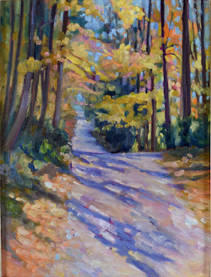
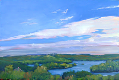
Vineyard, Carol L. Douglas, 40X30, oil on canvas.

Yesterday I heard from Sedona Arts Center that my workshop there is sold out. Schoodic and my first section in the Adirondacks are also sold out. (Of course, that still leaves a lot of options all over the country, so don’t imagine you’re free of me—yet.)

But it is part of a bigger trend, and one that points out my current dilemma: teaching is fundamentally limited by the instructor’s stamina and time. I can teach about seven six-week Zoom sessions a year, and they are usually full. Between them and my workshops, I can give one-on-one instruction to a maximum of 300 students a year. That’s if there are no returning students, which there always are. And that’s while maintaining a killer pace, one I’m unlikely to sustain for many more years.

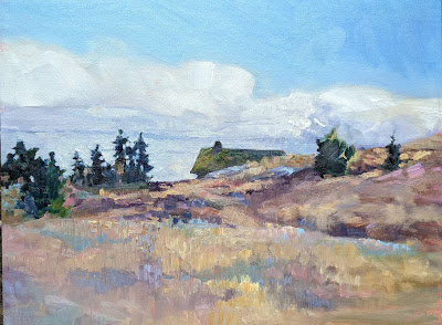
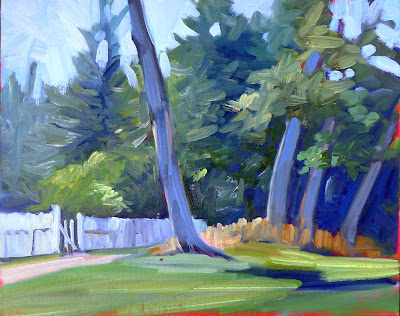
Tom Sawyer’s Fence, Carol L. Douglas, available.

Teaching, as any person who’s done it can tell you, is very much a bespoke industry. It’s individual and personal. As I think about ways to reach larger audiences, I know that I will be sacrificing that intimacy in the process.

This blog started as an exercise in spreading instruction to a broader audience. By their nature, blogs are simply not well-organized or easy to search. Although I’ve covered everything you need to know in the fifteen years I’ve been writing, it takes good research skills to ferret out specific information, especially as I’ve shifted platforms a few times.

The downside of social media is that it has an incredibly short lifespan. As of 2021 it was estimated to be:

  • Twitter: 15 minutes
  • TikTok & Snapchat: Start decaying immediately unless viral
  • Facebook: 6 hours
  • Instagram: 48 hours
  • LinkedIn: 24 hours
  • YouTube: 20 days or more
  • Pinterest: 4 months
  • Blog Post: Over a year

That means few of us are getting past the headlines—or the advertisements. Some platforms, like Twitter, Facebook and LinkedIn, are gatekeepers for more incisive writing, but most social media posts are simple snapshots.

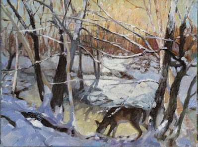
Bracken Fern, Carol L. Douglas, 9X12, oil on archival canvasboard

Americans now overwhelmingly get their news from digital media. In a recent Pew survey, 65% of respondents said they rarely read printed news. At the same time, only 20% of Americans are willing to pay for online news. That means most of us are getting our information in some kind of recycled format. Ouch.

Magazines are doing slightly better, but are still in decline. Print subscription circulations have fallen by 7% over the past two years, while single-copy sales are down 11%. The exception is specialty magazines, dedicated to niche audiences.

Best Buds, Carol L. Douglas, 11X14, oil on canvasboard

On the other hand, industry watchers were confident that book publishing would be moribund by 2022, and that hasn’t happened. Books remain a $27 billion industry in 2022. That compares to e-books, at $3 billion and—weirdly—sliding. Clearly, people perversely cling to reading on paper.

For art books, paper remains the only way to go. I can’t imagine curling up with my phone and browsing a text on Wayne Thiebaud, for example. His luscious, thick paint looks great in life. It looks decent with modern printing technology; it disappears on my computer screen.

In the same way, there’s something about handmade art that cannot be replaced with digital analogs. People have lots of time for digital media—movies, snapshots, television and video—but when it comes to hanging fine art on their walls, they like the feeling of hand-craft. Total sales of art photography were just $80 million in an art market of $64 billion in 2019—and in decline. Despite 137 years of commercially-viable photography, painters and printmakers aren’t obsolete. I have a feeling it’s not going to happen.

Monday Morning Art School: pigment and race

We all know race is an artificial construct, yet we persist in using it anyway. It’s not even skin deep. It doesn’t exist at all.

The Servant, Carol L. Douglas, is on display at the Rye Arts Center for the month of March.

There is nothing that worries me more about the future of our democracy than Daylight Savings Time. It serves no practical purpose and disrupts our sleep schedules twice a year. Yet we can’t seem to get our corporate act in gear and rid of it.

I don’t just say that because I forgot to reset the clock on the coffee-maker last night.

This week I’ll be teaching my classes to mix and use a variety of skin tones. The actual mixing is fairly simple; there’s a complete chart just below that will get you to every color you might need. It’s the application that’s so fascinating and difficult.

There are darker and lighter people, of course; to catch their color, just adjust the amount of white (or water) you use. There are also warmer and cooler skin tones. That’s why my chart has different rows. If your model is more olive, stick with a row that gives you more green tones. If pinker, choose a row that tends in that direction. You don’t need to mix all these colors for each model; it’s just a guide to set you in the right direction.

My original painted chart is ratty and worn but I also included it so you can see what the colors look like in paint rather than Adobe Illustrator.

Natural light hitting the human skin is far more variable than we see indoors. We live (and paint) under artificial light. That narrows the color range dramatically, which is why painting the model under spotlights is poor practice. Photography also narrows the chromatic range of human skin. However, painting from life in natural light is not always possible.

There are greens, purples, and yellows in every person’s skin. The ears, face, fingers and toes all tend to pink; there’s blood closer to the surface. Some of us have visible traceries of blue veins. There are lovely greens and mauves in shadows. In fact, the only difference between my landscape palette and my studio palette is that red always makes an appearance inside.

Self-portrait at the age of 63 (detail) Rembrandt van Rijn, 1669, National Portrait Gallery

Rembrandt was a master at capturing these subtle, varying colors in the human skin, as shown in the detail from his last self-portrait, above. He did this with the narrowest of palettes—essentially earth pigments with white. And yet he fools us into seeing a whole range of colors including blues and greens.

Rembrandt also painted Two African Men, below. Unfortunately, its surface is in such bad repair that it’s impossible to see what colors he saw in their skin. However, he would have used the same paints as he used in his own self-portrait. They’re all he had available.

Two African Men, 1661, Rembrandt van Rijn, courtesy Mauritshuis

Our actual skin color is based on just one pigment, melanin. Lighter people just have more blue-white connective tissue and hemoglobin showing through.

We talk of Asians as having ‘yellow’ skin. That’s a modern lie. In the 13th century Travels of Marco Polo, the people of China are described as white. Eighteenth century missionaries also called Japanese and other East Asians white.

The ‘yellow’ label can be laid squarely at the feet of science. The father of modern taxonomy, Carl Linnaeus, first used the label fuscus (dark) to describe the skin color of Asians. Later, he began calling them luridus instead. That translates to ‘pale yellow’, ‘wan’, ‘sallow’, ‘lurid’—with a dash of ‘horrifying’ attached.

The father of comparative anatomy, Johann Friedrich Blumenbach, used the word gilvus, which translates to ‘yellow’. (He’s also the guy who started calling Asians ‘Mongolians’.) By the nineteenth century, westerners were completely sold on the idea that Asians were yellow. Thanks, Science.

The farther down the Italian boot you go, the more you find genetic mixtures with Greeks, North Africans and Middle Easterners. That’s no surprise; the Mediterranean was the original melting pot. Southern Italians and Greeks are often very dark in color. 

It’s no surprise that neither were considered quite white in 19th century America (although they had that designation for naturalization purposes). In fact the largest mass lynching in American history was of Italian-Americans. What’s more peculiar is that some people didn’t consider Irish-Americans white, either.

We all know race is an artificial construct, yet we persist in using it anyway. Paint-mixing shows us that the similarity in our coloration is far greater than the differences. Race isn’t skin-deep; it doesn’t exist at all.

Why not paint under a false name?

The gender disparity in art is terrible. So why don’t I paint under a nom de pinceau?

Autumn Leaves, Beauchamp Point, is one of the non-nude paintings at the Rye Arts Center’s Censored and Poetic this month.

Last month, when I wrote about the gender disparity in art, a reader asked me why I didn’t believe gender-neutral nom de pinceaus were the answer. I promised  I’d answer the question in my following post, but then Russia invaded Ukraine and it seemed like wars and rumors of war were more pressing.

Last night was the opening of Censored and Poetic at Rye Arts Center, which brought the question back to mind.

Kicki Storm, me, and Anne de Villeméjane at the opening.

The gender disparity is in fact greater than the race disparity in US galleries. According to a 2019 study, an estimated 85% of artists represented on US gallery walls were white, compared to 76.3% in the general population. That is terrible, but a study the prior year found that in 820,000 exhibitions across the public and commercial sectors in 2018, only one third of the works were by female artists. That’s despite the fact that 51% of the US population is female.*

In general, a name cannot tell you whether a painter is white or black. I had a brief chat about this last night with Matthew Menzies, my former painting student. Matt and I both check a lot of the same sociological boxes. We both have Scottish surnames. However, Matt’s not white, although you’d never know that until you met him. On the other hand, my given name tells you immediately that I’m female. I can be rejected in the sorting process.

Last night, Kicki Storm referred to a 1989 art project by the Guerrilla Girls called Do Women Have to be Naked to Get Into the Met Museum? which found that less than 5% of the artists in the Modern art section of the Metropolitan Museum of Art in New York were women but 85% of the nudes were female.

I’d like to say it’s better now, but a short comparison of the careers of Lois Doddand Alex Katz reveals otherwise. They have oddly parallel careers. Both studied at Cooper Union. Dodd went on to be one of the founders of the Tanager Gallery. She taught at Brooklyn College and Skowhegan.

The Met owns 19 Alex Katz paintings and three of Lois Dodd’s, none of which are on view. MoMA owns one Lois Dodd painting, acquired in 2018, when she was 91 years of age. I lost track trying to count how many of Alex Katz’ paintings they own; there are 137 records.

In light of this, why not hide behind a gender-neutral set of initials, or, even better, a false name? Because to do so is to capitulate to the world, to agree to its assumption that male painters are superior. If my generation doesn’t challenge this assumption, who will?  

There’s also the stubbornness of identity. I am who I am, for better or ill. That’s complex; it involves boats and building as much as it does children and grandchildren. Concealing that complexity simply perpetuates gender stereotypes, which I think have gotten more rigid, not less, during my lifetime.

*Every time I read about a massive survey like these, I wonder who has time to count these things.

Helping Ukraine

We can all do what Americans and Canadians do best: send money.

This painting has ceased to exist; it was a musing on the First Gulf War.

Although I’m fairly ‘green’, I bought my Prius in 2005 primarily for geopolitical reasons. It had been only a few short years since 9/11. There was credible information that our oil purchases were funding jihadism. I wanted to limit the amount of money I was sending to the Middle East.

Dependency on foreign oil has been a fact of life since the invention of the internal-combustion engine.  Today it’s Europe that is suffering from the boycott of Russian oil. I reckon that every gallon we don’t consume is a gallon that eases pressure on European consumers.

We drive a hybrid and heat primarily with wood. We can and will curtail unnecessary travel, but I can’t figure out how to cut our oil consumption much further. If you have suggestions, I’d love to hear them.

Russia’s attack on Ukraine has put paid to any idea that modern Europeans have somehow sidestepped their bloody history. The post-Cold War peace was illusory; it has exploded into hot conflagration.

As I write, a friend is driving to Poland to try to rescue her cousin from the mass of refugees streaming across the border. I can’t drive to Poland, but I can do what Americans and Canadians do best: send money.

Retired journalist Rita Truschel is the child of refugees herself. She put together this list of organizations helping in Ukraine or for refugees. I’ve appended Charity Navigator ratings where appropriate. (No rating doesn’t mean the organization is wasteful; it just means that they aren’t required to file American tax forms.)

Children’s welfare

Save the Children (91.82)                         

United Nations Children’s Fund(89.18)     

Emergency housing

Airbnb Disaster Response (not a charitable organization but funneling money to people on the ground)

Surplus medical supplies 

Afya Foundation Disaster Response  (97)

MedWish International (100)

Medical volunteers

Doctors Without Borders (92.25)

International Medical Corps (83.94)

Logistics & shipping

Brother’s Brother Foundation(92.92)

Flexport (not rated)

Refugees’ survival & resettlement 

Catholic Relief Service(83.94)

Canada Helps (not rated)

Canada-Ukraine Foundation (not rated)

CARE Ukraine Crisis Fund (92.64)

International Rescue Committee (86.92)

Lutheran World Federation (not rated)

Sunflower of Peace (not rated)

US-Ukraine Foundation (not rated)

United Nations Refugee Agency(not rated)

Damned if you do, damned if you don’t is one of the paintings at Rye Arts Center’s Censored and Poetic, which is what I should be writing about today.

In normal times, this post would have been about the opening of Censored and Poetictomorrow evening, so I should at least mention it. If you’re in the metro New York City area, I’d love to see you there, and if not, the event will be livestreamed here.

Monday Morning Art School: that sinking feeling

Over time, the dark passages in an oil painting can grow hazy. In watercolors, the beautiful, jewel tone on the palette can look flat and dull after the paper dries. That’s ‘sinking’ color, and an ounce of prevention beats a pound of cure.

Clear Morning on Bunker Hill, 24X36, $3985 framed.

Oil painting: Sinking is caused by the displacement of the oil in the top layer. It’s most obvious in dark passages, but that’s only because the dusty haze is most visible there. It appears slowly over time—a painting that was once exuberantly colorful is suddenly dull. The different drying times of pigments means that color will sink unevenly across the canvas, giving it an irregular, blotchy look. Details that were once subtly beautiful will disappear.

Sinking can be repaired by oiling out or varnishing, but this may need to be repeated to keep the painting beautiful. If a painting is sold, you have no idea if it’s losing its color. It’s far better to do it right in the first place.

Tom Sawyer’s Fence, 14X18, $1275 unframed.

Sinking has three common causes:

Too much solvent—the painter has not mastered the art of using unadulterated paint or painting mediums in the top layer. He relies too much on odorless mineral spirit (OMS) to get good flow. The OMS takes the place of the linseed oil binder and then evaporates. That leaves the pigment particles isolated, with no oil surround. Air doesn’t have the same refractive index as linseed oil, so a pigment that looks dark and beautiful in solution looks dull and grey when the binder disappears.

Not enough oil in the top layer of paint—this is why we keep repeating that old saw, ‘fat over lean.’ There’s enough oil in modern paints to make a solid top layer, but only if applied in proper thickness. If you want to paint thin, you must cut your paint not with OMS but with an oil-based medium.

Over-absorbent grounds—acrylic gesso is more absorbent than oil gesso, but a well-prepared acrylic ground is fine. However, a very inexpensive board may not have enough ground to stop oil from seeping through. An aftermarket coating of gesso is a good cure. Non-traditional grounds like paper and raw fabric need very careful preparation.

Bunker Hill overlook, full sheet watercolor, available. One of the advantages of Yupo is that there is no sinking.

Watercolor: “The difficulty in watercolors is not that it is ‘unforgiving’, as amateurs widely misbelieve: it is that it begs for fussing,” wroteBruce MacEvoy. That fussing takes the form of overworking passages. Alla prima, or ‘on the first strike’ is vital in watercolor.

We want the pigments to stay on the top of the paper, rather than sink into it where they can’t be seen. The cellulose fibers of watercolor paper were laid down in a stiff mat so that pigments will sit nicely on top. Reworking wet-on-wet, scrubbing, and other repairs cause the fibers to unravel, creating a microscopic forest of random threads. Paint sinks into its crevices. The color is duller and, worse, blotchy.

The deck of American Eagle, from my sketchbook from Age of Sail workshop

Most watercolor paper is coated with gelatin or other sizing. This controls its absorption of paint. When you do a preliminary wash of color, you’re wetting the paper along with establishing primary shapes. If this wash layer is allowed to dry completely before the next layer is applied, the water and paint mix with the sizing and create a new layer, comprised of binder, sizing and pigment. That new, dense sizing layer can help hold successive layers of paint on the surface.

But if you ‘lick’ the wet paper constantly with your brush in an attempt to control minor flaws, you interrupt this process. Unless the paper dries completely between approaches, each pass with the brush lifts more paper fibers. That disturbance increases the capillary action that draws the pigment deeper into the paper. Overworked passages look dull and fuzzy.

Of course, the type and quality of the paper you use matters. Hot press paper is more tightly-compacted, making it more tolerant of overbrushing. Cold-press paper has less sizing and looser fibers. It tolerates less fussing.

I’d rather be painting

We don’t control our legacy; we just do our best work and hope for the best. But, please, if you love me, don’t tell me you like my writing better than my painting.

Pull up your Big Girl Panties, 6X8, is one of the paintings at Rye Arts Center this month.

Next Thursday, I give a short talk at the opening of Censored and Poetic at the Rye Arts Center in New York. It will be livestreamed; you can register here. I’m no stranger to speaking; I generally lecture for 25 minutes each week to my painting classes. That takes me about three hours to research and write.

Cutting that in half increases the prep time exponentially. The more economical the text, the longer it takes to prepare. Certainly, the more emotionally engaged you are with the subject, the more difficult it is to put it in lucid order, and I’m passionate about my subject.

Spring, 24X30, is one of the paintings at Rye Arts Center this month.

The net result is that I’ve used my entire week writing and practicing my talk. I’ll get out tomorrow for a few hours of plein airpainting in the snow, but that’s only because I’m doing a photo shoot with Derek Hayes.

I’ve spent an inordinate amount of time recently writing. And yet, I don’t think of myself as a writer, but a painter. This winter, it seems, I’m a writer whose subject is painting. Or, perhaps I’m a painter who writes.

It’s all very annoying. I’ve spent many years learning the craft of painting and almost none learning to write. That comes as naturally to me as talking.

Michelle Reading, 24X30, is one of the paintings at Rye Arts Center this month.

All of us carry these labels. I told someone recently that my husband was a programmer. He corrected me, because he is—of course—a software engineer. Not being in the profession, I don’t understand the difference, but it clearly matters.

Labels can be limiting. Mid-century America used to talk about the ‘Renaissance man.’ This was a polymath, a person who was a virtuoso at many things. That’s very different from the pejorative ‘Jack of all trades and master of none’ that we sometimes use to describe a person who can’t light on any one thing and do it well.

Polymathy was, in fact, a characteristic of the Renaissance and Enlightenment. Gentlemen (and some ladies) were expected to speak multiple languages, pursue science as a passionate avocation, play musical instruments, and draw competently, all while fulfilling their roles as aristocrats and courtiers. Of course, that was only possible because a whole host of peons (that would be you and me) attended to their every need from birth.

This Little Boat of Mine, 16X20, is one of the paintings at Rye Arts Center this month.

Having to work and do your own laundry tends to cut into one’s leisure time. In fact, in America, we have an inversion of the historic distribution of leisure. Our elite are workaholics. Wealthy American men, in particular, work longer hours than poor men in our society and rich men in other countries.

This leaves no time to do other things. It also affects our overall culture, since culture is the byproduct of leisure. We used to love highbrow things like classical music and art because the well-educated had time to turn their hobbies into art. Today our culture is much earthier, for good or ill.

Loretta Lynn made a commercial in the 1970s which opened with, “Some people like my pies better than my singin’.” I remember that and her 1970 hit single, Coal Miner’s Daughter, and, sadly, nothing else of her three-time-Grammy-Award oeuvre.

We don’t control our legacy; we just do our best work and hope for the best. But, please, if you love me, don’t tell me you like my writing better than my painting.

Don’t look at the hill

My asthma is teaching me life lessons that are applicable to painting and any other heroic endeavor.

Clary Hill Blueberry Barrens, full sheet watercolor, available.

My asthma, which is usually quiet, has been kicking up since I had COVID. I find myself stopping to suck air as I climb Beech Hill in the morning.

Beech Hill is no great shakes as hills go, since its summit is only a few hundred feet higher than my house. I climb it every morning, which gives me a good base level of cardiovascular fitness (and around 6000 steps to start my day). I figure that a little cardio work each morning will give better long-term results than killing myself a few times a week at the gym.

Early Spring on Beech Hill, oil on canvasboard, Carol L. Douglas, 12X16, $1449 framed.

Painting is like that, too. In their Art & Fear: Observations On the Perils (and Rewards) of Artmaking, David Bayles and Ted Orland make the point that the best art is made by people who do it over and over. A half-hour drawing every morning will yield quiet, positive results that no painting marathon can.

We’ve had a cold winter here in New England. Yesterday, it was -2°F. as we set out. Sensible people don’t go rambling in those temperatures, but rambling is a habit, and habit forces me out the door. In my professional life, I’m in a phase where I’ve spent most days ‘putting out fires’ rather than working on new material. There will always be challenges, but habit alone forces me back into my studio.

Mountain Path, 11X14, oil on canvasboard, available.

I’ve started repeating a mantra as my chest tightens: “Don’t look at the hill.” If I look at the distance I still have to climb, the tightness doubles and I have to stop. I know I’m psyching myself out, but I can’t seem to stop it. So, in the steepest parts of my climb, I concentrate assiduously on my footing. It’s better not to contemplate the enormity of what lies before me.

A few weeks ago, a student asked me how long it takes to learn to paint. Because he’s tough, I answered honestly: it takes years. But to focus on that is like looking up at the hill; it makes every step harder.

That dissuades many people from even trying. But time elapses whether or not we’re doing anything useful. It’s easy to fritter away, as all those people who were going to learn second languages during lockdown have learned to their dismay.

Christmas Eve, 6X8, oil on canvasboard, available.

I’m planning on walking the length of Hadrian’s Wall in Britain in May. It’s the wall’s 1900th anniversary and Queen Elizabeth’s Platinum Jubilee. Walking across an entire country sounds absurd to an American, but it’s a shorter distance (84 miles) than from my house to the New Hampshire border. However, it will be a series of long days in the company of friends who are all younger than me. And northern England is hilly.

I should be seriously training right now, and instead I’m unable to keep up my usual four-mile-a-day pace. I’ll regret ruining this trip for my companions, so I occasionally wonder if I should just bow out now.

However, I’m old enough to realize the truth in the adage, “Sufficient unto the day is the evil thereof.” Worrying about tomorrow is a great way to stop myself from doing anything today. That’s true of painting or any other heroic endeavor. Instead of panicking, I’ll just challenge myself again this morning. And, lest you worry, I have an appointment with my nurse-practitioner on Friday.

Monday Morning Art School: the color of darkness

Painters spend lots of time thinking about the subtractive color system. We spend very little time thinking about the additive system. That’s a mistake, because this is the color of light.

A deer I painted years ago as a demonstration for my class. Shadows are the complement of the morning light.

Every artist is familiar with the three primary colors: red, blue and yellow, and their complements, the secondary colors green, orange and violet. This is the fundamental color wheel for the subtractive color system, or what’s used for paint and ink.

There’s another set that became more important in the 20thcentury, with the rise of electric lights and then electronics. These are the so-called additive color primaries, which are red, green and blue. This color system doesn’t have a color wheel, but it does have complements, which are shown below.

Additive complements (left) and subtractive complements (right). Courtesy Wikipedia.

Painters spend lots of time thinking about the subtractive color system. We spend very little time thinking about the additive system. That’s a mistake, because this is the color of light.

For painters, color theory is a balance between natural light (additive color) and their paints (subtractive color). That’s mind-blowing but they’re not alone in this challenge. Despite working in an additive-color medium, many web designers still think in terms of subtractive color. This system has influenced our aesthetics since the 18th century, and we don’t let go of what ‘looks right’ easily.

But in practical terms, shadows are the absence of light. If light is full-spectrum, then its shadows will be full-spectrum too. That means a white light will cast a grey shadow.

However, natural light is far more complex than that. It seldom shows up with all wavelengths being equal.

Sunrise, or the so-called ‘golden hour’ on Beech Hill. The shadows are definitely blue.

For this reason, artists have a useful rule: shadows are the complement of the color of the light. In the north on a snowy morning, golden light casts blue-violet shadows on the snow. In overcast light, the shadows are vaguer and full-spectrum, meaning they appear greyer. That’s easy to see, and demonstrates an idea that you can then generalize to all subjects. Although you should never trust your camera for color, I have included two photographs that show this.

Midday at the same location, the light is diffuse and so are the shadows.

It’s a mistake to get too attached to theory, however. For one thing, light is tricky. And for another thing, ‘primary color’ is another one of those constructs that we use because it’s useful, not because it’s absolute or provable. Our understanding and technologies are imperfect. CRT televisions of the 20th century were dull compared to modern LED screens. As technology got better, so did the color gamut, and what was considered ‘primary’ changed accordingly.

Most importantly, all these color systems are a dim mirror of the interaction of natural light and the human brain. Both are complex and imperfectly understood.

Light and shadows exist in the additive system, so your understanding of primaries is wrong if it’s based on what you learned in kindergarten. The complement of yellow in subtractive color is violet. The complement of yellow in additive color is blue. So, if the light is golden, the complement is more likely to be blue than violet.

At sunset, shadows appear black. There’s color in those darks, but our eyes can’t process it.

On the other hand, at sunset, the light is often red. The complement of red in additive color is cyan, but we almost never see any colors in the shadows at sunset. Instead, they’re just black, because we’ve hit the limit of what our poor rods and cones can process.

There’s a lot of latitude in what colors you can make your shadows, as long as you maintain the warm-cool balance. And—as always—all the theory in the world is no substitute for observation.


War and rumors of war

The violence and inhumanity of war is apparently a lesson that every generation needs to learn for itself.

The Third of May 1808, 1814, Francisco Goya, courtesy Museo del Prado.

Francisco Goya was the most important Spanish artist of his day. His late painting, The Dog, was an icon for modern and symbolist painters through the 20th century. There’s a good reason: it prefigures modern art.

Goya became a court painter in 1786 and the First Court Painter to the Bourbon monarchy in 1799. This made him, in effect, a courtier of the Crown. As expressive as his painting was, he wrote nothing about current affairs.

In 1808, Napoleon turned on his former allies and occupied Spain. He forced the abdication of the King and installed his brother Joseph Bonaparte on the throne. Spaniards rejected French rule and fought a long and bloody guerrilla war to oust them.

The Third of May 1808, 1814, Francisco Goya, courtesy Museo del Prado.

The war started with the Dos de Mayo Uprising, the reprisals to which were memorably recorded by Goya in his masterpiece above. This was painted in 1814, after the war ended. Whatever his private thoughts, Goya meant to stay alive and working.

Goya remained in Madrid through the conflict. His ruminations resulted in a series of prints called The Disasters of War. That’s a modern title; Goya’s only written comment was on a proof-set, where he wrote, “Fatal consequences of Spain’s bloody war with Bonaparte, and other emphatic caprices.” In using the word caprichos, which also translates as ‘whims’, Goya said a mouthful.

Plate 10: Tampoco (Nor do these). Spanish women being raped, Francisco Goya from The Disasters of War, courtesy Museo del Prado.

The Disasters of War is a series of 82 prints, finished between 1810 and 1820. They are an expression of revulsion against the violence of the Peninsular War, an outpouring from the gut against the inhumanity of war. There is no polemic about the causes of the conflict, despite the fact that Goya retained his position in the Bourbon court while working on them. They were private works, and not published until 35 years after his death. Their influence has been incalculable.

Fast forward to 2003 and a pair of British art enfants terrible, Jake and Dinos Chapman. They purchased a folio of the Disasters of Warand set about systematically defacing it with cartoon figures drawn over Goya’s art. They called this appropriation work, Insult to Injury and the overall show Rape of Creativity.

One image of Jake and Dinos Chapman’s defacing of Disasters of War, which they retitled, What is this hubbub?

“Drawings of mutant Ronald McDonalds, a bronze sculpture of a painting showing a sad-faced Hitler in clown make-up and a major installation featuring a knackered old caravan and fake dog turds,” is how the BBC described the show at the time.

For this twitting of human suffering, they should have been spanked and sent to their rooms. Instead, they were nominated for the Turner Prize.

The Chapmans were born in the 1960s. They have lived through the longest period of peace in modern British history. The Disasters of Warmight have seemed funny to them, but it would not have amused those who remembered the convulsions of the two great 20th century European wars.

That kind of generational amnesia is an odd function of the human mind. It’s the only possible explanation for why we get into war over and over again.

I hadn’t meant to write on this subject, but the war in Ukraine couldn’t have happened without the slow forgetting of the violence and inhumanity that is war. Apparently, it’s a lesson that every generation needs to learn for itself.

In control

Every day, in every way, things are not necessarily getting better.

In Control (Grace and her unicorn), 24X36, is one of the paintings that’s going to Rye Arts Center’s Censored and Poetic: the works of Carol Douglas and Anne de Villemejane, March 2022.

A visitor to my studio recently asked me about the gender disparity in painting. “Eighty percent of art students are women,” I said—and that may be a low estimate. “But 80% of the top cadre of professional painters are men.” That, too, may be a low estimate.

“Why?” she asked. I was stumped for an answer. If I’d thought about it at all, I’d have attributed it to change—women moving up through the atelier system to take their rightful place in the art world. But since the 19th century women have studied and practiced painting with great seriousness. There were more girls in art class when I was young, and the earning disparity didn’t disappear when we came of age.

Michelle Reading, 24X30, is one of the paintings that’s going to Rye Arts Center’s Censored and Poetic: the works of Carol Douglas and Anne de Villemejane, March 2022.

This is not anecdotal. There have been many studies worldwide that document this phenomenon. The most exhaustivewas done in 2017. It analyzed 1.5 million auction transactions in 45 countries, and found a 47.6% gender discount in prices. The discount was worst (unsurprisingly) in countries with greater overall gender disparity.

Do women drop out, practicing art as dedicated amateurs rather than professionals? No; 51% of practicing visual artists are women.

Are women’s paintings somehow more ‘girly,’ and therefore less attractive to buyers? In blind studies (with the artist’s name excised), participants could not guess the gender of the artist. Women’s art sells for less because the signature is feminine. Period.

The Beggar, 36X48, is one of the paintings that’s going to Rye Arts Center’s Censored and Poetic: the works of Carol Douglas and Anne de Villemejane, March 2022.

My childhood chum Cynthia Cadwell Pacheco was a professional ballet dancer. While she was traveling around the world, her mother regaled me with stories of the culture of submission, abuse and body-shaming that the corps de ballet were subject to.

It’s a miserable career choice for women, but, ironically, serious ballet used to be a women-led art form. That was before it spun money. Today, it’s a multi-billion-dollar business. As it has grown in economic importance, women have been pushed out of leadership. Today’s companies are run by men, the work is choreographed by men, the jurors are men, and the big bucks go to men. Let that be a lesson to you if you believe that every day, in every way, we’re getting better and better.

“Despite the fact that girls outnumber boys 20 to one and pay most of the fees in ballet schools, and despite the audience and donor base being 70% women, female artistic directors are paid 68 percent of what their male counterparts earn,” wrote Elizabeth Yntema.

Saran Wrap Cynic, 20X24, is one of the paintings that’s going to Rye Arts Center’s Censored and Poetic: the works of Carol Douglas and Anne de Villemejane, March 2022.

Our culture actively discourages boys from dancing. That’s foolish and unfair, and it leads to a tremendous imbalance in dance classes. If there is a boy at all, he won’t lack for principal roles, no matter how execrably he dances; the great classical ballets require male dancers. No wonder boys in the dance world grow up thinking they’re the cock of the walk.

No other legal American industry is as gender-skewed as ballet, but the visual arts do share some of its daft values. You only have to compare the career of Lois Dodd with her contemporaries to see that.

Identifying the problem is only the first step. What can we do about it? Young artists might choose a gender-neutral nom de pinceau, but that perpetuates the problem. Women’s role in the arts will only be as strong as women’s role in the greater culture. I’m old enough to have seen some remarkable changes in society, but I’m also alive to the very real risk that we can move backwards, just as the dance world has.