fbpx

Monday Morning Art School: Creativity loves constraints

Two things I learned teaching my workshop last week.

Kamillah Ramos at the Grand Canyon.

I start each class and workshop by handing my students protocols for painting in oils and watercolor. “If you follow these steps,” I tell them, “you will understand how to paint.” These instructions are not unique; they’re how most successful artists work through drawing, composition, and paint application.

Just try it for the length of the class, I tell them. If it doesn’t improve your painting, go back to what you were doing before. But I’m confident that following this traditional approach works. Anyways, most people take painting classes because they recognize that something in their system isn’t working. 

A set of step-by-steps is oddly liberating. Working out the problems in advance leads to looser and more lyrical brushwork.

Student Becca Wilson responded by telling me that there’s a phrase for this: “creativity loves constraints.” Bam.

The idea that limits can lead to extraordinary creative output seems counterintuitive. After all, the creative pursuits (and particularly the visual arts) are often thought to be about feelings and thus limit- and rule-free. In reality, they’re quite the opposite. Every creative pursuit has its own established practice, and painting is no exception.

Constraints set up processes within which problems can be solved. Separating painting into discrete steps—value study, color mixing and then, finally, brushwork—helps cut it down into manageable pieces. Only when you can do the steps automatically will you find your authentic, unique artistic voice.

Kamillah Ramos and I were painting on Mather Point at 5:30 AM yesterday morning. This is a busy time at the Grand Canyon. The weather is good and schools are on spring break. Hundreds of people came by in the 4.5 hours we were painting, and many of them stopped to ask us questions or comment on our work.

“There’s nothing like plein air painting for changing the vibe of a place,” Kamillah said. She’s so right.

Our workshop painted in six separate locations in Sedona, which was also jam-packed with tourists. People might have found our presence irritating, but instead they were interested and enthusiastic. In fact, in decades of painting outside, I’ve had universally-positive reactions from passers-by.

Artists are very much a cultural and economic asset, and that’s worth remembering.

(Sorry this is brief but I’m about to board a red-eye to Portland.)

Where is the line between art and craft?

The line between art and craft is a modern one, and it’s resulted in banal, boorish and ultimately meaningless work being foisted on us as art.

Carved cravat, c. 1690, Grinling Gibbons, courtesy Victoria & Albert Museum

“Was Grinling Gibbons an artist or a craftsman?” a student asked. It’s a fascinating question, and one that points out how we’ve changed our ideas about human thought and endeavor.

The term intellectual is a recent invention, first written down in 1813, by of all people, Lord Byron (a man who was anything but). Prior to that, the literati would have been known as men of letters. They were literate in a time when many people weren’t. It wasn’t until the 20th century that the term acquired distinct social cachet and came to mean a person who was educated, artistic, and worked mainly in the realm of ideas.

Grinling Gibbons, c. 1690, after Godfrey Kneller, courtesy National Portrait Gallery

Grinling Gibbons was born in Rotterdam in 1648 to British parents. He learned to carve in the Netherlands before emigrating to London. He rapidly attracted attention from the highest circles, scoring his first Royal Commission in 1675. He went on to be the most celebrated master-carver of his day. His portrait was painted by Sir Godfrey Kneller, whose subjects included ten reigning European monarchs, Isaac Newton, John Locke, and the members of the Kit-Kat Club. In other words, Gibbons was working and living with the crème de la crèmeof British society.

So why, in the 21st century, do we call Kneller an artist and Gibbons a craftsman? They would not have made such a distinction themselves.

The Stoning of St Stephen, c. 1680-1700, Grinling Gibbons, courtesy Victoria & Albert Museum

Historically, painters and sculptors were held in low regard. The Greeks had nine muses for the arts, and—pointedly—none of them were visual artists. Sculptors and painters were thought of as manual laborers, barely above slaves in the social order. That’s not because they weren’t any good; Greek sculpture, in particular, approached the sublime.

It’s just that, prior to the middle of the 18thcentury, fine artists were considered craftsmen, along with jewelers, weavers, and everyone else who made consumer goods. While they may have been very successful and well-paid, they had no intellectual pretensions.

The Enlightenment changed all this, by casting artists in the role of communicating the civic virtues. This raised their status from artisans to gentlemen. Their training moved from the old apprenticeship/atelier model to formal art schools.

The Enlightenment also brought us the Cult of Genius, with its handmaidens, Feeling and Creativity. The artist no longer primarily tried to render beautiful images; he was engaged in profound and creative thought.

Limewood carving of musical instruments, c. 1690, Grinling Gibbons, courtesy National Trust Images/Andreas von Einsiedel

Grinling Gibbons’ medium was wood, and it was used for decoration. There’s a modern assumption that there’s nothing profound about beauty, so the artist-as-craftsman is sadly out of touch with our times.

Western society has become caught in a trap where our civic virtues are now considered liabilities. This is vividly demonstrated in the stark contrast between our own dissection of shared values at the same time as Ukraine fights to the death to preserve theirs.

The focus on ‘genius’ is what has landed us in the modern dilemma of having so much banal, boorish, casual and ultimately meaningless material foisted on us as art. The intellectual mind can always be seduced by the idea of transgression, whereas a craftsman generally seeks to raise his standards to the highest degree possible. Given that this is the modern dividing line, I’d personally prefer to come down on the side of craft.

The famous vortexes of Sedona

“It’s not about measurable facts, it’s about what you know in your gut is real.”

The only thing I’ve managed to paint this week has been this 9X12 demo.

Painters and photographers know there’s a dead period in the middle of the day. The long raking shadows of early morning or the beautiful golden light of afternoon are ideal for building a composition and matching colors. The harsh midday sun, with its bleached color, is more suited for listening to the instructor drone on.

In Maine, that dead hour hits at about 11 AM. Here in Sedona in March, it’s been showing up about 1:30 in the afternoon. Arizona is in Mountain Time, but they don’t observe Daylight Savings Time (DST), except in the Navajo nation. That puts us three hours behind Maine, where we just switched over to DST ten days ago. Neither my body nor my mind has any idea of what time it is.

The Sedona Arts Center is a very lovely facility in which to teach. (Photo courtesy Ed Buonvecchio)

I’m in Sedona teaching a six-day workshop through the Sedona Arts Center. The star of the show is, of course, the place. Sedona is a village of 10,000 people plopped down in the clefts of spectacular eroded red sandstone. As it weathered over the eons, it left buttes that rear up from 800 feet to 1,000 feet high. Twisted and carved by wind and water, they loom over the town in every direction.

This is probably why Sedona attracts a variety of spiritual and alternative-medicine practices. There are four areas which are called by the “vortexes”, described as “swirling centers of energy that are conducive to healing, meditation and self-exploration.” They’re all conveniently located where the hiking is easy, so tourists can get there without a lot of extra work.

Red rock spires are everywhere, looming over the town.

The vortexes were made famous in 1980 by psychic channeler Page Bryant and her spirit-world sidekick, Albion. According to her blog, Page “offer[ed] a number of services, including intuitive readings, Star Charts, subscription-based channeled messages from her spirit teacher, Albion, and private lessons on a wide range of topics.  She also [sold] her beautiful knitted, crocheted, and beaded work and her custom-designed jewelry — all of which has been inspired by working with the ‘wee people’ (fairies and elves).”

Bryant studied under Sun Bear, a self-proclaimed medicine man of Ojibwe descent. Sun Bear’s theology was a mishmash of various indigenous traditions, and traditional healers repudiated him. He attracted spiritual seekers from outside his community. They paid handsomely for the privilege. The heirs of Bryant and Sun Bear are classic American entrepreneurs bringing salt-healing, channeling, and other New Age mystical experiences to roughly three million visitors a year.

I’m a spiritual practitioner myself. I don’t think the metaphysical is testable. However, my own practice (white-bread Christianity) makes no claims to energy. In physics, energy is the capacity to do work, and that’s measurable.

Me, teaching. (Photo courtesy Ed Buonvecchio)

A brief search of the internet revealed no scientific literature on the subject, but certainly sucked me into a swirl of believers. As one wrote, “It’s not about measurable facts, it’s about what you know in your gut is real.”

Seeking God in nature is, in fact, an ancient spiritual practice. Job, the oldest book in the Bible (and therefore the oldest continuous religious text in existence), says:

“But ask the animals, and they will teach you,
    or the birds in the sky, and they will tell you;
or speak to the earth, and it will teach you,
    or let the fish in the sea inform you.
Which of all these does not know
    that the hand of the Lord has done this?”

It’s impossible to be in this majestic place and not see God’s handiwork. I’ll be generous and believe that’s the truth that Bryant and Sun Bear were muddling towards.

Monday Morning Art School: it’s plein air season

How can you get the most from a workshop or class? Here are some simple suggestions.

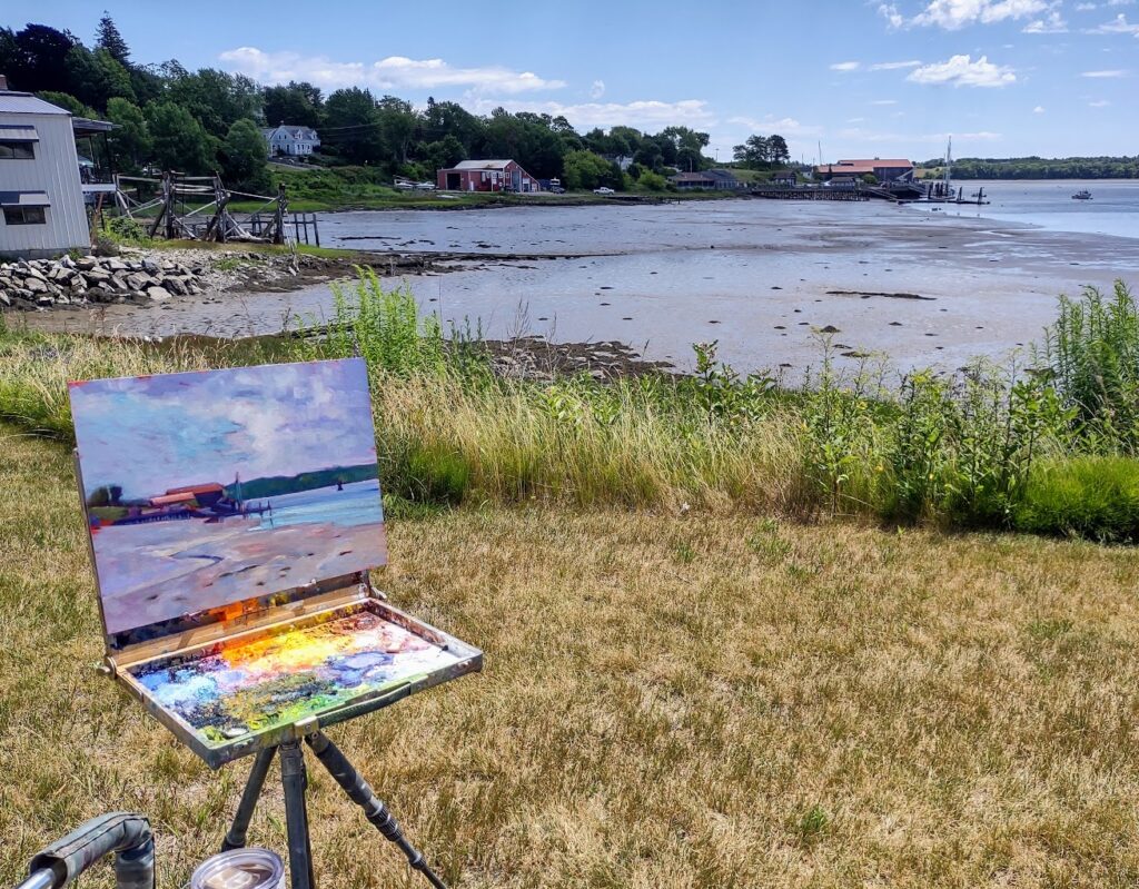
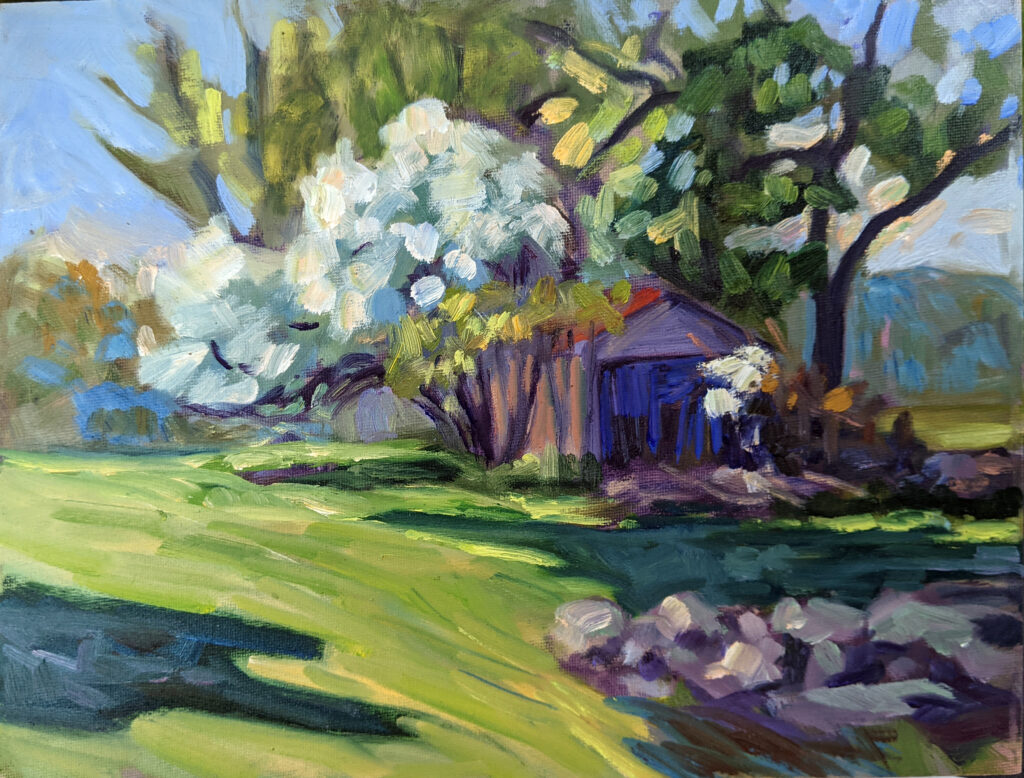
Early Spring, Beech Hill, 12X16, oil on canvas board, $1449 framed.

I’ve been to enough beauty spots in this world that few really astonish me, but the red rocks of Sedona managed it. Brilliant cliffs and spires of sculpted sandstone soar directly above the town. After seeing a dozen or so sites, I turned to my monitor, Ed Buonvecchio, and said, “It’s all wonderful.”

I’m here to teach the first workshop of my season, and it feels great to be out of the cool damp of the northeast, although the temperature there is steadily rising. I’ll be going home to spring painting and it’s time to get prepared.

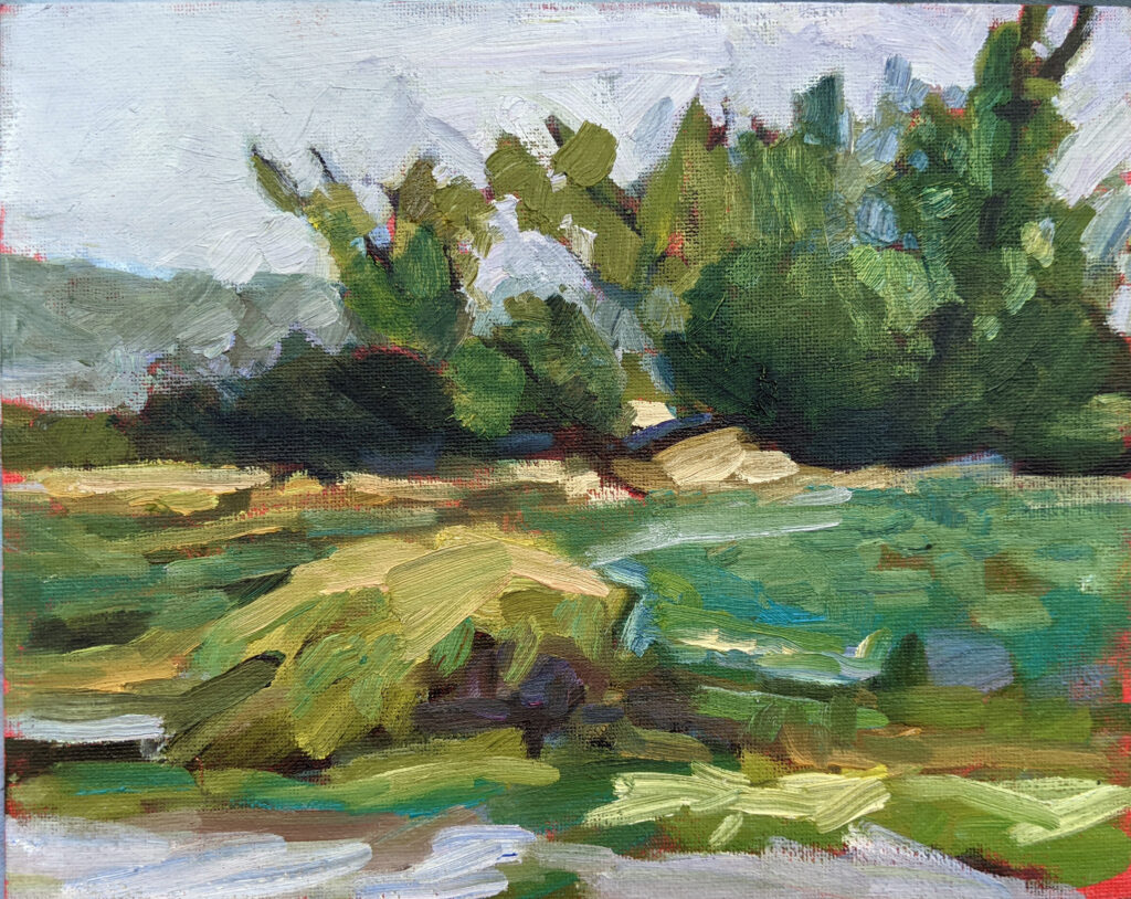
Lupines and woods, 8X10, oil on canvasboard, $522 unframed.

How can you get the most from a workshop or class? Here are some simple suggestions:

Study the supply list.

Note that I didn’t say, “run right out and buy everything on it.” Every teacher has a reason for asking for specific materials. In my case, it’s that I teach a system of paired primaries. You can’t understand color theory without the right starting pigments. Another teacher might have beautiful mark-making. If you don’t buy the brushes he suggests, how are you going to understand his technique?

A tube of cadmium green that I once bought for a workshop and never opened still rankles. I never want to do that to one of my students. When you study with me, I want you to read my supply lists. If something confuses you, or you think you already have a similar item, email and ask.

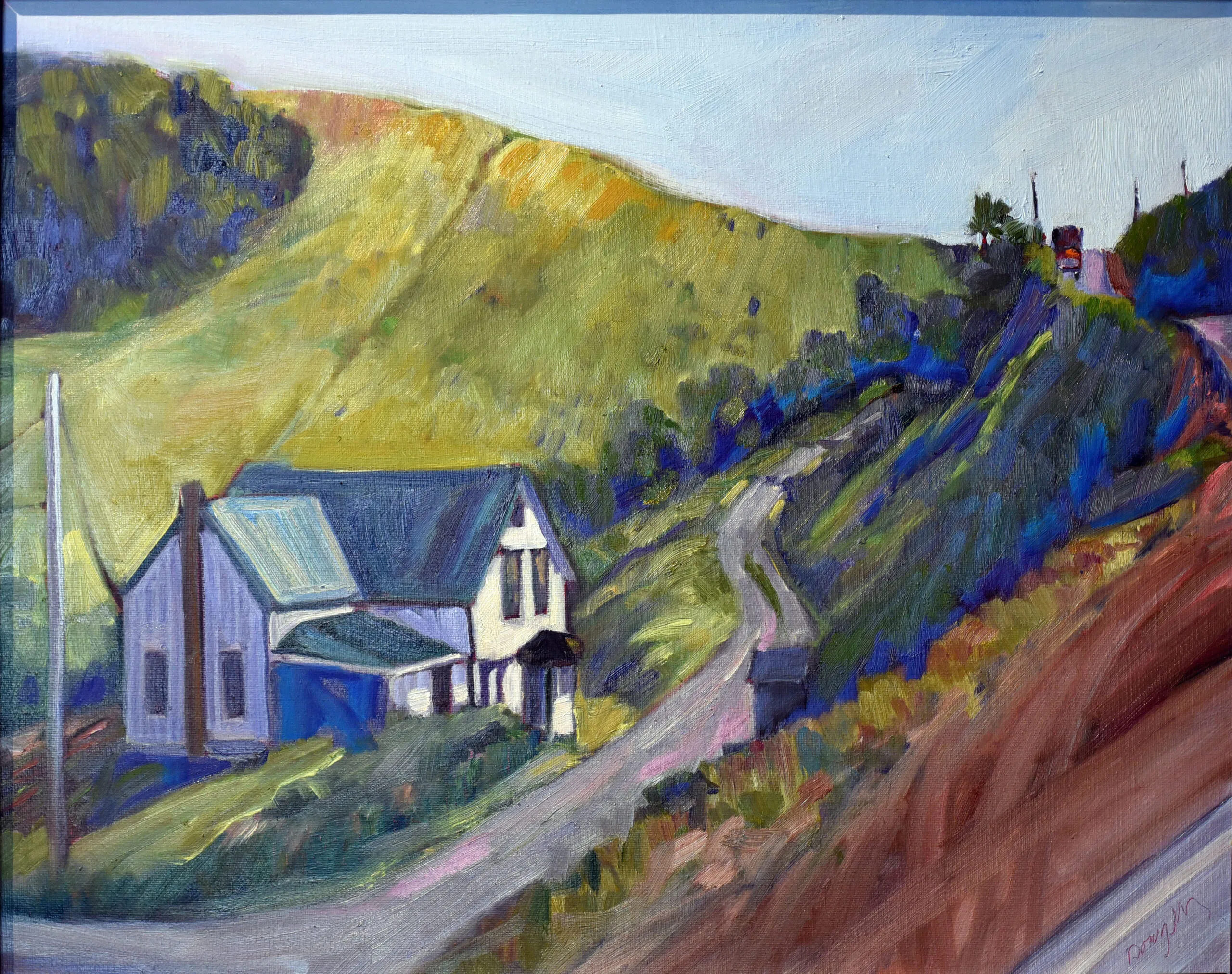
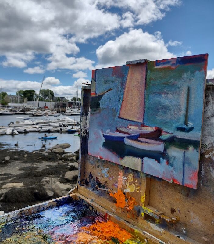
Spring Greens, 8X10, oil on canvasboard, is available through the Rye Arts Center.

Bring the right clothes.

I’d forgotten that I didn’t have enough warm-weather painting clothes to take to Arizona; I retired most at the end of last year. It was warm in Phoenix but just 50° in Sedona yesterday. That means a variety of clothing, because you’ll be chilled in the evenings but might need shorts and a tee-shirt during the day. Layer, baby, layer.

I send my students a packing list for clothes and personal belongings. If you’re going on the Age of Sail, Shary will send you a different list, meant for a boat. Follow these instructions, especially in the matter of insect repellent and sunscreen. Bugs and skin cancer are, unfortunately, eternal verities.

End of winter, Wyoming, 8X10, oil on canvasboard, $522 unframed. It will be much warmer when I teach there in September.

Know what you’re getting into.

“How can you stand this? It’s all so green!” an urban painter once said to me after a week in the Adirondacks.

There are amenities in Sedona, but not in other places I teach. If you’re dependent on your latte macchiato, you may find the wilderness uncomfortable at first. There are compensatory attractions. Last night I listened to a duet sung by a coyote and a domestic dog. It was magical.

Be prepared to get down and dirty.

I’m not talking about the outdoors here, I’m talking about change and growth. I am highly competitive myself, so it’s difficult for me to feel like I’m struggling. However, it’s in challenging ourselves that we make progress. Use your teacher’s method while you’re at the workshop, even if you feel like you’ve stepped back ten years in your development. That’s a temporary problem.

You can disregard what you learn when you go home, or incorporate only small pieces into your technique, but you traveled to be challenged, and you can’t do that if you cling to what you know.

Connect with your classmates

I know painters from all over the US. I met most of them in plein air events. There’s power in those relationships. Exchange email addresses. Keep in contact. Follow them on Instagram or Twitter.
Take good notes.

Listen for new ideas, write down concepts, and above all, ask questions. If your teacher can’t stop and answer them mid-stream, save them for after the demo.

What’s the matter with this picture?

If young women—who should be the most interested in changing this—cling to outmoded and incorrect ideas about the value of women’s art, is there any hope?

Pull up your big girl panties, at Rye Arts Center this month.

I am not going to have the time to write a proper blog. Portland Jetport has been like a morgue for the last few years, but today it’s packed (and therefore slower to clear TSA than normal). America is on the move, and that’s a good thing.

But I’d like to point out a repeated conversation I’ve had this week. It’s been with people of both genders and all ages, but the worrisome part to me is how many young women have told me that it’s not true that you can’t tell men’s and women’s paintings apart. That’s something I mentioned in my talk in Rye, here (scroll down), and in my blog post, here. That was, in some cases, even after they ‘failed’ the test below. They made excuses.

Michelle reading, at Rye Arts Center this month.

There have been many studies worldwide that document this phenomenon. The most exhaustive was done in 2017. It analyzed 1.5 million auction transactions in 45 countries, and found a 47.6% gender discount in prices. The discount was worst (unsurprisingly) in countries with greater overall gender disparity.

My painting pal Chrissy Pahucki questioned whether it was different for plein air painters, so she ran a test among her middle school students. I shared the test with my adult students, and, last I heard, the guesses were in the same range as random chance—around 51.95% correct guesses.

Saran Wrap Cynic, at Rye Arts Center this month.

I can’t take it because I can identify too much of the work, but perhaps you can. Try to avoid looking at the signatures if you can see them.

Here’s the link. I’m curious if a bigger sample will show a different result, but I doubt it.

As for what I can do to change attitudes about the gender pay disparity in painting, I’m at a loss. If young women—who should be the most interested in changing this—cling to outmoded and incorrect ideas about the value of women’s art, is there any hope?

I’m off to teach my workshop in Sedona and boarding in just a few minutes. I’ll revisit this soon, I promise.

Is painting dead?

Despite predictions to the contrary, paintings and books haven’t been replaced by their digital analogs.

Vineyard, Carol L. Douglas, 40X30, oil on canvas.

Yesterday I heard from Sedona Arts Center that my workshop there is sold out. Schoodic and my first section in the Adirondacks are also sold out. (Of course, that still leaves a lot of options all over the country, so don’t imagine you’re free of me—yet.)

But it is part of a bigger trend, and one that points out my current dilemma: teaching is fundamentally limited by the instructor’s stamina and time. I can teach about seven six-week Zoom sessions a year, and they are usually full. Between them and my workshops, I can give one-on-one instruction to a maximum of 300 students a year. That’s if there are no returning students, which there always are. And that’s while maintaining a killer pace, one I’m unlikely to sustain for many more years.

Tom Sawyer’s Fence, Carol L. Douglas, available.

Teaching, as any person who’s done it can tell you, is very much a bespoke industry. It’s individual and personal. As I think about ways to reach larger audiences, I know that I will be sacrificing that intimacy in the process.

This blog started as an exercise in spreading instruction to a broader audience. By their nature, blogs are simply not well-organized or easy to search. Although I’ve covered everything you need to know in the fifteen years I’ve been writing, it takes good research skills to ferret out specific information, especially as I’ve shifted platforms a few times.

The downside of social media is that it has an incredibly short lifespan. As of 2021 it was estimated to be:

  • Twitter: 15 minutes
  • TikTok & Snapchat: Start decaying immediately unless viral
  • Facebook: 6 hours
  • Instagram: 48 hours
  • LinkedIn: 24 hours
  • YouTube: 20 days or more
  • Pinterest: 4 months
  • Blog Post: Over a year

That means few of us are getting past the headlines—or the advertisements. Some platforms, like Twitter, Facebook and LinkedIn, are gatekeepers for more incisive writing, but most social media posts are simple snapshots.

Bracken Fern, Carol L. Douglas, 9X12, oil on archival canvasboard

Americans now overwhelmingly get their news from digital media. In a recent Pew survey, 65% of respondents said they rarely read printed news. At the same time, only 20% of Americans are willing to pay for online news. That means most of us are getting our information in some kind of recycled format. Ouch.

Magazines are doing slightly better, but are still in decline. Print subscription circulations have fallen by 7% over the past two years, while single-copy sales are down 11%. The exception is specialty magazines, dedicated to niche audiences.

Best Buds, Carol L. Douglas, 11X14, oil on canvasboard

On the other hand, industry watchers were confident that book publishing would be moribund by 2022, and that hasn’t happened. Books remain a $27 billion industry in 2022. That compares to e-books, at $3 billion and—weirdly—sliding. Clearly, people perversely cling to reading on paper.

For art books, paper remains the only way to go. I can’t imagine curling up with my phone and browsing a text on Wayne Thiebaud, for example. His luscious, thick paint looks great in life. It looks decent with modern printing technology; it disappears on my computer screen.

In the same way, there’s something about handmade art that cannot be replaced with digital analogs. People have lots of time for digital media—movies, snapshots, television and video—but when it comes to hanging fine art on their walls, they like the feeling of hand-craft. Total sales of art photography were just $80 million in an art market of $64 billion in 2019—and in decline. Despite 137 years of commercially-viable photography, painters and printmakers aren’t obsolete. I have a feeling it’s not going to happen.

Monday Morning Art School: pigment and race

We all know race is an artificial construct, yet we persist in using it anyway. It’s not even skin deep. It doesn’t exist at all.

The Servant, Carol L. Douglas, is on display at the Rye Arts Center for the month of March.

There is nothing that worries me more about the future of our democracy than Daylight Savings Time. It serves no practical purpose and disrupts our sleep schedules twice a year. Yet we can’t seem to get our corporate act in gear and rid of it.

I don’t just say that because I forgot to reset the clock on the coffee-maker last night.

This week I’ll be teaching my classes to mix and use a variety of skin tones. The actual mixing is fairly simple; there’s a complete chart just below that will get you to every color you might need. It’s the application that’s so fascinating and difficult.

There are darker and lighter people, of course; to catch their color, just adjust the amount of white (or water) you use. There are also warmer and cooler skin tones. That’s why my chart has different rows. If your model is more olive, stick with a row that gives you more green tones. If pinker, choose a row that tends in that direction. You don’t need to mix all these colors for each model; it’s just a guide to set you in the right direction.

My original painted chart is ratty and worn but I also included it so you can see what the colors look like in paint rather than Adobe Illustrator.

Natural light hitting the human skin is far more variable than we see indoors. We live (and paint) under artificial light. That narrows the color range dramatically, which is why painting the model under spotlights is poor practice. Photography also narrows the chromatic range of human skin. However, painting from life in natural light is not always possible.

There are greens, purples, and yellows in every person’s skin. The ears, face, fingers and toes all tend to pink; there’s blood closer to the surface. Some of us have visible traceries of blue veins. There are lovely greens and mauves in shadows. In fact, the only difference between my landscape palette and my studio palette is that red always makes an appearance inside.

Self-portrait at the age of 63 (detail) Rembrandt van Rijn, 1669, National Portrait Gallery

Rembrandt was a master at capturing these subtle, varying colors in the human skin, as shown in the detail from his last self-portrait, above. He did this with the narrowest of palettes—essentially earth pigments with white. And yet he fools us into seeing a whole range of colors including blues and greens.

Rembrandt also painted Two African Men, below. Unfortunately, its surface is in such bad repair that it’s impossible to see what colors he saw in their skin. However, he would have used the same paints as he used in his own self-portrait. They’re all he had available.

Two African Men, 1661, Rembrandt van Rijn, courtesy Mauritshuis

Our actual skin color is based on just one pigment, melanin. Lighter people just have more blue-white connective tissue and hemoglobin showing through.

We talk of Asians as having ‘yellow’ skin. That’s a modern lie. In the 13th century Travels of Marco Polo, the people of China are described as white. Eighteenth century missionaries also called Japanese and other East Asians white.

The ‘yellow’ label can be laid squarely at the feet of science. The father of modern taxonomy, Carl Linnaeus, first used the label fuscus (dark) to describe the skin color of Asians. Later, he began calling them luridus instead. That translates to ‘pale yellow’, ‘wan’, ‘sallow’, ‘lurid’—with a dash of ‘horrifying’ attached.

The father of comparative anatomy, Johann Friedrich Blumenbach, used the word gilvus, which translates to ‘yellow’. (He’s also the guy who started calling Asians ‘Mongolians’.) By the nineteenth century, westerners were completely sold on the idea that Asians were yellow. Thanks, Science.

The farther down the Italian boot you go, the more you find genetic mixtures with Greeks, North Africans and Middle Easterners. That’s no surprise; the Mediterranean was the original melting pot. Southern Italians and Greeks are often very dark in color. 

It’s no surprise that neither were considered quite white in 19th century America (although they had that designation for naturalization purposes). In fact the largest mass lynching in American history was of Italian-Americans. What’s more peculiar is that some people didn’t consider Irish-Americans white, either.

We all know race is an artificial construct, yet we persist in using it anyway. Paint-mixing shows us that the similarity in our coloration is far greater than the differences. Race isn’t skin-deep; it doesn’t exist at all.

Why not paint under a false name?

The gender disparity in art is terrible. So why don’t I paint under a nom de pinceau?

Autumn Leaves, Beauchamp Point, is one of the non-nude paintings at the Rye Arts Center’s Censored and Poetic this month.

Last month, when I wrote about the gender disparity in art, a reader asked me why I didn’t believe gender-neutral nom de pinceaus were the answer. I promised  I’d answer the question in my following post, but then Russia invaded Ukraine and it seemed like wars and rumors of war were more pressing.

Last night was the opening of Censored and Poetic at Rye Arts Center, which brought the question back to mind.

Kicki Storm, me, and Anne de VillemĂŠjane at the opening.

The gender disparity is in fact greater than the race disparity in US galleries. According to a 2019 study, an estimated 85% of artists represented on US gallery walls were white, compared to 76.3% in the general population. That is terrible, but a study the prior year found that in 820,000 exhibitions across the public and commercial sectors in 2018, only one third of the works were by female artists. That’s despite the fact that 51% of the US population is female.*

In general, a name cannot tell you whether a painter is white or black. I had a brief chat about this last night with Matthew Menzies, my former painting student. Matt and I both check a lot of the same sociological boxes. We both have Scottish surnames. However, Matt’s not white, although you’d never know that until you met him. On the other hand, my given name tells you immediately that I’m female. I can be rejected in the sorting process.

Last night, Kicki Storm referred to a 1989 art project by the Guerrilla Girls called Do Women Have to be Naked to Get Into the Met Museum? which found that less than 5% of the artists in the Modern art section of the Metropolitan Museum of Art in New York were women but 85% of the nudes were female.

I’d like to say it’s better now, but a short comparison of the careers of Lois Doddand Alex Katz reveals otherwise. They have oddly parallel careers. Both studied at Cooper Union. Dodd went on to be one of the founders of the Tanager Gallery. She taught at Brooklyn College and Skowhegan.

The Met owns 19 Alex Katz paintings and three of Lois Dodd’s, none of which are on view. MoMA owns one Lois Dodd painting, acquired in 2018, when she was 91 years of age. I lost track trying to count how many of Alex Katz’ paintings they own; there are 137 records.

In light of this, why not hide behind a gender-neutral set of initials, or, even better, a false name? Because to do so is to capitulate to the world, to agree to its assumption that male painters are superior. If my generation doesn’t challenge this assumption, who will?  

There’s also the stubbornness of identity. I am who I am, for better or ill. That’s complex; it involves boats and building as much as it does children and grandchildren. Concealing that complexity simply perpetuates gender stereotypes, which I think have gotten more rigid, not less, during my lifetime.

*Every time I read about a massive survey like these, I wonder who has time to count these things.

Helping Ukraine

We can all do what Americans and Canadians do best: send money.

This painting has ceased to exist; it was a musing on the First Gulf War.

Although I’m fairly ‘green’, I bought my Prius in 2005 primarily for geopolitical reasons. It had been only a few short years since 9/11. There was credible information that our oil purchases were funding jihadism. I wanted to limit the amount of money I was sending to the Middle East.

Dependency on foreign oil has been a fact of life since the invention of the internal-combustion engine.  Today it’s Europe that is suffering from the boycott of Russian oil. I reckon that every gallon we don’t consume is a gallon that eases pressure on European consumers.

We drive a hybrid and heat primarily with wood. We can and will curtail unnecessary travel, but I can’t figure out how to cut our oil consumption much further. If you have suggestions, I’d love to hear them.

Russia’s attack on Ukraine has put paid to any idea that modern Europeans have somehow sidestepped their bloody history. The post-Cold War peace was illusory; it has exploded into hot conflagration.

As I write, a friend is driving to Poland to try to rescue her cousin from the mass of refugees streaming across the border. I can’t drive to Poland, but I can do what Americans and Canadians do best: send money.

Retired journalist Rita Truschel is the child of refugees herself. She put together this list of organizations helping in Ukraine or for refugees. I’ve appended Charity Navigator ratings where appropriate. (No rating doesn’t mean the organization is wasteful; it just means that they aren’t required to file American tax forms.)

Children’s welfare

Save the Children (91.82)                         

United Nations Children’s Fund(89.18)     

Emergency housing

Airbnb Disaster Response (not a charitable organization but funneling money to people on the ground)

Surplus medical supplies 

Afya Foundation Disaster Response  (97)

MedWish International (100)

Medical volunteers

Doctors Without Borders (92.25)

International Medical Corps (83.94)

Logistics & shipping

Brother’s Brother Foundation(92.92)

Flexport (not rated)

Refugees’ survival & resettlement 

Catholic Relief Service(83.94)

Canada Helps (not rated)

Canada-Ukraine Foundation (not rated)

CARE Ukraine Crisis Fund (92.64)

International Rescue Committee (86.92)

Lutheran World Federation (not rated)

Sunflower of Peace (not rated)

US-Ukraine Foundation (not rated)

United Nations Refugee Agency(not rated)

Damned if you do, damned if you don’t is one of the paintings at Rye Arts Center’s Censored and Poetic, which is what I should be writing about today.

In normal times, this post would have been about the opening of Censored and Poetictomorrow evening, so I should at least mention it. If you’re in the metro New York City area, I’d love to see you there, and if not, the event will be livestreamed here.

Monday Morning Art School: that sinking feeling

Over time, the dark passages in an oil painting can grow hazy. In watercolors, the beautiful, jewel tone on the palette can look flat and dull after the paper dries. That’s ‘sinking’ color, and an ounce of prevention beats a pound of cure.

Clear Morning on Bunker Hill, 24X36, $3985 framed.

Oil painting: Sinking is caused by the displacement of the oil in the top layer. It’s most obvious in dark passages, but that’s only because the dusty haze is most visible there. It appears slowly over time—a painting that was once exuberantly colorful is suddenly dull. The different drying times of pigments means that color will sink unevenly across the canvas, giving it an irregular, blotchy look. Details that were once subtly beautiful will disappear.

Sinking can be repaired by oiling out or varnishing, but this may need to be repeated to keep the painting beautiful. If a painting is sold, you have no idea if it’s losing its color. It’s far better to do it right in the first place.

Tom Sawyer’s Fence, 14X18, $1275 unframed.

Sinking has three common causes:

Too much solvent—the painter has not mastered the art of using unadulterated paint or painting mediums in the top layer. He relies too much on odorless mineral spirit (OMS) to get good flow. The OMS takes the place of the linseed oil binder and then evaporates. That leaves the pigment particles isolated, with no oil surround. Air doesn’t have the same refractive index as linseed oil, so a pigment that looks dark and beautiful in solution looks dull and grey when the binder disappears.

Not enough oil in the top layer of paint—this is why we keep repeating that old saw, ‘fat over lean.’ There’s enough oil in modern paints to make a solid top layer, but only if applied in proper thickness. If you want to paint thin, you must cut your paint not with OMS but with an oil-based medium.

Over-absorbent grounds—acrylic gesso is more absorbent than oil gesso, but a well-prepared acrylic ground is fine. However, a very inexpensive board may not have enough ground to stop oil from seeping through. An aftermarket coating of gesso is a good cure. Non-traditional grounds like paper and raw fabric need very careful preparation.

Bunker Hill overlook, full sheet watercolor, available. One of the advantages of Yupo is that there is no sinking.

Watercolor: “The difficulty in watercolors is not that it is ‘unforgiving’, as amateurs widely misbelieve: it is that it begs for fussing,” wroteBruce MacEvoy. That fussing takes the form of overworking passages. Alla prima, or ‘on the first strike’ is vital in watercolor.

We want the pigments to stay on the top of the paper, rather than sink into it where they can’t be seen. The cellulose fibers of watercolor paper were laid down in a stiff mat so that pigments will sit nicely on top. Reworking wet-on-wet, scrubbing, and other repairs cause the fibers to unravel, creating a microscopic forest of random threads. Paint sinks into its crevices. The color is duller and, worse, blotchy.

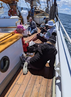
The deck of American Eagle, from my sketchbook from Age of Sail workshop

Most watercolor paper is coated with gelatin or other sizing. This controls its absorption of paint. When you do a preliminary wash of color, you’re wetting the paper along with establishing primary shapes. If this wash layer is allowed to dry completely before the next layer is applied, the water and paint mix with the sizing and create a new layer, comprised of binder, sizing and pigment. That new, dense sizing layer can help hold successive layers of paint on the surface.

But if you ‘lick’ the wet paper constantly with your brush in an attempt to control minor flaws, you interrupt this process. Unless the paper dries completely between approaches, each pass with the brush lifts more paper fibers. That disturbance increases the capillary action that draws the pigment deeper into the paper. Overworked passages look dull and fuzzy.

Of course, the type and quality of the paper you use matters. Hot press paper is more tightly-compacted, making it more tolerant of overbrushing. Cold-press paper has less sizing and looser fibers. It tolerates less fussing.