fbpx

Monday Morning Art School: what is critique?

It’s not an emotional response or mere fault finding.

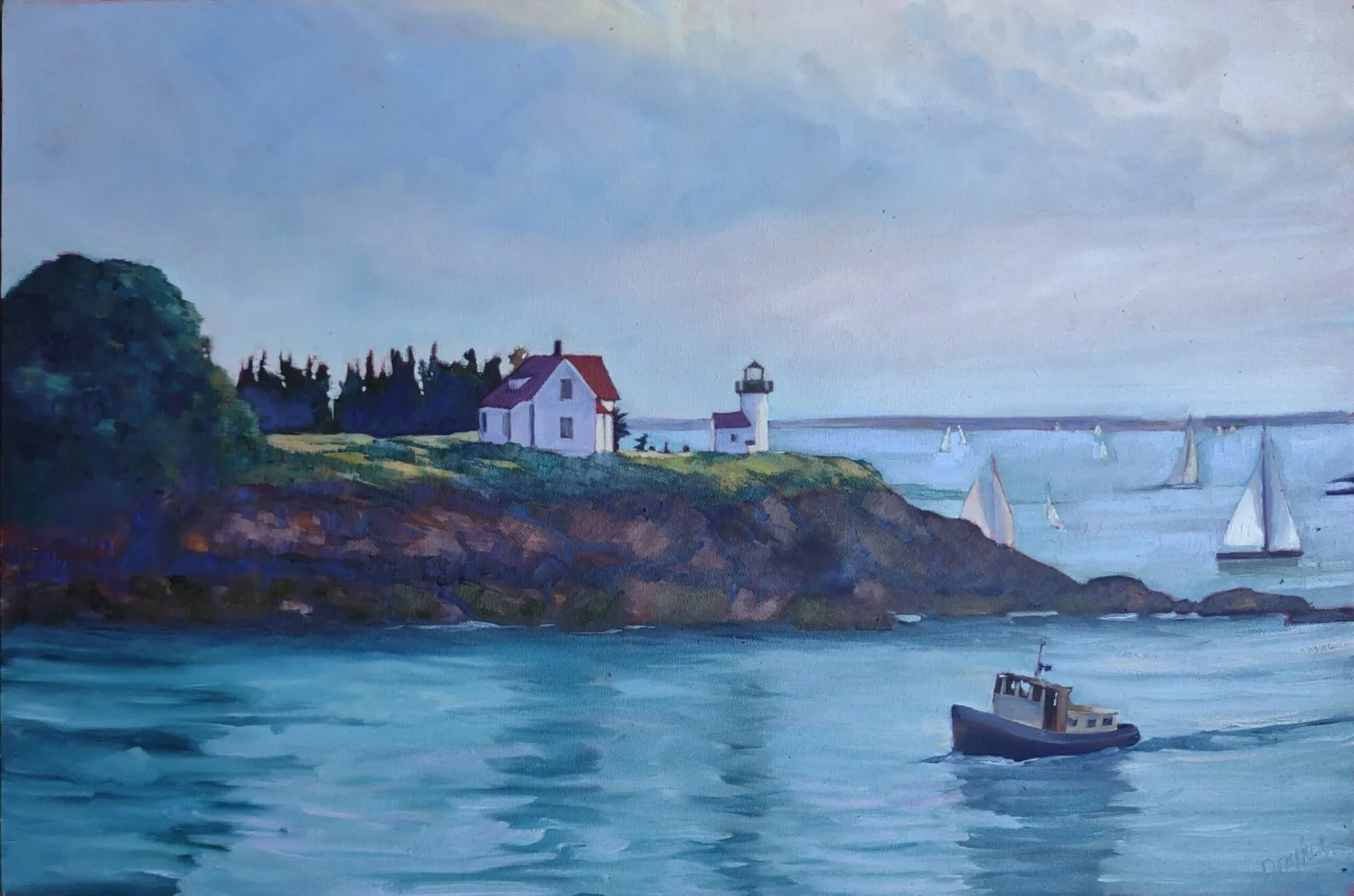
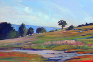
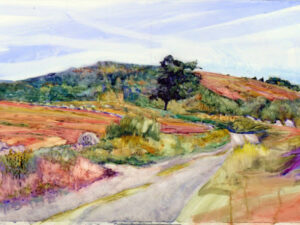
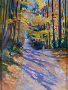
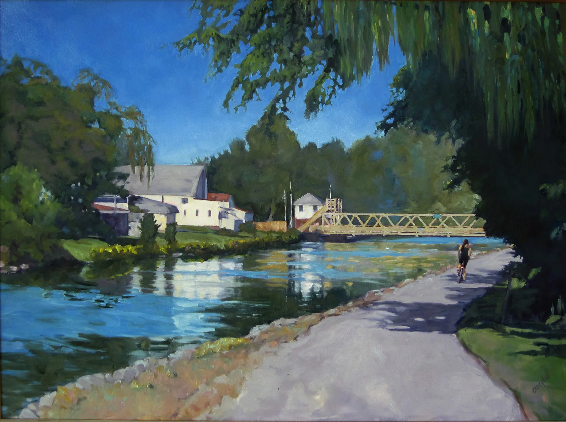
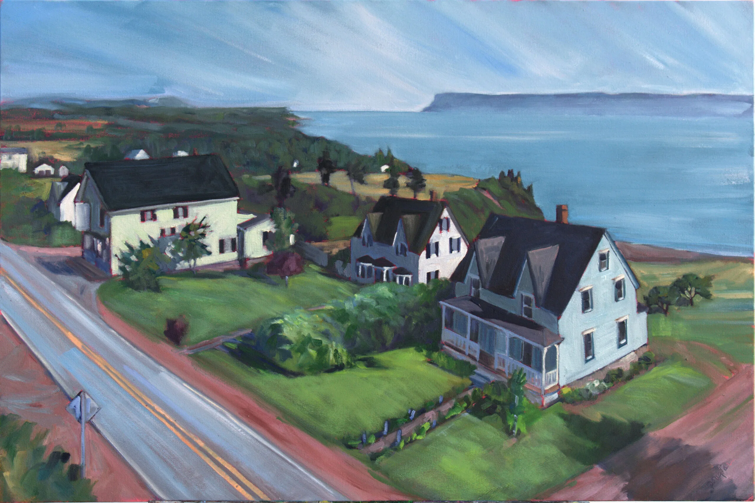
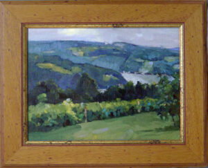
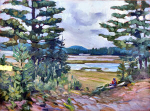
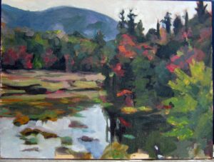
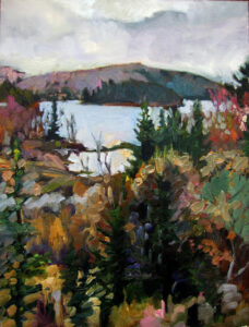
Skylarking 2, 18X24, available.

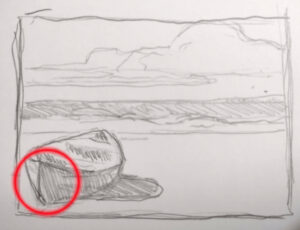
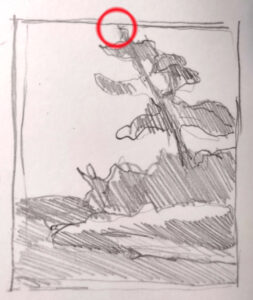
This week I begin a new online class dedicated to critique. Since it’s a totally new idea, the shape of this class is evolving. However, the plan is that students will bring work they’ve done on their own for analysis within the group. The hope is that we can develop a sort of executive function that will oversee our painting processes outside of class. This, as you can imagine, is much harder than “hold your brush like this” painting classes.

Critique is a long-standing tool in every intellectual discipline, artistic and technical. However, it’s more straightforward to tell your co-worker, “I can’t duplicate your results,” than it is to put into words why a painting isn’t working. “I don’t know about art, but I know what I like,” is only a funny joke because it’s to a large degree true.

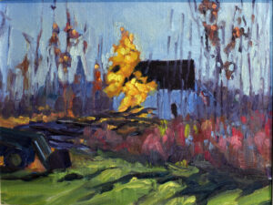
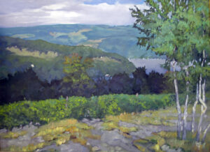
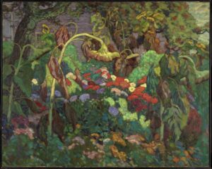
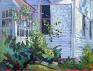
Lobster Pound, available.

What critique is not is an emotional response. It must be disciplined and systematic, but art is at the same time intuitive and subjective. We bridge that gap by analyzing works based on a series of values:

  • Focal point
  • Line
  • Value
  • Color
  • Balance
  • Shape and form
  • Rhythm and movement
  • Texture (brushwork)

These elements of design transcend style or period. Every painting includes them to some degree. The critic must consider how they work together. Do they coalesce into something arresting or not? If not, what forces are blocking the full expression of the artist’s idea?

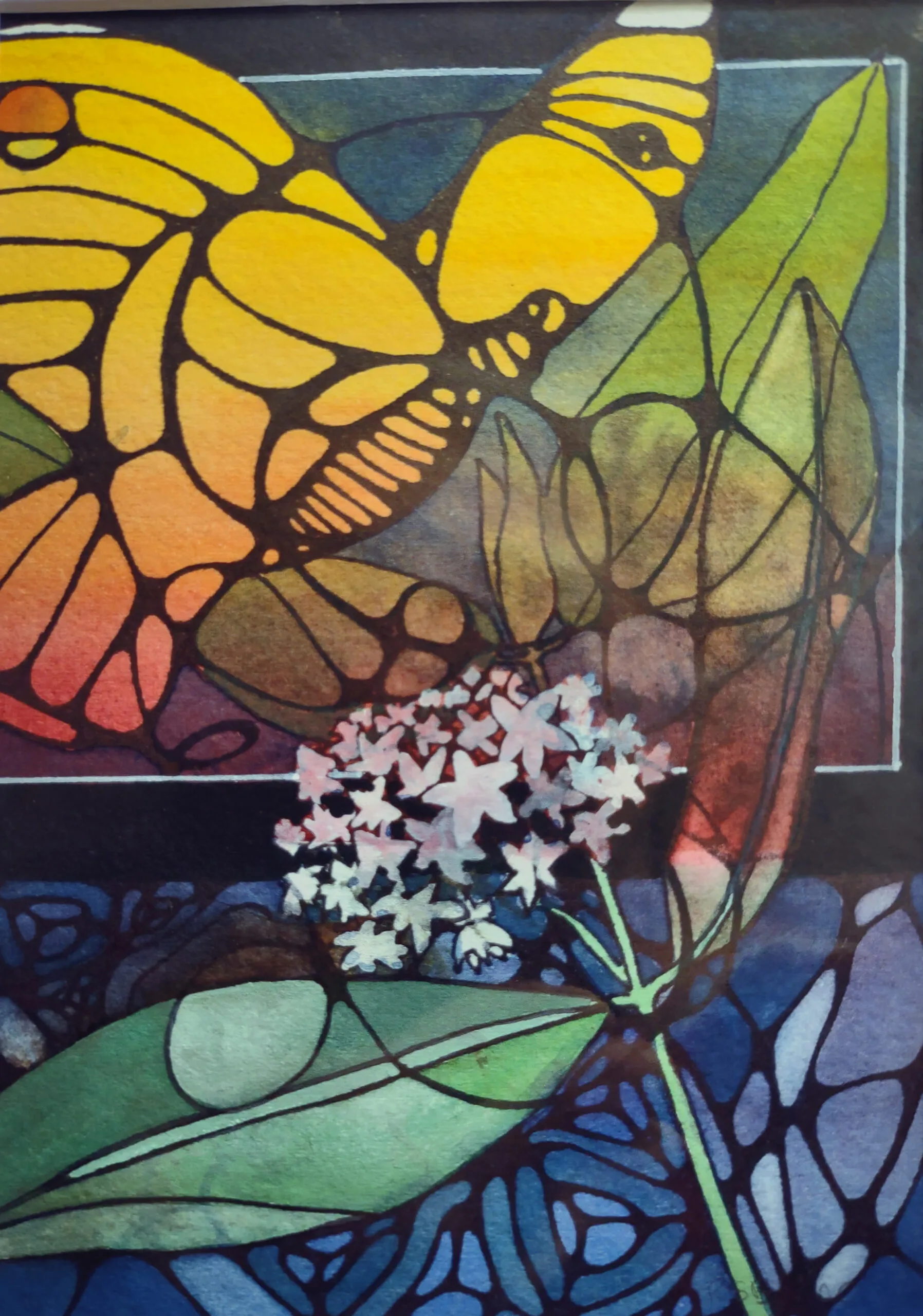
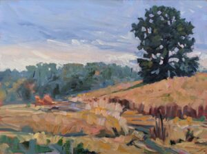
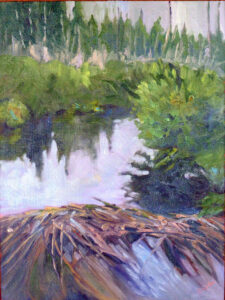
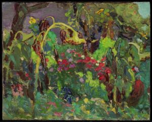
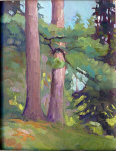
Beautiful Dream, 12X16, available.

There should be no censure involved. We’re all intelligent adults; if our ideas aren’t working, it’s because we’ve run into a problem that another set of eyes can help us unravel.

The very first question we must ask (and answer) is, what are you trying to do or say in this painting? That’s not always simple, so it deserves time. Every subsequent point of discussion should be weighted in regards to that answer. For example, if what interested me was the loneliness of a home on a rocky crag, my composition, color, brushwork all need to support that aloofness.

Criticism should never be mere fault-finding. There is a seed of brilliance in almost every painting, and it needs to be enlarged upon. That means discussing the merits of a painting as much as discussing its faults.

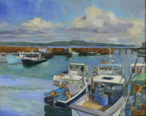
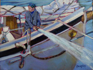
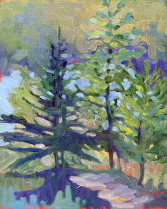
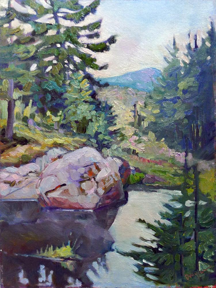
Belfast Harbor, 11X14, available.

For critique to work well, the critic and artist must both approach the process with humility and mutual respect. I once took a painting I couldn’t finish to a noted teacher for criticism. She told me that it looked like a ‘bad Chagall.’ In trying to execute her ideas on the canvas, I completely destroyed my own vision. My self-doubt met her self-confidence in a terrible concatenation.

I’m speaking here of narrow peer criticism. There’s a larger world of art criticism that seeks to analyze artists in terms of their culture and times, but it has nothing to do with us.

By the way, I’m also starting my mid-coast plein air sessions tomorrow. There’s more than ample room in this class, so if you’re interested, email me for more information.

Your brushes suck. What are you going to do about it?

While you can paint a good oil painting with a stick (if you know how), decent brushes certainly help.

They used to be my first-string brushes, until some kindly friends staged an intervention.

A few months ago, a student in my Zoom class asked me to check a brush for him. He held it up to the camera.

“Shot. Toss it,” I said.

“How about this one?”

“Total c--p. Toss it.”

“This one?”

“It’s a stub! You can’t paint with a stub!”

A taklon wash brush can be the watercolorist's best friend.

After more of this than I ever expected, we came up with some ground rules for assessing brushes. While watercolor brushes will last forever if you care for them properly, oil painting brushes do wear out. You can’t paint with a brush that’s:

  • Hardened with paint;
  • Splayed (because it has paint dried in the ferrule);
  • Developed a wicked curve (either a manufacturing problem or because it’s sat in solvent);
  • Worn to the point of having no flexible fibers left;
  • Missing chunks of hair.

I’ve puttered endlessly trying to revitalize hardened, splayed or curved brushes, and its simply not worth the effort. Pitch them.

In a pinch, I've found that coconut oil can soften hardening oil brushes. But in most cases, it's not worth trying.

Most of us need fewer brushes than we think, but the difficulty lies in knowing which brushes are appropriate. There is no one-size-fits-all answer. The first question is what fiber is appropriate.

  • For alla prima oil painting, hog bristle brushes (synthetics are generally too soft for stiff paint);
  • For indirect oil painting, synthetic or sable along with hog bristle;
  • For acrylic painting, either hog bristle or synthetic brushes, because acrylic paint is softer than oil paint;
  • For watercolor painting, sable or synthetic, including taklon. (It’s too early in the morning for me to consider plucking squirrels. Sorry.)
You can waste a lot of money in the discount bins at art stores.

There is very little application for tiny brushes in painting unless you’re a miniaturist. In watercolor, a ½” flat, a 1” wash brush, a #6 quill and a #8 round are enough to get you started. Add a set of short synthetic flats (or mottlers, as they’re sometimes called) in ¾”, 1” and 1½”. A little pointed brush to sign your name is helpful.

In oils and acrylics, a life list would include:

  • Brights (short flats) in 6, 8, 10, possibly 12, depending on how big you’re going to paint;
  • Rounds: 2, 4, 6;
  • Long (true) flats: 3, 4, 5;
  • Filbert: 2, 4, 6;
  • A few tiny rounds in sable for detail and to sign your name: 2,4;
  • 1” badger blender brush;
  • 2” spalter or hog bristle background brush—this is for blocking.

I generally recommend Princeton brushes to students; they come in a range of quality and material and are good value for money. I’m currently painting with Rosemary & Co. in both watercolor and oils. Other brushes I’ve known and loved include Isabey, and Winsor & Newton. But brushes are a highly-personal thing, and you’re best buying one or two from a maker and running them through their paces before you commit to a relationship.

The best brushes in the world will do you no good if you abuse them. My daughter makes me castile soap, which cleans my oil brushes beautifully. You can buy it in the laundry section of your grocery store. Saddle soap and conditioning brush soap are also excellent products. The important thing is to clean your brushes as soon as you finish a painting session.

Watercolor brushes need nothing more than a good rinse in tepid water. Shake dry and gently reshape the bristles.

All brushes will be ruined if they’re allowed to stand in solvent or water. That’s a terrible habit, so don’t let it develop. Swish them free of solvents and set them down on a paper-towel or in a brush holder.

Good design is in the details

The people who made beautiful art in earlier eras weren’t focused on themselves, but on craft and how it fit into a greater whole.

The rood screen of York Minster featured the kings of England from William the Conquerer to Henry VI. That's the only reason these figures weren't smashed, and they give us an idea of what the saints in their niches might have looked like.

York was founded by the Romans, slumped into inconsequence under Anglian rule, was rebuilt by the Northumbrians, conquered by Vikings, was sacked by the Normans, and then rose slowly again, only to be pummeled during the Dissolution of the Monasteries and the English Civil War. It is, in short, deep and complex, and that is visible on the very fabric of the city.

York Minster contains three monuments designed by Grinling Gibbons. They don’t stand out. That’s not a slam on Gibbons, but rather a reflection of the depth and breadth of good design in the Minster. It’s hard to be moved by massive marble reliquaries to slumbering prelates, but they’re all masterworks. They make their point powerfully.

There are thousands of beautiful small details in the Minster.

The north transept contains the so-called Five Sisters window. Five long, narrow lancet windows are the largest example of grisaille glass left in the world today.  Grisaille glass came into vogue after a prohibition on the use of colored glass by the Cistercian Order in 1134, and these are dated to around 1260.

These windows are so contemporary in effect that I wondered if they were modern. Yet they are almost 800 years old. There’s a lesson there: if your art is solely about ideas, it’s unlikely that it hasn’t already been done.

The quire at York Minster.

York Minster survived the hacking and smacking of Henry VIII’s evil minions, but the saints in its innumerable niches did not. They stand empty to this day, a stark reminder of the dangers of iconoclastic fury. Still, one has a sense of the power of the cathedral’s design as it moves from broad concept to finest detail. First there is its standard cruciform shape, oriented to the east and balanced by a tower rising above the crossing. This became so standardized in ecclesiastical design that we sometimes forget that it was a new language then. So, too, was the inexorable visual sweep upward and the glorious light. It must have seemed amazing to people accustomed to squat wattle-and-daub or stone huts.

Contemporary needlework at York Minster.

It is impossible to describe all the layers of design that were integrated into this new cathedral form—arches, buttresses, niches, gargoyles, right down to tiny bits and bobs of sculpture. It has evolved over the centuries. Thus, the tiny headless saints dancing on the western wall seem as much a part of the fabric of the place as the Great East Window. The statues were sculpted in 2004 by Terance Hammill and they are sending a semaphore message with their haloes: Christ is here.

Semaphore Saints, 2004, by Terance Hamill, York Minster.

I was raised in the era of Brutalism and Scandinavian modern and have a fondness for stripped-down design, whether it’s in architecture or painting. But there’s something missing in that: the integration of detail and depth.

Part of that comes, I think, from the egocentricity of our own age. The people who made beautiful art in earlier eras weren’t focused on themselves, but on craft and how it fit into a greater whole. That’s as true of the metalwork of the Vikings and Romans as it is of the ecclesiastical art at York Minster.

The stonemason's yard is an eternal verity of a great cathedral as parts are constantly wearing out and must be replaced.

The Five Sisters window is too extensive to have been the work of any single man. It fits in an austere blind arcade of banded stone, and is topped by another group of five lancets. I expect the glassblowers, the men who leaded the windows, and the stone carvers each had their specific instructions, handed down to them by someone who, in turn, was following instructions. These plans would have been rigorous and limited. That ruled out the self-expression we consider basic in our own time, and yet it resulted in one of the glories of civilization.

Feel the Love

Kind Cumbrians cheered us on as we hiked the last few miles of the wall. Now on to the Queen’s Jubilee celebrations.

The churches of Cumbria are built of reclaimed wall stone, including pagan shrines and inscriptions.

The last few hundred yards of the Hadrian’s Wall path took us down the main street of Bowness-on-Solway, population 1126. It being a warm day in June, there were people out on their business or sitting in their front gardens. Each smiled and nodded, or offered congratulations and last-minute encouragement.

Rambling is a uniquely British pastime, supported by a network of footpaths across private land. We have no equivalent in America, and it’s a wonderful way to see the backside of Britain—its farmyards (complete with ordure), sheepfolds and gardens. The Roman engineers were interested in a strategic fort to keep the Picts out, so the wall misses most settlements and marches resolutely east to west.

These fellows were celebrating a bike ride across England in honor of the Queen's Jubilee.

There were places where I thought those engineers were daft as brushes. In the crags of Northumberland National Park, the wall seesaws crazily across sharp rises and gullies. It’s miserable hiking, so it must have been just terrible for the toiling stonemasons. “Why didn’t they just fill these parts in and make less work for themselves?” I grumbled as I lurched down yet another steep pass.

The wall is an amazing feat of architecture. Much has been dismantled, for shielings, barns, walls, byres and houses. But what remains still stands impossibly true 1900 years later.

There are times on the path when you are walking through someone's back garden.

Bowness-on-Solway is the terminus because it’s the westernmost point where the Solway Firth can be forded at low tide. There was once a large fort and garrison stationed here. Other defenses continue 40 miles down the coast to Maryport. Selgovae raiders weren’t the only problem; there were also troublesome Celts just across the Irish Sea.

But here is where the wall itself ended. The wall’s second-largest fort, Maia, lies under little Bowness-on-Solway.

Drumburgh castle has bits of Roman arch and shrine in its walls. It's a private home today.

The wall is disembodied, but its presence is all around us. In places, it shows as a stiff turf line in low meadowlands. Bits and bobs are baked into churches, houses, and the 14th century pele-tower castle at Drumburgh.

Alas, no wading in the Irish sea for me.

The Cumbria shore looks tranquil but is prone to flooding. Signs warn us against quicksand and fast current changes. We’ve tramped through fields containing innumerable cows, sheep and horses, but it was here that we finally encountered a beast who took umbrage. She quickly decided to boss someone else around.

Our intrepid group, from left: Alison, Doug, Kenneth, Martha, me and wee Poppy, who took at least twice as many steps to go the same distance.

Perhaps fewer people than I imagine really finish the walk. “We just had a party quit in Carlisle,” the publican at The Inn at the Bush told me. “They were in their 30s.” A walker we encountered in Burgh-by-Sands told us that his partner had quit along the way. Yet this is considered the easiest of all the national pathways.

Yarn bombing seemed silly in Manhattan, but is so right for the Queen's Jubilee.

As for us, our feet are terribly blistered. We ache in places we didn’t even know we had. But today we stuff our hiking clothes in a plastic bag and dress for a weekend in Yorkshire. This is the Queen’s Jubilee, and we are looking for lawn fetes and evensong in her honor.

God Save the Queen

Here in the countryside, her subjects love her.


Shop window display in Cumbria


Every small town we’ve walked through has been decorated for the Jubilee. That’s not with big-box generic décor, either, although there are Jubilee flags and bunting everywhere. Every little shop window and many, many front gardens sport tributes from the heart—handmade signs, memorabilia from the Coronation, and many, many teacups of the kind your grandmother collected.

A laundromat in Haltwhistle, Cumbria

It's not my country, she’s not my Queen, but the sentiment chokes me up. This is England’s famous red wall, the Labour heartland that went Conservative in the last election. In other words, it’s in political flux. There are both conservative and workingmen’s pubs in these villages, but none of that touches the Jubilee. The Queen truly transcends politics in a way Americans don’t understand. This Jubilee is her celebration.

Every pub is decorated for the Jubilee.

I am an unabashed fan of the Queen. She reminds me of my mother and all the women of her generation—stoic, composed, hardworking, redoubtable and dignified. I miss them, terribly.

The Jubilee is tied with memories of WW2, which are made more poignant by the current Ukraine war.

The Washington Post opined recently that the Queen should retire. We Americans are not entitled to an opinion (something we should practice saying regularly about a whole host of things). The British monarchy has had no impact on America for 250 years. Any road, the question of whether she’s ‘fit’ for the role is absurd. The modern monarchy is largely her creation, and for all we know she’ll keep on defining it.

The Queen Bee and her subject bees in Gilsland.

I will be in Yorkshire for the Jubilee celebrations proper, but there could be no better place to observe them than right here in Brampton, Cumbria—or any of the other little villages we’ve passed through. There will be prayer vigils and parties for the old people. Tomorrow night, there will be beacons lit across England, including along Hadrian’s Wall. These will range from “private bonfires to full-blown spectaculars with fireworks, choirs, pipers, and buglers.”

The Queen's corgis in a large yarn-bomb in Brampton, Cumbria.

I’ve been to Britain before, but always to big cities or World Heritage Sites. This time, I’m waiting out the rain in country bus stops and drinking in rural pubs. This England is to London as Pecos, NM is to New York. I had breakfast yesterday with a Shropshire farmer. We discussed the labor shortage, just as I might with my Maine neighbor.

In the window of an Indian restaurant in Brampton.

Two nights ago, we stayed at The Centre of Britain in Haltwhistle. It’s in a stone building that wraps around a 15th century Border Reivers' Pele Tower. It’s ridiculously atmospheric, and it’s for sale for a fraction of the price of a boutique inn in Maine. You’d have to deal with muddy boots, but if you want to throw over your current life for one in a small English village, email the proprietors here. The beer, I promise you, is very, very good.

Many people have pulled out treasured memorabilia from the Coronation in 1952.

The care and feeding of your dogs

Poppy discovered the joys of manure, but my feet were thoroughly blistered.

The beautiful Northumbrian landscape.

This is what I’d call ‘hill-walking’ but my friend Kenny—who was raised on the shores of Loch Linnhe, just a hop, skip and a jump from Ben Nevis—thinks of as a doddle. Shortly after leaving the Tyne at Newburn, we started the long slog up to Heddon-on-the-Wall. There is no urban sprawl here—just long agricultural vistas and Constable skies.

These small Northumbrian villages are Cotswold-beautiful, built of golden-brown stone and perched on high hills with magnificent vistas in every direction. Still, all the beauty in the world doesn’t prevent one from being parched and in need of a pee by midmorning. There was a public house but it seemed a bit early, even for me.

The ever-polite British have deferred the 1900th birthday celebrations for the wall until September, so as to not take away from the Queen's Jubilee.

“Look for a Methodist church,” said Alison, and she was right. They had a bathroom, and they offered us coffee, tea, and cheese scones. We had a lovely sit in their garden before we went to look at our first section of unreconstructed wall. Thank you, lovely Methodists!

From there we walked a section of military road planned by Field Marshal George Wade following his inability to move artillery and troops cross-country in pursuit of Bonnie Prince Charlie. The old wall was torn out and used as the base for the highway. The British were pretty sick of the Jacobites by that point.

Our first glimpse of the wall since Wallsend.

After crossing the A69, we dropped down into a peaceful meadow where Poppy discovered the joys of cow dung. Poppy is a well-bred lass from Edinburgh but that didn’t stop her from rolling ecstatically. Fifteen minutes and a package of baby wipes later, we’d fairly evenly distributed the manure among our human persons, with only a moderate amount left on the dog.

Rural England is crisscrossed by public rights-of-way, but they’re shared with livestock. I don’t mind cows; they’re generally leery of people. Horses so far have been behind fences; that’s good as they’re far too canny to be trusted with daypacks.

Rudchester Farm.

At Rudchester, we crossed a sheepfold, the site of the fourth fort along the Wall, Vindobala. The only reminder of its existence was the unnatural flatness of the farmyard—and the ancient stone walls, undoubtably made of reclaimed stone. As we gathered to read the explanatory sign, Poppy found sheep manure and joyfully worked it with her muzzle.

I am an assiduous hiker who does 4.5 miles up Beech Hill every morning before breakfast. I’d hoped that would prepare me for this walk, but by midafternoon, my own poor dogs were blistered. They were sliding forward with every downward step. At lunch, Martha cleverly relaced my hiking shoes for me, but the damage was done. I limped the remaining distance.

The path is very well marked, and surprisingly busy.

Kenny is very kind. For the last four miles, he promised me that there was a pub just another half mile along.

It worked.

The Perfect English Holiday

I dipped my feet in the North Sea. It rained. I ate an ice cream. There was a dog. How much more British can you get?

Dipping my toes in the North Sea, with the requisite British dog. Her name is Poppy and she's a gem.

Last week, I wrote here and here that nothing lasts forever. In Britain, is sometimes turned on its head; antiquity seems to pop up everywhere.

The Moray Estate was built in the early 19th century on a steep slope above the Water of Leith. Ownership is by feu, a feudal land tenure system peculiar to Scotland. The freeholder is somehow a vassal to the mesne lord, in this case the Earl of Moray. This is all pretty vestigial at this point, but it seems to confer some rights, including the beautiful gardens of the Moray Estate.

Portrait of Dr. Martha Vail Barker, 2019, Carol L. Douglas.

I came to Scotland in 2019 to paint a portrait in one of these townhouses, located on Great Stuart Street. In the end it became as much a portrait of the rooms as of the subject. I’d heard the townhouse had sustained serious flooding last year, but the scale of the damage shocked me. There is nothing left of the rooms but the radiators, the fireplace and the wooden shutters. The ornate plaster ceiling friezes have been restored; but the floors are gone completely. The ground floor has been restored, with just a few fiddly bits left to finish, but the first floor is uninhabitable. Nothing lasts forever.

The Moray Estate was built to house Edinburgh’s rich and famous, but the only one that truly interests me is the Scottish ColouristFrancis Cadell, whose family home was at 22 Ainslie Place. Cadell used that interior in many of his paintings, so I play Peeping Tom whenever I walk by.

Interior, The Orange Blind, c. 1914, Francil Cadell

My goal for this trip is actually England, not Edinburgh. Yesterday, we traveled by train to Newcastle-upon-Tyne. The East Lothian landscape would serve up a lifetime of painting in itself. Quietly rolling, impossibly green, dotted with sheep and cattle, it lies along the North Sea. Unlike America, every inch of shoreline has not been coopted by the rich.

We spent the afternoon dutifully touring the Roman ruins of Segedunum. There are only so many clay pots and bronze brooches I can take, but the cavalry barracks were touching. Each man lived back-to-back with his horse in adjoining rooms and stalls. How do they know this? On one side of the wall were the remains of cooking hearths. On the other, horse piss and manure.

The Spanish City in its heyday.

The seaside holiday resort of Whitley Bay is dominated by the Spanish City, a pleasure hall that opened in 1910. It once included a concert hall, ballroom, funfair, restaurant, tea room and roof garden, but all are closed. Now there’s a gift shop, a restaurant, and a wedding venue.

I ate an ice cream on the lido and dipped my toes in the North Sea. It rained. In short; it was a perfect English holiday.

Today we start our walk in earnest—11.5 miles through Tyneside. We’ve been promised that this is the most boring part of the walk, as we’re essentially crossing the city. The upside, as I reminded my partners in this venture, is that we can lunch in a pub, and that will include a half pint of Newcastle Brown Ale.

Boys will be boys

Boys must be boys

The ick factor in art history is compounded by our own era’s obsession with sex and power.

The Milkmaid, c. 1600, Johannes Vermeer, courtesy Rijksmuseum

During Monday’s class, I zipped quickly through Vermeer’s oeuvre on line, when a sentence about Vermeer’s The Milkmaid stopped me cold. This is one of the most well-known paintings in western art, so familiar that it’s become background noise.

“For at least two centuries before the painting was created, milkmaids and kitchen maids had a reputation as being predisposed to love or sex, and this was frequently reflected in Dutch paintings of kitchen and market scenes from Antwerp, Utrecht and Delft. Some of the paintings were slyly suggestive, like The Milkmaid, others more coarsely so.”

This interpretation apparently came from a 2009 show at the Metropolitan, curated by the late Walter Liedtke, because most of the text was lifted verbatim from his catalog.

“The physical appeal of the ‘milkmaid’ is sensed naturally,” wrote Liedtke, “like the taste of milk or the touch of bread. Rough sleeves reveal bare arms, where the skin (unlike that of the wrists and hands) is rarely exposed to sunlight. The ruddy wrists and face, the woman's generous proportions, and her warmth, softness and approachability are qualities not found in Vermeer's more refined young ladies. They too are alluring, but the kitchen maid is frankly so.”

Kitchen Scene, 1620s, Peter Wtewael, courtesy Metropolitan Museum of Art

There are certainly coarse Dutch kitchen scenes—the Peter Wtewael kitchen scene, above, is a compendium of every sex reference that can be crammed on a canvas. Dutch painting of this time was full of jokes and bawdy comic references. Frans Hals’ laughing faces contrast vividly with the rest of Europe’s dour demeanor in Baroque portraiture. Art history tells us that the Dutch drank copiously.

Yes, the 17th century Dutch Republic was Calvinist. Prostitution and adultery were against the law. That didn’t stop the Dutch from recognizing the realities of life, and laughing at them.

The Laughing Cavalier, 1624, Frans Hals, courtesy the Wallace Collection

But Peter Wtewael’s kitchen scene is the attraction of equals. That’s very different from the class abuse of men like Samuel Pepys groping their maids.

These paintings are no longer in middle-class Dutch homes. They have been moved to palaces and museums, where their caretakers and interpreters are the wealthy, educated and powerful. It’s no surprise that their own privilege subtly colors the work they analyze.

To Liedtke, the wide-mouth jug in The Milkmaid was a symbol of feminine anatomy. “By inserting a foot warmer and, next to it, a Delft tile depicting Cupid, Vermeer intimates that love and desire, as well as work, are burdens the maid must bear… Foot warmers do not heat rooms. They heat feet and, under a long skirt (as in Van Loo's Wooing), more private parts.”

Ick.

The Procuress, c. 1622, Dirck van Baburen, courtesy Museum of Fine Arts.

This is not to say that there wasn’t an erotic underpinning to Dutch art, or that servants weren’t the objects of male lust. “I am perfectly willing to believe that you are knowledgeable in the delectable art of preparing stews / But I feel even more appetite for you / Than for the stew that you are preparing,” read the French caption for an engraving of Gerrit Dou’s A Girl Chopping Onions.

It’s just that the ick factor is compounded by our own era’s obsession with sex and power.

Vermeer was just too intelligent to have played this game of simple parts. His mature paintings show keen psychological insight. His milkmaid is a dignified, moral presence. It’s obscene to suggest otherwise.

Romance or reality?

Be honest or sanitize the view? What’s actually there can be a hard sell.

Lobster Pound at Tenants Harbor, Carol L. Douglas, available.

I painted the above, of a lobster pound at Tenants Harbor, ME, just a few years ago. These days, a backhoe is clearing the property. This is no paeon to a lost way of life, because lobstering is a healthy $1 billion business in Maine (although it is currently is threatened by Federal regulation). It’s just an observation that things change. Paintings can be a way of marking what was once there.

But that’s only if we’re honest. Years ago, I painted the upper falls at Letchworth (below). There has been an old steel railroad bridge above it for as long as I can remember. I wanted to minimize it as much as possible, as I thought it was an ugly, ominous intrusion into the landscape. Still, it needed to be there. It was as much a part of the place as the rocks and water.

Upper Falls at Letchworth, Carol L. Douglas, private collection

In 2017, the bridge was replaced with a newer, squatter, safer model. Last year, a visitor from New York saw my painting. “That’s the old railroad bridge!” he enthused. What I thought was annoying was, to him, a part of history.

Landscape artists—myself included—have a tendency to minimize the effect of people in the landscape and to paint what is already obsolete or rustic. We paint lobster boats but delete the shiny white cruise ships in the harbor. We delete cars, in part because they’re difficult to draw, and in part because they’re ubiquitous.

A 1917 postcard of a car accident below the Upper Falls, showing the railroad bridge. Eleven people were in that car when it tumbled off the gorge wall. Two died.

This has always been the case. Artists have the same ideas about what’s beautiful as the rest of humanity. There are exceptions, of course. Childe Hassam used carriages and cars as motifs in his paintings. George Bellows nearly rubs our face in the humanity of the early 20th century. But for the most part, landscape artists paint a romanticized, sanitized version of reality.

The new bridge changes the view forever.

In earlier times, that meant the horse manure and mud were removed from the street and steam engines and coal didn’t deposit soot everywhere. Today we excise power lines, fire hydrants, bus stops and plastic kids’ toys.

Why? Mostly, I think, because our audience demands it. Landscape art is in many ways an escape from reality. It is a reflection of what we as a society want, not what is.

Consider Daniel Greene’sseries on the New York subway. Yes, we get a sense of its subterranean light, utilitarian architecture and fabulous tile walls. However, he omits the filth, dripping water, ubiquitous crazy people, and the overall crush of humanity. These are portraits of the subways as some future archeologist might see them, not as they really are.

Fishing shacks at Owls Head, Carol L. Douglas, available.

Would these have been better paintings had he included reality? I think so, but they might not have sold so well.

Attention to prosaic reality is not without its risks. There are exceptions of course, like Rackstraw Downes or Linden Frederick, but mostly it doesn’t pay. Buyers aren’t that keen on truth-telling.

I used to do an annual event with a painter who has a wonderful heart for working-class life. Year after year, he turned out well-designed paintings of local landmarks in all their utilitarian beauty. They languished at auction compared to highly romanticized views of sea and woods in gilt frames. Yet, by any critical standard in painting, they were superior paintings. There’s a lesson in that, and it’s not a pretty one.

Monday Morning Art School: paint with precision

We’re all proponents of loose-is-more, but there are times when you have to be able to hit it right.

Cremorne Pastoral, 1895, Arthur Streeton, courtesy Art Gallery of New South Wales. There are few details, but the ones that are, are very accurately painted.

Detail and precision are not in style right now. “The artist should fear to become the slave of detail,” wrote Albert Pinkham Ryder. “They should strive to express their thought and not the surface of it. What avails a storm cloud accurate in form and color if the storm is not therein?” We’re all proponents of this loose-is-more theory of painting.

However, this is a current trope, and not an artistic truth. There are contemporary figure and still life painters who focus on detail, and artists practicing modern trompe l’oeil. Even in plein air, there are fine painters who eschew looseness for careful attention to detail. Richard Sneary, Jay Brooks and Patrick McPhee come to mind.

The Girl with the Wine Glass, c. 1659, Johannes Vermeer, courtesy Herzog Anton Ulrich Museum. We’re so focused on the clarity of Vermeer’s vision that we barely notice how empty the room is.

Many people get caught up in the details before they get the big shapes right. That’s overwhelming. Before you ever get to the point of painting in blades of grass, the rhythm of light and dark must be researched and articulated properly. How do you do that? The same way as with an alla prima finish—through sketch and underpainting.

Even the exuberant Dutch Golden Ageartists left things to the imagination. We’re so busy looking at all the stuff they crammed into their canvases that we sometimes don’t notice what they’ve left out. Not every detail deserves the same attention.

Banquet of the Amsterdam Civic Guard in Celebration of the Peace of Münster, 1648, Bartholomeus van der Helst. Courtesy Amsterdam Museum

Great painters distill the visual noise, and then concentrate on the important parts. Consider the problems facing Bartholomeus van der Helst in his monumental commission, Banquet of the Amsterdam Civic Guard in Celebration of the Peace of Münster, above. It’s a portrait of 24 august gentlemen and one lady. (And wouldn’t you love to know why she was included?) None of the subjects would have been happy to be represented with a few Impressionistic brush strokes. There were symbols that needed to be included—pikestaff, drum, silver drinking horn and the paper on the side of the drum. In addition, the men were garbed in their very best frippery, and they meant to show that off.

Van der Helst pared away at the composition with ruthless efficiency. The background is muted. He let black hats and black garb sink wherever he could. Thank goodness for the fashion of ruffs and white linen collars—they allow the faces to stand out. The remaining textiles are held in a rigid pattern of gold, blue, and red. The color harmony is, in large part, holding the picture together.

It’s unlikely that an artist will ever paint a monumental commission like this again. It’s more likely that we’ll add a few details to a much looser painting. These details can fool the eye into thinking there’s more there than is actually present.
Out Back, Peter Yesis, courtesy of the artist.

Peter Yesis is the best painter of flowers I know. In my mind’s eye, I see his paintings as detailed, but they’re actually very restrained. The focal points draw our eyes, allowing our minds to fill in the other areas. This engages our imagination, which is far more potent than anything on the canvas.

I wrote last week about pareidolia, our ability to see meaningful images in ambiguous visual patterns. Humans find this much more compelling than having things spelled out for them.

We’ve been using that technique since the Impressionists to engage viewers. But to do it, you need to be able to occasionally lay down a tight, accurate line.

Painting precisely is a matter of slowing down and exerting greater direct control over your brush. Smaller brushes can help, but a light hand is most important. (Most of us are slightly tremulous, and smaller brushes can result in shakier lines.) There’s no way to get there but to practice your fine motor control.