fbpx

The first rule is, there are no rules

Kisses for Wayne T, by Jennifer Johnson, courtesy of the artist.

As usual, I’m the behindest of artists at my own party. It’s the tenth morning of the 45-day-triple-watercolor challenge and I’ve finishedā€¦ exactly four paintings. I think. Maybe it’s three.

Mary Silver’s keyring, courtesy of the artist. At least she can find her key now… it’s in her sketchbook.

I’ve lost count of how many people are playing, but it’s a good turnout. As usual, Robin Miller has gone off the rails, this year creating a character named Mrs. Quince, who collects things. “Everything was cross-referenced to avoid confusion. For instance, squashed soda cans would be listed under ‘S’ for ‘soda’, ‘F’ for ‘flattened’, and ‘E’ for ‘environmental nuisance’. Mrs. Quince also had her missing husband Sam entered in the computer. Sam was lost at sea in 1988 after joining the Merchant Marines. He was filed under ‘S’ for his name, ‘L’ for lost, and ‘M’ for memories.”

Robin Miller’s Mrs. Quince, who collects things, courtesy of the artist.

It would be a great boon for culture if Robin would retire from her day job and take up art full time.

I can’t publish everyone’s work here; there are too many people playing. I thought I’d give you a cross section instead. It isn’t necessary to be a watercolorist to play this game; Mark Gale of Austin bought his first watercolor kit last week and dove right in. On the other hand, there’s Mary Silver from San Antonio, who’s extremely polished. Texas seems to have a lot of people playing, including Judi Beauford and Cindy Schiffgens, whom I just met because she’s taking my workshop in Austin next month.

Cindy Schiffgens’ school bus, courtesy of the artist.

I can’t remember what prompted Becky Bense and I to start this game. I suspect one or both of us was suffering from painter’s block. Neither of us can manage the Strada challenge, which requires a new painting every day for a month. That’s not to knock it; those who finish it in the spirit in which it was intended will reap great benefits in brushwork and composition. However, it’s not always possible to devote several hours a day to painting-a-day. I did it once for a year and it was all-consuming.

Sandy Sibley is painting the contents of her purse. Courtesy of the artist.

Becky and I created the lazy-man’s version, and a big part of the idea was to discourage perseverating. That can be the death of watercolors, which benefit from quickness and a light hand. This challenge was intended to encourage quickness: three studies of a few minutes each, in pencil, monochrome and then color. We’re supposed to spend no more than a half an hour on the whole process. It’s a value-driven exercise that should leave room for spontaneity.

Mike Prairie’s dog biscuits, courtesy of the artist.

However, if there was ever a duo who color outside the lines, it’s Becky and me. So, the first rule is, there are no rules. If you only finish three paintings in 45 days (which is about where I came in last year), that’s okay. You’re three ahead of where you would have been if you didn’t do any. If you don’t start until the 15th and you go until March 1, that’s okay too.

Judi Beauford’s pages are as beautifully-designed as her paintings. Courtesy of the artist.

If you feel like perseverating, go ahead. Jennifer Johnson started painting three Hershey’s kisses and ended up finishing a careful tribute to Wayne Thiebaud. That was more than okay, that was excellent.

“Paint what’s right in front of you,” I suggested, and Corinne Kelly Avery did just that. Courtesy of the artist.

Sure, you can start today! Read the instructions, and then post your work here. Or just enjoy what other artists are doing. It’s all fine by me!

Reserve your spot now for a workshop in 2025:

AI-generated art vs. the human soul

Drawing in church by Carol L. Douglas

A few weeks ago, I wrote on the highly-forgettable nature of AI-generated art. That got a response from painter Carey Corea. He’s involved in the Art & Spirit Forum. Would I be interested in speaking to their group online? “Of course!” I said. That’s this Thursday, February 9, from 6:30-8 PM. Admission is free but you must register through Eventbrite.

Acts 18:3 tells us that Paul was a tent maker by trade (in an era when they were massive structures, not little nylon things). I’m a painter by trade, and my landscape paintings are no more ‘religious’ than Paul’s tents were.

Drawing in church by Carol L. Douglas

Our beliefs inform our work

Still, our beliefs and behaviors can’t help but inform our work. This is why I have a difficult time with Pablo Picasso’s paintings; the same misogyny that characterized his relationships with women bleeds through his canvases. How different that is from the slightly-older Henri Matisse, who was equally obsessed with the female form, but in a positive way.

Volumes have been written Picasso’s and Matisse’s relationships. That covers the ‘who’ and ‘what’ but it only scratches the surface on the ‘why.’ Why does one artist end up victimizing women and another, like Sir Stanley Spencer, end up the victim? Our personal histories are too complex to write off as the result of family, background, genes, or experience, although all those things are factors.

Drawing in church by Carol L. Douglas

AI doesn’t have beliefs

We’ve all seen examples of AI-generated text that reads like polished, human-written copy. Kept within narrow parameters, AI can do a passable job of assembling data into pleasing paragraphs. But that’s where it ends.

Last night, I asked ChatGPT some questions that another human being would have no trouble with, things like, “Do you love me?” “What is love?” and my favorite, “How do you know I’m a sentient human being?”

Elizabeth Barrett Browning has nothing to worry about.

If we’ve met in person, you know I’m a sentient human being becauseā€¦ well, you just know. (It’s also true if you’ve only seen me on a screen or read this blog, albeit to a lesser extent.) That’s the soul talking, and it’s the part AI-generated art doesn’t get. You may not believe in God, but it’s hard to deny that human beings have souls. Otherwise, our flesh bags would not respond as they do to our contacts with others. We experience this indefinable reaction both through intense connections, such as with a lover or child, and in transitory experiences like paying the cashier at McDonalds.

Drawing in church by Carol L. Douglas

If anything, AI validates traditional religion. Christian doctrine teaches that we are triune beings, composed of body, soul, and spirit. The body is our physical self; the soul is our humanity; the spirit is that part of us that’s in contact with God. On the surface it appears that we differ from AI because we have a body, but it’s our soul and spirit that differentiate us from machines.

I’m going to talk about AI-generated art, including examples made by photographer Ron Andrews, which are frankly more interesting than mine were. I’m also going to talk about some of my own work, the things that I don’t generally show. That starts with my sketchbooks. I hope you join us!

Drawing in church by Carol L. Douglas

Art & Spirit Forum
Thursday, February 9
6:30-8 PM.
Admission is free but you must register through Eventbrite.

Reserve your spot now for a workshop in 2025:

Monday Morning Art Schoolā€”Greeking

Ice Cream Stand, 8×10, Carol L. Douglas, $652 framed includes shipping.

Artists use the term ‘greeking’ to describe writing that isn’t writing, text that isn’t text, in a painting. The term comes from typography. There’s a famous passage that starts, Lorem ipsum dolor sit ametā€¦ It gets subbed in anywhere where the words aren’t already available to the designer.

This text comes from an essay by Cicero, and has been used by typesetters for this purpose almost since the start of moveable type. I don’t know which surprises me more-that typesetters in the 15th century knew Latin, or that so many of us today can recite a fragment of Cicero without having a clue about its meaning.

Medieval scribes were schooled in Latin, but not Greek. When they encountered Greek in a passage, they would note, graecum est; non potest legi (It’s Greek, so it can’t be read). Today we say, “it’s all Greek to me,” meaning it’s in a foreign language. Thus, a Latin placeholder ends up being called greeking. Makes perfect sense.

Poosie Nansie’s Inn, from Picturesque Ayrshire, 1900, by William Harvey. This was a popular subject for photographs due to its association with Robert Burns.

When is greeking appropriate?

Actual words are powerfully potent in visual imagery, as advertising attests. For a more high-brow example, think of Robert Indiana‘s famous LOVE icon and how it immediately changes the landscape when in sculptural form.

There are times when words can stand alone. For example, you might paint nocturne of a bar and put the single word ‘bar’ over the transom, to convey something about the destination to your viewers. That would read differently than if you carefully scribed Poosie Nansies, etc. on the wall of a painting of that Scottish inn. In the photo above, we’re instantly drawn to the text at the expense of the people, road, and fabulous chimney pots. The photographer couldn’t help it, but we painters have the option to deemphasize the writing in favor of the longer view.

We greek words to avoid overemphasizing their meaning at the expense of your overall design.

The Washing Buckets, 20X16, Ken DeWaard, courtesy of the artist.

How do I do it?

In oils, greeking is very simple. You simply scribe in some approximation of text and then push the background colors against it. You can do that neatly, as in Ken DeWaard‘s example above, or mushily, as in mine, at top.

Tums Bottle, watercolor, approximately 4X5, Carol L. Douglas.

In watercolor it is a little more difficult, since you can’t push the paint around in quite the same way. If the text you’re greeking is darker than the background, just scribble it in. If you have to reverse it, I find it’s easiest to write it in with your light color, let it dry, and then push the background in around it.

Try it; it’s fun!

My 30 Watercolors in 45 Days Challenge is an excellent opportunity to try greeking. Anything packaged in your home is bound to have words on it. Or, paint a sign in a landscape and experiment with how muddled or clear you want it to be. How does the painting read differently with different levels of clarity in the text?

Reserve your spot now for a workshop in 2025:

Respect the artistā€™s copyright

Ravening wolves, 24X30, Carol L. Douglas, $3,478.00, US shipping included

Jeff Koons has done more to keep intellectual-property lawyers busy than any other living artist. He’s won some and lost more, both here and in France. Koons has also returned the favor, accusing a bookstore of infringement for selling copies of his Balloon Dogs. Their attorneys argued, “As virtually any clown can attest, no one owns the idea of making a balloon dog, and the shape created by twisting a balloon into a dog-like form is part of the public domain.” Koons dropped the suit. Some images are so universal that they cannot be copyrighted.

Koons has very deep pockets and can afford to keep a lawyer on retainer. You and I don’t. It behooves us to respect others’ copyright. Furthermore, we should do unto other artists as we would have them do unto us.

In 2011, Shepard Fairey and the Associated Press (AP) settled a case debating who owned the rights to Fairey’s 2008 Hope portrait of President Barack Obama. Fairey copied an AP photograph and then lied about it. He also destroyed evidence. For that he was sentenced to two years of probation, 300 hours of community service, and a fine of $25,000.

Rim Light, 16X20, Carol L. Douglas, oil on archival canvasboard, $1623 unframed, US shipping included

Material changes or ripping the photographer off?

What Fairey and Koons unsuccessfully argued was that they made material alterations to the original work. This is a defense, but it’s subjective, interpreted differently by different courts.

The question of material changes has as much to do with structure as it does with detail. If you were to combine five different photos of white pines in the Adirondacks into one pastiche painting, you would probably sail happily under the radar. You might even include an old Grumman canoe floating poignantly on the water, since you would have to substantially rework it to match the lighting, angle, etc. However, if you included a child in a canoe taken verbatim from a photograph of the same, you’d be stealing someone else’s content.

Copyright in the US is for created works. It doesn’t protect ideas or processes. You can’t sue for an undeveloped scribble on a card in your dresser drawer; you must have executed the work. Copyright is an inherent state that occurs at the time the work was created; registering it just provides one form of legal evidence that you created the work. For visual artists, registering every painting or photograph would be both absurdly expensive and unnecessary; you would only do it if you needed to sue someone.

That means any photo or illustration you find in books, magazines, newspapers, and even on the internet is automatically protected by copyright law.
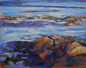
Spring Allee, 14X18, Carol L. Douglas, $1,594.00, US shipping included
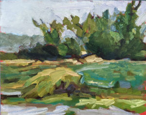
Protect yourself

The best way around this is to take your own reference photos. That’s important for more reasons than just copyright, starting with the greatly-expanded understanding we all have of places we’ve been to and people we’ve known.

Sometimes, sadly, that’s impossible. You’re on the other side of the country or the boat has sunk. If a client sends you their own photo for a painting, you can presume permission. If it’s not their own photo, do some investigating. “He said he got the photo from his cousin,” is not much of a defense.

Vineyard, 30X40, Carol L. Douglas, $5,072.00, US shipping included

If you use someone else’s photo, protect yourself by obtaining written permission from the photographer.

You can use photos that are in the public domain. Copyright doesn’t run forever, no matter what some museums try to tell their website visitors. Copyright expires when the original creator has been dead for more than seventy years. Just google “public domain images” and the word for which you’re searching, like “clouds” or “Grand Canyon.”

Creative Commons also has photos available for reuse, although the terms of use are different for each photo (and exhaustively spelled out).

Reserve your spot now for a workshop in 2025:

There’s a limit to winter painting

Candlemas Day, 1901, Marianne Stokes, 1901, Tate Britain. Note the extremely cool shadows on the face.

To old-timers-by which I mean people hundreds of years older than me-tomorrow is Candlemas. This is the official end of the season of Christmastide and one of the oldest dates on the Liturgical Calendar. Pennsylvania Dutch celebrated Candlemas as Dachstag, or Badger Day. That comes down to us as Groundhog Day.

Candlemas was gussied up by saying it celebrated the Presentation at the Temple, but the simple truth is that February is a desperate time in northern climes. A festival of lights seemed perfect. (Our medieval ancestors had around 60 holy days a year, compared to 11 Federal holidays for modern Americans. We’re doing something wrong.)

Georges de la Tour was the master of paintings of candelight. Magdalene with Two Flames, c. 1640, Metropolitan Museum of Art

It doesn’t matter if the groundhog sees his shadow

Candlemas marks the midpoint of winter. There have been seven weeks since the winter solstice, and there will be seven more weeks until the vernal equinox. That’s set in the orbit of the earth. It doesn’t matter what the groundhog sees.

Nevertheless, some parts of the country will have warming temperatures long before the vernal equinox. Here in the northern tier of the country, the chill won’t depart until the end of March.

My friend Eric Jacobsen was out painting yesterday, the daft bugger. “I would join you,” I told him, “except that I don’t have my truck this week.” Yeah, right.

Eric Jacobsen’s tiny painting stove.

The person who first said, “there is no bad weather, only bad clothes,” was an idiot. I have snow boots and winter coveralls, but extreme cold still seeps in. Standing in one spot painting is very different from snowshoeing or skiing, where you keep warm by moving. Eric compensates by bringing a clever little portable woodstove with him (above), in front of which he can thaw out his hands and paint tubes. But even he was complaining yesterday.

I once committed to painting outdoors every day for a year. Snowstorms, although good in studio work, result in horrible plein air paintings, and western New York gets a lot of snow. This was before cell phones, so when my battery died from the cold, I had to trudge to the nearest farmhouse for help.

That year turned me into a professional artist. I had a gigantic stack of paintings and no idea what to do with them, so I sold them. Today, I no longer feel the need to prove my toughness. I’ll paint plein air a few times over the winter, but it must be sunny and warm.

Candles were Godfried Schalcken’s best subject. A young woman with a burning candle, c. 1670-75, Uffizi Gallery

This is no week for plein air painting

I’d like to believe that the worst is behind us; after all, the days are getting noticeably longer. However, we’re settling into a deep freeze this week. Our nominal temperature is predicted to drop to -15Ā° F. on Friday night and bounce back up to a high of 5Ā° on Saturday. That’s going to be accompanied with gusts up to 45 mph, which should give us a wind-chill of somewhere around absolute zero. In those temperatures, even oil paints will stiffen until they’re unworkable, although they won’t really freeze until they hit -4Ā° F.

I finished a commission and sent a photo to the client yesterday. “That’s beautiful! That’s just what I was hoping for!” he wrote back, eager to collect his painting. “I’m not going out on Saturday, though, it’s going to be beyond cold.” It wouldn’t be good for the painting to move it in this weather, either.

Despite the beautiful snow, I won’t be painting outdoors this week. If you’re looking for something to do that doesn’t involve freezing to death, consider joining us for the 30-watercolors-in-45-days challenge instead. It’s fun, fast, and will help develop your watercolor skills.

Reserve your spot now for a workshop in 2025:

Monday Morning Art School: sinking paint

Test for sinking by running a rag with OMS over the dried passage–if the color comes back, the paint is sunk.

What is sinking paint?

When the top layer of oil paint has been lost to the layer underneath, the surface of the painting can turn grey and lifeless.

The siccative oils in oil paint don’t dry from evaporation; rather they harden in the presence of oxygen. This is the fundamental reason for the fat-over-lean rule. Ignoring it will create other long-term preservation problems besides the ghostly greys settling over your paintings.

Sinking appears slowly over time. A painting that was once boisterously colorful turns dull. The different drying times of pigments means that color will sink unevenly across the canvas, giving it an irregular, blotchy look. Details that were once subtly beautiful will disappear.

That dull film is the pigment granules standing alone, without their enveloping oil. Yes, pigment gives oil paint its color, but without a rich bath of oil to surround it, pigment just looks dull and grey.

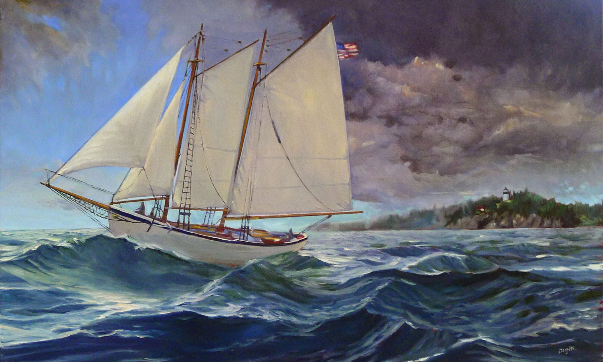
Sunset Sail, 14X18, oil on linen, $1594.

In most cases, the entire painting won’t be affected. There will be passages that look dull to the eye sitting next to glossy, normal paint. Sinking is most visible in the dark passages, particularly when they’ve been applied thinly, as most traditional teachers recommend.

Since sinking only appears in dry paint, you will often see it in paintings you’ve set aside for a few weeks or months. You can quickly tell if you have a sinking-in problem by wiping the offending passages with a light layer of odorless mineral spirits (OMS). If color comes back, it was sunk. Don’t try this on a recently-painted work; the solvent can dislodge not-quite-cured paint.

By the way, underpainting should sink if you leave it unfinished-it’s part of the fat-over-lean rule that you don’t use oils in this layer.

There’s no need for oiling out any layers where you’re going to paint right over them.

How to prevent sinking-in

Sinking has three common causes:

Too much solvent-the painter has not mastered the art of using unadulterated paint or painting mediums in the top layer. He relies too much on solvent instead of mediums to get good flow. The OMS takes the place of the linseed oil binder and then evaporates. That leaves the pigment particles isolated, with no oil surround. Air doesn’t have the same refractive index as linseed oil, so pigments that look dark and beautiful in solution looks dull and grey when the binder disappears.

Not enough oil in the top layer of paint-there’s enough oil in modern paints to make a solid top layer, but only if applied in proper thickness. If you want to paint thin, you must cut your paint with an oil-based medium, not with OMS.

Over-absorbent grounds-acrylic gesso is more absorbent than oil gesso, but a well-prepared acrylic ground is fine. However, a very inexpensive board may not have enough ground to stop oil from seeping through. An aftermarket coating of gesso is a good cure. Non-traditional grounds like paper and raw fabric need very careful preparation.

The Wave, 9X12, oil on archival canvasboard, $869

What to do about sinking

Sinking is a case of an ounce of prevention being worth a pound of cure, but it is fixable.

Sometimes, you can see that a passage is sinking while you’re still working on the painting. If this has happened in a bottom layer, ignore it-that’s how it’s supposed to work. If the passage is finished, oiling-out is your best option. Simply brush a very thin layer of medium across the surface in the areas that have turned grey. Then remove the excess with a lint-free painting cloth. You can paint straight onto this slightly tacky surface, or wait for it to dry.

If you find sinking in a thoroughly-dry painting, varnish is your best option. Unlike oiling-out, varnish creates an entirely-separate layer that won’t give future conservators fits.

Reserve your spot now for a workshop in 2025:

Talk about a frustrating commission

American Commissioners of the Preliminary Peace Agreement with Great Britain (unfinished oil sketch), c. 1783-84, Benjamin West, courtesy Winterthur Museum

On Wednesday, I mentioned that Norman Mailer finished the first volume of a planned trilogy right before his death at age 84. Sometimes things just don’t go as planned.

Benjamin West was a British-American painter best known for historical scenes, including the highly-romanticized The Death of General Wolfe. West was born in Springfield, PA, near Philadelphia, the youngest of ten children. He was entirely self-taught as an artist, but even from his youth, he attracted the interest and admiration of collectors.

Perhaps it was the persona in which he cloaked himself. Later in England, he reminisced that as a child, he was taught by Native Americans to mix paint using clay and bear grease. Today, that story would get you laughed right into Congress; the indigenous people had been pushed out of the lower Delaware River before he was born.

Still, West taught himself to paint, and he did so very well, being widely acclaimed as the first Colonial artist of serious skill. He began to attract the interest of wealthy collectors. At age 22 he set off for a Grand Tour, paid for by two sponsors. At the time, anyone with pretensions to be a gentleman or serious artist went to Italy to moon over the art and architecture. West used his time productively, making copies of Renaissance paintings and expanding his network of friends.

Self-portrait of Benjamin West (c. 1763, copy), courtesy National Gallery of Art

A detour

Three years later, West stopped in England for a short visit on his way home. In fact, he never moved on. After pottering about in Bath and Reading, he settled in London, eventually sending back to Pennsylvania for his fiancƩe. West went on to become one of the founders of the Royal Academy, and earned the patronage and custom of King George III himself.

That didn’t mean he didn’t consider himself a Colonial. He frequently revisited North American themes for his grand-scale history paintings, including the bizarre General Johnson Saving a Wounded French Officer from the Tomahawk of a North American Indian. When theĀ British and Americans came to hammer blows in 1776, he maintained a careful neutrality.

The Death of General Wolfe is West’s most famous painting. Courtesy National Gallery of Canada.

Peace breaks out

Perhaps his idea behind The Treaty of Paris was, “never mind that, we’re all friends again.” However, it didn’t work out as planned. It was intended to be the first in a series on the American Revolution, in the same vein as his cycles of historical paintings at Windsor Castle. It was intended to commemorate the commission that negotiated the end of the American Revolution. On the American side, that was John Jay, John Adams, Benjamin Franklin, Henry Laurens, and William Temple Franklin (Benjamin Franklin’s grandson).

The Americans were easy. All but Benjamin Franklin agreed to sit for him, and Franklin’s likeness was easy enough to find. West drew him from an engraving; once you realize that, you can see how he was slotted in to the composition.

The British representatives were a Scottish merchant and slave trader called Richard Oswald and his secretary, Caleb Whitefoord. Whitefoord was a beautiful young man, judging by his portrait by Sir Joshua Reynolds. Oswald flat out refused to sit. He said he had a bad eye, and a previous portrait made him look ugly.

We don’t have the pictorial evidence to judge, but I’d like to believe that a slave trader with sharp business practices was ugly, inside and out. However, there also must have been a fair amount of bad feeling on the part of the British envoys at that moment. Who really wants to commemorate losing a war?

Benjamin Franklin Drawing Electricity from the Sky, c. 1816, Benjamin West, courtesy Philadelphia Museum of Art

“As I very strongly expressed my regret that this picture should be left unfinished, Mr. West said he thought he could finish it,” John Quincy Adams later wrote in his diary. “I understood his intention to be to make a present of it to Congress.”

Instead, it languished, and West’s Revolutionary War painting cycle never got off the ground. Still, it’s more accessible and interesting in its half-finished state than it ever would have been had it been finished and presented to Congress.

Reserve your spot now for a workshop in 2025:

Painting can help you live longer

Self Portrait at the Age of 63, 1669, Rembrandt van Rijn, courtesy National Gallery

T. is the only artist I’ve known who’s ever retired. Most of them paint their way forward into extreme old age. And T. couldn’t stay retired-in the last year she’s picked up her brushes again, done a solo show, and sold a few pieces.

“Why would I stop doing what I love?” asked pastellist Diane Leifheit in response to Transcending Popular Culture.

Three Machines, 1963, Wayne Thiebaud, courtesy de Young Museum

Old age often produces great work

By modern standards, Rembrandt didn’t live long, but 63 beat his contemporary odds by a long shot. His last self-portrait, painted the year of his death, is both technically confident and psychologically insightful.

Norman Mailer finished his last novel, The Castle in the Forest, right before his death at the age of 84. It was both very long and very good, and was the first volume of an intended trilogy.

The superstar of working into extreme old age was American pop artist Wayne Thiebaud, who died on Christmas Day 2021 at the age of 101. Earlier that year, he recorded a conversation with curator Karen Wilkin and Lois Dodd, about working into old age.

“It has never ceased to thrill and amaze me,” Thiebaud said, “the magic of what happens when you put one bit of paint next to another. “I wake up every morning and paint. I’ll be damned but I just can’t stop.”

Lois Dodd, of course, we claim as Maine’s own favorite daughter. She’ll celebrate her 96th birthday this year, as will her fellow modernist Alex Katz.

Equilibrium, 2012, Carmen Herrera, courtesy Metropolitan Museum of Art

Carmen Herrera didn’t have her first solo show until she was in her mid-50s, although she’d sold her first work while in her teens. She was almost 90 when she was ‘discovered’ by the New York art scene. She lived until age 106.

A list of major artists who’ve reached their centenary is too long to reprint here, but mention must be made of Anna Mary Robertson “Grandma” Moses. She was a hardscrabble farmer’s wife who didn’t start painting until her mid-70s. She died at age 101, having carved out a second career that was far more successful than her first one.

“I look back on my life like a good day’s work, it was done and I feel satisfied with it. I was happy and contented, I knew nothing better and made the best out of what life offered,” she said.

Hoosick Falls in Winter, 1944, Anna Mary Robertson “Grandma” Moses, courtesy Phillips Collection

Science says

The anecdotal evidence I’ve related above is supported by science. British researchers found that people over 50 who regularly engaged in the arts were 31% less likely to die during a 14-year follow-up than peers with no art in their lives. A World Health Organization review found that both passive engagement with the arts (like visiting a museum) and active participation (making art or music) had health benefits.

Why don’t more people engage in art, then? We start devaluing it in school, where it’s the first thing cut, despite manifest evidence of its health and intellectual benefits. It’s no wonder that by middle age, most of us are more likely to be watching TV than picking up a brush or singing in a choir.

But as Grandma Moses demonstrated, it’s never too late to start painting. Or singing, playing the harmonium, or taking up interpretive dance. Why not give yourself a health boost, and have fun at the same time?

Reserve your spot now for a workshop in 2025:

Monday Morning Art School: donā€™t be boring

Linda Smiley used the big shapes of shadows to draw us across a very familiar lake scene.

Don’t be boring, I wrote last week. This is the first and greatest rule of composition. “What do you mean by that?” a reader asked in response. This, like obscenity, is one of those things that’s hard to define, but we know it when we see it.

The subject is never the issue. We’ve all seen a thousand boring paintings of barns, but when Edward Hopper painted them, they were brilliant studies of light and shape. Very familiar subjects can be seen in new and arresting ways. I took the liberty of illustrating this post with paintings by my students; they all took common scenes in the northeast and finished them beautifully.

Most people would paint the fence from the side, but Rebecca Bense drove us right into the picture plane with that shadow.

The easy out

We tend to draw what’s right in front of us without thinking too much of how changing the viewpoint might make for a better painting. Commit to an idea, and squeeze out every ounce of design you can by drawing it repeatedly in different arrangements. That’s as important in landscape as it is in still life. The time you spend trying out new compositions is the most important part of the painting process.

That is not just a question of large shapes, but of values. Even a typical arrangement of trees, point, and water can be made arresting through dark shapes running through them. Contrast draws the eye.

Beth Carr used the chop of snow shadows to create great texture.

What everyone says is not necessarily true

You’ve heard of the rule of thirds, or that you should never center the subject directly on your canvas. What makes you believe these things? Someone told them to you.

Ideas of division of space are culturally-derived and quite complex. Tutankhamun’s golden mask is beautiful and perfectly symmetrical.

You will have an easier time creating a composition if you abide by these shibboleths, but that doesn’t mean you’ll make a better painting. A deep dive into space division is never wasted time. I think about the abstract paintings of Clyfford Still when I start to feel my compositions falling into dullness.

Cassie Sano crossed the tire tracks and the tree shadows to create a weave of interest.

There are some verities

Defining your composition with long unbroken horizontal and vertical lines will make it start out rigid. Look to Frances Cadell for ways to break out of that. Likewise, you don’t want to lead the eye out the corners of your canvas, or put a focal point to close to an edge. ‘Respect the picture plane’ is a good general rule.

The human brain loves the insolvable. That’s why the Golden Ratio and Dynamic Symmetry work better than the rule of thirds in design. That doesn’t mean you need to spend a lifetime studying design arcana; just understand it and better placement will come naturally to you.

Stephen Florimbi didn’t beat the details to death in this lovely creek painting, instead, concentrating on the patterns of light and dark.

Things to avoid

No painting without a series of focal points can succeed. This is where the marsh painting usually fails. The eye needs to be able to walk through, into, and beyond the work. I’m not talking about anything as hackneyed as the winding path or river, but a series of points that draw your eye around the picture in a planned way. These details reward careful study and keep the viewer engaged for long periods of time.

Reserve your spot now for a workshop in 2025:

Transcending popular culture

Daybreak, 1922, Maxfield Parrish

One of my students chatted with me recently about Maxfield Parrish. “I erroneously dismissed him as a pop artist for too long,” I told her. “He was that and much more.”

“What’s the difference between a fine artist and a pop artist?” she asked.

It was a bad choice of words on my part. There was a 20th century movement called Pop Art, which encompassed the likes of Roy Lichtenstein and Andy Warhol. It was fine art commenting on popular culture, rather than a part of popular culture. (The difference between Warhol’s Brillo boxes and the ones made by the soap company was that Warhol’s were in museums. Now even that distinction is blurred.)

I was talking about of the art equivalent to pop music, and I don’t think there’s a word for it. Parrish was part of the Golden Age of American illustration, along with N.C. WyethHoward Pyle, Jessie Willcox Smith and others. Our modern concept of illustration doesn’t begin to encompass the range of their work. They were riding a revolution in printing technology, and they were visionary.

Sheep Pasture, Cornish, New Hampshire (sketch), 1936, Maxfield Parrish

A world now gone

Parrish’s Daybreak was the most popular art print of the 20th century. At one time, one in four households had purchased one. Printing is so cheap for us today that we can hardly imagine what it meant a hundred years ago for working-class people to afford a color picture for the dining room, or to read books and magazines with color illustrations.

Today’s illustrators work to someone else’s idea. When Time orders up a caricature of the president for next week’s issue, the artist has little scope or time. In their heyday, magazine covers were self-contained paintings, often narrating a little story of the artist’s own invention. The Saturday Evening Post discovered Norman Rockwell, who went on to create more than 300 covers for them, and John Philip Falter, who did 120 covers. All the best magazines, ranging from Harper’s Bazaar to Life to Boys’ Life to Popular Science, hired top illustrators for their covers.

Hill Top Farm, Winter, 1949, Maxfield Parrish

The best of them, including Parrish, were wildly successful. It’s not just that they were in it for the money; everyone is just in it for the money. It’s that they succeeded in making a great deal of it.

Today magazines are filled with photography. The only major magazine still using stand-alone art on its cover is The New Yorker. Meanwhile, there’s a surfeit of wall decoration available to us, ranging from bad department-store art to high-quality prints of masterpieces. There’s no room in the market for pop painters in the style of Maxfield Parrish.

Birches in Winter, undated, Maxfield Parrish

Parrish can be credited with many things, including the craze for androgyny that has bedeviled fashion for a hundred years, and for introducing a shade of blue that now bears his name. He was a consummate commercial artist, but he could also really paint. In 1931, he told theĀ Associated Press, “I’m done with girls on rocks,” and focused exclusively on landscapes, particularly those of his adopted home state of New Hampshire. They were never as popular as his nymphs, but he still made money. He painted until he was 91 and lived to a few months shy of 96. That’s a recurring trait among successful artists; painting is a healthy vocation.

Reserve your spot now for a workshop in 2025: