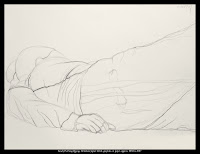
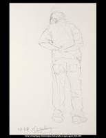
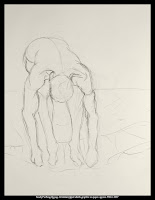
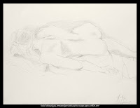
Not only were they both accepted, but both were awarded Presidential Merit Scholarships. Good going, girls!
Trip to Ghost Ranch in Abiquiú, NM added to Taos workshop
“When I got to New Mexico, that was mine.”
 That was how Georgia O’Keeffe described her instant love for northern New Mexico, which she first visited in 1917 Although she never owned Ghost Ranch, she eventually purchased a small home there and later a home in nearby Abiquiú. (Learn more about Ghost Ranch here.)
We have added a guided tour of this area (which she loved, explored, painted, and lived in for over 50 years) to our “Paint the Magic and Mystery of Taos” workshop, from June 15-21, 2008. This is optional and requires a ticket at $25.

Tour update
This trip is selling well, and we have a few openings left. I’m getting pretty jazzed about it myself.
I plan to pick up tour participants at Albuquerque Airport on Sunday, June 15 (if you arrive at a different time, there’s a shuttle available to Taos). On Sunday evening, we’ll relax over dinner at the Sagebrush Inn and get to know each other.
I am always excited to get to work right away and I bet you’re the same. In the morning, we’ll get right down to the business of painting. Then, while you eat your lunch and relax, Shelli or I will demo in a variety of media.
We’re visiting Ghost Ranch on Friday. We’ll bring our supplies so we can get one work session in that day. On Saturday we’ll help you pack and ship your stuff and get you back to Albuquerque for the trip home.
Your fee of $1200 includes workshop instruction, five days of painting in special selected plein air locations, lodging and two meals per day at the historic Sagebrush Inn. (http://www.sagebrushinn.com/) 
Painters are welcome to work in oils, pastels, acrylics and watercolor. Materials list and daily schedule will be supplied upon registration. A branch of Artisans art store is nearby. (http://www.artisan-santafe.com/)
Travel arrangements and fees
Call Jeannie at Esplanade Travel to reserve your workshop space with a $550 deposit. She’s at (718) 597-1414 or [email protected]. She can also help with your flight arrangements if you wish.
Shelli Robiner-Ardizzone has led workshops for 8 years at the Women’s Studio Center, LIC, and at Great Neck Arts Center. She has been awarded a residency at the Vermont Studio Center and grants from National Academy School and Art Students League.
Carol L. Douglas (moi) is the chairperson of New York Plein Air Painters and teaches plein air, studio and figure painting in Rochester, NY. She studied at the Art Students League and elsewhere. (http://www.watchmepaint.blogspot.com%20/and http://www.goaway-letmepaint.com/)
For a brochure you can print, go here.
The Kung Fu Fighters
I have recently had the opportunity to work with two young artists preparing portfolios for college. (Their work follows in the posts below.) They are laughingly called my Art Slaves since they have been in my studio seven days a week. One of my adult students wondered why they make such swift progress and she doesn’t. “If you’re willing to be chained to an easel seven days a week and do what you’re told, you can do it too,” I said. (But the charm of adult learners is that they are individualistic, stubborn, and idiosyncratic, and I wouldn’t have them any other way.)
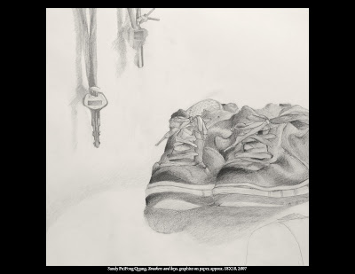
Neither Sandy nor Ze had ever painted in oils before December. That they each have an oil painting in their portfolio is an indication of how hard they’ve worked.
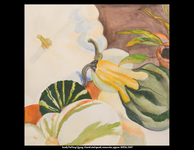
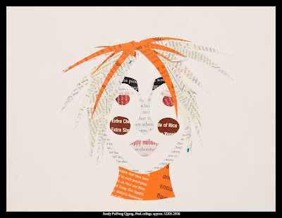
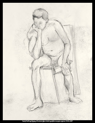
Completed portfolio: Sandy Puifong Quang
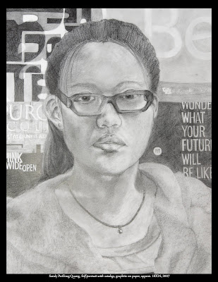
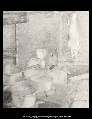
Sandy Puifong Quang is 19 and will graduate from Monroe Community College in May with an AS in liberal arts and a GPA of around 3.5. Although she has always loved design, Sandy didn’t know she loved art until she began taking studio classes at MCC. Sandy speaks three dialects of Chinese along with some Russian and French. Her family are refugees from the fall of Vietnam and run a restaurant in Rochester.
Sandy started working with me seriously in the summer of 2007, although I have known her for many years.
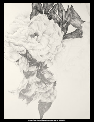
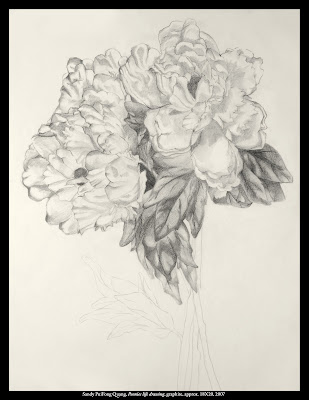 Peonies life drawing, graphite, approx. 18X20, 2007
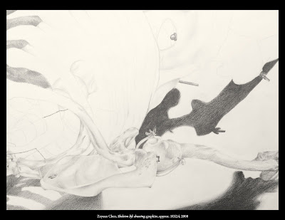
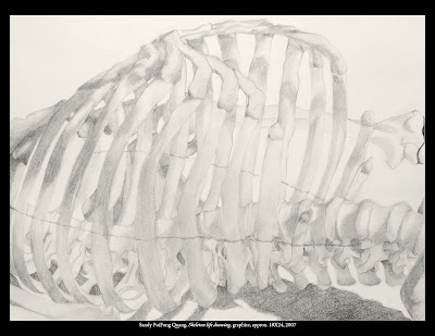 Skeleton life drawing, graphite, approx. 18X24, 2007
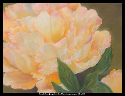 Peonies life drawing, pastel, approx. 9X12, 2008
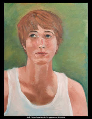 Patrick, oil on canvas, approx. 18X24, 2008
Completed portfolio: Zeyuan Chen
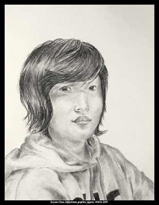 Self-portrait, graphite, approx. 18X24, 2007
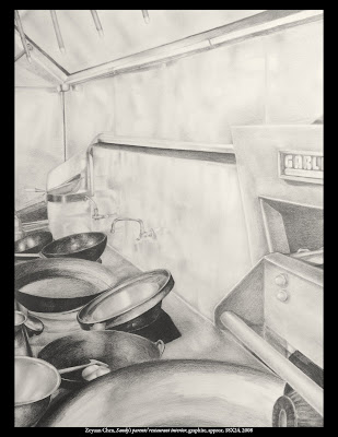 Sandy’s parents’ restaurant interior, graphite, approx. 18X24, 2008
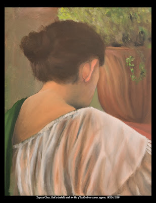 Gail as Isabella with the pot of Basil, oil on canvas, approx. 18X24, 2008
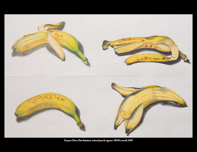
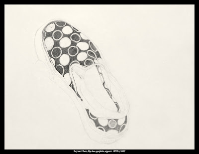
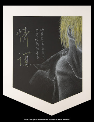
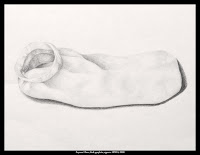
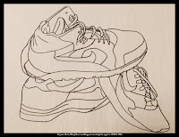
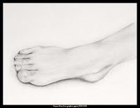
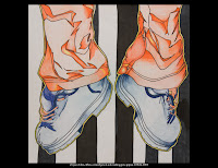
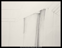 Classroom window molding, graphite, approx. 18X24,
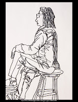
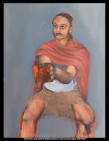
Mary as John the Baptist (unfinished), acrylic on canvas, approx. 18X24, 2007
Paint Taos June 15-21, 2008
Register by February 20, 2008
Esplanade Travel (718) 597-1414
[email protected]
[email protected]
June is the perfect time for plein air painting in Taos! Join workshop instructors Shelli Robiner-Ardizzone and Carol L. Douglas and experience the beauty and majesty of the western landscape that captivated Georgia O’Keeffe, Nicolai Fechin and many others.
WORKSHOP
The fee of $1200 includes five days of painting, lodging at the historic Sagebrush Inn and two meals per day.
There will be both morning and afternoon painting sessions en plein air with a midday break for lunch. The days will also include individualized instruction along with instructor demos.
Painters are welcome to work in oils, pastels, acrylics and watercolor. Materials list and daily schedule will be supplied upon registration A branch of Artisan-Santa Fe art store is nearby.
For more information about instruction, contact Shelli Ardizzone.
TRAVEL ARRANGEMENTS AND FEES
Call Jeannie at Esplanade Travel to coordinate flights and lodging reservation, at (718) 597-1414 or email her here.
Reserve your workshop space with a $550 deposit by March 1, 2008.
INSTRUCTORS
Shelli Robiner-Ardizzone has led workshops for 8 years at the Women’s Studio Center, LIC, and at Great Neck Arts Center. She has been awarded a residency at the Vermont Studio Center and grants from the National Academy School and Art Students League. (http://www.shellirobiner-ardizzone.com/)
Carol L. Douglas is the chairperson of New York Plein Air Painters and teaches plein air, studio and figure painting in Rochester, NY. She studied at the Art Students League and elsewhere. (http://www.goaway-letmepaint.com/)
Handle with care
A student had stored these pastels in a nylon carrier which holds six plastic boxes. Each box contained a selection of hard and soft pastels in roughly analogous colors. Because there was no rice or foam or compression holding the pastels in place, they danced jigs against each other. The resultant grey slurry coated the sticks, making it impossible to tell what color each pastel was.
We are cleaning them and putting a bed of rice in the bottom of each tray, but the process takes hours. Better to avoid the problem.
White rice (uncooked, please!) is a tried and true method of keeping pastels clean. It is cheap and renewable. (Be careful disposing of it, since it might tempt small animals.) Nevertheless, little rice-filled boxes are a pain in the neck to handle en plein air.
My favorite pastel box has hard panels which press in place with Velcro seals. These hold my pastels securely between two sheets of foam. My local art supply store has discontinued it because it isn’t well-made (I’ll vouch for that) but rather than show you some commercial alternatives, I’d suggest that you look at this delightful rendition made out of a cigar box. For my purposes, it’s too small, but I do like the price.
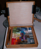 Cori Nicholls’ cigar box pastel pochade. Devilishly clever, follow her link, below!
The Magi in Alabama
John has posted his comments about the Adoration of the Magi in the Snow at The Shepherd’s Staff. He paints a wonderful word picture of Alabama which is well worth reading.
The Adoration of the Magi in the Snow
Oil on wood panel, dimensions not available
Oskar Reinhart Collection, Switzerland
My students have spent a lot of time in the past two months talking about composition. They would tell you that it is passing strange to have that Nativity on the edge of the canvas, partially obscured. Many critics have noted this and concluded that this is really a just a Flemish village scene with a Nativity tossed in. I disagree.
Pieter Bruegel’s birth was unrecorded, but it is thought to have been around 1525-30 in either Liège or Brabant. Just as there is ambiguity about his birthplace, there is no record of whether Bruegel died as a Protestant or Catholic. (He was shrewd—he asked his wife to burn his papers after his death.)
Bruegel’s youthful world was wholly Catholic. His training and early career were excellent and orthodox: apprenticeship to a leading Antwerp painter in the Italianate style (Pieter Coecke van Aelst), further studies with an artist-priest (Giulio Clovio) in Rome, a now-lost church altar in 1550-51. The anomaly was Coecke’s wife, Mayken Verhulst, an artist from Mechelin. This city was an early center for peasant genre painting, and she is sometimes credited with transmitting this idea to Bruegel. (She also trained his young sons after his early death in 1569; art history knows her mainly as the root of the Brueghel painting dynasty.)
Bruegel worked with three themes throughout his career: peasants, landscape and religion. In his early work, these converged and diverged in no particular pattern. As a member of a successful atelier family (he married the Coeckes’ daughter) he flourished; he had a high degree of skill as well. But his most brilliant paintings were at the end of his life. Was that simply because he had grown to maturity, or was he responding to the trials of his times?
One of the decrees of the Council of Trent was that religious painting must be suitably elevated; saints must be set apart from mere mortals in dress, demeanor and activity. The Church recognized that saints with dirty feet were a dangerous endorsement of the Protestant concept of a priesthood of all believers.
By then, Reformation was smoldering in the Netherlands; Anabaptists and Calvinists met secretly and illegally. Bruegel left no record of what he thought of this or anything else. But from a Catholic standpoint, his paintings became positively impertinent. Of these paintings, three deserve mention. Bruegel located his Tower of Babel (1563) in a Flemish city and dressed Nimrod as a European king. The Sermon of St. John the Baptist (1566) is militant—subversive, actually—because it clearly depicts a contemporary Calvinist or Anabaptist service. In it he identifies the heretic Protestant preachers with John the Baptist. The Adoration of the Magi of 1564 is a straight-up Nativity scene, but anything but saintly. Notice Mary’s droopy veil, Joseph’s distraction, and the brutish faces of the peasants to his right.
One could ask whether these reflected the views of his patrons or his own religious convictions. I would guess that the two were so intertwined that the question is meaningless. (One of Bruegel’s most important patrons was Cardinal Antoine Perrenot de Granvelle, a leading European statesman and Counterreformer, but if Caravaggio’s experience was an indicator, we shouldn’t read too much into that.)
How powerful art can be! In 1566, the Reformation ignited in the Low Countries. It did so over the issue of art, in the form of the Beeldenstorm (“picture storm”), in which church art was systematically destroyed throughout the Netherlands. Spain responded by sending the cruel Duke of Alba to Brussels (where Bruegel had settled) to extirpate the rebels. This reign of terror—in which thousands died and many more were dislocated—led directly to the Eighty Years’ War.
It was during the height of this terror that Bruegel painted The Adoration of the Magi in the Snow. It’s lovely, but it isn’t peaceful. The central stream of figures is very nearly on the march.
The Protestant impulse forced a new way of painting. Artists couldn’t produce idols, so the pattern books of their faith—unchanged for a millennium—were closed to them. How, then, could they articulate their religious feelings? Bruegel actually painted three winter scenes of the Biblical Infancy Narratives. The others are The Slaughter of the Innocents (1565-66) and The Census at Bethlehem (1566).
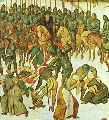 Slaughter of the Innocents, detail (1565-66)
Pieter Bruegel the Elder
Oil on wood panel, dimensions not available
The Nativity (particularly the Virgin and Child) is the most commonly painted subject in art. Even in our secular age, even among non-Christians, it is universal. Bruegel’s brilliance was in realizing that he didn’t need to spell out the scene inside the stable; everyone knew it. In fact, in not doing so, he allowed us to regain something mysterious and personal about that night.
I must mention Bruegel’s technical prowess. Since he invented the winter landscape, he can also be credited with chromatic modeling in snow, in the form of violet shadows and the warm highlights. Note how the roof in the building on the top left is shaped by these shifts in color rather than with darker grey shadows. (This was an artistic choice; the snow on a dark winter day is generally flat.) The dark mass of people sweeps in an arc to the Nativity, pulling it back up into importance. Bruegel emphasized this sweep by making it the busiest part of his painting, and by making the figures darker and in greater contrast than the surround. This arc of humanity plays off against the perfectly composed diagonal lines of the surround.
A blessed Advent to you all.
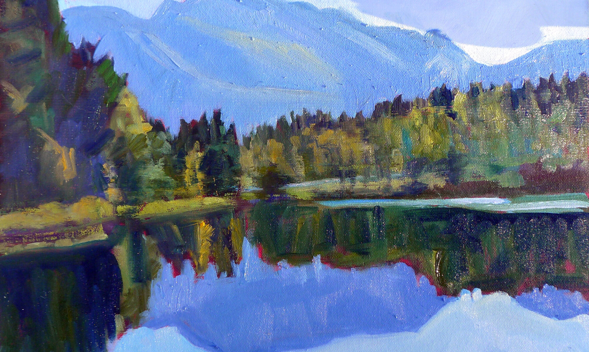
Plein Air Taos 2008
I will teach plein air in Taos next June with Shelli Robiner-Ardizzone of New York. Here is some information about her previous trip to Taos. We will be sending materials out at the first of the year, but of course, if this trip is what you want for Christmas, contact me here.
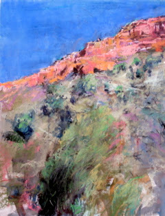
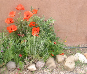 Poppies in a Taos yard , 2007